
- Latest SAPUI Version 1.124
- SAPUI5 Version 1.122
- SAPUI5 Version 1.120
- SAPUI5 Version 1.118
- SAPUI5 Version 1.116
- SAPUI5 Version 1.114
- SAPUI5 Version 1.112
- SAPUI5 Version 1.110
- SAPUI5 Version 1.108
- SAPUI5 Version 1.106
- SAPUI5 Version 1.104
- SAPUI5 Version 1.102
- SAPUI5 Version 1.100
- SAPUI5 Version 1.98
- SAPUI5 Version 1.96
- SAPUI5 Version 1.94
- SAPUI5 Version 1.92
- SAPUI5 Version 1.90
- SAPUI5 Version 1.88
- SAPUI5 Version 1.86
- SAPUI5 Version 1.84
- SAPUI5 Version 1.82
- SAPUI5 Version 1.80
- SAPUI5 Version 1.78
- SAPUI5 Version 1.76
- SAPUI5 Version 1.74
- SAPUI5 Version 1.72
- SAPUI5 Version 1.70
- SAPUI5 Version 1.68
- SAPUI5 Version 1.66
- SAPUI5 Version 1.64
- SAPUI5 Version 1.62
- SAPUI5 Version 1.60
- SAPUI5 Version 1.58
- SAPUI5 Version 1.56
- SAPUI5 Version 1.54
- SAPUI5 Version 1.52
- SAPUI5 Version 1.50
- SAPUI5 Version 1.48
- SAPUI5 Version 1.44
- SAPUI5 Version 1.42
- SAPUI5 Version 1.40
- SAPUI5 Version 1.38
- SAPUI5 Version 1.36
- SAPUI5 Version 1.34
- SAPUI5 Version 1.32
- SAPUI5 Version 1.30
- SAPUI5 Version 1.28
- SAPUI5 Version 1.26
- Latest SAPUI Version 1.124
- SAPUI5 Version 1.122
- SAPUI5 Version 1.120
- SAPUI5 Version 1.118
- SAPUI5 Version 1.116
- SAPUI5 Version 1.114
- SAPUI5 Version 1.112
- SAPUI5 Version 1.110
- SAPUI5 Version 1.108
- SAPUI5 Version 1.106
- SAPUI5 Version 1.104
- SAPUI5 Version 1.102
- SAPUI5 Version 1.100
- SAPUI5 Version 1.98
- SAPUI5 Version 1.96
- SAPUI5 Version 1.94
- SAPUI5 Version 1.92
- SAPUI5 Version 1.90
- SAPUI5 Version 1.88
- SAPUI5 Version 1.86
- SAPUI5 Version 1.84
- SAPUI5 Version 1.82
- SAPUI5 Version 1.80
- SAPUI5 Version 1.78
- SAPUI5 Version 1.76
- SAPUI5 Version 1.74
- SAPUI5 Version 1.72
- SAPUI5 Version 1.70
- SAPUI5 Version 1.68
- SAPUI5 Version 1.66
- SAPUI5 Version 1.64
- SAPUI5 Version 1.62
- SAPUI5 Version 1.60
- SAPUI5 Version 1.58
- SAPUI5 Version 1.56
- SAPUI5 Version 1.54
- SAPUI5 Version 1.52
- SAPUI5 Version 1.50
- SAPUI5 Version 1.48
- SAPUI5 Version 1.46
- SAPUI5 Version 1.44
- SAPUI5 Version 1.42
- SAPUI5 Version 1.40
- SAPUI5 Version 1.38
- SAPUI5 Version 1.36
- SAPUI5 Version 1.34
- SAPUI5 Version 1.32
- SAPUI5 Version 1.30
- SAPUI5 Version 1.28
- SAPUI5 Version 1.26
Carousel
sap.m.Carousel
Intro
The carousel allows the user to browse through a set of items. It always displays one item at a time. From the displayed item, the user can navigate to either the next or the previous item. The interaction resembles browsing through the pages of a book.
Optionally, a paging indicator displays the user’s current position inside the set of items.
The control is best known for browsing through a set of images, as it works best when the single items are represented in a way that the user can easily distinguish. Nonetheless, the carousel is not limited to displaying images; it can contain every sap.m control.
Usage
Use the carousel if:
- You have strong visual representations of the items you want to display.
- You want to display the items one after the other.
Do not use the carousel if:
- The items you want to display need to be visible at the same time.
- The items you want to display are uniform.
Responsiveness
The size of the control’s content area is automatically adjusted to the amount of space available.
When used in non-touch mode, the user can navigate with forward and backward icons displayed on the left and right side of the control.
On touch devices, the carousel control makes use of the swipe gesture to navigate through the items. Therefore, the forward and backward icons are not displayed on touch devices.
The paging indicator (when activated) is visible on each form factor. The paging indicator wraps if not all items fit in one line.
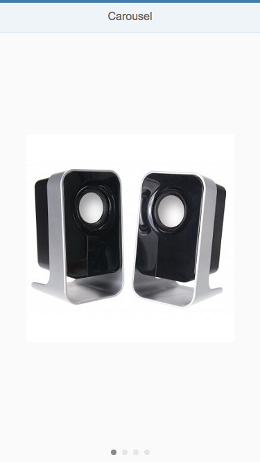
Carousel (size S)

Carousel (size M)
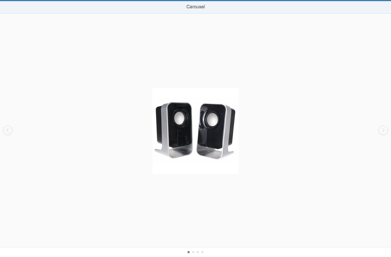
Carousel (size L)
Layout
The carousel control mainly consists of a content area in which the different items are displayed and cycled through.
Optionally, a paging indicator can be displayed floating either above the top or at the bottom of the content area.
On non-touch devices, icons for navigating to the next or previous item are displayed either floating above the left and right side of the content area or in the paging indicator area. This is controlled by the arrowsPlacement property.
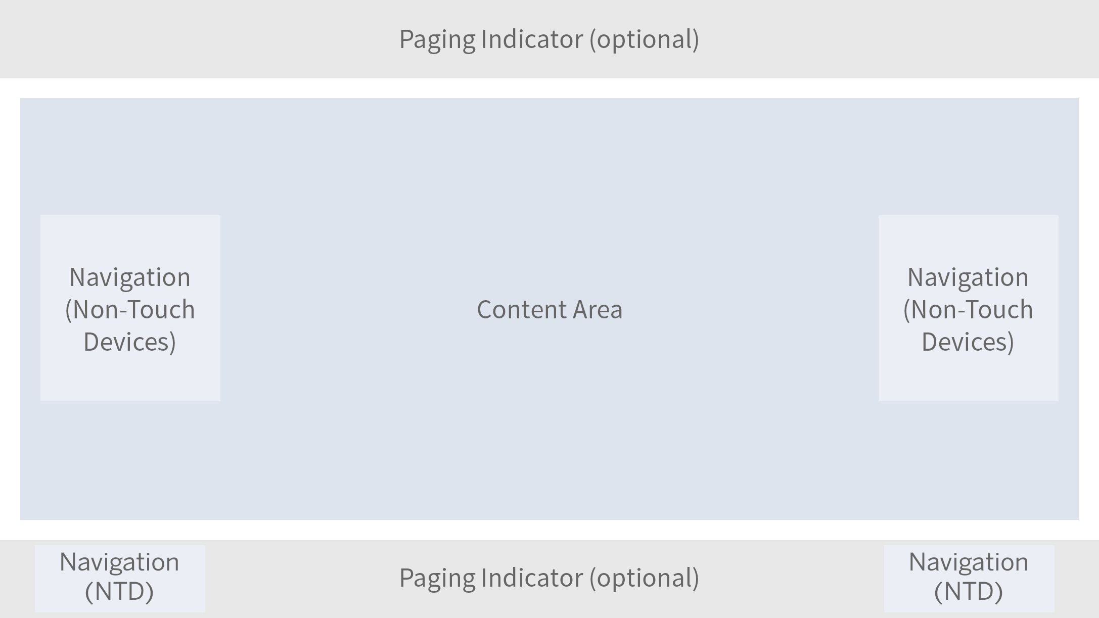
Schematic layout of carousel
Behavior and Interaction
The current item is displayed in the content area.
Navigating
When the user navigates from a displayed item to another item, the item is moved out of the content area and the next or previous item (depending on the direction of navigation) appears with a sliding transition.
On touch devices, navigation is performed with swipe gestures (swipe right or swipe left).
On non-touch devices, navigation is provided by icons.
When the item set contains only one item, the navigation is deactivated.

Navigation – Previous

Navigation – Next (hover)
Looping
The carousel can be set to loop (property: loop). In this case, the carousel jumps back to the first item once all items have been displayed. If looping is not enabled, there is no forward navigation on the last item.
Paging
The current position inside the set of items is displayed using an optional paging indicator (properties: showPageIndicator, pageIndicatorPlacement).

Paging indicator
If there are more than 8 pages, the paging indicator changes from icons to numbers.

Paging indicator
Resources
Want to dive deeper? Follow the links below to find out more about related controls, the SAPUI5 implementation, and the visual design.
 Your feedback has been sent to the SAP Fiori design team.