
- Latest SAPUI Version 1.124
- SAPUI5 Version 1.122
- SAPUI5 Version 1.120
- SAPUI5 Version 1.118
- SAPUI5 Version 1.116
- SAPUI5 Version 1.114
- SAPUI5 Version 1.112
- SAPUI5 Version 1.110
- SAPUI5 Version 1.108
- SAPUI5 Version 1.106
- SAPUI5 Version 1.104
- SAPUI5 Version 1.102
- SAPUI5 Version 1.100
- SAPUI5 Version 1.98
- SAPUI5 Version 1.96
- SAPUI5 Version 1.94
- SAPUI5 Version 1.92
- SAPUI5 Version 1.90
- SAPUI5 Version 1.88
- SAPUI5 Version 1.86
- SAPUI5 Version 1.84
- SAPUI5 Version 1.82
- SAPUI5 Version 1.80
- SAPUI5 Version 1.78
- SAPUI5 Version 1.76
- SAPUI5 Version 1.74
- SAPUI5 Version 1.72
- SAPUI5 Version 1.70
- SAPUI5 Version 1.68
- SAPUI5 Version 1.66
- SAPUI5 Version 1.64
- SAPUI5 Version 1.62
- SAPUI5 Version 1.60
- SAPUI5 Version 1.58
- SAPUI5 Version 1.56
- SAPUI5 Version 1.54
- SAPUI5 Version 1.52
- SAPUI5 Version 1.50
- SAPUI5 Version 1.48
- SAPUI5 Version 1.44
- SAPUI5 Version 1.42
- SAPUI5 Version 1.40
- SAPUI5 Version 1.38
- SAPUI5 Version 1.36
- SAPUI5 Version 1.34
- SAPUI5 Version 1.32
- SAPUI5 Version 1.30
- SAPUI5 Version 1.28
- SAPUI5 Version 1.26
- Latest SAPUI Version 1.124
- SAPUI5 Version 1.122
- SAPUI5 Version 1.120
- SAPUI5 Version 1.118
- SAPUI5 Version 1.116
- SAPUI5 Version 1.114
- SAPUI5 Version 1.112
- SAPUI5 Version 1.110
- SAPUI5 Version 1.108
- SAPUI5 Version 1.106
- SAPUI5 Version 1.104
- SAPUI5 Version 1.102
- SAPUI5 Version 1.100
- SAPUI5 Version 1.98
- SAPUI5 Version 1.96
- SAPUI5 Version 1.94
- SAPUI5 Version 1.92
- SAPUI5 Version 1.90
- SAPUI5 Version 1.88
- SAPUI5 Version 1.86
- SAPUI5 Version 1.84
- SAPUI5 Version 1.82
- SAPUI5 Version 1.80
- SAPUI5 Version 1.78
- SAPUI5 Version 1.76
- SAPUI5 Version 1.74
- SAPUI5 Version 1.72
- SAPUI5 Version 1.70
- SAPUI5 Version 1.68
- SAPUI5 Version 1.66
- SAPUI5 Version 1.64
- SAPUI5 Version 1.62
- SAPUI5 Version 1.60
- SAPUI5 Version 1.58
- SAPUI5 Version 1.56
- SAPUI5 Version 1.54
- SAPUI5 Version 1.52
- SAPUI5 Version 1.50
- SAPUI5 Version 1.48
- SAPUI5 Version 1.46
- SAPUI5 Version 1.44
- SAPUI5 Version 1.42
- SAPUI5 Version 1.40
- SAPUI5 Version 1.38
- SAPUI5 Version 1.36
- SAPUI5 Version 1.34
- SAPUI5 Version 1.32
- SAPUI5 Version 1.30
- SAPUI5 Version 1.28
- SAPUI5 Version 1.26
Split-Screen Layout
sap.m.SplitApp
Intro
The split-screen layout is optimized for displaying and processing a list of items. On the left, users can quickly scan and navigate through the list. On the right, they see the details of the selected item, and can trigger related actions or edit the data.
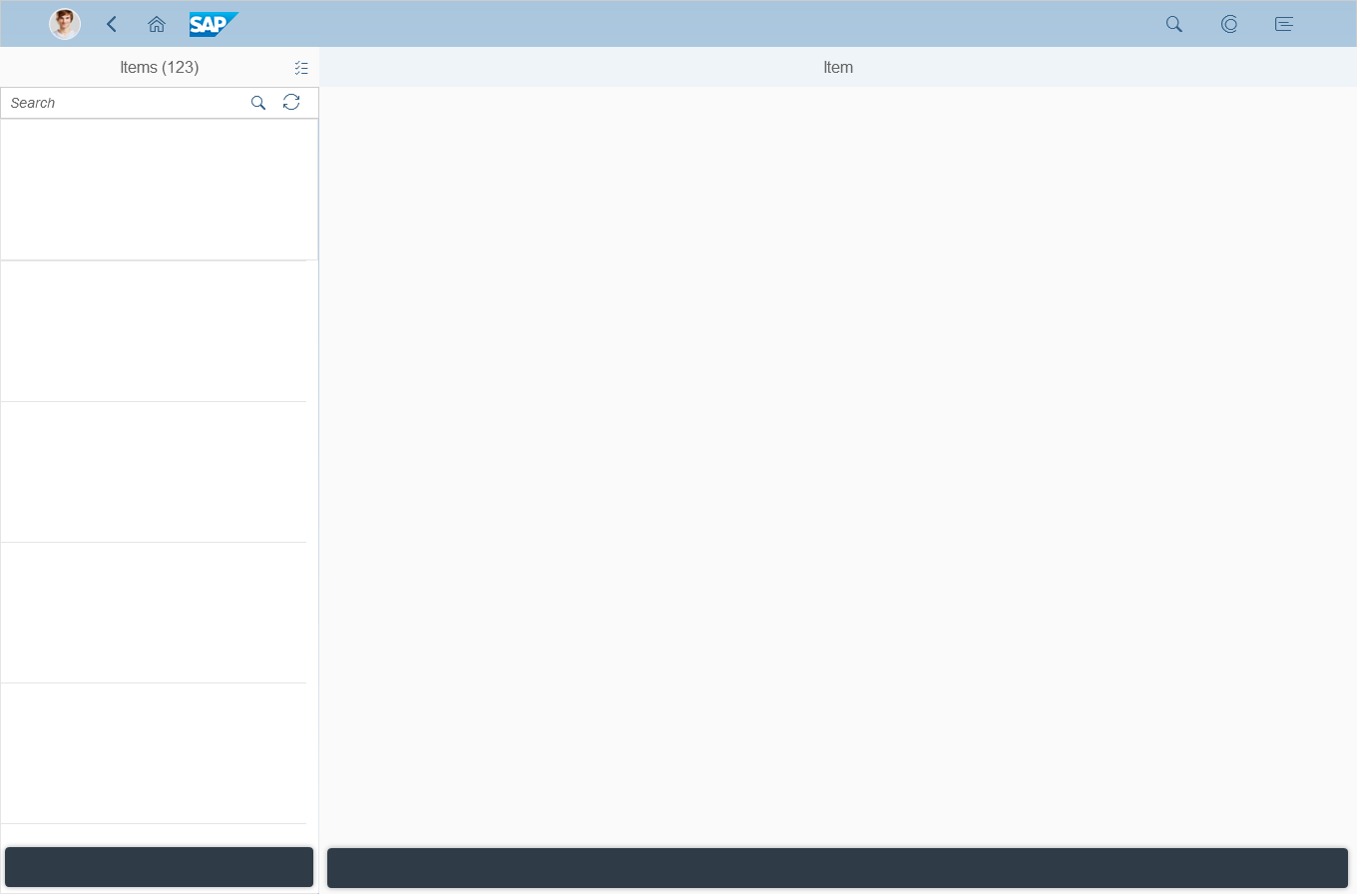
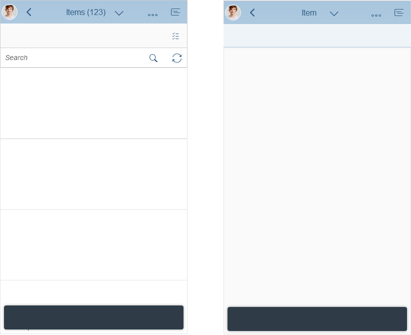
Split-screen layout
Usage
Use the split-screen layout if:
- Your users need to review and process different items quickly with minimal navigation.
Do not use the split-screen layout if:
- You need to offer complex filters for the list of items.
- Users need to see different attributes for each item in the list, and compare these values across items.
- You want to display a single object. Do not use the master list to display different facets of the same object.
Structure
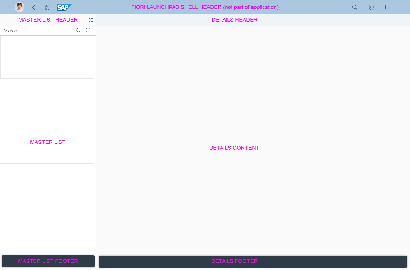
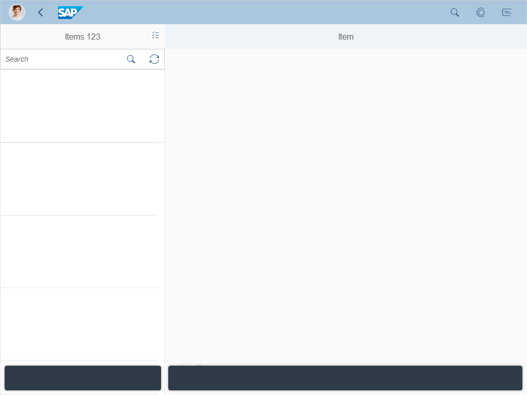
Split-screen layout – Structure
Like all layouts, the split-screen layout is embedded in the shell bar of the SAP Fiori launchpad. From the header, users have access to the launchpad services, including the home page, search, settings, and help. Apps are embedded in the shell and have little influence over its features.
The split-screen layout is divided into two separate areas:
- Master list area: The master list displays the items available to the user. The master list title shows the item type in the plural form and the number of items, such as Products (115). The user can navigate between the items, perform a basic search, and organize the list using sort, filter, and grouping functions. Currently, only the master list is allowed in this area. For more details, see the master list pattern.
- Details area: This content area displays the details for single or multiple items that are selected in the master list. The title of the details area normally shows the item type in the singular form, such as Product. Exceptions are selecting or editing multiple items in the master list. From here, the user can drill down to subpages (line items). The title of the subpage shows, for example, (2 of 5). The details area can contain one of the following floorplans:
Both areas have separate app headers and footer bars with navigation and actions.
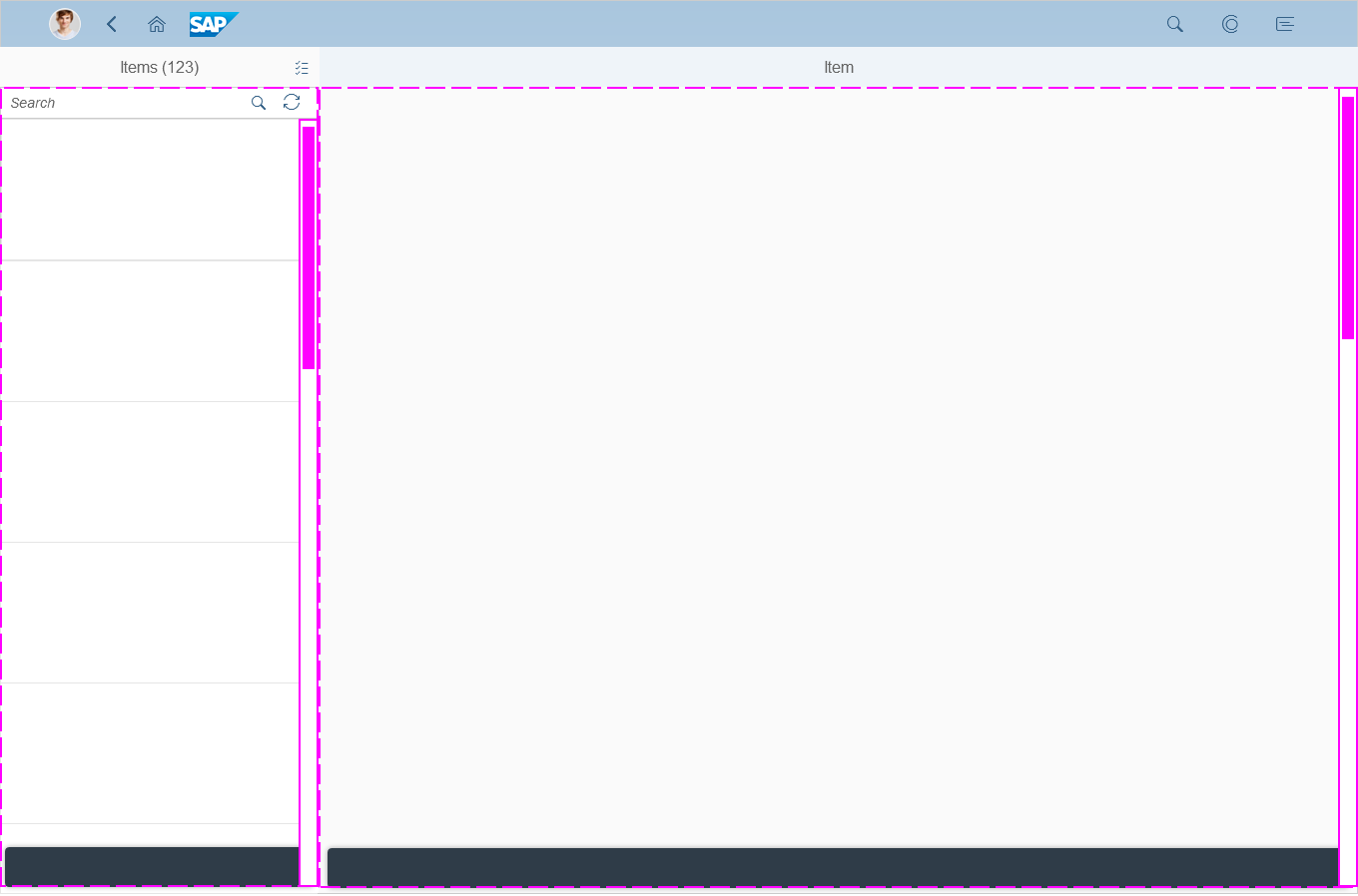
Split-screen layout – Two independent scrolling areas
The split-screen layout has two independent scrolling areas: the master list area and the details area. To implement the split-screen layout, you can use the sap.m.SplitApp control.
Navigation

Typical navigation within the details area
The split-screen layout has two independent navigation containers. Drilldown capabilities and back navigation are supported in both the master list and the details area. For details on navigating in the master list, see the master list pattern.
In the details area, the user can drill down to the details of the main object within the app. Do not offer navigation to other apps from either of the split screen areas.
For example, the main item in the details area might be a shopping cart. A shopping cart contains multiple products. Within the details area, the user can navigate from the list of products in the shopping cart to the details for a single product. To navigate back to the shopping cart, the user clicks or taps the back arrow that appears at the top of the details area. In addition, apps should offer iterators (up/down arrows in the app header) to help users navigate more easily between products.
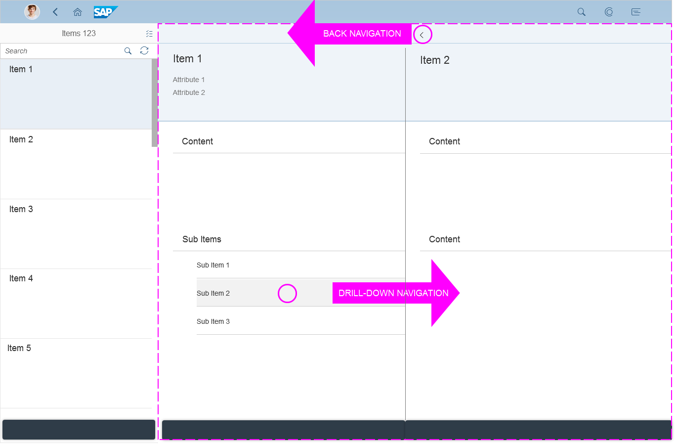
Drilldown and back navigation in the details area
Responsiveness
Split-screen layout on a phone
Split-screen layout on a tablet
Split-screen layout on a desktop device
On narrow screens for phones (or tablet devices in portrait mode), the master list and the details are split into two separate pages. The user navigates between the list and details, and can see all the available information for each.
The split-screen layout comes with built-in logic to respond to different device types, which reduces the development effort. This is an advantage over the full screen layout, which needs to be adapted manually by the app development team.

Split-screen layout with letterboxing on a desktop device
To further reduce the difference in width, you can make use of letterboxing to limit the maximum width of the app.
Examples
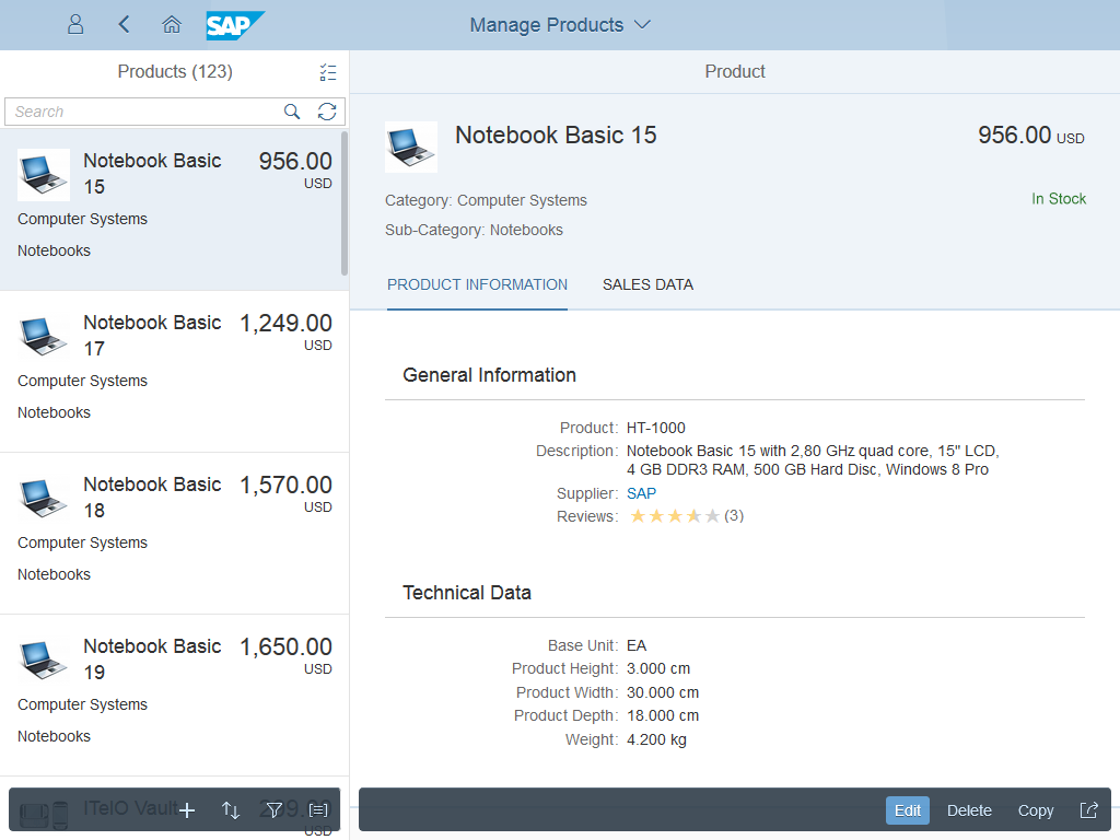
Reference App Manage Products
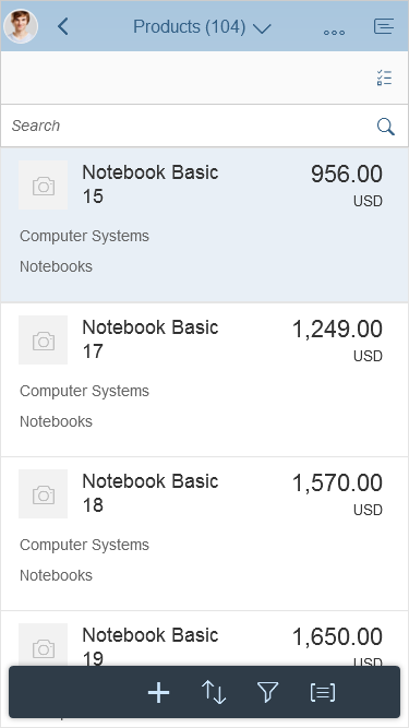
Reference app ''Manage Products'' – Product master list
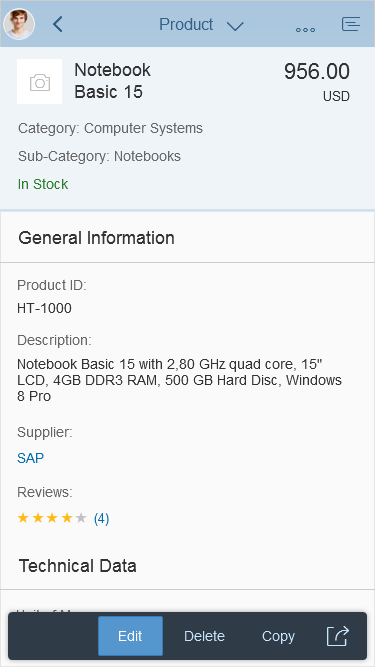
Reference app ''Manage Products'' – Product details
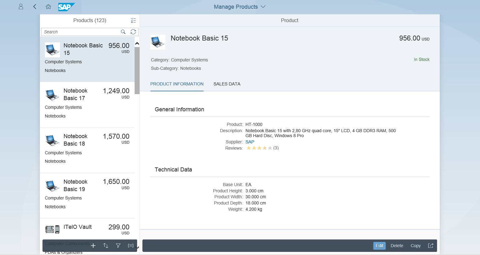
Reference app ''Manage Products'' on a tablet
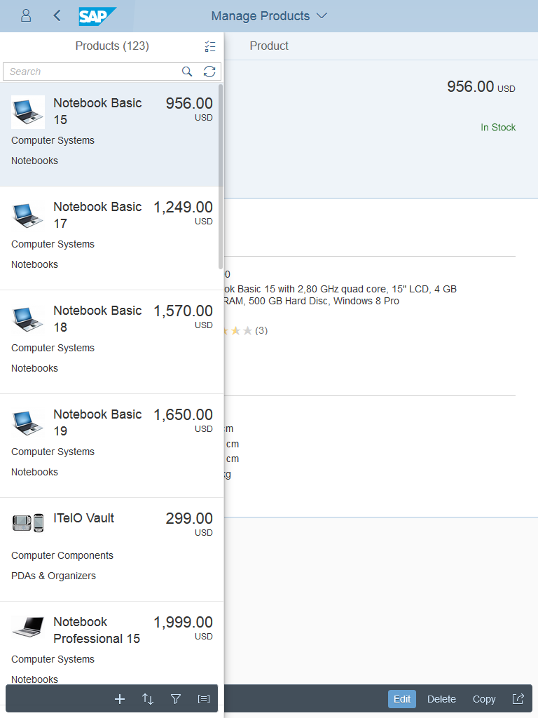
Reference app ''Manage Products'' on a desktop device
The reference app highlights how the user can navigate between the master list and the product details. The user selects a product in the master list and navigates to the product details. By selecting the back navigation, the user returns to the master list.
On a tablet, the master list and details can already be shown side by side. The user selects an item in the master list and it is displayed in the details.
However, when the tablet is turned into portrait mode, similar behavior occurs as on the smartphone. This time, the list can be called up from a menu in the top left-hand corner of the screen and it overlays the details area. The list disappears when the user makes a selection.
Split-screen layout on a tablet in portrait mode – The master list can be called by a menu button in the top left-hand corner
Resources
Want to dive deeper? Follow the links below to find out more about related controls, the SAPUI5 implementation, and the visual design.
 Your feedback has been sent to the SAP Fiori design team.