
- Latest SAPUI Version 1.124
- SAPUI5 Version 1.122
- SAPUI5 Version 1.120
- SAPUI5 Version 1.118
- SAPUI5 Version 1.116
- SAPUI5 Version 1.114
- SAPUI5 Version 1.112
- SAPUI5 Version 1.110
- SAPUI5 Version 1.108
- SAPUI5 Version 1.106
- SAPUI5 Version 1.104
- SAPUI5 Version 1.102
- SAPUI5 Version 1.100
- SAPUI5 Version 1.98
- SAPUI5 Version 1.96
- SAPUI5 Version 1.94
- SAPUI5 Version 1.92
- SAPUI5 Version 1.90
- SAPUI5 Version 1.88
- SAPUI5 Version 1.86
- SAPUI5 Version 1.84
- SAPUI5 Version 1.82
- SAPUI5 Version 1.80
- SAPUI5 Version 1.76
- SAPUI5 Version 1.74
- SAPUI5 Version 1.72
- SAPUI5 Version 1.70
- SAPUI5 Version 1.68
- SAPUI5 Version 1.66
- SAPUI5 Version 1.64
- SAPUI5 Version 1.62
- SAPUI5 Version 1.60
- SAPUI5 Version 1.58
- SAPUI5 Version 1.56
- SAPUI5 Version 1.54
- SAPUI5 Version 1.52
- SAPUI5 Version 1.50
- SAPUI5 Version 1.48
- SAPUI5 Version 1.46
- SAPUI5 Version 1.44
- SAPUI5 Version 1.42
- SAPUI5 Version 1.40
- SAPUI5 Version 1.38
- SAPUI5 Version 1.36
- SAPUI5 Version 1.34
- SAPUI5 Version 1.32
- SAPUI5 Version 1.30
- SAPUI5 Version 1.28
- SAPUI5 Version 1.26
- Latest SAPUI Version 1.124
- SAPUI5 Version 1.122
- SAPUI5 Version 1.120
- SAPUI5 Version 1.118
- SAPUI5 Version 1.116
- SAPUI5 Version 1.114
- SAPUI5 Version 1.112
- SAPUI5 Version 1.110
- SAPUI5 Version 1.108
- SAPUI5 Version 1.106
- SAPUI5 Version 1.104
- SAPUI5 Version 1.102
- SAPUI5 Version 1.100
- SAPUI5 Version 1.98
- SAPUI5 Version 1.96
- SAPUI5 Version 1.94
- SAPUI5 Version 1.92
- SAPUI5 Version 1.90
- SAPUI5 Version 1.88
- SAPUI5 Version 1.86
- SAPUI5 Version 1.84
- SAPUI5 Version 1.82
- SAPUI5 Version 1.80
- SAPUI5 Version 1.78
- SAPUI5 Version 1.76
- SAPUI5 Version 1.74
- SAPUI5 Version 1.72
- SAPUI5 Version 1.70
- SAPUI5 Version 1.68
- SAPUI5 Version 1.66
- SAPUI5 Version 1.64
- SAPUI5 Version 1.62
- SAPUI5 Version 1.60
- SAPUI5 Version 1.58
- SAPUI5 Version 1.56
- SAPUI5 Version 1.54
- SAPUI5 Version 1.52
- SAPUI5 Version 1.50
- SAPUI5 Version 1.48
- SAPUI5 Version 1.46
- SAPUI5 Version 1.44
- SAPUI5 Version 1.42
- SAPUI5 Version 1.40
- SAPUI5 Version 1.38
- SAPUI5 Version 1.36
- SAPUI5 Version 1.34
- SAPUI5 Version 1.32
- SAPUI5 Version 1.30
- SAPUI5 Version 1.28
- SAPUI5 Version 1.26
Action Placement
Intro
Actions trigger functions, such as saving or deleting a business object. They can also trigger navigation to a different screen, where the action can be executed, detailed out, or further reviewed. Actions are displayed as buttons.
Place actions close to the information they act upon. For example, actions related to a business object go to the top of the page, next to the title that identifies the object. Actions related to the task workflow go to the bottom of the page and can be carried out after working through the page content.
To make actions easier to organize and find, they are mostly placed in toolbars. Depending on the content affected by the action, different toolbars are available. Within toolbars, some actions are usually more important than others. By ordering the actions and applying different styles, you can set the right focus.
You can also place actions inline as part of the content. For example, an action can be positioned next to a field within a form, or within a table row.
Actions must be clearly differentiated from pure navigation. Navigation functions are usually located on the left side, such as Home or breadcrumbs, whereas actions in toolbars are right-aligned.
Components
The following toolbars are available:
Toolbars
- Shell-level toolbar: Contains actions that affect all applications or the entire user environment.
- Page-level toolbars: Contain actions that affect the entire page or that are related to the entity represented by the page, such as a business object, report, or process. Page-level toolbars remain constant and do not depend on selections or interactions within the page. Toolbars at page level are optional. If no actions are available, they are not shown. If toolbars are available, they are always visible and maintain their position when the user scrolls. The following page-level toolbars are available:
a) Header toolbar
b) Footer toolbar - Content-level toolbars: Contain local actions that affect the content in a section of the screen, specifically table and chart toolbars.
Actions can also be placed in table rows and next to fields in forms. See Actions in Table Rows and Forms.
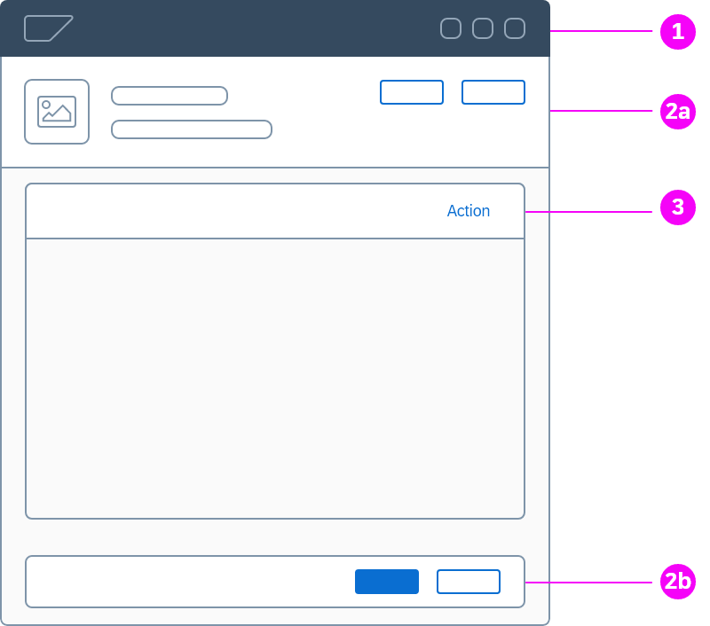
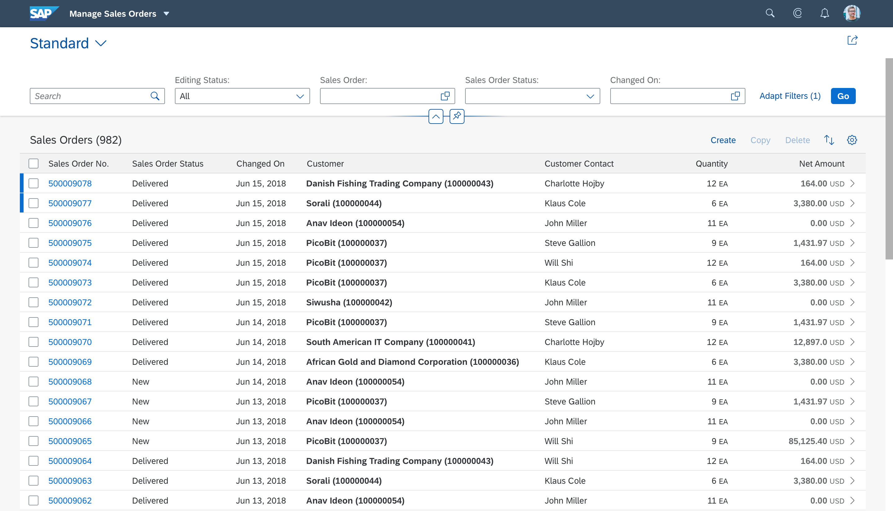
Header Toolbar
The header toolbar contains global actions that apply to the entity shown on the page. Examples of global actions are Edit or Delete. The header toolbar can also include global actions that relate to the page as an interface element. These can include actions for switching a page view, maximizing or minimizing the page, bookmarking the page, or leaving a comment.
The actions in the header toolbar must always be visible, independent of the scrolling position on the screen (“sticky” behavior). If there is not enough space to show all actions, they are successively moved to an overflow menu, depending on their priority.
Design Rationale |
| Placing the header toolbar in line with the title establishes a clear connection between the entity represented in the page and the action relating to that entity. Positioning actions next to the title indicates that they are both on the same hierarchy level. This also supports the overall SAP Fiori design paradigm of showing content on the left side of the screen and actions on the right. |
Header toolbar
Guidelines for the Header Toolbar
Header Toolbar – Example
Example: Header toolbar in an object page
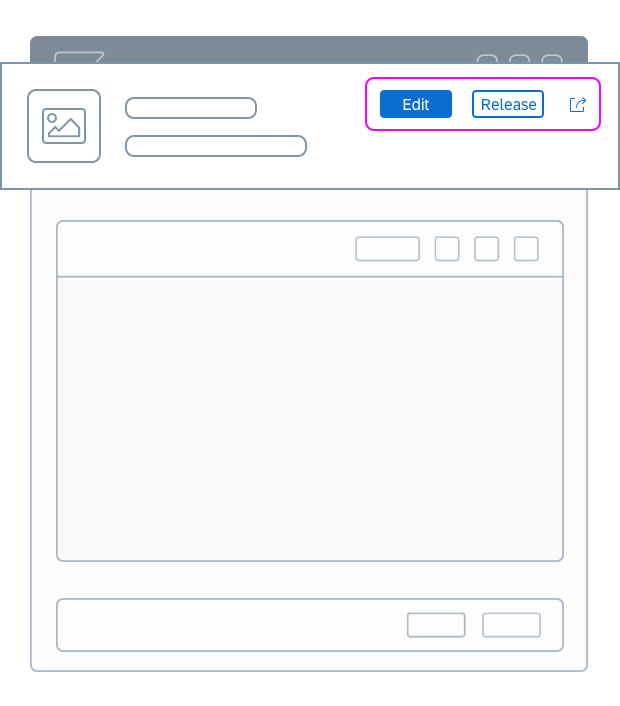
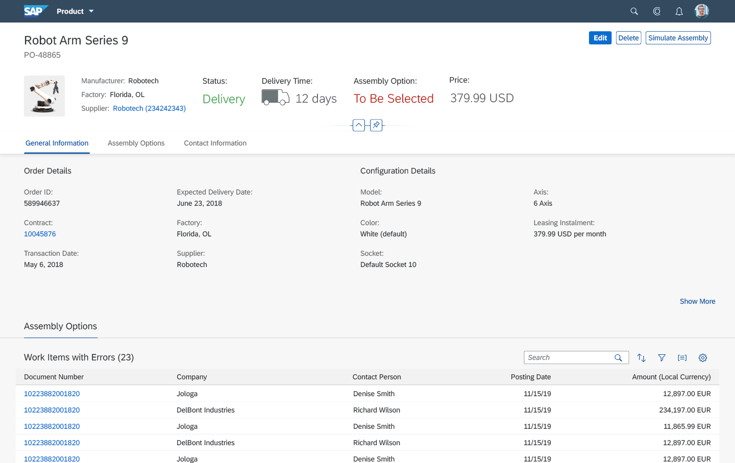
Footer Toolbar
The footer toolbar contains actions related to the user’s task workflow. These actions represent steps in a process. This can be something the user wants to accomplish (such as Save a form), or actions to finalize a business process (such as Post a goods receipt or Accept/Decline a leave request).
The footer toolbar can also include alternative paths (such as Return goods) and actions that allow the user to back out of the workflow without saving (such as Cancel).
We call these actions “workflow actions” or “finalizing actions”.
Design Rationale |
| Placing the footer toolbar at the end of the page supports the logical interaction flow. The user first reviews the contents or fills in the information required, and then finalizes processing for the screen. Locating the actions within the footer toolbar to the right of the page ensures that all actions are clearly separated from the content and can be found by scanning the right-hand side of the page. |
Footer toolbar
Guidelines for the Footer Toolbar
Footer Toolbar – Examples
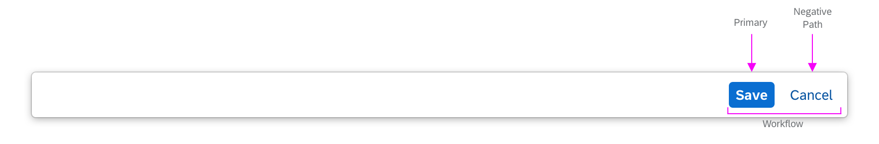
Workflow with primary and negative path actions
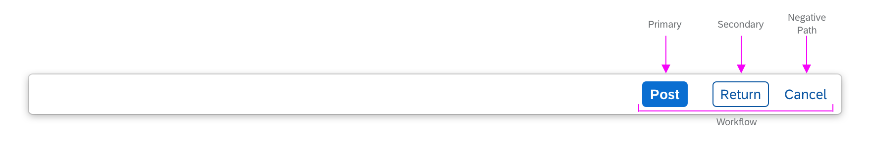
Workflow with primary, secondary, and negative path actions
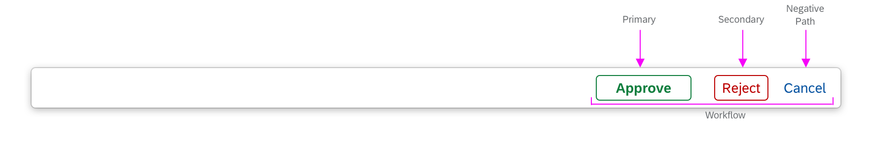
Workflow with positive/negative semantic actions and negative path action
Content-Level Toolbars
Content toolbars contain actions related to a specific section of the screen. They are used in tables and charts.
Table Toolbar
Use the table toolbar for local actions, such as:
- Adding a new item to a table
- Editing or deleting selected items in a table
- Switching the table to edit mode
- Controlling the table settings, such as filtering or sorting
For more information, see Table Toolbar.
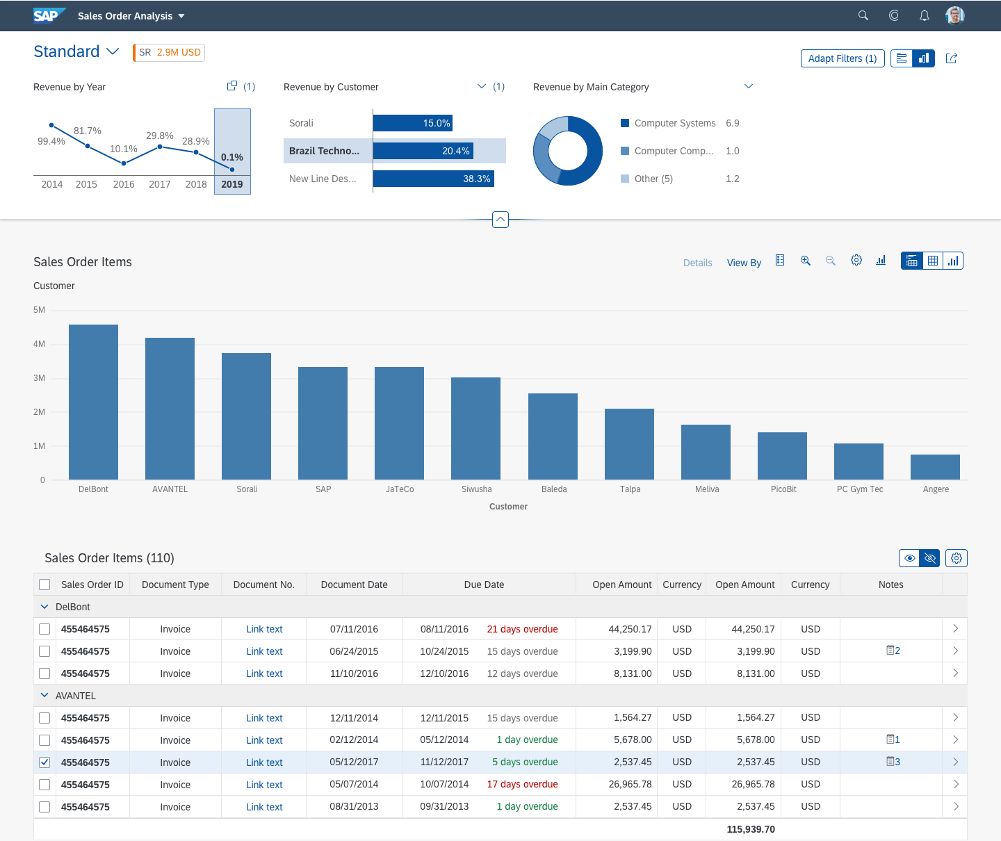
Chart Toolbar
Use the chart toolbar for local actions such as:
- Switching the chart perspective
- Switching between chart and table views, or between different chart types
- Standard actions such as legend toggle, the personalization menu, and full screen mode
- App-specific business actions
For more information and examples, see Chart Toolbar.
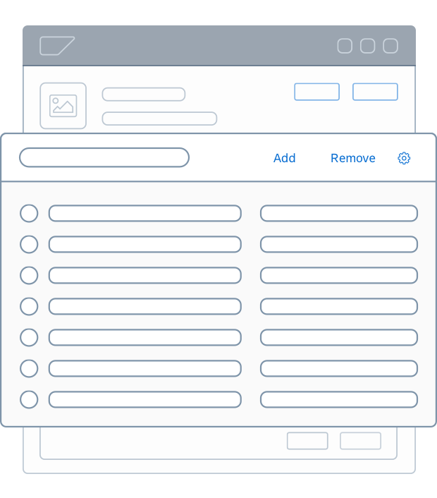
Actions in a table toolbar
Actions in Forms and Table Rows
Actions can also be placed inline as part of the content, either next to a field within a form or within a table row.
Actions in Forms
If an action affects a single field within a form, place the action next to the field.
Actions in Table Rows
If an action affects only a single line or single field of a table, place the action in the table row.
Some row actions can be set using table properties. These actions include:
- Navigating to a detailed view of an item
- Deleting an item
- Editing an item
All the above actions are shown as icons, and are positioned on the right-hand side of the table.
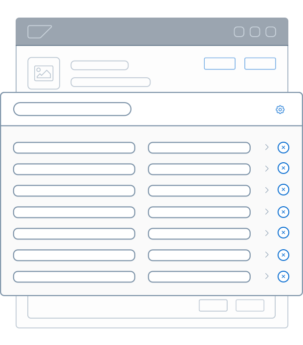
Table row with navigation and 'Delete' action
If you want to add your own freely-defined actions, apply the following guidelines:
- Only place an action in the table row if there is a substantial use case.
- Offer only one action per row (the most important).
- Place the action close to the data it affects.
For more information about actions in table rows, see:
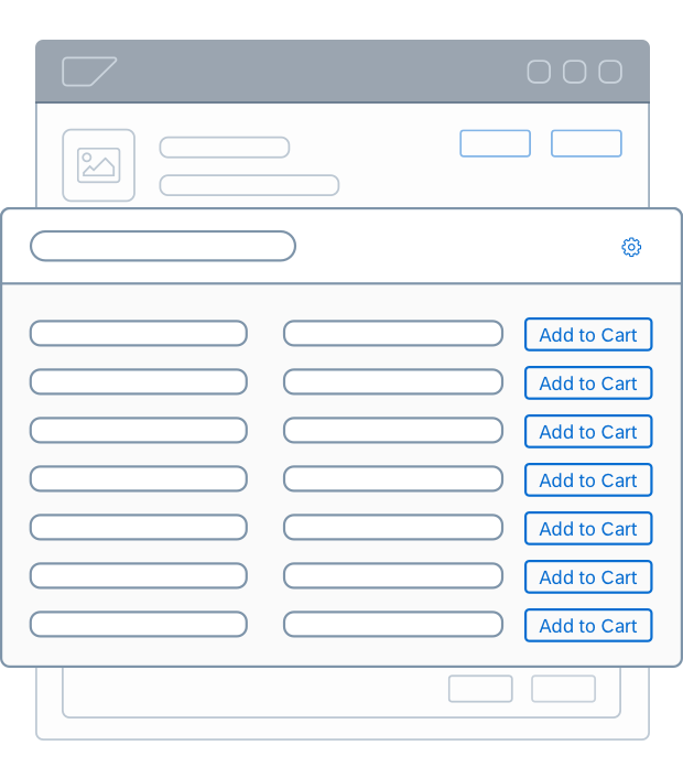
Table row with freely-defined action
Action Types
Actions can be classified by their importance in a given business context. To reflect the importance, the visual styles differ.
Page-Level Toolbars
The following action types are defined for header and footer toolbars:
Type
What you need to know
Examples
Style
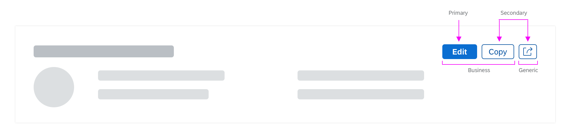
Primary
- Most important action
- Needs to stand out on the page
- Needed to move the workflow forward
Edit
Save
Submit

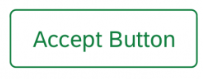
Semantic
- Alternative to a primary action
- Usually come in pairs with a positive and a negative value
- Exception: If a single primary action has a strong semantic meaning (such as Delete), this might be emphasized using the semantic action.
Approve and Reject
Accept and Decline

Secondary
- All actions that are not primary or negative path actions
- Do not stand out on the page
- Might be collapsed in menus
Copy
Negative Path
- Navigates away from the current page without executing an action
- Usually one negative path action only
Cancel
Close (for modal dialogs)
Note that the example actions above don’t automatically belong to a specific type. The use case and context of the page determines whether an action is most important or less important to the user.
See also: Button – Header and Footer Toolbars
Content-Level Toolbars
The following action types are defined for content toolbars:
Type
What you need to know
Examples
Style
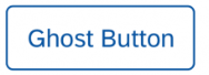
Primary
- Most important action
- Caution: Usually, the primary action is positioned in the header or footer toolbar.
- If a page already has a primary action in the header or footer toolbar, but you
also need to highlight the most important action in a content toolbar, use the ghost styling for this action.
Edit
Secondary
- All other actions
- Might be collapsed in menus
Copy
Negative Path
- Used in edit mode
- Usually one negative path action only
Cancel
See also: Button – Content Toolbars
Action Groups
In the header and footer toolbar, actions are grouped as follows, based on their purpose in the business context:
| Action Group | What you need to know | Examples |
Workflow(also known as “finalizing actions”) |
|
Positive path: Save, Submit, Accept and RejectAlternative path: Forward, ReturnNegative (escape) path: Cancel, Close |
Business |
|
Specific: Add, Copy
General: Edit, Delete |
Manage Content |
|
Filter |
Manage Layout |
|
View panel in full page
Close panel (not used on standalone pages) |
Generic |
|
Share |
Examples
List report with header toolbar and table toolbar
Object page with header toolbar and table section with table toolbar
Analytical list page with header toolbar, chart toolbar, and table toolbar
Wizard floorplan with inline action 'Next Step'
Top Tips
General
- Place actions as close as possible to the content they affect – usually in a toolbar or, if needed, directly in a form or table row.
- In toolbars, always right-align.
Action Order in Header Toolbar
Use the following order:
- Business actions (such as Edit, Delete)
- Manage content (such as Filter)
- Manage layout (such as viewing a panel in full screen mode)
- Generic (such as Share)
Recommended: Always place the action that is most important for your business context on the very left, even if the action belongs to a group further to the right.
Action Order in Footer Toolbar
Use the following order:
- Primary workflow/finalizing action leftmost (such as Post)
- Secondary actions (such as Return)
- Negative path actions (such as Cancel)
Primary Action (Emphasized)
- Use only one primary action per page.
- Show a primary action or a semantic action, but never both.
Style
- To help the user quickly identify primary, secondary, and negative path actions, apply the correct visual styles.
For more information, see Action Types.
Related Links
Enable / disable / hide actions: UI Element States
Buttons:
- When to use text buttons or icon buttons: Button – Components
- Guidelines for text and icon buttons: Button – Guidelines
- Standard action labels: Terminology for Common Actions
Toolbars:
 Your feedback has been sent to the SAP Fiori design team.