
- Latest SAPUI Version 1.124
- SAPUI5 Version 1.122
- SAPUI5 Version 1.120
- SAPUI5 Version 1.118
- SAPUI5 Version 1.116
- SAPUI5 Version 1.114
- SAPUI5 Version 1.112
- SAPUI5 Version 1.110
- SAPUI5 Version 1.108
- SAPUI5 Version 1.104
- SAPUI5 Version 1.102
- SAPUI5 Version 1.100
- SAPUI5 Version 1.98
- SAPUI5 Version 1.96
- SAPUI5 Version 1.94
- SAPUI5 Version 1.92
- SAPUI5 Version 1.90
- SAPUI5 Version 1.88
- SAPUI5 Version 1.86
- SAPUI5 Version 1.84
- SAPUI5 Version 1.82
- SAPUI5 Version 1.80
- SAPUI5 Version 1.78
- SAPUI5 Version 1.76
- SAPUI5 Version 1.74
- SAPUI5 Version 1.72
- SAPUI5 Version 1.70
- SAPUI5 Version 1.68
- SAPUI5 Version 1.66
- SAPUI5 Version 1.64
- SAPUI5 Version 1.62
- SAPUI5 Version 1.60
- SAPUI5 Version 1.58
- SAPUI5 Version 1.56
- SAPUI5 Version 1.54
- SAPUI5 Version 1.52
- SAPUI5 Version 1.50
- SAPUI5 Version 1.48
- SAPUI5 Version 1.46
- SAPUI5 Version 1.44
- SAPUI5 Version 1.42
- SAPUI5 Version 1.40
- SAPUI5 Version 1.38
- SAPUI5 Version 1.36
- SAPUI5 Version 1.34
- SAPUI5 Version 1.32
- SAPUI5 Version 1.30
- SAPUI5 Version 1.28
- SAPUI5 Version 1.26
- Latest SAPUI Version 1.124
- SAPUI5 Version 1.122
- SAPUI5 Version 1.120
- SAPUI5 Version 1.118
- SAPUI5 Version 1.116
- SAPUI5 Version 1.114
- SAPUI5 Version 1.112
- SAPUI5 Version 1.110
- SAPUI5 Version 1.108
- SAPUI5 Version 1.106
- SAPUI5 Version 1.104
- SAPUI5 Version 1.102
- SAPUI5 Version 1.100
- SAPUI5 Version 1.98
- SAPUI5 Version 1.96
- SAPUI5 Version 1.94
- SAPUI5 Version 1.92
- SAPUI5 Version 1.90
- SAPUI5 Version 1.88
- SAPUI5 Version 1.86
- SAPUI5 Version 1.84
- SAPUI5 Version 1.82
- SAPUI5 Version 1.80
- SAPUI5 Version 1.78
- SAPUI5 Version 1.76
- SAPUI5 Version 1.74
- SAPUI5 Version 1.72
- SAPUI5 Version 1.70
- SAPUI5 Version 1.68
- SAPUI5 Version 1.66
- SAPUI5 Version 1.64
- SAPUI5 Version 1.62
- SAPUI5 Version 1.60
- SAPUI5 Version 1.58
- SAPUI5 Version 1.56
- SAPUI5 Version 1.54
- SAPUI5 Version 1.52
- SAPUI5 Version 1.50
- SAPUI5 Version 1.48
- SAPUI5 Version 1.46
- SAPUI5 Version 1.44
- SAPUI5 Version 1.42
- SAPUI5 Version 1.40
- SAPUI5 Version 1.38
- SAPUI5 Version 1.36
- SAPUI5 Version 1.34
- SAPUI5 Version 1.32
- SAPUI5 Version 1.30
- SAPUI5 Version 1.28
- SAPUI5 Version 1.26
Message Handling
Intro
Carefully orchestrated messages are key to the user experience: they guide and validate user actions, and serve to both pre-empt and help resolve problems. But messages also distract users and interrupt their flow, so it’s important to always use messages consistently and optimize the interaction as a whole.
SAP Fiori comes with a range of different message types and controls. This article provides an overview of the message formats available and how to use them in common messaging scenarios.
Basic Principles
- Indicate errors and warnings clearly on the UI.
- Think carefully about how prominent your message needs to be and when you need to interrupt the user. Don’t interrupt users unnecessarily.
- Help the user to recognize, diagnose, and resolve the issue.
Message Types
The following message types are available:
| Icon | Message Type | When to Use | Example |
| Error | An issue has occurred that prevents further processing. The user must resolve the issue to continue. | A value has been entered in the wrong format. | |
| Warning | A problem or inconsistency has arisen. Users can carry on working, but might run into an error later on. | An action can’t be applied to some of the selected items, but can still be performed for the rest. | |
| Success | An action has been performed without errors or warnings. | A business partner has been created. | |
| Information | You want to provide additional, non-critical information. Processing is not blocked. | Highlight and explain a system recommendation. | |
| Confirmation | You want to prompt the user to confirm an action before it is executed. | Confirm approval of a vacation request. |
Message Controls
SAP Fiori uses the following message controls and visualizations:
Message Box
The message box (sap.m.MessageBox) displays a message dialog that interrupts the user in the course of an action. It forces the user to acknowledge the information or make a decision.
Usage
Use the message box to display messages that are not related to a field on the UI, or when you require a user decision.
More information: Message Box
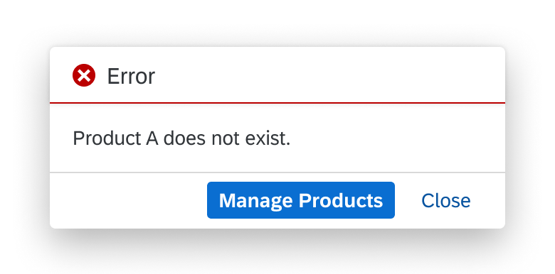
Error message box
Message Popover
The message popover (sap.m.messagePopover) can display multiple messages of different types (error, warning, information, or success).
Messages are added to the popover automatically, without interrupting the user.
Usage
The message popover is used to collect messages relating to form fields and table fields.
More information:
Message Popover
Form Field Validation
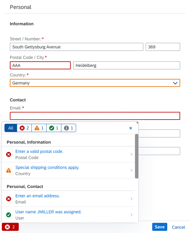
Message popover for a form
Message View
The message view can contain multiple messages of different types (error, warning, information, or success). It is typically embedded in a dialog and interrupts the user action.
Usage
Use a message view to collect messages that are triggered by a user action, but are not related to form or table fields.
More information: Message View
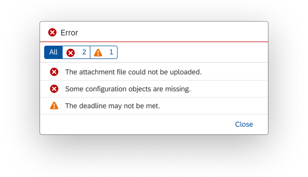
Message view
Message Toast
A message toast (sap.m.MessageToast) is a small, non-disruptive popup that disappears automatically after a few seconds.
Usage
The message toast is the standard message component for success messages.
More information: Message Toast

Message toast
Message Strip
The message strip is an information bar that can be placed within the content area of a page. It can contain error, warning, success, or information messages. The message strip can be static or interactive.
Usage
You can use the message strip to display general information or inform about the status of an object.
More information: Message Strip

Message strip with warning message
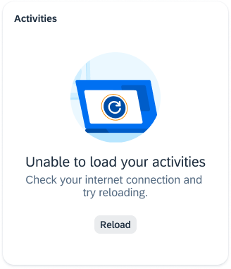
Message Page
A message page fills an entire page or content area. It shows an icon, a short message, and an optional explanation.
Usage
Use the message page when a page is empty or can longer be shown (for example, if an object no longer exists).
More information: Message Page

Message page
Illustrated Message
An illustrated message combines a message, a supportive illustration, and an (optional) call to action.
Usage
You can use illustrated messages to improve the user experience for empty states within UI elements. Illustrated messages adjust to the size of the container (such as a card, dialog, or full page).
More information: Illustrated Message
Illustrated message
Value States for Input Fields
Value states give feedback on user entries at field level. After input validation, affected fields are highlighted using semantic colors for the message type (error, warning, success, information). Clicking a field displays a corresponding in-place message.
Usage
Value state messages are used for input fields, typically in forms.
More information:
UI Element States – Value States
Form Field Validation
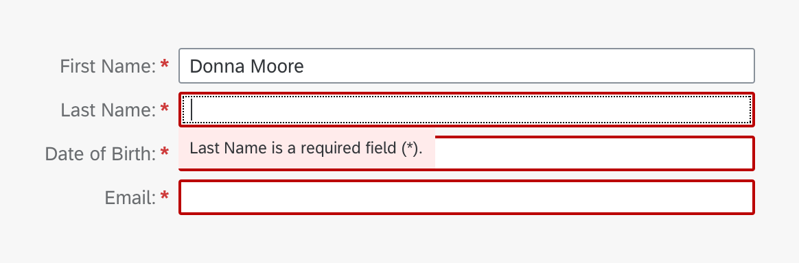
Form fields with error value state
Quick Confirmation Popover
The quick confirmation popover displays a confirmation prompt adjacent to the triggering action.
Usage
Use the quick confirmation popover when the user leaves the create or edit screen for an object by pressing Cancel.
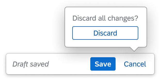
Quick confirmation popover
Common Message Patterns
Standard message patterns have been defined for certain scenarios. Here’s an overview of the main patterns and where to find more information.
| Message Pattern | Summary | More Information |
Validation |
||
| For specific fields | SAPUI5 provides a set of controls to guide users when completing forms, including in-place value state messages for fields and a full list of all messages in a popover. | Form Field Validation |
| For actions (not field-related) | In edit mode, messages that do not relate to a particular field on a page, but result from an action, appear in the message popover. | Message Popover |
| For multiple selection scenarios | If multiple items are selected, the user is made aware of all issues and warnings in one place. The exact format depends on the available messaging controls and infrastructure. | Draft Handling |
Data loss warning |
||
| Triggered by Cancel | If there is a risk of losing unsaved data, a warning message is provided as soon as the Cancel action is triggered. | Message Box |
| Triggered by navigation | If there is a risk of losing unsaved data, a warning message is provided as soon as the user navigates away from the page using in-app controls. | Message box |
Intelligent systems |
||
| Situation handling | Situation handling is a concept for bringing business issues to the attention of specific user groups. It helps the user to recognize, understand, and resolve the situation by gathering all relevant information and proposing solutions. | Situation Handling |
| Recommendations | Intelligent systems can help users by recommending appropriate content or suggesting an action or input the user may “prefer”. In this case, we speak of a recommendation pattern and its impact on the UI. | Recommendations |
Message Copy
When formulating message texts, keep the following principles in mind:
More Information:
Top Tips
- Ask yourself if you really need a message. Can the message be avoided by improving the design?
- Define and test messaging scenarios in the design phase.
- Always get your message texts (including the titles and buttons) reviewed by a user assistance developer.
Related Links
Elements and Controls
- Form Field Validation (guidelines)
- Value States (guidelines)
- Message Box (guidelines)
- Message Popover (guidelines)
- Message view (guidelines)
- Message Toast (guidelines)
- Message Strip (guidelines)
- Message page (guidelines)
- Illustrated message (guidelines)
- How to Use Semantic Colors (guidelines)
 Your feedback has been sent to the SAP Fiori design team.