
- Latest SAPUI Version 1.124
- SAPUI5 Version 1.122
- SAPUI5 Version 1.120
- SAPUI5 Version 1.118
- SAPUI5 Version 1.116
- SAPUI5 Version 1.114
- SAPUI5 Version 1.112
- SAPUI5 Version 1.110
- SAPUI5 Version 1.108
- SAPUI5 Version 1.106
- SAPUI5 Version 1.104
- SAPUI5 Version 1.102
- SAPUI5 Version 1.100
- SAPUI5 Version 1.98
- SAPUI5 Version 1.96
- SAPUI5 Version 1.94
- SAPUI5 Version 1.92
- SAPUI5 Version 1.90
- SAPUI5 Version 1.88
- SAPUI5 Version 1.86
- SAPUI5 Version 1.84
- SAPUI5 Version 1.82
- SAPUI5 Version 1.80
- SAPUI5 Version 1.78
- SAPUI5 Version 1.76
- SAPUI5 Version 1.74
- SAPUI5 Version 1.72
- SAPUI5 Version 1.70
- SAPUI5 Version 1.68
- SAPUI5 Version 1.66
- SAPUI5 Version 1.64
- SAPUI5 Version 1.62
- SAPUI5 Version 1.60
- SAPUI5 Version 1.58
- SAPUI5 Version 1.56
- SAPUI5 Version 1.52
- SAPUI5 Version 1.50
- SAPUI5 Version 1.48
- SAPUI5 Version 1.46
- SAPUI5 Version 1.44
- SAPUI5 Version 1.42
- SAPUI5 Version 1.40
- SAPUI5 Version 1.38
- SAPUI5 Version 1.36
- SAPUI5 Version 1.34
- SAPUI5 Version 1.32
- SAPUI5 Version 1.30
- SAPUI5 Version 1.28
- SAPUI5 Version 1.26
- Latest SAPUI Version 1.124
- SAPUI5 Version 1.122
- SAPUI5 Version 1.120
- SAPUI5 Version 1.118
- SAPUI5 Version 1.116
- SAPUI5 Version 1.114
- SAPUI5 Version 1.112
- SAPUI5 Version 1.110
- SAPUI5 Version 1.108
- SAPUI5 Version 1.106
- SAPUI5 Version 1.104
- SAPUI5 Version 1.102
- SAPUI5 Version 1.100
- SAPUI5 Version 1.98
- SAPUI5 Version 1.96
- SAPUI5 Version 1.94
- SAPUI5 Version 1.92
- SAPUI5 Version 1.90
- SAPUI5 Version 1.88
- SAPUI5 Version 1.86
- SAPUI5 Version 1.84
- SAPUI5 Version 1.82
- SAPUI5 Version 1.80
- SAPUI5 Version 1.78
- SAPUI5 Version 1.76
- SAPUI5 Version 1.74
- SAPUI5 Version 1.72
- SAPUI5 Version 1.70
- SAPUI5 Version 1.68
- SAPUI5 Version 1.66
- SAPUI5 Version 1.64
- SAPUI5 Version 1.62
- SAPUI5 Version 1.60
- SAPUI5 Version 1.58
- SAPUI5 Version 1.56
- SAPUI5 Version 1.54
- SAPUI5 Version 1.52
- SAPUI5 Version 1.50
- SAPUI5 Version 1.48
- SAPUI5 Version 1.46
- SAPUI5 Version 1.44
- SAPUI5 Version 1.42
- SAPUI5 Version 1.40
- SAPUI5 Version 1.38
- SAPUI5 Version 1.36
- SAPUI5 Version 1.34
- SAPUI5 Version 1.32
- SAPUI5 Version 1.30
- SAPUI5 Version 1.28
- SAPUI5 Version 1.26
Search
sap.m.SearchField
Intro
A search is a means of accessing information quickly. If an amount of data is too large for users to find something just by scanning through it, you should consider providing a search function.
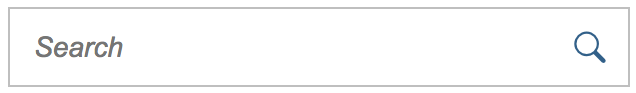
Search field
Usage
Use a search field (sap.m.SearchField) if you want to enable users to enter text to search for information. The search field is also the control of choice for filtering down a given amount of information.
Responsiveness
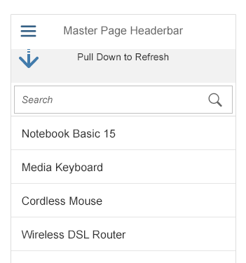
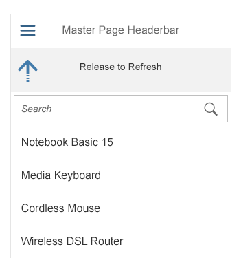
On tablets (size M) and smartphones (size S), the master list’s search field is not initially visible. It only appears when the user pulls down the list. Its position is not fixed, so it scrolls away. On desktops (size L), the master list’s search field is visible from the start. Its position is fixed and it does not scroll away.
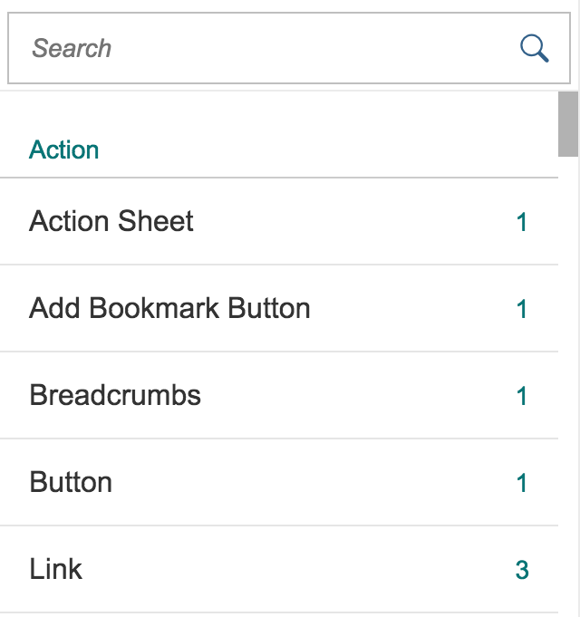
Master list with search field
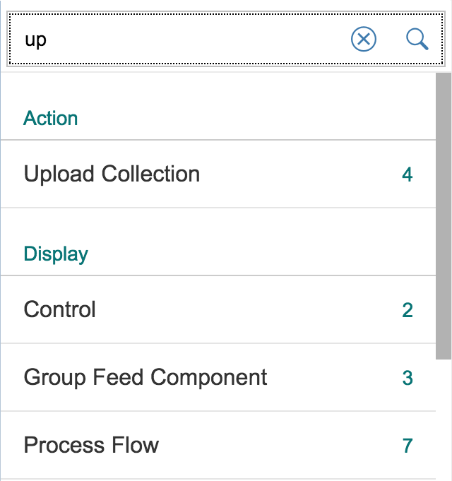
Searching in the master list - Search field on focus
Searching in the master list
Types
SAP Fiori comes with two different search types.
- The manual searchis triggered explicitly after the user enters text in the search field and clicks or taps the Search button or presses the Enter key.
- The live search(also known as “incremental search” or “search-as-you-type”) is triggered by each character that the user enters or deletes.
Queries that are entered are used to search the backend data for term matches (not case-sensitive). While a live search uses a “contains” approach, a manual search uses a “starts with” approach. “Contains” means that the result needs to match the query only partly to be a valid result. “Starts with” means that full terms of the result need to start with the entered query to be visualized.
Layout
The search input field (or search box) consists of two parts:
- The text input, which is left-aligned. Initially, the field shows a placeholder (Search). As soon as the user enters a character, this prompt text disappears. It appears again if the user deletes the entry.
- If a manual search is to be implemented, a search button with a magnifier icon is placed on the right side of this input control. The user clicks or taps this button to trigger the search. In live searches, the magnifier icon is also placed here, but it functions more like an additional indicator to signify that this is a search input field. It also functions as an explicit search button if the user wants to search again for a query that has already been entered.
All item attributes defined by the app development team are searched. When the results are displayed, the items found do not necessarily have to show the attribute through which the item was found. The results are displayed in the same list that contained the original item set. Initial grouping and the order of the list are not affected by the search.
When the split screen is used, the search field appears at the top of the master list. In full screen mode, the search field is placed at the top of the page.
Behavior and Interaction
Entering a Search Term
Search terms can be entered easily into the input field. The search box then displays all full-text search terms. There is no line break and no truncation if the query is longer than the input field. Results might also be displayed that do not match the query in their title or subtitle. This might be because details can also be searched for. The user can see the matching terms in the specific details section.
Deleting a Search Term
The user can click or tap the ex ( ) button to remove the text from the field. In the case of the live search, this also resets the search. In a manual search, deleting the search term and then triggering the search resets the search results.
Refreshing
If the Refresh button is available, the user can update the list without triggering a new search. This is usually needed when backend data changes quickly and often.
If the currently selected item is no longer available after the list has been refreshed, the next item in the line is selected. If no next item is available, the first item in the line should be selected next.
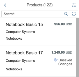
Search field with refresh
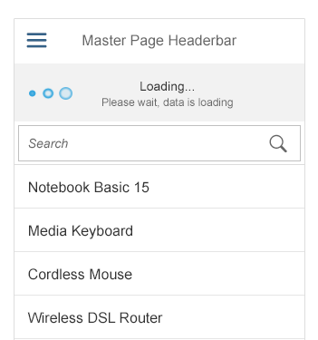
On touch devices, the Refresh icon is not visible in the search field. In this case, Pull Down to Refresh is used instead. The Pull Down to Refresh arrow icon is animated and spins to signal that the user should release it.
Pull to Refresh
Properties
The following methods are important.
For the live search:
- attachLiveChange(oData?, fnFunction, oListener?) Attach event handler
fnFunctionto the ‘liveChange’ event of thissap.m.SearchField. - detachLiveChange(fnFunction, oListener) Detach event handler
fnFunctionfrom the ‘liveChange’ event of thissap.m.SearchField. - fireLiveChange(mArguments?) Fire event liveChange to attached listeners.
For the manual search:
- attachSearch(oData?, fnFunction, oListener?) Attach event handler
fnFunctionto the ‘search’ event of thissap.m.SearchField. - detachSearch(fnFunction, oListener) Detach event handler
fnFunctionfrom the ‘search’ event of thissap.m.SearchField. - fireSearch(mArguments?) Fire event search to attached listeners.
If a Refresh button is needed:
- getShowRefreshButton() Getter for property
showRefreshButton. - setShowRefreshButton(bShowRefreshButton) Setter for property
showRefreshButton.
To show the Search button:
- getShowSearchButton() Getter for property
showSearchButton. - setShowSearchButton(bShowSearchButton) Setter for property
showSearchButton.
To ensure the focus is set to input:
- setSelectOnFocus(bSelectOnFocus) Setter for property
selectOnFocus.
Guidelines
- Implement the live search whenever possible.
- Use a manual search only if the amount of data is too large and if your app would otherwise run into performance issues.
- Show an appropriate prompt text:Search if queries are sent to all connected services, or Search In: if the search is limited to a certain source or providing service.
Resources
Want to dive deeper? Follow the links below to find out more about related controls, the SAPUI5 implementation, and the visual design.
Elements and Controls
- Input Field (guidelines)
- Button (guidelines)
- Master List (guidelines)
- Split Screen (guidelines)
- Full Screen (guidelines)
- Enterprise Search (guidelines)
- Cozy/Compact (guidelines)
 Your feedback has been sent to the SAP Fiori design team.