
- Latest SAPUI Version 1.124
- SAPUI5 Version 1.122
- SAPUI5 Version 1.120
- SAPUI5 Version 1.118
- SAPUI5 Version 1.116
- SAPUI5 Version 1.114
- SAPUI5 Version 1.112
- SAPUI5 Version 1.110
- SAPUI5 Version 1.108
- SAPUI5 Version 1.106
- SAPUI5 Version 1.104
- SAPUI5 Version 1.102
- SAPUI5 Version 1.100
- SAPUI5 Version 1.98
- SAPUI5 Version 1.96
- SAPUI5 Version 1.94
- SAPUI5 Version 1.92
- SAPUI5 Version 1.90
- SAPUI5 Version 1.88
- SAPUI5 Version 1.86
- SAPUI5 Version 1.84
- SAPUI5 Version 1.82
- SAPUI5 Version 1.80
- SAPUI5 Version 1.78
- SAPUI5 Version 1.76
- SAPUI5 Version 1.74
- SAPUI5 Version 1.72
- SAPUI5 Version 1.70
- SAPUI5 Version 1.68
- SAPUI5 Version 1.66
- SAPUI5 Version 1.64
- SAPUI5 Version 1.62
- SAPUI5 Version 1.60
- SAPUI5 Version 1.58
- SAPUI5 Version 1.56
- SAPUI5 Version 1.52
- SAPUI5 Version 1.50
- SAPUI5 Version 1.48
- SAPUI5 Version 1.46
- SAPUI5 Version 1.44
- SAPUI5 Version 1.42
- SAPUI5 Version 1.40
- SAPUI5 Version 1.38
- SAPUI5 Version 1.36
- SAPUI5 Version 1.34
- SAPUI5 Version 1.32
- SAPUI5 Version 1.30
- SAPUI5 Version 1.28
- SAPUI5 Version 1.26
- Latest SAPUI Version 1.124
- SAPUI5 Version 1.122
- SAPUI5 Version 1.120
- SAPUI5 Version 1.118
- SAPUI5 Version 1.116
- SAPUI5 Version 1.114
- SAPUI5 Version 1.112
- SAPUI5 Version 1.110
- SAPUI5 Version 1.108
- SAPUI5 Version 1.106
- SAPUI5 Version 1.104
- SAPUI5 Version 1.102
- SAPUI5 Version 1.100
- SAPUI5 Version 1.98
- SAPUI5 Version 1.96
- SAPUI5 Version 1.94
- SAPUI5 Version 1.92
- SAPUI5 Version 1.90
- SAPUI5 Version 1.88
- SAPUI5 Version 1.86
- SAPUI5 Version 1.84
- SAPUI5 Version 1.82
- SAPUI5 Version 1.80
- SAPUI5 Version 1.78
- SAPUI5 Version 1.76
- SAPUI5 Version 1.74
- SAPUI5 Version 1.72
- SAPUI5 Version 1.70
- SAPUI5 Version 1.68
- SAPUI5 Version 1.66
- SAPUI5 Version 1.64
- SAPUI5 Version 1.62
- SAPUI5 Version 1.60
- SAPUI5 Version 1.58
- SAPUI5 Version 1.56
- SAPUI5 Version 1.54
- SAPUI5 Version 1.52
- SAPUI5 Version 1.50
- SAPUI5 Version 1.48
- SAPUI5 Version 1.46
- SAPUI5 Version 1.44
- SAPUI5 Version 1.42
- SAPUI5 Version 1.40
- SAPUI5 Version 1.38
- SAPUI5 Version 1.36
- SAPUI5 Version 1.34
- SAPUI5 Version 1.32
- SAPUI5 Version 1.30
- SAPUI5 Version 1.28
- SAPUI5 Version 1.26
Form Field Validation
Intro
This article describes data validation within SAP Fiori apps. This includes information about the validation points and the choreography associated with messaging.
For more information on the messaging concept for SAP Fiori apps, see the article on message handling.
Behavior and Interaction
The message popover should only display field-related messages.
Validation Choreography
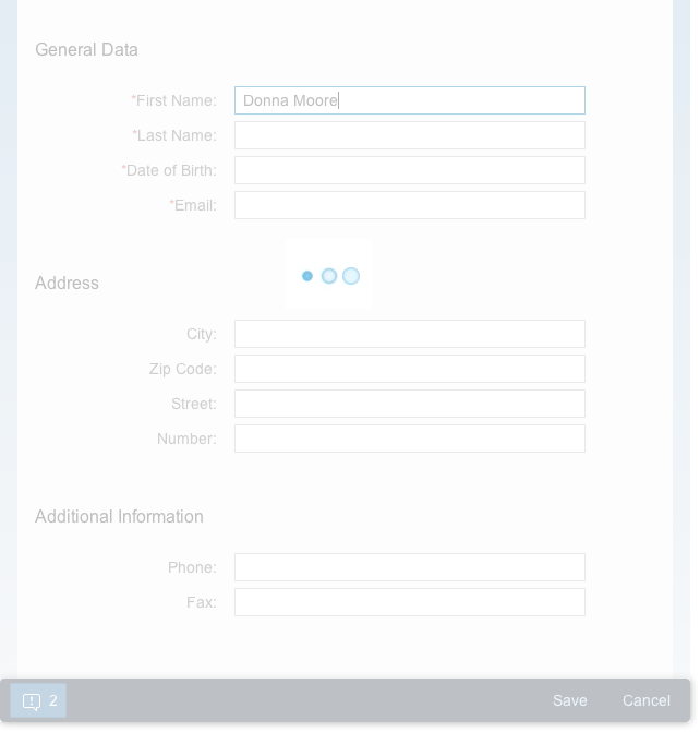
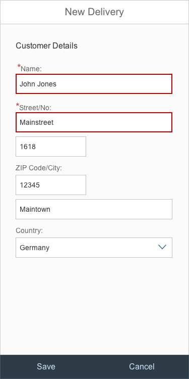
Focus Out (First Validation)
- Clicking or touching another part of the screen (focus out) validates the field.
- The mandatory fields are marked.
- A messaging button appears in toolbar (semantic button, icon: alert, counter)
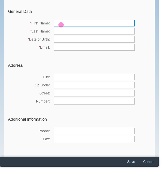
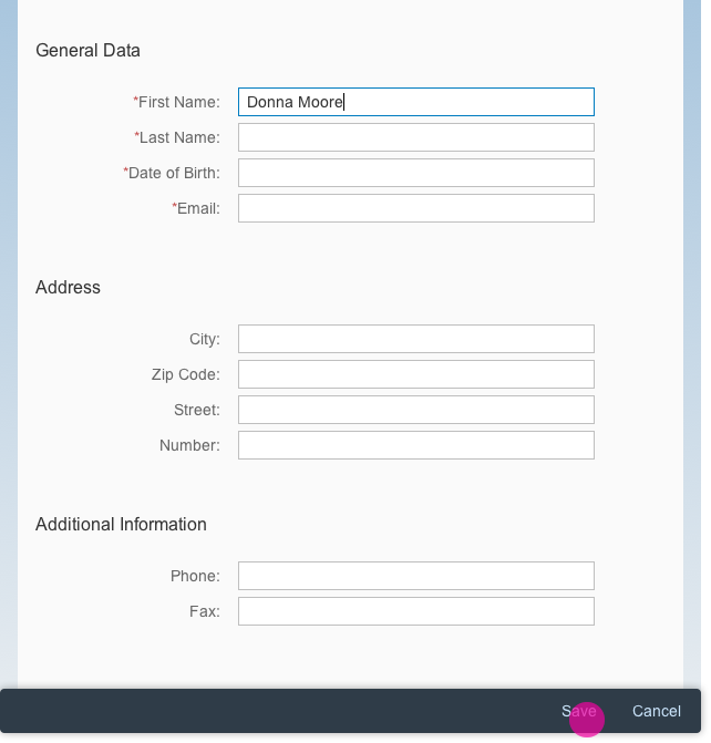
Form
Form with field validation
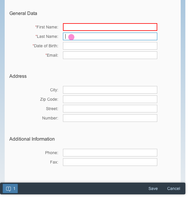
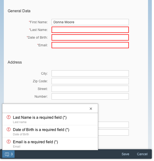
Focus Out (Not First Validation, At Least One Message Already Occurred on UI)
- The message popover counter increases.
- If the message popover is open, the list will be updated.
Form with field validation (at least one message already occurred)
Message popover counter increases to "2"
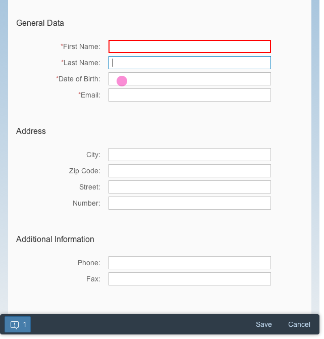
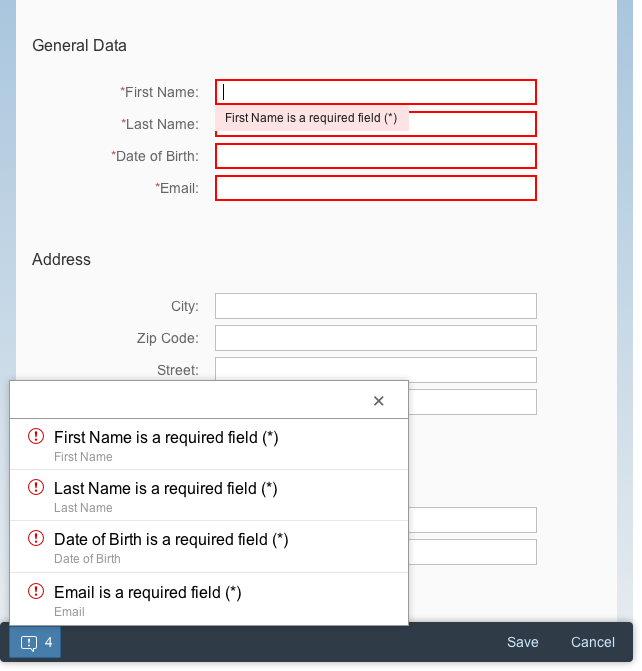
On “Enter”
- The entire form is validated.
- If there is more than one form on the page, only the input fields in the form that was last in focus are validated. This can also include dependent input fields in other sections.
- If the user selects a value by pressing Enter, the value is selected without triggering validation (for example, when adopting a suggestion or entering a value in a combo box). The user must then press Enter a second time to trigger the full form validation process.
- Any errors or warnings are displayed in a message popover.
Loading animation on enter

Validation completed
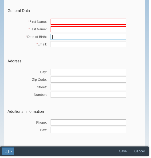
On “Save”
- The entire form is validated.
- Any errors or warnings are displayed in a message popover.
Form with at least one input
Validation completed
Validation
- Highlight the specific field and include a useful message.
- Display a button on the left side of the footer toolbar.
- The button displays the sap.m.MessagePopover. For more information, see message popover.
- If the issues have been resolved so that the user is able to proceed with his or her action, there is no need to display those messages anymore.
Useful message in value state
Error Prevention
Help the user to avoid errors by using input types (sap.m.InputTypes) and mask input (sap.m.MaskInput). The input fields automatically get a specific format, which helps prevent the user from making invalid entries.
Always start with the least complex control (for example, use select instead of value help if the user needs to select only one item from a short list). Use more intricate controls only if the use case really requires it.
Guidelines
Depending on the floorplan, certain validation guidelines need to be applied.
Global Edit Flow
This floorplan is significant in that the actions are only displayed in the footer toolbar on the main page of the object. The subpages do not provide action buttons. Therefore, the message popover includes all messages for the whole object (the main object page and all subpages).
The validation can be triggered by the following:
- Focus Out: Current field, or current field and dependent fields.
- On Enter: The form with the latest focus and possible dependent fields in other sections on a page
- Action Button: Complete object validation including subpages.
Partial Editing
When the user clicks Save, the whole form remains in a busy state until the action has been completed:
- If there are no messages: switch to display mode.
- If there are messages that relate to a field: highlight the respective field with its value state and do not use the message popover.
- If there are messages that do not relate to a field, show a dialog with the message(s).
Message Popover Control
Do not show the messaging button and message popover:
- In the footer toolbar of a dialog
- In a popover
- In a partial editing area. If you offer partial editing, never show a message popover for the part of the screen being edited. The message popover always belongs to the footer toolbar for the whole page.
Instead, just highlight the fields that contain errors to make it easier for the user to understand the issue(s).
Highlighted form fields in a dialog
Resources
Want to dive deeper? Follow the links below to find out more about related controls, the SAPUI5 implementation, and the visual design.
Elements and Controls
- Message Popover (guidelines)
- Message Box (guidelines)
- Message Toast (guidelines)
Implementation
- No Links.
 Your feedback has been sent to the SAP Fiori design team.