
- Latest SAPUI Version 1.124
- SAPUI5 Version 1.122
- SAPUI5 Version 1.120
- SAPUI5 Version 1.118
- SAPUI5 Version 1.116
- SAPUI5 Version 1.114
- SAPUI5 Version 1.112
- SAPUI5 Version 1.110
- SAPUI5 Version 1.108
- SAPUI5 Version 1.106
- SAPUI5 Version 1.104
- SAPUI5 Version 1.102
- SAPUI5 Version 1.100
- SAPUI5 Version 1.98
- SAPUI5 Version 1.96
- SAPUI5 Version 1.94
- SAPUI5 Version 1.92
- SAPUI5 Version 1.90
- SAPUI5 Version 1.88
- SAPUI5 Version 1.86
- SAPUI5 Version 1.84
- SAPUI5 Version 1.82
- SAPUI5 Version 1.80
- SAPUI5 Version 1.78
- SAPUI5 Version 1.76
- SAPUI5 Version 1.74
- SAPUI5 Version 1.72
- SAPUI5 Version 1.70
- SAPUI5 Version 1.68
- SAPUI5 Version 1.66
- SAPUI5 Version 1.64
- SAPUI5 Version 1.62
- SAPUI5 Version 1.60
- SAPUI5 Version 1.58
- SAPUI5 Version 1.56
- SAPUI5 Version 1.52
- SAPUI5 Version 1.50
- SAPUI5 Version 1.48
- SAPUI5 Version 1.46
- SAPUI5 Version 1.44
- SAPUI5 Version 1.42
- SAPUI5 Version 1.40
- SAPUI5 Version 1.38
- SAPUI5 Version 1.36
- SAPUI5 Version 1.34
- SAPUI5 Version 1.32
- SAPUI5 Version 1.30
- SAPUI5 Version 1.28
- SAPUI5 Version 1.26
- Latest SAPUI Version 1.124
- SAPUI5 Version 1.122
- SAPUI5 Version 1.120
- SAPUI5 Version 1.118
- SAPUI5 Version 1.116
- SAPUI5 Version 1.114
- SAPUI5 Version 1.112
- SAPUI5 Version 1.110
- SAPUI5 Version 1.108
- SAPUI5 Version 1.106
- SAPUI5 Version 1.104
- SAPUI5 Version 1.102
- SAPUI5 Version 1.100
- SAPUI5 Version 1.98
- SAPUI5 Version 1.96
- SAPUI5 Version 1.94
- SAPUI5 Version 1.92
- SAPUI5 Version 1.90
- SAPUI5 Version 1.88
- SAPUI5 Version 1.86
- SAPUI5 Version 1.84
- SAPUI5 Version 1.82
- SAPUI5 Version 1.80
- SAPUI5 Version 1.78
- SAPUI5 Version 1.76
- SAPUI5 Version 1.74
- SAPUI5 Version 1.72
- SAPUI5 Version 1.70
- SAPUI5 Version 1.68
- SAPUI5 Version 1.66
- SAPUI5 Version 1.64
- SAPUI5 Version 1.62
- SAPUI5 Version 1.60
- SAPUI5 Version 1.58
- SAPUI5 Version 1.56
- SAPUI5 Version 1.54
- SAPUI5 Version 1.52
- SAPUI5 Version 1.50
- SAPUI5 Version 1.48
- SAPUI5 Version 1.46
- SAPUI5 Version 1.44
- SAPUI5 Version 1.42
- SAPUI5 Version 1.40
- SAPUI5 Version 1.38
- SAPUI5 Version 1.36
- SAPUI5 Version 1.34
- SAPUI5 Version 1.32
- SAPUI5 Version 1.30
- SAPUI5 Version 1.28
- SAPUI5 Version 1.26
Planning Calendar
sap.m.PlanningCalendar
Intro
The planning calendar allows users to see different appointments at the same time and to create new appointments. It allows the user to display appointments for several objects, such as a team calendar, and compare them to each other.
Usage
Use the planning calendar if:
- You want to compare objects of the same type with each other over a period of time.
- You require responsive behavior.
- You have less than 100 lines in the calendar.
Do not use the planning calendar if:
- You want to show a calendar for one object and a detailed overview of appointments over a long time interval.
- You want to show a complex or graphical representation. In this case, please use the Gantt chart.
- You have more than 100 lines in the calendar. In this case, please use the Gantt chart.
Responsiveness
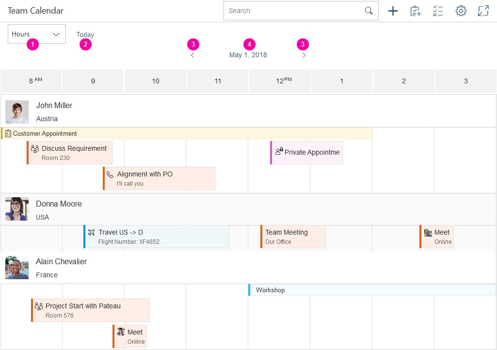
In size S, the control provides pop-in behavior, which allows the user to see as many appointments as possible and to connect them with the corresponding object. If the toolbar contains too many actions for the space available, the overflow icon appears.
The interval section displaying the hours, days, and months is responsive and shows 12 values in size L, 8 values in size M, and 6 values in size S. You can override this behavior, but you should then check that the responsiveness is still working.
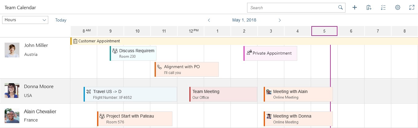
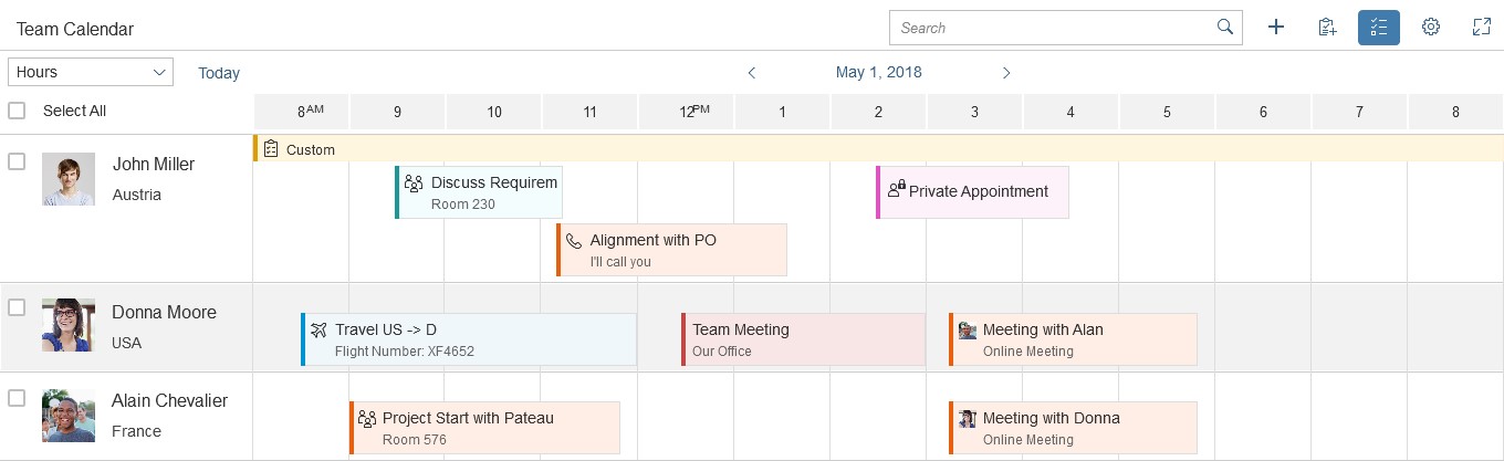
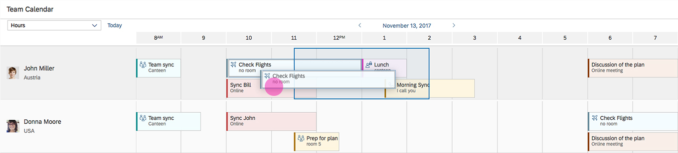
Planning calendar - Size L
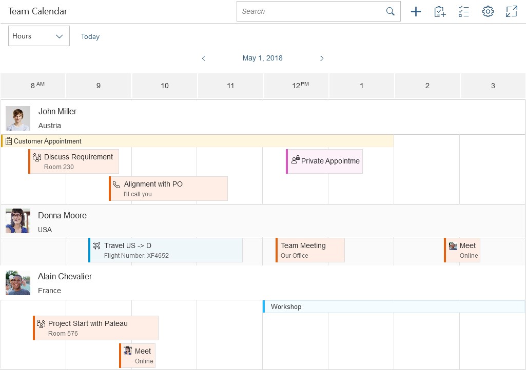
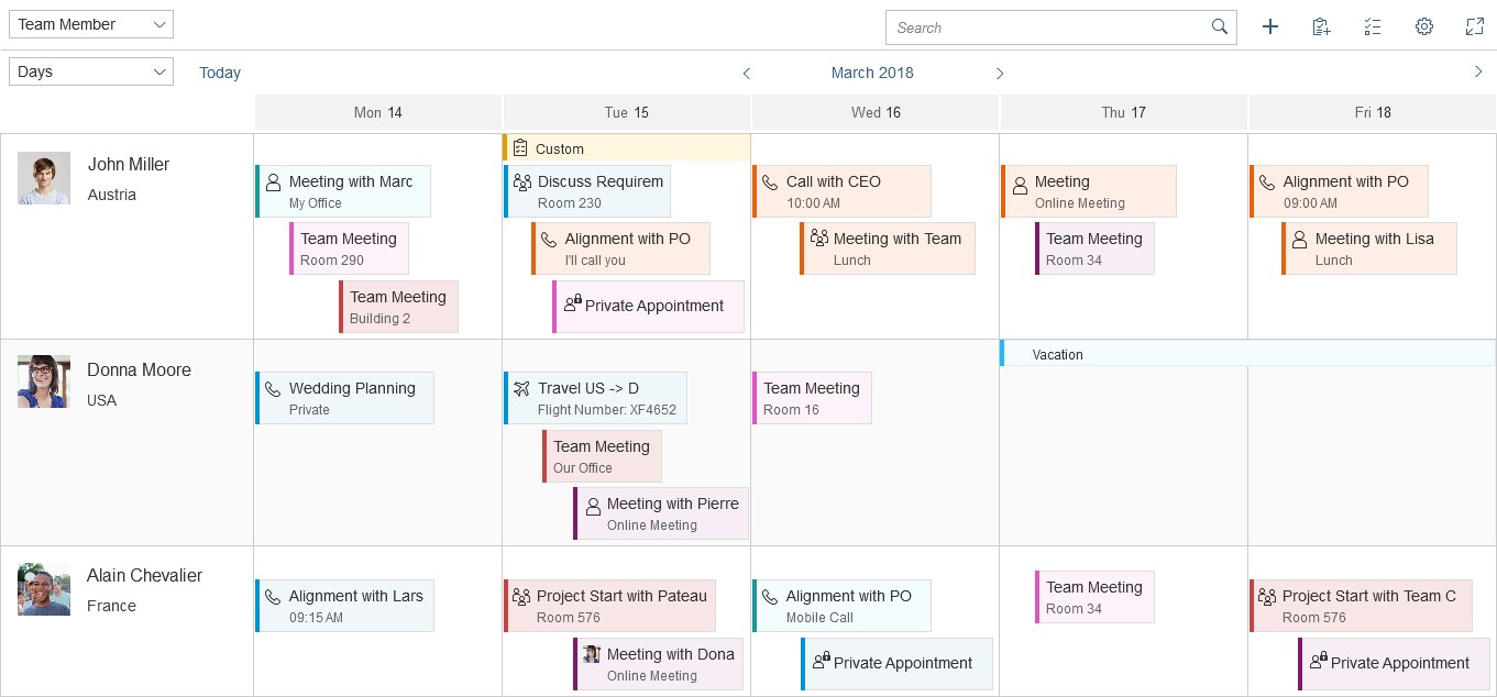
Planning calendar - Size M
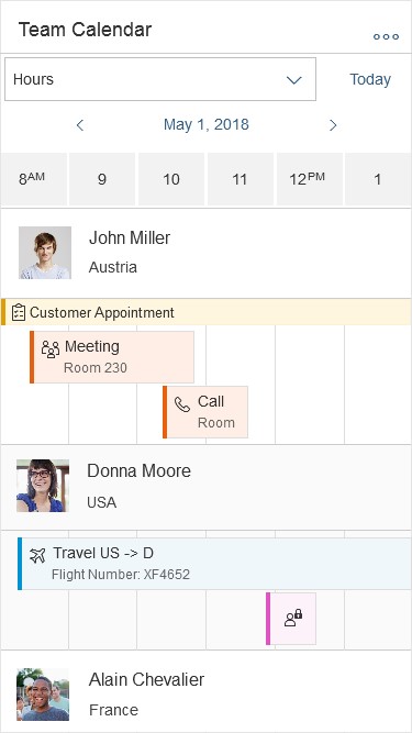
Planning calendar - Size S
Types
You can define what size of interval the calendar should show, and whether multi selection should be possible. Additionally, the row header and the interval appointments are optional.
The control allows multi-select mode to be shown for the list items. This can be used, for example, to delete multiple objects from the view.
An app development team must decide whether to show the planning calendar with or without multi-select mode, or whether users should be able to switch between the two modes. Hiding the interval appointments of every object is optional.
The example opposite shows what the interaction looks like if the user can trigger multi-select mode. When the user clicks or taps the button, a checkbox appears next to each list item and a Select All option is shown. Additional actions can appear or disappear in the calendar toolbar.
The planning calendar can also be used without a row header. In this case, the row header disappears and only the appointments are visible. It can be used to show the calendar of one object. Note that the control was built mainly to compare time slots of different objects. For this reason, the time axis is shown horizontally and, depending on the interval, the appointments might shrink to smaller size. In this case, the text is cut off rather than truncated.
Switching to Multi-Select Mode
Components
This section describes the various components of the planning calendar.
Parts of the planning calendar
The control consists of different parts:
- Toolbar
- Header
- Calendar view
- List item
- Row header
- Row
- Appointment
- Interval appointment
1. Toolbar
The toolbar is optional and can contain a title as well as app-specific and generic actions.
If you have actions in the toolbar, we recommend that you use a title to describe the purpose of the planning calendar. For more information, check out the toolbar guideline article.
The generic actions are as follows:
- Search
- Add Appointment (icon: add)
- Add New Contact (icon: add-contact)
- Multi-Select Mode (icon: multi-select)
- Legend (icon: legend)
- Settings (icon: action-settings)
- Full Screen (icon: full-screen/exit-full-screen)
2. Header
The calendar header comprises the left part, which includes an optional switch to see the calendar in a different view (day, month, year), and the right part, which contains the calendar view.
3. Calendar view
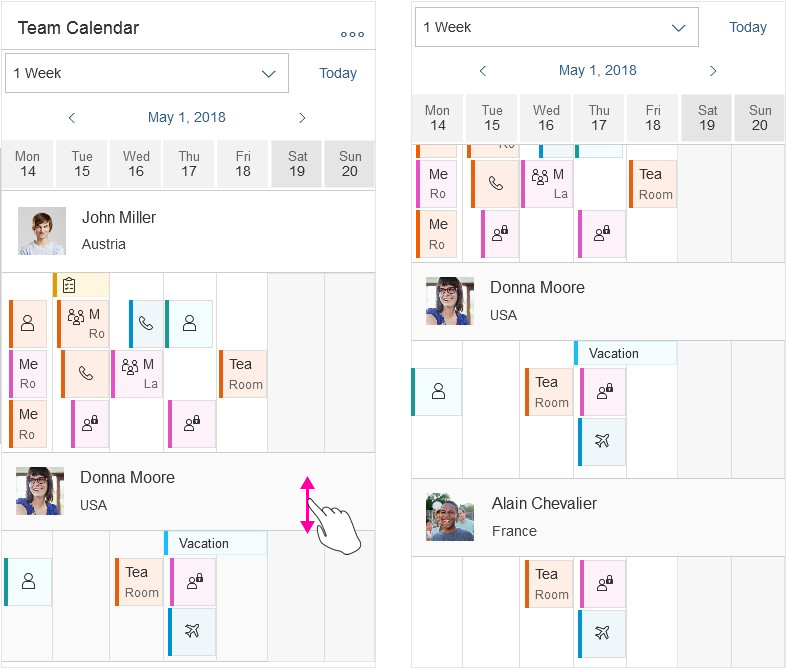
The calendar view defines the granularity of the appointments. You can decide what kind of views (Hours, Days, Months, 1 Week, 1 Month) are available by using the view switch, and how many values are shown for each view. There is a default value for the number of values shown. App developers can change this value, but they should then ensure that the app is still responsive.
The 1 Week view always renders a full week. It displays seven days on one screen. The start date is always the beginning of the week (depending on the locale). It can be found in the view switch as a default view. When applications have this view available, we strongly recommend setting a different number of days displayed in the Days view (more or less than seven). Otherwise, the user might be confused, as the navigation for the two differs.
The 1 Month view shows an entire month. On desktop, the 1 Month view always displays an interval of 31 days. When the displayed month is shorter (28, 29, 30 days), days from the following month are displayed. They have a different visual state and serve as navigation to the following month.
On size M and Size S, the 1 Month view is adaptive. It consists of a calendar and a list of appointments for the selected day.

1-month view - Size S
4. List item
The list item contains the row header, row, appointments, and interval appointments. Each row can show different working and non-working days. This is useful if users want to view calendars from different countries that have different weekends.
5. Row header
This identifies the object for which the appointments are shown. The row header pops in if there is not enough space. It can contain a picture or icon, a title, and a subtitle.
6. Row
All appointments that appear for an object are shown here.
App developers can turn the alternating row coloring on or off. By default, the alternating rows option is turned on.
7. Appointment
Appointments display an icon or picture, a title, and a subtitle. Appointments taking place simultaneously are shown one above the other. There are two appointment sizes – regular and half size. While half-sized appointments save space, they do not show a second line with appointment details.
App developers can define the colors of different appointment types, and appointments can be shown as tentative. Appointments are fully colored.
The control can register the click event, but the app development team must define what happens next.
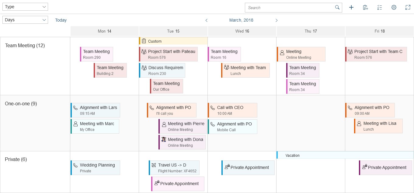
In Months view, appointments within the same calendar week are combined to save space. The combined appointment shows the number of appointments in the same week. If an appointment takes place between two calendar weeks (for example, from Sunday to Monday), it is not included in the combined appointments for either calendar week.
You can show the list of the appointments in a combined appointment in a popover. However, this must be implemented by the app team. The control only provides the click event.
The app developer can disable combined appointments by setting the property GroupAppointmentsMode to Expanded.
8. Interval appointment
Each row can also have interval appointments, which are smaller and always appear at the top of the row. Interval appointments can be used to show appointments that last for a prolonged period of time, such as vacations or workshops.
The app developer can choose to hide the space reserved for interval appointments if no such appointments exist for that time period.
Planning Calendar Legend
To show the types for days and appointments, the planning calendar uses a specific legend control (sap.m.PlanningCalendarLegend).
Users open the planning calendar legend using a standard legend button in the toolbar ( ). Like all other actions in the toolbar, the app developer must add the legend button explicitly.
The app team also needs to decide which container to use for the planning calendar legend. We recommend placing the legend in a popover to keep the context. You can also use a dialog, or, if there is sufficient screen real estate, show the legend as dynamic side content.
The planning calendar legend has two non-collapsible sections containing legend elements. By default, these are called Calendar and Appointments. The app developer can configure the section names using the itemsHeader and appointmentItemsHeader properties. If no elements are available for a section, it is not displayed.
The Calendar section contains standard legend items: Today, Working Day, Non-Working Day, and Selected (only in the 1-month view on mobile). The app team must ensure that the Selected element is added to the planning calendar legend when the planning calendar is viewed in 1-month mode in a smartphone size. This is not provided by the control. If any of the standard legend items are not needed, you can switch them off (property: standardItems).
You can also apply colors for special days in the Calendar section. The planning calendar legend does not automatically use the colors defined for special days in the planning calendar – this must be done by the app team.
The Appointments section contains the color values for the available appointment types. The app developer has to define explicitly which color represents which type. The planning calendar legend does not take the color automatically from the planning calendar.
If combined appointments in the calendar are of the same type (in Months view), they take the color of that type. Combined appointments of different types are marked gray. We also recommend adding the gray color for mixed combined appointments to the Appointments section in the legend.
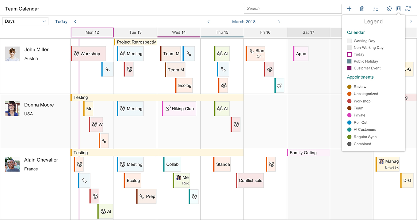
Planning calendar with legend
Behavior and Interaction
To create an appointment, the user must trigger an action by clicking the Add icon in the toolbar. Clicking directly on the row also creates a new appointment.
The user can click on the appointment to see further details. The app development team must define what kind of information is then shown. For example, clicking on an appointment can trigger a popover with detailed information.
A multi-select toggle can also be provided in the toolbar. This can be used, for example, to select multiple people in order to delete them from the planning calendar.
Various tooltips can be shown, but you should not use them to show additional information because users cannot access this functionality on touch devices.
Depending on the current time interval, appointments might be smaller and the text might be cut off, rather than truncated. The user can click or tap the appointment to see the details.
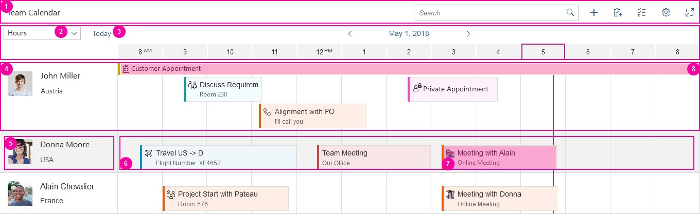
1. View select
The user can change the calendar view with the select control (dropdown). For example, to get an overview of a whole year, the user selects the Months view. Which view is most useful depends on the average length of appointments and the use case.
2. Today action
The user can trigger this action to go back to the current date/moment.
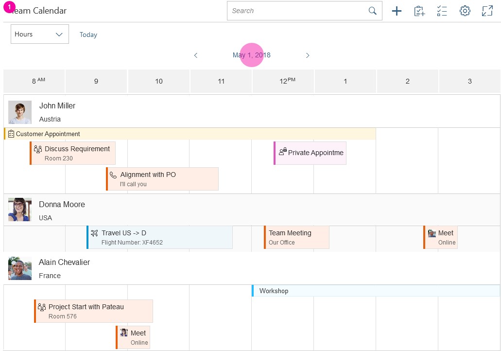
3. Back and forward navigation
The arrows allow the user to navigate to the next or previous interval.
4. Picker
The user can open a date picker to select the start time for the visible interval. What is shown initially in the picker differs depending on the view.
5. Month switch
The month switch is available if the day or month view is selected. It allows the user to switch to a different month.
6. Year switch
Day, month, and year views enable the user to switch between different years.
Navigation parts
Interaction Flow for Switching Days
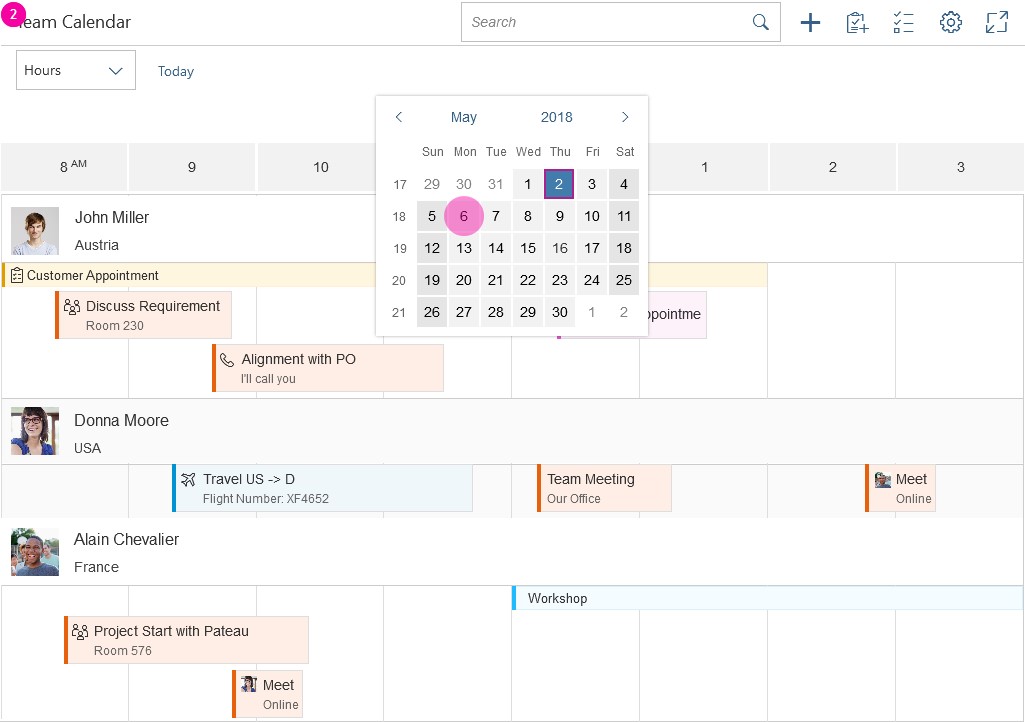
There are two ways in which the user can switch to a different day:
- Clicking or tapping the arrows to navigate to the next or previous interval.
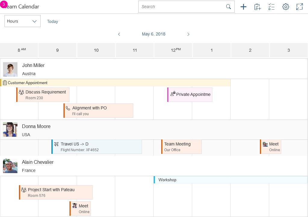
- Clicking or tapping the date opens the date picker. When the user selects a day, the picker closes and navigates the user to the selected value.
Switching to a Different Day
Snapping Header
The header area of the planning calendar can remain fixed on top of the screen (property: stickyHeader), which allows users to view calendars with a lot of rows without losing the context.
Header snaps to top when scrolling down
Drag and Drop
Drag and drop can be used to move appointments and change their start and end times (to enable Drag and Drop use property: enableAppointmentDragAndDrop). When dragged, the appointment is shown as a ghost element on the mouse cursor. Drop target areas are indicated to the user with a placeholder.
In the “Hours” view, the appointments can be moved to a specific new time, with the placeholder snapping at every 30 minutes. In the “Days” view, the appointment can be moved to a different day. The placeholder indicates the target day. On drop the appointment is moved to that day but keeps its previous start and end hour. The interaction is the same for the “Months” view. The placeholder indicates the target month and, when dropped, the appointment is moved to that month. The start and end hour and start and end day remain the same.
Combined appointments and interval appointments are not draggable.
Drag and drop is only available on supporting browsers.
Drag and drop
Guidelines
Switching the Row Header
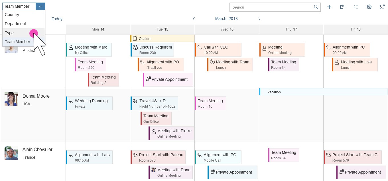
To enable end users to rearrange the planning calendar by switching the row header, you can implement a flexible row header. This is not done by the control and must be implemented by the app development team.
The list items in the row header can be a value of any attribute of an appointment. The appointment attributes are part of app-specific content, so they should be specified by the app development team. The control does not provide default attributes.
Our guideline is to use the select control in the place of the calendar title. The select control will contain all the attributes that can serve as the row header. When a different attribute is selected, the calendar is rearranged accordingly. You can also add a counter after the list items to indicate how many appointments fall into a specific group.
It is also possible to have both the calendar title and select control, in which case you should have first the title and then the select.
On small screen sizes, use select instead of the calendar title. If you want to keep the calendar title, place select in the overflow menu.
Select Control in Row Header
Resources
Want to dive deeper? Follow the links below to find out more about related controls, the SAPUI5 implementation, and the visual design.
Elements and Controls
- Overview Toolbar (guidelines)
- Calendar Date Interval (guidelines)
- Date Picker (guidelines)
Implementation
- Planning Calendar (SAPUI5 samples)
- Planning Calendar (SAPUI5 test suite)
- Planning Calendar Row (SAPUI5 API reference)
- Planning Calendar View (SAPUI5 API reference)
 Your feedback has been sent to the SAP Fiori design team.