
- Latest SAPUI Version 1.124
- SAPUI5 Version 1.122
- SAPUI5 Version 1.120
- SAPUI5 Version 1.118
- SAPUI5 Version 1.116
- SAPUI5 Version 1.114
- SAPUI5 Version 1.112
- SAPUI5 Version 1.110
- SAPUI5 Version 1.108
- SAPUI5 Version 1.106
- SAPUI5 Version 1.104
- SAPUI5 Version 1.102
- SAPUI5 Version 1.100
- SAPUI5 Version 1.98
- SAPUI5 Version 1.96
- SAPUI5 Version 1.94
- SAPUI5 Version 1.92
- SAPUI5 Version 1.90
- SAPUI5 Version 1.88
- SAPUI5 Version 1.86
- SAPUI5 Version 1.84
- SAPUI5 Version 1.82
- SAPUI5 Version 1.80
- SAPUI5 Version 1.78
- SAPUI5 Version 1.76
- SAPUI5 Version 1.74
- SAPUI5 Version 1.72
- SAPUI5 Version 1.70
- SAPUI5 Version 1.68
- SAPUI5 Version 1.66
- SAPUI5 Version 1.64
- SAPUI5 Version 1.62
- SAPUI5 Version 1.60
- SAPUI5 Version 1.58
- SAPUI5 Version 1.56
- SAPUI5 Version 1.52
- SAPUI5 Version 1.50
- SAPUI5 Version 1.48
- SAPUI5 Version 1.46
- SAPUI5 Version 1.44
- SAPUI5 Version 1.42
- SAPUI5 Version 1.40
- SAPUI5 Version 1.38
- SAPUI5 Version 1.36
- SAPUI5 Version 1.34
- SAPUI5 Version 1.32
- SAPUI5 Version 1.30
- SAPUI5 Version 1.28
- SAPUI5 Version 1.26
- Latest SAPUI Version 1.124
- SAPUI5 Version 1.122
- SAPUI5 Version 1.120
- SAPUI5 Version 1.118
- SAPUI5 Version 1.116
- SAPUI5 Version 1.114
- SAPUI5 Version 1.112
- SAPUI5 Version 1.110
- SAPUI5 Version 1.108
- SAPUI5 Version 1.106
- SAPUI5 Version 1.104
- SAPUI5 Version 1.102
- SAPUI5 Version 1.100
- SAPUI5 Version 1.98
- SAPUI5 Version 1.96
- SAPUI5 Version 1.94
- SAPUI5 Version 1.92
- SAPUI5 Version 1.90
- SAPUI5 Version 1.88
- SAPUI5 Version 1.86
- SAPUI5 Version 1.84
- SAPUI5 Version 1.82
- SAPUI5 Version 1.80
- SAPUI5 Version 1.78
- SAPUI5 Version 1.76
- SAPUI5 Version 1.74
- SAPUI5 Version 1.72
- SAPUI5 Version 1.70
- SAPUI5 Version 1.68
- SAPUI5 Version 1.66
- SAPUI5 Version 1.64
- SAPUI5 Version 1.62
- SAPUI5 Version 1.60
- SAPUI5 Version 1.58
- SAPUI5 Version 1.56
- SAPUI5 Version 1.54
- SAPUI5 Version 1.52
- SAPUI5 Version 1.50
- SAPUI5 Version 1.48
- SAPUI5 Version 1.46
- SAPUI5 Version 1.44
- SAPUI5 Version 1.42
- SAPUI5 Version 1.40
- SAPUI5 Version 1.38
- SAPUI5 Version 1.36
- SAPUI5 Version 1.34
- SAPUI5 Version 1.32
- SAPUI5 Version 1.30
- SAPUI5 Version 1.28
- SAPUI5 Version 1.26
Overview Page (SAP Fiori Element)
Intro
View, Filter, and Take Immediate Action
The overview page (OVP) is a data-driven SAP Fiori app type and floorplan that provides all the information a user needs in a single page, based on the user’s specific domain or role. It allows the user to focus on the most important tasks, and view, filter, and react to information quickly.
Each task or topic is represented by a card (or content container). The overview page acts as a UI framework for organizing multiple cards on a single page.
The overview page is based on SAP Fiori elements technology, and uses annotated views of app data, meaning that the app content can be tailored to the domain or role. Different types of card allow you to visualize information in an attractive and efficient way.
At a Glance
-
Entry-level view of content on cards
-
One specific context and task area for one role
-
Content from different sources shows side by side – no need to switch screens
-
Information can be visualized on cards in different ways (texts, charts, lists, tables)
-
Micro actions let users react on the spot
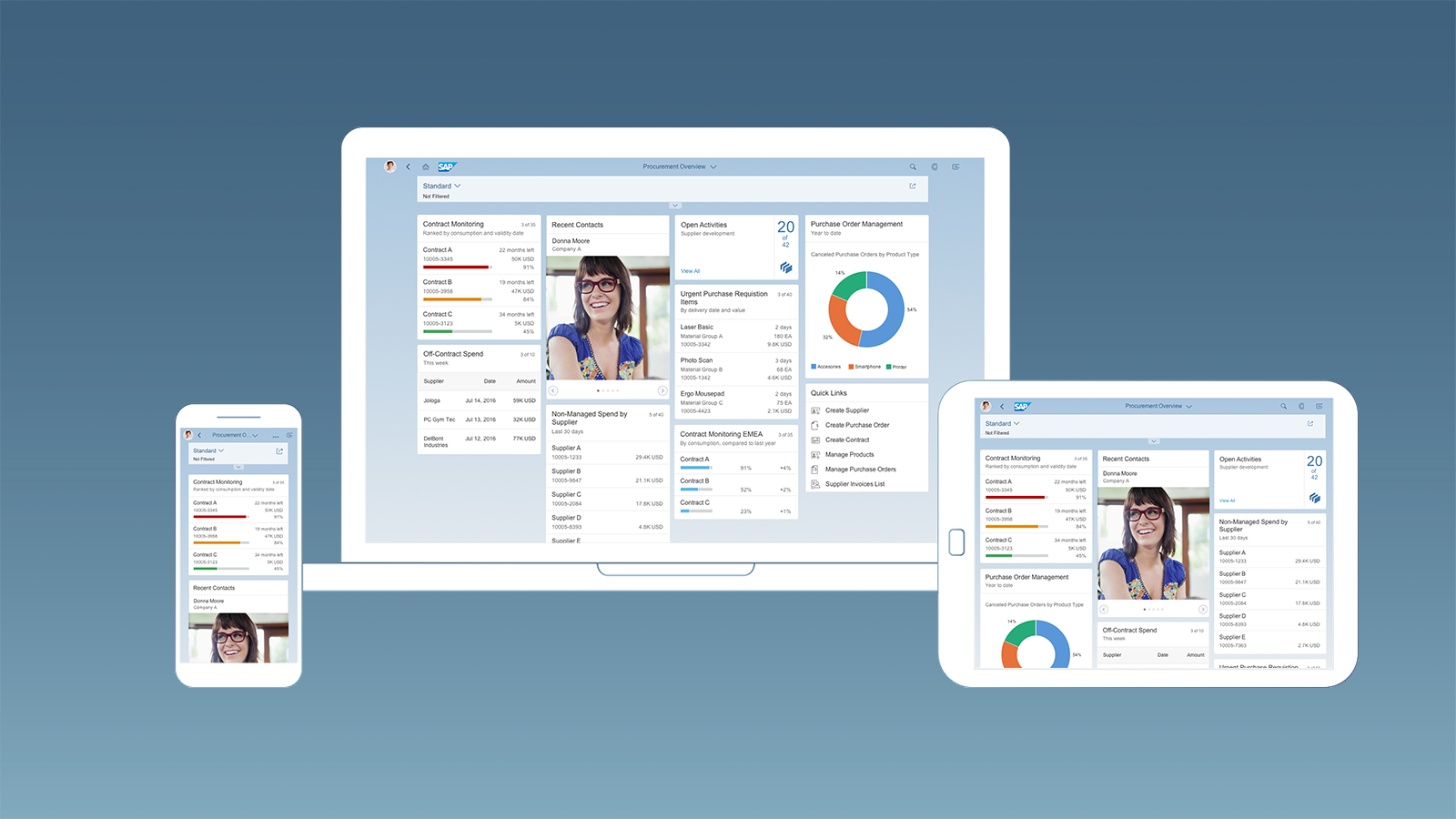
Overview page – Fixed card layout
Usage
Use the overview page if:
- You want to provide an entry-level view of content related to a specific domain or role.
- Users needs to filter and react to information from at least two different applications to complete their role-specific tasks.
- You want to offer different information formats (such as charts, lists, and tables) on a single page.
- You plan to have at least three cards. These cards should not all be of the same type.
Do not use the overview page if:
- A high-level or birds-eye view of application content is sufficient.
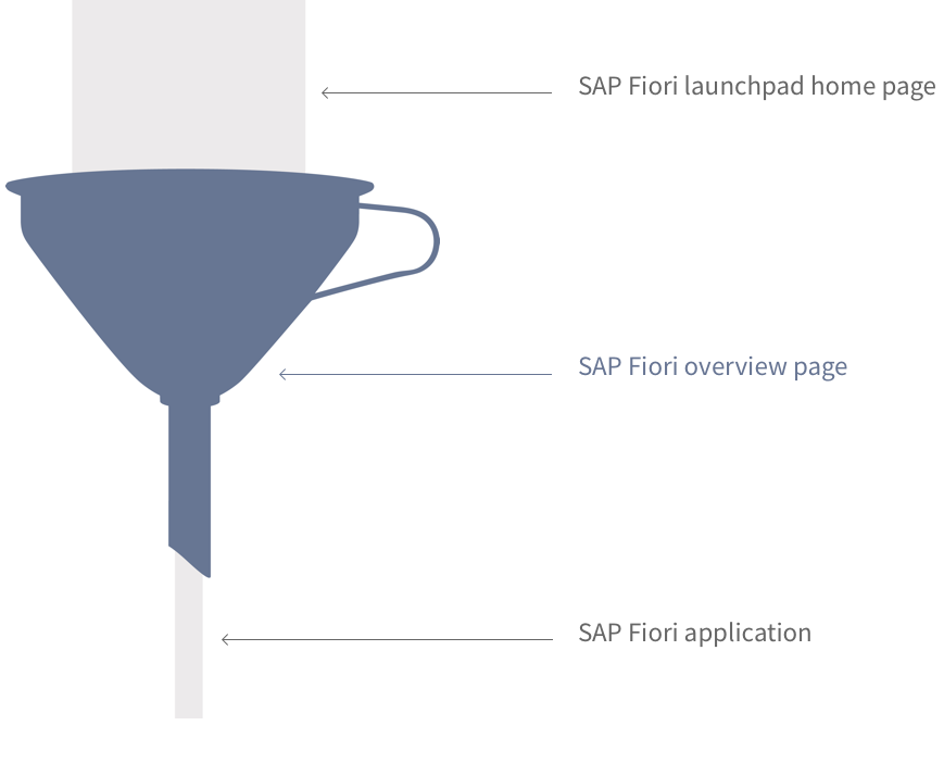
- You just want the user to launch an application. In this case, use the SAP Fiori launchpad home page instead.
- You want to show information about one object only. In this case, use the object page instead.
- You just represent one application and less than three cards. In this case, use the object page instead.
The Difference Between the SAP Fiori Launchpad Home Page, Overview Page, and Object Page
The launchpad home page contains all of a user’s favorite apps and offers access to them via tiles. This covers all the roles that a user might have, such as employee, manager, production worker, or quality manager.
An overview page focuses on the key tasks for a specific role, and contains only the most frequently-used apps for that role. The overview page uses cards, which display more (preview) information than tiles because of their size, properties, and interaction areas. One card type also allows users to perform simple actions. Cards represent an entry-level view of application content.
Launchpad Home Page vs. Overview Page
| Launchpad Home Page | Overview Page |
| Framework (given) | SAP Fiori application (optional) |
| “Birds-eye” view | “Street-level” view |
| Single point of entry | Specific business context for a role |
| One SAP Fiori launchpad per user | Multiple overview pages per user possible |
| Access to all the user’s favourite applications | Selected applications are presented as cards |
| Uses tiles | Uses cards |
| No actions | Micro actions |
The overview page is always role-based. The user sees a heterogeneous set of information related to a specific business context and the tasks associated with a specific role. This is not the case with the object page, which contains homogenous, object-based information.
Overview Page vs. Object Page
| Overview Page | Object Page |
| Role-based | Object-based |
| “Street-level” view | “Details” view |
| Heterogeneous information | Homogeneous information |
Role-Specific Overview Pages
As you can see in the picture, the overall content scope (shown in gray) becomes more focused with each interaction step. An overview page brings together information from different sources that support a specific task or information need. Only provide an overview app for a role if it makes sense to do so.
If a role or user has several main tasks that each require a specific set of information, the role or user might also have multiple overview apps. For example, one overview app could be used to reflect the user’s role as manager, with information for managing team performance reviews. Another overview app could be used to track quality issues and other relevant information pertaining to the machines that the user is responsible for in the role of quality manager.
Metaphor – Different entry points in SAP Fiori
Interaction Flow
As for any other SAP Fiori app, users open overview page apps by selecting a tile on the SAP Fiori launchpad home page, or by bookmarking the direct link in a browser. From the overview page the user decides which issues need attention, and navigates via cards to the relevant SAP Fiori apps. In addition, users can also access the navigation menu in the shell bar, which allows fast and easy navigation to other apps. The overview page supports navigation to both SAP Fiori and non-SAP Fiori apps. For SAP Fiori apps, it uses intent-based navigation. Non-SAP Fiori apps open in a new the browser window.
In the screen flow, always position the overview page app between the SAP Fiori launchpad home page and the SAP Fiori app. The overview page doesn’t replace the SAP Fiori launchpad home page. Never start overview page apps from another SAP Fiori app.
The picture below illustrates the complete interaction flow:
SAP Fiori launchpad home page ➝ SAP Fiori overview app ➝ SAP Fiori app or non-SAP Fiori app
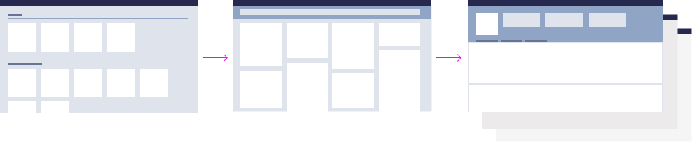
Overview page – Interaction flow
Dedicated Floorplan
While other floorplans like the list report and object page can be combined in a single app, there is a 1:1 relationship between the overview page floorplan and the corresponding overview app. The overview page floorplan is never combined with other floorplans. Because of this, the terms “overview page floorplan” and “overview (page) app” are often used synonymously.
Usually, several floorplans can be combined in one app. The overview page floorplan is an exception.
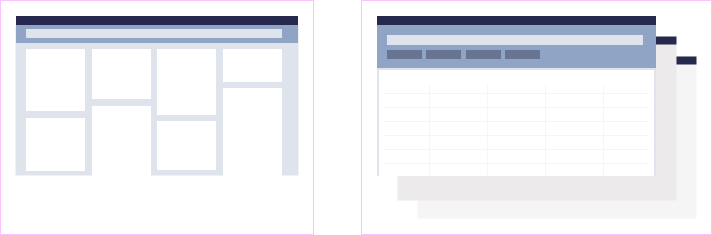
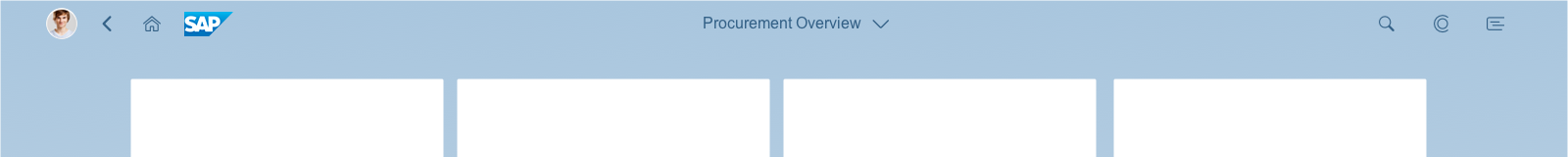
Structure
The basic structure and appearance of the overview page is governed by the dynamic page layout. This enables you to use variant management, text, and a smart filter bar in the upper part of the screen (dynamic page header). The content of the overview page is presented using cards.
The card layout determines the size and position of the cards.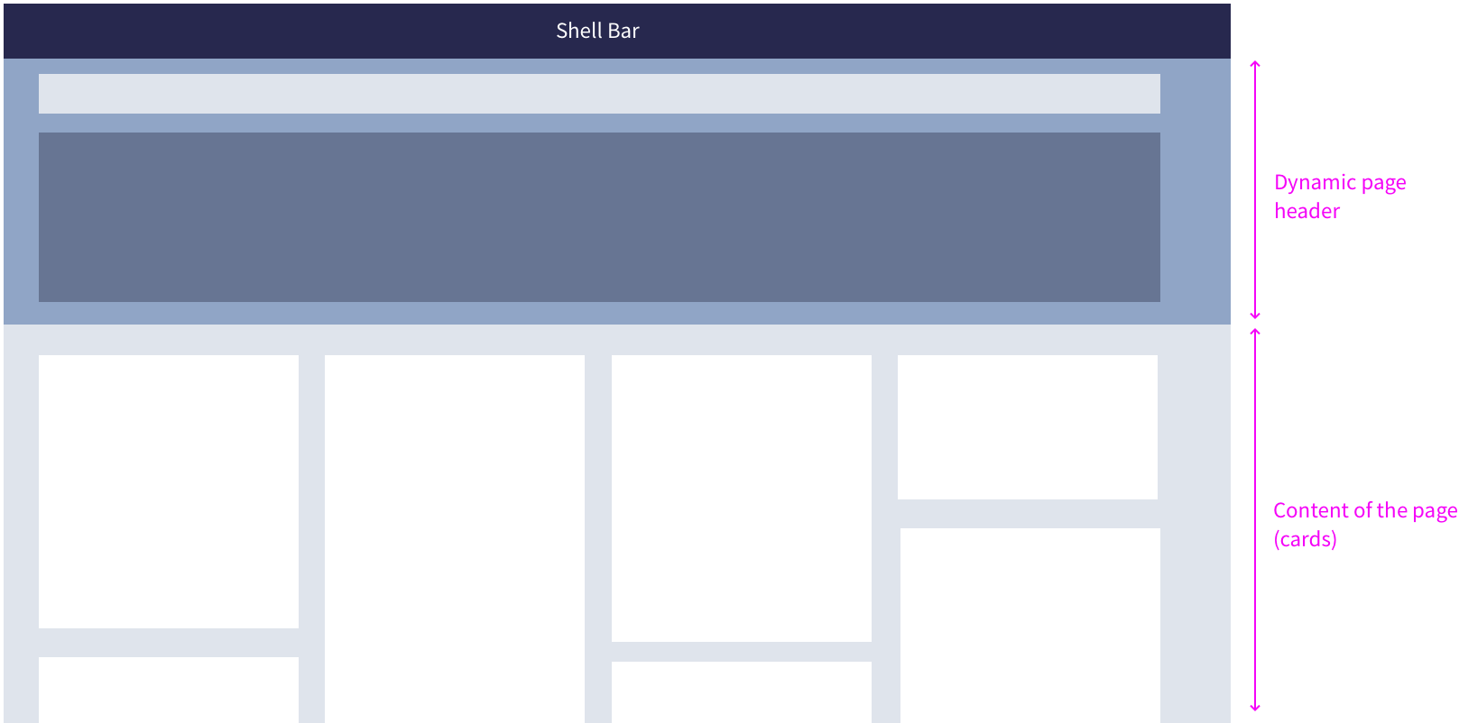
Overview page – Basic structure
Dynamic Page
The overview page can consume four different variants of the dynamic page. These variants support different user needs and provide flexibility for application designers. None of the variants include the footer toolbar.
The smart filter bar in the header content uses the live update mode: the results are updated immediately whenever the user changes a filter field. As a result, there is no Go button for the filter bar. In addition, the variant management control lets users share user-defined variants (Save View feature).
Dynamic Page Variants for the Overview Page
| Variant 1 | Variant 2 | Variant 3 | Variant 4 | |
| Dynamic page header | Yes | – | – | Yes |
| Header title | Variant Management | Text | – | Text |
| Header content | Smart Filter Bar | – | – | Smart Filter Bar |
| Page content | Cards | Cards | Cards | Cards |
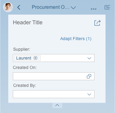
In this variant, the header title contains variant management, and the header content includes the smart filter bar. The initial default uses the collapsed mode, because content is already available on the cards, and users can start right away. When the user scrolls or clicks, the header content expands as defined. The header title offers the Share menu, which enables the actions „Send Email“ and „Save as Tile“.
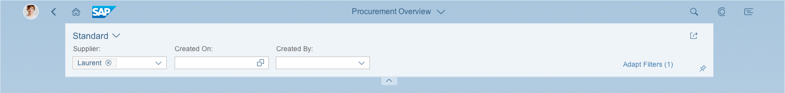
Dynamic page variant 1 – Expanded mode for size XL/L/M

Dynamic page variant 1 (default) – Collapsed mode for size XL/L/M
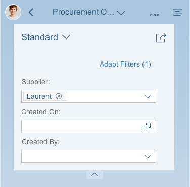
Dynamic page variant 1 – Expanded mode for size S
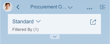
Dynamic page variant 1 – Collapsed mode for size S
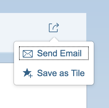
Share menu
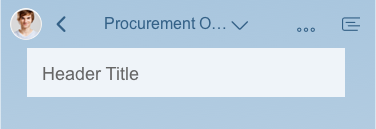
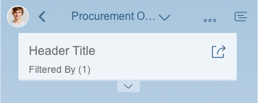
In the second variant, the header title contains a text (“Header Title” in the example below). This text serves the same purpose as the former page subtitle. The header content is empty (auto hidden), and therefore doesn’t snap. The content area displays the overview page cards.

Dynamic page variant 2 – Expanded/collapsed mode for size XL/L/M
Dynamic page variant 2 – Expanded/collapsed mode for size S
This variant doesn’t snap because both the header title and header content are empty (auto hidden). In this case, the overview page cards (page content) display directly below the shell bar.
Dynamic page variant 3 – Size XL/L/M
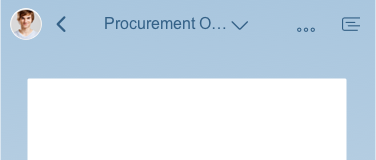
Dynamic page variant 3 – Size S
In this variant, the header title contains a text (“Header Title” in the example below), and the header content area contains the smart filter bar. When the user scrolls or clicks, the header content snaps as defined.

Dynamic page variant 4 – Expanded mode for size XL/L/M

Dynamic page variant 4 – Collapsed mode for size XL/L/M
Dynamic page variant 4 – Expanded mode for size S
Dynamic page variant 4 – Collapsed mode for size S
The fixed card layout describes the position, size, and characteristics of cards in the content area below the dynamic page header. The layout can accommodate typical laptop screens as well as larger desktop monitors, and features responsive (collapsible) “columns” of cards that can scale all the way down to tablet or phone screen sizes.
Personalized Selection of Cards
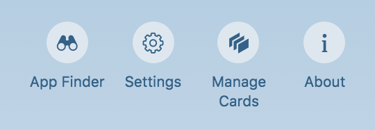
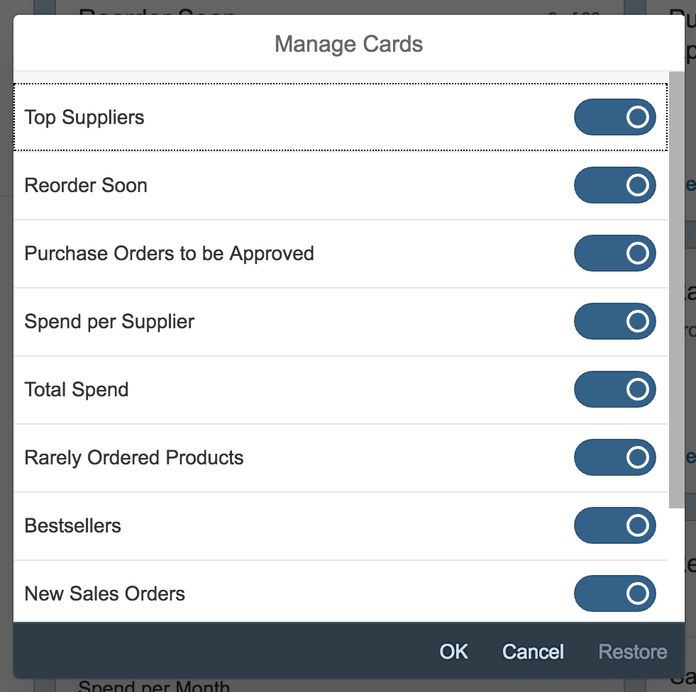
Users can also hide cards. The corresponding setting is in the Me Area under Manage Cards. A dialog appears on the overview page, and lists the different card names. Users can opt to show or hide the cards using a switch control. Restore reinstates the default setup. The personalized setup stays until the user next changes it.
Each overview page app has its own Manage Cards setting. Users who work with several overview pages can personalize the cards shown for each one.
Overview page – 'Manage Cards' dialog
Overview page – 'Manage cards' dialog after initial loading
Cards
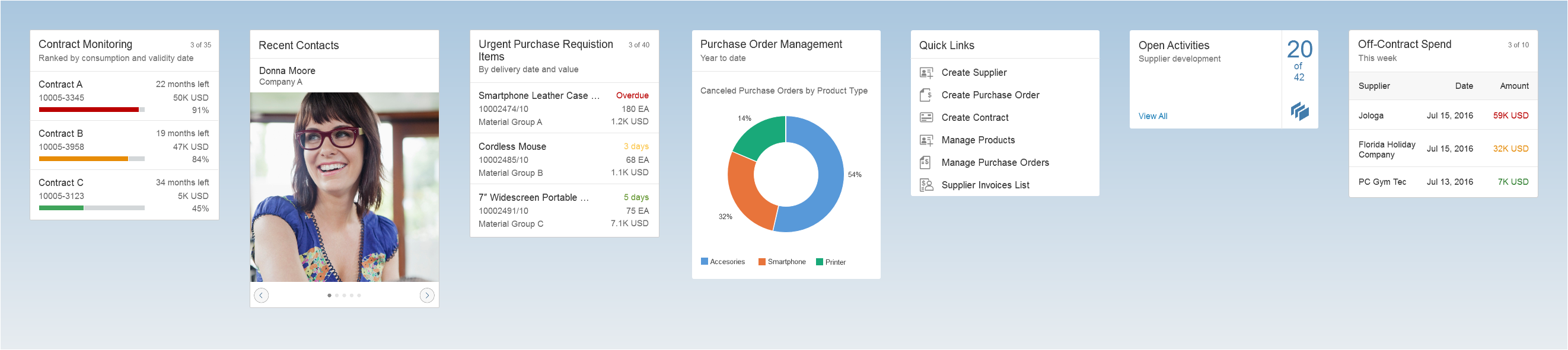
Overview page – Variety of different card types (extract)
Cards are containers for app content, and represent an entry-level view of the most pertinent app data for a given topic or issue. The overview page can contain several cards that reference the same (parent) application. However, each card must bring added value to the user, and not just repeat information already offered on another card.
Cards can display different types of content. They can show a chart, a list, a table, informative text, or a combination of two elements. However, cards never have editable fields.
When designing cards, make sure that you define and format the texts on all the cards consistently. Check the UI text guidelines for the overview page for details.
For more information about cards and card types, see the dedicated articles:
Best Practices
Before you start designing an overview page, familiarize yourself with following best practices to optimize the user experience. They reflect the basic findings of multiple usability tests across different scenarios and user groups.
- Make a conscious decision on the number of cards: Show only cards that really support the specific role context or task.
- Accentuate the most important information: Semantic colors in texts, charts, and images attract more attention.
- Offer a well-balanced mixture of card types: Diversity makes it easy to recognize, select, and read information.
- Define a deliberate card order: Users assume that cards at the top of the page are more important than others.
- Group similar topics: Users assume that related cards will be shown next to each other.
- Choose easy-to-read and actionable texts: If the user needs to take action, use the active voice (for example “Reorder Soon” when stocks are running low).
- Be semantically consistent: Users expect crucial terms like „urgent“ or “out of stock” to be highlighted with semantic colors.
Resources
Want to dive deeper? Follow the links below to find out more about the SAP Fiori Overview Page.
Elements and Controls
- Introduction to SAP Fiori Elements (guidelines)
- Overview Page – UI Text Guidelines (guidelines)
- Overview Page – Card (guidelines)
- Overview Page – Fixed Card Layout (guidelines)
- Overview Page – Analytical Card (guidelines)
- Overview Page – List Card (guidelines)
- Overview Page – Table Card (guidelines)
- Overview Page – Stack Card | Quick View Card (guidelines)
 Your feedback has been sent to the SAP Fiori design team.