
- Latest SAPUI Version 1.124
- SAPUI5 Version 1.122
- SAPUI5 Version 1.120
- SAPUI5 Version 1.118
- SAPUI5 Version 1.116
- SAPUI5 Version 1.114
- SAPUI5 Version 1.112
- SAPUI5 Version 1.110
- SAPUI5 Version 1.108
- SAPUI5 Version 1.106
- SAPUI5 Version 1.104
- SAPUI5 Version 1.102
- SAPUI5 Version 1.100
- SAPUI5 Version 1.98
- SAPUI5 Version 1.96
- SAPUI5 Version 1.94
- SAPUI5 Version 1.92
- SAPUI5 Version 1.90
- SAPUI5 Version 1.88
- SAPUI5 Version 1.86
- SAPUI5 Version 1.84
- SAPUI5 Version 1.82
- SAPUI5 Version 1.80
- SAPUI5 Version 1.78
- SAPUI5 Version 1.76
- SAPUI5 Version 1.74
- SAPUI5 Version 1.72
- SAPUI5 Version 1.70
- SAPUI5 Version 1.68
- SAPUI5 Version 1.66
- SAPUI5 Version 1.64
- SAPUI5 Version 1.62
- SAPUI5 Version 1.60
- SAPUI5 Version 1.58
- SAPUI5 Version 1.56
- SAPUI5 Version 1.52
- SAPUI5 Version 1.50
- SAPUI5 Version 1.48
- SAPUI5 Version 1.46
- SAPUI5 Version 1.44
- SAPUI5 Version 1.42
- SAPUI5 Version 1.40
- SAPUI5 Version 1.38
- SAPUI5 Version 1.36
- SAPUI5 Version 1.34
- SAPUI5 Version 1.32
- SAPUI5 Version 1.30
- SAPUI5 Version 1.28
- SAPUI5 Version 1.26
- Latest SAPUI Version 1.124
- SAPUI5 Version 1.122
- SAPUI5 Version 1.120
- SAPUI5 Version 1.118
- SAPUI5 Version 1.116
- SAPUI5 Version 1.114
- SAPUI5 Version 1.112
- SAPUI5 Version 1.110
- SAPUI5 Version 1.108
- SAPUI5 Version 1.106
- SAPUI5 Version 1.104
- SAPUI5 Version 1.102
- SAPUI5 Version 1.100
- SAPUI5 Version 1.98
- SAPUI5 Version 1.96
- SAPUI5 Version 1.94
- SAPUI5 Version 1.92
- SAPUI5 Version 1.90
- SAPUI5 Version 1.88
- SAPUI5 Version 1.86
- SAPUI5 Version 1.84
- SAPUI5 Version 1.82
- SAPUI5 Version 1.80
- SAPUI5 Version 1.78
- SAPUI5 Version 1.76
- SAPUI5 Version 1.74
- SAPUI5 Version 1.72
- SAPUI5 Version 1.70
- SAPUI5 Version 1.68
- SAPUI5 Version 1.66
- SAPUI5 Version 1.64
- SAPUI5 Version 1.62
- SAPUI5 Version 1.60
- SAPUI5 Version 1.58
- SAPUI5 Version 1.56
- SAPUI5 Version 1.54
- SAPUI5 Version 1.52
- SAPUI5 Version 1.50
- SAPUI5 Version 1.48
- SAPUI5 Version 1.46
- SAPUI5 Version 1.44
- SAPUI5 Version 1.42
- SAPUI5 Version 1.40
- SAPUI5 Version 1.38
- SAPUI5 Version 1.36
- SAPUI5 Version 1.34
- SAPUI5 Version 1.32
- SAPUI5 Version 1.30
- SAPUI5 Version 1.28
- SAPUI5 Version 1.26
Worklist Floorplan
Intro
A worklist displays a collection of items that a user needs to process. Working through the list usually involves reviewing details of the items and taking action. In most cases, the user has to either complete a work item or delegate it.
The focus of the worklist floorplan is on processing the items. This differs from the list report floorplan, which focuses on finding and acting on relevant items from a large dataset.
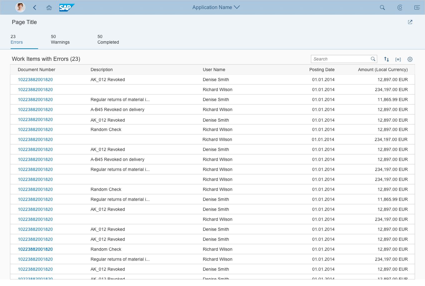
Worklist – Full screen
Usage
Use the worklist floorplan if:
- The user has numerous potential work items and needs to decide which ones to process first.
- You want to give the user a direct entry point for taking action on work items.
- Users need to work with multiple views of the same content (for example, items that are “Open”, “In Process”, or “Completed”. Users can switch between views using the tab bar.
Do not use the worklist floorplan if:
- The items you are showing are not work items.
- You want to show large item lists, or combine different data visualizations (charts or tables). In this case, use the list report floorplan instead.
- Users need to find and act on relevant items from within a large set of items by searching, filtering, sorting, and grouping. Use the list report floorplan instead.
Layout
The worklist floorplan is based on the dynamic page. In addition to the SAP Fiori launchpad shell bar, the dynamic page contains the following areas:
- The header title: Use this to display a title or the variant for the whole page, KPI information (if relevant), and a header toolbar with global actions, such as Share.
- The content area: Use this to display:
-
- An icon tab bar in the content area
- One table (per tab)
- You can use any kind of table and list. To ensure that the application runs on all devices, we recommend using the responsive table.
- The footer toolbar: If needed, use a footer toolbar to display the messaging button and finalizing actions.
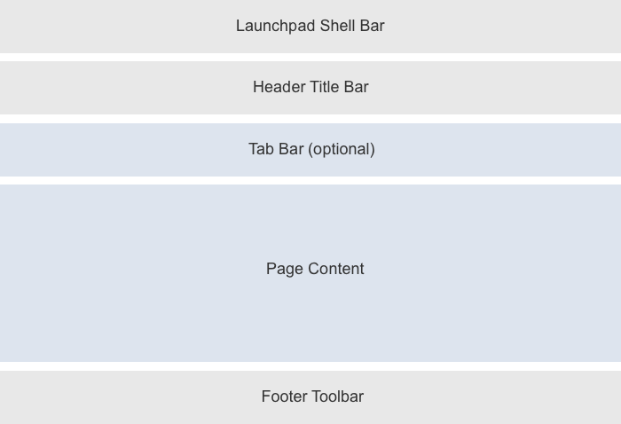
Basic structure
Responsiveness and Adaptiveness
In general, the worklist floorplan is responsive. However, there are exceptions if the following controls are used:
- Grid table: Supported on desktop and tablet devices only. On smartphones, replace these tables with something else, such as a responsive table or a list. In rare cases, displaying only a chart on smartphones might also suffice.
- Tree table: Supported on desktop and tablet devices only. For smartphones, there is no equivalent alternative. In some cases, a tree, the category navigation pattern, or a chart might work.
- Smart table: The smart table is a wrapper around the different existing table controls. If a grid table or tree table is used inside the smart table, the same issues occur as listed above. On a smartphone, you can use a responsive table inside the smart table. For the tree table, you need to replace the smart table as described above.
For more details, see the respective guideline articles.
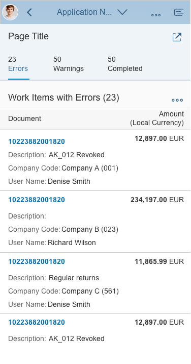
Worklist floorplan - Size S
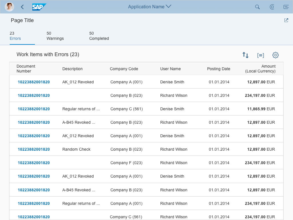
Worklist floorplan - Size M
Worklist floorplan - Size L
Guidelines
Simple Worklist
The worklist floorplan allows the user to work through a list of items. Ideally, the system provides the user with a complete list of work items in the correct order. You should also ensure that no important work items are lost, and keep distracting functions to a minimum.
The most basic version of the worklist is therefore a plain page with a table.

Simple worklist without tabs
Worklist with Tabs
The icon tab bar enables users to call up work items in specific categories. This can help users identify critical items more easily. Different tabs show different perspectives on the same dataset.
You can offer visual orientation by applying semantic colors to the icons for the different categories (for example, red for the Error tab).
Worklist with tab categories
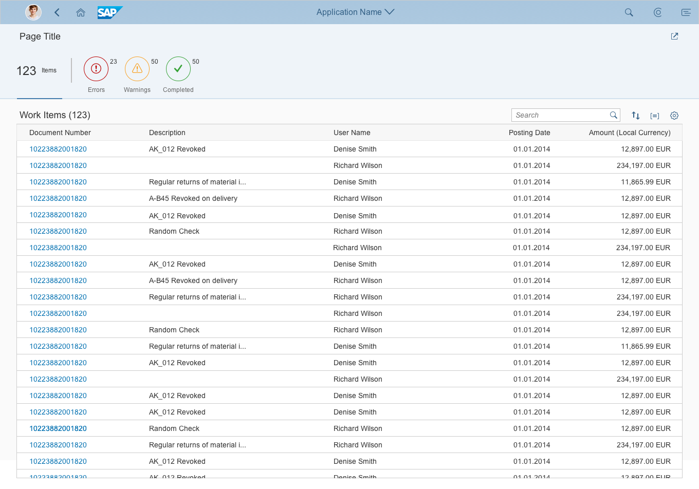
Worklist with KPI
The key performance indicator (KPI) worklist allows the user to track a KPI while processing the worklist. You can display the KPI within the KPI container next to the page title as an object status.
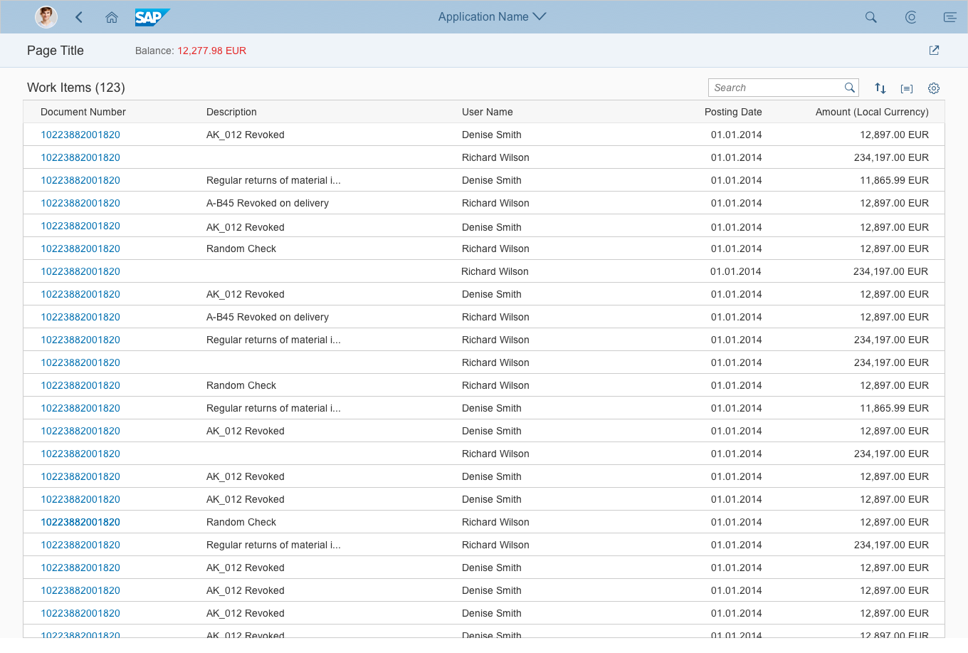
Worklist with KPI
Header Title
Variant Management
Variant management is optional. If used, apply it to the whole page. Use the variants to save and restore all settings, including selected tabs, all tables, and all personalization settings.
If variant management is not needed, just show a title that describes the current view instead.
Header Toolbar (Global Actions)
Use this for non-finalizing global actions such as Share. Share opens an action sheet, which features Save as Tile (if the SAP Fiori launchpad is available), Send Email, and Share in SAP Jam (if SAP Jam is available). Show the Share button only if it makes sense for your application.
In addition, offer any other global, non-finalizing actions that are needed. Hide actions that cannot be used at all (for example, because of access rights). To save space on the header toolbar, group similar actions using a menu button.
For more information on global actions, see the guidelines for the header toolbar.
Page Content
Tab Bar
The tab bar is part of the page content container, which means that the tab bar is not “sticky” and will scroll away when the user scrolls down the page.
Use the icon tab bar. Display the number of items shown in the table on each tab (sap.m.IconTabFilter, property: count). Only use icons if you need to display semantic colors on the icon tab bar.
The tab bar works as a filter on the content below.
Table Toolbar
Display at least a table title (ideally with an item count) and icon-only buttons for sorting, grouping, and column settings. For filter, sort, and group, show a view settings dialog with only the corresponding features enabled. For column settings, show the table personalization dialog. If you need more extensive functionality (for example, grouping or sorting on several levels, tables with more than 20 columns), use the P13n-Dialog with just the corresponding feature enabled.
In addition, offer any other actions needed. Disable selection-dependent actions (such as Delete) if no items or only unsuitable items are selected. Always enable selection-independent actions (such as Add). To save space on the table toolbar, group similar actions using a menu button. For example:
- Release and Release with Conditions
- Add Contact and Replace Contact
- Edit Account and Edit Title
For more information on table actions, see the guidelines for the table toolbar and for managing objects.
Table
If there are no items to display, use the “no data text” of the corresponding table. Explain why the table is empty, and what the user needs to do to display items.
Examples:
- The search was executed, but no items were found: No items found. Try adjusting your search criteria.
- By opening a related app, the filter criteria were transferred automatically, but no items were found: No items found. Check the search and filter settings.
There are three types of navigation at item level in the worklist floorplan:
- Line item navigation: If applicable, allow navigation to a detail view (usually an object page) at line item level. Show a navigation indicator (chevron icon) for each line item that provides a detail view. In a list, tree, or responsive table, clicking the line item triggers the navigation. In a grid table, analytical table, or tree table, clicking the navigation indicator triggers the navigation. Another option is to use a link as the identifier for the line item. This link triggers the navigation. Use this only if the navigation indicator is used for a different target.
- Drilldown navigation: If a line item contains aggregated data, allow navigation to a view that contains details for the aggregated amount. This is usually a list report. In this case, use a link to display the aggregated amount. If the table contains many columns with links, use the link options to provide different levels of highlighting. In charts, offer the drilldown navigation link in the popover for the chart element. In this case, also navigate to the corresponding list report to show the details.
- Cross navigation: If a line item contains cross-references to other entities, such as people or business objects, use a link to display the corresponding data point in the table. Triggering the link opens a quick view. Typically, the quick view displays basic details of the referenced object, as well as a navigation link to another page (usually an object page) or another app that shows the object details.
Footer Toolbar
Use the footer toolbar to display the messaging button and finalizing actions. Only use the footer toolbar if finalizing actions for the whole page and/or the message popover are available.
Always show the footer toolbar in edit mode.
Hide actions that cannot be used at all (for example, if the user doesn’t have authorization). To save space on the footer toolbar, group similar actions using a menu button.
For more information on finalizing actions, see the guidelines for the footer toolbar.
Standard Naming Conventions
For all objects, follow the standard conventions for action buttons, the object name, and the title in the shell bar. For more information see Manage Objects – Naming Guidelines and Launchpad Shell Bar – Page Title and Navigation Menu.
Actions
The worklist offers four locations for actions: global actions, table actions, line item actions, and finalizing actions.
1. Global Actions
Place actions that affect the entire page in the header toolbar in the header title (1). These include the standard Share action.
The Share button opens an action sheet that contains actions like Save as Tile (if the SAP Fiori Launchpad is available), Send Email, and Share in SAP Jam (if SAP Jam is available). Show the Share button only if it makes sense for your application.
Hide actions that cannot be used at all (for example, because the user has no authorization). To save space in the header toolbar, group similar actions using a menu button.
Do not place actions that finalize the current process (“finalizing actions”) on the header toolbar of the header title, even if they affect the entire page.
For more information on global actions, see the guidelines for the header toolbar.

Global actions
2. Table Actions
Place actions that affect the content of a table in the table toolbar (2).
If an action applies only for selected items, disable it if no items are selected, or if the selected items don’t qualify for the action. For example:
- Disable Remove if no item is selected.
- Always keep Add enabled.
Exception: The user needs to specify where in the table the item should be added. In this case, disable Add if no items are selected, or more than one item is selected. - Always keep Edit enabled if it switches the whole table to edit mode. If Edit applies only to one item or to a selection of items, disable it if no item is selected.
- Disable object-specific actions if no item is selected.
- Disable actions that change the status of one or multiple items if no item is selected.
Hide actions that cannot be used at all (for example, because the user has no authorization).
For more information on table actions, see the guidelines for the table toolbar and for managing objects.

Toolbar actions
3. Line Item Actions
In rare cases, actions that affect a single item can be placed directly inside the line item. Use this option only for specific, frequently-used tasks (3). If the same action can also be applied to several items at once, feel free to also place it on the table toolbar. Nevertheless, if you do so, reconsider whether you really need to offer the action at line item level. Examples of line item actions include:
- Start/Stop (a batch job)
- Approve (an item)
- Assign (an item)
Do not disable line item actions. If an action cannot be used, hide it. This can be the case if the user has no authorization or if the line item has the wrong state, for example.
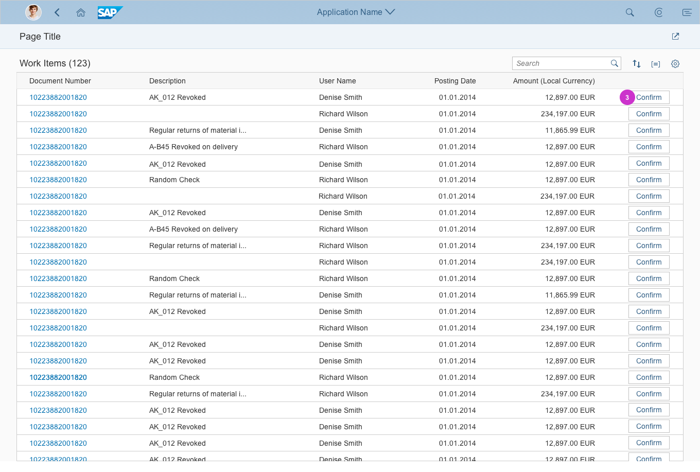
Inline actions
4. Finalizing Actions
Place actions that trigger the end of a process and affect the entire page in the footer toolbar (4).
Examples:
- Save
- Cancel
- Submit
Please be aware: Even if you are using the icon tab bar, there is only one footer toolbar for all tabs.
Hide actions that cannot be used at all (for example, because the user has no authorization).
For more information on finalizing actions, see the guidelines for the footer toolbar.
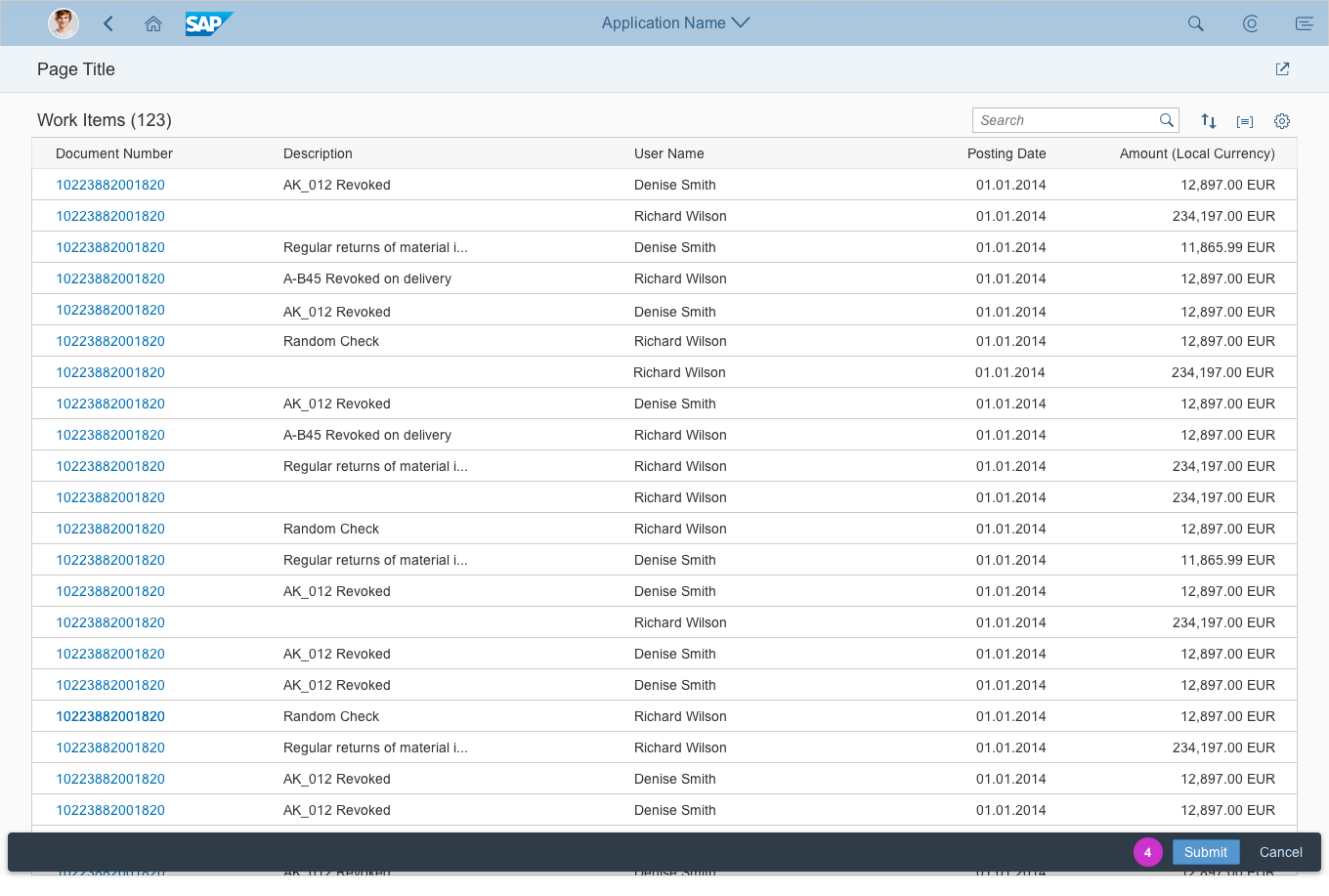
Finalizing actions
Often, users will need more information before they can take action. In this case, offer navigation to the work item details, and offer all the relevant actions in the detail screen. Once the user has completed the task, the app should:
- Return the user to the worklist
- Remove the processed item from the list, or move it to a “completed” section
- Confirm the user’s action with a message toast
Resources
Want to dive deeper? Follow the links below to find out more about related controls, the SAPUI5 implementation, and the visual design.
Elements and Controls
- Full Screen Layout (guidelines)
- Variant Management (guidelines)
- Filter Bar (guidelines)
- Tab Bar (guidelines)
- Responsive Table (guidelines)
- Toolbar (guidelines)
- Icons (guidelines)
Implementation
- Filter Bar (documentation)
- Tab Bar/Icon Tab Bar (SAPUI5 API reference)
- Table (SAPUI5 API reference)
- Toolbar (SAPUI5 API reference)
- Popover (SAPUI5 API reference)
 Your feedback has been sent to the SAP Fiori design team.