
- Latest Version 1.128
- Version 1.126
- SAPUI Version 1.124
- SAPUI5 Version 1.122
- SAPUI5 Version 1.120
- SAPUI5 Version 1.118
- SAPUI5 Version 1.116
- SAPUI5 Version 1.114
- SAPUI5 Version 1.112
- SAPUI5 Version 1.110
- SAPUI5 Version 1.108
- SAPUI5 Version 1.106
- SAPUI5 Version 1.104
- SAPUI5 Version 1.102
- SAPUI5 Version 1.100
- SAPUI5 Version 1.98
- SAPUI5 Version 1.96
- SAPUI5 Version 1.94
- SAPUI5 Version 1.92
- SAPUI5 Version 1.90
- SAPUI5 Version 1.88
- SAPUI5 Version 1.86
- SAPUI5 Version 1.84
- SAPUI5 Version 1.82
- SAPUI5 Version 1.80
- SAPUI5 Version 1.78
- SAPUI5 Version 1.76
- SAPUI5 Version 1.74
- SAPUI5 Version 1.72
- SAPUI5 Version 1.70
- SAPUI5 Version 1.68
- SAPUI5 Version 1.66
- SAPUI5 Version 1.64
- SAPUI5 Version 1.62
- SAPUI5 Version 1.58
- SAPUI5 Version 1.56
- SAPUI5 Version 1.54
- SAPUI5 Version 1.52
- SAPUI5 Version 1.50
- SAPUI5 Version 1.48
- SAPUI5 Version 1.46
- SAPUI5 Version 1.44
- SAPUI5 Version 1.42
- SAPUI5 Version 1.40
- SAPUI5 Version 1.38
- SAPUI5 Version 1.36
- SAPUI5 Version 1.34
- SAPUI5 Version 1.32
- SAPUI5 Version 1.30
- SAPUI5 Version 1.28
- SAPUI5 Version 1.26
- Latest Version 1.128
- Version 1.126
- SAPUI Version 1.124
- SAPUI5 Version 1.122
- SAPUI5 Version 1.120
- SAPUI5 Version 1.118
- SAPUI5 Version 1.116
- SAPUI5 Version 1.114
- SAPUI5 Version 1.112
- SAPUI5 Version 1.110
- SAPUI5 Version 1.108
- SAPUI5 Version 1.106
- SAPUI5 Version 1.104
- SAPUI5 Version 1.102
- SAPUI5 Version 1.100
- SAPUI5 Version 1.98
- SAPUI5 Version 1.96
- SAPUI5 Version 1.94
- SAPUI5 Version 1.92
- SAPUI5 Version 1.90
- SAPUI5 Version 1.88
- SAPUI5 Version 1.86
- SAPUI5 Version 1.84
- SAPUI5 Version 1.82
- SAPUI5 Version 1.80
- SAPUI5 Version 1.78
- SAPUI5 Version 1.76
- SAPUI5 Version 1.74
- SAPUI5 Version 1.72
- SAPUI5 Version 1.70
- SAPUI5 Version 1.68
- SAPUI5 Version 1.66
- SAPUI5 Version 1.64
- SAPUI5 Version 1.62
- SAPUI5 Version 1.60
- SAPUI5 Version 1.58
- SAPUI5 Version 1.56
- SAPUI5 Version 1.54
- SAPUI5 Version 1.52
- SAPUI5 Version 1.50
- SAPUI5 Version 1.48
- SAPUI5 Version 1.46
- SAPUI5 Version 1.44
- SAPUI5 Version 1.42
- SAPUI5 Version 1.40
- SAPUI5 Version 1.38
- SAPUI5 Version 1.36
- SAPUI5 Version 1.34
- SAPUI5 Version 1.32
- SAPUI5 Version 1.30
- SAPUI5 Version 1.28
- SAPUI5 Version 1.26
Popover
sap.m.Popover | sap.m.ResponsivePopover
Intro
The popover displays additional information for an object in a compact way and without leaving the page. The popover can contain various UI elements such as fields, tables, images, and charts. It can also include actions in the footer.
Note: The quick view is similar to a popover, but has a predefined structure, a fixed set of UI elements, and automatic UI rendering. Check first whether the quick view is appropriate for your use case.
Usage
Use a popover if:
- You need to define your own structure.
- You want to show UI elements that are not available with the quick view.
Do not use a popover if:
- The quick view is more appropriate for your use case.
- The objects are in a master list (in this case, the details are shown in the details area).
Responsiveness
The popover can be used in the following ways:
- Responsive and adaptive: sap.m.ResponsivePopover
Shows a dialog on smartphones (to be closed with an X) and a popover on a tablet or desktop. - Non-responsive: sap.m.Popover
Always shows a popover. Only use a non-responsive popover if it has very little content. On smartphones, the popover should not use more than a third of the phone’s real estate.
Layout
Structure of Popover
The header and footer are generally optional. The other elements are as follows:
Back (1) – optional
Needs to be implemented if the user can trigger further popovers. Always show popovers in place. Never place them on top of each other.
Title (2)
We recommend that you show an app-specific title for accessibility reasons. If you do not show a title, use the invisible text control (sap.ui.core.InvisibleText) to set a text for screen reader support.
Close function (3)
This feature closes the dialog. It is available for smartphones only and is set automatically (sap.m.ResponsivePopover).
Content (4)
Ensure that the content has a basic design and shows only the most important information. We recommend the following:
- Use no more than two groups.
- Limit the total number of fields to eight.
- Use single-column tables.
- Use micro charts.
Actions (5) – optional
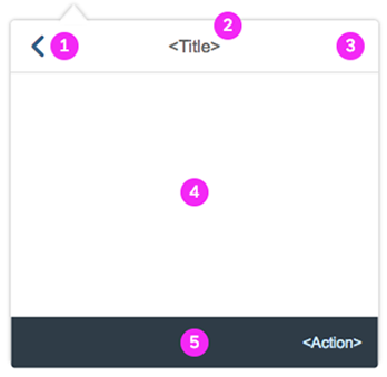
Popover – General structure
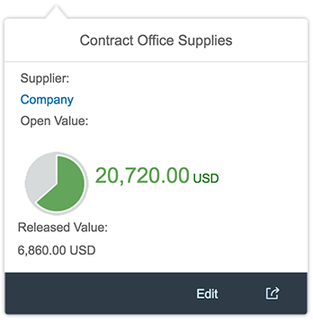
Popover – Example
Placement Types
The placement type defines how the popover will be positioned on the screen in relation to its trigger. The default placement is “Right”: the popover appears to the right of the object it relates to.
If you set the placement type to “Auto”, the position of the popover in relation to the reference control is determined automatically, depending on the available space.
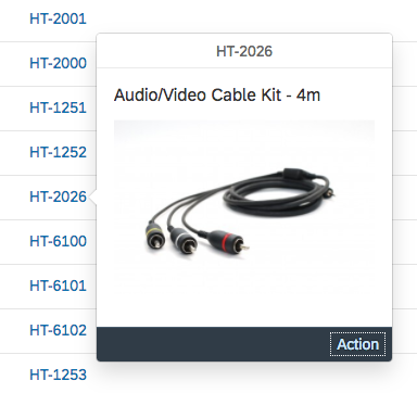
Popover with default placement type - Right
Modal Mode
The popover in modal mode opens in a modal window, which blocks the whole screen and attracts the user’s attention.
Use the modal mode only if you want to prompt the user to make a decision or confirm an action. Ensure that the user can close the popover, either by offering an action button in the footer or a Close button in the header.
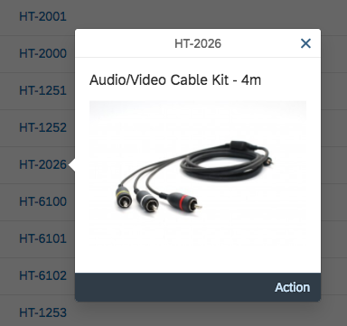
Popover – Modal
Behavior and Interaction
The user opens a popover by clicking or tapping an object represented by a text link or an icon. To improve accessibility, we recommend using texts, such as the name or ID of an object.
Closing a Popover
The popover is closed when the user clicks or taps outside the popover or selects an action within the popover.
When the popover is open over a table, and the user clicks outside the popover to close it, this can trigger unwanted drill-down navigation to a table item. Since this interaction changes the whole screen content, you can suppress drill-down navigation on tables when popovers are open on the same screen.
Guidelines
- Show status information as text fields in a content group. You can use semantic text colors.
- You can define a height for the popover. If the content exceeds the height, a scroll bar is displayed.
Resources
Want to dive deeper? Follow the links below to find out more about related controls, the SAPUI5 implementation, and the visual design.
 Your feedback has been sent to the SAP Fiori design team.