
- Latest SAPUI Version 1.124
- SAPUI5 Version 1.122
- SAPUI5 Version 1.120
- SAPUI5 Version 1.118
- SAPUI5 Version 1.116
- SAPUI5 Version 1.114
- SAPUI5 Version 1.112
- SAPUI5 Version 1.110
- SAPUI5 Version 1.108
- SAPUI5 Version 1.106
- SAPUI5 Version 1.104
- SAPUI5 Version 1.102
- SAPUI5 Version 1.100
- SAPUI5 Version 1.98
- SAPUI5 Version 1.96
- SAPUI5 Version 1.94
- SAPUI5 Version 1.92
- SAPUI5 Version 1.90
- SAPUI5 Version 1.88
- SAPUI5 Version 1.86
- SAPUI5 Version 1.84
- SAPUI5 Version 1.82
- SAPUI5 Version 1.80
- SAPUI5 Version 1.78
- SAPUI5 Version 1.76
- SAPUI5 Version 1.74
- SAPUI5 Version 1.72
- SAPUI5 Version 1.70
- SAPUI5 Version 1.68
- SAPUI5 Version 1.66
- SAPUI5 Version 1.64
- SAPUI5 Version 1.62
- SAPUI5 Version 1.58
- SAPUI5 Version 1.56
- SAPUI5 Version 1.54
- SAPUI5 Version 1.52
- SAPUI5 Version 1.50
- SAPUI5 Version 1.48
- SAPUI5 Version 1.46
- SAPUI5 Version 1.44
- SAPUI5 Version 1.42
- SAPUI5 Version 1.40
- SAPUI5 Version 1.38
- SAPUI5 Version 1.36
- SAPUI5 Version 1.34
- SAPUI5 Version 1.32
- SAPUI5 Version 1.30
- SAPUI5 Version 1.28
- SAPUI5 Version 1.26
- Latest SAPUI Version 1.124
- SAPUI5 Version 1.122
- SAPUI5 Version 1.120
- SAPUI5 Version 1.118
- SAPUI5 Version 1.116
- SAPUI5 Version 1.114
- SAPUI5 Version 1.112
- SAPUI5 Version 1.110
- SAPUI5 Version 1.108
- SAPUI5 Version 1.106
- SAPUI5 Version 1.104
- SAPUI5 Version 1.102
- SAPUI5 Version 1.100
- SAPUI5 Version 1.98
- SAPUI5 Version 1.96
- SAPUI5 Version 1.94
- SAPUI5 Version 1.92
- SAPUI5 Version 1.90
- SAPUI5 Version 1.88
- SAPUI5 Version 1.86
- SAPUI5 Version 1.84
- SAPUI5 Version 1.82
- SAPUI5 Version 1.80
- SAPUI5 Version 1.78
- SAPUI5 Version 1.76
- SAPUI5 Version 1.74
- SAPUI5 Version 1.72
- SAPUI5 Version 1.70
- SAPUI5 Version 1.68
- SAPUI5 Version 1.66
- SAPUI5 Version 1.64
- SAPUI5 Version 1.62
- SAPUI5 Version 1.60
- SAPUI5 Version 1.58
- SAPUI5 Version 1.56
- SAPUI5 Version 1.54
- SAPUI5 Version 1.52
- SAPUI5 Version 1.50
- SAPUI5 Version 1.48
- SAPUI5 Version 1.46
- SAPUI5 Version 1.44
- SAPUI5 Version 1.42
- SAPUI5 Version 1.40
- SAPUI5 Version 1.38
- SAPUI5 Version 1.36
- SAPUI5 Version 1.34
- SAPUI5 Version 1.32
- SAPUI5 Version 1.30
- SAPUI5 Version 1.28
- SAPUI5 Version 1.26
Micro Chart
sap.suite.ui.microchart.AreaMicroChart | sap.suite.ui.microchart.BulletMicroChart | sap.suite.ui.microchart.ColumnMicroChart | sap.suite.ui.microchart.ComparisonMicroChart | sap.suite.ui.microchart.DeltaMicroChart | sap.suite.ui.microchart.HarveyBallMicroChart | sap.suite.ui.microchart.LineMicroChart | sap.suite.ui.microchart.RadialMicroChart | sap.suite.ui.microchart.StackedBarMicroChart
Intro
Micro charts help you visualize a small number of data points in a small, non-interactive way. They can be embedded in tiles, SAP Smart Business drilldowns, and any SAPUI5 container (such as SAPUI5 tables).
Usage
Use the micro chart if:
- You want to provide tracking at a glance.
- You want to display changes in the data in an easy and condensed way.
Do not use the micro chart if:
- You are looking for interactive analytics. Use the analytical card instead.
- You want to display extensive data. Use the vizFrame chart instead.
Responsiveness
All micro charts are fully responsive. The size of the control adapts automatically to the size of the parent container and does not have a defined width or height.
Types
The following micro charts are currently available:


Choosing the Correct Chart Type
Charts are used to visually represent the relationships between numeric values. In order to choose the correct chart type, it’s important to define the type of relationship you want to illustrate.
Ranking
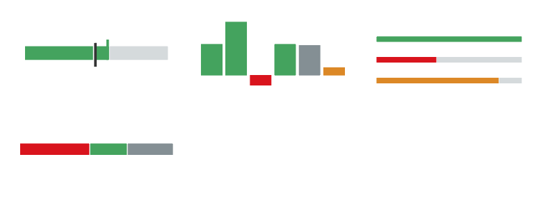
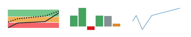
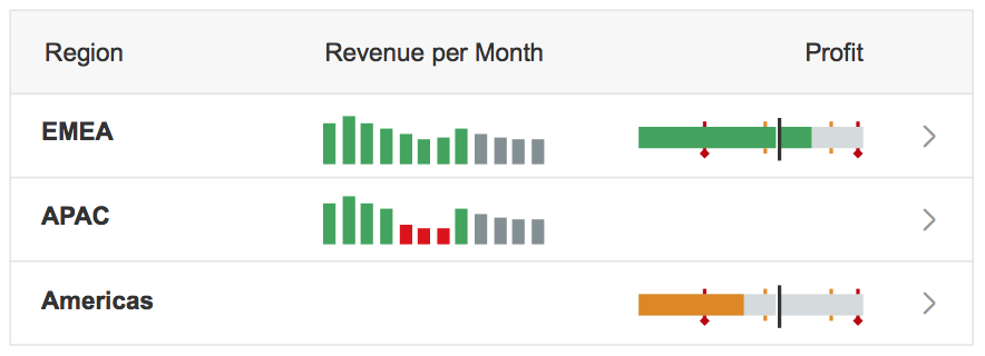
If you want to rank items from highest to lowest, or vice versa, we recommend using the comparison (bar) micro chart. For time-based categories, the column micro chart is more appropriate.

Micro charts for ranking
Comparison
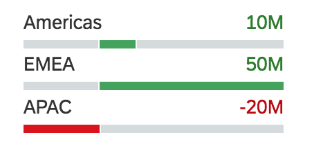
To compare items that don’t have a particular order, you can use the comparison micro chart (offering category and value labels for each part) or the column micro chart.
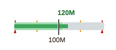
Sometimes it can also be useful to show when a certain value reaches or exceeds a reference point (for example, when an actual value is compared to a target or forecast). In such cases, use a bullet micro chart. Keep in mind that the bullet micro chart shows data points for given points in time. Do not use it to show a time series.
To compare value totals within and across different categories, you can use the stacked bar micro chart.
Micro charts for comparison
Variation over Time
By convention, time is represented horizontally from left to right which means it’s best to use the horizontal axis to represent the time in chart visualizations.
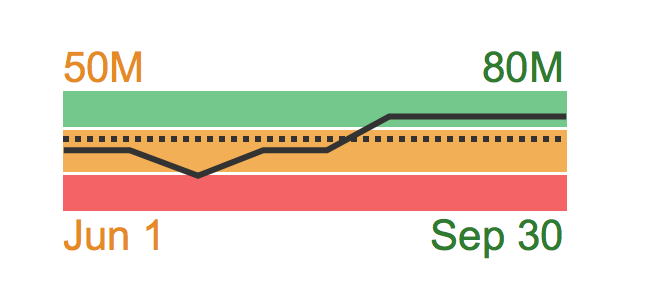
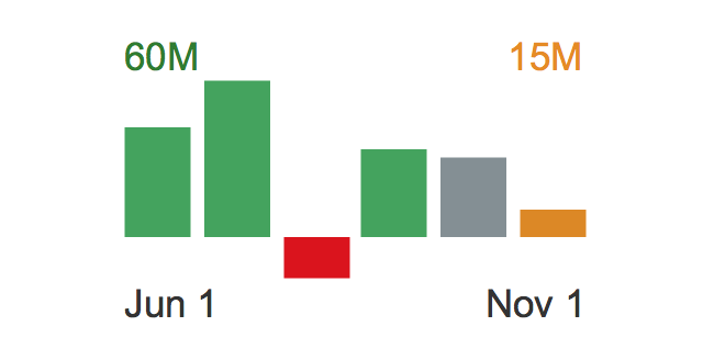
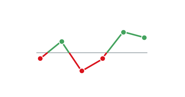
To show changes in measures over time, you can use the line micro chart, the column micro chart, and the area micro chart. The exact chart type depends on the type of change you want to visualize.
If you want to emphasize the trend over time, use the area micro chart (which provides information for actual and target values, visualized and compared to threshold areas) or the line micro chart. If you want to emphasize the values themselves, use the column micro chart.
Micro charts for variation over time
Part to Whole
You can use several chart types that depict the contribution of individual values to a whole.
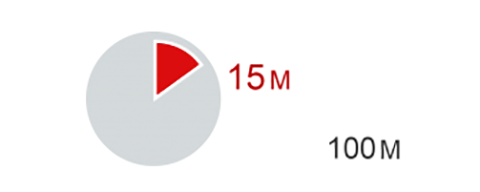
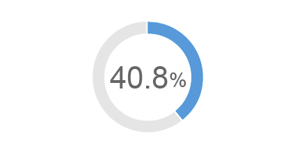
The typical chart for visualizing part of a whole is the Harvey ball micro chart. This is most suitable if you want to display a single value compared to its total. To show a single percentage value, use the radial micro chart.
The stacked bar micro chart works best for visualizing different values as part of one whole; its bars are shown next to each other. The comparison micro chart is better if you want to compare parts to each other and display category labels and value labels associated with each part.
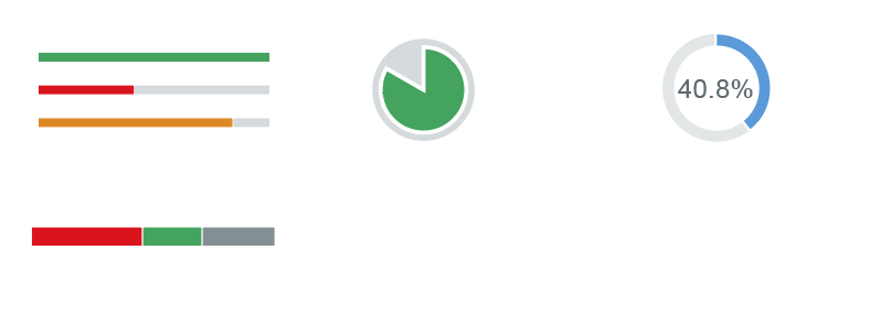
Micro charts for part to whole
Deviation
These chart types visualize the difference or variance between two values (or two sets of values).
To show a time-related deviation between sets of values, use the area micro chart (for example, to show the difference between actual expenses and target expenses), or the line micro chart.
If you want to emphasize the deviating values, use the column micro chart (suitable for showing variances), or the comparison micro chart (offering category and value labels).
The bullet micro chart shows the difference between two values (actual and target) or three values (actual, target, and forecast) at a given point in time.
The delta micro chart helps to visualize a delta value (difference) between two main key figures, which can be time-related or category-based.
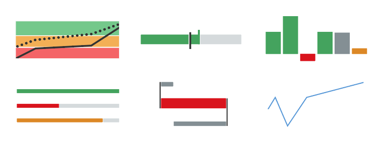
Micro charts for deviation
Distribution
To visualize how values are distributed within a set, we recommend using the column micro chart or the comparison micro chart (offering category and value labels). The stacked bar micro chart shows the distribution of values as part of a whole.
If you want to emphasize the shape of the distribution over time, use the line micro chart.
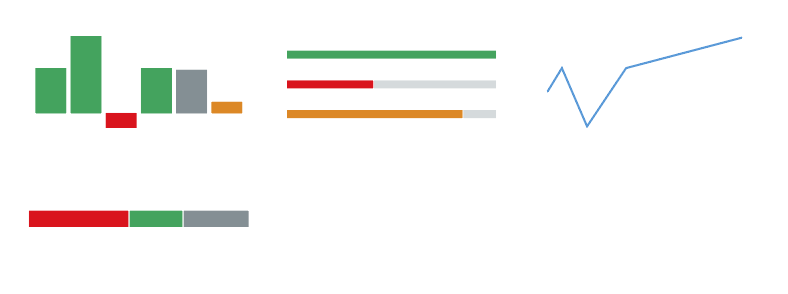
Micro charts for distribution
Behavior and Interaction
Clicking/Tapping (Optional)
The micro charts include one interaction: a click event that can be switched on or off.
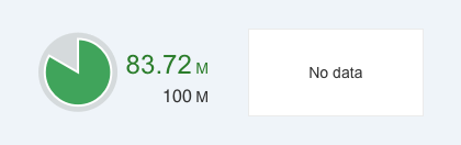
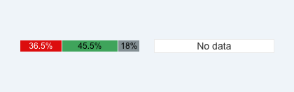
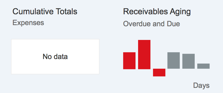
“No data” Text
When data is missing, a white rectangular placeholder with the text “No data” is shown instead of the chart. The size of the placeholder depends on the size of the chart. No labels and tooltips are shown. The “No data” placeholder can be focused, but it’s not possible to attach a click event to it.
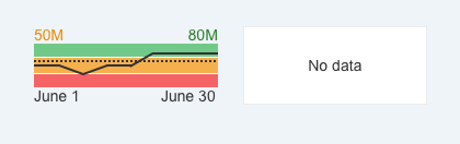
Area micro chart without data
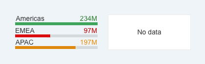
Comparison micro chart without data
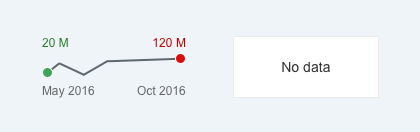
Line micro chart without data
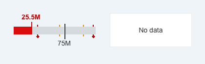
Bullet micro chart without data
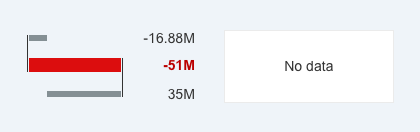
Delta micro chart without data
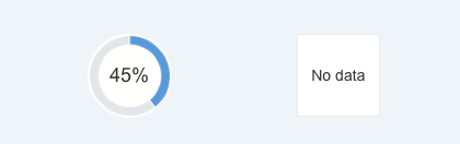
Radial micro chart without data
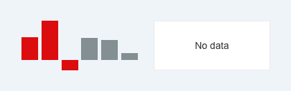
Column micro chart without data
Harvey Ball micro chart without data
Stacked bar micro chart without data
Guidelines
Truncation
Never truncate numeric labels, as this could be misleading for the user. If there is not enough space for the label, hide it.
“No data” Text
If the micro chart is placed in the cell of a table and there is no data for the chart, leave the cell blank (empty).
Micro charts without data in table cells
If the chart is used in the micro chart facet of the object page header and data is missing, make sure the footer of the facet is removed as well if it doesn’t add any value for the user.
Micro charts without data in the object page header
Resources
Want to dive deeper? Follow the links below to find out more about related controls, the SAPUI5 implementation, and the visual design.
Elements and Controls
- Color Palettes (guidelines)
- VizFrame chart Types (guidelines)
- Area Micro Chart (guidelines)
- Bullet Micro Chart (guidelines)
- Column Micro Chart (guidelines)
- Comparison Micro Chart (guidelines)
- Delta Micro Chart (guidelines)
- Harvey Ball Micro Chart (guidelines)
- Line Micro Chart (guidelines)
- Radial Micro Chart (guidelines)
- Stacked Bar Micro Chart (guidelines)
Implementation
- Area Micro Chart (SAPUI5 samples)
- Bullet Micro Chart (SAPUI5 samples)
- Column Micro Chart (SAPUI5 samples)
- Comparison Micro Chart (SAPUI5 samples)
- Delta Micro Chart (SAPUI5 samples)
- Harvey Ball Micro Chart (SAPUI5 samples)
- Line Micro Chart (SAPUI5 samples)
- Radial Micro Chart (SAPUI5 samples)
- Stacked Bar Micro Chart (SAPUI5 samples)
 Your feedback has been sent to the SAP Fiori design team.