
- Latest SAPUI5 Version 1.120
- Version 1.118
- SAPUI5 Version 1.116
- SAPUI5 Version 1.114
- SAPUI5 Version 1.112
- SAPUI5 Version 1.110
- SAPUI5 Version 1.108
- SAPUI5 Version 1.106
- SAPUI5 Version 1.104
- SAPUI5 Version 1.102
- SAPUI5 Version 1.100
- SAPUI5 Version 1.98
- SAPUI5 Version 1.96
- SAPUI5 Version 1.94
- SAPUI5 Version 1.92
- SAPUI5 Version 1.90
- SAPUI5 Version 1.88
- SAPUI5 Version 1.86
- SAPUI5 Version 1.84
- SAPUI5 Version 1.82
- SAPUI5 Version 1.80
- SAPUI5 Version 1.78
- SAPUI5 Version 1.76
- SAPUI5 Version 1.74
- SAPUI5 Version 1.72
- SAPUI5 Version 1.70
- SAPUI5 Version 1.68
- SAPUI5 Version 1.66
- SAPUI5 Version 1.64
- SAPUI5 Version 1.62
- SAPUI5 Version 1.58
- SAPUI5 Version 1.56
- SAPUI5 Version 1.54
- SAPUI5 Version 1.52
- SAPUI5 Version 1.50
- SAPUI5 Version 1.48
- SAPUI5 Version 1.46
- SAPUI5 Version 1.44
- SAPUI5 Version 1.42
- SAPUI5 Version 1.40
- SAPUI5 Version 1.38
- SAPUI5 Version 1.36
- SAPUI5 Version 1.34
- SAPUI5 Version 1.32
- SAPUI5 Version 1.30
- SAPUI5 Version 1.28
- SAPUI5 Version 1.26
- Latest SAPUI5 Version 1.120
- Version 1.118
- SAPUI5 Version 1.116
- SAPUI5 Version 1.114
- SAPUI5 Version 1.112
- SAPUI5 Version 1.110
- SAPUI5 Version 1.108
- SAPUI5 Version 1.106
- SAPUI5 Version 1.104
- SAPUI5 Version 1.102
- SAPUI5 Version 1.100
- SAPUI5 Version 1.98
- SAPUI5 Version 1.96
- SAPUI5 Version 1.94
- SAPUI5 Version 1.92
- SAPUI5 Version 1.90
- SAPUI5 Version 1.88
- SAPUI5 Version 1.86
- SAPUI5 Version 1.84
- SAPUI5 Version 1.82
- SAPUI5 Version 1.80
- SAPUI5 Version 1.78
- SAPUI5 Version 1.76
- SAPUI5 Version 1.74
- SAPUI5 Version 1.72
- SAPUI5 Version 1.70
- SAPUI5 Version 1.68
- SAPUI5 Version 1.66
- SAPUI5 Version 1.64
- SAPUI5 Version 1.62
- SAPUI5 Version 1.60
- SAPUI5 Version 1.58
- SAPUI5 Version 1.56
- SAPUI5 Version 1.54
- SAPUI5 Version 1.52
- SAPUI5 Version 1.50
- SAPUI5 Version 1.48
- SAPUI5 Version 1.46
- SAPUI5 Version 1.44
- SAPUI5 Version 1.42
- SAPUI5 Version 1.40
- SAPUI5 Version 1.38
- SAPUI5 Version 1.36
- SAPUI5 Version 1.34
- SAPUI5 Version 1.32
- SAPUI5 Version 1.30
- SAPUI5 Version 1.28
- SAPUI5 Version 1.26
Combo Box
sap.m.Combobox
Intro
The combo box control allows users to select an item from a predefined list.
The control provides an editable input field for filtering the list, and a dropdown menu with a list of the available options.
If the entries are not validated by the application, users can also enter custom values.
Usage
Use the combo box if:
- Users need to select a single item from a long list of items (minimum 13, maximum 200 entries).
- The values of the option list are secondary information and do not need to be displayed right away.
Do not use the combo box if:
- Users need to select from a list of two options, where one of the options can be implied as on and off or yes and no. Consider using a switch control instead.
- Users need to pick one item from a small set of options, such as up to 12 entries. Consider using the select control instead.
- Users need to pick one item from a large set of options, such as more than 200 entries. Consider using the input field control with a select dialog or value help dialog instead.
- You need to display more than one attribute. Consider using the input field with select dialog or value help dialog.
- Searching on multiple attributes is required. Consider using the input field with select dialog or value help dialog.
- Your use cases require that all available options should be displayed right away without any user interaction. Consider using radio buttons or a radio button group.
For more information on which selection control to choose, see the selection control overview.
Responsiveness
Size S
Size S
Size M
Size M
Size L
Size L
Also see the section on mobile handling below.
Components
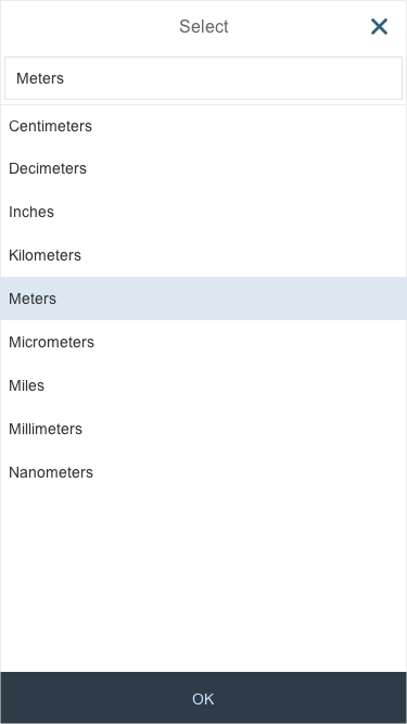
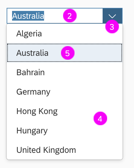
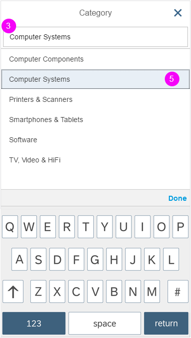
Title
A descriptive heading (1).
Input Field
The input field (2) displays the selected value. Users can type any character to filter the option list.
Dropdown Arrow
The dropdown menu’s arrow (3) collapses and expands the option list.
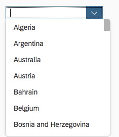
Option List
The option list (4) contains a list of values (5) that users can choose from.
Size S
Size M/L
Two-Column Layout
Use the combo box with a two-column layout if you need to display additional information for the selection options, such as currencies, country abbreviations, or system abbreviations.
Users can filter both columns simultaneously showing only matching entries.

Combo box with two-column layout
Behavior and Interaction
Select a Value
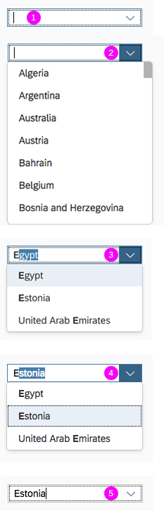
There are three ways to select an item from the list:
- Select the item directly from the dropdown list.
- Type the item into the input field.
- Use the up and down arrows to navigate the list.
Clicking the input field places the cursor in the field (1). Clicking the arrow opens the option list (2). When the user starts typing, the list is filtered accordingly. The first item that starts with the characters entered is highlighted in the list and autocompleted in the input field (3). Up/down moves the highlight in the list and populates the value in the field (4). Selecting a value closes the list of options (5).
Autocomplete
When the first few letters are typed in the input field, the control performs autocomplete to help users to easily select one item from the option list.
Choose from Option List
The option list displays all the available items the user can choose from. The selection is always highlighted. Selecting another option from the list moves the highlight to the newly selected option.
Clicking the arrow opens the option list below the field. If there is not enough space, the list is displayed above the input field.
Selecting a value
Filtering the Option List
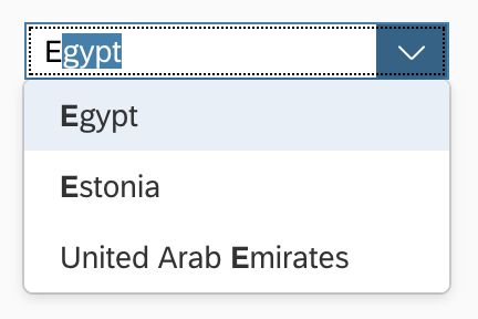
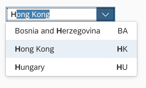
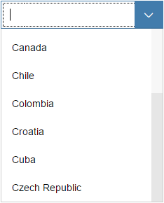
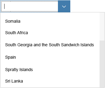
When the user starts typing in the input field, the option list is filtered. Only items that match the characters entered are shown in the dropdown list. The default filtering method is “starts with per term”, which matches the beginning of each word in an item’s text.
In addition, application developers can set a custom filtering method “starts with” or “contains” (method: setFilterFunction). The “starts with” approach filters only for items where the beginning of the label matches the query entered. The “Contains” approach searches the full label for a match.
As a visual hint for the user, the matched characters are highlighted in the option list items. The highlighting works on the basis of “starts with per term”, regardless of the filtering method.
If the filtered option list contains items that start with the characters entered by the user, the first matching, unselected item is autocompleted in the input field.
Combo box - Default filtering and autocomplete
Combo box - Default filtering in both columns and autocomplete
Auto-Resize
The width of the option list adapts to its content. The minimum width is the input field plus the dropdown arrow. The maximum width is the part of the screen furthest to the right. If the option list content requires even more width, entries become truncated.
Option list – Minimum width
Option list adapts to long entries
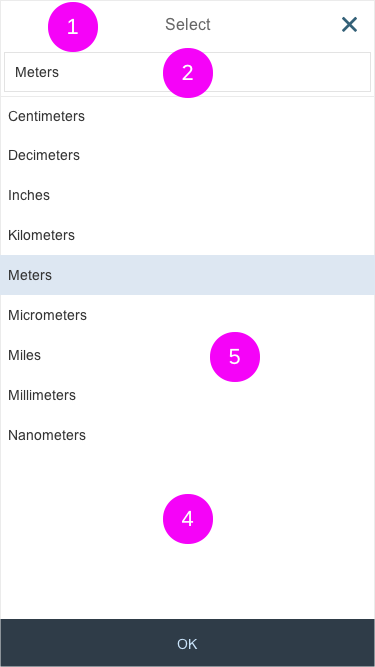
Mobile Handling
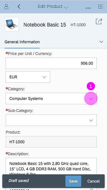
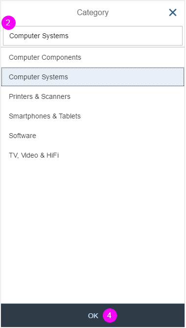
The user can enter text into the input field (supported by autocompletion). Clicking or tapping on the dropdown arrow of the combo box (1) opens in a full-screen dialog (2). The user can now modify the selected entry by tapping the input field of the combo box. The mobile keyboard is then displayed, and the user can begin to enter a new term to filter the option list, also supported by autocompletion (3). The option list closes when the user clicks or taps the OK button at the bottom of the list (4) or selects an item in the list (5).
Styles
A combo box has different styles for its different states. Here are some examples:
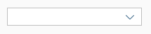
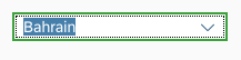
Unselected
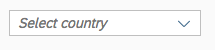
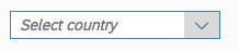
Unselected with predefined placeholder
Unselected on hover
Arrow on hover
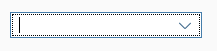
Focus
Expanded
Autocomplete
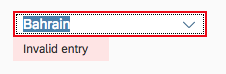
Error
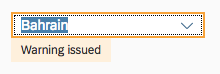
Warning
Success
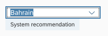
Information
For more information on how to use the different semantic states of the control, see How to Use Semantic Colors.
Guidelines
Label
The combo box control can be displayed with or without a label. If the field is attached to another field, you do not need to define a second label. For more information, see the article on how to use labels in SAP Fiori.
Placeholder
Do not use the placeholder attribute as an alternative to a label. This is important because the placeholder text is overwritten as soon as the form is filled out. Labels are necessary to indicate the meaning of the form fields when the placeholders are no longer visible. Show a placeholder only if the user needs a hint on data entry. Do not repeat the content of the label. A hint could be a sample value or a brief description of the expected format. Read more about how to use placeholders.
Option List
The option list contains text values only. Keep the text values short because the list is represented using only single lines. Values that are too long might be truncated.
If you need to express that none of the selection options are selected, show a blank input field. Define a default selection whenever possible.
Sorting
We recommend sorting options alphabetically to help users find the right option quickly. For more sorting rules, check out the guidelines for the select control.
Width
You can adjust the width of the option list to some extent.
The combo box control is usually used in forms, where the width is determined by the form element or container in which the combo box control is embedded. Therefore, we do not recommend defining a fixed width, but rather working with proper layout containers that have a defined width, such as the following properties: “form”, “simpleform”, “responsivegridlayout”, and “layoutdata” .
If you need to restrict the width to a defined value, set the width accordingly.
Keep in mind that there is no horizontal scrolling in the option list. Entries in the list that are too long become truncated and users may not be able to read them.
If localized text is not an issue, consider using a smaller width.
Unit of Measurement
You can use the layout options of the form to add the unit of measurement (UoM) after the combo box control. Apps can use the label-field ratio to show the UoM after the field. However, you must make sure that the UoM is properly visualized and doesn’t wrap to the next row.
Properties
Selection
When you select a value, there are two events:
- Change: Occurs when the text in the input field is changed and the focus leaves the input field or the user presses the Enter key.
- Selection change: Occurs when the user types something that matches an item in the list; also when the user clicks a list box item, or when navigating via keyboard.
Resources
Want to dive deeper? Follow the links below to find out more about related controls, the SAPUI5 implementation, and the visual design.
Elements and Controls
- Select (guidelines)
- Multi-Combo Box (guidelines)
- Input Field (guidelines)
- Form (guidelines)
- Radio Button (guidelines)
- Checkbox (guidelines)
- Switch (guidelines)
 Your feedback has been sent to the SAP Fiori design team.