
- Latest SAPUI Version 1.124
- SAPUI5 Version 1.122
- SAPUI5 Version 1.120
- SAPUI5 Version 1.118
- SAPUI5 Version 1.116
- SAPUI5 Version 1.114
- SAPUI5 Version 1.112
- SAPUI5 Version 1.110
- SAPUI5 Version 1.108
- SAPUI5 Version 1.106
- SAPUI5 Version 1.104
- SAPUI5 Version 1.102
- SAPUI5 Version 1.100
- SAPUI5 Version 1.98
- SAPUI5 Version 1.96
- SAPUI5 Version 1.94
- SAPUI5 Version 1.92
- SAPUI5 Version 1.90
- SAPUI5 Version 1.88
- SAPUI5 Version 1.86
- SAPUI5 Version 1.84
- SAPUI5 Version 1.82
- SAPUI5 Version 1.80
- SAPUI5 Version 1.78
- SAPUI5 Version 1.76
- SAPUI5 Version 1.74
- SAPUI5 Version 1.72
- SAPUI5 Version 1.70
- SAPUI5 Version 1.68
- SAPUI5 Version 1.66
- SAPUI5 Version 1.64
- SAPUI5 Version 1.62
- SAPUI5 Version 1.58
- SAPUI5 Version 1.56
- SAPUI5 Version 1.54
- SAPUI5 Version 1.52
- SAPUI5 Version 1.50
- SAPUI5 Version 1.48
- SAPUI5 Version 1.46
- SAPUI5 Version 1.44
- SAPUI5 Version 1.42
- SAPUI5 Version 1.40
- SAPUI5 Version 1.38
- SAPUI5 Version 1.36
- SAPUI5 Version 1.34
- SAPUI5 Version 1.32
- SAPUI5 Version 1.30
- SAPUI5 Version 1.28
- SAPUI5 Version 1.26
- Latest SAPUI Version 1.124
- SAPUI5 Version 1.122
- SAPUI5 Version 1.120
- SAPUI5 Version 1.118
- SAPUI5 Version 1.116
- SAPUI5 Version 1.114
- SAPUI5 Version 1.112
- SAPUI5 Version 1.110
- SAPUI5 Version 1.108
- SAPUI5 Version 1.106
- SAPUI5 Version 1.104
- SAPUI5 Version 1.102
- SAPUI5 Version 1.100
- SAPUI5 Version 1.98
- SAPUI5 Version 1.96
- SAPUI5 Version 1.94
- SAPUI5 Version 1.92
- SAPUI5 Version 1.90
- SAPUI5 Version 1.88
- SAPUI5 Version 1.86
- SAPUI5 Version 1.84
- SAPUI5 Version 1.82
- SAPUI5 Version 1.80
- SAPUI5 Version 1.78
- SAPUI5 Version 1.76
- SAPUI5 Version 1.74
- SAPUI5 Version 1.72
- SAPUI5 Version 1.70
- SAPUI5 Version 1.68
- SAPUI5 Version 1.66
- SAPUI5 Version 1.64
- SAPUI5 Version 1.62
- SAPUI5 Version 1.60
- SAPUI5 Version 1.58
- SAPUI5 Version 1.56
- SAPUI5 Version 1.54
- SAPUI5 Version 1.52
- SAPUI5 Version 1.50
- SAPUI5 Version 1.48
- SAPUI5 Version 1.46
- SAPUI5 Version 1.44
- SAPUI5 Version 1.42
- SAPUI5 Version 1.40
- SAPUI5 Version 1.38
- SAPUI5 Version 1.36
- SAPUI5 Version 1.34
- SAPUI5 Version 1.32
- SAPUI5 Version 1.30
- SAPUI5 Version 1.28
- SAPUI5 Version 1.26
Token
sap.m.Token | sap.m.Tokenizer
Intro
Tokens are small items of information (similar to tags) that mainly serve to visualize previously selected items. The tokenizer is the container that handles the tokens. Tokens can be added, removed, selected, or deselected.
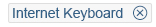
Token
Usage
Use tokens only in the multi-combo box, multi-input control, or value help dialog.
Components
The tokenizer is an invisible container that can display multiple tokens.
Tokens have the following properties:
- They usually contain single text items.
- They may also contain key-value pairs, such as John Miller (ID1234567).
- They contain a Remove icon , which is invisible if the token is in edit mode.
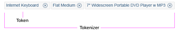
Tokens with a surrounding tokenizer
Behavior and Interaction
Interacting
Users can interact with tokens using a mouse, keyboard, and/or touch input. In size L (desktop) only, hovering with the mouse over the token produces a tooltip with the entire content of the token (on a maximum of two lines).
Selecting and Deselecting Tokens
Users can select tokens by clicking them, or by using the keyboard. The selected tokens are then indicated. Users can select multiple tokens separately by holding down the CTRL key and selecting the relevant tokens, for example, by clicking them.
The user can select a series of tokens by placing the cursor in an initial position (which can also be a token), holding down the SHIFT key, and clicking a new position. The tokens between these two cursor positions are then selected.
Adding Tokens
The user can add tokens to the multi-combo box and multi-input control. New tokens are added in the order in which they are entered.
Removing Tokens
The user can instantly remove tokens via the keyboard, or by clicking the Remove icon .
Styles
There are five different styles of tokens: regular, on hover, selected, selected on hover and read-only. These styles correspond to the type of interaction being used.

Regular
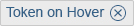
On hover

Selected
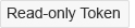
Read only

Hover selected
Guidelines
- The tokenizer can also be used as a tag container.
Resources
Want to dive deeper? Follow the links below to find out more about related controls, the SAPUI5 implementation, and the visual design.
Elements and Controls
- Multi-Combo Box (guidelines)
- Multi-Input Field (guidelines)
- Value Help Dialog (guidelines)
- Combo Box (guidelines)
 Your feedback has been sent to the SAP Fiori design team.