
- Version 1.126
- SAPUI Version 1.124
- SAPUI5 Version 1.122
- SAPUI5 Version 1.120
- SAPUI5 Version 1.118
- SAPUI5 Version 1.116
- SAPUI5 Version 1.114
- SAPUI5 Version 1.112
- SAPUI5 Version 1.110
- SAPUI5 Version 1.108
- SAPUI5 Version 1.106
- SAPUI5 Version 1.104
- SAPUI5 Version 1.102
- SAPUI5 Version 1.100
- SAPUI5 Version 1.98
- SAPUI5 Version 1.96
- SAPUI5 Version 1.94
- SAPUI5 Version 1.92
- SAPUI5 Version 1.90
- SAPUI5 Version 1.88
- SAPUI5 Version 1.86
- SAPUI5 Version 1.84
- SAPUI5 Version 1.82
- SAPUI5 Version 1.80
- SAPUI5 Version 1.78
- SAPUI5 Version 1.76
- SAPUI5 Version 1.74
- SAPUI5 Version 1.72
- SAPUI5 Version 1.70
- SAPUI5 Version 1.68
- SAPUI5 Version 1.66
- SAPUI5 Version 1.64
- SAPUI5 Version 1.62
- SAPUI5 Version 1.60
- SAPUI5 Version 1.58
- SAPUI5 Version 1.56
- SAPUI5 Version 1.54
- SAPUI5 Version 1.52
- SAPUI5 Version 1.50
- SAPUI5 Version 1.48
- SAPUI5 Version 1.46
- SAPUI5 Version 1.44
- SAPUI5 Version 1.42
- SAPUI5 Version 1.40
- SAPUI5 Version 1.38
- SAPUI5 Version 1.36
- SAPUI5 Version 1.34
- SAPUI5 Version 1.32
- SAPUI5 Version 1.30
- SAPUI5 Version 1.28
- SAPUI5 Version 1.26
- Latest Version 1.128
- Version 1.126
- SAPUI Version 1.124
- SAPUI5 Version 1.122
- SAPUI5 Version 1.120
- SAPUI5 Version 1.118
- SAPUI5 Version 1.116
- SAPUI5 Version 1.114
- SAPUI5 Version 1.112
- SAPUI5 Version 1.110
- SAPUI5 Version 1.108
- SAPUI5 Version 1.106
- SAPUI5 Version 1.104
- SAPUI5 Version 1.102
- SAPUI5 Version 1.100
- SAPUI5 Version 1.98
- SAPUI5 Version 1.96
- SAPUI5 Version 1.94
- SAPUI5 Version 1.92
- SAPUI5 Version 1.90
- SAPUI5 Version 1.88
- SAPUI5 Version 1.86
- SAPUI5 Version 1.84
- SAPUI5 Version 1.82
- SAPUI5 Version 1.80
- SAPUI5 Version 1.78
- SAPUI5 Version 1.76
- SAPUI5 Version 1.74
- SAPUI5 Version 1.72
- SAPUI5 Version 1.70
- SAPUI5 Version 1.68
- SAPUI5 Version 1.66
- SAPUI5 Version 1.64
- SAPUI5 Version 1.62
- SAPUI5 Version 1.60
- SAPUI5 Version 1.58
- SAPUI5 Version 1.56
- SAPUI5 Version 1.54
- SAPUI5 Version 1.52
- SAPUI5 Version 1.50
- SAPUI5 Version 1.48
- SAPUI5 Version 1.46
- SAPUI5 Version 1.44
- SAPUI5 Version 1.42
- SAPUI5 Version 1.40
- SAPUI5 Version 1.38
- SAPUI5 Version 1.36
- SAPUI5 Version 1.34
- SAPUI5 Version 1.32
- SAPUI5 Version 1.30
- SAPUI5 Version 1.28
- SAPUI5 Version 1.26
Infobar
sap.ui.commons.Toolbar | sap.m.sample.ToolbarActive.Toolbar | sap.m.SelectDialog
Intro
The infobar is a type of toolbar that appears above a list or panel, and shows filter or selection settings:
- Filter criteria: The infobar indicates the filter criteria that have been applied for a filter, for example on a table or list. Do not show the infobar if no filter is applied.
- Selected items: In a multi-select dialog, the infobar shows the number of selected items.
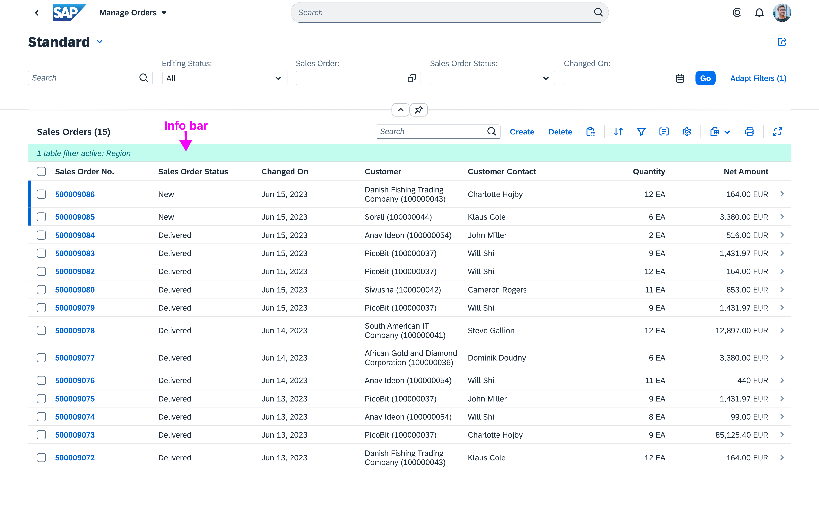
The infobar is placed above the content and shows the applied filters
Responsiveness
The bar has the same height, text size, and icon size in both cozy and compact formats. The text inside the bar is truncated if there’s not enough space.
Types
The infobar is shown in the following situations:
- After a general filter has been applied
- After the user has selected multiple items in a select dialog
General Filter
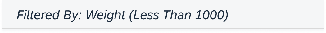
All applied filters are shown as labels in the infobar.

Infobar after a filter has been applied
Multiple Selection
If the user selects multiple items, the infobar shows the number of selected items. For more information, see select dialog.

Infobar after multiple items have been selected
Components
The infobar is a toolbar that consists of a label on the left side and an icon on the right side.
The label shows the filter criteria, and the icon selected depends on the use case.
General Filter and Multiple Selection
No icon is shown. The only exception is the Cancel icon, which is used to reset the current filter criteria. For more information, see the responsive table.
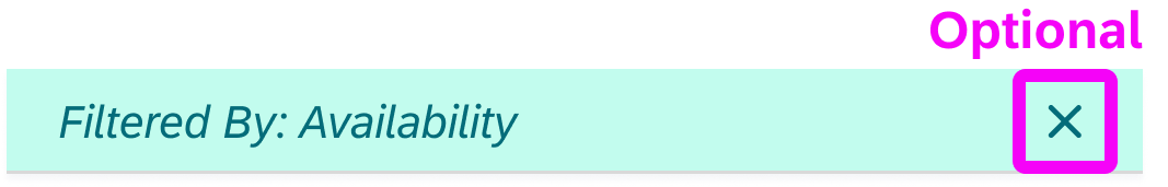
Infobar with optional 'Cancel' icon
Behavior and Interaction
The bar can have two active areas: either the entire bar can be active, or if an icon is added, it creates a second active area. We recommend that you use the active behavior for the bar and the icon.
Bar Area
When the user clicks the bar, the filter dialog from the view settings dialog is shown. If only one filter is applied, the filter can be changed directly in the detailed filter selection. If more than one filter is applied, the filter dialog shows a list with general filter categories.
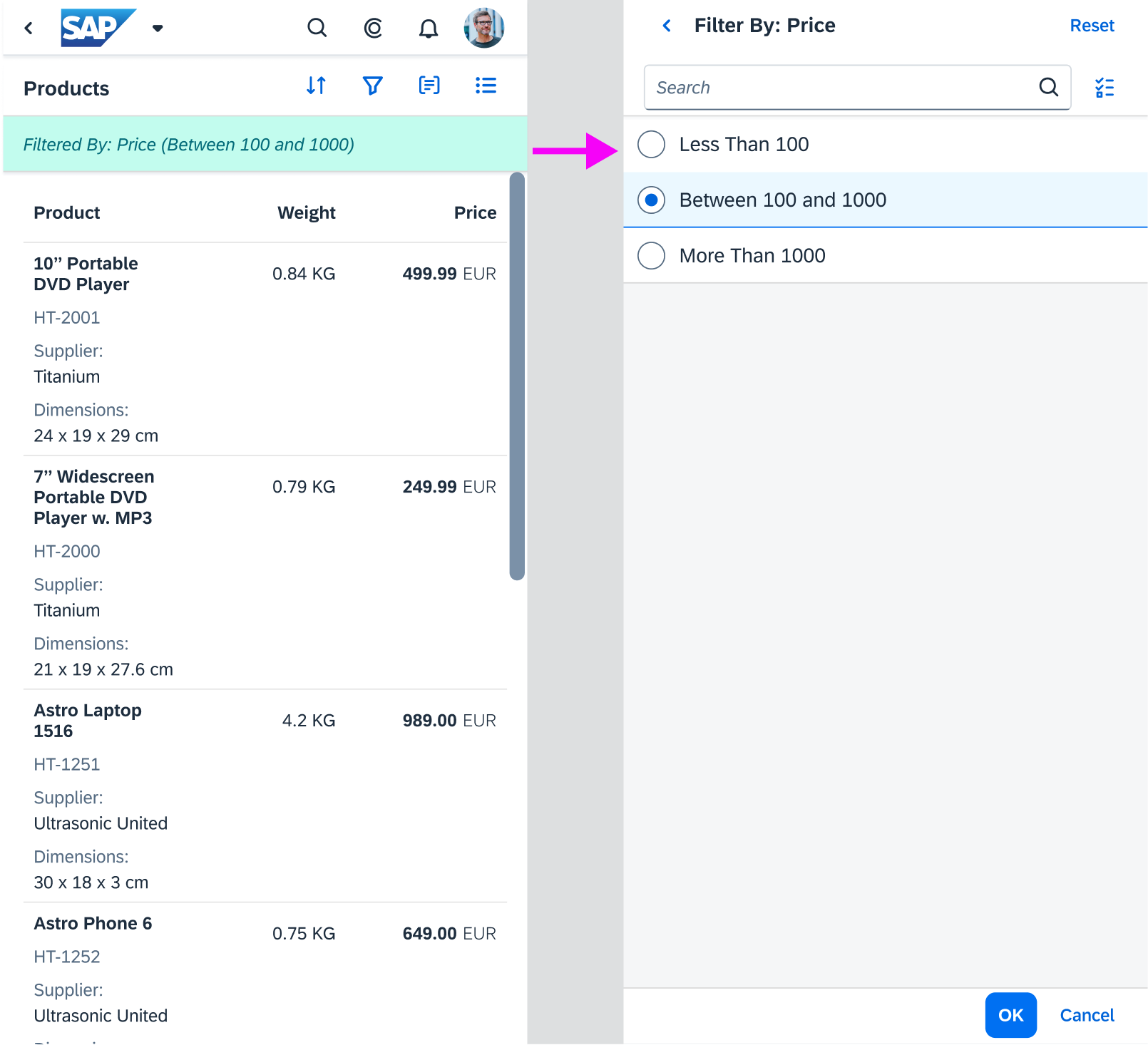
Clicking the infobar with a single filter shows the detailed filter selection
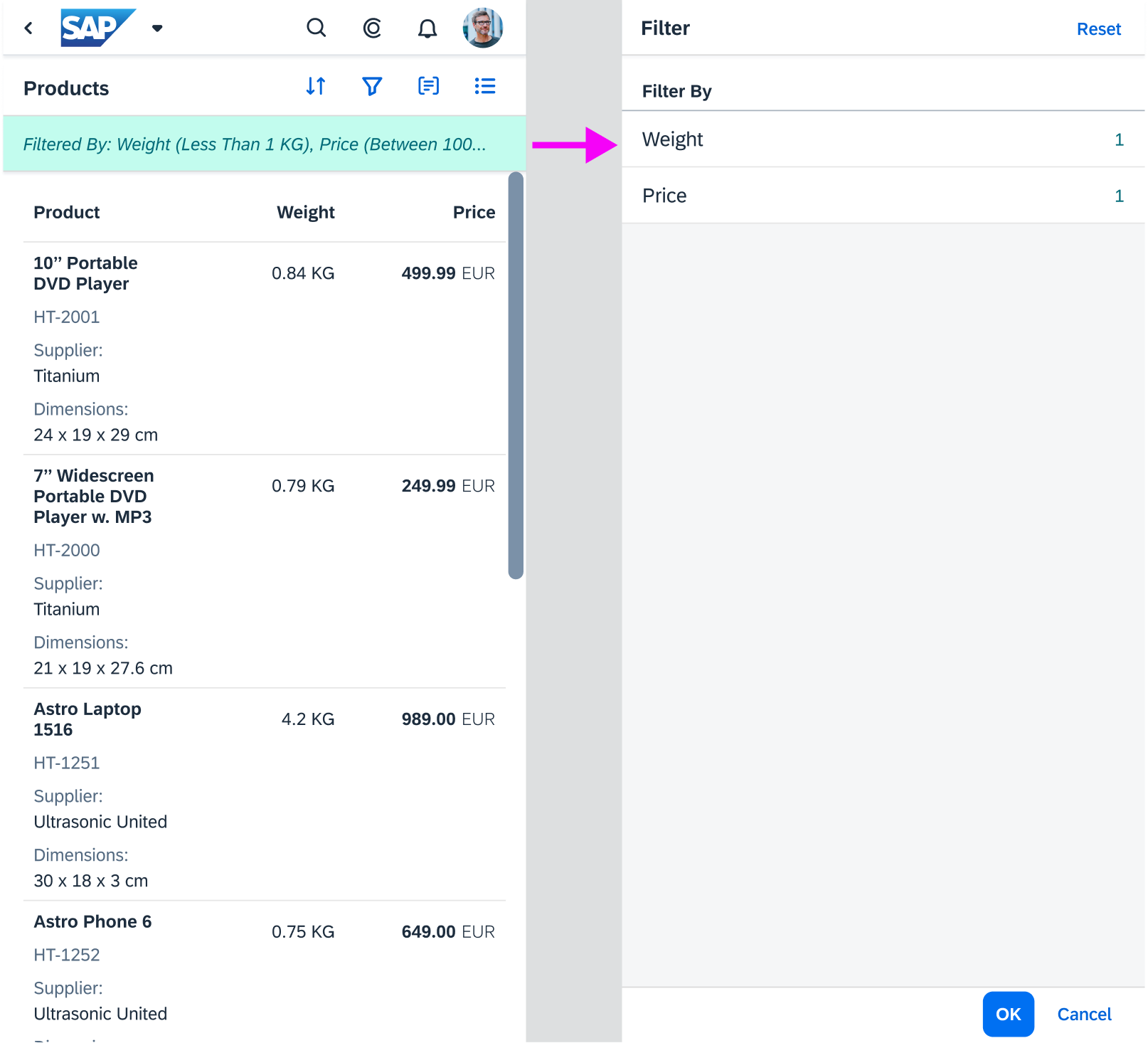
Clicking the infobar with multiple filters shows the filter categories
Icon Area
Cancel: The user clicks the icon to delete the current filter settings. We recommend using the cancel icon.
States
The infobar has two states – active and non-active (non-clickable). If set to non-active, the whole bar turns gray and the user cannot interact with it.

Infobar - Active state
Infobar - Non-active state
Properties
The infobar is not a separate control. If you want to build an infobar, you need to use the sap.m.Toolbar control.
To achieve the infobar design, set the design property of the toolbar to “info”.
Resources
Elements and Controls
- Select Dialog (guidelines)
- Toolbar (guidelines)
- View Settings Dialog (guidelines)
Implementation
- Table View Settings Dialog (SAPUI5 samples)
- Multi Select Dialog (SAPUI5 samples)
- Toolbar (SAPUI5 samples)
- Toolbar (SAPUI5 API reference)
 Your feedback has been sent to the SAP Fiori design team.