
- Latest Version 1.128
- Version 1.126
- SAPUI Version 1.124
- SAPUI5 Version 1.122
- SAPUI5 Version 1.120
- SAPUI5 Version 1.118
- SAPUI5 Version 1.116
- SAPUI5 Version 1.114
- SAPUI5 Version 1.112
- SAPUI5 Version 1.110
- SAPUI5 Version 1.108
- SAPUI5 Version 1.106
- SAPUI5 Version 1.104
- SAPUI5 Version 1.102
- SAPUI5 Version 1.100
- SAPUI5 Version 1.98
- SAPUI5 Version 1.96
- SAPUI5 Version 1.94
- SAPUI5 Version 1.92
- SAPUI5 Version 1.90
- SAPUI5 Version 1.88
- SAPUI5 Version 1.86
- SAPUI5 Version 1.84
- SAPUI5 Version 1.82
- SAPUI5 Version 1.80
- SAPUI5 Version 1.78
- SAPUI5 Version 1.76
- SAPUI5 Version 1.74
- SAPUI5 Version 1.72
- SAPUI5 Version 1.70
- SAPUI5 Version 1.68
- SAPUI5 Version 1.66
- SAPUI5 Version 1.64
- SAPUI5 Version 1.62
- SAPUI5 Version 1.60
- SAPUI5 Version 1.58
- SAPUI5 Version 1.56
- SAPUI5 Version 1.54
- SAPUI5 Version 1.52
- SAPUI5 Version 1.50
- SAPUI5 Version 1.48
- SAPUI5 Version 1.46
- SAPUI5 Version 1.44
- SAPUI5 Version 1.42
- SAPUI5 Version 1.40
- SAPUI5 Version 1.38
- SAPUI5 Version 1.36
- SAPUI5 Version 1.34
- SAPUI5 Version 1.32
- SAPUI5 Version 1.30
- SAPUI5 Version 1.28
- SAPUI5 Version 1.26
Tile
Intro
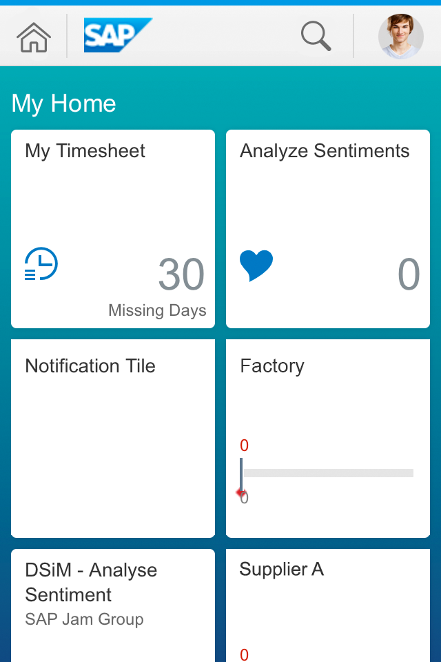
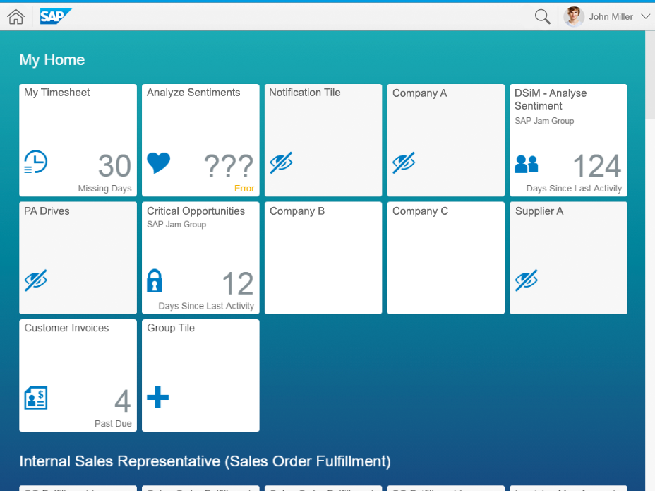
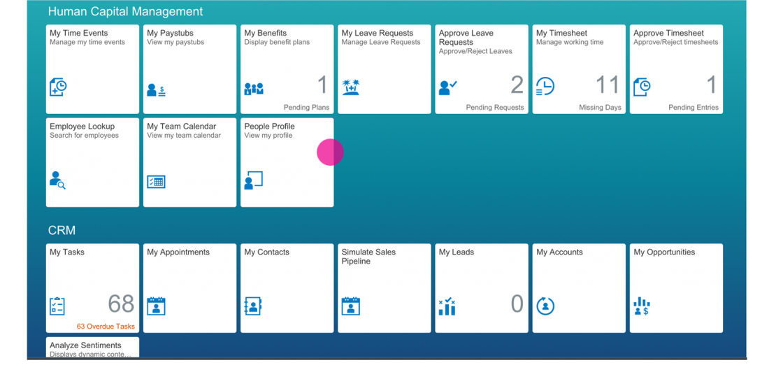
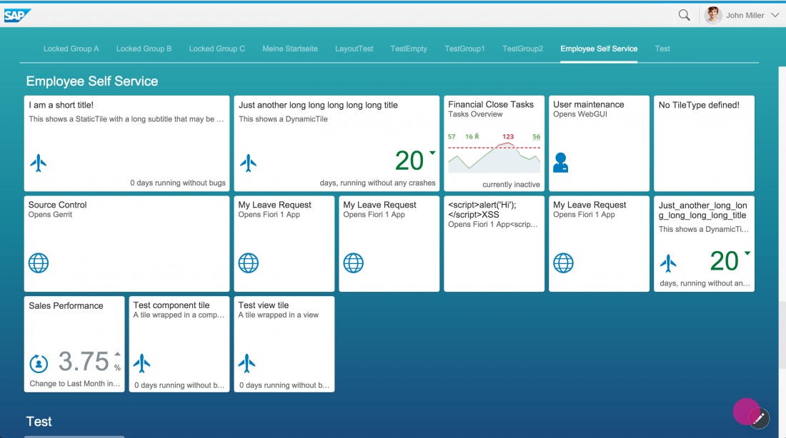
A tile is a container that represents an app on the SAP Fiori launchpad home page. All apps have at least one corresponding tile. The only exception is the fact sheet, although users also have the option of saving fact sheets as tiles.
Tiles are used for displaying and launching apps on the launchpad. Therefore, do not use them on an overview page or anywhere else.
Tiles can display different types of content. They can contain an icon, a title, an informative text, numbers, and charts. The information shown is based on data supplied by the app, such as key performance indicators (KPIs).
Users can personalize their home page by selecting the tiles for the apps they want to use from the tile catalog. The apps available in the tile catalog depend on the user’s role.
The number of visible tiles on the launchpad home page depends on the screen resolution. If the tiles in a group do not fit in one row, they are wrapped to the next row. The tiles also appear smaller on small screens.
Responsiveness
The examples below show how the tiles render for different screen sizes:
Tiles – Size S
Tiles – Size M
The tiles themselves are not responsive. The tile size is independent of the device: small screens get smaller tiles (even on a desktop device), and all larger screens (including some smartphone screens) get larger tiles.
Small tile (smartphone)
Medium tile (desktop/tablet)
Layout
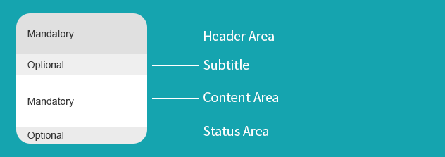
The generic tile control currently supports two tile sizes (one for size S, and one for larger screens) and two tile dimensions (1 x 1 and 2 x 1). The layout of the generic tile is fixed, with designated areas for the header, content area, and footer.
Header Area
The header area is mandatory, and contains the header and an (optional) subtitle. The header is always in the upper left corner of the tile, except on feed tiles.
Tile layout
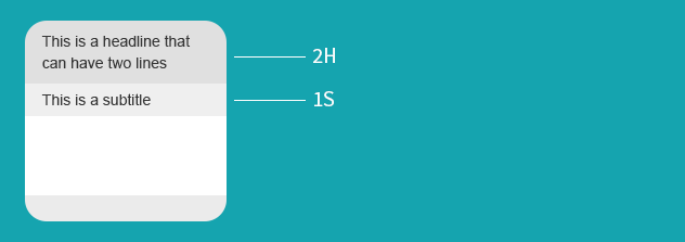
Texts in the header area:
- Mandatory header
The header can have up to two lines of text before it is truncated. - Optional subtitle
The subtitle can have one line of text before it is truncated. - Condition
A total of three lines is available for the title and subtitle (two for the header and one for the subtitle).
Tile header with header and subtitle
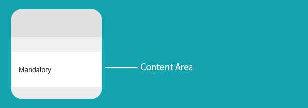
Content Area
The content area is mandatory. The content itself is defined by the apps and can comprise KPIs, charts, texts, or icons. Only show content types that are described on this page. Do not use custom icons.
Tip: If you are not showing a KPI or a chart, show an icon or number instead.
Tile content area
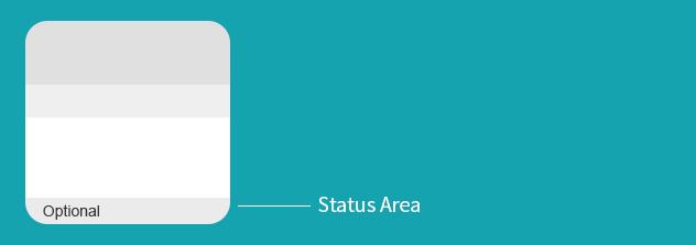
Status Area
The status area is an optional, text-only area, and cannot display any other content.
Tile status area
Types
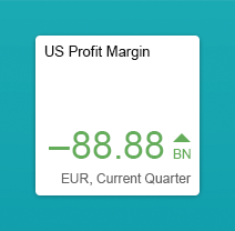
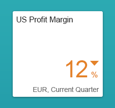
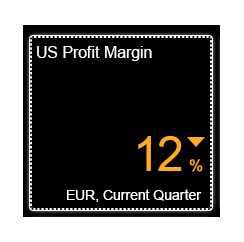
KPI Tile
Key performance indicators (KPIs) are used to measure and monitor a company’s performance at a strategic and operational level.
The tile displays the KPI values as large, easy-to-recognize digits. In addition, you can show deviation arrows, negative values, and scaling factors. You can also use semantic colors to emphasize the content. The number of digits is limited by the size of the tiles.
You can use the 2 x 1 tile to combine the content of two tiles into one. For example, you can show a KPI next to a comparison chart (as shown on the right), or use any other combination such as KPI/KPI, chart/chart, and so on. You can show different information in both the content and status areas. However, in all other respects, the 2 x 1 tile behaves as one tile – with one headline, subtitle, clickable area, and target.
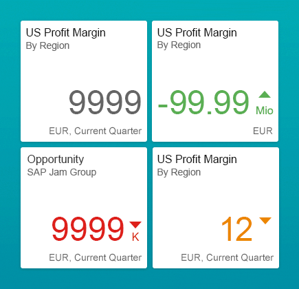
Tile with KPI
Tile with KPI (2 x 1)
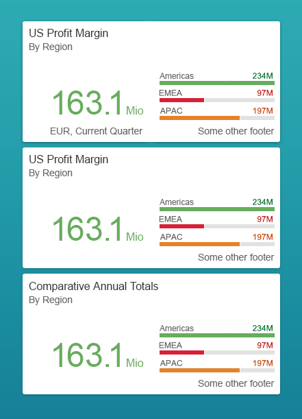
Comparison Chart (Micro Chart)
You can use bar charts to show detailed comparisons with semantic coloring for entries in a “Top N” list. You can choose between two different layouts:
- 1 x 1 tile with two or three entries
- 2 x 1 tile with up to four entries
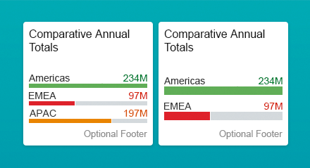
Tile with comparison chart
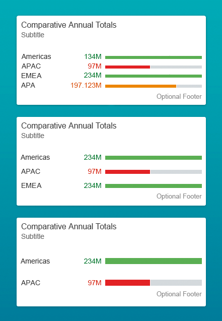
Tile with comparison chart (2 x 1)
Bullet Chart (Micro Chart)
A bullet chart is a variation of a bar chart. It compares a single, primary value to one or more target values. The primary value is shown in the context of qualitative ranges (thresholds) such as poor, satisfactory, and good.
See the image on the right for examples of different bullet charts:
- The chart on the leftfocuses on the actual value in relation to the target value and the forecast.
- The chart in the middle shows the same combination, but without the forecast.
- The chart on the right focuses on the delta between the actual value and the target value. Note that the delta visualization never shows the forecast.
All the charts show certain thresholds to give the user a sense of orientation.
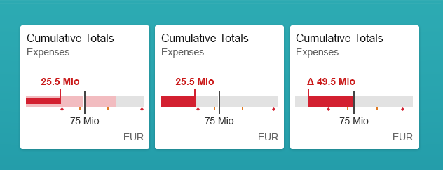
Tile with bullet chart
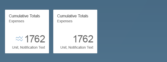
Trend Chart/Area Chart (Micro Chart)
You can use trend charts (also known as area charts) to show cumulated totals over time, based on amounts or percentages. In this example, you can see a stacked trend chart. You can also use trend charts to depict trends for related attributes.
The trend chart is similar to the plot chart, except that the area below the plotted line is colored to indicate the volume.

Tile with trend chart
Column Chart (Micro Chart)
You can use column charts (bar charts) to compare categories using vertical bars. One axis of the chart shows the specific categories, while the other axis represents a discrete value. You can also cluster multiple bars into groups within the column chart.

Tile with column chart
Basic Launch Tile
The most basic type of launch tile contains a title and an icon.
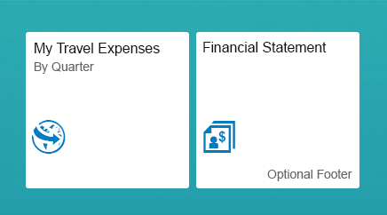
Basic launch tile
The most basic type of launch tile contains a title and an icon.
Basic launch tile
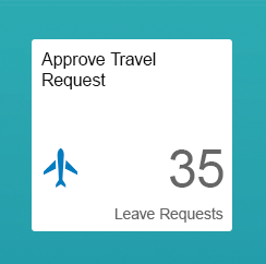
Monitoring Tile
Use the monitoring tile when you want to display status updates or an object count.
You can also apply semantic colors to the status bar to indicate a positive, negative, or critical status.
Monitoring tile
Use the monitoring tile when you want to display status updates or an object count.
You can also apply semantic colors to the status bar to indicate a positive, negative, or critical status.
Monitoring tile
SAP Jam Tile
If an organization uses SAP Jam, users can also add SAP Jam tiles to the launchpad. The SAP Jam tile shows the content of new notifications in 10-second intervals. It can scroll through up to 10 new notifications. Tile content is updated every five minutes. If there are no new notifications, the tile displays the most recent notification. If the 2 x 1 tile does not contain an icon, the headline uses the full length of the container.
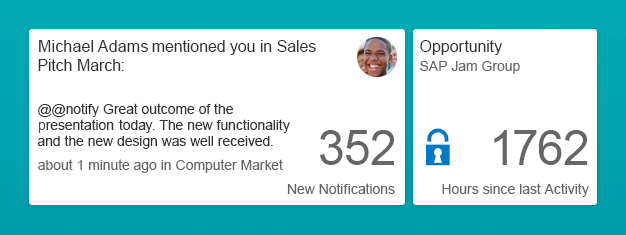
SAP Jam tile (2 x 1)
Feed Tile
The feed tile is a special tile that shows a news feed. It refreshes every three to five seconds and is twice the size of a standard tile. In addition to the news headline, it comes with a background image, the news source, and a time stamp. The feed tile flips through news messages, which are configured for the tile.

Feed/news tile (2 x 1)
Behavior and Interaction
All tiles on the SAP Fiori launchpad support one click event and one navigation target.
Open App
All tiles have one click/tap area that opens the corresponding app.
Move Tile/Access Personalization
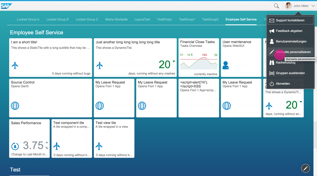
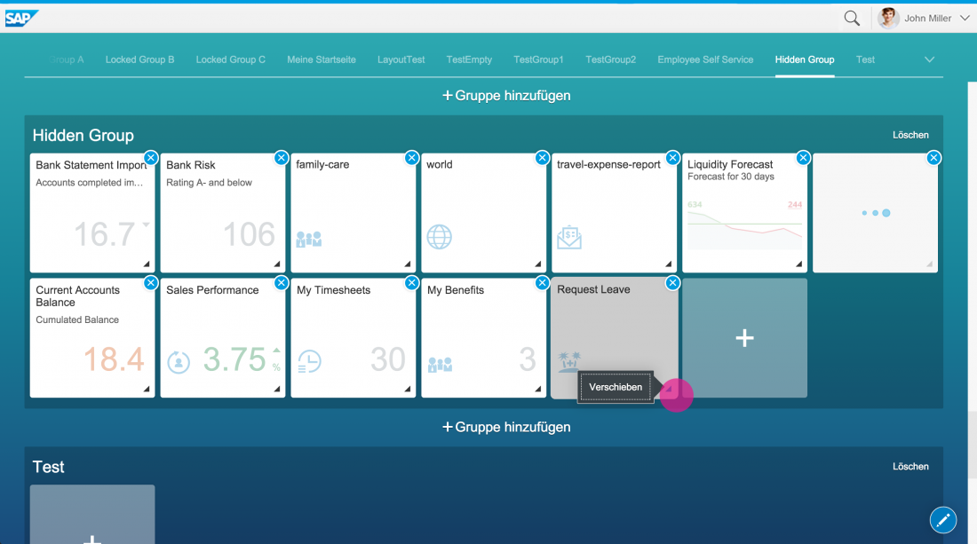
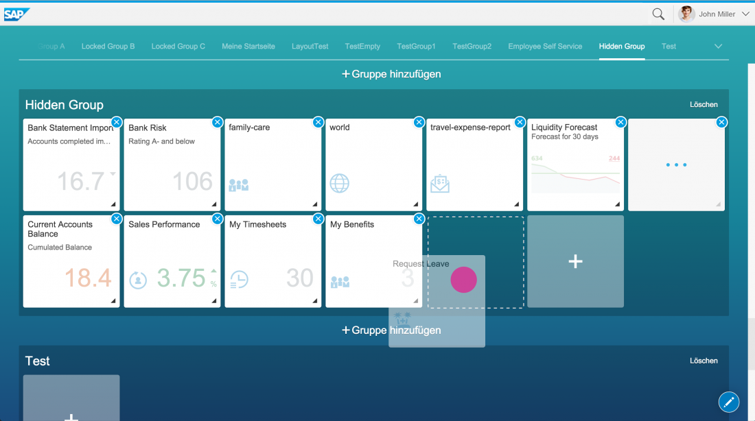
Users can customize tiles by switching to the action mode in the SAP Fiori launchpad. To activate the action mode, the user can either select Personalize Home Page in the App Settings menu, or click the pencil icon ( ) on the bottom right of the launchpad screen.
When the action mode is activated, the tile behavior changes. Clicking on a tile displays an action sheet with possible actions, such as Move and Remove. You can also drag a tile to another group.
Styles
Tile Loading
When a tile is loading, the standard loading indicator shows in the center of the tile. The tile itself is overlayed in white.
If a tile cannot be loaded, a warning icon and text appear at the bottom of the tile. Error messages should not be displayed in the status area.
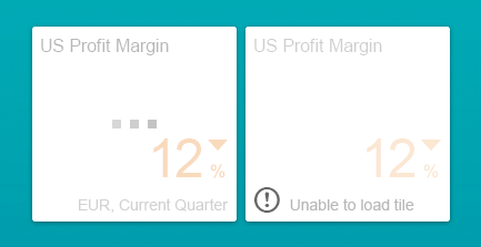
Tile loading (left) and failing to load (right)
Tile Usage Indication
The opacity of the tile background reflects how often an app has been launched during the last 30 days.
Lesser-used tiles are dimmed (reduced background opacity), while frequently-used tiles remain highlighted (higher background opacity). There are four levels of background opacity between 80 and 100%, which are assigned to tiles based on the relative usage of the underlying apps when the launchpad is loaded.
The goal of this visualization is to give users a very subtle indication of app usage, without providing a direct interaction cue.

Tile opacity indicating app usage
Default, Hover, Pressed State
A dotted line around the tile indicates that the tile is in focus.
Tile focus
The hover/down border around a tile is a solid 3 px line.
Tile hover/down
High-Contrast Black Theme (HCB)
HCB tiles offer a glare-free user interface on which visual details are reduced to the absolute minimum.
Tiles – HCB
Guidelines
Do’s
- In the content area, only show content described in this guideline. (For example, do not play videos or animations or gifs in the tiles)
- Use short tile names.
Don’ts
- Do not use the standard tile (sap.m.StandardTile) or custom tile (sap.m.CustomTile). These are deprecated.
- Do not use the status area for error messages.
- Do not use icons on KPI tiles; only use icons on basic launch tiles or monitoring tiles.
- Do not show icons if five digits or four digits and ellipsis are shown.
Resources
Want to dive deeper? Follow the links below to find out more about related controls, the SAPUI5 implementation, and the visual design.
 Your feedback has been sent to the SAP Fiori design team.