
- Latest SAPUI Version 1.124
- SAPUI5 Version 1.122
- SAPUI5 Version 1.120
- SAPUI5 Version 1.118
- SAPUI5 Version 1.116
- SAPUI5 Version 1.114
- SAPUI5 Version 1.112
- SAPUI5 Version 1.110
- SAPUI5 Version 1.108
- SAPUI5 Version 1.106
- SAPUI5 Version 1.104
- SAPUI5 Version 1.102
- SAPUI5 Version 1.100
- SAPUI5 Version 1.98
- SAPUI5 Version 1.96
- SAPUI5 Version 1.94
- SAPUI5 Version 1.92
- SAPUI5 Version 1.90
- SAPUI5 Version 1.88
- SAPUI5 Version 1.86
- SAPUI5 Version 1.84
- SAPUI5 Version 1.82
- SAPUI5 Version 1.80
- SAPUI5 Version 1.78
- SAPUI5 Version 1.76
- SAPUI5 Version 1.74
- SAPUI5 Version 1.72
- SAPUI5 Version 1.70
- SAPUI5 Version 1.68
- SAPUI5 Version 1.66
- SAPUI5 Version 1.64
- SAPUI5 Version 1.62
- SAPUI5 Version 1.60
- SAPUI5 Version 1.58
- SAPUI5 Version 1.56
- SAPUI5 Version 1.54
- SAPUI5 Version 1.52
- SAPUI5 Version 1.50
- SAPUI5 Version 1.48
- SAPUI5 Version 1.46
- SAPUI5 Version 1.44
- SAPUI5 Version 1.42
- SAPUI5 Version 1.40
- SAPUI5 Version 1.38
- SAPUI5 Version 1.36
- SAPUI5 Version 1.34
- SAPUI5 Version 1.32
- SAPUI5 Version 1.30
- SAPUI5 Version 1.28
- SAPUI5 Version 1.26
Table Toolbar
sap.m.OverflowToolbar
Intro
The table tool bar always appears at the above the table and has a transparent background. The control is used for main actions that impact the whole table. Please be aware that this toolbar scrolls away.
Our general guideline is to use only icon or text. Icon and text are not supposed to be combined into one button. Buttons are always right-aligned.
The buttons are sorted from very often used to seldom used. This ensures that important buttons go last into the overflow.
Usage
Use the table toolbar if:
- There are multiple objects on your page and you need to edit only the table.
- You want to show actions as close to their corresponding controls as possible.
- You need a title for your table.
Do not use the table toolbar if:
- You are using single selection and only one or two actions. In this case, place the actions on each line.
Responsiveness & Adaptiveness
For a responsivness use the OverflowToolbar control. It is a container based on sap.m.Toolbar, that provides overflow when its content does not fit in the visible area. A the moment only buttons can move into the overflow all other controls can shrink.
Only allow important actions to shrink and stay outside of the overflow, since truncated text on infrequently used actions is not helpful for the user. This has to be done by the application itself.
The height of the toolbar changes on desktop (compact mode), tablet, and phone (cozy mode).
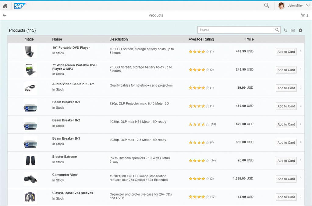
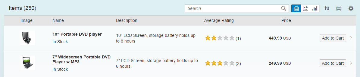
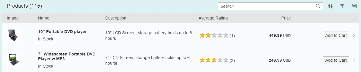
Responsive table toolbar
Responsive Table Toolbar
Components
All components of the table toolbar are optional. It can contain the following actions:
- App specific actions
- Generic actions
The following actions are generic actions:
- Title
- Variant management
- Content Switch
- Search
- Edit
- View switch
- Add
- Sort, filter, group (view settings)
- Personalize
- Overflow
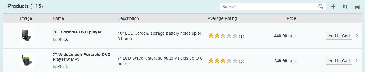
Example of possible components
Behavior & Interaction
Our general guideline is to use only icon buttons or text buttons. Icon and text should not be combined into one button. Buttons are always right-aligned.
Buttons are sorted from very often used to seldom used. This ensures that the most important buttons will go last into the overflow.
App specific Actions
If the generic actions do not work, the apps can define their own actions. Therefore, the text buttons should have a short and easily understandable text which explains what the button does. Please use a concise, specific, self-explanatory text that clearly describes the action that the button performs. Usually button text content is a single word, in most cases a verb.
It is also important to know that translated UIs may increase the length of the text by up to 200 percent.
You can put every control you want into the toolbar, but please keep in mind that only buttons can move into the overflow.
Only use icon buttons if you are sure that the user can translate the icon, because it is either standardized or the icon represents an object with a strong recognition (e.g. paper clip for attachment).
The user should know the meaning of the icon without using a tool tip.

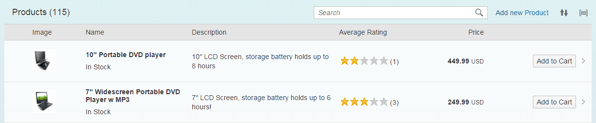
Table toolbar with app specific icon buttons
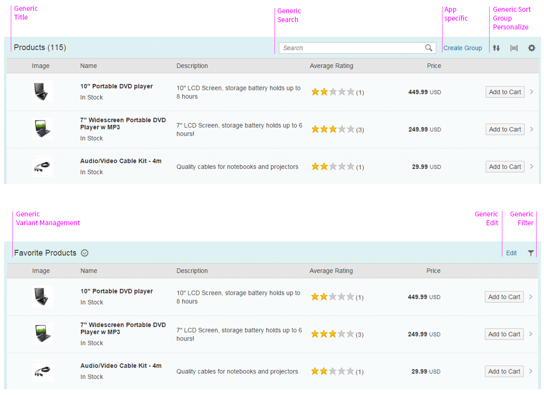
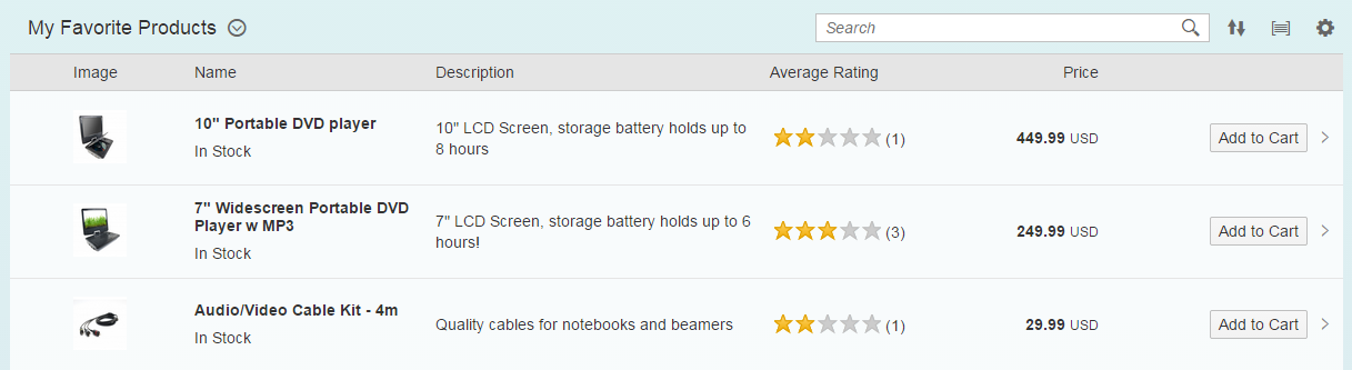
Title (Generic)
A title provides a short, meaningful summary of the content, mostly by using a single word. The title bar is a toolbar property that supports consistently-sized text and titles with the same height in cozy and compact form factors.
Consider the following when using a title:
- Use the sap.m.Title control.
- The toolbar height must be set to 3 rem.
- The title must have the label class sapMH4Fontsize.
Use a table title if you need the table toolbar, and if the title of the table is not indicated in the surrounding area. To avoid repeating text, feel free to use generic text as a table title, such as Items. Note that the title becomes truncated if there is not enough space.
Title in table toolbar
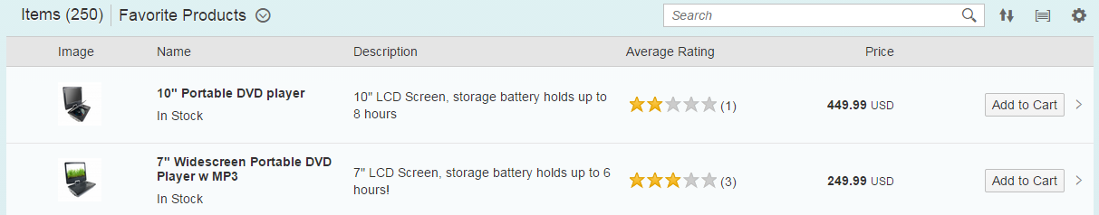
Variant Management (Generic)
Variants store settings that have been defined, for example, for layout, column visibility, sorting, and grouping. The variant management control enables the user to load, save, and change variants.
In the context of tables, the variant management control is used to save, manage, and load table settings which include layout, column visibility, sorting, and grouping.
For this, the variant management control can be used independently of the filter settings.
Always place this control in the table toolbar next to the title.
If you place the variant management control inside a toolbar, you need to apply the following styles:
- The toolbar height must be set to 3 rem.
- The title must have the class sapMH4Fontsize.
The examples below show where to place this control:
Save as variant in table toolbar
Title and Variant Management (Generic)
In exceptional cases, both the title and variant management have to be used. However, we do not recommend this because it results in a crowded toolbar and problems with responsiveness may occur. Variant management alone is generally sufficient.
The title and variant management are both left-aligned. The title is placed first, followed by a separator and the variant management.
Title with variant management
Content Switch (Generic)
Use a select control to allow users to switch between different views within a single table. The control should appear in the table toolbar (left-aligned) and allow the user to select a specific content view from a dropdown menu.
These views could be very specific. For example, All, Mine, and Others. However, you should ensure that there is no interference with the filters in the filter bar. Alternatively, the views might be made up of specific groupings or configurations, such as By X or By Y.
An alternative to the dropdown menu is the segmented button. This works only for a small number of items and should collapse into a dropdown on a smartphone.
You can also use the tab bar as a filter. The first tab can be an All tab (optional), which states the overall number and type of items, such as 14 Products. If you use the icon tab bar as a filter, we strongly recommend that you display a counter on every tab. If you need a counter, use the tab bar instead of the content switch in a table. Also use the tab bar if you need different actions for your various table views. Use the content switch instead of tabs if there are numerous table variants.
If you use a content switch, you no longer need a title. In rare exceptions, both a title and a content switch must be visible. In this case, the title and the content view are left-aligned.
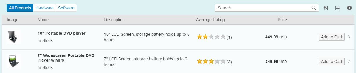
Segmented Text Button to switch content
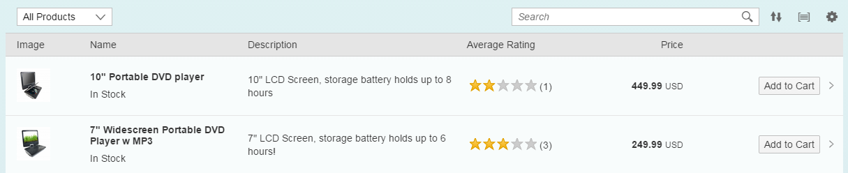
Select to switch content
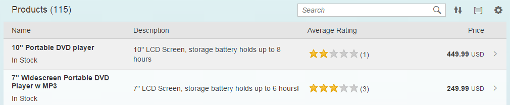
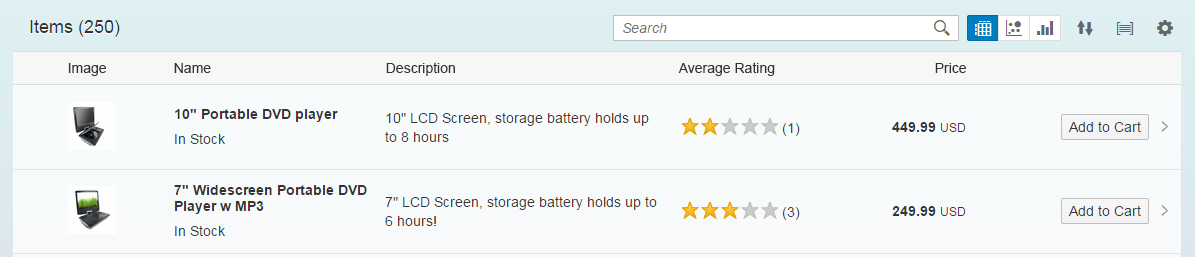
Search (Generic)
If a data set is too large for users to find items by scanning through them, we recommend that you offer a search functionality. Do not place a search function in the table toolbar if there is a filter bar above.
If you want to provide a search for your table, place it on the right side of the toolbar. Note that this control cannot be moved into the overflow menu. We therefore recommend that you define a minimum width.
For more information, see search.
Search in table toolbar
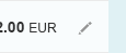
Edit (Generic)
Sometimes the user will need to edit a table. In this case, you need to decide whether the user needs to edit only single elements, or multipe elements at once.
Option 1: Editing Single Elements
To allow the user to edit a single line item on the details page, set sap.m.ListType to “detail” in the corresponding item (sap.m.ColumnListItem/sap.m.ListItemBase, property: type, value: sap.m.ListType.Detail or sap.m.ListType.DetailAndActive). This creates an Edit button at the end of the line. The user can click or tap the button to trigger the edit event. Use this event to switch the corresponding line item to edit mode.
Edit is a list item type and therefore cannot be used together with navigation or with the use of click events on the entire item (active).
Option 1: Editing an individual line
Option 2: Editing the Entire Table
To edit an entire table, use the table toolbar. The edit function is a text button. Triggering this action results in the Edit button being replaced by Save and Cancel, and the user can then make any necessary changes in the table. All actions that control the UI of the table remain visible, and all other actions are hidden.
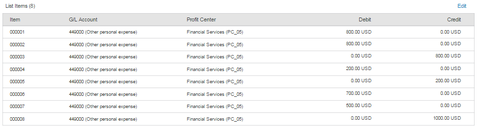
Table in view mode
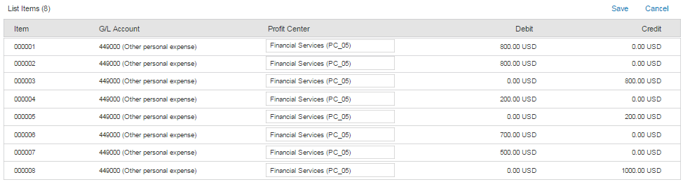
Table in edit mode
View Switch (Generic)
View switches are right-aligned in the toolbar and allow the user to switch between different chart types or table layouts. You must provide the view switch if the chart relies on subtle color differences or gradients of color. In these cases, users with visual impairments can switch to the table view.
Switches are optional and do not have to be available if there is no need to switch between different charts or tables.
The number of chart types and switches must be used with caution. Each app team must decide what kinds of chart types make sense to visualize the respective data to assist the user in the best possible way.
We do not recommend using more than three types of visualization. The sequence of chart type switches is not fixed; however, you must sort them in terms of their importance and frequency of usage.
The chart type currently in use is highlighted. For this purpose, use a segmented control with icons. For more information about the icons and the chart types they represent, see chart toolbar.
Segmented icon buttons in table toolbar
Segmented icon buttons in table toolbar
Add (Generic)
The Add item or row action can be presented by a generic icon button or a text that describes the action in more detail. Place the action as close to the content as possible.
If the Add action is a main function, the action should never be moved into the overflow.
If the app uses more than two Add actions, or if the meaning of the icon is not entirely clear, use text buttons.
Add as icon button
Add as text button
Sort, Filter, and Group (Generic)
Sort, Filter, and Group can appear in any combination or as single actions. If you use more than one of these actions, we recommend keeping them in the following order: Sort, Filter, and Group.
When the user chooses one of these actions, the view settings dialog appears. This dialog can provide any combination of these three settings, including only one setting, such as Sort.
- If sorting, filtering, and/or grouping is a common use case in your app, offer one, two, or all three of the corresponding features in one or more view settings dialogs. Do not provide these features if the table is expected to have only a small number of entries (up to 20 in most cases).
- If filtering is a main use case, do not offer filtering in the view settings dialog; use the filter bar instead.
There are two ways to trigger the view settings dialog:
- The user clicks or taps a button on the table toolbar. Offer all relevant functionality (Sort, Filter, and/or Group) in this dialog.
- The user clicks or taps one of several buttons for each of these view settings. Each button opens a view settings dialog which contains only the corresponding page.
Use one of the two options listed above based on the following guidelines:
- If sorting, filtering, and/or grouping are a secondary use case, use option 1.
- If there are several additional actions and the table toolbar becomes overloaded with buttons, use option 1.
- If sorting, filtering, and/or grouping are a primary use case, use option 2 to allow faster access to these settings.
- If screen real estate is not an issue, use option 2.
- If there is only one view setting (Sort, Filter, or Group), use option 2.
Always use only the view settings you really need. For example, do not offer grouping if it does not support your use case.
Using the view settings dialog allows you to define several Sort, Filter, and/or Group settings per column. Thus, a column with several data points can be sorted, filtered, and/or grouped independently by each data point.
Ensure a consistent user experience. When a user reopens the app, show the analytical table with the same view settings that were last defined by this user.
Option 1: One trigger for all view settings (Sort, Filter, Group)
Option 2: Several triggers for the different view settings (Sort, Filter, Group)
Option 1: One trigger for all view settings (Sort, Filter, and Group)
Option 2: Several triggers for the different view settings (Sort, Filter, and Group)
Personalization (Generic)
Use the table personalization dialog for adding, removing, and rearranging columns. The user triggers the dialog by clicking a button on the table toolbar.
Offer personalization if you need more columns than those that fit on a tablet screen (which is usually five) to fulfill 80% of your main use cases. Before you do this, try to reduce the number of columns, for example, by using several lines per column or by using the pop-in.
Ensure a consistent user experience. When a user reopens the app, show the analytical table with the same view settings (Sort, Filter, and Group settings) that were last defined by this user.
Table toolbar with personalization icon
Overflow (Generic)
The overflow should be activated either when there is not enough space for all footer bar actions or some actions are less important than others. In this case, the app decides to have certain actions only appear in the overflow.
By implementing the overflow toolbar the overflow behavior is generated automatically.
Furthermore, the app decides if some actions are so important that they should never move into the overflow.
An action sheet opens by clicking on the overflow button. In this action sheet, all text buttons are displayed without an icon and all icon buttons are labeled with text.
All buttons go from right to the left into the overflow. This ensures that the most important buttons go last into the overflow.
Everything else than a button cannot move into the overflow wave 8/1.28.
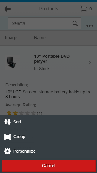
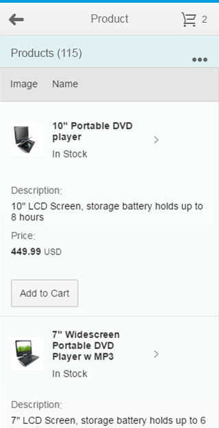
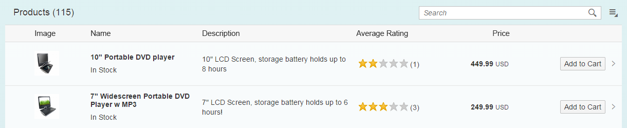
Table toolbar on phone with overflow
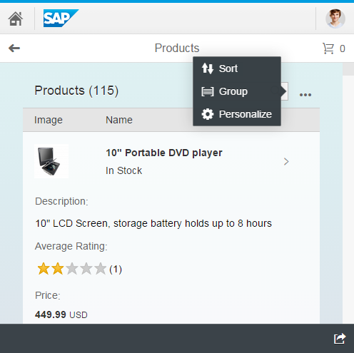
Table toolbar on desktop or tablet with overflow
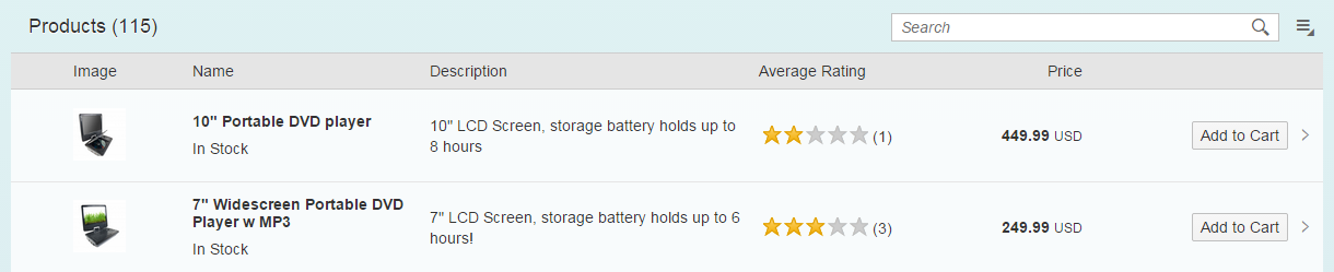
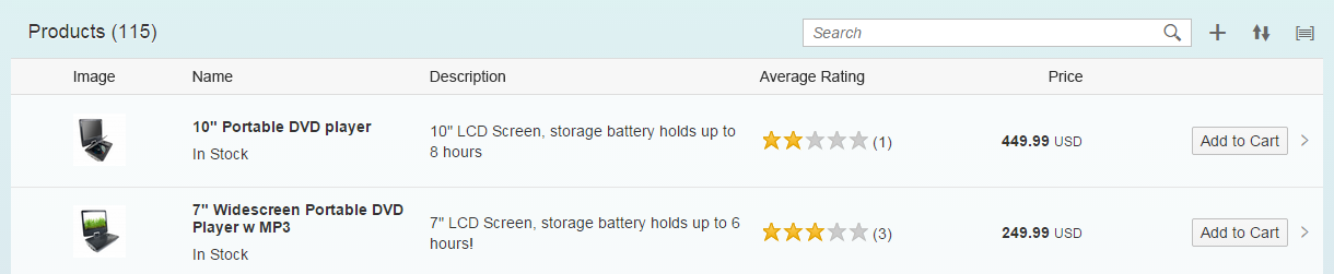
Table toolbar on desktop without overflow
Styles
The table toolbar is always transparent and and has transparent-style buttons. Do not use the accept, reject, or emphasized button styles; these are reserved for key actions in the footer toolbar. For more information, see button.
Guidelines
Please see the Guidelines section in the toolbar overview article.
Resources
Want to dive deeper? Follow the links below to find out more about related controls, the SAPUI5 implementation, and the visual design.
Implementation
- Overflow Toolbar (SAPUI5 samples)
- Action Sheet (SAPUI5 samples)
- Personalization Dialog (SAPUI5 samples)
- Toolbar (SAPUI5 samples)
- Overflow Toolbar (SAPUI5 API reference)
- Action Sheet (SAPUI5 API reference)
- Footer Toolbar (SAPUI5 API reference)
- Table Personalization Dialog (SAPUI5 API reference)
- Toolbar Separator (SAPUI5 API reference)
- Toolbar Spacer (SAPUI5 API reference)
 Your feedback has been sent to the SAP Fiori design team.