- Latest Version 1.128
- Version 1.126
- SAPUI Version 1.124
- SAPUI5 Version 1.122
- SAPUI5 Version 1.120
- SAPUI5 Version 1.118
- SAPUI5 Version 1.116
- SAPUI5 Version 1.114
- SAPUI5 Version 1.112
- SAPUI5 Version 1.110
- SAPUI5 Version 1.108
- SAPUI5 Version 1.106
- SAPUI5 Version 1.104
- SAPUI5 Version 1.102
- SAPUI5 Version 1.100
- SAPUI5 Version 1.98
- SAPUI5 Version 1.96
- SAPUI5 Version 1.94
- SAPUI5 Version 1.92
- SAPUI5 Version 1.90
- SAPUI5 Version 1.88
- SAPUI5 Version 1.86
- SAPUI5 Version 1.84
- SAPUI5 Version 1.82
- SAPUI5 Version 1.80
- SAPUI5 Version 1.78
- SAPUI5 Version 1.76
- SAPUI5 Version 1.74
- SAPUI5 Version 1.72
- SAPUI5 Version 1.70
- SAPUI5 Version 1.68
- SAPUI5 Version 1.66
- SAPUI5 Version 1.64
- SAPUI5 Version 1.62
- SAPUI5 Version 1.60
- SAPUI5 Version 1.58
- SAPUI5 Version 1.56
- SAPUI5 Version 1.54
- SAPUI5 Version 1.52
- SAPUI5 Version 1.50
- SAPUI5 Version 1.48
- SAPUI5 Version 1.46
- SAPUI5 Version 1.44
- SAPUI5 Version 1.42
- SAPUI5 Version 1.40
- SAPUI5 Version 1.38
- SAPUI5 Version 1.36
- SAPUI5 Version 1.34
- SAPUI5 Version 1.32
- SAPUI5 Version 1.30
- SAPUI5 Version 1.28
- SAPUI5 Version 1.26
Tree Table
sap.ui.table.TreeTable
Intro
Usage
Trees are used to display and work with large amounts of hierarchical data. They have a high data density and therefore convey an immediate feeling of complexity. Ideally, you should only show trees with a lot of hierarchical data as a last resort. Try the following instead:
- Break down the data into manageable chunks and allow the user to navigate or drill down between them.
- Use charts with drilldown functionality until the amount of data is more manageable.
Responsiveness
The tree table is desktop-only. It does not support touch devices and is not responsive. If using the tree table for desktop use cases, please be aware that you have to implement a fallback solution for mobile and for touch devices. This fallback solution does not need to support all use cases. Ideas for fallback solutions are:
- Use navigation to different pages instead of a tree structure. This works well for structures which are not deep (up to 4 levels).
- Remove levels until you have only one or two. Replace a one-level tree through a table, a two-level tree by a grouped table or by a split-screen layout.
- Use filtering instead of a tree structure.
You can try to create a fallback based on these ideas. Nevertheless, a completely different solution (e.g. by showing charts in a read-only case) might fit better.
Types
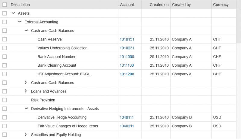
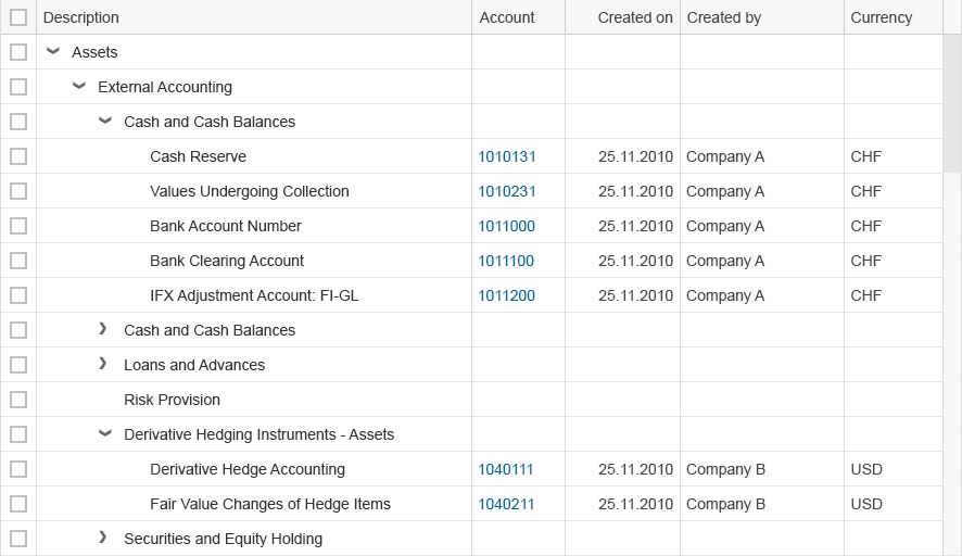
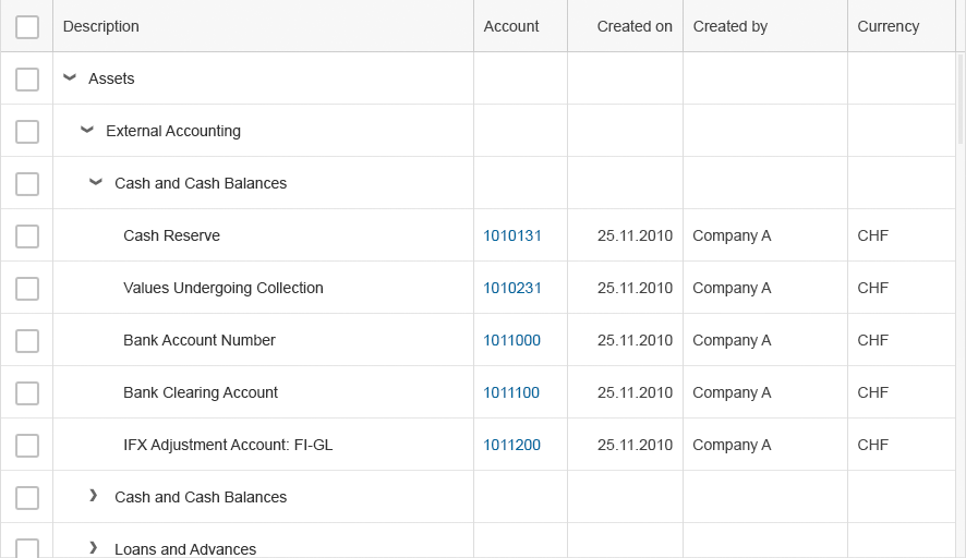
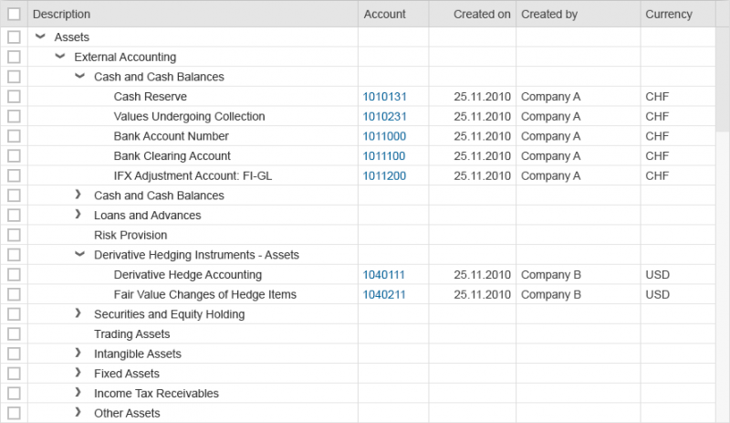
In order to display a larger amount of rows on the same screen height, use the condensed mode. It renders less white space for each item.
Please be aware that the condensed mode is not touchable. Even on a desktop with touch screen, users will have a hard time selecting rows or using controls inside the cells.
Note: The condensed mode is not available on Internet Explorer 9. When using the condensed mode, provide a fallback.
Components
Column Header
The column header provides the label for the corresponding column and access to the column header menu. The user can resize columns by dragging the separator line between two columns. Double-clicking the separator optimizes the column according to the length of the visible data and the label of the column header. Columns can be rearranged by dragging the column header to another position.
Line Item
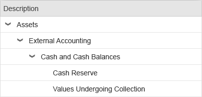
Tree Column
Expand/Collapse Button
Container Node
Leaf Node
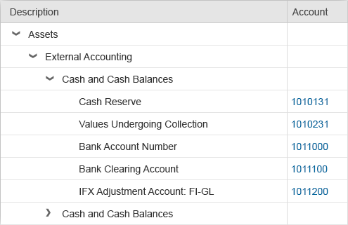
Cell
Each cell provides one data point. It can contain one of the following controls to display the data point: text, label, object status, icon, button, input, date picker, select, combo box, multi-combo box, checkbox, link, currency.
If you use text, use only single-line text to keep the same row height. Truncate if necessary as this prevents adverse side effects when scrolling vertically (sap.m.Text, property: wrapping, value: false).
Tree Cell
Column Header Menu
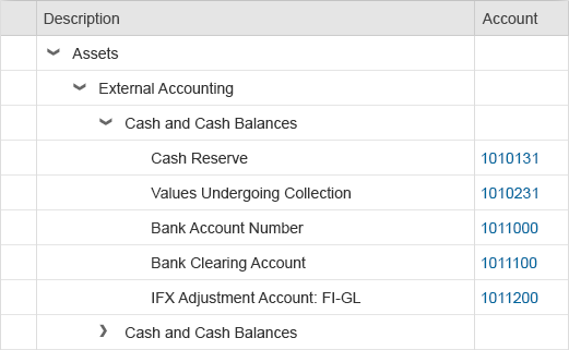
Selection Cells
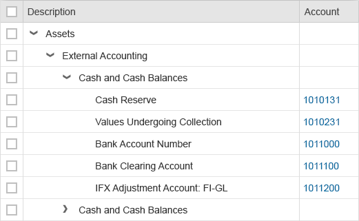
Select All
Scrollbar
The tree table allows horizontal and vertical scrolling. You can add any number of line items to the tree table, which is known as “lazy loading”.
To prevent adverse side effects when scrolling vertically, all line items must have the same height (sap.ui.table.TreeTable, property: rowHeight).
Behavior and Interaction
Selection
The tree provides the following possibilities:
Column Header Menu
Filter
The column header menu can provide a search field for entering free text. If the user enters a term in the input field and triggers the search by pressing Enter, the tree is filtered by the tree column and the corresponding value. If no items match the filter values, the filtered tree table may be empty.
Freeze Columns
Column Handling
Show/Hide Columns
Columns can be shown and hidden. If the tree column is hidden, the following column is the tree column.
Rearrange Columns
The user rearranges columns by dragging and dropping the corresponding column header. The tree column is always the first column and cannot be dragged.
Resize columns
Resizing columns works by dragging and dropping the column separator on the right side of the column.
Cell Content
The tree is traditional in that each cell can contain only one data point in one single line.
Apart from plain read-only text, cells can contain the following:
- Text
- Label
- Object status
- Icon
- Button
- Input
- Date picker
- Select
- Combo box
- Multi-combo box
- Checkbox
- Link
- Currency
If you use text, use only single-line text to keep the same row height. Truncate if necessary as this prevents adverse side effects when scrolling vertically (sap.m.Text, property: wrapping, value: false).
Guidelines
Filtering
- To filter, choose the filter bar instead of the built-in free text filter.
- Only use the free text filter if the filter bar is too heavy.
Columns
- For default delivery, reduce the number of columns to the absolute minimum. Ideally, the user should not need to scroll horizontally.
- In the first column, show the hierarchical data, which should identify the line item. Choose the name over the ID, but if both are needed, show the name first, then the ID.
- For default delivery, optimize column width for the largest data.
- Specify initial column sizes in pixels. If the column width is defined in percentages, the text becomes truncated when the browser window size is reduced. However, if you define the column width in pixels, reducing the browser window size results in a scrollbar, which is what the user expects. Note that when the user changes the column width, the width is internally calculated in pixels.
Alignment of Cell Content
Align column headers according to their cell content:
- Texts are left-aligned.
- Numbers (except for IDs), dates, and times are right-aligned.
- Single-word status information and icons are generally centered.
In addition, align amounts with currencies to the decimal point. You can do this with the sap.ui.unified.Currency control.
Note that most currencies have two digits after the decimal point, but there are exceptions, for example:
- The Tunisian dinar has three digits.
- The Japanese yen has no digits.
In tree tables with mixed currencies, all amounts still have to be aligned to the decimal point.
To enable positive and negative values to be identified more easily, position the minus sign to the right of the number. It is placed in the same position in every row.
For more information, see currency.
Formatting Cell Content
- Note that there are different locale formats, so show dates, times, and numbers in the format corresponding to the user’s language.
- If text and an ID are to be shown, show the ID in brackets after the corresponding text.
- Where possible, show the unit of measurement together with the number within the lines, and not only on the column header.
Tree vs. Table
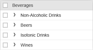
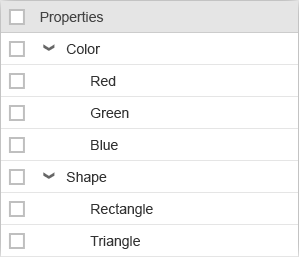
Trees are more complex than tables due to their hierarchical view. Users tend to have more problems finding items in hierarchical views than in flat lists, except where the hierarchical view is natural. By natural we mean that every child node should be part of only one parent, and this relationship between the child and parent is clear and well known.
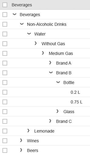
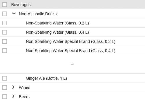
When you use trees, you should choose broad hierarchies over deep hierarchies. Deep hierarchies make finding items more complicated. So try to reduce hierarchical levels where possible, especially if the hierarchy is not natural. Ideally, a tree should have a maximum of four levels, the first two of which should contain the most important items.
You can use the following methods to reduce hierarchy levels:
- Avoid single root nodes. A single root node is often used to provide a Select All feature. Since the tree control provides an extra space for a Select All feature, the root node is not usually needed.
- When you use only two levels, choose a grouped table or grouped ALV over a tree table control. Expand all groups for the default delivery.
- Container nodes at the top level can usually be replaced by tabs or value pickers.
- Eliminate unnecessary mid-level containers, for example, by combining redundant ones.
- Exercise care when using a tree due to its overall complexity. The hierarchical structure of the data does not necessarily mean that a tree control is required.
Design Concepts
The tree table can be used to display large amounts of hierarchical data. Unfortunately, tree tables have a high data density and therefore convey an immediate feeling of complexity. Ideally, tree tables with large amounts of data should only be shown if there is no other option. You should instead try the following:
- Flatten the data. A list, table, or ALV is still complex, but less so than a tree table.
- Break down the data into manageable chunks. Allow the user to navigate or drill down between them.
- Use charts with drilldown functionality until the amount of data is more manageable.
Try to avoid horizontal scrolling in the default delivery.
Examples of Incorrect and Correct Usage
When using trees:
- Prefer breadth over depths
- Emphasize the important values. Do not let the user run into a “wall of text” without guidance. You can use bold text for this.
- Try to keep the number of columns small, especially in case of many rows.
- Optimize column width to its initial visible content. Do not automatically adapt column width based on content change.
- Maintain a fixed layout, except when the user wants to change it.
- In the default layout, use the tree column for the item name or data that identifies the row. This helps the user to choose between different items.
- Create a clear and immediately understandable hierarchy. Use clear parent-child relationships. If this is not possible, add a child in different nodes to help the user find the element.
- Avoid showing an empty tree table.
- Consider persisting the layout settings. When a user reopens the app, show the tree table with the same column sizes, column order, and view settings as last defined by this user.
- Use the Select All feature only if it makes sense. Note that selecting a lot of data also takes time and might not be appropriate for all use cases. For example, a delete operation on two million database entries might not be very helpful in many cases.
Resources
Want to dive deeper? Follow the links below to find out more about related controls, the SAPUI5 implementation, and the visual design.
Elements and Controls
- Text (guidelines)
- Label (guidelines)
- Object Status (guidelines)
- Icon (guidelines)
- Button (guidelines)
- Input (guidelines)
- Date Picker (guidelines)
- Select (guidelines)
- Combo Box (guidelines)
- Multi-Combo Box (guidelines)
- Checkbox (guidelines)
- Link (guidelines)
- Table (guidelines)
- Formatting (guidelines)
- Icon Tab Bar (guidelines)
- Filter Bar (guidelines)
- Feed List Item (guidelines)








 Your feedback has been sent to the SAP Fiori design team.