- Latest Version 1.128
- Version 1.126
- SAPUI Version 1.124
- SAPUI5 Version 1.122
- SAPUI5 Version 1.120
- SAPUI5 Version 1.118
- SAPUI5 Version 1.116
- SAPUI5 Version 1.114
- SAPUI5 Version 1.112
- SAPUI5 Version 1.110
- SAPUI5 Version 1.108
- SAPUI5 Version 1.106
- SAPUI5 Version 1.104
- SAPUI5 Version 1.102
- SAPUI5 Version 1.100
- SAPUI5 Version 1.98
- SAPUI5 Version 1.96
- SAPUI5 Version 1.94
- SAPUI5 Version 1.92
- SAPUI5 Version 1.90
- SAPUI5 Version 1.88
- SAPUI5 Version 1.86
- SAPUI5 Version 1.84
- SAPUI5 Version 1.82
- SAPUI5 Version 1.80
- SAPUI5 Version 1.78
- SAPUI5 Version 1.76
- SAPUI5 Version 1.74
- SAPUI5 Version 1.72
- SAPUI5 Version 1.70
- SAPUI5 Version 1.68
- SAPUI5 Version 1.66
- SAPUI5 Version 1.64
- SAPUI5 Version 1.62
- SAPUI5 Version 1.60
- SAPUI5 Version 1.58
- SAPUI5 Version 1.56
- SAPUI5 Version 1.54
- SAPUI5 Version 1.52
- SAPUI5 Version 1.50
- SAPUI5 Version 1.48
- SAPUI5 Version 1.44
- SAPUI5 Version 1.42
- SAPUI5 Version 1.40
- SAPUI5 Version 1.38
- SAPUI5 Version 1.36
- SAPUI5 Version 1.34
- SAPUI5 Version 1.32
- SAPUI5 Version 1.30
- SAPUI5 Version 1.28
- SAPUI5 Version 1.26
- Latest Version 1.128
- Version 1.126
- SAPUI Version 1.124
- SAPUI5 Version 1.122
- SAPUI5 Version 1.120
- SAPUI5 Version 1.118
- SAPUI5 Version 1.116
- SAPUI5 Version 1.114
- SAPUI5 Version 1.112
- SAPUI5 Version 1.110
- SAPUI5 Version 1.108
- SAPUI5 Version 1.106
- SAPUI5 Version 1.104
- SAPUI5 Version 1.102
- SAPUI5 Version 1.100
- SAPUI5 Version 1.98
- SAPUI5 Version 1.96
- SAPUI5 Version 1.94
- SAPUI5 Version 1.92
- SAPUI5 Version 1.90
- SAPUI5 Version 1.88
- SAPUI5 Version 1.86
- SAPUI5 Version 1.84
- SAPUI5 Version 1.82
- SAPUI5 Version 1.80
- SAPUI5 Version 1.78
- SAPUI5 Version 1.76
- SAPUI5 Version 1.74
- SAPUI5 Version 1.72
- SAPUI5 Version 1.70
- SAPUI5 Version 1.68
- SAPUI5 Version 1.66
- SAPUI5 Version 1.64
- SAPUI5 Version 1.62
- SAPUI5 Version 1.60
- SAPUI5 Version 1.58
- SAPUI5 Version 1.56
- SAPUI5 Version 1.54
- SAPUI5 Version 1.52
- SAPUI5 Version 1.50
- SAPUI5 Version 1.48
- SAPUI5 Version 1.46
- SAPUI5 Version 1.44
- SAPUI5 Version 1.42
- SAPUI5 Version 1.40
- SAPUI5 Version 1.38
- SAPUI5 Version 1.36
- SAPUI5 Version 1.34
- SAPUI5 Version 1.32
- SAPUI5 Version 1.30
- SAPUI5 Version 1.28
- SAPUI5 Version 1.26
Link
sap.m.Link
Intro
A link (also known as hyperlink) is a clickable text element. The link control is used for navigation, but can also trigger an event. Links are visualized to stand out from standard, non-clickable text.
Usage
Use a link if:
- The control you are using does not support other navigation options.
- You want to reference an object (for example, from a form or table).
Note: Use the quick view control to show the object details (sap.m.QuickView).
Do not use a link if:
- The link text is the key identifier of an object. In this case, use an actionable object identifier instead.
- You could use a button to trigger the action instead. If you want the button to look like a link, you can use a transparent button.
Responsiveness
A link can react to insufficient room in two different ways:
- By default, the text is truncated to fit the available screen real estate.
- If you enable wrapping, the link uses more lines instead of truncating the text (property: wrapping).
Behavior and Interaction
Triggering an Event
The purpose of a link is to trigger navigation or an event. The action is triggered when the user clicks or taps the link. For navigation links, you can specify a target to define where the linked content should open (property: target).
Hovering
When the mouse pointer is positioned over a link, the user gets additional visual feedback (underlining) to emphasize that the text is a clickable link.
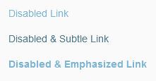
Disabled State
Styles
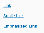
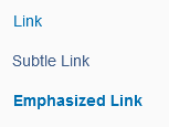
Besides the standard link visualization, there are two more styles: subtle and emphasized.
Subtle
You can use subtle links to distinguish between important and less important (subtle) links (property: subtle). This allows you to improve the visual hierarchy in large data lists.
Do not use subtle links for any other use cases.
Emphasized
If the standard link visualization is not sufficient to attract the user’s attention, you can highlight the link (property: emphasized).
Guidelines
Use a meaningful link text that indicates what will happen when the user clicks the link (for example, Open Sales Order). Avoid texts such as Click Here or Link, as these do not meet accessibility standards.
Resources
Want to dive deeper? Follow the links below to find out more about related controls, the SAPUI5 implementation, and the visual design.
Implementation
- Link (SAPUI5 samples)
- Button (SAPUI5 samples)
- Object Identifier (SAPUI5 samples)
- Link (SAPUI5 API reference)
- Button (SAPUI5 API reference)
- Object Identifier (SAPUI5 API reference)


 Your feedback has been sent to the SAP Fiori design team.