- Version 1.118
- SAPUI5 Version 1.116
- SAPUI5 Version 1.114
- SAPUI5 Version 1.112
- SAPUI5 Version 1.110
- SAPUI5 Version 1.108
- SAPUI5 Version 1.106
- SAPUI5 Version 1.104
- SAPUI5 Version 1.102
- SAPUI5 Version 1.100
- SAPUI5 Version 1.98
- SAPUI5 Version 1.96
- SAPUI5 Version 1.94
- SAPUI5 Version 1.92
- SAPUI5 Version 1.90
- SAPUI5 Version 1.88
- SAPUI5 Version 1.86
- SAPUI5 Version 1.84
- SAPUI5 Version 1.82
- SAPUI5 Version 1.80
- SAPUI5 Version 1.78
- SAPUI5 Version 1.76
- SAPUI5 Version 1.74
- SAPUI5 Version 1.72
- SAPUI5 Version 1.70
- SAPUI5 Version 1.68
- SAPUI5 Version 1.66
- SAPUI5 Version 1.64
- SAPUI5 Version 1.62
- SAPUI5 Version 1.60
- SAPUI5 Version 1.58
- SAPUI5 Version 1.56
- SAPUI5 Version 1.54
- SAPUI5 Version 1.52
- SAPUI5 Version 1.50
- SAPUI5 Version 1.48
- SAPUI5 Version 1.46
- SAPUI5 Version 1.44
- SAPUI5 Version 1.42
- SAPUI5 Version 1.40
- SAPUI5 Version 1.38
- SAPUI5 Version 1.36
- SAPUI5 Version 1.34
- SAPUI5 Version 1.32
- SAPUI5 Version 1.30
- SAPUI5 Version 1.28
- SAPUI5 Version 1.26
- Latest SAPUI5 Version 1.120
- Version 1.118
- SAPUI5 Version 1.116
- SAPUI5 Version 1.114
- SAPUI5 Version 1.112
- SAPUI5 Version 1.110
- SAPUI5 Version 1.108
- SAPUI5 Version 1.106
- SAPUI5 Version 1.104
- SAPUI5 Version 1.102
- SAPUI5 Version 1.100
- SAPUI5 Version 1.98
- SAPUI5 Version 1.96
- SAPUI5 Version 1.94
- SAPUI5 Version 1.92
- SAPUI5 Version 1.90
- SAPUI5 Version 1.88
- SAPUI5 Version 1.86
- SAPUI5 Version 1.84
- SAPUI5 Version 1.82
- SAPUI5 Version 1.80
- SAPUI5 Version 1.78
- SAPUI5 Version 1.76
- SAPUI5 Version 1.74
- SAPUI5 Version 1.72
- SAPUI5 Version 1.70
- SAPUI5 Version 1.68
- SAPUI5 Version 1.66
- SAPUI5 Version 1.64
- SAPUI5 Version 1.62
- SAPUI5 Version 1.60
- SAPUI5 Version 1.58
- SAPUI5 Version 1.56
- SAPUI5 Version 1.54
- SAPUI5 Version 1.52
- SAPUI5 Version 1.50
- SAPUI5 Version 1.48
- SAPUI5 Version 1.46
- SAPUI5 Version 1.44
- SAPUI5 Version 1.42
- SAPUI5 Version 1.40
- SAPUI5 Version 1.38
- SAPUI5 Version 1.36
- SAPUI5 Version 1.34
- SAPUI5 Version 1.32
- SAPUI5 Version 1.30
- SAPUI5 Version 1.28
- SAPUI5 Version 1.26
Link
sap.m.Link
Intro
A link (also known as hyperlink) is an interactive text element.

Different links visualizing the various link types
Usage
Use a link if:
- You want to navigate to another page.
- You want to trigger an event.
- You want to point to an object or person. If so, you can either navigate to the object’s/person’s details or display them in a quick view after the link is triggered.
Do not use a link if:
- You could use a button to trigger the action instead.
- The link text is the key identifier of an object. In this case, use an actionable object identifier instead.
-
There is no target or reference to be linked to.
Responsiveness
The link can either truncate or wrap. Favor wrapping over truncating and keep the link text as short and meaningful as possible.
For more information and guidelines on the responsive behavior of text, see Wrapping and Truncating Text.

Wrapped (first) and truncated (second) link
Types
There are four different link types:
- Default
- Emphasized
- Subtle
- Link with icon

Default, emphasized, subtle link, and link with icon
Default
Use a default link if you want to display a simple link.

Default links
Emphasized
Use an emphasized link for extraordinarily important links that need to attract the user’s attention quickly.

Emphasized links
Subtle
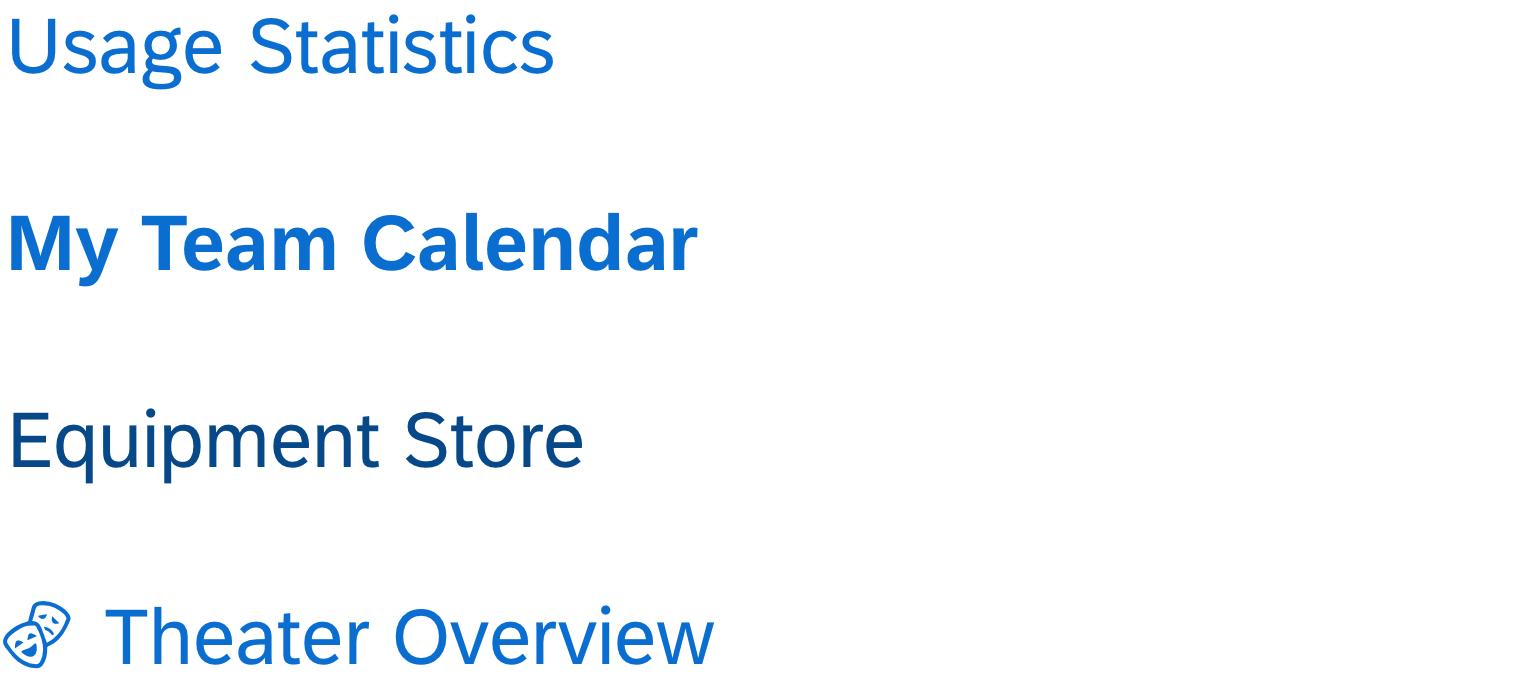
Link with Icon
Use the link with an icon when the user expects and profits from the icon in the UI context. Please note that the icon is supportive, which means that it supports the text next to it. Therefore, a tooltip is not required. Do not use the icon for additional information.

Links with icon
Behavior and Interaction
To trigger the event or navigation, the user clicks the link. It provides visual feedback for “hover” and “focused” states.
If the link cannot be triggered due to, for example, a disabled content area part, display the disabled state.

Default, hover, focused, and disabled link
Resources
Want to dive deeper? Follow the links below to find out more about related controls, the SAPUI5 implementation, and the visual design.
Elements and Controls
- Button (guidelines)
- Object Display Components (guidelines)
- Wrapping and Truncating Text (guidelines)
Implementation
- Link (SAPUI5 samples)
- Link (SAPUI5 API reference)
- Button (SAPUI5 samples)
- Button (SAPUI5 API reference)
- Object Identifier (SAPUI5 samples)
- Object Identifier (SAPUI5 API reference)


 Your feedback has been sent to the SAP Fiori design team.