
- Latest SAPUI Version 1.124
- SAPUI5 Version 1.122
- SAPUI5 Version 1.120
- SAPUI5 Version 1.118
- SAPUI5 Version 1.116
- SAPUI5 Version 1.114
- SAPUI5 Version 1.112
- SAPUI5 Version 1.110
- SAPUI5 Version 1.108
- SAPUI5 Version 1.106
- SAPUI5 Version 1.104
- SAPUI5 Version 1.102
- SAPUI5 Version 1.100
- SAPUI5 Version 1.98
- SAPUI5 Version 1.96
- SAPUI5 Version 1.94
- SAPUI5 Version 1.92
- SAPUI5 Version 1.90
- SAPUI5 Version 1.88
- SAPUI5 Version 1.86
- SAPUI5 Version 1.84
- SAPUI5 Version 1.82
- SAPUI5 Version 1.80
- SAPUI5 Version 1.78
- SAPUI5 Version 1.76
- SAPUI5 Version 1.74
- SAPUI5 Version 1.72
- SAPUI5 Version 1.70
- SAPUI5 Version 1.68
- SAPUI5 Version 1.66
- SAPUI5 Version 1.64
- SAPUI5 Version 1.62
- SAPUI5 Version 1.60
- SAPUI5 Version 1.58
- SAPUI5 Version 1.56
- SAPUI5 Version 1.54
- SAPUI5 Version 1.52
- SAPUI5 Version 1.50
- SAPUI5 Version 1.48
- SAPUI5 Version 1.44
- SAPUI5 Version 1.42
- SAPUI5 Version 1.40
- SAPUI5 Version 1.38
- SAPUI5 Version 1.36
- SAPUI5 Version 1.34
- SAPUI5 Version 1.32
- SAPUI5 Version 1.30
- SAPUI5 Version 1.28
- SAPUI5 Version 1.26
- Latest SAPUI Version 1.124
- SAPUI5 Version 1.122
- SAPUI5 Version 1.120
- SAPUI5 Version 1.118
- SAPUI5 Version 1.116
- SAPUI5 Version 1.114
- SAPUI5 Version 1.112
- SAPUI5 Version 1.110
- SAPUI5 Version 1.108
- SAPUI5 Version 1.106
- SAPUI5 Version 1.104
- SAPUI5 Version 1.102
- SAPUI5 Version 1.100
- SAPUI5 Version 1.98
- SAPUI5 Version 1.96
- SAPUI5 Version 1.94
- SAPUI5 Version 1.92
- SAPUI5 Version 1.90
- SAPUI5 Version 1.88
- SAPUI5 Version 1.86
- SAPUI5 Version 1.84
- SAPUI5 Version 1.82
- SAPUI5 Version 1.80
- SAPUI5 Version 1.78
- SAPUI5 Version 1.76
- SAPUI5 Version 1.74
- SAPUI5 Version 1.72
- SAPUI5 Version 1.70
- SAPUI5 Version 1.68
- SAPUI5 Version 1.66
- SAPUI5 Version 1.64
- SAPUI5 Version 1.62
- SAPUI5 Version 1.60
- SAPUI5 Version 1.58
- SAPUI5 Version 1.56
- SAPUI5 Version 1.54
- SAPUI5 Version 1.52
- SAPUI5 Version 1.50
- SAPUI5 Version 1.48
- SAPUI5 Version 1.46
- SAPUI5 Version 1.44
- SAPUI5 Version 1.42
- SAPUI5 Version 1.40
- SAPUI5 Version 1.38
- SAPUI5 Version 1.36
- SAPUI5 Version 1.34
- SAPUI5 Version 1.32
- SAPUI5 Version 1.30
- SAPUI5 Version 1.28
- SAPUI5 Version 1.26
Overview Page – UI Text Guidelines
Intro
Texts for the overview page include:
The sections below describe the guidelines for each of these texts.
Note: These guidelines do not cover the texts for imported elements shown on the card body, such as tables or graphics.
Basics
- Ensure that the card texts on the overview page are easy to read. Users need to grasp the information on each card at a glance.
- Be clear. If necessary, provide context for the information you are showing, such as an explanation or filter criteria.
- Be consistent. When you work on an overview page, always consider the texts for each card in the context of the overview page as a whole.
- Bear in mind that other languages may need more space.
Guidelines by Text Type
The page title appears on the launchpad tile and in the application header for the overview page itself. Where possible, use the same text for both.
Guidelines
- Use a noun-based name (for example, “Procurement Center”).
- Use title case.
- Choose a name that best fits your use case and the conventions in your business.
For example, do your users think in terms of the role, or the business area? What terms are they most familiar with? Look for a name that fits for all the cards you are including. Also consider the terms already used in your application area. - Do not use the term “Overview Page”. This is just the name of the floorplan. However, it’s OK to use “Overview” on its own.
Launchpad tile for overview page
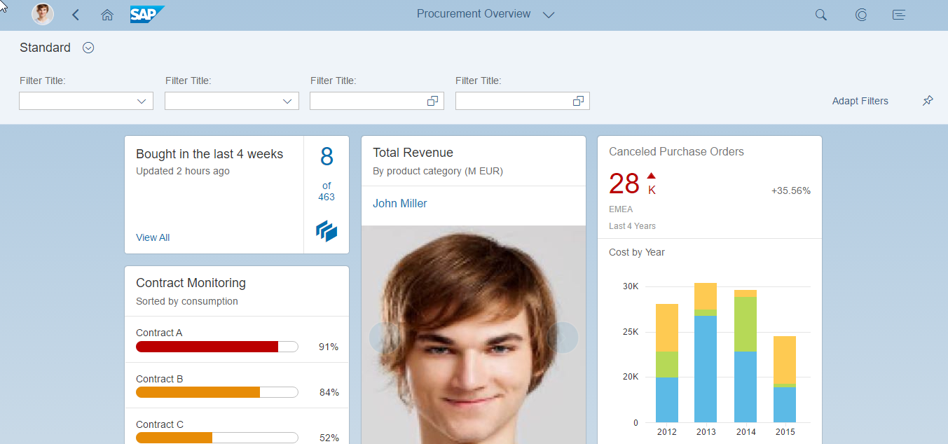
Overview page title in the launchpad shell bar
The title is the top element on all cards and is always required. The title for a stack of cards is also used as the heading for the detail view.
Guidelines
- Use title case.
- Be concise. Aim for one-line texts, which are easier to scan. If you need more space, try not to exceed 2 lines.

Concise title (eyecatcher)
- Don’t overload the title with too much information.
If the title is short, consider including qualifying information in the title.
If the title is longer, or the qualifying information is more complex, use a subtitle for the qualifier. - Recommended: Use a consistent pattern across all the cards on your overview page.

Titles can also include qualifiers - if they are not too long
The subtitle is optional. You can use it to qualify the title, offer an explanation, or show a status. The use of the subtitle can differ, depending on the card type.
Guidelines
- Use title case.
Exception: Use sentence style for longer explanations, or statuses involving time periods or numbers. - If you have a mixture of subtitles in sentence style and title case, consider changing them all to sentence style.

Subtitle with simple qualifier

Explantory subtitle (sentence style)

Subtitle with relative time period (sentence style)
- If your subtitle contains multiple qualifiers, separate them with commas.

Multiple qualifiers
- If you need to qualify amounts (unit, currency), use the following format:
(<Unit> <Currency>) - Place this information at the end of the subtitle.

Subtitle with scaling factor and currency
Actions can appear at the bottom of the quick view card.
Guidelines
The action buttons on cards follow the same text conventions as all other action buttons:
- Use title case.
- Start with a verb.
- Keep the text as short as possible.
Resources
Want to dive deeper? Follow the links below to find out more about related resources.
 Your feedback has been sent to the SAP Fiori design team.