
- SAPUI5 Version 1.122
- SAPUI5 Version 1.120
- SAPUI5 Version 1.118
- SAPUI5 Version 1.116
- SAPUI5 Version 1.114
- SAPUI5 Version 1.112
- SAPUI5 Version 1.110
- SAPUI5 Version 1.108
- SAPUI5 Version 1.106
- SAPUI5 Version 1.104
- SAPUI5 Version 1.102
- SAPUI5 Version 1.100
- SAPUI5 Version 1.98
- SAPUI5 Version 1.96
- SAPUI5 Version 1.94
- SAPUI5 Version 1.92
- SAPUI5 Version 1.90
- SAPUI5 Version 1.88
- SAPUI5 Version 1.86
- SAPUI5 Version 1.84
- SAPUI5 Version 1.82
- SAPUI5 Version 1.80
- SAPUI5 Version 1.78
- SAPUI5 Version 1.76
- SAPUI5 Version 1.74
- SAPUI5 Version 1.72
- SAPUI5 Version 1.70
- SAPUI5 Version 1.68
- SAPUI5 Version 1.66
- SAPUI5 Version 1.64
- SAPUI5 Version 1.62
- SAPUI5 Version 1.60
- SAPUI5 Version 1.58
- SAPUI5 Version 1.56
- SAPUI5 Version 1.54
- SAPUI5 Version 1.52
- SAPUI5 Version 1.50
- SAPUI5 Version 1.48
- SAPUI5 Version 1.46
- SAPUI5 Version 1.44
- SAPUI5 Version 1.42
- SAPUI5 Version 1.40
- SAPUI5 Version 1.38
- SAPUI5 Version 1.36
- SAPUI5 Version 1.34
- SAPUI5 Version 1.32
- SAPUI5 Version 1.30
- SAPUI5 Version 1.28
- SAPUI5 Version 1.26
- Latest SAPUI Version 1.124
- SAPUI5 Version 1.122
- SAPUI5 Version 1.120
- SAPUI5 Version 1.118
- SAPUI5 Version 1.116
- SAPUI5 Version 1.114
- SAPUI5 Version 1.112
- SAPUI5 Version 1.110
- SAPUI5 Version 1.108
- SAPUI5 Version 1.106
- SAPUI5 Version 1.104
- SAPUI5 Version 1.102
- SAPUI5 Version 1.100
- SAPUI5 Version 1.98
- SAPUI5 Version 1.96
- SAPUI5 Version 1.94
- SAPUI5 Version 1.92
- SAPUI5 Version 1.90
- SAPUI5 Version 1.88
- SAPUI5 Version 1.86
- SAPUI5 Version 1.84
- SAPUI5 Version 1.82
- SAPUI5 Version 1.80
- SAPUI5 Version 1.78
- SAPUI5 Version 1.76
- SAPUI5 Version 1.74
- SAPUI5 Version 1.72
- SAPUI5 Version 1.70
- SAPUI5 Version 1.68
- SAPUI5 Version 1.66
- SAPUI5 Version 1.64
- SAPUI5 Version 1.62
- SAPUI5 Version 1.60
- SAPUI5 Version 1.58
- SAPUI5 Version 1.56
- SAPUI5 Version 1.54
- SAPUI5 Version 1.52
- SAPUI5 Version 1.50
- SAPUI5 Version 1.48
- SAPUI5 Version 1.46
- SAPUI5 Version 1.44
- SAPUI5 Version 1.42
- SAPUI5 Version 1.40
- SAPUI5 Version 1.38
- SAPUI5 Version 1.36
- SAPUI5 Version 1.34
- SAPUI5 Version 1.32
- SAPUI5 Version 1.30
- SAPUI5 Version 1.28
- SAPUI5 Version 1.26
Launchpad Shell Bar
Intro
The shell bar is a universal header element that appears at the top of all screens. It provides the product or application context and offers global functions, such as search, notifications, and the user profile.

Launchpad shell bar - Home view

Launchpad shell bar - App view
Components
Mandatory
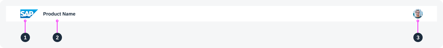
Launchpad shell bar - Mandatory components
The following components of the shell bar are mandatory:
- Logo: Visual branding elements like the SAP logo or a company logo.
Optional: Clicking the logo can navigate back to the product’s home page. - Title: Product name or application name.
Optional: The title can offer access to a navigation menu. - User profile: Provides access to user-specific settings.
Optional
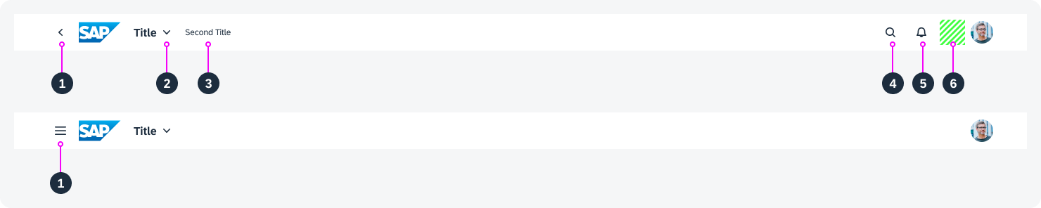
Launchpad shell bar - Optional components
The following elements of the shell bar are optional
- Back or side navigation button:
- Back: Allows back navigation.
- Side navigation button: Opens and closes a vertical navigation menu.
- Menu: Option to display a menu when clicking the title.
- Second title: Provides additional information on the context, such as the tenant name or scope.
- Search
- Notifications
- Container for additional shell bar actions
Back and Branding Area
When an app is launched, the Back icon is displayed next to the branding element.
Back navigates to the previously visited screens. The branding element takes the user directly to the home page.
The branding area usually shows the company logo, as defined by the administrator. The branding area cannot be left out.
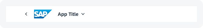
Shell bar with 'Back' button and branding area
Title and Navigation Menu
Title
The title inside the shell always indicates the user’s position in the system. The navigation menu is a quick way to browse the hierarchical structure of applications.
For the home page, the title is Home. In the app finder, it changes to App Finder.
In the initial screen of an application, the title is usually the application name, such as Manage Products. This name must match the app name used on the launchpad tile.
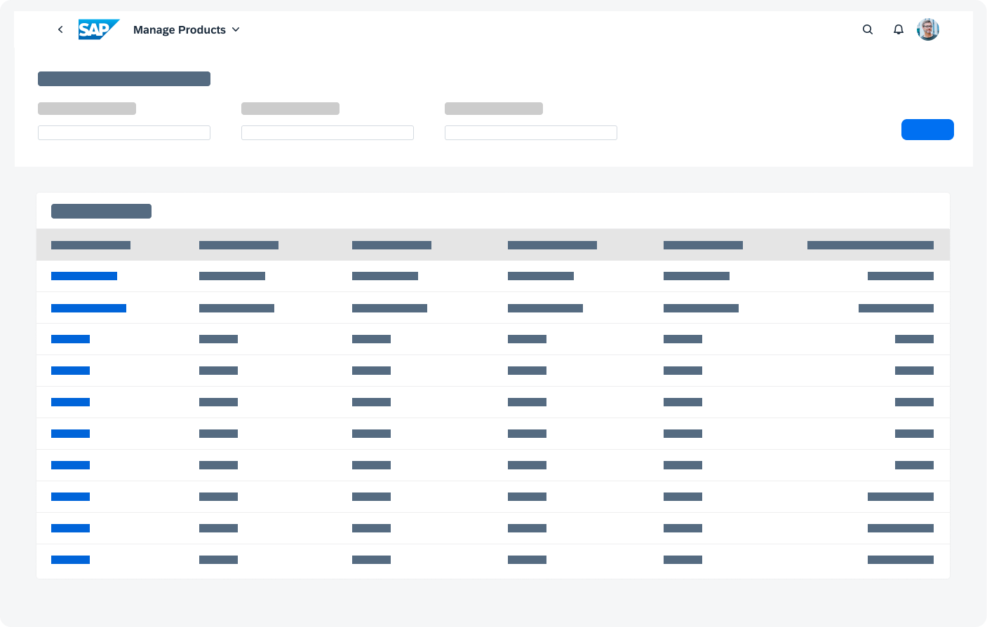
Initial page of an application - Page title is the app name
Exception: Flexible Column Layout
In the flexible column layout, the shell bar displays the application name. The title only changes when the user switches to full screen mode or navigates. On size S, the title changes when the user navigates between the different panels.
Navigation Menu
Clicking the title in the shell bar opens the dropdown navigation menu. The height of the container depends on its content.
To close the menu again, users can click the page title, the dropdown arrow, or anywhere outside the navigation menu.
This interaction applies for all device types.
Navigation Hierarchy
The navigation menu displays the navigation path that led to the current page within an application. The current hierarchy level is represented by the page name only. Selecting a navigation entry opens the respective page in-place.
The menu only shows hierarchy levels within the current application, and there is only one entry per hierarchy level.
The entry page of an app always displays as “Home”, and is the first entry. Drill-in navigation adds further hierarchical entries to the navigation menu. If a user navigates to an app using a deep link, the navigation menu also shows the hierarchy levels for the previous app.
The entries are ordered according to the hierarchy, starting with Home, down to the current hierarchy level (= page name). Each entry consists of a title, subtitle, and icon.
All My Apps
All My Apps lists the main applications assigned to a user’s role. These include apps from the home page group and the app finder (catalog).
Enterprise Search
The Search icon for the enterprise search is on the top right, to the very left of the group. You can use it to search across all apps and business objects, such as materials, customers, and maintenance plans. Users can access the search function from any screen within the SAP Fiori launchpad.
Optional Actions
In addition to the buttons for the enterprise search and notifications, key users or administrators can add more actions to the shell bar. The optional actions are placed to the right of the search button. If an action is placed in the shell bar, it is no longer available in the user actions menu.
Since actions in the shell bar are very prominent, we only recommend placing additional actions in the shell bar if users need to access them frequently.
User Actions Menu Button
Clicking the profile picture opens the user actions menu. If no profile picture is set, a default icon is displayed.
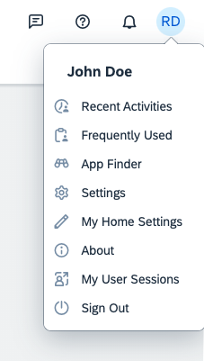
Shell bar - User actions menu
Responsiveness
The launchpad shell bar is fully responsive.
On size S, the search and notifications are displayed behind the overflow menu icon.

Shell bar - Size XXL ( >=1920)

Shell bar - Size M, L, XL (600-1919px)

Shell bar - Size S
Lean Mode
The user can right-click a tile and choose Open Link in New Tab or Open Link in New Window from the context menu. In these cases, the app opens in lean mode, and its shell only shows contextual services for the app.
The lean mode was introduced to avoid inconsistent behavior when working with different tabs or windows in parallel, and to improve performance.
The following services do not appear in lean mode:
- Shell: Home, Enterprise Search, Notifications
- Navigation Menu: Related Apps, All My Apps, Home (from navigation hierarchy)
- User Actions Menu: Settings, App Finder, Recent Activities, Frequently Used
 Your feedback has been sent to the SAP Fiori design team.