
- Latest SAPUI Version 1.124
- SAPUI5 Version 1.122
- SAPUI5 Version 1.120
- SAPUI5 Version 1.118
- SAPUI5 Version 1.116
- SAPUI5 Version 1.114
- SAPUI5 Version 1.112
- SAPUI5 Version 1.110
- SAPUI5 Version 1.108
- SAPUI5 Version 1.106
- SAPUI5 Version 1.104
- SAPUI5 Version 1.102
- SAPUI5 Version 1.100
- SAPUI5 Version 1.98
- SAPUI5 Version 1.96
- SAPUI5 Version 1.94
- SAPUI5 Version 1.92
- SAPUI5 Version 1.90
- SAPUI5 Version 1.88
- SAPUI5 Version 1.86
- SAPUI5 Version 1.84
- SAPUI5 Version 1.82
- SAPUI5 Version 1.80
- SAPUI5 Version 1.78
- SAPUI5 Version 1.76
- SAPUI5 Version 1.74
- SAPUI5 Version 1.72
- SAPUI5 Version 1.70
- SAPUI5 Version 1.68
- SAPUI5 Version 1.66
- SAPUI5 Version 1.64
- SAPUI5 Version 1.62
- SAPUI5 Version 1.60
- SAPUI5 Version 1.58
- SAPUI5 Version 1.56
- SAPUI5 Version 1.52
- SAPUI5 Version 1.50
- SAPUI5 Version 1.48
- SAPUI5 Version 1.46
- SAPUI5 Version 1.44
- SAPUI5 Version 1.42
- SAPUI5 Version 1.40
- SAPUI5 Version 1.38
- SAPUI5 Version 1.36
- SAPUI5 Version 1.34
- SAPUI5 Version 1.32
- SAPUI5 Version 1.30
- SAPUI5 Version 1.28
- SAPUI5 Version 1.26
- Latest SAPUI Version 1.124
- SAPUI5 Version 1.122
- SAPUI5 Version 1.120
- SAPUI5 Version 1.118
- SAPUI5 Version 1.116
- SAPUI5 Version 1.114
- SAPUI5 Version 1.112
- SAPUI5 Version 1.110
- SAPUI5 Version 1.108
- SAPUI5 Version 1.106
- SAPUI5 Version 1.104
- SAPUI5 Version 1.102
- SAPUI5 Version 1.100
- SAPUI5 Version 1.98
- SAPUI5 Version 1.96
- SAPUI5 Version 1.94
- SAPUI5 Version 1.92
- SAPUI5 Version 1.90
- SAPUI5 Version 1.88
- SAPUI5 Version 1.86
- SAPUI5 Version 1.84
- SAPUI5 Version 1.82
- SAPUI5 Version 1.80
- SAPUI5 Version 1.78
- SAPUI5 Version 1.76
- SAPUI5 Version 1.74
- SAPUI5 Version 1.72
- SAPUI5 Version 1.70
- SAPUI5 Version 1.68
- SAPUI5 Version 1.66
- SAPUI5 Version 1.64
- SAPUI5 Version 1.62
- SAPUI5 Version 1.60
- SAPUI5 Version 1.58
- SAPUI5 Version 1.56
- SAPUI5 Version 1.54
- SAPUI5 Version 1.52
- SAPUI5 Version 1.50
- SAPUI5 Version 1.48
- SAPUI5 Version 1.46
- SAPUI5 Version 1.44
- SAPUI5 Version 1.42
- SAPUI5 Version 1.40
- SAPUI5 Version 1.38
- SAPUI5 Version 1.36
- SAPUI5 Version 1.34
- SAPUI5 Version 1.32
- SAPUI5 Version 1.30
- SAPUI5 Version 1.28
- SAPUI5 Version 1.26
Chart – Correlation
Intro
This article explains how to visualize the relationship between two or three sets of numerical values, and how these values relate to each other.
Scatter charts and bubble charts are the most frequently used charts to visualize a correlation, although using a line chart or bar chart side-by-side is also an acceptable solution.
Two Datasets
The scatter plot is the most efficient chart to show the correlation between two sets of numerical values. The chart below illustrates the correlation between age and income.
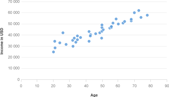
Correlation with a scatter plot
You can also group all the data points in ranges and display one average value per range, as illustrated below.
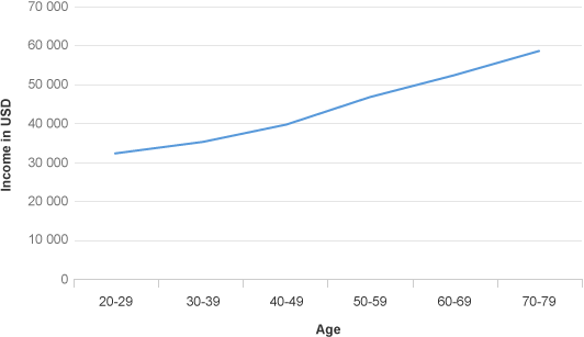
Correlation with a line chart
Few Items
When you have a small number of items, you can display the datasets in two sets of bars. This allows you to display the item name just once. Both sets of bars should be sorted by the first set or the second set to make the relationship easily visible by comparing the two shapes.
In the chart below, we can easily see that there is a direct correlation between Revenue and Margin, although ‘Servers’ is an outlier.

Correlation between 2 sets of values in bar chart
Three Datasets
You can use a bubble chart to show the correlation between three sets of numerical values. One set can be displayed in the horizontal axis, another set can be displayed in the vertical axis, and the third set can be represented by the size of the bubbles.
It’s difficult to precisely compare the size of bubbles. Therefore, it’s better to only use the Bubble chart when you want people to grasp a rough approximation of the values represented by the size of the bubbles.
The bubble chart below shows how the probability of the sales opportunty relates to the estimated close date and the expected revenue which is represented by the size of the bubble. In this context, the sales opportunity bubble usually begins in the bottom right quadrant, and moves to the top left quadrant of the chart over time.
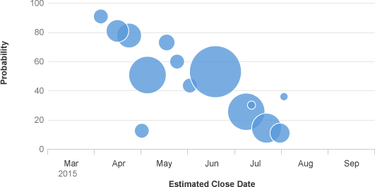
Correlation with a bubble chart
Resources
Want to dive deeper? Follow the links below to find out more about related controls, the SAPUI5 implementation, and the visual design.
Implementation
- Scatter Chart (SAPUI5 samples)
- Bubble Chart (SAPUI5 samples)
- Line Chart (SAPUI5 samples)
- Bar Chart (SAPUI5 samples)
 Your feedback has been sent to the SAP Fiori design team.