
- Latest SAPUI Version 1.124
- SAPUI5 Version 1.122
- SAPUI5 Version 1.120
- SAPUI5 Version 1.118
- SAPUI5 Version 1.116
- SAPUI5 Version 1.114
- SAPUI5 Version 1.112
- SAPUI5 Version 1.110
- SAPUI5 Version 1.108
- SAPUI5 Version 1.106
- SAPUI5 Version 1.104
- SAPUI5 Version 1.102
- SAPUI5 Version 1.100
- SAPUI5 Version 1.98
- SAPUI5 Version 1.96
- SAPUI5 Version 1.94
- SAPUI5 Version 1.92
- SAPUI5 Version 1.90
- SAPUI5 Version 1.88
- SAPUI5 Version 1.86
- SAPUI5 Version 1.84
- SAPUI5 Version 1.82
- SAPUI5 Version 1.80
- SAPUI5 Version 1.78
- SAPUI5 Version 1.76
- SAPUI5 Version 1.74
- SAPUI5 Version 1.72
- SAPUI5 Version 1.70
- SAPUI5 Version 1.68
- SAPUI5 Version 1.66
- SAPUI5 Version 1.64
- SAPUI5 Version 1.62
- SAPUI5 Version 1.58
- SAPUI5 Version 1.56
- SAPUI5 Version 1.54
- SAPUI5 Version 1.52
- SAPUI5 Version 1.50
- SAPUI5 Version 1.48
- SAPUI5 Version 1.46
- SAPUI5 Version 1.44
- SAPUI5 Version 1.42
- SAPUI5 Version 1.40
- SAPUI5 Version 1.38
- SAPUI5 Version 1.36
- SAPUI5 Version 1.34
- SAPUI5 Version 1.32
- SAPUI5 Version 1.30
- SAPUI5 Version 1.28
- SAPUI5 Version 1.26
- Latest SAPUI Version 1.124
- SAPUI5 Version 1.122
- SAPUI5 Version 1.120
- SAPUI5 Version 1.118
- SAPUI5 Version 1.116
- SAPUI5 Version 1.114
- SAPUI5 Version 1.112
- SAPUI5 Version 1.110
- SAPUI5 Version 1.108
- SAPUI5 Version 1.106
- SAPUI5 Version 1.104
- SAPUI5 Version 1.102
- SAPUI5 Version 1.100
- SAPUI5 Version 1.98
- SAPUI5 Version 1.96
- SAPUI5 Version 1.94
- SAPUI5 Version 1.92
- SAPUI5 Version 1.90
- SAPUI5 Version 1.88
- SAPUI5 Version 1.86
- SAPUI5 Version 1.84
- SAPUI5 Version 1.82
- SAPUI5 Version 1.80
- SAPUI5 Version 1.78
- SAPUI5 Version 1.76
- SAPUI5 Version 1.74
- SAPUI5 Version 1.72
- SAPUI5 Version 1.70
- SAPUI5 Version 1.68
- SAPUI5 Version 1.66
- SAPUI5 Version 1.64
- SAPUI5 Version 1.62
- SAPUI5 Version 1.60
- SAPUI5 Version 1.58
- SAPUI5 Version 1.56
- SAPUI5 Version 1.54
- SAPUI5 Version 1.52
- SAPUI5 Version 1.50
- SAPUI5 Version 1.48
- SAPUI5 Version 1.46
- SAPUI5 Version 1.44
- SAPUI5 Version 1.42
- SAPUI5 Version 1.40
- SAPUI5 Version 1.38
- SAPUI5 Version 1.36
- SAPUI5 Version 1.34
- SAPUI5 Version 1.32
- SAPUI5 Version 1.30
- SAPUI5 Version 1.28
- SAPUI5 Version 1.26
Overview Page – Stack Card | Quick View Card
Intro
Take Action on the Overview Page
As well as giving users access to content from multiple applications using different visualizations, the overview page can also let users take immediate action. This is supported by a special interaction pattern with a set of closely-integrated card types: the stack card, object stream, and quick view card. These three card types are only ever used together, and navigation between them has been optimized to best support user needs.
A stack card is a collection of quick view cards, which provide a footer area with actions. These quick view cards are displayed in the object stream (overlay). The advantage of using stack cards is that users don’t have to leave the overview page, and therefore don’t lost their focus.
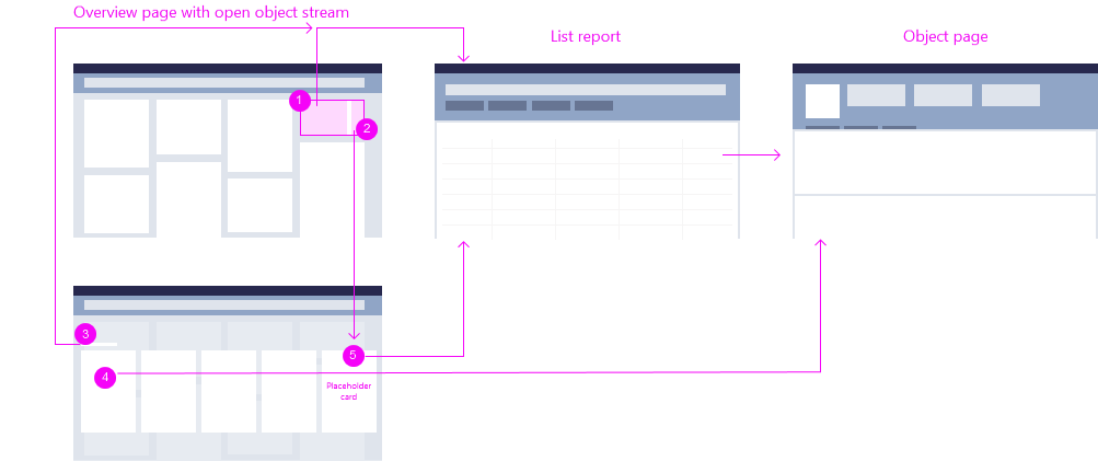
Overview page – Navigation overview of stack card, object stream, and and quick view card
Explanation:
- Stack card (left side): Opens the parent application (such as a list report with all approvals).
- Stack card (right side): Opens the object stream.
- Heading of the object stream: A link that navigates to the parent application (such as a list report with all approvals).
- Single quick view cards within the object stream: Offer navigation to the object details (such as an object page with the selected approval), as well as actions.
- Placeholder card: The last card a one-click area and navigates directly to the parent application (such as a list report with all approvals).
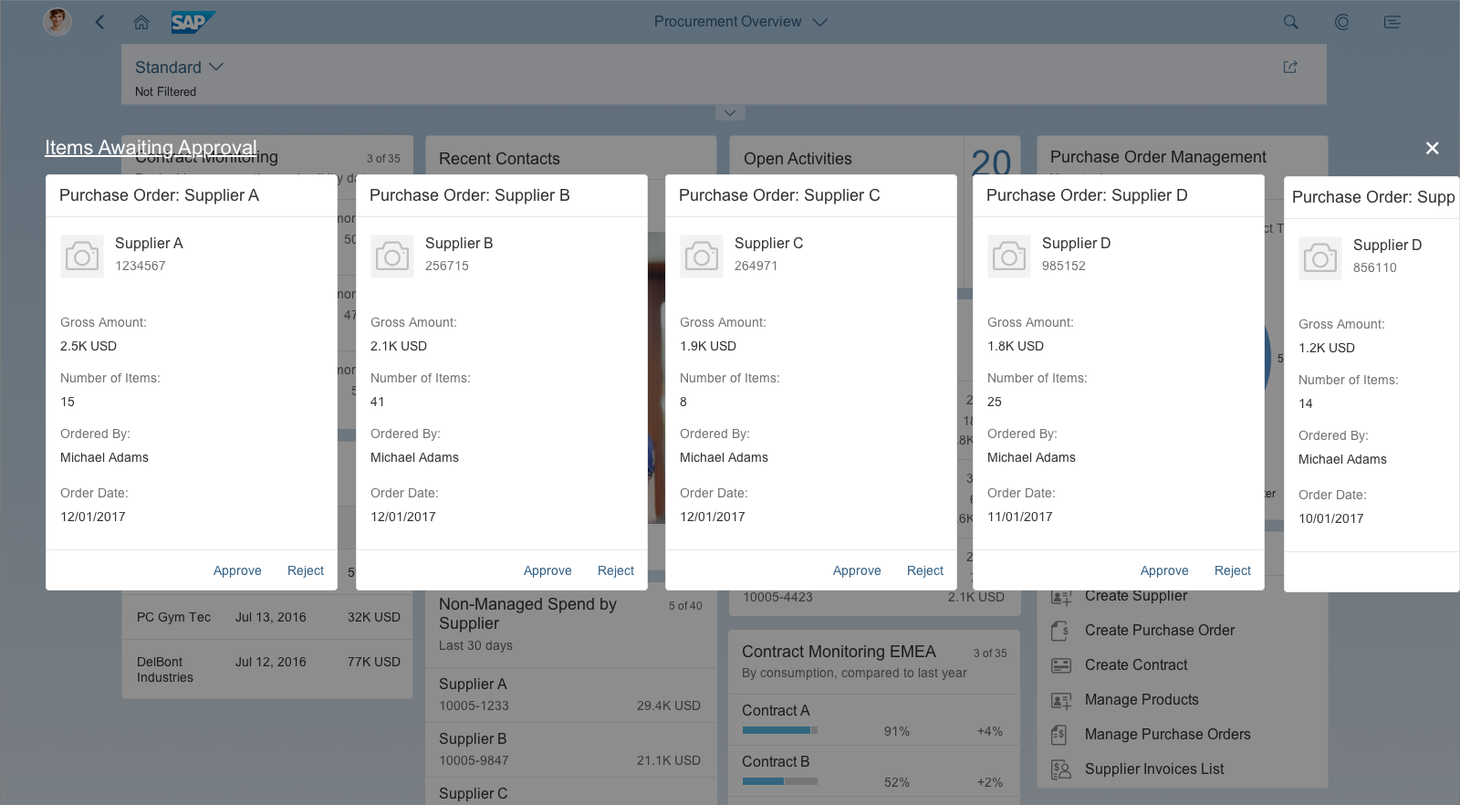
A stack card is a special collection of single-object quick view cards, based on a topic or action. Unlike the other card types, the top-level stack cards don’t show any application content. Instead, they act as an entry point to an object stream containing multiple cards.
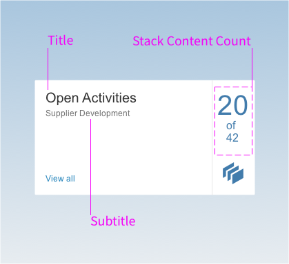
Stack cards have the following components:
- The title is the top element and is always required. It is used as the heading for the detail view, and comprises 1-2 lines of text.
- The subtitle is optional. You can use it to qualify the title, offer an explanation, or show a status. The purpose of the subtitle is explain the content of the stack in one line, so its usage depends on the context.
- The stack content count indicates the number of cards in the stack (object stream). The object stream can contain up to 20 cards. Below the number of cards in the stack, you see the total number of items returned for the annotated view (for example, “20 of 42”).
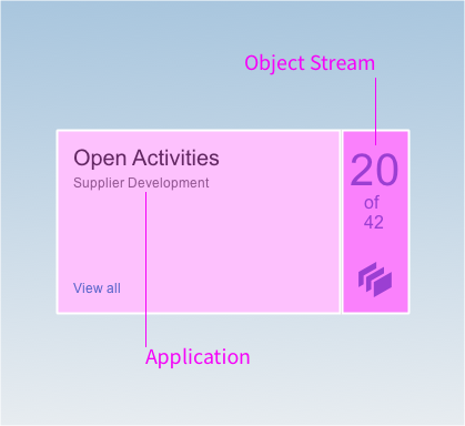
The top-level stack card contains two clickable navigation areas:
- The left area and View All link navigate to the parent application, where the user can see all the objects returned for the annotated view (42 in the example above). The placeholder card and heading inside the object stream have the same navigation target.
- The right area opens the object stream, which contains a scrollable collection of cards presented in an overlay format. The user can browse individual cards, with the option to view, inspect, or take action.
Overview Page – Stack Card Components
Overview page – Object stream
Clicking the right-hand area of the stack card opens the object stream. The object stream appears on top of the overview page as a modeless overlay, and serves as a layer for showing quick view cards with actions. The overlay has heading on the top left, and a Close button on the right. The heading is the same as the stack card title, and links to the full result set in the parent application (same target as the left-side navigation on the stack card and the navigation from the placeholder card). Clicking outside the overlay area also closes the object stream.
The object stream can have up to 20 cards (maximum), which all get their content from the same parent application. By default, the cards are ordered chronologically, with the most recent items first. However, app developers can define the best object stream sorting option for their own needs and content. If the number of cards exceeds the available space in the overlay window, an arrow icon appears on the right for scrolling. Mobile device users can swipe to see more cards. If the object stream is empty, the stack link is not active and the overlay cannot be opened. The stack count number displays 0. If only one item is returned, the object stream contains just a single card.
The header area of the quick view cards in the object stream navigates to the detail view for that specific object in the parent application. The footer area of the quick view cards can also offer actions.
Object Stream – Scroll Arrows
Scroll arrows only appear on desktop devices. If all the cards in the object stream fit on the screen, the arrows are not visible. If the number of cards exceeds the available space, an arrow icon appears on the right when the user mouses over the object stream overlay. Mousing over the arrow button area scrolls the cards across the screen from right to left. As soon as the first card on the left moves out of the visible overlay area, a second arrow appears on the left for moving in the other direction. Once the last card is in full view, the arrow on the right disappears.
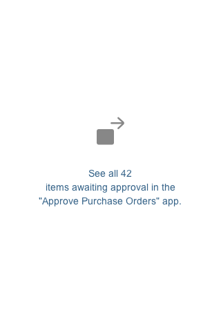
Placeholder Card
If the number of items returned for the annotated view exceeds the maximum 20 cards allowed in the object stream, a placeholder card is added automatically at the end of the stream (as card 21). The entire placeholder card is navigable, and takes the user to the full result set in the parent application.
The text on the placeholder card is composed as follows:
See all [total] [items] in the“[app name]” app.
Where:
- The values for [total] and [app name] are supplied by the system.
- The term for [items] must be rephrased by the app team to reflect the type of item or business object. For more information, see Mandatory Adjustments.
Examples:
- See all 42 items awaiting approval in the “Approve Leave Requests” app.
- See all 42 purchase orders awaiting approval in the “Approve Purchase Orders” app.
Overview page – Placeholder card
Object Stream – Tablet Version
On tablet devices, the modeless overlay expands horizontally. It also expands vertically to accommodate the card height and allow space for the title and Close button. The user can swipe through cards and perform micro actions. Swiping a card into view moves the entire object stream. Tapping the Close button closes the stack card and returns the user to the main overview page. There are no scroll arrows on touch devices.
Object Stream – Phone Version
On smartphones, the overview page layout collapses to a single column in both portrait and landscape modes. Tapping the right-hand navigation area of a stack card opens the object stream on top of the overview page in a new full screen window.
The object stream expands horizontally and vertically to accommodate the card height, and to allow space for the title and Close button. The user can swipe through the cards and perform micro actions. Swiping a card moves the entire object stream. Since the cards are too large to fit on the screen in landscape mode, users can also scroll vertically to see the full card content. Tapping the Close button closes the stack card and returns the user to the main overview page. There are no scroll arrows on touch devices.
Object Stream on Mobile Devices
")
")
")
")
Quick view cards are single-object cards. They display the basic details for one object, such as the name, address, and phone numbers for a contact. This card type is only available within the object stream; you can’t place quick view cards on the overview page itself. The quick view card inherits the SAPUI5 element sap.m.QuickView.
The header area contains a static text, such as Purchase Order, and an optional dynamic text, such as 1005-3345. In this way, each card header can show different content. Clicking on the header area of the card opens the detailed view of the object in the corresponding parent app. If the content area of a card cannot display all the information, a scrollbar appears on the right. Only the footer area of the quick view card can provide actions. The footer bar is a specific feature of the card anatomy for quick view cards.
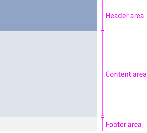
Card anatomy of the quick view card
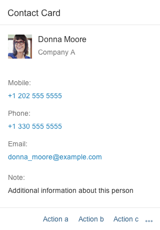
Quick view card for a contact
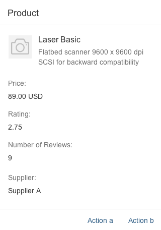
Quick view card for a product
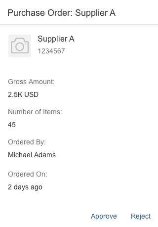
Quick view card for a purchase order
Only quick view cards within an object stream can have actions in the footer area. The overflow toolbar manages how the actions are displayed. All actions are right-aligned. Any actions that don’t fit into the available space move into the overflow action sheet, represented by the ellipsis ( ). A maximum of six actions are allowed in the footer area. Only offer actions the user really needs in the specific context.
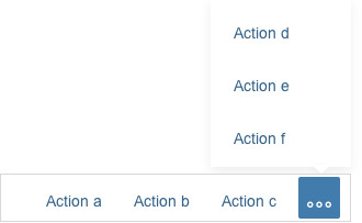
Footer area with additional actions in the overflow
There are two possible types of action: navigation and function import. Any combination of navigation and function import actions is allowed. Error or confirmation messages are displayed directly on the overview page. Always overwrite the predefined default text for errors in a message box: Formulate your message in plain language (without code), describe the issue precisely, and suggest a constructive solution.
Type: Navigation
Navigation is “intent-based” and takes the user to a different SAP Fiori app that specializes in executing an action. Navigation actions are always multi-click (meaning they can be repeated over and over). The destination screen opens in the same browser window, and any error or task confirmation messages are handled by the supporting application, not the overview page.
Type: Function Import
Function imports are custom OData service operations for actions. These actions are handled by the overview page, rather than by another SAP Fiori app. The interaction depends on whether or not the action requires user input:
- If the action requires additional user input, the input parameters are handled directly on the overview screen without further navigation. A dialog appears on top of the card, allowing the user to enter data or make a selection. An example of additional input might be the rejection reason for a “Reject” action.
- If the action has no input parameters, the action request is sent immediately. Once the action has been completed, the card disappears from the object stream.
Action on Phone
If an action on a card requires an input dialog box, use a full screen dialog on smartphones.
Resources
Want to dive deeper? Follow the links below to find out more about the SAP Fiori overview page.
Elements and Controls
- Overview Page (SAP Fiori Element) (guidelines)
- Overview Page – Card (guidelines)
- Overview Page – UI Text Guidelines (guidelines)
Implementation
- No links
 Your feedback has been sent to the SAP Fiori design team.