
- Latest SAPUI Version 1.124
- SAPUI5 Version 1.122
- SAPUI5 Version 1.120
- SAPUI5 Version 1.118
- SAPUI5 Version 1.116
- SAPUI5 Version 1.114
- SAPUI5 Version 1.112
- SAPUI5 Version 1.110
- SAPUI5 Version 1.108
- SAPUI5 Version 1.106
- SAPUI5 Version 1.104
- SAPUI5 Version 1.102
- SAPUI5 Version 1.100
- SAPUI5 Version 1.98
- SAPUI5 Version 1.96
- SAPUI5 Version 1.94
- SAPUI5 Version 1.92
- SAPUI5 Version 1.90
- SAPUI5 Version 1.88
- SAPUI5 Version 1.86
- SAPUI5 Version 1.84
- SAPUI5 Version 1.82
- SAPUI5 Version 1.80
- SAPUI5 Version 1.78
- SAPUI5 Version 1.76
- SAPUI5 Version 1.74
- SAPUI5 Version 1.72
- SAPUI5 Version 1.70
- SAPUI5 Version 1.68
- SAPUI5 Version 1.66
- SAPUI5 Version 1.64
- SAPUI5 Version 1.62
- SAPUI5 Version 1.58
- SAPUI5 Version 1.56
- SAPUI5 Version 1.54
- SAPUI5 Version 1.52
- SAPUI5 Version 1.50
- SAPUI5 Version 1.48
- SAPUI5 Version 1.46
- SAPUI5 Version 1.44
- SAPUI5 Version 1.42
- SAPUI5 Version 1.40
- SAPUI5 Version 1.38
- SAPUI5 Version 1.36
- SAPUI5 Version 1.34
- SAPUI5 Version 1.32
- SAPUI5 Version 1.30
- SAPUI5 Version 1.28
- SAPUI5 Version 1.26
- Latest SAPUI Version 1.124
- SAPUI5 Version 1.122
- SAPUI5 Version 1.120
- SAPUI5 Version 1.118
- SAPUI5 Version 1.116
- SAPUI5 Version 1.114
- SAPUI5 Version 1.112
- SAPUI5 Version 1.110
- SAPUI5 Version 1.108
- SAPUI5 Version 1.106
- SAPUI5 Version 1.104
- SAPUI5 Version 1.102
- SAPUI5 Version 1.100
- SAPUI5 Version 1.98
- SAPUI5 Version 1.96
- SAPUI5 Version 1.94
- SAPUI5 Version 1.92
- SAPUI5 Version 1.90
- SAPUI5 Version 1.88
- SAPUI5 Version 1.86
- SAPUI5 Version 1.84
- SAPUI5 Version 1.82
- SAPUI5 Version 1.80
- SAPUI5 Version 1.78
- SAPUI5 Version 1.76
- SAPUI5 Version 1.74
- SAPUI5 Version 1.72
- SAPUI5 Version 1.70
- SAPUI5 Version 1.68
- SAPUI5 Version 1.66
- SAPUI5 Version 1.64
- SAPUI5 Version 1.62
- SAPUI5 Version 1.60
- SAPUI5 Version 1.58
- SAPUI5 Version 1.56
- SAPUI5 Version 1.54
- SAPUI5 Version 1.52
- SAPUI5 Version 1.50
- SAPUI5 Version 1.48
- SAPUI5 Version 1.46
- SAPUI5 Version 1.44
- SAPUI5 Version 1.42
- SAPUI5 Version 1.40
- SAPUI5 Version 1.38
- SAPUI5 Version 1.36
- SAPUI5 Version 1.34
- SAPUI5 Version 1.32
- SAPUI5 Version 1.30
- SAPUI5 Version 1.28
- SAPUI5 Version 1.26
Chart Popover
Intro
A popover is used to display information or an action related to the selected data points. By default, the chart component:
- Displays dimension members and measure values fed into the chart that relate to the data point.
- Displays the number of selected items when in multiselection mode.
- Does not display related actions.
The entire content of the popover can be changed or a related action can be added at the end.
Selection and Popover
The content displayed in the popover depends on the selection mode; in other words, whether the chart is in single-selection or multiselection mode.
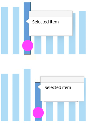
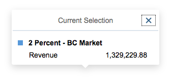
In Single-Selection Mode
When the user clicks an item that is not selected, the popover appears displaying information about this selected item only. The item that was previously selected becomes deselected.
Popover in single-selection mode
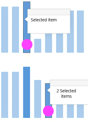
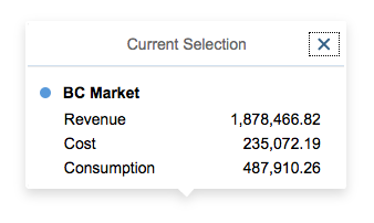
In Multiselection Mode
When the user clicks an item that is not selected, the item is added to the selection. The popover appears with information about this last selected item and any other selected items. When the user clicks an item that is already selected, this item is removed from the selection. If there are no more selected items, the popover disappears.
Popover in multiselection mode
Structure
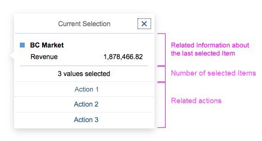
Popover structure
| Section | Explanation | Provided by default | Customizable |
| Related information about last selected item | Contains all related information about the last selected item. In single-selection mode, this is the single selected item. In multiselection mode, this is the last item added to the selection. | Yes | Yes. If the app developer wants different information, this section should be replaced entirely. Text only cannot be changed and another value cannot be added. |
| Number of selected items | Displays the number of items in the selection. Only used when multiple items are selected. | Yes | No |
| Related actions | Displays actions that act on all selected items. | No | Yes. The app developer can add its own actions. See the section below about related actions. |
Default Information
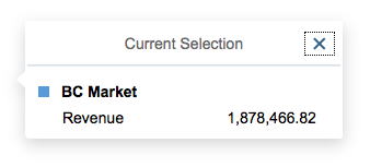
Default display
With multiple dimensions, the dimension members are concatenated and displayed in the following order:
- Firstly, the dimensions displayed in the legend.
- Secondly, the dimension displayed in the axis. If there is more than one dimension in the axis, the dimension closest to the axis is displayed first.
The first row is wrapped if necessary.
Multiple dimensions display
Multiple measures display
Number of Selected Items
If multiselection is possible, the popover displays the number of items that have been selected. If multiple items have been selected, it is not possible to display the values of all selected items. If you need to display these values, you will have to develop your own solution. For example, you can add a Compare Values or Display Values button at the bottom of the popover. This button is only displayed when multiple items have been selected.
Related Actions
You can add related actions at the end of the popover. These related actions may vary depending on the current selection. Related actions can generally be used to do the following:
- Display more information.
- Display another type of visualization.
- Display another dataset.
- Navigate to another page or app.
If an action is dedicated to showing more detailed information about the selection, use the View Details label. Actions that are specific to the entire chart or to the app should not be provided in the popover. In this case, it is better to provide them at app level, such as in the app toolbar.
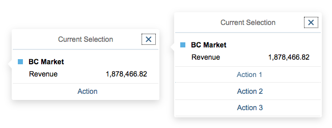
Examples of popovers with one and three related actions
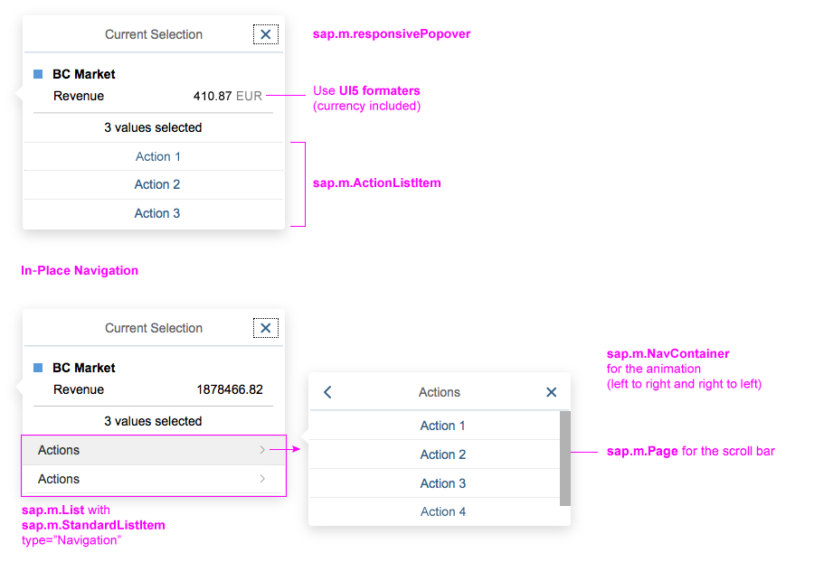
Group of Actions
Do not display more than four actions in the popover. If more are needed, use in-place navigation.
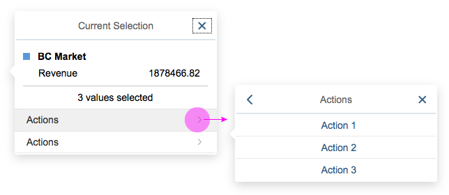
Example of in-place navigation
Customization and UI Controls
The UI controls for customizing the popover are shown below:
UI controls for customization
Resources
Want to dive deeper? Follow the links below to find out more about related controls, the SAPUI5 implementation, and the visual design.
 Your feedback has been sent to the SAP Fiori design team.