
- Latest SAPUI Version 1.124
- SAPUI5 Version 1.122
- SAPUI5 Version 1.120
- SAPUI5 Version 1.118
- SAPUI5 Version 1.116
- SAPUI5 Version 1.114
- SAPUI5 Version 1.112
- SAPUI5 Version 1.110
- SAPUI5 Version 1.108
- SAPUI5 Version 1.106
- SAPUI5 Version 1.104
- SAPUI5 Version 1.102
- SAPUI5 Version 1.100
- SAPUI5 Version 1.98
- SAPUI5 Version 1.96
- SAPUI5 Version 1.94
- SAPUI5 Version 1.92
- SAPUI5 Version 1.90
- SAPUI5 Version 1.88
- SAPUI5 Version 1.86
- SAPUI5 Version 1.84
- SAPUI5 Version 1.82
- SAPUI5 Version 1.80
- SAPUI5 Version 1.78
- SAPUI5 Version 1.76
- SAPUI5 Version 1.74
- SAPUI5 Version 1.72
- SAPUI5 Version 1.70
- SAPUI5 Version 1.66
- SAPUI5 Version 1.64
- SAPUI5 Version 1.62
- SAPUI5 Version 1.60
- SAPUI5 Version 1.58
- SAPUI5 Version 1.56
- SAPUI5 Version 1.54
- SAPUI5 Version 1.52
- SAPUI5 Version 1.50
- SAPUI5 Version 1.48
- SAPUI5 Version 1.46
- SAPUI5 Version 1.44
- SAPUI5 Version 1.42
- SAPUI5 Version 1.40
- SAPUI5 Version 1.38
- SAPUI5 Version 1.36
- SAPUI5 Version 1.34
- SAPUI5 Version 1.32
- SAPUI5 Version 1.30
- SAPUI5 Version 1.28
- SAPUI5 Version 1.26
- Latest SAPUI Version 1.124
- SAPUI5 Version 1.122
- SAPUI5 Version 1.120
- SAPUI5 Version 1.118
- SAPUI5 Version 1.116
- SAPUI5 Version 1.114
- SAPUI5 Version 1.112
- SAPUI5 Version 1.110
- SAPUI5 Version 1.108
- SAPUI5 Version 1.106
- SAPUI5 Version 1.104
- SAPUI5 Version 1.102
- SAPUI5 Version 1.100
- SAPUI5 Version 1.98
- SAPUI5 Version 1.96
- SAPUI5 Version 1.94
- SAPUI5 Version 1.92
- SAPUI5 Version 1.90
- SAPUI5 Version 1.88
- SAPUI5 Version 1.86
- SAPUI5 Version 1.84
- SAPUI5 Version 1.82
- SAPUI5 Version 1.80
- SAPUI5 Version 1.78
- SAPUI5 Version 1.76
- SAPUI5 Version 1.74
- SAPUI5 Version 1.72
- SAPUI5 Version 1.70
- SAPUI5 Version 1.68
- SAPUI5 Version 1.66
- SAPUI5 Version 1.64
- SAPUI5 Version 1.62
- SAPUI5 Version 1.60
- SAPUI5 Version 1.58
- SAPUI5 Version 1.56
- SAPUI5 Version 1.54
- SAPUI5 Version 1.52
- SAPUI5 Version 1.50
- SAPUI5 Version 1.48
- SAPUI5 Version 1.46
- SAPUI5 Version 1.44
- SAPUI5 Version 1.42
- SAPUI5 Version 1.40
- SAPUI5 Version 1.38
- SAPUI5 Version 1.36
- SAPUI5 Version 1.34
- SAPUI5 Version 1.32
- SAPUI5 Version 1.30
- SAPUI5 Version 1.28
- SAPUI5 Version 1.26
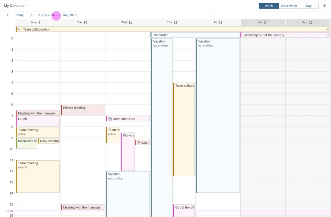
Single Planning Calendar
sap.m.SinglePlanningCalendar
The single planning calendar is a scheduling control that displays the calendar of a single person or resource over a day, work week, or week. Users can view appointments, create new appointments, and delete appointments.
Single planning calendar
Usage
Use the single planning calendar if:
- You want to enable users to schedule or monitor the calendar of a single person or resource.
- You want to offer multiple calendar views (day, work week, week).
Do not use the single planning calendar if:
- You want to compare objects of the same type over a given period (for example, appointments for multiple persons or resources). In this case, use the planning calendar.
- The main use case is to schedule all-day appointments, and you don’t need to see an hour axis. In this case, use the planning calendar.
- You need a complex graphical representation or planning application involving activities, resources, hierarchical project structures, relationships, and so on. In this case, use the Gantt chart.
Responsiveness
The single planning calendar is responsive and supports the cozy and compact density modes.
Overflow Behavior
On smaller screens, the custom toolbar utilizes the overflow behavior of the standard SAP Fiori toolbar.
If the available actions do not all fit into the available space on the toolbar, an overflow menu button appears on the right of the toolbar. The rightmost actions move into the overflow menu first.
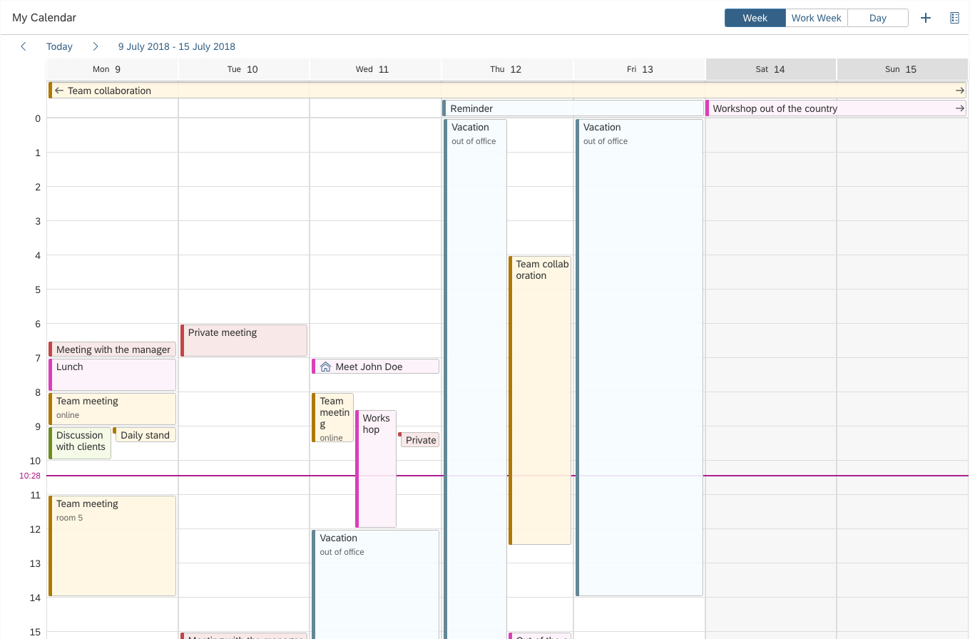
Single planning calendar - Size L
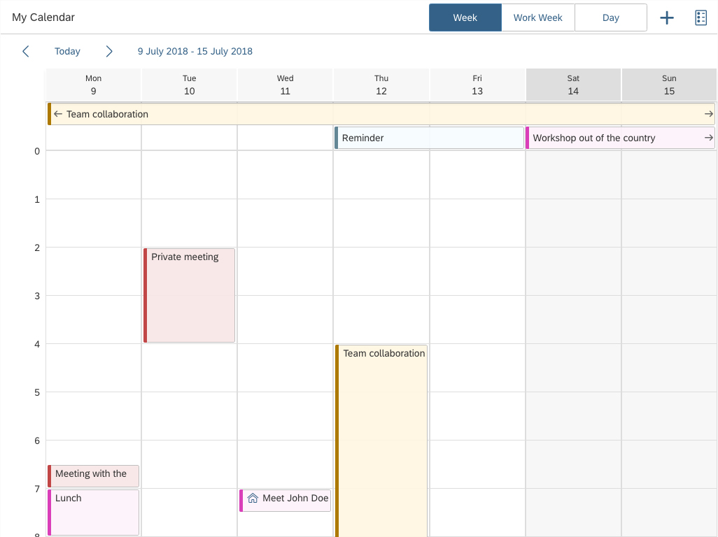
Single planning calendar - Size M

Single planning calendar - Size S
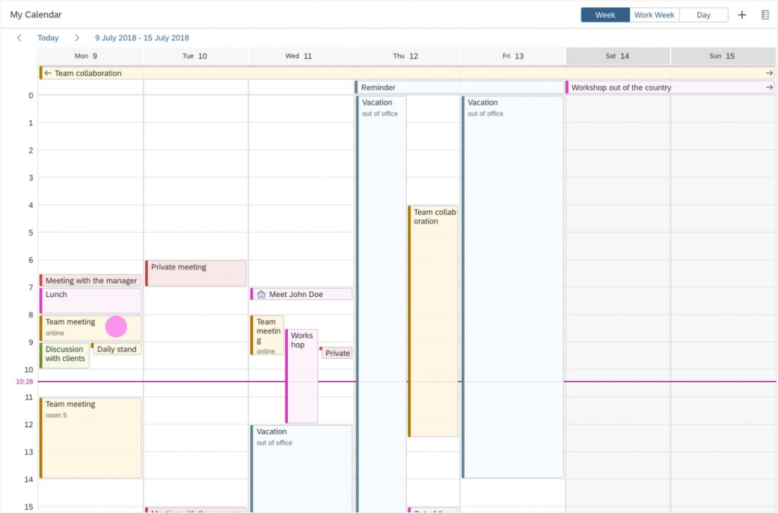
Components
The single planning calendar consists of the following components:
- Header
- Toolbar
- View switch
- Navigation
- Date strip
- All-day appointment
- Timeline
- Appointment
- Calendar grid
- Now marker
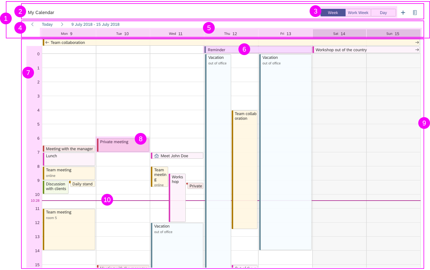
Components of the single planning calendar
1. Header
The header contains the toolbar and the navigation.
2. Toolbar
The toolbar consists of the calendar title (optional) and the toolbar actions, including a default view switch. You can add other app-specific actions that are relevant for your use case (such as adding an appointment, search, filter, settings, showing the calendar legend, and so on). Always place actions that affect the entire calendar in the toolbar.
3. View switch
The view switch allows the user to switch between different time intervals. The default views are day, work week, and week. The app developer can choose which views to include, depending on the use case.
You can also create custom views by setting a different number of visible columns in the grid. We only recommend doing this if your use case really requires it. You must also ensure that any custom views are responsive. For anything over 7 days, provide an alternative view for size S.
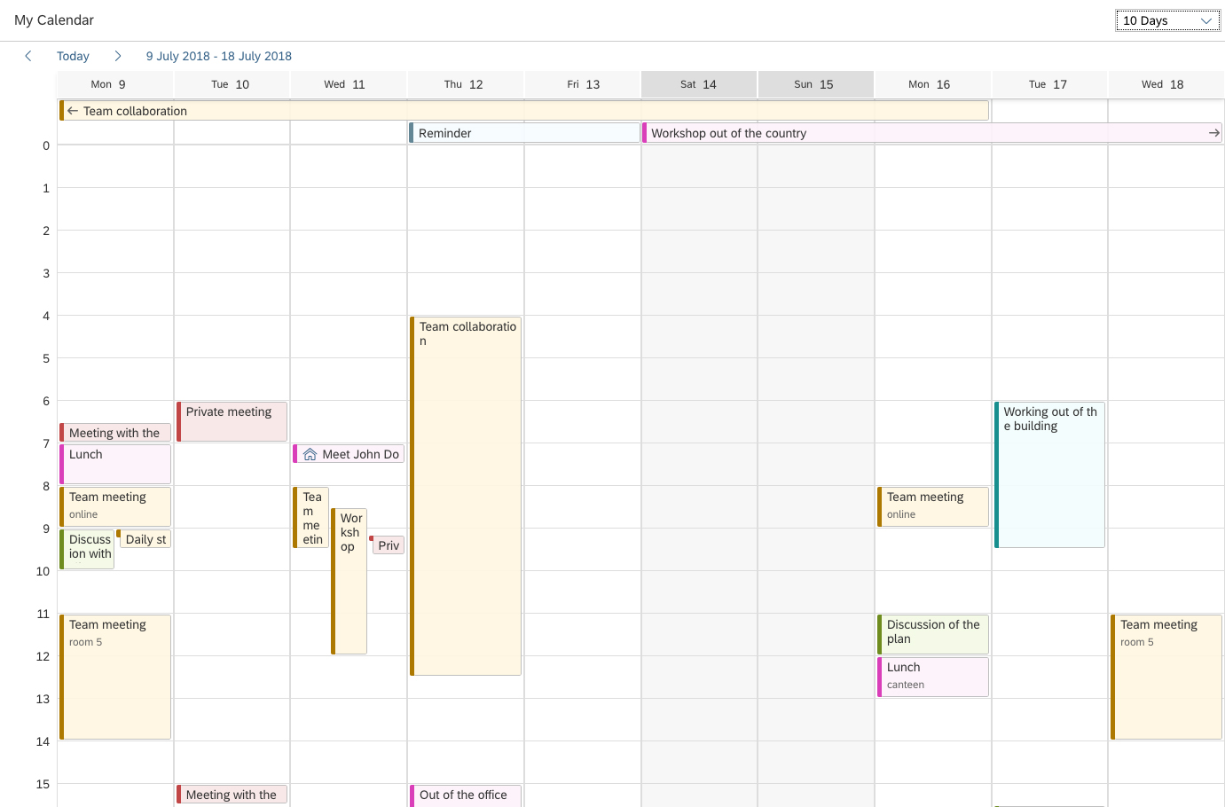
Custom view 10 days - size L
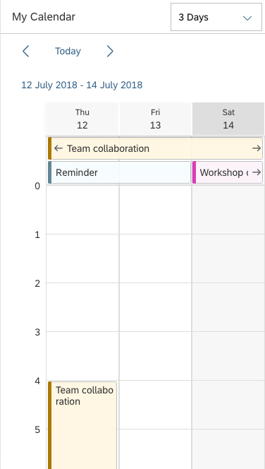
Custom view 3 days - size S
4. Navigation
The navigation area contains back and forward arrows, the Today button, a date interval link, and the date strip. Clicking the Today button takes the user to the period containing the current day.
5. Date strip
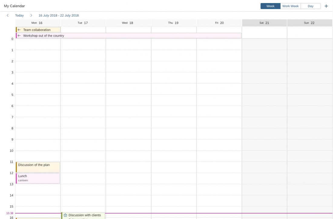
The date strip is the horizontal axis of the calendar grid, showing the currently visible day or days. Non-working days are a darker color.
6. All-day appointment
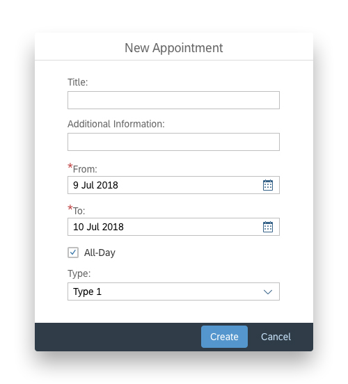
All-day appointments are appointments that take up 24 hours. They are located in a dedicated area below the date strip and above the first hour of the timeline.
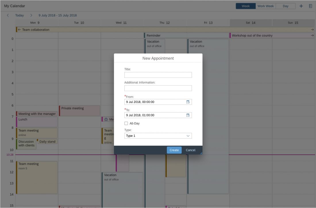
The option to create all-day appointments must be added at application level. Consider using a switch or checkbox that automatically sets the start and end time of the appointment to 00:00. We recommend reflecting this in the UI for creating the appointment as well. For example, offer a date picker instead of a date/time picker for selecting the start and end of the appointment (as shown in the sample dialog).
There is no limit of the height of the all-day appointments area. However, if your use case involves a lot of all-day appointments (and their area takes up most of the screen), consider using the planning calendar instead.
7. Timeline
The timeline is the vertical axis of the calendar grid, showing the hours.
Creating an All-Day Appointment - Sample Dialog

8. Appointment
Each appointment can have an icon or image, a title, and a subtitle. If there is not enough horizontal space for the text, it is truncated. If an appointment has an icon, the icon remains visible as long as there is space for it, even if that does not leave enough space for the title. If there is not enough vertical space, the subtitle is not shown.
Appointments vary in height, depending on their duration, and in width, depending on how many appointments take place simultaneously. The minimum height of an appointment corresponds to a 30-minute appointment.
The app can set up to 20 types of appointments. Each type has its assigned color. Always choose appointment types with contrasting colors. Make sure that each type is also represented as a text, and not only by the color.
9. Calendar grid
The calendar contains the appointments and all-day appointments, and is controlled by the currently selected view. Non-working days have a darker background color in the calendar grid.
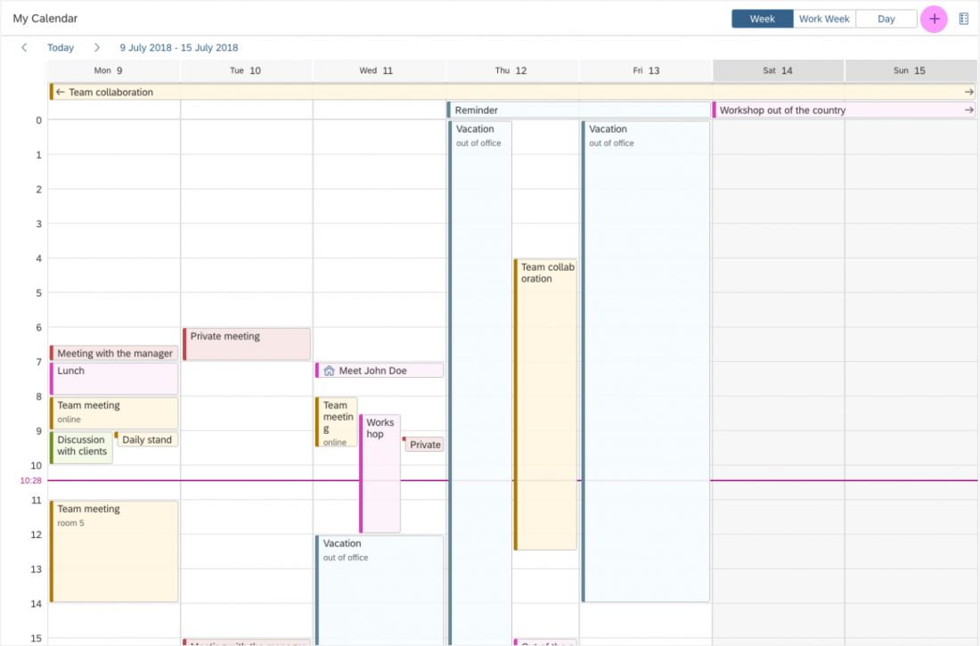
10. Now marker
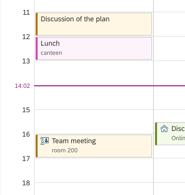
The now marker is a horizontal line through the calendar grid, which indicates the current time. The current time is visible on the timeline. If the current time falls within 15 minutes of a full hour, it replaces the full hour.
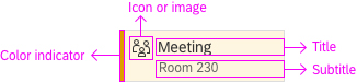
Appointment structure
Now marker - Current time replaces the full hour
Behavior and Interaction
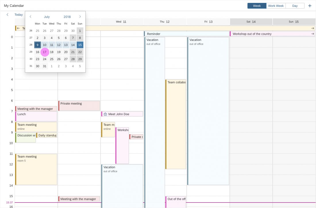
Date Picker
The visible period is indicated with the date interval link in the navigation. Clicking the link opens a date picker, which helps the user to navigate quickly to a specific day or week.
Changing the visible interval with the Date Picker
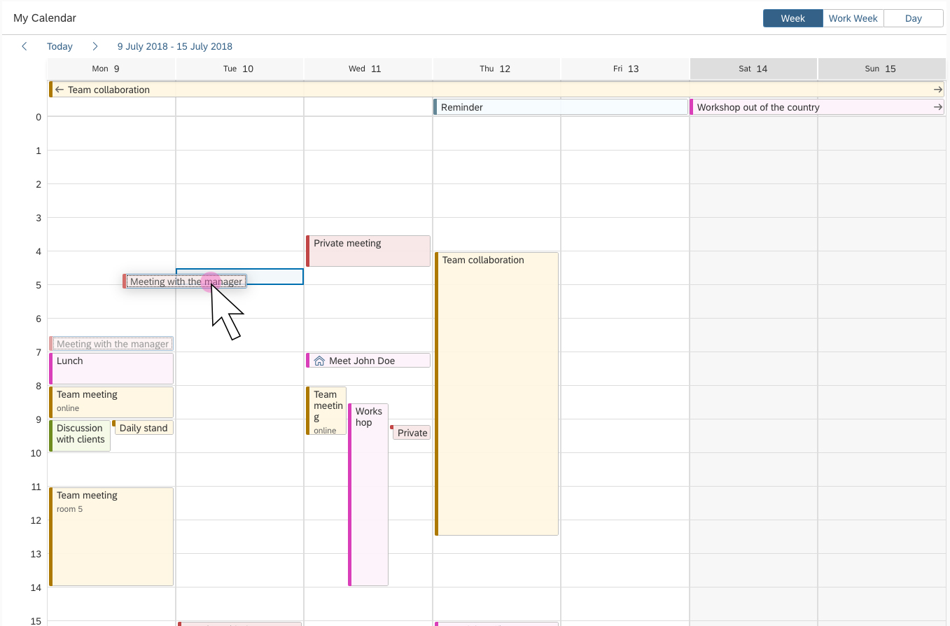
Creating an Appointment
We recommend offering a Create action in the toolbar. Use the generic icon button.
The UI for creating the appointment must be implemented at app level. The control provides only the underlying functionality for creating appointments. For most use cases, a dialog works best and is recommended (see sample dialog below).
Sample Dialog for Creating an Appointment
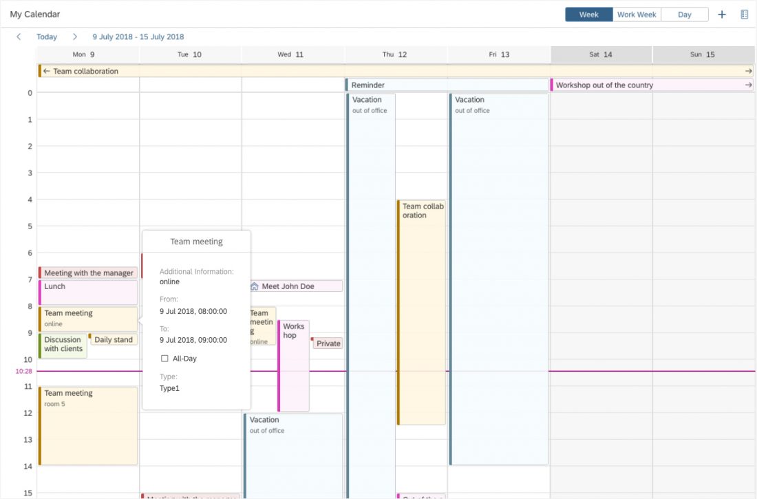
Viewing Appointment Details
The UI for viewing appointment details must be implemented at app level. The control provides only the underlying functionality for displaying appointment details. We recommend using a popover to keep the context for the user (see sample popover below).
Sample Popover for Viewing Appointment Details
Sticky Header
To keep the context when the user scrolls down the calendar, the header area of the single planning calendar can remain fixed at the top of the screen (property: stickyMode).
At app level, you can choose to have the entire header area sticky (value: All) or only the Navigation area (value: NavBarAndColHeaders).
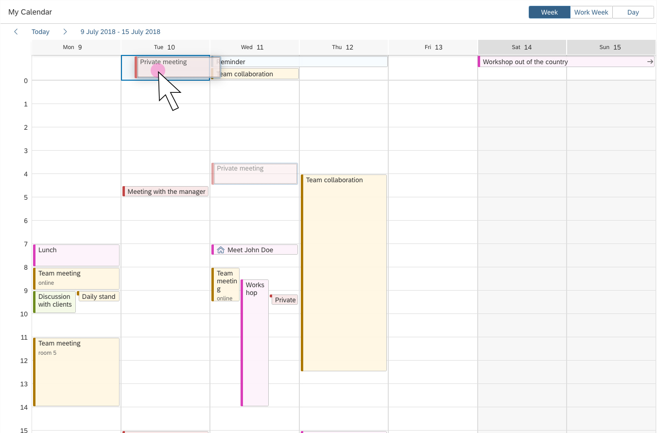
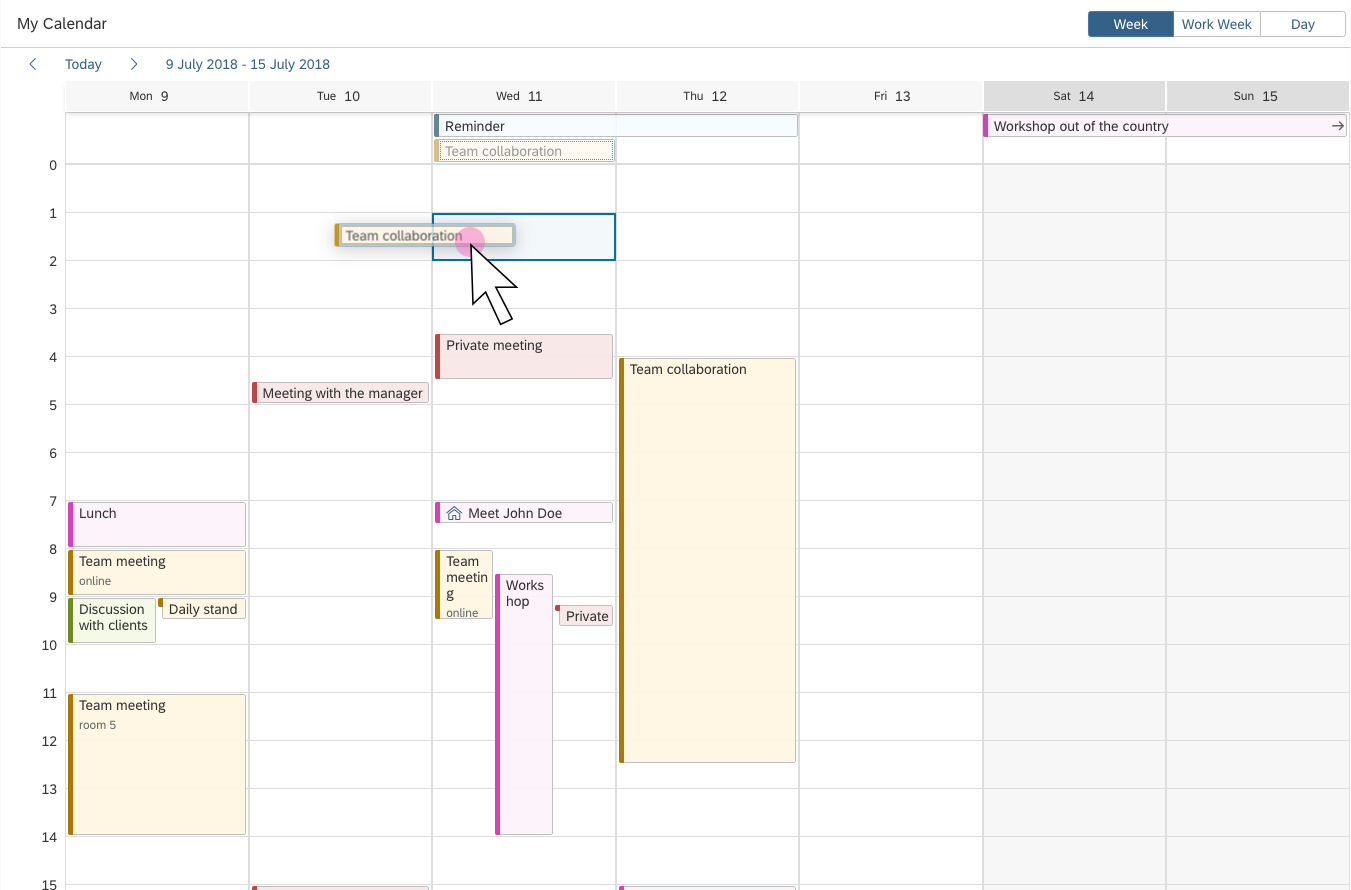
Drag and drop
You can enable drag and drop for moving appointments (property: enableAppointmentDragAndDrop). Moving an appointment changes its start and end times (for example, if an appointment is scheduled from 1:00-2:00 PM, the user can drag it and change the time slot to 2:00-3:00 PM). When dragged, the appointment is shown as a ghost element on the mouse cursor. A placeholder indicates the target drop area.
Appointments can also be dragged from or to the area for all-day appointments. When the user drags an all-day appointment to the planning area, a placeholder shows the duration of the appointment after dropping (default = 1 hour). Similarly, dragging a regular appointment to the all-day appointments area transforms it into an all-day appointment (default = 1 day).
For desktop devices, you can also enable the following options:
- Allow users to create new appointments by clicking, dragging, and releasing on an empty space in the content area (property:
enableAppointmentsCreate). - Allow users to change the duration of an appointment by clicking and dragging one side of the appointment (property:
enableAppointmentsResize).
Drag and drop
Drag and drop into the all-day appointments area
Drag and drop from the all-day appointments area
Resources
Want to dive deeper? Follow the links below to find out more about related controls, the SAPUI5 implementation, and the visual design.
Implementation
- Single Planning Calendar (SAPUI5 Sample)
- Planning Calendar (SAPUI5 Sample)
- Single Planning Calendar (API)
- Planning Calendar (API)
 Your feedback has been sent to the SAP Fiori design team.