
Updated: November 29, 2022
SAPUI5 Version 1.68
- Latest SAPUI5 Version 1.120
- Version 1.118
- SAPUI5 Version 1.116
- SAPUI5 Version 1.114
- SAPUI5 Version 1.112
- SAPUI5 Version 1.110
- SAPUI5 Version 1.108
- SAPUI5 Version 1.106
- SAPUI5 Version 1.104
- SAPUI5 Version 1.102
- SAPUI5 Version 1.100
- SAPUI5 Version 1.98
- SAPUI5 Version 1.96
- SAPUI5 Version 1.94
- SAPUI5 Version 1.92
- SAPUI5 Version 1.90
- SAPUI5 Version 1.88
- SAPUI5 Version 1.86
- SAPUI5 Version 1.84
- SAPUI5 Version 1.82
- SAPUI5 Version 1.80
- SAPUI5 Version 1.78
- SAPUI5 Version 1.76
- SAPUI5 Version 1.74
- SAPUI5 Version 1.72
- SAPUI5 Version 1.70
- SAPUI5 Version 1.66
- SAPUI5 Version 1.64
- SAPUI5 Version 1.62
- SAPUI5 Version 1.60
- SAPUI5 Version 1.58
- SAPUI5 Version 1.56
- SAPUI5 Version 1.54
- SAPUI5 Version 1.52
- SAPUI5 Version 1.50
- SAPUI5 Version 1.48
- SAPUI5 Version 1.46
- SAPUI5 Version 1.44
- SAPUI5 Version 1.42
- SAPUI5 Version 1.40
- SAPUI5 Version 1.38
- SAPUI5 Version 1.36
- SAPUI5 Version 1.34
- SAPUI5 Version 1.32
- SAPUI5 Version 1.30
- SAPUI5 Version 1.28
- SAPUI5 Version 1.26
- Latest SAPUI5 Version 1.120
- Version 1.118
- SAPUI5 Version 1.116
- SAPUI5 Version 1.114
- SAPUI5 Version 1.112
- SAPUI5 Version 1.110
- SAPUI5 Version 1.108
- SAPUI5 Version 1.106
- SAPUI5 Version 1.104
- SAPUI5 Version 1.102
- SAPUI5 Version 1.100
- SAPUI5 Version 1.98
- SAPUI5 Version 1.96
- SAPUI5 Version 1.94
- SAPUI5 Version 1.92
- SAPUI5 Version 1.90
- SAPUI5 Version 1.88
- SAPUI5 Version 1.86
- SAPUI5 Version 1.84
- SAPUI5 Version 1.82
- SAPUI5 Version 1.80
- SAPUI5 Version 1.78
- SAPUI5 Version 1.76
- SAPUI5 Version 1.74
- SAPUI5 Version 1.72
- SAPUI5 Version 1.70
- SAPUI5 Version 1.68
- SAPUI5 Version 1.66
- SAPUI5 Version 1.64
- SAPUI5 Version 1.62
- SAPUI5 Version 1.60
- SAPUI5 Version 1.58
- SAPUI5 Version 1.56
- SAPUI5 Version 1.54
- SAPUI5 Version 1.52
- SAPUI5 Version 1.50
- SAPUI5 Version 1.48
- SAPUI5 Version 1.46
- SAPUI5 Version 1.44
- SAPUI5 Version 1.42
- SAPUI5 Version 1.40
- SAPUI5 Version 1.38
- SAPUI5 Version 1.36
- SAPUI5 Version 1.34
- SAPUI5 Version 1.32
- SAPUI5 Version 1.30
- SAPUI5 Version 1.28
- SAPUI5 Version 1.26
Interactive Chart
sap.suite.ui.microchart.InteractiveBarChart | sap.suite.ui.microchart.InteractiveLineChart | sap.suite.ui.microchart.InteractiveDonutChart
Intro
The interactive chart is used for visual-based filtering in the visual filter bar (VFB) within the analytical list page (ALP). It allows the user to filter by categories, time periods, or by parts of a whole.
Usage
Use the interactive chart if:
- You want to give the user the possibility to visually filter data in the analytical list page.
- You want the user to gain insights before filtering large datasets with the visual filter bar.
Do not use the interactive chart if:
- You want to visualize data without using it for filtering.
- You are not using the visual filter bar.
- You want to visualize data for more complex scenarios. In this case, use the VizFrame chart instead.
Responsiveness
The interactive chart is fully responsive and supports both cozy and compact content density.
Types
There are three types of interactive charts currently available:
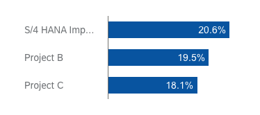
Filter by categorical data
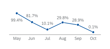
Filter large sets of data by time period
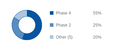
Filter by parts of a whole
Resources
Want to dive deeper? Follow the links below to find out more about related controls, the SAPUI5 implementation, and the visual design.
Elements and Controls
- Interactive Bar Chart (guidelines)
- Interactive Line Chart (guidelines)
- Interactive Donut Chart (guidelines)
- Analytical List Page (guidelines)
Implementation
- Interactive Bar Chart (SAPUI5 samples)
- Interactive Bar Chart (SAPUI5 API reference)
- Interactive Line Chart (SAPUI5 samples)
- Interactive Line Chart (SAPUI5 API reference)
- Interactive Donut Chart (SAPUI5 samples)
- Interactive Donut Chart (SAPUI5 API reference)
 Your feedback has been sent to the SAP Fiori design team.