
- Latest SAPUI Version 1.124
- SAPUI5 Version 1.122
- SAPUI5 Version 1.120
- SAPUI5 Version 1.118
- SAPUI5 Version 1.116
- SAPUI5 Version 1.114
- SAPUI5 Version 1.112
- SAPUI5 Version 1.110
- SAPUI5 Version 1.108
- SAPUI5 Version 1.106
- SAPUI5 Version 1.104
- SAPUI5 Version 1.102
- SAPUI5 Version 1.100
- SAPUI5 Version 1.98
- SAPUI5 Version 1.96
- SAPUI5 Version 1.94
- SAPUI5 Version 1.92
- SAPUI5 Version 1.90
- SAPUI5 Version 1.88
- SAPUI5 Version 1.86
- SAPUI5 Version 1.84
- SAPUI5 Version 1.82
- SAPUI5 Version 1.80
- SAPUI5 Version 1.78
- SAPUI5 Version 1.76
- SAPUI5 Version 1.74
- SAPUI5 Version 1.72
- SAPUI5 Version 1.70
- SAPUI5 Version 1.66
- SAPUI5 Version 1.64
- SAPUI5 Version 1.62
- SAPUI5 Version 1.60
- SAPUI5 Version 1.58
- SAPUI5 Version 1.56
- SAPUI5 Version 1.54
- SAPUI5 Version 1.52
- SAPUI5 Version 1.50
- SAPUI5 Version 1.48
- SAPUI5 Version 1.46
- SAPUI5 Version 1.44
- SAPUI5 Version 1.42
- SAPUI5 Version 1.40
- SAPUI5 Version 1.38
- SAPUI5 Version 1.36
- SAPUI5 Version 1.34
- SAPUI5 Version 1.32
- SAPUI5 Version 1.30
- SAPUI5 Version 1.28
- SAPUI5 Version 1.26
- Latest SAPUI Version 1.124
- SAPUI5 Version 1.122
- SAPUI5 Version 1.120
- SAPUI5 Version 1.118
- SAPUI5 Version 1.116
- SAPUI5 Version 1.114
- SAPUI5 Version 1.112
- SAPUI5 Version 1.110
- SAPUI5 Version 1.108
- SAPUI5 Version 1.106
- SAPUI5 Version 1.104
- SAPUI5 Version 1.102
- SAPUI5 Version 1.100
- SAPUI5 Version 1.98
- SAPUI5 Version 1.96
- SAPUI5 Version 1.94
- SAPUI5 Version 1.92
- SAPUI5 Version 1.90
- SAPUI5 Version 1.88
- SAPUI5 Version 1.86
- SAPUI5 Version 1.84
- SAPUI5 Version 1.82
- SAPUI5 Version 1.80
- SAPUI5 Version 1.78
- SAPUI5 Version 1.76
- SAPUI5 Version 1.74
- SAPUI5 Version 1.72
- SAPUI5 Version 1.70
- SAPUI5 Version 1.68
- SAPUI5 Version 1.66
- SAPUI5 Version 1.64
- SAPUI5 Version 1.62
- SAPUI5 Version 1.60
- SAPUI5 Version 1.58
- SAPUI5 Version 1.56
- SAPUI5 Version 1.54
- SAPUI5 Version 1.52
- SAPUI5 Version 1.50
- SAPUI5 Version 1.48
- SAPUI5 Version 1.46
- SAPUI5 Version 1.44
- SAPUI5 Version 1.42
- SAPUI5 Version 1.40
- SAPUI5 Version 1.38
- SAPUI5 Version 1.36
- SAPUI5 Version 1.34
- SAPUI5 Version 1.32
- SAPUI5 Version 1.30
- SAPUI5 Version 1.28
- SAPUI5 Version 1.26
List
sap.m.List
Intro
In SAP Fiori, we distinguish between tables and lists. Both usually contain homogeneous data, but lists generally have rather basic data, whereas the data in tables tends to be more complex. Lists are mostly used in the master list for a master-detail scenario using the flexible column layout, as well as in popovers or dialogs. For certain use cases, lists can also be used in the dynamic page layout.
Usage
Use the list if:
- You want to display a homogeneous set of basic data.
- You need to sort, group, or filter simple datasets.
- You need to display a single-level hierarchy rather than using a complex tree table to support this simple use case.
Do not use the list if:
Responsiveness
The list is like a layout container. You can change its width, but you must also ensure that the items contained in the list adapt whenever the list is resized.
All list item variants available in SAP Fiori already adapt to the respective screen size.
List Item Variants
The list contains various list items. These items can be of various types depending on the use case and on the content they have. SAPUI5 already provides the most common list items in SAP Fiori in the form of controls, although custom list items can also be created if necessary.
Object List Item
The object list item is the list item variant used most frequently in SAP Fiori applications. Consisting of a title, key figure, attributes, and a status, it contains the most important information about an object.
The space available for the attributes and status is limited as it should only show crucial information that allows the user to decide which items should be dealt with first.
All essential information about an object is usually provided when the user navigates to the item details.
For more information, see object list item.
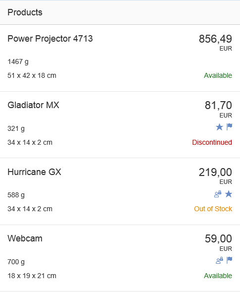
Object list items
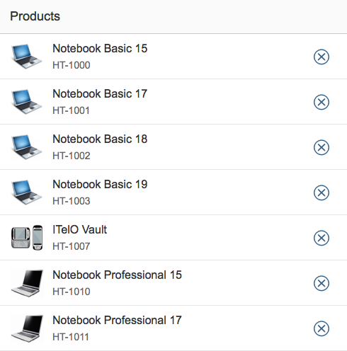
Standard List Item
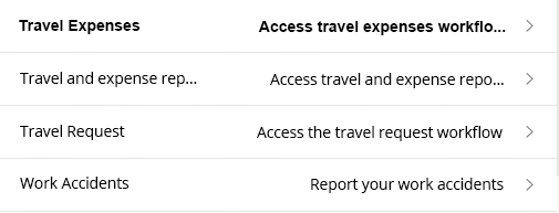
The standard list item is used for less complex entries, such as when the user selects an item in a dialog. This list item contains an optional image, a title, description, and a single info text (which can contain semantic information).
For more information, see standard list item.
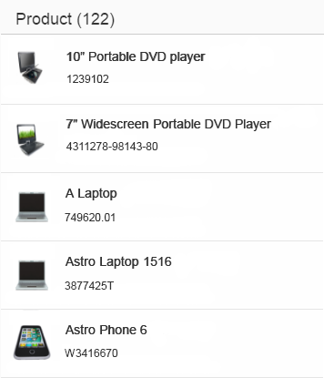
Standard list items
Display List Item
The display list item is the simplest form of a list item and is only capable of showing a label and values. It is seldom used.
For more information, see display list item.
Display list items
Action List Item
The action list item allows various actions to be triggered in a dialog. The action list item is not used in the content area.
For more information, see action list item.
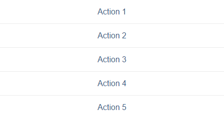
Action list item
Feed List Item
The feed list item is mainly used in feeds and notes.
For more information, see feed list item.
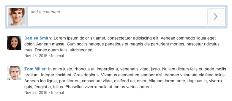
Feed with feed list items
Input List Item
The input list item allows the user to enter data in a list item. It is seldom used in SAP Fiori apps as forms are usually the preferable method for entering data.
For more information, see input list item.
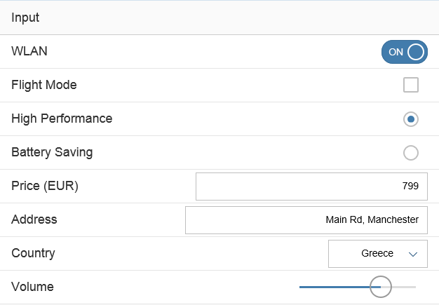
Input list item
Components
Header
The header text contains the title of the list. It is usually only used when the list is in the content area.
Footer
The footer text is the last entry in the list, and as such, it scrolls away with the content. Therefore, this property is also seldom used.
Lazy Loading
Like the table, the list also allows lazy loading. The “growing” list property is used for this purpose.

List with header and footer
Empty List
Avoid empty lists. If necessary, provide instructions on how to fill the list with data (sap.m.List/ sap.m.ListBase, properties: noDataText, showNoData).
Examples:
- If a list is initially empty, provide at least a basic text:
No items available.
Overwrite this whenever a hint can be provided on how to fill the list with data. - If a list is used together with a filter bar (as in the list report), and is initially empty, use the following text:
No filters set. To start, enter your search and filter settings and run the search. - If a list is used together with a filter bar and the filter does not return results, use the following text:
No items found. Check the search and filter settings.
Adapt the texts above if:
- The standard text is not precise enough for your use case (for example, no search is offered, only the search is offered).
- You are using the live search (no Go button in the filter bar). In this case, leave out “run the search”.
- The standard text is misleading (for example, if the data is filled based on a master-detail pattern instead of search and filter settings).
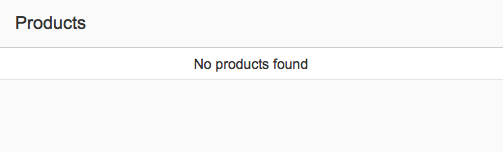
Empty list
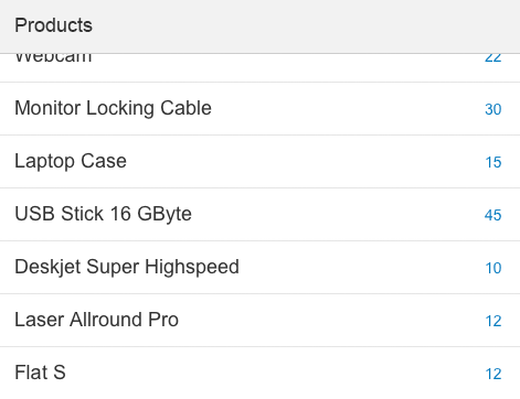
Count
List items can have a count, which is located on the far right of a row. You can use the count in simple lists, such as those that contain standard list items, to indicate how many subitems the user can expect when navigating to the item.
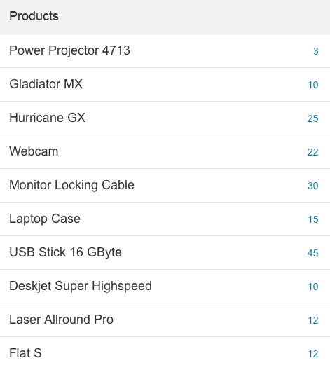
Standard list items with counter
Read/Unread
You can set an indicator to highlight unread items, making it easier for the user to discover them (property: showUnread = true). If you set this indicator, all texts for the unread items are shown in bold font.
By default, this indicator is switched off, and all list items are displayed in normal font.
Display list item with read and unread items
Highlight Items
To show that an item needs attention, you can display a highlight indicator in front of the item. The highlight indicator can be used to show:
- A semantic state, such as red or orange for an error or warning.
- Additional information, such as blue to highlight newly added items.
- Industry-specific or process-specific states, such as “out of stock” or “excess of inventory”.
Be aware that the highlight is just an indication. It does not tell users exactly what is wrong. Make sure that you provide this information within the table row, ideally in the same color.
For details on the use of highlight colors, see How To Use Semantic Colors.
(sap.m.ListItemBase, property: highlight)
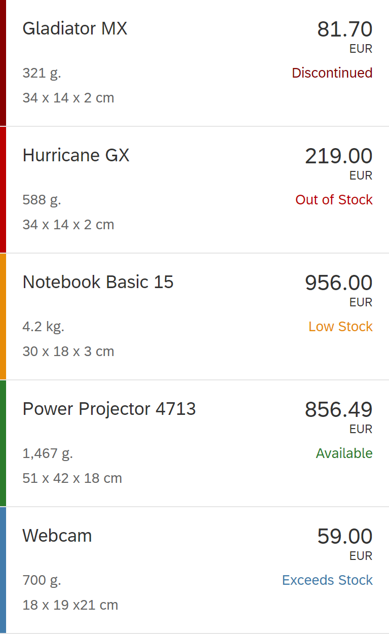
Highlighted items
Behavior and Interaction
There are several ways to interact with the list and its list items:
Line Item Level
Scroll
The height of the list is defined by the number of items it contains. It does not have its own scroll container, but is scrolled together with the app.
If the list works in a “growing” mode, it only loads a few items at first. Additional items are only loaded (and rendered) on request. The “request” can either be triggered by scrolling (preferred), or by clicking the More button.
When the user scrolls, the title and the filter info bar can stick to the top of the surrounding layout container (sap.m.List, property: sticky).
Sticky title
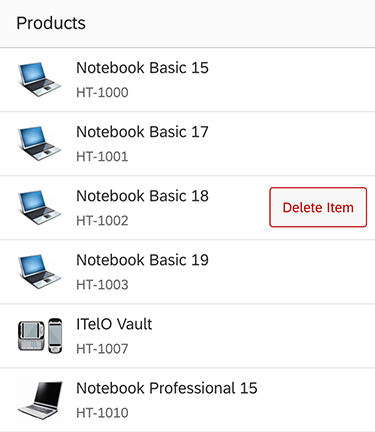
Mode
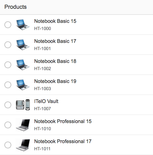
The list can have several modes. The respective property (Mode) allows the following selection methods:
- None
- SingleSelectMaster (used to pick one item with no additional indicator, as in the master list for a master-detail scenario with the flexible column layout)
- SingleSelectLeft (used to pick one item using a radio button on the far left)
- MultiSelect (used to pick several items from the list using checkboxes on the far left)
- Delete (used to delete items from the list using a delete indicator on the far right)
List with explicit single selection

List with multiple selection
List with delete mode
Grouping
List items can be grouped. The group header is a visually separate line at the top of the items it groups. It does not currently provide an interaction of its own.
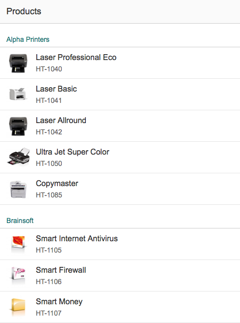
Grouped list
Type
The list item type defines the interaction of the list item, which is accompanied by a visual cue.
The items can be one of the following:
- Active (click event; cursor changes to indicate that)
- Inactive (no click event; cursor does not change)
- Navigation (a small arrow appears on the far right, indicating that clicking would navigate)
- Detail (a pencil appears on the far right, indicating that something can be changed. The user can only click on the pencil.)
- Detail and active (same as “detail”, but the item itself is also clickable)
The example shows how all these types are visualized.
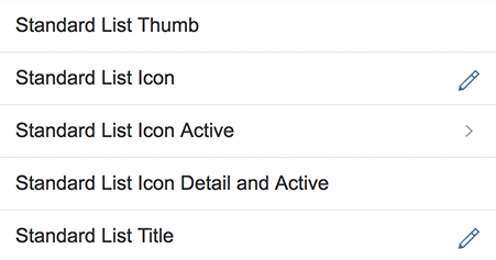
All list item types: inactive, detail, navigation, active, detail and active
Swipe
You can provide a swipe feature (SwipeDirection) for quickly approving or deleting items without having to look at the details. It must only be provided as an additional feature, and not be the only way of performing the action.
List with swipe action
Context Menu
The context menu can be triggered for the list or per item.
It gives users an alternative way of modifying the focused elements by giving access to context-specific functions.
Context menus are opened by right-clicking (desktop), long press (mobile), the context menu key, or SHIFT+F10.
Be aware that using the context menu overrides the browser context menu, which can no longer be opened.
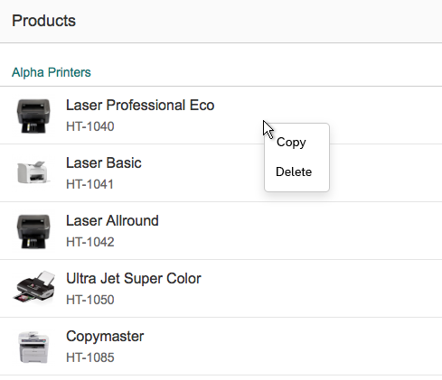
List - context menu
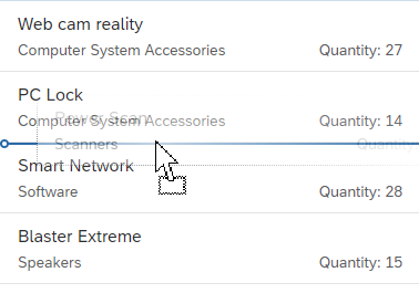
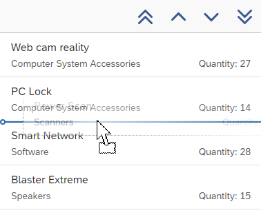
Drag and Drop
One or several items can be repositioned within a list or moved to other UI elements using drag and drop operations (sap.m.ListBase, aggregation: dragDropConfig). While being dragged, the items are shown as ghost elements on the mouse cursor.
Drop targets can be on items, between items, or both (sap.ui.core.dnd.DropPosition). On a drop target, the mouse cursor changes to either a “copy”, “link”, “move”, or “none” cursor. “None” indicates that the dragged item cannot be dropped in the current position (sap.ui.core.dnd.DropEffect).
Drag and drop is only available on supporting browsers.
Drag and drop
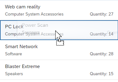
Whole item as drop target
Styles
The list items can have a header when they are used in a content area. It is also technically possible to change the background of the header and of the list itself. Depending on the use case, the lines between the list items and around the list can be shown or hidden.
The property Show Separators (All, Inner, None) allows only the outer lines (Inner) or all the lines (None) to be hidden when the list is used as a more structural element within a content area.
List without separators
Guidelines
Text Length
When you use the list in the first column of the flexible column layout, keep the texts as short as possible and only as long as necessary. If you expect large numbers, use formatting instead.
Custom List Items
If none of the list items provided suits the requirements of your app, you can also create a custom list. If you choose this option, ensure that your custom list item is responsive when resized.
When creating custom list items, take the following guidelines into account, as needed:
Radio Button
Only use radio buttons if they are absolutely necessary. One example would be if you want to distinguish single selection from navigation. This is a rare case in which visible radio buttons for single selection are allowed.
Actions
To trigger actions on single items, show the actions on a toolbar above the list. Do not offer actions on multiple items if the list is expected to have fewer than 10 items in most cases.
The following actions on single items must always be inline:
- Delete: Use “Delete” mode (sap.m.Tree / sap.m.ListBase, property: mode, value: sap.m.ListMode.Delete). This places a Delete button at the end of each item.
- Navigation: Use the “Navigation” item type (sap.m.StandardTreeItem / sap.m.ListItemBase, property: type, value: sap.m.ListType.Navigation). This places a navigation indicator at the end of the corresponding items. Use this to navigate to a new page containing item details.
- Edit: Use the “Detail” item type (sap.m.TreeItem / sap.m.ListItemBase, property: type, value: sap.m.ListType.Detail). This places an Edit icon at the end of the corresponding items.
You can combine delete and edit actions, or delete and navigation actions. However, edit and navigation actions cannot be combined.
To trigger actions that are independent of the selection, show the actions on a toolbar above the list. For example: Add, Collapse All, Expand All, … .
To trigger a default action on the entire item, use the “Active” or “DetailAndActive” item type (sap.m.TreeItem / sap.m.ListItemBase, property: type, value: sap.m.ListType.Active). When clicked, active items trigger an event that can be handled by the app (for example, to open a dialog). Selection of items and expanding/collapsing a node do not trigger the event, and are handled by the tree. Do not use the active item type for navigation, to switch the line item to an edit state, or to delete the item.
Active can be combined with edit and delete, but not with navigation. Do not combine active with the single selection master.
Add Items
For adding items, place an Add or Create text button on the table toolbar.
- Use Create if the button adds a brand new item that doesn’t yet exist on the database.
- Use Add if the item already exists and is merely added or assigned to the current object.
Show new items as the first item of the table, with a visual highlight at the beginning of the row.
For more information, see the guidelines for managing objects (including subarticles).
Enabling/Disabling Actions
To indicate if an action can be applied to the current selection:
- Enable the action if it can be applied to all selected items.
- Enable the action if it can be applied to some of the selected items. If the action is triggered, show a message that informs the user how many items will be affected. Let users choose whether to apply the action anyway or cancel the action.
- Only disable the action if it can be applied to none of the selected items.
For more details, see UI Element – States.
If the action was applied and the items are still available, keep them selected.
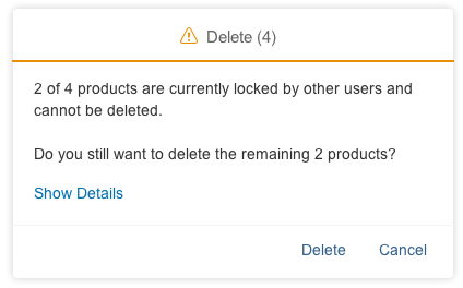
Message for action which applies to a part of a selection
Context Menu
Use the context menu only to give users a quick way of accessing functions that are already available elsewhere (for example, as buttons in the toolbar).
Don’t just offer actions in the context menu itself, as users might not realize that these actions are available at all.
Drag and Drop
Drag and drop is “invisible” on the UI: users can’t see where dragging is available and where it isn’t. In addition, it is not accessible, since there is no generic keyboard interaction. Drag and drop is also not available on all browsers. For these reasons, provide it only in addition to existing (and visible) UI elements that fulfill the same purpose. For example, offer (toolbar) buttons for moving or for copying and pasting items.
Use drag and drop only in addition to existing visible UI elements
If you offer drag and drop for rearranging items within the list, use drop targets that are between items (sap.ui.core.dnd.DropPosition.Between). This provides better feedback on where the item will be inserted. Show the “move” mouse cursor (sap.ui.core.dnd.DropEffect.Move).
Drop targets in between items
Do not combine rearranging items and sorting. If you really need to do so, make sure that there is a dedicated sort criterion for the user-defined sort order, and only offer options for rearranging items if this sort order is set.
When combining rearranging items with grouping, be aware that moving items to another group also means that a value of the dropped item changes: because grouping is based on values, the dropped item needs to take on the corresponding value of the target group. If this is not wanted, do not allow users to rearrange items in grouped lists.
Example:
A list is grouped by availability. An item is moved from the group “Not Available” to the group “In Stock”. In this case, the moved item needs to change its availability to “In Stock” to match the target group. If changing the value doesn’t make sense, only allow users to rearrange the items within the same group, or don’t allow rearranging at all.
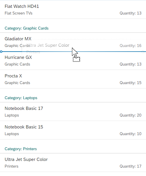
Do not combine rearranging items with grouping, unless you know exactly what you're doing
Export to Spreadsheet
Apps can provide a menu button for exporting list data to a spreadsheet (for example, on the relevant toolbar). For the export, use the export to spreadsheet function.
'Export to Spreadsheet' menu button
Resources
Want to dive deeper? Follow the links below to find out more about related controls, the SAPUI5 implementation, and the visual design.
Elements and Controls
- Action List Item (guidelines)
- Action Placement (guidelines)
- Display List Item (guidelines)
- Feed List Item (guidelines)
- Flag and Favorite (guidelines)
- Formatting (guidelines)
- Input List Item (guidelines)
- Object List Item (guidelines)
- Standard List Item (guidelines)
- UI Element States (guidelines)
Implementation
- List (SAPUI5 samples)
- Object List Item (SAPUI5 samples)
- Standard List Item (SAPUI5 samples)
- Display List Item (SAPUI5 samples)
- Action List Item (SAPUI5 samples)
- Feed List Item (SAPUI5 samples)
- Input List Item (SAPUI5 samples)
- List (SAPUI5 API reference)
- Object List Item (SAPUI5 API reference)
- Standard List Item (SAPUI5 API reference)
- Display List Item (SAPUI5 API reference)
- Action List Item (SAPUI5 API reference)
- Feed List Item (SAPUI5 API reference)
- Input List Item (SAPUI5 API reference)
 Your feedback has been sent to the SAP Fiori design team.