
- Latest SAPUI Version 1.124
- SAPUI5 Version 1.122
- SAPUI5 Version 1.120
- SAPUI5 Version 1.118
- SAPUI5 Version 1.116
- SAPUI5 Version 1.114
- SAPUI5 Version 1.112
- SAPUI5 Version 1.110
- SAPUI5 Version 1.108
- SAPUI5 Version 1.106
- SAPUI5 Version 1.104
- SAPUI5 Version 1.102
- SAPUI5 Version 1.100
- SAPUI5 Version 1.98
- SAPUI5 Version 1.96
- SAPUI5 Version 1.94
- SAPUI5 Version 1.92
- SAPUI5 Version 1.90
- SAPUI5 Version 1.88
- SAPUI5 Version 1.86
- SAPUI5 Version 1.84
- SAPUI5 Version 1.82
- SAPUI5 Version 1.80
- SAPUI5 Version 1.76
- SAPUI5 Version 1.74
- SAPUI5 Version 1.72
- SAPUI5 Version 1.70
- SAPUI5 Version 1.68
- SAPUI5 Version 1.66
- SAPUI5 Version 1.64
- SAPUI5 Version 1.62
- SAPUI5 Version 1.60
- SAPUI5 Version 1.58
- SAPUI5 Version 1.56
- SAPUI5 Version 1.54
- SAPUI5 Version 1.52
- SAPUI5 Version 1.50
- SAPUI5 Version 1.48
- SAPUI5 Version 1.46
- SAPUI5 Version 1.44
- SAPUI5 Version 1.42
- SAPUI5 Version 1.40
- SAPUI5 Version 1.38
- SAPUI5 Version 1.36
- SAPUI5 Version 1.34
- SAPUI5 Version 1.32
- SAPUI5 Version 1.30
- SAPUI5 Version 1.28
- SAPUI5 Version 1.26
- Latest SAPUI Version 1.124
- SAPUI5 Version 1.122
- SAPUI5 Version 1.120
- SAPUI5 Version 1.118
- SAPUI5 Version 1.116
- SAPUI5 Version 1.114
- SAPUI5 Version 1.112
- SAPUI5 Version 1.110
- SAPUI5 Version 1.108
- SAPUI5 Version 1.106
- SAPUI5 Version 1.104
- SAPUI5 Version 1.102
- SAPUI5 Version 1.100
- SAPUI5 Version 1.98
- SAPUI5 Version 1.96
- SAPUI5 Version 1.94
- SAPUI5 Version 1.92
- SAPUI5 Version 1.90
- SAPUI5 Version 1.88
- SAPUI5 Version 1.86
- SAPUI5 Version 1.84
- SAPUI5 Version 1.82
- SAPUI5 Version 1.80
- SAPUI5 Version 1.78
- SAPUI5 Version 1.76
- SAPUI5 Version 1.74
- SAPUI5 Version 1.72
- SAPUI5 Version 1.70
- SAPUI5 Version 1.68
- SAPUI5 Version 1.66
- SAPUI5 Version 1.64
- SAPUI5 Version 1.62
- SAPUI5 Version 1.60
- SAPUI5 Version 1.58
- SAPUI5 Version 1.56
- SAPUI5 Version 1.54
- SAPUI5 Version 1.52
- SAPUI5 Version 1.50
- SAPUI5 Version 1.48
- SAPUI5 Version 1.46
- SAPUI5 Version 1.44
- SAPUI5 Version 1.42
- SAPUI5 Version 1.40
- SAPUI5 Version 1.38
- SAPUI5 Version 1.36
- SAPUI5 Version 1.34
- SAPUI5 Version 1.32
- SAPUI5 Version 1.30
- SAPUI5 Version 1.28
- SAPUI5 Version 1.26
Comparison Pattern
Intro
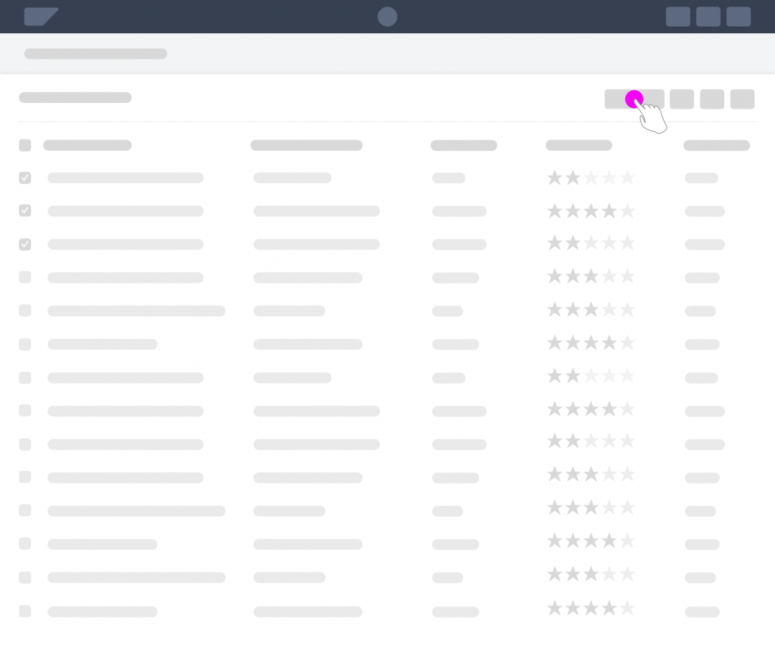
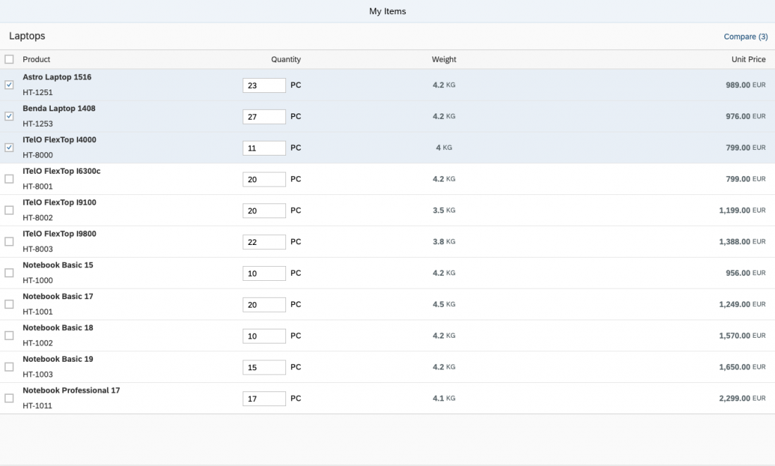
The comparison pattern allows users to select items from a list and display them side-by-side. This makes it easier to compare the characteristics of multiple items.
Show Comparison for Selected Items

When to Use
Use the comparison pattern if:
- Users need to compare two or more similar items.
- Users need to compare versions of the same item.
- You are using the Dynamic Page Layout.
Do not use the comparison pattern if:
- There is no business need for displaying items side-by-side. Don’t use the pattern purely for visualization.
- You want to display only one item. In this case, use the Object Page Floorplan instead.
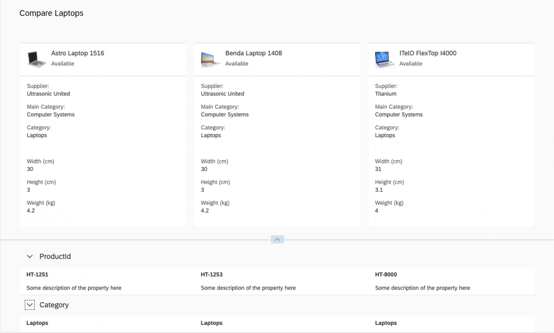
Components
The comparison pattern comprises the following components. All are mandatory:
- Triggering action: Opens the comparison view for the selected items.
- Header area: Shows the most important characteristics for identifying and comparing items. Each item is represented by a card.
- Content area: Shows all characteristics needed for comparison. Each item is represented by a panel.
Triggering Action
The comparison is triggered by a button on a selection screen (for example, in a table toolbar).
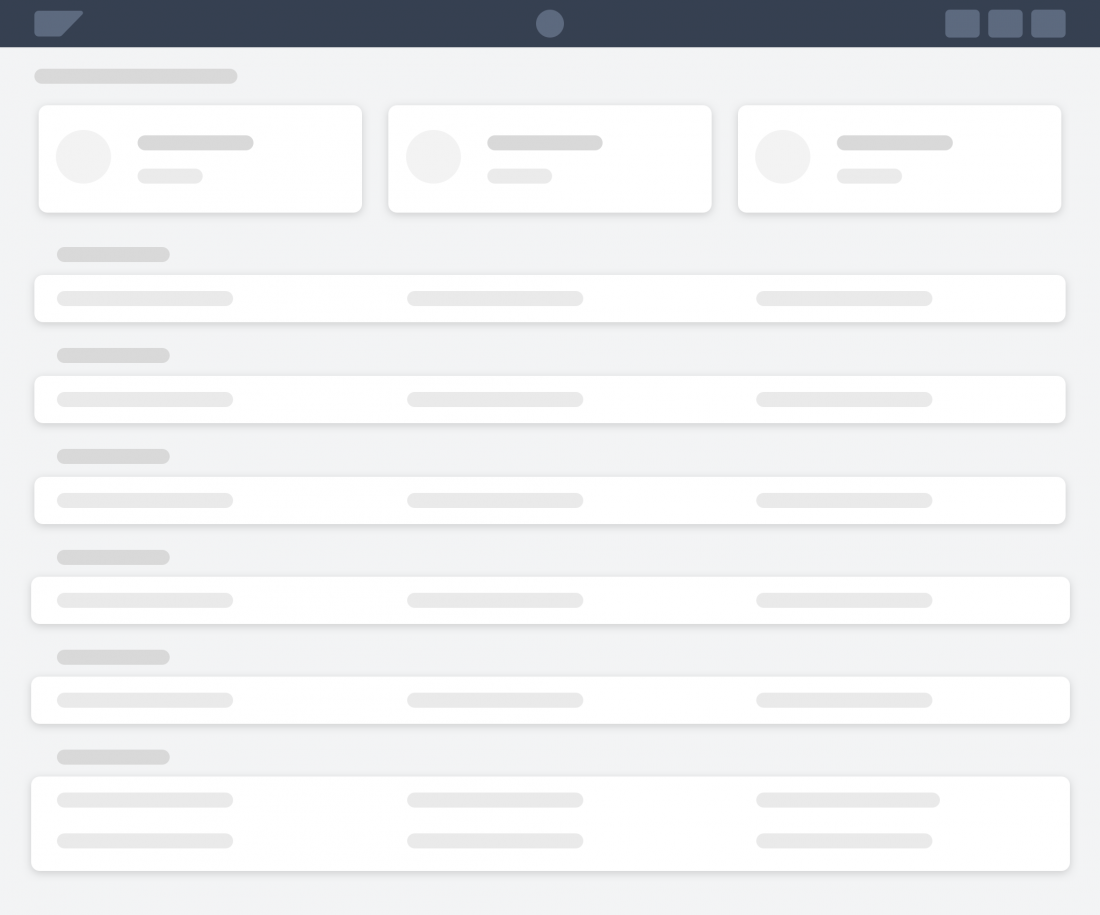
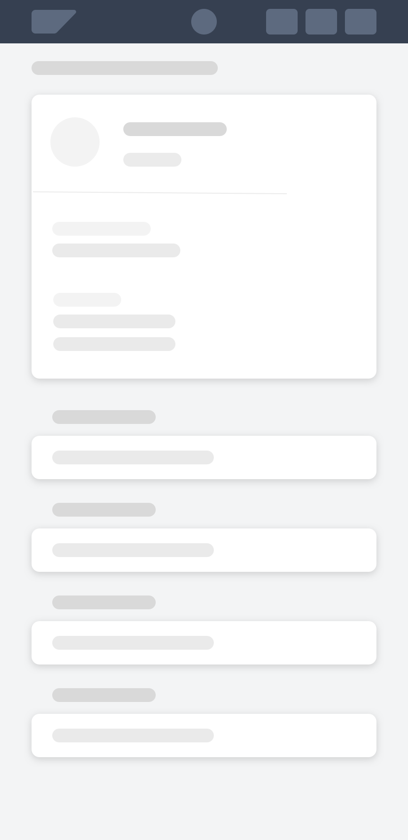
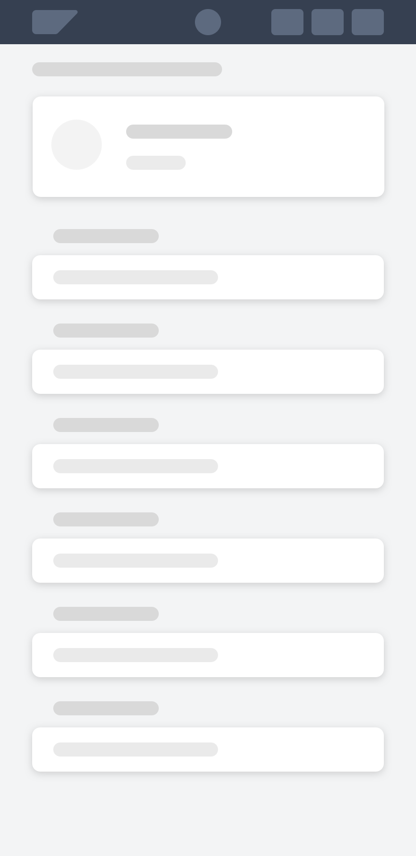
Header Area
The dynamic page header holds the header area of the comparison pattern. It uses the snapping behavior.
The header area has two main components:
1. Carousel
The carousel control displays the items in cards.
If there is not enough space to show all cards, paging buttons are displayed. Each time a user navigates left or right, the previous or next card is displayed. This also affects the respective panels in the content area. They are updated with the details of the item represented by the card.
2. Card
The card contains the most important characteristics for an item. It consists of the card header and the card content.
When the header snaps, the information in the header area stays and the card content hides.
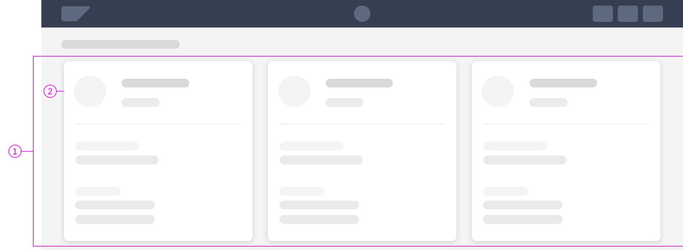
Comparison pattern - Header area
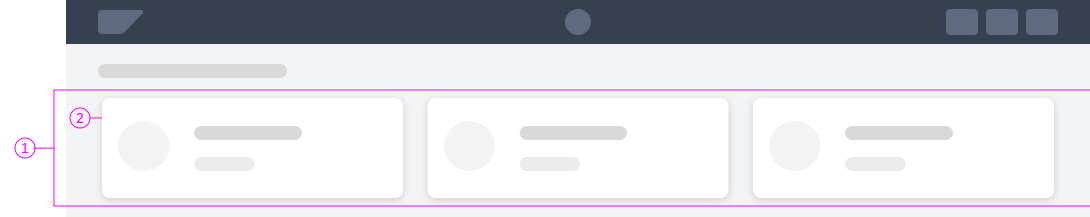
Comparison pattern - Snapped header
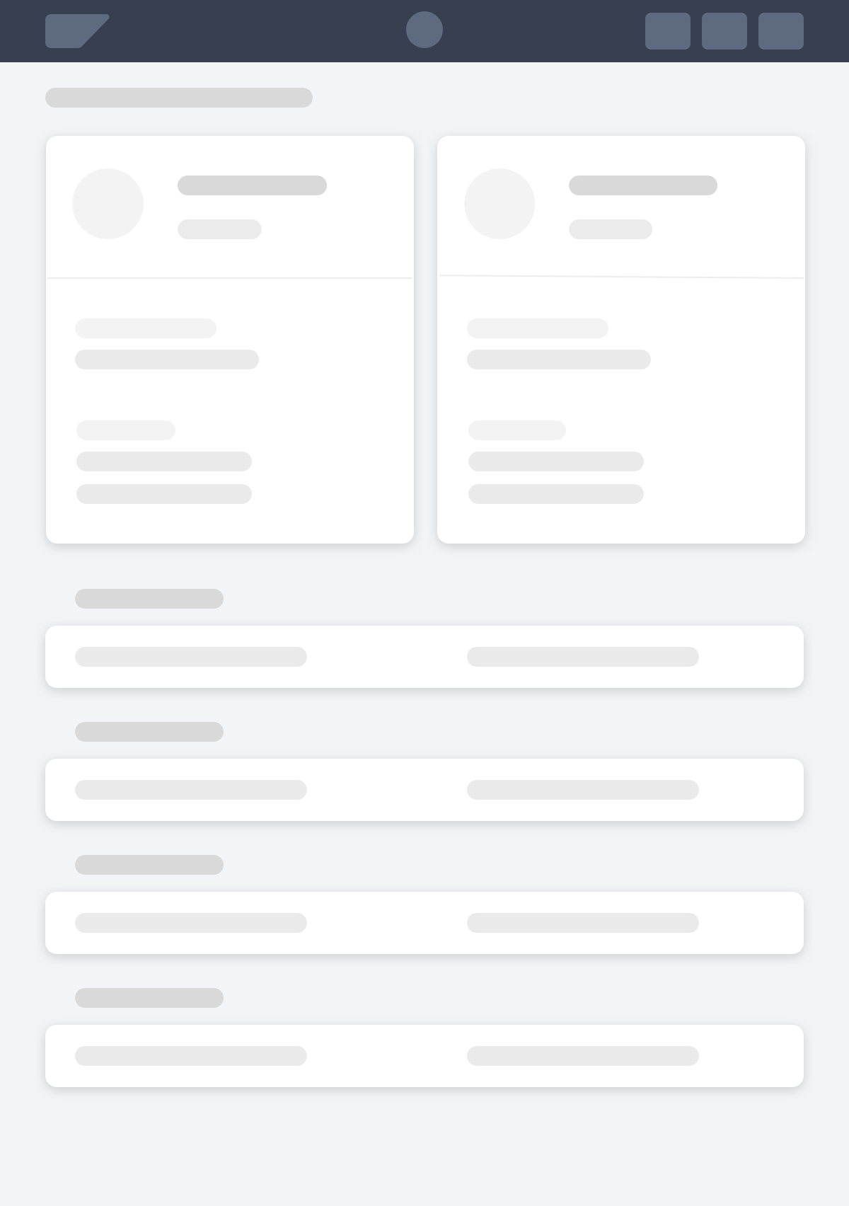
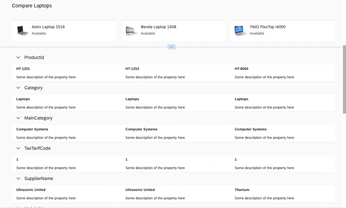
Content Area
The dynamic page content area holds the content area of the comparison pattern.
The content area must contain at least two panels. For easier and faster comparison, use up to 10 panels to display the specifics of the selected items.
Panel
The expandable panel (1) is used to display all comparable characteristics in columns. A column is aligned with the respective card.
The first column of each panel should contain the characteristics of the item represented with the first card, the second column the item represented with the second card, and so on.
A panel must have a title that describes the characteristics. When collapsed (2), the panel displays only the title toolbar.
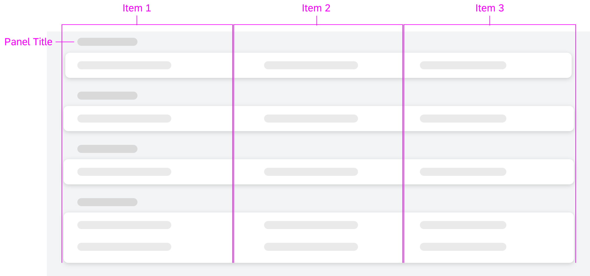
Comparison pattern - Content area
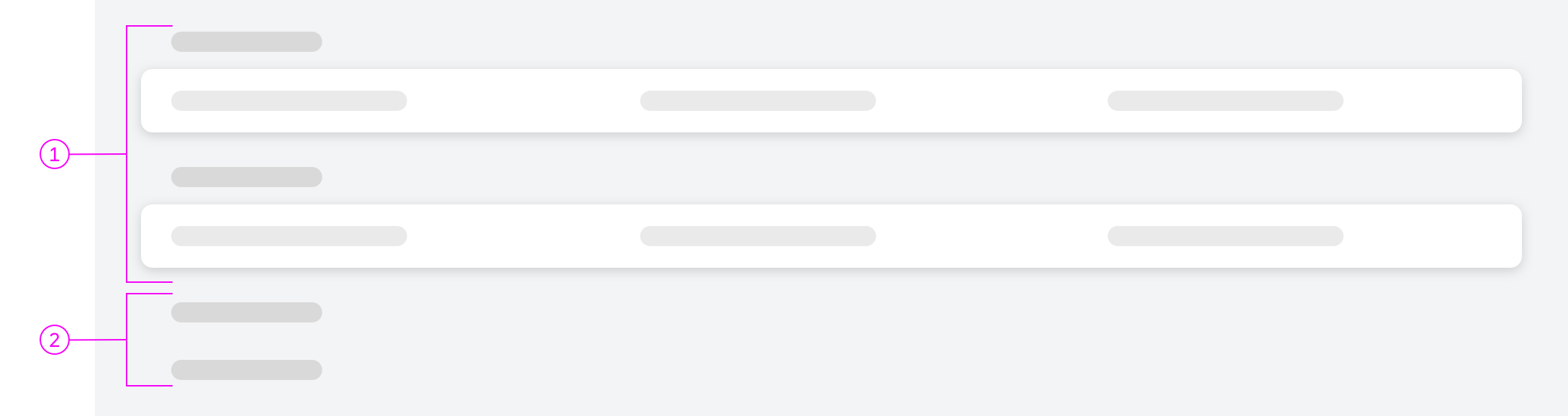
Comparison pattern content area - Expanded and collapsed panels
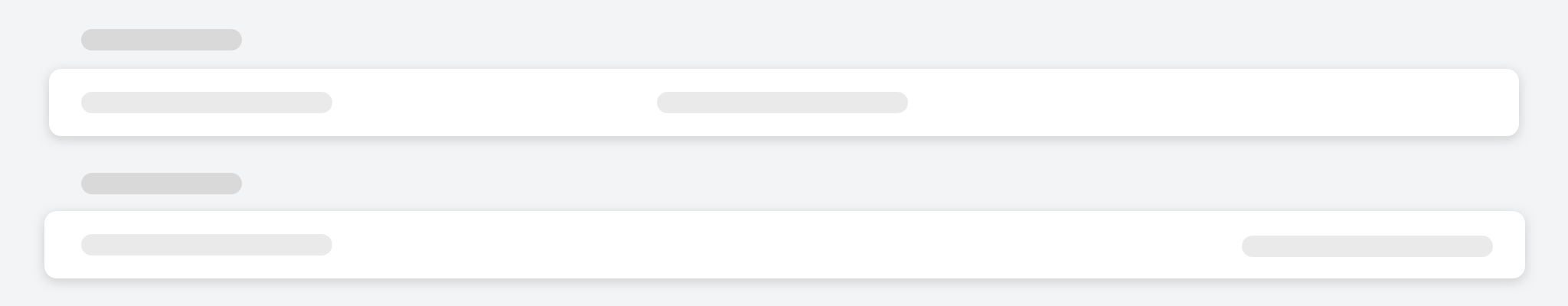
Missing characteristics
Behavior and Interaction
Adding More Items
If your users need to add more items while comparing, place an Add to Comparison action in the header. For more information, see Dynamic Page Layout – Header Title.
For adding more items, either show a dialog or the original page the user started from. Make sure that you display the items that are already in the comparison: in the dialog, also show the previously selected items; in the original page, keep the items selected.
Responsiveness
The comparison pattern adapts the number of visible items based on the screen size. If a card is no longer in the visible area, also hide its corresponding column in the panels.
On size S, there is only one visible card in the header area and its corresponding panels in the content area. Users can navigate left or right to see the next or previous item.
The comparison pattern maintains the scrolling position of the page when switching to the next or previous item. This feature helps the user focus on a certain characteristic while navigating through the items.
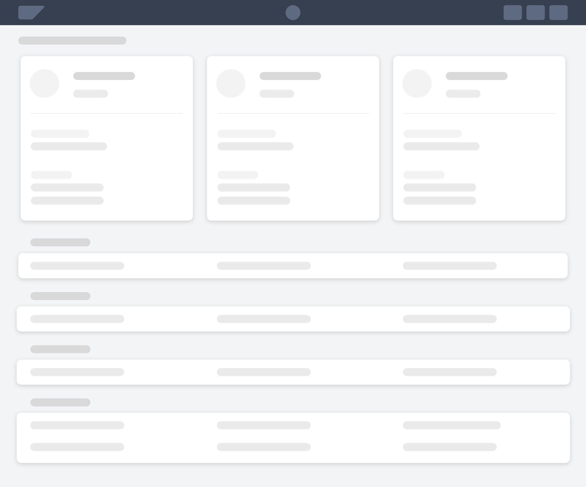
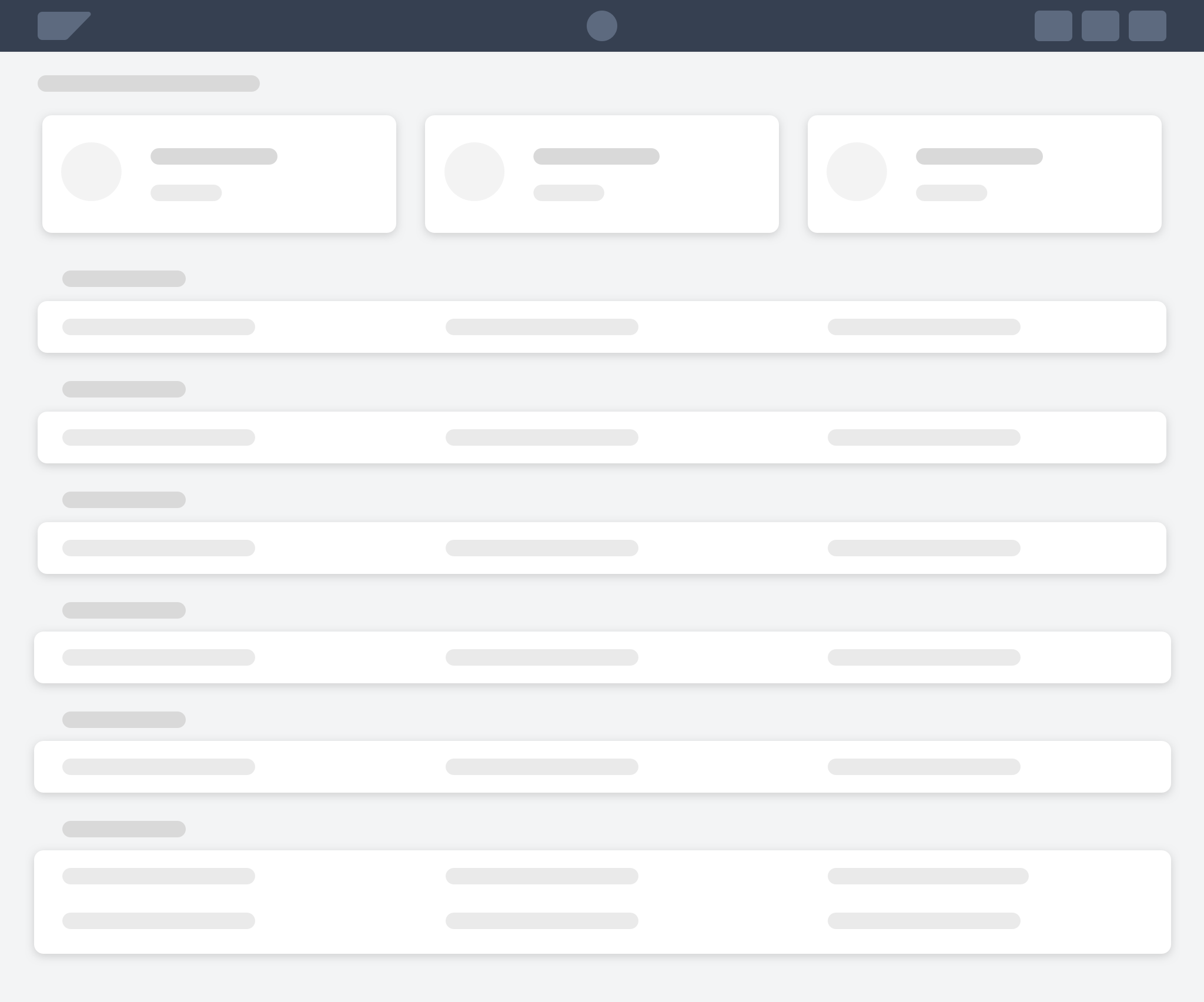
On size M and larger, always show two or more cards with their corresponding panel columns in the visible area.
Size S
Size S - Snapped header
Size M

Size M -Snapped header
Size L
Size L - Snapped header
Example
Top Tips
Compare apples with apples.
Wording
- For triggering the comparison, use a meaningful button text with the number of selected items in brackets. We recommend “Compare (<number of selected items>)”, for example, Compare (3).
- Use a page title that describes the task. We recommend “Compare <selected object type>”, for example, Compare Products.
- Use precise panel titles to describe the characteristics.
Cards
- Show only the most important information for an item on the card.
- If the cards contain only a title, subtitle, and image/avatar, show the dynamic page header in collapsed mode when starting the app.
- Link each item’s object page (if available) to the header area of the card. This gives users access to all the characteristics for a specific item to help them make a final decision.
 Your feedback has been sent to the SAP Fiori design team.