
- Latest SAPUI Version 1.124
- SAPUI5 Version 1.122
- SAPUI5 Version 1.120
- SAPUI5 Version 1.118
- SAPUI5 Version 1.116
- SAPUI5 Version 1.114
- SAPUI5 Version 1.112
- SAPUI5 Version 1.110
- SAPUI5 Version 1.108
- SAPUI5 Version 1.106
- SAPUI5 Version 1.104
- SAPUI5 Version 1.102
- SAPUI5 Version 1.100
- SAPUI5 Version 1.98
- SAPUI5 Version 1.96
- SAPUI5 Version 1.94
- SAPUI5 Version 1.92
- SAPUI5 Version 1.90
- SAPUI5 Version 1.88
- SAPUI5 Version 1.86
- SAPUI5 Version 1.84
- SAPUI5 Version 1.82
- SAPUI5 Version 1.80
- SAPUI5 Version 1.76
- SAPUI5 Version 1.74
- SAPUI5 Version 1.72
- SAPUI5 Version 1.70
- SAPUI5 Version 1.68
- SAPUI5 Version 1.66
- SAPUI5 Version 1.64
- SAPUI5 Version 1.62
- SAPUI5 Version 1.60
- SAPUI5 Version 1.58
- SAPUI5 Version 1.56
- SAPUI5 Version 1.54
- SAPUI5 Version 1.52
- SAPUI5 Version 1.50
- SAPUI5 Version 1.48
- SAPUI5 Version 1.46
- SAPUI5 Version 1.44
- SAPUI5 Version 1.42
- SAPUI5 Version 1.40
- SAPUI5 Version 1.38
- SAPUI5 Version 1.36
- SAPUI5 Version 1.34
- SAPUI5 Version 1.32
- SAPUI5 Version 1.30
- SAPUI5 Version 1.28
- SAPUI5 Version 1.26
- Latest SAPUI Version 1.124
- SAPUI5 Version 1.122
- SAPUI5 Version 1.120
- SAPUI5 Version 1.118
- SAPUI5 Version 1.116
- SAPUI5 Version 1.114
- SAPUI5 Version 1.112
- SAPUI5 Version 1.110
- SAPUI5 Version 1.108
- SAPUI5 Version 1.106
- SAPUI5 Version 1.104
- SAPUI5 Version 1.102
- SAPUI5 Version 1.100
- SAPUI5 Version 1.98
- SAPUI5 Version 1.96
- SAPUI5 Version 1.94
- SAPUI5 Version 1.92
- SAPUI5 Version 1.90
- SAPUI5 Version 1.88
- SAPUI5 Version 1.86
- SAPUI5 Version 1.84
- SAPUI5 Version 1.82
- SAPUI5 Version 1.80
- SAPUI5 Version 1.78
- SAPUI5 Version 1.76
- SAPUI5 Version 1.74
- SAPUI5 Version 1.72
- SAPUI5 Version 1.70
- SAPUI5 Version 1.68
- SAPUI5 Version 1.66
- SAPUI5 Version 1.64
- SAPUI5 Version 1.62
- SAPUI5 Version 1.60
- SAPUI5 Version 1.58
- SAPUI5 Version 1.56
- SAPUI5 Version 1.54
- SAPUI5 Version 1.52
- SAPUI5 Version 1.50
- SAPUI5 Version 1.48
- SAPUI5 Version 1.46
- SAPUI5 Version 1.44
- SAPUI5 Version 1.42
- SAPUI5 Version 1.40
- SAPUI5 Version 1.38
- SAPUI5 Version 1.36
- SAPUI5 Version 1.34
- SAPUI5 Version 1.32
- SAPUI5 Version 1.30
- SAPUI5 Version 1.28
- SAPUI5 Version 1.26
Rich Text Editor
sap.ui.richtexteditor.RichTextEditor
Intro
The rich text editor (RTE) is a complex control for data input and editing. It allows users to format the text and insert different types of elements within the text, such as images and hyperlinks.
The rich text editor uses the third party component TinyMCE. In addition to the native toolbar, you can also use a toolbar built with SAPUI5 controls. This custom toolbar acts as a wrapper around the native toolbar and takes care of synchronizing the state of the internal controls with the current state of the selection in the editor.

Rich text editor
Usage
Use the rich text editor if:
- You want to enable users to enter rich text with different styles and colors.
- You need to provide an instrument for texts that require additional formatting.
Do not use the rich text editor if:
- You want to let users add simple text that doesn’t require formatting. Use text area instead.
Responsiveness
The rich text editor is intended primarily for use on desktop devices, even though it still displays smoothly on mobile devices. You can also enable the mobile theme of TinyMCE, but we don’t recommend using it as it comes with some limitations explained in the Mobile Theme section.
Overflow Behavior
On smaller screens, the custom toolbar utilizes the overflow behavior of the standard SAP Fiori toolbar.
If the available actions do not all fit into the available space in the toolbar, the extra actions disappear from the visible part of the toolbar from right to left, and an overflow menu button appears on the right of the toolbar. Clicking the overflow button reveals the hidden options.
Each action has a priority, which determines whether and when the action moves into the overflow menu. You can prioritize the actions in the toolbar by applying one of five statuses:
- Always overflow: The action always goes into the overflow.
- Disappear: An action that is not so relevant for the user can disappear if the space is limited.
- Low: Actions with the priority “Low” overflow first. Assign this status to actions the user rarely needs.
- High: Actions with priority “High” remain visible in the toolbar until all lower-priority actions have moved to the overflow. Lower-priority actions are those with the priorities “Disappear” or “Low”, and all unprioritized actions.
- Never overflow: These actions are always visible in the toolbar.
Size S
Size M

Size L
Mobile Theme
From version 4.7, TinyMCE provides native mobile support with the mobile theme. If your use case requires it and you have enabled the mobile theme, the custom toolbar cannot be used, and the native TinyMCE toolbar and layout are loaded. This is why we don’t recommend using the mobile theme.
Layout
The rich text editor has two main components – the toolbar and the content area.
- Toolbar: All available actions are displayed in the toolbar. App development teams can add or remove individual action groups, depending on the use case.
- Content area: The content area is where users create their text. It visualizes all the changes made using the actions in the toolbar.
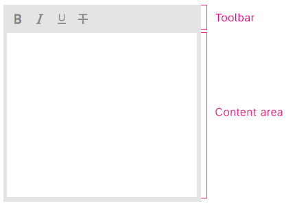
Schematic visualization of the rich text editor
Toolbar Types
The rich text editor comes with two types of toolbar: the common TinyMCE toolbar and the custom toolbar.
The first image shows the default (native) toolbar, which comes with its own behavior for smaller screens.
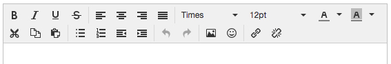
Rich text editor - Native TinyMCE toolbar
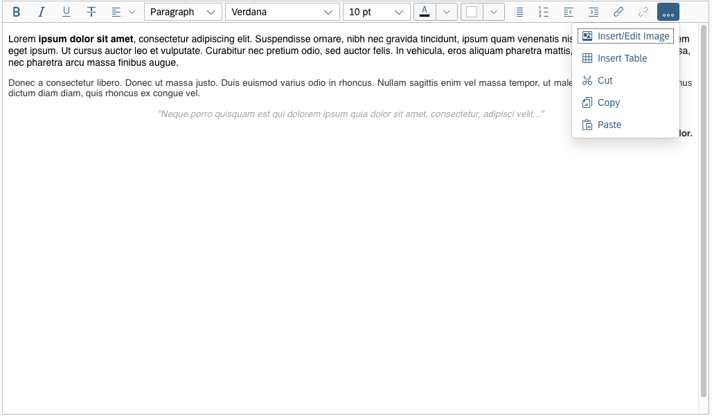
The next image shows the custom toolbar, which includes common SAP Fiori controls and utilizes the overflow toolbar behavior. All common actions provided by the native toolbar are also offered by the custom toolbar.
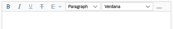
Rich text editor - Custom SAP Fiori toolbar with overflow
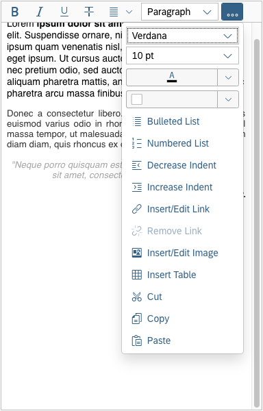
Actions in the Custom Toolbar
The custom toolbar includes most of the native TinyMCE actions. The actions are separated into several virtual groups. You can hide each group of actions individually if it is not required by the use case.
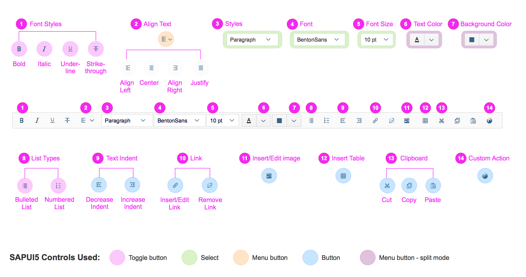
Rich text editor - Actions in the custom toolbar
1) Font Styles: A group of four styles that can be applied to individual symbols (Bold, Italic, Underline and Strikethrough). All of the actions can be combined, which means that a preselected text can be bold, italicized, underlined and crossed out at the same time.
2) Align Text: A group of actions for aligning the text: Align Left, Align Right, Center and Justify. By default the text is left aligned. The selected style is applied to the entire paragraph.
3) Styles: Offers a list of predefined styles, including 6 heading levels and a paragraph. The default style is Paragraph.
4) Font: Changes the font family of the text. All the available fonts are displayed in a select control. 17 font families are supported, including popular fonts like Verdana, Tahoma, Arial, Times New Roman, and Helvetica. The change is applied to individual symbols.
5) Font Size: Changes the size of the text. All available font sizes are displayed in a select control. The minimum size is 8 pt and the maximum size is 36 pt. The change is applied to individual symbols.
6) Text Color: Opens a menu with different options for choosing the color of the text, including a color picker dialog. The default text color is black.
7) Background Color: Opens a menu with different options for choosing the color of the background, including a color picker dialog. The default background color is white.
8) List Type: Part of the structure group. There are two types of list: Bulleted List and Numbered List. This action is applied at paragraph level and turns a normal paragraph into a list. The two list types cannot be applied simultaneously.
9) Text Indent: Part of the structure group. These two actions let users increase or decrease the indentation of the text.
10) Link: A group with two actions: Insert/Edit Link and Remove Link.
11) Insert/Edit image: This option opens a dialog for adding and editing images. Users can also define some of the image properties, such as the width, height, and description.
12) Insert Table: Inserts a simple table within the content area.
13) Clipboard: This action group includes the Cut, Copy, and Paste actions.
14) Custom Action: If the use case requires an action that is not available in the set of common actions, you can attach an external plugin to the custom action. Technically, you can add as many custom actions as you like. However, because custom actions are displayed after the common actions, we recommend keeping the number of custom actions down to a reasonable level.
Behavior and Interaction
General Information
The rich text editor is only available in edit mode of the floorplan it is displayed in. In display mode the content is shown as it is formatted by the user. The user-defined formatting cannot be overwritten.
The toolbar is always visible and the user has access to all the action groups. To start typing, the user has to click inside the content area.
To apply any of the actions from the toolbar, the user has to select the text to be formatted upfront.
Some of the actions can be preselected and applied prior to typing the text. These actions are:
- Font family, font size and styling (bold, italic, underline)
- Paragraph alignment
- Color selection (text color and background color)
Font Styles
The user selects the font style using the respective icon toggle buttons (Bold, Italic, Underline, Strikethrough). The style is applied to a preselected text and remains active until the user clicks the button again or moves the marker to an area where a different style is applied, or no style is applied.
Alignment
The user can change the alignment of the text (Align Left, Align Right, Center, Justify).
By default the text is left-aligned. The selected style is applied to the entire paragraph. To apply any of the styles, the user selects the text and then clicks on the Align Text button . It is also possible to select the alignment upfront, but in this case only the text written after the selection will have the desired alignment.
Font
The user selects the desired font family from a list of all available font families. The selected font family can be applied to a preselected text, or selected upfront. The default font family is Verdana.
Font Size
The user selects the desired font size from a list of font sizes from 8 pt to 36 pt. The selected font size can be applied to a preselected text, or selected upfront.
List Types
The user can create two types of lists, both of which are triggered by toggle buttons: bulleted lists and numbered lists . List formatting is applied at paragraph level. To apply list formatting, the user preselects the relevant paragraphs and selects the relevant list type action.
Text Indent
The text indent defines the amount of empty space in front of a paragraph. The user can increase the indentation , or decrease it . Both actions are triggered by standard buttons, and are applied at paragraph level. To change the indentation, the user selects the paragraph (or just positions the cursor within the text) and selects the indent action. The text is moved 30 px left or right, depending on the action chosen.
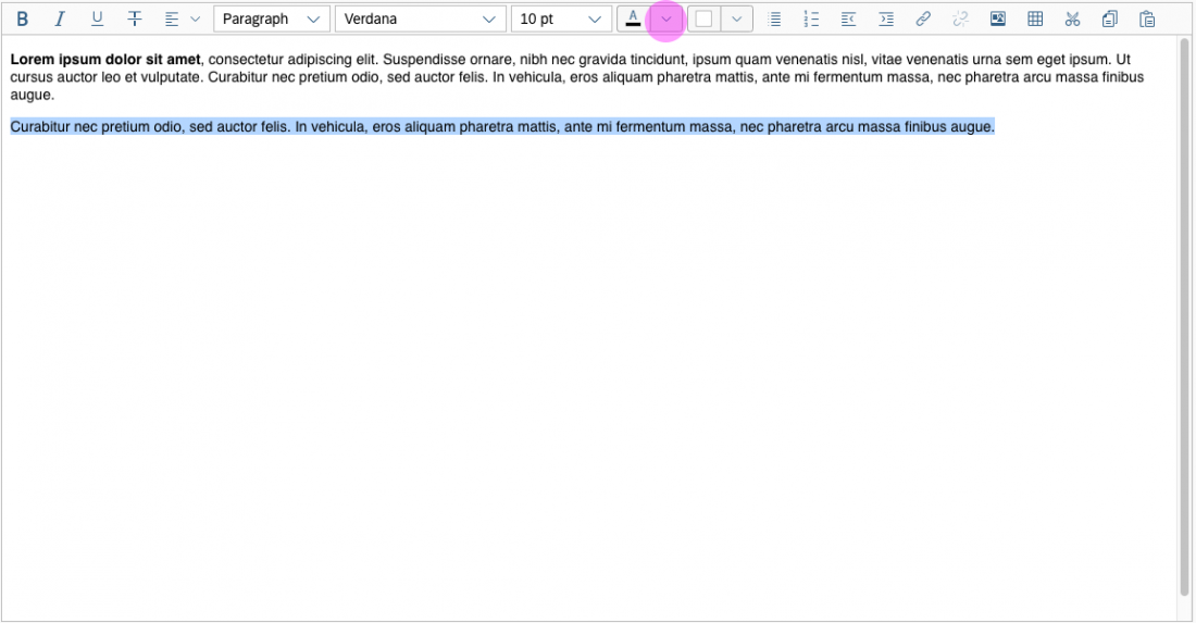
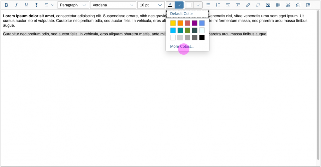
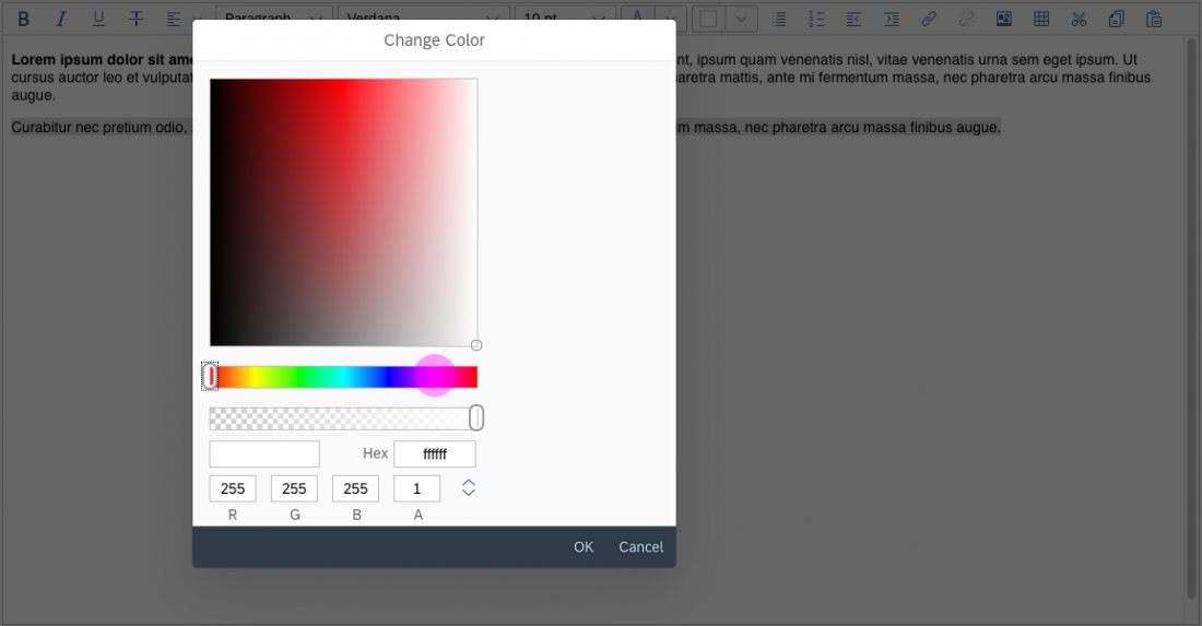
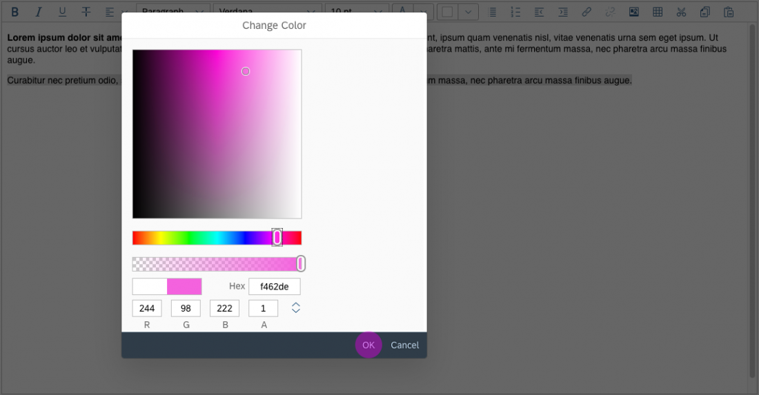
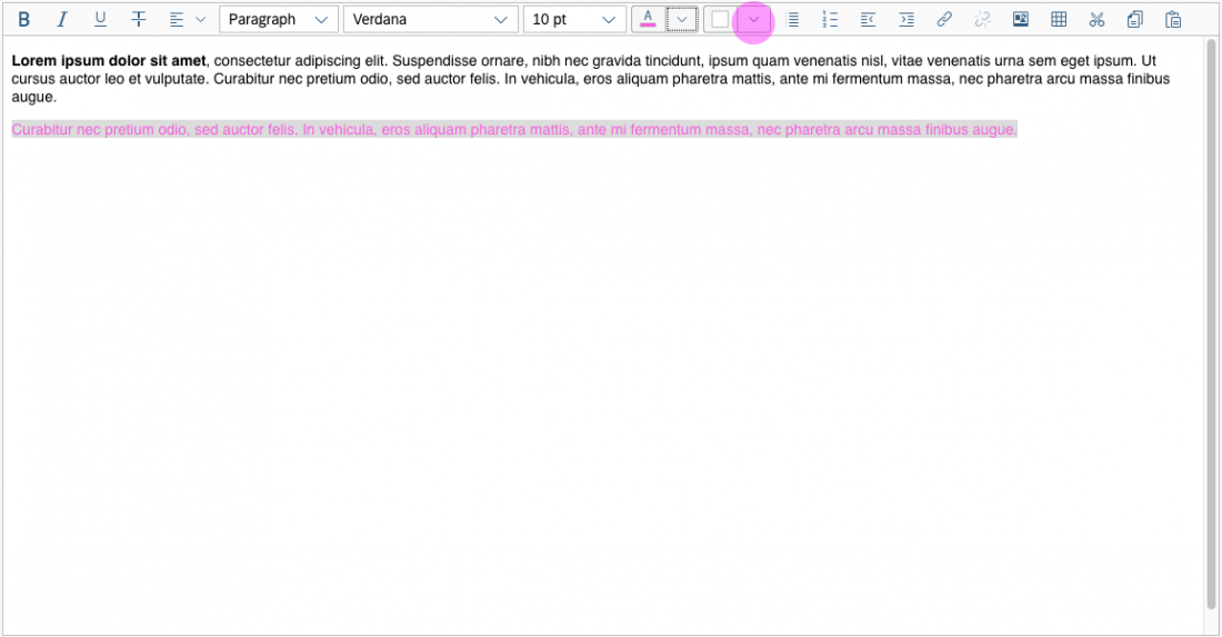
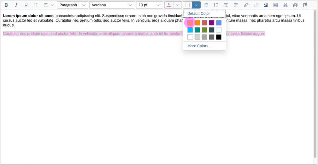
Color Selection
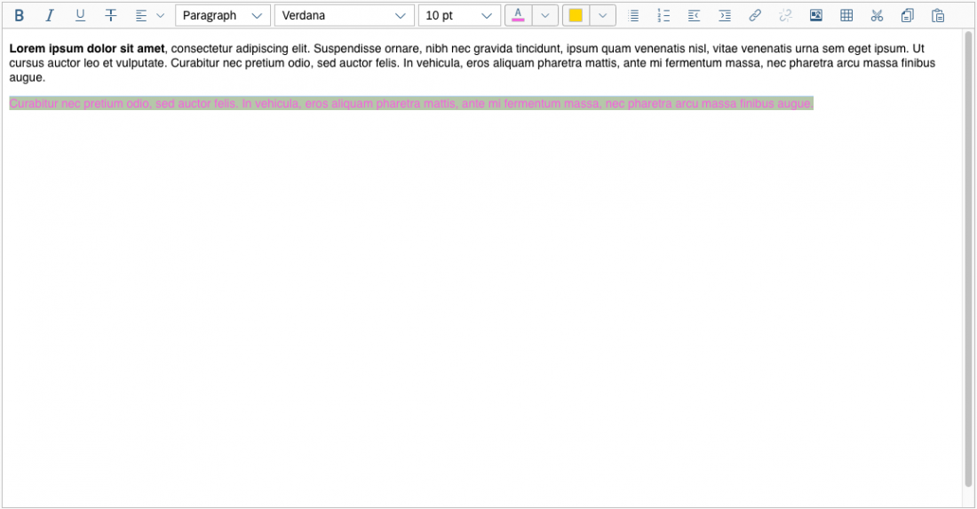
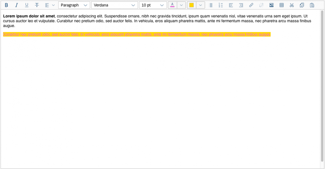
The user can change the text color and the background color. The chosen colors can be applied to a preselected text or selected upfront.
To choose a color, the user clicks on the color arrow button for the font or background (the right-hand segment of the split button). This opens a popover where users can choose the default color (black for text, white for background), select one of 15 predefined colors, or open a separate color picker dialog.
Within the color picker dialog, the following options are available:
- Move the circle inside the color field
- Define RGB values
- Define HSL values
- Enter the HEX value
- Use the horizontal color slider
Users can also define the transparency with the transparency slider.
Clicking OK confirms the selection.
The user can also apply the most recent font or background color without opening the color palette or the dropdown menu. This is done by pressing the left-hand segment of the split button.
Example: Selecting Text and Background Colors
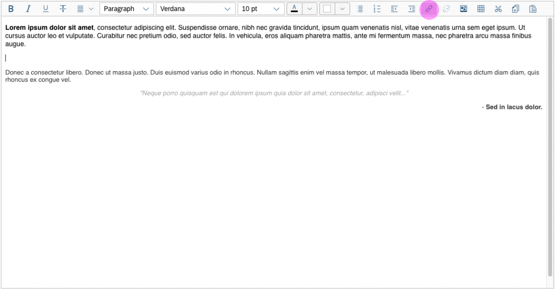
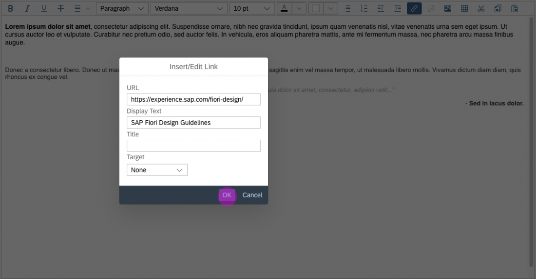
Inserting, Editing, and Removing Links
The Insert/Edit Link button opens a dialog for entering the link details. These include the URL, the link text, a title, and the target for the link (same or new browser window) .
It is also possible to attach a link to a preselected text and to edit details for an existing link.
The Remove Link button is only active when an existing text link has been selected.
Example: Insert/Edit Link
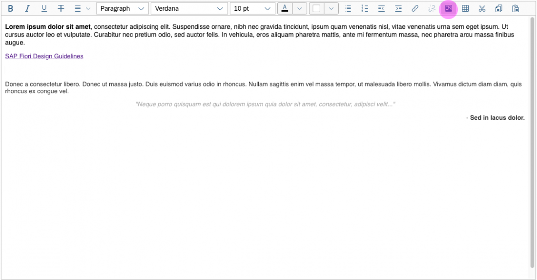
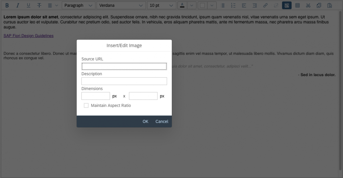
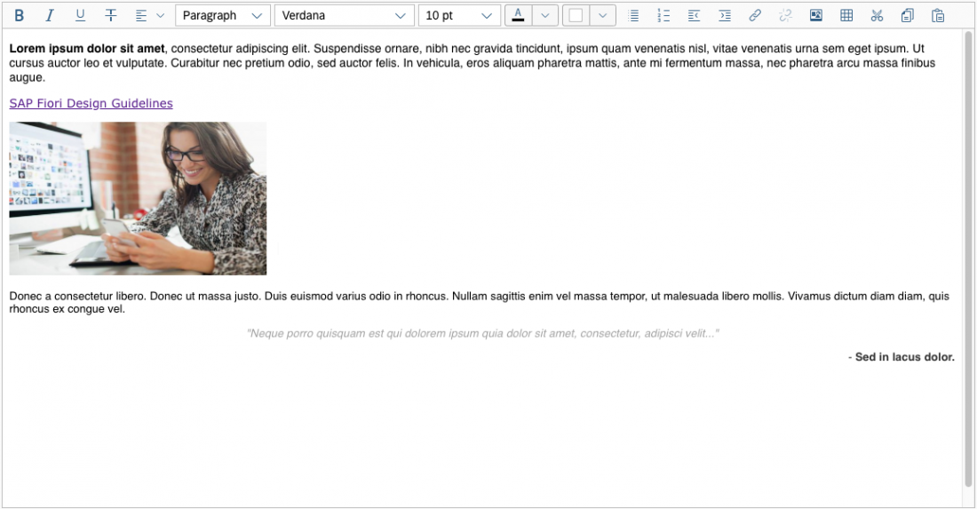
Inserting and Editing Images
The Insert/Edit Image button opens a dialog for entering the image URL, a description, and the size.
Beforehand, the user must upload the image to a library that is accessible. In the dialog itself, users can only enter an existing image link. Images cannot be uploaded directly to the server.
To change the alignment of the inserted image, the user selects the image and applies the relevant alignment action. The text around the image is positioned as follows:
- Right-aligned image: The text is displayed to the left of the image.
- Left-aligned image: The text is displayed to the right of the image.
- Centered image: Only the image is displayed in the center of the paragraph.
Users can also edit the URL, description, and size of an existing image by selecting the image and choosing Insert/Edit Image.
Example: Inserting an Image
Guidelines
Minimum Width
Although the control allows a minimum width of 6 rem (96 px), we recommend setting the width to at least 17.5 rem (280 px). Any less will make the editor practically unusable.
Minimum Height
The minimum height of the control is 12.5 rem (200 px), which ensures that the editor is usable.
Number of Actions in the Toolbar
Only offer actions that are relevant for the use case. If you just need simple text formatting (such as bold, italic, underline, and strikethrough), remove the other groups.
Custom Plugins
Exercise judgement when adding custom plugins to the editor. Only offer a reasonable number of additional options.
Use self-explanatory icons for custom actions. Do not use a text label, or combine a text label with and icon.
As for all icons, offer a tooltip with a text label instead.
Additional Guidelines
The guidelines for the following controls also apply:
Resources
Want to dive deeper? Follow the links below to find out more about related controls, the SAPUI5 implementation, and the visual design.
Implementation
- RTE with Custom Toolbar (SAPUI5 samples)
- RTE with Custom Toolbar (SAPUI5 test suite)
- RTE with Native Toolbar (SAPUI5 test suite)
- RTE with Custom Plugin Enabled (SAPUI5 test suite)
- Rich Text Editor (SAPUI5 API reference)
 Your feedback has been sent to the SAP Fiori design team.