
- Latest SAPUI Version 1.124
- SAPUI5 Version 1.122
- SAPUI5 Version 1.120
- SAPUI5 Version 1.118
- SAPUI5 Version 1.116
- SAPUI5 Version 1.114
- SAPUI5 Version 1.112
- SAPUI5 Version 1.110
- SAPUI5 Version 1.108
- SAPUI5 Version 1.106
- SAPUI5 Version 1.104
- SAPUI5 Version 1.102
- SAPUI5 Version 1.100
- SAPUI5 Version 1.98
- SAPUI5 Version 1.96
- SAPUI5 Version 1.94
- SAPUI5 Version 1.92
- SAPUI5 Version 1.90
- SAPUI5 Version 1.88
- SAPUI5 Version 1.86
- SAPUI5 Version 1.84
- SAPUI5 Version 1.82
- SAPUI5 Version 1.80
- SAPUI5 Version 1.76
- SAPUI5 Version 1.74
- SAPUI5 Version 1.72
- SAPUI5 Version 1.70
- SAPUI5 Version 1.68
- SAPUI5 Version 1.66
- SAPUI5 Version 1.64
- SAPUI5 Version 1.62
- SAPUI5 Version 1.60
- SAPUI5 Version 1.58
- SAPUI5 Version 1.56
- SAPUI5 Version 1.54
- SAPUI5 Version 1.52
- SAPUI5 Version 1.50
- SAPUI5 Version 1.48
- SAPUI5 Version 1.46
- SAPUI5 Version 1.44
- SAPUI5 Version 1.42
- SAPUI5 Version 1.40
- SAPUI5 Version 1.38
- SAPUI5 Version 1.36
- SAPUI5 Version 1.34
- SAPUI5 Version 1.32
- SAPUI5 Version 1.30
- SAPUI5 Version 1.28
- SAPUI5 Version 1.26
- Latest SAPUI Version 1.124
- SAPUI5 Version 1.122
- SAPUI5 Version 1.120
- SAPUI5 Version 1.118
- SAPUI5 Version 1.116
- SAPUI5 Version 1.114
- SAPUI5 Version 1.112
- SAPUI5 Version 1.110
- SAPUI5 Version 1.108
- SAPUI5 Version 1.106
- SAPUI5 Version 1.104
- SAPUI5 Version 1.102
- SAPUI5 Version 1.100
- SAPUI5 Version 1.98
- SAPUI5 Version 1.96
- SAPUI5 Version 1.94
- SAPUI5 Version 1.92
- SAPUI5 Version 1.90
- SAPUI5 Version 1.88
- SAPUI5 Version 1.86
- SAPUI5 Version 1.84
- SAPUI5 Version 1.82
- SAPUI5 Version 1.80
- SAPUI5 Version 1.78
- SAPUI5 Version 1.76
- SAPUI5 Version 1.74
- SAPUI5 Version 1.72
- SAPUI5 Version 1.70
- SAPUI5 Version 1.68
- SAPUI5 Version 1.66
- SAPUI5 Version 1.64
- SAPUI5 Version 1.62
- SAPUI5 Version 1.60
- SAPUI5 Version 1.58
- SAPUI5 Version 1.56
- SAPUI5 Version 1.54
- SAPUI5 Version 1.52
- SAPUI5 Version 1.50
- SAPUI5 Version 1.48
- SAPUI5 Version 1.46
- SAPUI5 Version 1.44
- SAPUI5 Version 1.42
- SAPUI5 Version 1.40
- SAPUI5 Version 1.38
- SAPUI5 Version 1.36
- SAPUI5 Version 1.34
- SAPUI5 Version 1.32
- SAPUI5 Version 1.30
- SAPUI5 Version 1.28
- SAPUI5 Version 1.26
Input Field
sap.m.Input
Intro
A text input field allows users to enter and edit text or numeric values in one line. To help users enter a valid value, you can enable the autocomplete suggestion feature and the value help option.
Usage
Use the input field if:
- The user needs to enter a short, single-line text or number.
- The user needs to enter a password, URL, phone number, or email address.
- The user needs to select a single item from a large amount of data (for example, more than 200 items).
- The user needs to find an object by searching for more than one attribute, such as an ID, city, and customer name. Use this control in combination with the autocomplete suggestion feature and value help option. For a small set of values (for example, fewer than 20 items), consider using the select control. Otherwise, use the combo box (for 20-200 items).
Do not use the input field if:
- The user needs to enter dates and times. In this case, use the date picker, date range selection, or date/time picker.
- The user needs to enter long texts. In this case, use the text area.
- The user needs to carry out a search. In this case, use the search field.
- The user needs to select multiple values. In this case, use the multi-combo box (for fewer than 200 items) or the multi-input field (for more than 200 items).
Responsiveness
In the examples below, the input field is shown in combination with the tabular autocomplete feature for different device sizes.
Size S (Smartphones)
When the user clicks the input field, a new full screen dialog opens in which suggested items can be selected. Here, the pop-in feature of the responsive table is used.
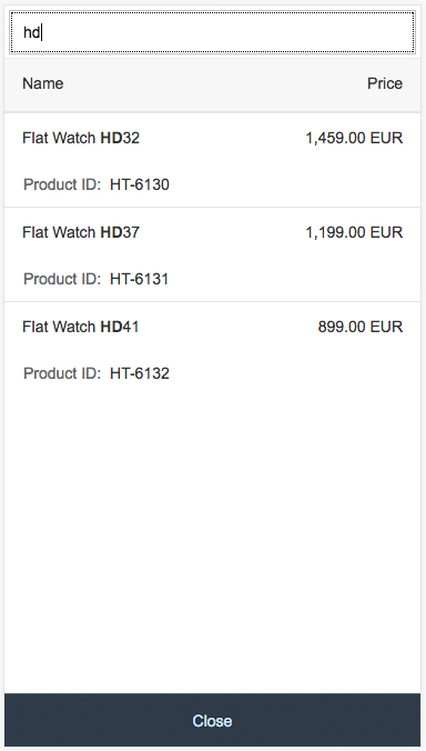
Tabular autocomplete suggestion feature on a smartphone
Size M (Tablets)
The pop-in feature of the responsive table is used here, and defined columns are wrapped into a new line due to the limited space available.
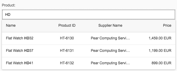
Tabular autocomplete suggestion feature on a tablet
Size L (Desktops)
The full table is shown by the suggest feature.
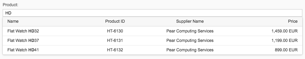
Tabular autocomplete suggestion feature on a desktop
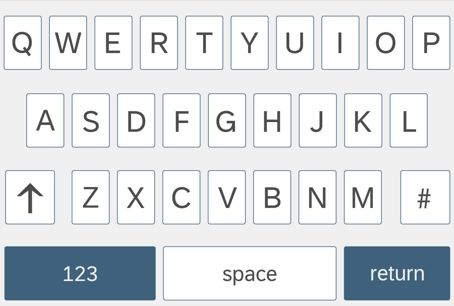
Types
Six input types are currently supported (API). Be sure to select the correct type for your use case. Depending on the input type, a different keyboard layout is displayed on a mobile device (see some sample input types).
Note: The control does not provide validation based on the type. The app development team must implement format validation. If binding is used, validation is carried out by the model, but error handling must still be implemented on the UI side.
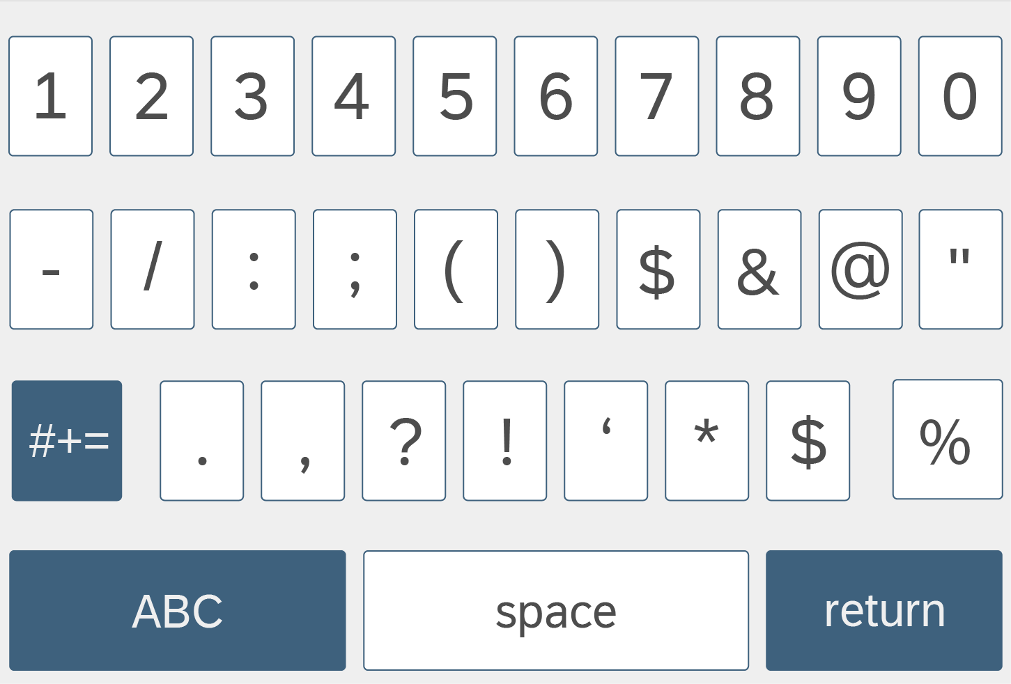
Text (default)
Input type text – Keyboard layout on a smartphone
Number
Input type number – Keyboard layout on a smartphone
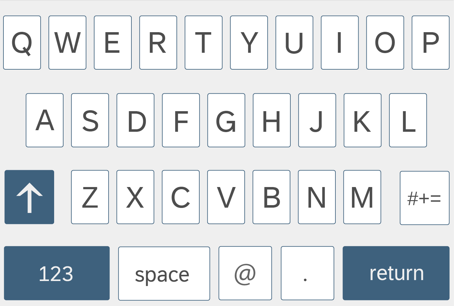
Input type email – Keyboard layout on a smartphone
URL
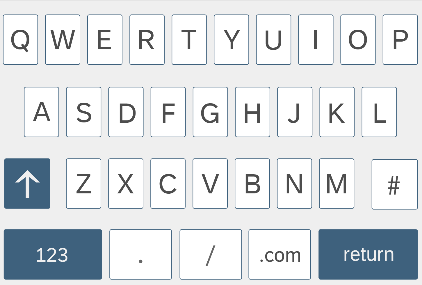
Input type URL – Keyboard layout on a smartphone
Telephone Number
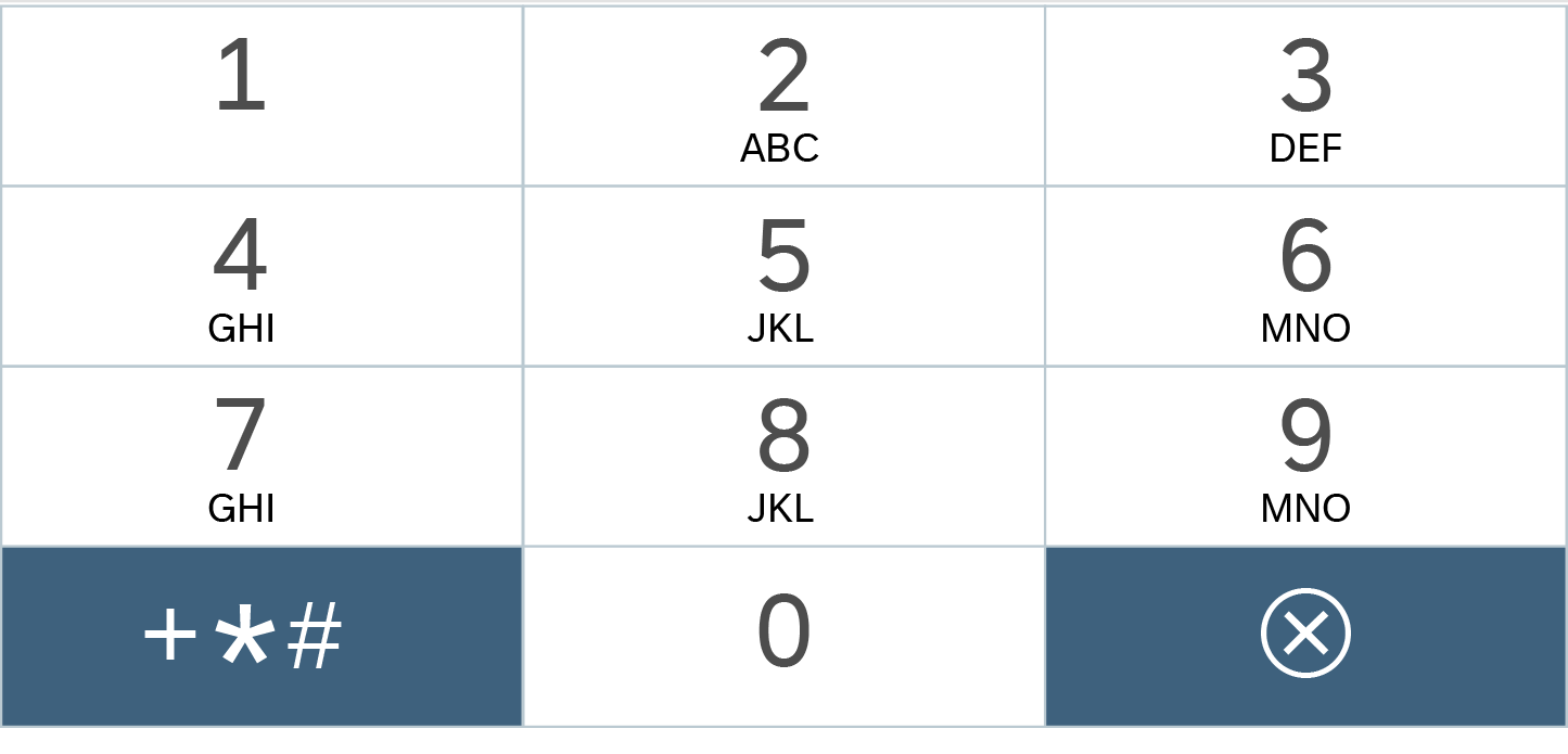
Input type telephone number – Keyboard layout on a smartphone
Password

Input type password – Keyboard layout on a smartphone
Some types, such as number or telephone number, can be used together with mask input for better guidance.
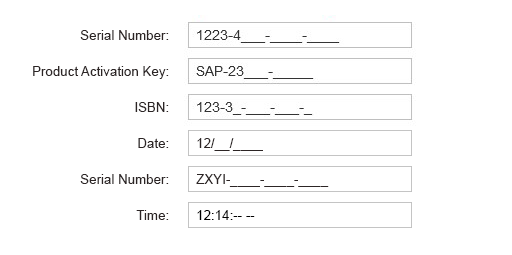
Examples of input with different number masks
Behavior and Interaction
Entering Text Using the Autocomplete Feature
Have a look at the interaction flow below:
Entering Text Using the Value Help Dialog
Have a look at the interaction flow below:
Value Help Dialog on Mobile
Value Help Dialog on Desktop
Styles
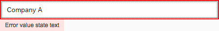
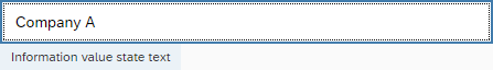
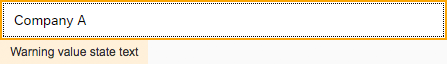
An input field can have five value states: default (neutral), warning, error, success, or information.

Default

Error

Information

Warning

Success
Properties
Value State and Value State Message
The input control offers the five value states listed below. For the error, warning, and information states you can show an additional value state text when the focus is on the input field.
- None (default): No value state message is shown.
- Warning
- Error
- Success: No value state message is shown.
- Information
For more guidance on when to use which state, see How to Use Semantic Colors.

Default
Error
Information
Warning

Success
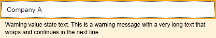
Warning value state with a long, wrapping text
Required
Use this property to indicate that user input is required. Set the property for the specific input field to ensure that the asterisk is shown in front of the label.
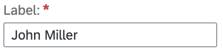
Required input field
Maximum Length
Use this property to set the maximum number of characters allowed. There is no limit by default.
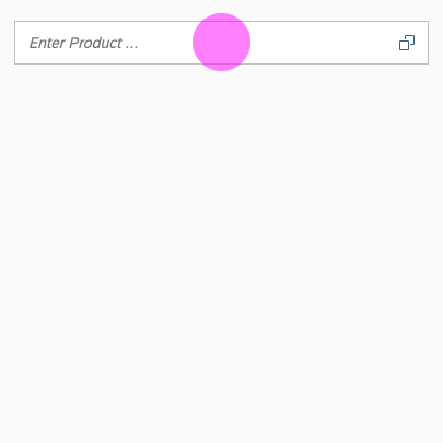
Placeholder
The placeholder, or input prompt, is a short hint (a word or short phrase) to help the user with data entry. A hint can be a sample value or a brief description of the expected format.

Placeholder
Description
You can provide an additional description on the input field, for example, for units or currency. The width of the input field and description is distributed equally by default. Although the default setting is 50%, you can change this with the fieldWidth property.

Input description
Width
The width of the input field is set to 100% by default. Input fields are usually used in forms, where the width is determined by the form element or container that the input field is embedded in. Instead of defining a fixed width, we recommend working with proper layout containers, like the form, simple form, and responsive grid layout, and with the layout data property, where the width is defined by the 12-column approach.
Editable and Enabled States
The input field has three states (see examples of input states):
- Enabled: This is the default setting.
- Read-only: The input field isn’t shown; only the value is shown. This is used in display-only forms.
- Disabled: The input field is shown with a visual indication that editing isn’t possible (for example, because the user isn’t authorized to make changes).
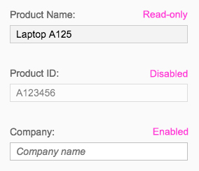
Editable and enabled input states
Text Alignment
The input field offers six types of alignment for text values (API):
- Begin
- Center
- End
- Initial (default): Browser-configured alignment is used
- Left
- Right
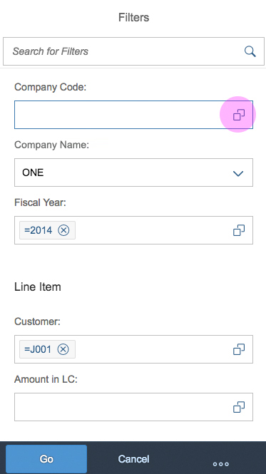
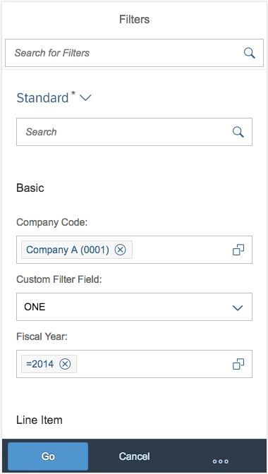
Value Help
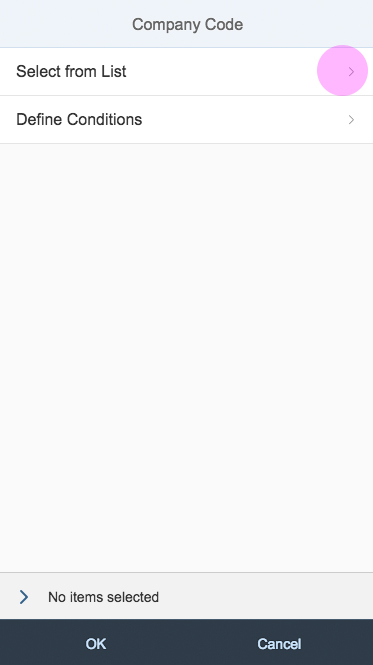
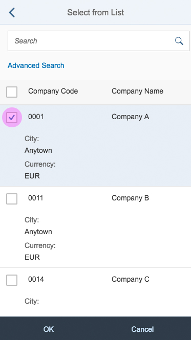
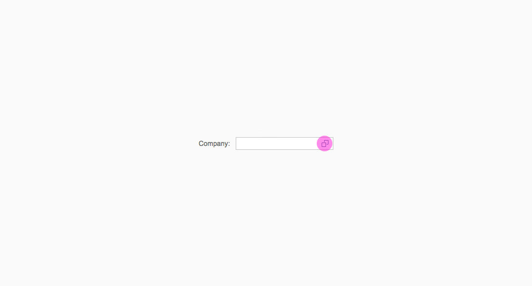
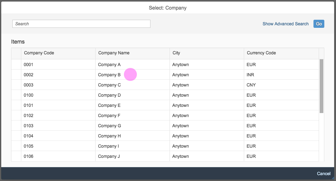
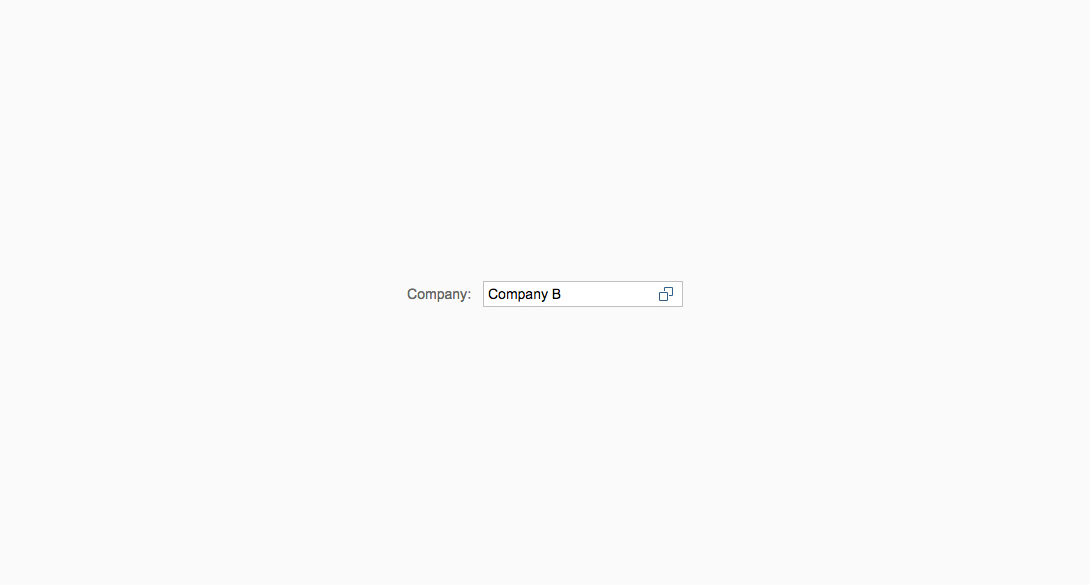
To help the user find the correct value, you can enable the value help option (property: showValueHelp). By enabling this option, a small value help icon is displayed in the input field on the right-hand side. Once this option is enabled, the click event can be registered and one of the following displayed:
- Select dialog (simple)
- Value help dialog (complex)
If you want to force the user to select only existing values, you can enable the value-help-only option (see an example). In this case, the user cannot enter text in the input field. Instead, the value must be selected from the list of suggestions, or chosen using the select dialog or value help dialog.
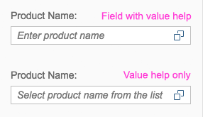
Value help option
The values can also be pasted into the input field by copying and pasting, or dragging and dropping, if the user prefers. In this case, the values are automatically transformed into conditional expressions. For example: Copying values “1234” and “5678” leads to the token generation “=1234” and “=5678”. Additionally, these values are shown in the conditions tab of the value help dialog.
Input Assistance
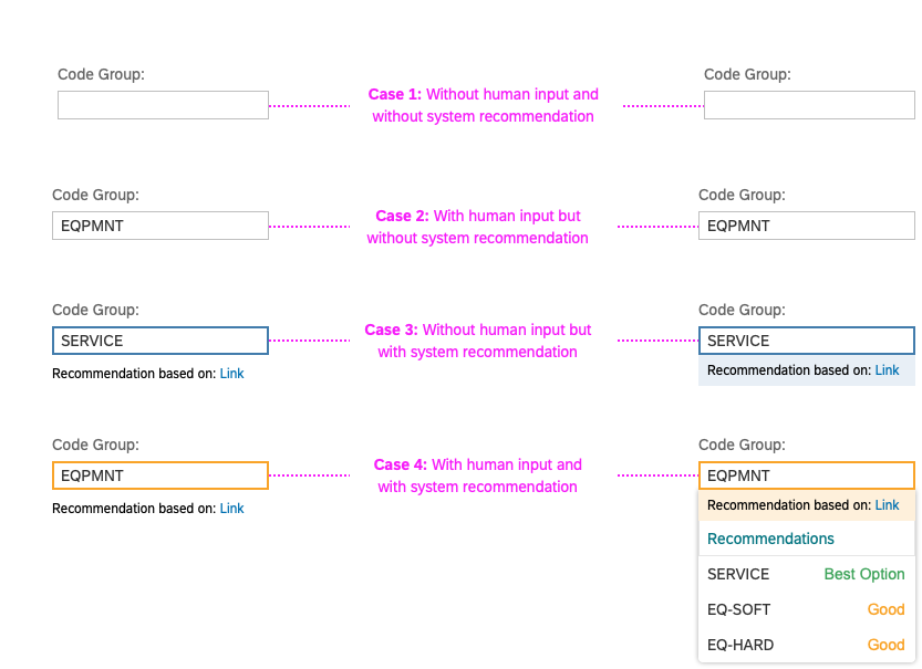
Intelligent systems can help users by recommending appropriate content or suggesting an action or input the user may “prefer”. The system assists the user by entering data or filtering data. Typical examples might be a search phrase suggestion, an appropriate form template, or a set of suggested default values for certain fields, based on the user input and interaction history.
For more information, see Designing Intelligent Systems – Input Assistance.
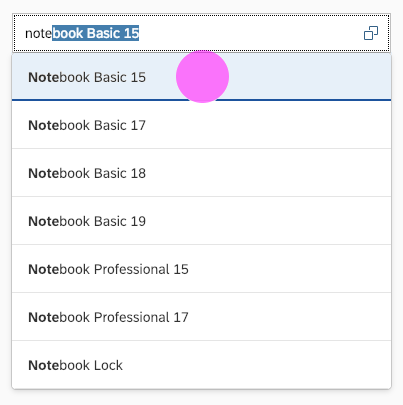
Autocomplete Suggestions
The input control offers three different types of autocomplete suggestions: single, two-value, and tabular. The width of the suggestion box and the input field are set by default, but you can change them using the maxSuggestionWidth property. The position of the suggestion box depends on the space available below the control. If there is not enough space, the suggestion box is shown above the control.
As the user types, the first suggestion item that matches the characters entered is autocompleted in the input field. The typed characters are matched against the beginning of the suggestion items, based on the “starts with” filter. The user can accept the autocompleted value by pressing ENTER. The autocomplete property is set by default if suggestions are available, but can also be switched off.
Single Value with Autocomplete
Single-value autocomplete displays a list of suggestions with one left-aligned value. As a base for the aggregation suggestionItems, sap.ui.core.Item is used.
Use the single-value autocomplete feature if you want to search by only one attribute, such as an ID or a customer name.
See this live example of single-value autocomplete suggestions.
Single-value autocomplete suggestion feature
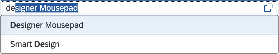
Two Values with Autocomplete
The two-value autocomplete suggestion feature displays two attributes of a business object, such as a customer and an ID. As a base for the aggregation of suggestionItems, sap.ui.core.ListItem is used.
The text property is displayed first, and is left-aligned. The additionalText property is right-aligned. The first text property is autocompleted in the input field.
Use the two-value autocomplete feature if you want to search by two attributes. This ensures that the search is carried out for both attributes.
See this live example of two-value autocomplete suggestions.
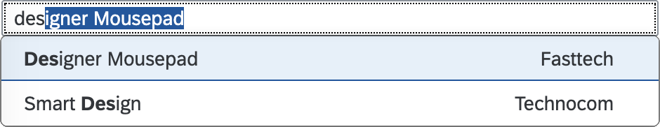
Two-value autocomplete suggestion feature
Tabular Autocomplete
This autocomplete feature displays the values in a table layout. Use the tabular autocomplete feature if you need to display more than two attributes.
For input fields in a tabular view, we recommend using a maximum of 4 columns. Focus on columns that are really relevant for the use case.
With the showTableSuggestionValueHelp property, you can offer a Show All Items button at the end of the suggest result list. Because the number of results in the suggest functionality is limited, this option helps the user find the relevant item via an alternative dialog:
- Select dialog (simple)
- Value help dialog (complex)
The width of the columns is distributed equally by default. To avoid truncation, accurately estimate the primary attribute length and set a minimum width for this column.
See a live example of tabular autocomplete suggestions.
Tabular autocomplete
Grouping
You can group the items in a suggestion list by a specific attribute and separate each group visually with a group header. This feature is also available for tabular suggestion lists.
The group headers are not interactive.
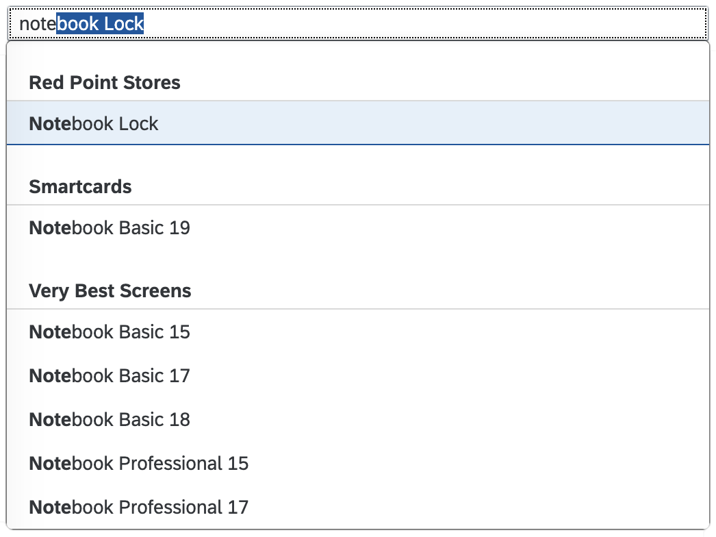
Input with grouped suggestions
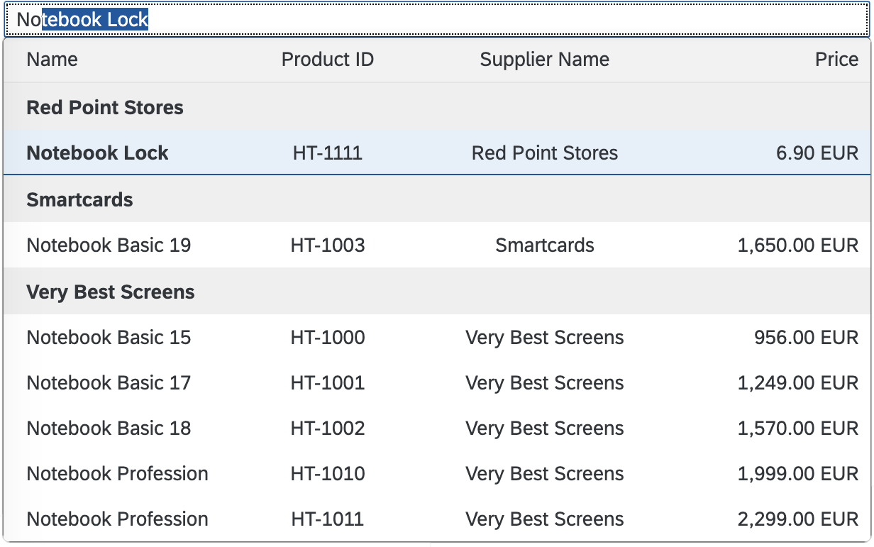
Input with grouped tabular suggestions
Guidelines
Always provide a meaningful label for any input field, and use the least complex control (such as select instead of value help). Use more intricate controls only if the use case really requires it. Where appropriate, help users by providing mask input or placeholder texts.
Maximum Columns
For input fields in a tabular view, we recommend using a maximum of 4 columns.
Maximum Length
Limit the length of the input field. For example, if you don’t want users to enter more than 5 characters, set the maximum length to 5. The maximum permissible character length is not defined by default. If the back-end system has a limit, ensure that you set this property accordingly.
Note that this parameter is not compatible with the input type sap.m.InputType.Number. If the input type is set to Number, the value of the maxLength property is ignored.
Placeholder
Avoid using the placeholder attribute as an alternative to a label. This is important because the placeholder text is overwritten as soon as the form is filled out. Labels are necessary to indicate the meaning of the form fields when the placeholders are no longer visible.
Description
The description field should be used, for example, for displaying units or currency. Do not use a description for help text or as a label replacement. Note that the description is not placed in a new line in size S. Therefore, only use the description property for small input fields with a short description.
Width
- Avoid setting a fixed width, but rather embed it in a proper layout (such as a form, simple form, or grid layout) and use the layout data property to define the responsive behavior for sizes S, M, and L:
- Simple form – See a live example of a simple form.
- Form – See a live example of a form.
- Grid layout – See a live example of a grid layout.
- Ensure an appropriate width for the range of values to be entered for the sizes S, M, and L. Keep in mind that word length can vary between languages, so take localization into account.
Editable and Enabled States
Editable
Property settings: editable = true, enabled = true
The input control is enabled and editable by default. Set the control to editable to allow the user to enter a value.
Not Editable
Property settings: editable = false, enabled = true
Use this state, for example, to display data only.
Disabled
Property settings: editable = not relevant, enabled = false
Set the control to disabled in an edit scenario to indicate that the user cannot change the control, for example, due to missing access rights or previous conditions not having been fulfilled or selected.
Text Align
Align left if:
- Text is used. Also use left alignment for a phone number, URL, password, and email address.
Align right if:
- Amounts and decimal numbers are used.
- Values need to be added and compared.
Value Help
Show the value help option to help the user select the correct value (such as a customer ID) from a large dataset via the:
- Value help dialog (complex)
- Select dialog (simple)
- Custom dialog
Use this option in combination with the autocomplete suggestion feature.
When the user clicks the value help icon, the data entered into the input field must be transferred to the processing dialog so that the user does not have to enter the search term again. Likewise, data entered in the processing dialog must be transferred back to the input field.
Creating and Editing Objects
Sometimes a new object needs to be created if the user cannot find a specific item via autocomplete or value help. In this case, we recommend that you place the New action next to the input field.
If you want the user to be able to edit a selected object directly, you should place the Edit link next to the input field.
If both actions are needed, they should be toggled based on the content of the input field. If a valid object is selected, you should display Edit. If the input field is empty or the object is not valid, you should display New. This pattern can also be applied for the multi-input field, combo box, multi-combo box, and select controls.
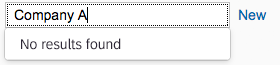
Input field – New action
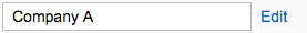
Input field – Edit action
Resources
Want to dive deeper? Follow the links below to find out more about related controls, the SAPUI5 implementation, and the visual design.
Elements and Controls
- Select Dialog (guidelines)
- Value Help Dialog (guidelines)
- Combo Box (guidelines)
- Select (guidelines)
- Multi-Input Field (guidelines)
- Date Range (guidelines)
- Date/Time Picker (guidelines)
- Multi-Combo Box (guidelines)
- Dialog (guidelines)
- How To Use Semantic Colors (guidelines)
 Your feedback has been sent to the SAP Fiori design team.