
- Latest SAPUI5 Version 1.120
- Version 1.118
- SAPUI5 Version 1.116
- SAPUI5 Version 1.114
- SAPUI5 Version 1.112
- SAPUI5 Version 1.110
- SAPUI5 Version 1.108
- SAPUI5 Version 1.106
- SAPUI5 Version 1.104
- SAPUI5 Version 1.102
- SAPUI5 Version 1.100
- SAPUI5 Version 1.98
- SAPUI5 Version 1.96
- SAPUI5 Version 1.94
- SAPUI5 Version 1.92
- SAPUI5 Version 1.90
- SAPUI5 Version 1.88
- SAPUI5 Version 1.86
- SAPUI5 Version 1.84
- SAPUI5 Version 1.82
- SAPUI5 Version 1.80
- SAPUI5 Version 1.76
- SAPUI5 Version 1.74
- SAPUI5 Version 1.72
- SAPUI5 Version 1.70
- SAPUI5 Version 1.68
- SAPUI5 Version 1.66
- SAPUI5 Version 1.64
- SAPUI5 Version 1.62
- SAPUI5 Version 1.60
- SAPUI5 Version 1.58
- SAPUI5 Version 1.56
- SAPUI5 Version 1.54
- SAPUI5 Version 1.52
- SAPUI5 Version 1.50
- SAPUI5 Version 1.48
- SAPUI5 Version 1.46
- SAPUI5 Version 1.44
- SAPUI5 Version 1.42
- SAPUI5 Version 1.40
- SAPUI5 Version 1.38
- SAPUI5 Version 1.36
- SAPUI5 Version 1.34
- SAPUI5 Version 1.32
- SAPUI5 Version 1.30
- SAPUI5 Version 1.28
- SAPUI5 Version 1.26
- Latest SAPUI5 Version 1.120
- Version 1.118
- SAPUI5 Version 1.116
- SAPUI5 Version 1.114
- SAPUI5 Version 1.112
- SAPUI5 Version 1.110
- SAPUI5 Version 1.108
- SAPUI5 Version 1.106
- SAPUI5 Version 1.104
- SAPUI5 Version 1.102
- SAPUI5 Version 1.100
- SAPUI5 Version 1.98
- SAPUI5 Version 1.96
- SAPUI5 Version 1.94
- SAPUI5 Version 1.92
- SAPUI5 Version 1.90
- SAPUI5 Version 1.88
- SAPUI5 Version 1.86
- SAPUI5 Version 1.84
- SAPUI5 Version 1.82
- SAPUI5 Version 1.80
- SAPUI5 Version 1.78
- SAPUI5 Version 1.76
- SAPUI5 Version 1.74
- SAPUI5 Version 1.72
- SAPUI5 Version 1.70
- SAPUI5 Version 1.68
- SAPUI5 Version 1.66
- SAPUI5 Version 1.64
- SAPUI5 Version 1.62
- SAPUI5 Version 1.60
- SAPUI5 Version 1.58
- SAPUI5 Version 1.56
- SAPUI5 Version 1.54
- SAPUI5 Version 1.52
- SAPUI5 Version 1.50
- SAPUI5 Version 1.48
- SAPUI5 Version 1.46
- SAPUI5 Version 1.44
- SAPUI5 Version 1.42
- SAPUI5 Version 1.40
- SAPUI5 Version 1.38
- SAPUI5 Version 1.36
- SAPUI5 Version 1.34
- SAPUI5 Version 1.32
- SAPUI5 Version 1.30
- SAPUI5 Version 1.28
- SAPUI5 Version 1.26
Motion Design
Intro
Motion design is a design method that applies animation and visual effects to user interface design. It expands the conventional design space with a time dimension that makes it an ideal medium for storytelling. In the context of SAP Fiori, motion design and microinteractions work together to provide our users with a coherent user experience.
Starting with the big picture, and extending into the smaller details, motion design modernizes the SAP Fiori design language. It helps to make apps simpler, more effective, and more delightful to use, contributing to one look and feel across all SAP Fiori applications.
Motion Design Principles
We’ve established handy motion design principles to follow when designing animations in SAP Fiori:
We’ll look at each of these principles in turn in the sections below.
Duration
Based on research from previous studies and our findings from testing with prototypes, we have defined four duration classes for SAP Fiori animations:
Different animations are grouped in these classes to define the correct duration for each use case.
How do we define animation duration?
The average eye movement takes 230 ms (based on research ranging from 70-700 ms). We classify our generic animations on a scale from 0 ms to 500 ms. If the duration exceeds 500 ms, we speak of “continuous animation”.
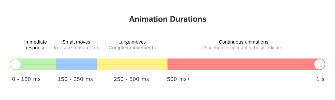
Motion design animation durations for SAP Fiori
Immediate response (< 150 ms)
This duration applies when the user directly manipulates the content. If animation of this type is needed (for example, to show a hover effect, down state, or drag & drop), the device must react instantaneously and the animation should last no longer than 150 ms.
According to the Nielsen Norman Group, 0.1 s is the response time limit for users to feel like they are directly causing something to happen on the screen. For example, to give users the impression that they are manipulating the table directly, the time it takes between the user clicking a table column and the column being highlighted should be no more than 0.1s. Ideally, this would also be the response time for sorting the column. Users then feel that they are sorting the table, rather than ordering the computer to do the sorting for them.
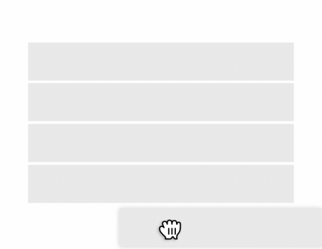
Example: Drag and Drop on list
Small Moves (150 ms – 250 ms)
In some cases, the application responds to an interaction so fast that users can lose track of what’s happening on the screen. To present the feedback in a more natural way, we show short animations when elements move between positions or states.
It is important to keep these animations simple and short, because:
- They reflect a small change on the screen.
- The user should not have to wait.
- It is very likely that the user will see these animations frequently.
- The main purpose of the animation is to enable the user to track a change.

Example: Action sheet - Animations should not make users wait
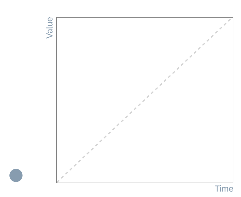
Large Moves (250 ms – 500 ms)
If you need to depict a large movement on the screen, use a longer animation duration to avoid fast flashing movements.
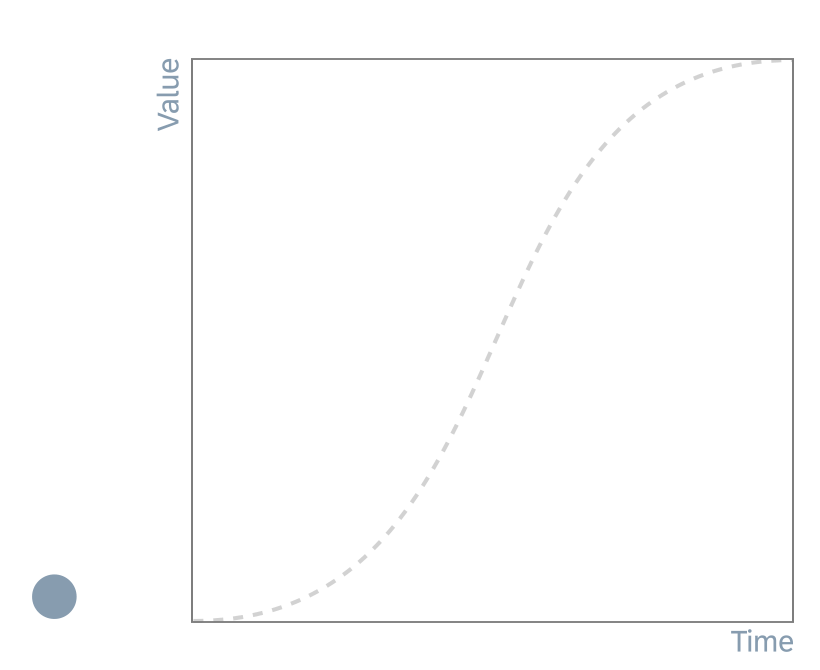
Continuous Animations (500 ms – ∞)
The duration of these animations is unpredictable. Anything that takes less than a second should be reflected on the screen as fast as possible. However, some interactions have unknown response times. Placeholder animation is a typical example of a continuous animation.

Example: Placeholder for loading content
Easing
To enable natural movement for screen elements, most coding languages and animation tools offer functions for easing. To understand the term “easing”, we need to break down the main components of motion.
Motion or movement is described by the position and time. For a given initial position at time “0”, movement is the the change in the position value over time.
- Position value: The position value is expressed numerically for a certain time, and can be one of the following properties:
- Position (space)
- Scaling
- Rotation
- Alpha
- Time: To standardize motion for practical purposes, the time is generally measured in positive numbers. At any moment in time, there is a position value.
Curves and Transition Timing
The property for the transition timing function specifies the speed curve of the transition effect. This property allows a transition effect to change speed over its duration.
The duration defines the total duration of a transition from state A to state B, whether the transition involves scaling, distorting, rotating or modifying the style of an element. The transition timing function defines the rate at which the transition is carried out, which can involve speeding up and slowing down.
The transition timing function uses Bézier curves to describe how the animation will proceed over time. You can either use predefined easing settings for the common functions, or specify the control points for a cubic Bézier function to have full control over the transition function. CSS transitions and animations support easing, formally called a “timing function”. The common easing types are:
- Ease-in
- Ease-out
- Ease-in-out
- Linear
Ease-In
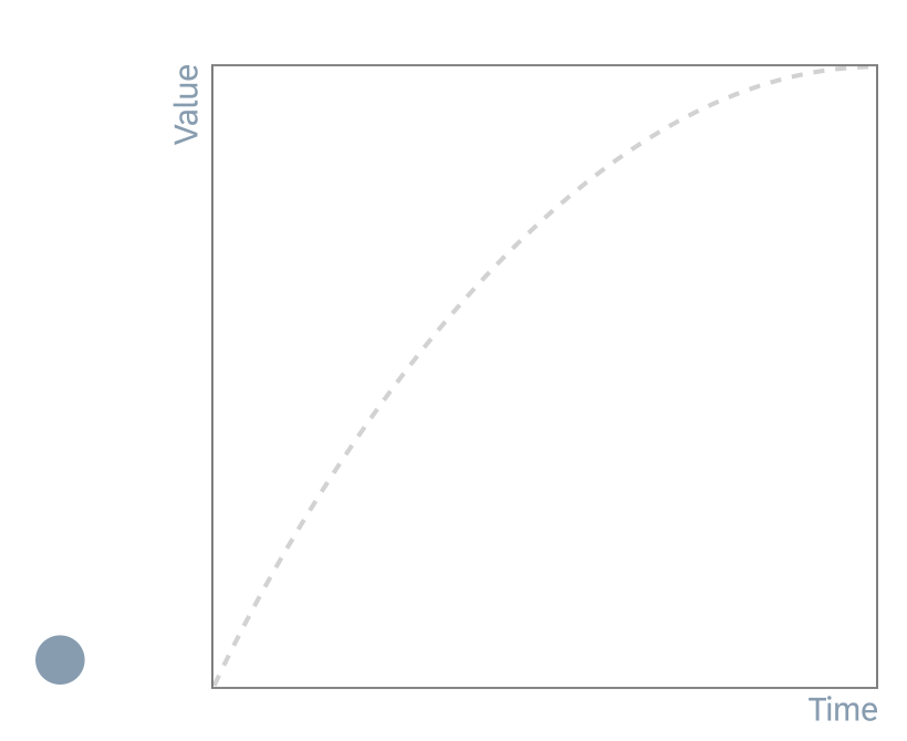
| Easing Type | Description | Protocol |
| Ease-in | The animation starts slowly and finishes at full speed. | cubic-bezier (0.65, 0, 1, 1) |
Ease-Out
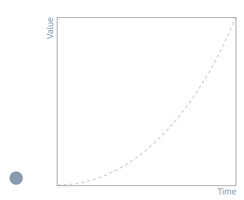
| Easing Type | Description | Protocol |
| Ease-out | The animation starts at full speed and finishes slowly. | cubic-bezier (0, 0, 0.35, 1) |
Ease-In-Out
| Easing Type | Description | Protocol |
| Ease-in-out | The animation starts slowly, reaches its maximum speed in the middle of the animation, then finishes slowly. | cubic-bezier (0.5, 0, 0.5, 1) |
Linear
| Easing Type | Description | Protocol |
| No easing | No acceleration is used. Use this type only for changes in opacity. | cubic-bezier(0, 0, 1, 1) |
Direction and Orientation
The direction and orientation determine how elements behave within SAP Fiori.
- Direction gives users the ultimate sense of where an object is coming from, and where it is going to.
- Digital elements use 3-axis directions (x,y,z) to emulate real-life movement.
- Spatial cases without direction, such as popups, use other animiation methods when rendered on the screen (for example, fading).
The examples below illustrate the principle of direction.
Move Elements

In this case, objects are repositioned. Elements enter, exit, or remain on the screen. The direction defines the spatial placement of the element according to its purpose.
- Used for: Swipe, slide, switch, page/gallery indicators, saving elements.
- Logical movement: Elements that come in and out of the screen should follow a consistent pattern.
- If an element moves out, and then back in, it must come in from the place it initially moved out to.
- If an element moves in, and then back out, it must return to the place it initially moved in from.
Stack Elements

When elements are stacked, one action is placed over another. Here, direction is used to help users follow the way elements are spread on the screen (spatial placement).
- Used for: Elements that expand/spread or collapse/pile up, open/closed elements with a point of interest.
- Logical movement: If elements come into the group of elements in a certain order from a certain place, they should leave the group in the same way.
Rotate Elements

Elements can rotate as long as this serves a meaningful purpose, and is not just a normal transition for showing content.
- Used for: Rearranging elements on the screen, device rotation.
- Elements that have a radial design can take advantage of this property, which uses direction to express values or states.
- Logical movement:
- For 2D rotation, use radial values appropriately (clockwise, anticlockwise).
- Avoid 3D rotations (for example, flip or page turn).
Choreography
By combining easing, duration, and direction, you can design precise movement sequences. This is known as choreography.
Choreography relates to the sequential movements, steps, and patterns composed for a single element or set of elements on the screen. Elements on the screen appear, disappear, and behave in certain way, depending on their depth on the screen, their importance, and the message they convey. The word choreography literally means “dance-writing”. In the context of motion design, this refers to a series of planned situations that are linked to create consistency and harmony.
Entry and Exit Animations
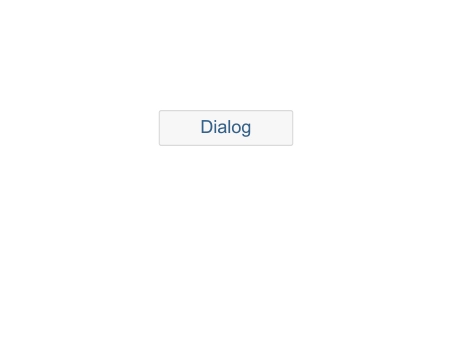
Often, the entry behavior of a certain element will vary from the exit behavior of the same element. This is because entering the screen has one flow and purpose, and exiting may have another. For example, when a dialog is opened, the animation should last 150 ms, since the purpose of the animation is to reflect the change on the screen. However, closing the dialog should last only 50 ms to avoid waiting situations.

Example: Dialog container
Choreography Behaviors
The choreography behaviors below allow you to optimize your motion design.
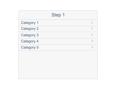
Offset
Example: Dialog
Combining spatial offset and direction allows you to connect an element to the part of the screen it belongs to.
Objects can use animated offset to demonstrate their parent group or hierarchy, and to show where they are coming from and where they are going to.
Delay

Example: Notification cards with a delay of 50 ms
Delays support usability by visually separating one element (or set of elements) from another.
You can delay the duration of each single element in a group of elements by specifying a delay for the start of an animation. Animating each element with a slight of delay creates depth and a visual understanding that these elements, while still acting as a group, are independent of one another.
Conditional Delay
Example: Navigation container, slide in-out and fade animations
With a conditional delay, the system waits for a certain action or animation to complete (onComplete) before playing the next one.
Resources
Want to dive deeper? Follow the links below to find out more about related controls, and the visual design.
Elements and Controls
- No links.
Implementation
- No links.
 Your feedback has been sent to the SAP Fiori design team.