- Latest Version 1.128
- Version 1.126
- SAPUI Version 1.124
- SAPUI5 Version 1.122
- SAPUI5 Version 1.120
- SAPUI5 Version 1.118
- SAPUI5 Version 1.116
- SAPUI5 Version 1.114
- SAPUI5 Version 1.112
- SAPUI5 Version 1.110
- SAPUI5 Version 1.108
- SAPUI5 Version 1.106
- SAPUI5 Version 1.104
- SAPUI5 Version 1.102
- SAPUI5 Version 1.100
- SAPUI5 Version 1.98
- SAPUI5 Version 1.96
- SAPUI5 Version 1.94
- SAPUI5 Version 1.92
- SAPUI5 Version 1.90
- SAPUI5 Version 1.88
- SAPUI5 Version 1.86
- SAPUI5 Version 1.84
- SAPUI5 Version 1.82
- SAPUI5 Version 1.80
- SAPUI5 Version 1.76
- SAPUI5 Version 1.74
- SAPUI5 Version 1.72
- SAPUI5 Version 1.70
- SAPUI5 Version 1.68
- SAPUI5 Version 1.66
- SAPUI5 Version 1.64
- SAPUI5 Version 1.62
- SAPUI5 Version 1.60
- SAPUI5 Version 1.58
- SAPUI5 Version 1.56
- SAPUI5 Version 1.54
- SAPUI5 Version 1.52
- SAPUI5 Version 1.50
- SAPUI5 Version 1.48
- SAPUI5 Version 1.46
- SAPUI5 Version 1.44
- SAPUI5 Version 1.42
- SAPUI5 Version 1.40
- SAPUI5 Version 1.38
- SAPUI5 Version 1.36
- SAPUI5 Version 1.34
- SAPUI5 Version 1.32
- SAPUI5 Version 1.30
- SAPUI5 Version 1.28
- SAPUI5 Version 1.26
- Latest Version 1.128
- Version 1.126
- SAPUI Version 1.124
- SAPUI5 Version 1.122
- SAPUI5 Version 1.120
- SAPUI5 Version 1.118
- SAPUI5 Version 1.116
- SAPUI5 Version 1.114
- SAPUI5 Version 1.112
- SAPUI5 Version 1.110
- SAPUI5 Version 1.108
- SAPUI5 Version 1.106
- SAPUI5 Version 1.104
- SAPUI5 Version 1.102
- SAPUI5 Version 1.100
- SAPUI5 Version 1.98
- SAPUI5 Version 1.96
- SAPUI5 Version 1.94
- SAPUI5 Version 1.92
- SAPUI5 Version 1.90
- SAPUI5 Version 1.88
- SAPUI5 Version 1.86
- SAPUI5 Version 1.84
- SAPUI5 Version 1.82
- SAPUI5 Version 1.80
- SAPUI5 Version 1.78
- SAPUI5 Version 1.76
- SAPUI5 Version 1.74
- SAPUI5 Version 1.72
- SAPUI5 Version 1.70
- SAPUI5 Version 1.68
- SAPUI5 Version 1.66
- SAPUI5 Version 1.64
- SAPUI5 Version 1.62
- SAPUI5 Version 1.60
- SAPUI5 Version 1.58
- SAPUI5 Version 1.56
- SAPUI5 Version 1.54
- SAPUI5 Version 1.52
- SAPUI5 Version 1.50
- SAPUI5 Version 1.48
- SAPUI5 Version 1.46
- SAPUI5 Version 1.44
- SAPUI5 Version 1.42
- SAPUI5 Version 1.40
- SAPUI5 Version 1.38
- SAPUI5 Version 1.36
- SAPUI5 Version 1.34
- SAPUI5 Version 1.32
- SAPUI5 Version 1.30
- SAPUI5 Version 1.28
- SAPUI5 Version 1.26
Message Page
sap.m.MessagePage
Intro
Message pages give feedback to the user when an app or list is empty, or when an error has occurred. There are different use cases for showing a message page. The layout is the same, but the text and icon can change depending on the use case. You can use the message page in the following situations:
- Filtering with no results
- Searching with no results
- Empty app
- Too many items
- Item saved as a tile that is not longer available
- Error
Responsiveness
The size of the message page adjusts to fit the available space.
Types
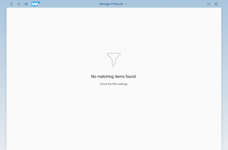
Filter
-
Display the following text: No matching [entities] found. Check the filter settings. For example: “No matching items found. Check the filter settings.”
-
Show the filter icon.
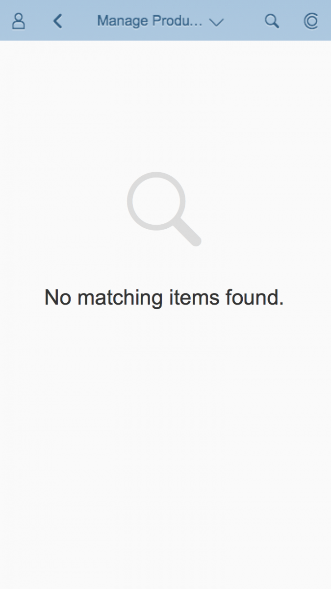
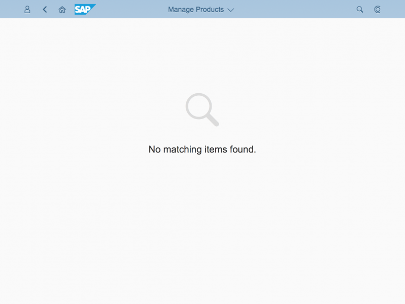
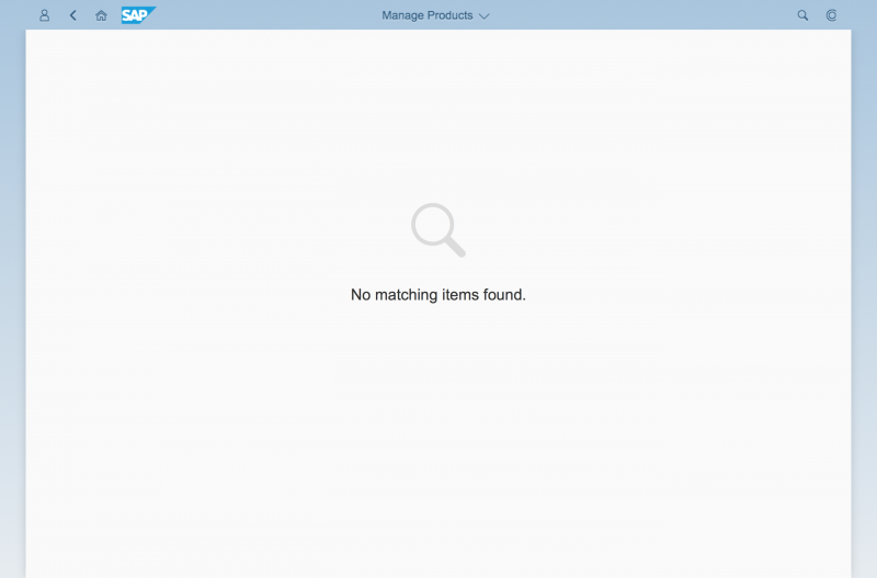
Search
- Display the following text: No matching [entities] found. For example: “No matching items found.”
- Show the search icon.
Too Many Items
- Display the following text: Search for [entities]. For example: “Search for opportunities.”
- Show the search icon.
Save as Tile
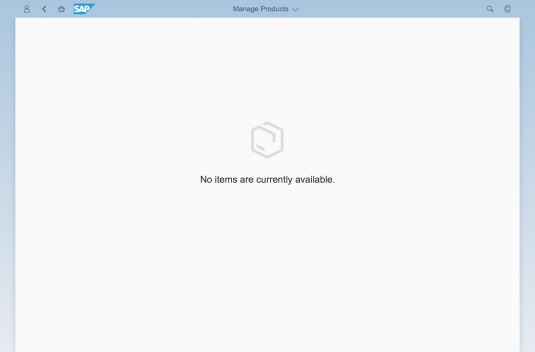
- Display the following text on the page and specify the entity. Where relevant, you can also include the ID: This [entity] is no longer available, or [Entity] [ID] is no longer available. Examples: “This product is no longer available.” or “Purchase order 123456 is no longer available.”
- Show the product icon or an icon that matches your use case.
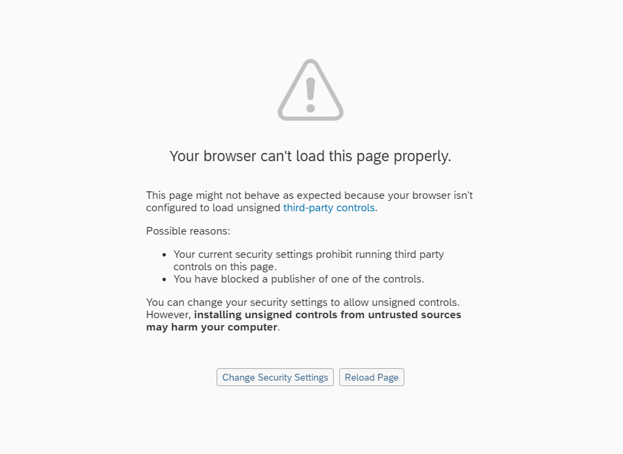
Error
The app cannot show any content due to an error:
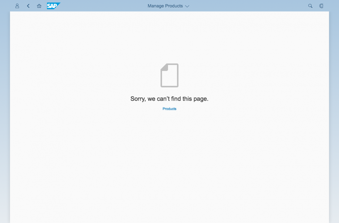
- Display the following text: “Sorry, we can’t find this page.”
- Provide a link to the app start screen if you can.
- Show the document icon.
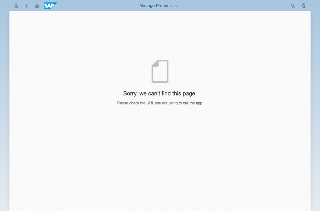
- Otherwise, display the following text: “Sorry, we can’t find this page. Please check the URL you are using to call the app.”
- Show the document icon.
Components
The following UI elements can be placed on the message page:
- Icon
- Text
- Formatted text
- Link
- Button
Guidelines
- The icon in the message page is mandatory.
Exception: If you can’t find a suitable icon for your message, leave out the icon. - Always include a message short text, and add a description with further details if needed. Do not show only the state of the message (like error or warning), but rather try to describe the problem. Help the user to recognize, diagnose, and resolve the issue.
- Keep your message as concise as possible.
- Use the plural forms of the business objects. Ensure that the business objects are in sentence case.
- Sometimes, your app will simply be loading. In this case, use the busy state without an explanatory text. Do not show the “No data” message, which could mislead users.
Resources
Want to dive deeper? Follow the links below to find out more about related controls, the SAPUI5 implementation, and the visual design.

 Your feedback has been sent to the SAP Fiori design team.