- Latest Version 1.128
- Version 1.126
- SAPUI Version 1.124
- SAPUI5 Version 1.122
- SAPUI5 Version 1.120
- SAPUI5 Version 1.118
- SAPUI5 Version 1.116
- SAPUI5 Version 1.114
- SAPUI5 Version 1.112
- SAPUI5 Version 1.110
- SAPUI5 Version 1.108
- SAPUI5 Version 1.106
- SAPUI5 Version 1.104
- SAPUI5 Version 1.102
- SAPUI5 Version 1.100
- SAPUI5 Version 1.98
- SAPUI5 Version 1.96
- SAPUI5 Version 1.94
- SAPUI5 Version 1.92
- SAPUI5 Version 1.90
- SAPUI5 Version 1.88
- SAPUI5 Version 1.86
- SAPUI5 Version 1.84
- SAPUI5 Version 1.82
- SAPUI5 Version 1.80
- SAPUI5 Version 1.76
- SAPUI5 Version 1.74
- SAPUI5 Version 1.72
- SAPUI5 Version 1.70
- SAPUI5 Version 1.68
- SAPUI5 Version 1.66
- SAPUI5 Version 1.64
- SAPUI5 Version 1.62
- SAPUI5 Version 1.60
- SAPUI5 Version 1.58
- SAPUI5 Version 1.56
- SAPUI5 Version 1.54
- SAPUI5 Version 1.52
- SAPUI5 Version 1.50
- SAPUI5 Version 1.48
- SAPUI5 Version 1.46
- SAPUI5 Version 1.44
- SAPUI5 Version 1.42
- SAPUI5 Version 1.40
- SAPUI5 Version 1.38
- SAPUI5 Version 1.36
- SAPUI5 Version 1.34
- SAPUI5 Version 1.32
- SAPUI5 Version 1.30
- SAPUI5 Version 1.28
- SAPUI5 Version 1.26
- Latest Version 1.128
- Version 1.126
- SAPUI Version 1.124
- SAPUI5 Version 1.122
- SAPUI5 Version 1.120
- SAPUI5 Version 1.118
- SAPUI5 Version 1.116
- SAPUI5 Version 1.114
- SAPUI5 Version 1.112
- SAPUI5 Version 1.110
- SAPUI5 Version 1.108
- SAPUI5 Version 1.106
- SAPUI5 Version 1.104
- SAPUI5 Version 1.102
- SAPUI5 Version 1.100
- SAPUI5 Version 1.98
- SAPUI5 Version 1.96
- SAPUI5 Version 1.94
- SAPUI5 Version 1.92
- SAPUI5 Version 1.90
- SAPUI5 Version 1.88
- SAPUI5 Version 1.86
- SAPUI5 Version 1.84
- SAPUI5 Version 1.82
- SAPUI5 Version 1.80
- SAPUI5 Version 1.78
- SAPUI5 Version 1.76
- SAPUI5 Version 1.74
- SAPUI5 Version 1.72
- SAPUI5 Version 1.70
- SAPUI5 Version 1.68
- SAPUI5 Version 1.66
- SAPUI5 Version 1.64
- SAPUI5 Version 1.62
- SAPUI5 Version 1.60
- SAPUI5 Version 1.58
- SAPUI5 Version 1.56
- SAPUI5 Version 1.54
- SAPUI5 Version 1.52
- SAPUI5 Version 1.50
- SAPUI5 Version 1.48
- SAPUI5 Version 1.46
- SAPUI5 Version 1.44
- SAPUI5 Version 1.42
- SAPUI5 Version 1.40
- SAPUI5 Version 1.38
- SAPUI5 Version 1.36
- SAPUI5 Version 1.34
- SAPUI5 Version 1.32
- SAPUI5 Version 1.30
- SAPUI5 Version 1.28
- SAPUI5 Version 1.26
Message View
sap.m.MessageView
Intro
Containing features from the message popover control, the message view control gives you the flexibility to display multiple messages within SAP Fiori.
While message view can be embedded within multiple controls, we recommend that you use it only within a responsive popover or a dialog.
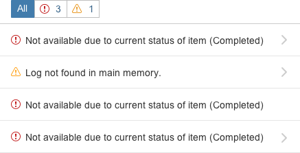
Message view
Usage
Use the message view if:
- You want to display messages without using the message popover.
- You want to display multiple messages.
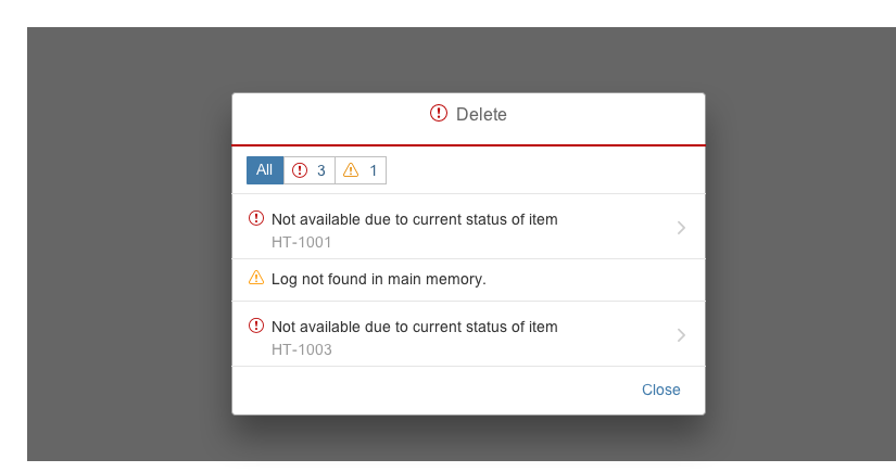
- You want to display multiple transient messages within a disruptive dialog.
Do not use the message view if:
- You want to display state messages. Instead, use message popover.
Responsiveness
Size S (Smartphone)
The responsiveness of the message view is determined by the container in which it is embedded.
To display messages as popovers on desktop devices, or in full-screen mode on smartphones, we recommend that you use sap.m.ResponsivePopover as a container.
Layout
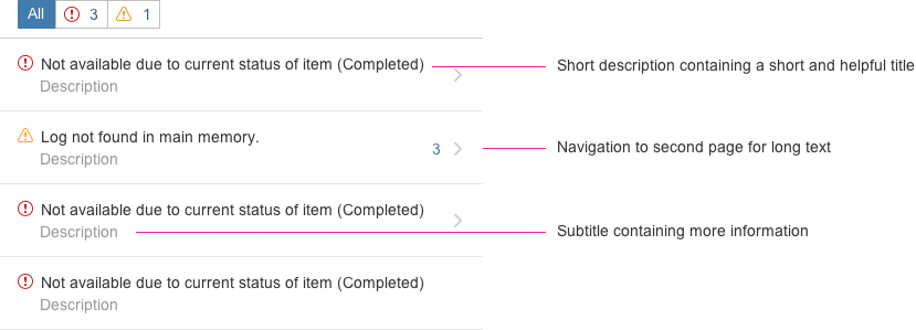
Filtering
Multiple Message types – Filtering by Message Severity
If different types of message are available, users can filter messages by type (error, warning, success, and information) using the segmented buttons at the top of the message view.
Grouping by section and subsections
Messages in the list are grouped by the section and (if relevant) subsection. This helps the user to find the field that triggered the message on the UI.
One Message Type Only – Filtering Hidden
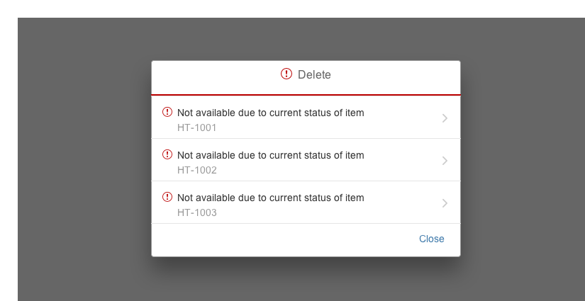
If there is only one type of message (for example, only errors), the filter bar is hidden.
List
Short Description
The short description comprises a simple and helpful text.
Subtitle
The subtitle comprises a description that helps users to identify the object they are looking for.
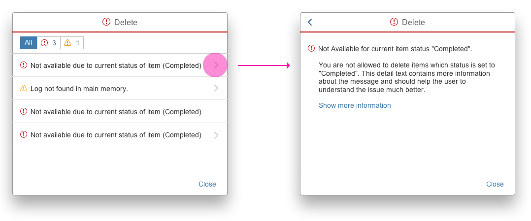
Navigation to Second Page
If there is a long text, the message popover automatically provides a “chevron” on the right side so that the user is able to navigate to the second page of the message view, where he or she can read the long text of the message.
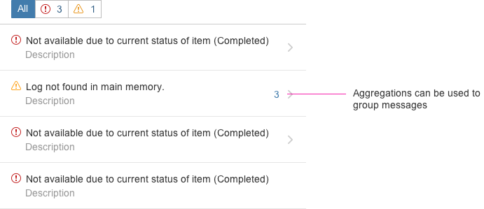
Aggregating Messages
If desired, the app development team can aggregate messages by filling out the counter property of each list item. Note that the app team must implement this aggregation on their own as the message popover only provides the counter property.
Detail Page of Message View
Message View Within a Dialog
Handling of Transient Messages
The message view also handles transient messages and is available within a dialog. Possessing the same interaction patterns as the message popover, this control helps the app development team to display messages more easily and consistently.
Life Cycle
We recommend that messages no longer be displayed after the user closes the dialog (sap.m.MessageBox/sap.m.Dialog).
Message View within a Responsive Popover
Handling Application-Specific Messages
The message view can be embedded in a responsive popover (sap.m.ResponsivePopover), for example, if you want to display multiple messages by clicking a button.
Due to the full screen behavior on smartphones (size S), we recommend that you use the responsive popover as a container.
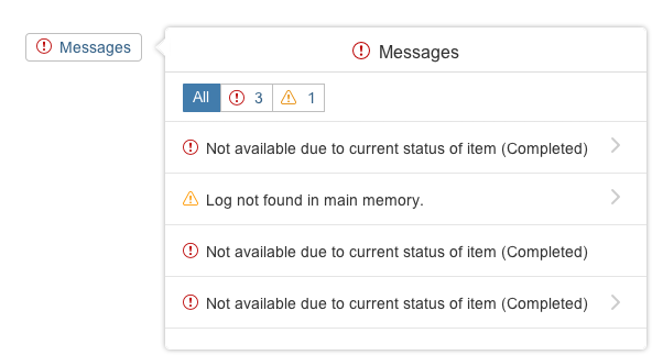
Message view inside the sap.m.ResponsivePopover
Resources
Want to dive deeper? Follow the links below to find out more about related controls, the SAPUI5 implementation, and the visual design.
Elements and Controls
- Message Box (guidelines)
- Message Handling (guidelines)
- Message Popover (guidelines)



 Your feedback has been sent to the SAP Fiori design team.