
- Latest SAPUI Version 1.124
- SAPUI5 Version 1.122
- SAPUI5 Version 1.120
- SAPUI5 Version 1.118
- SAPUI5 Version 1.116
- SAPUI5 Version 1.114
- SAPUI5 Version 1.112
- SAPUI5 Version 1.110
- SAPUI5 Version 1.108
- SAPUI5 Version 1.106
- SAPUI5 Version 1.104
- SAPUI5 Version 1.102
- SAPUI5 Version 1.100
- SAPUI5 Version 1.98
- SAPUI5 Version 1.96
- SAPUI5 Version 1.94
- SAPUI5 Version 1.92
- SAPUI5 Version 1.88
- SAPUI5 Version 1.86
- SAPUI5 Version 1.84
- SAPUI5 Version 1.82
- SAPUI5 Version 1.80
- SAPUI5 Version 1.78
- SAPUI5 Version 1.76
- SAPUI5 Version 1.74
- SAPUI5 Version 1.72
- SAPUI5 Version 1.70
- SAPUI5 Version 1.68
- SAPUI5 Version 1.66
- SAPUI5 Version 1.64
- SAPUI5 Version 1.62
- SAPUI5 Version 1.60
- SAPUI5 Version 1.58
- SAPUI5 Version 1.56
- SAPUI5 Version 1.54
- SAPUI5 Version 1.52
- SAPUI5 Version 1.50
- SAPUI5 Version 1.48
- SAPUI5 Version 1.46
- SAPUI5 Version 1.44
- SAPUI5 Version 1.42
- SAPUI5 Version 1.40
- SAPUI5 Version 1.38
- SAPUI5 Version 1.36
- SAPUI5 Version 1.34
- SAPUI5 Version 1.32
- SAPUI5 Version 1.30
- SAPUI5 Version 1.28
- SAPUI5 Version 1.26
- Latest SAPUI Version 1.124
- SAPUI5 Version 1.122
- SAPUI5 Version 1.120
- SAPUI5 Version 1.118
- SAPUI5 Version 1.116
- SAPUI5 Version 1.114
- SAPUI5 Version 1.112
- SAPUI5 Version 1.110
- SAPUI5 Version 1.108
- SAPUI5 Version 1.106
- SAPUI5 Version 1.104
- SAPUI5 Version 1.102
- SAPUI5 Version 1.100
- SAPUI5 Version 1.98
- SAPUI5 Version 1.96
- SAPUI5 Version 1.94
- SAPUI5 Version 1.92
- SAPUI5 Version 1.90
- SAPUI5 Version 1.88
- SAPUI5 Version 1.86
- SAPUI5 Version 1.84
- SAPUI5 Version 1.82
- SAPUI5 Version 1.80
- SAPUI5 Version 1.78
- SAPUI5 Version 1.76
- SAPUI5 Version 1.74
- SAPUI5 Version 1.72
- SAPUI5 Version 1.70
- SAPUI5 Version 1.68
- SAPUI5 Version 1.66
- SAPUI5 Version 1.64
- SAPUI5 Version 1.62
- SAPUI5 Version 1.60
- SAPUI5 Version 1.58
- SAPUI5 Version 1.56
- SAPUI5 Version 1.54
- SAPUI5 Version 1.52
- SAPUI5 Version 1.50
- SAPUI5 Version 1.48
- SAPUI5 Version 1.46
- SAPUI5 Version 1.44
- SAPUI5 Version 1.42
- SAPUI5 Version 1.40
- SAPUI5 Version 1.38
- SAPUI5 Version 1.36
- SAPUI5 Version 1.34
- SAPUI5 Version 1.32
- SAPUI5 Version 1.30
- SAPUI5 Version 1.28
- SAPUI5 Version 1.26
Avatar Group
sap.f.AvatarGroup
Intro
The avatar group displays a number of avatars, which act as a digital representation of a user. This control is useful for visualizing a team, project team members, or a group of employees, for example.

Avatar group - Group type

Avatar group - Individual type
When to Use
Use the avatar group if:
- You want to display a group of at least 2 people.
- You want to display several people who have something in common (for example, people who are in the same team, project, or company).
Types
There are two types of avatar groups: group and individual.
Group Type – Focus on the Sum of People
The group type displays overlapping avatars. Use this type if it’s important to display the sum of people at first sight, rather than the individuals. Examples for the group type include overviews in cards and organization charts, as well as cases where you need to display a large number of people (100+).
This is the default type.
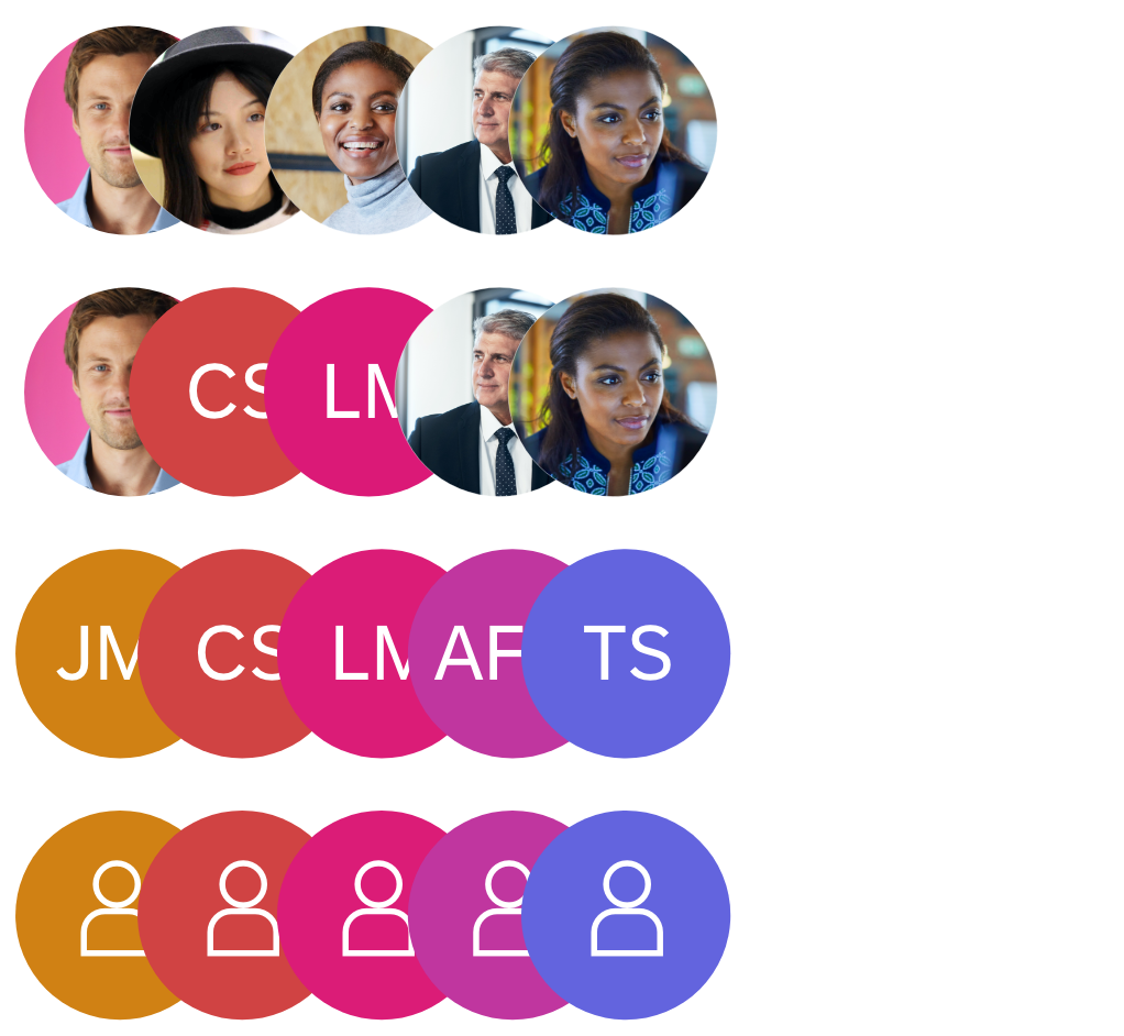
Variants for the group type (user's image, initials, placeholders)
Individual Type – Focus on Each Person
The avatars are displayed next to each other and don’t overlap. Use this type if each person is as important as the group as a whole, and the user’s main focus is to get more information about some individuals in the group. The user can find out more about a person by interacting with the avatar to access secondary information, such as a business card.
This type is useful for a smaller group of avatars, such as a project team or teams in a line organization.

Variants for the individual type (user's image, initials, placeholders)
Components
Avatars
The avatar group consists of at least two avatars and can display as many avatars as you need.
Order
You can set the order of the avatars in the group freely. For example, the order can be alphabetical, history-based, or random.
Content
The avatar group reuses the avatar control and its logic: if a person’s image is available, the avatar displays the image. If no image is available, it displays the person’s initials on a colored background. If there are more than 3 initials or the language system doesn’t support initials, the avatar displays a gender-neutral person icon. You can also adapt this placeholder icon to meet your own requirements.
Size
The avatar group supports the different sizes of the avatar control.

Avatar groups
Overflow Button
If an avatar group has too many members to display, an overflow button is displayed at the end of the group.

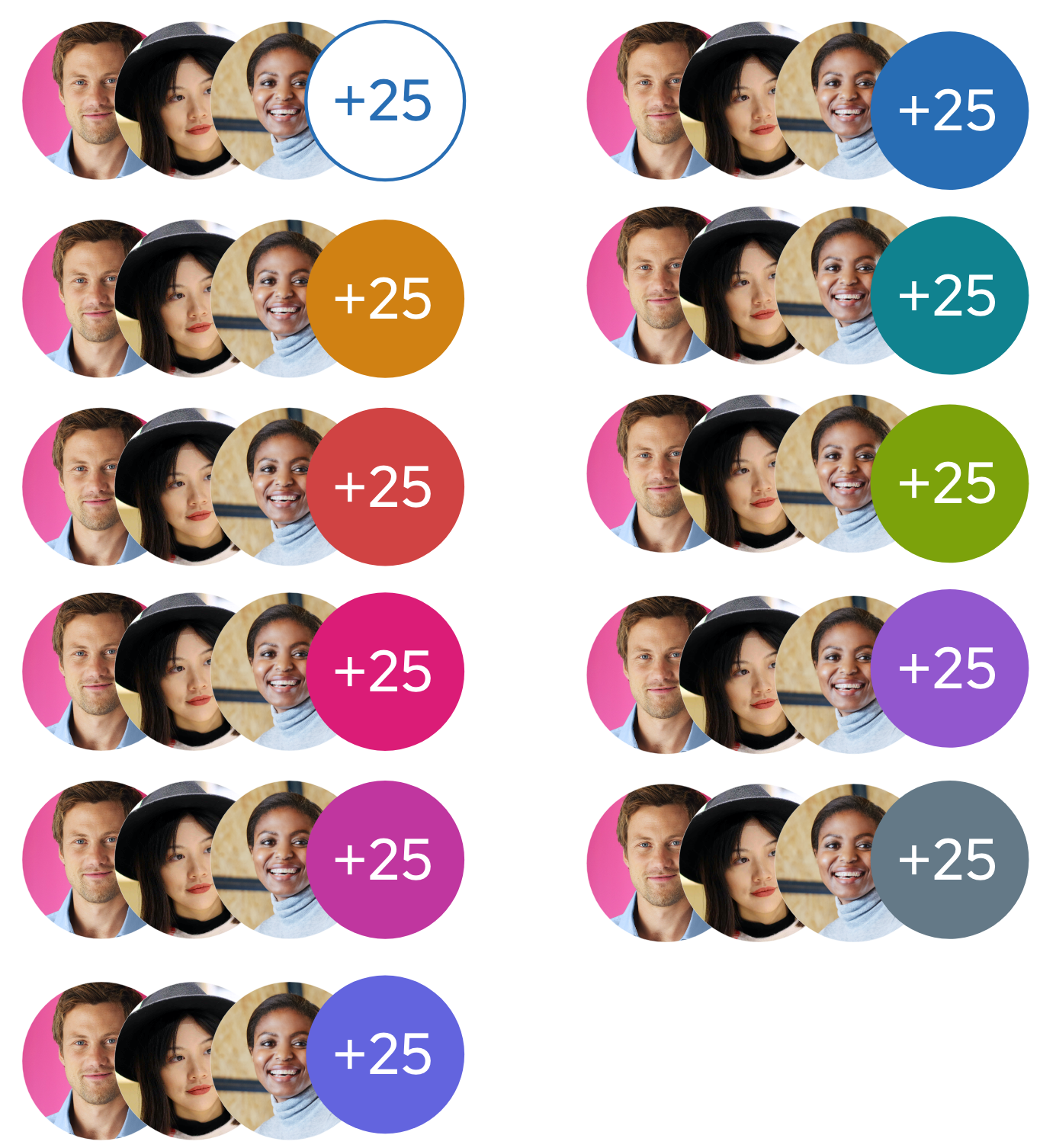
Overflow button with 99 "overflowed" avatars
Color Options
The overflow button has different color options:
- Neutral default color
- Random color – The color of the overflow button is a random color from the accent color palette.
- Specific accent color – The color of the overflow button is selected from the accent color palette.
All the colors mentioned are themeable.
Overflow button in the neutral and all available accent colors
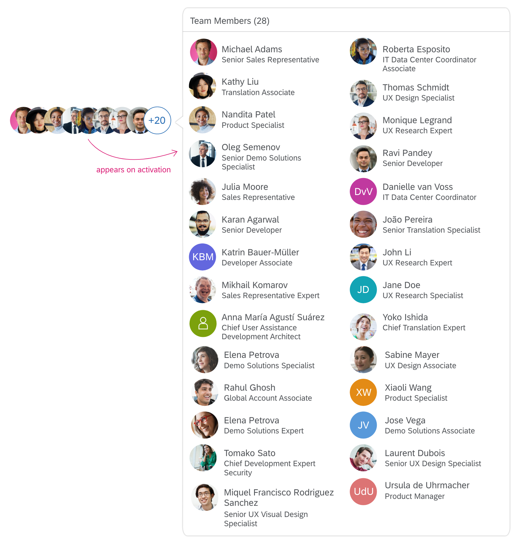
When users interact with the overflow shape, they expect information about the “overflowed” avatars. By default, an overview of all “overflowed” avatars is displayed directly in a popover. Adapt the content in the popover to your individual app needs.

Minimum version: overflow popover with simple avatars

Recommended version: overflow popover with context-specific information
Behavior and Interaction
The group and individual types have different behavior and interactions.
Group Type
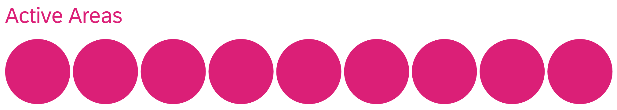
The group type is one big active area. In other words, the entire control is basically the active area. When the user interacts with the avatar group, an overview of ALL visible AND “overflowed” avatars appears. You can display the full avatar group in an overflow popover, or on a details page.

Active area for the group type (schematic visualization)
Group type with overflow popover using the grid list control
Individual Type
The individual avatars and the overflow button have their own active areas.
Active areas for the individual type (schematic visualization)
Interact with Avatar
When the user activates the avatar, a popover opens. The user expects to find more details about the person behind the avatar.

Possible content in popover (popover content is use case dependent)
Interact with Avatar in Overflow Popover
When an avatar is in the overflow popover, the user should have the access to the same detailed information as for avatars displayed in the visible group outside the overflow. Choosing the avatar either triggers navigation within the popover or navigation to another page (for example, with a person’s profile).
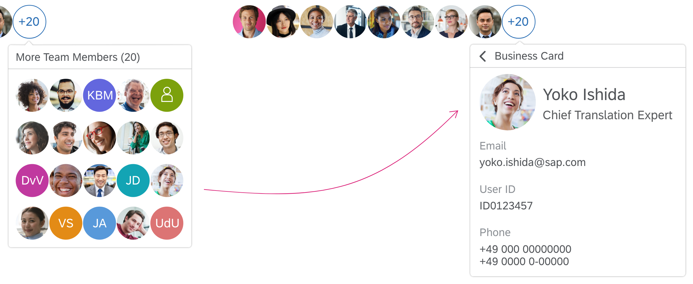
Navigation within popover to avatar's details
Open Full List
You can add an optional Open Full List link to the overflow popover. The link should lead to a page that displays the full set people of the group. An example might be a page with a grid list and simple filtering options.

Popover with 'overflowed' avatars and 'Open Full List' link
Responsiveness
The avatar group is responsive. If there is not sufficient space to display all the avatars in a group, the overflow button appears and one or more avatars move into the overflow popover. The circular overflow button indicates the exact number of avatars that can’t be displayed on the screen. The size of the overflow button adapts to fit the number of items in the overflow.
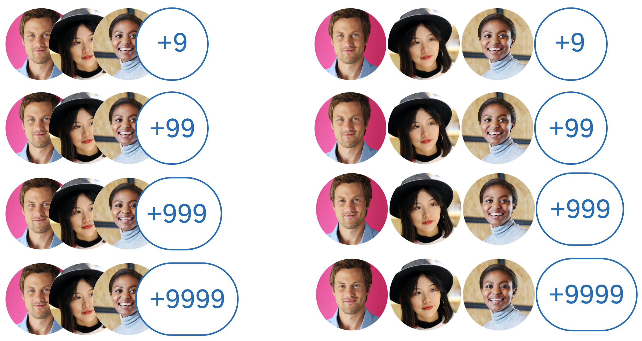
Avatar groups with a different number of avatars inside
Top Tips
Carefully select the primary and secondary information you want to display for the avatars. Base the content on your user research findings.
 Your feedback has been sent to the SAP Fiori design team.