
- Latest SAPUI Version 1.124
- SAPUI5 Version 1.122
- SAPUI5 Version 1.120
- SAPUI5 Version 1.118
- SAPUI5 Version 1.116
- SAPUI5 Version 1.114
- SAPUI5 Version 1.112
- SAPUI5 Version 1.110
- SAPUI5 Version 1.108
- SAPUI5 Version 1.106
- SAPUI5 Version 1.104
- SAPUI5 Version 1.102
- SAPUI5 Version 1.100
- SAPUI5 Version 1.98
- SAPUI5 Version 1.96
- SAPUI5 Version 1.94
- SAPUI5 Version 1.92
- SAPUI5 Version 1.88
- SAPUI5 Version 1.86
- SAPUI5 Version 1.84
- SAPUI5 Version 1.82
- SAPUI5 Version 1.80
- SAPUI5 Version 1.78
- SAPUI5 Version 1.76
- SAPUI5 Version 1.74
- SAPUI5 Version 1.72
- SAPUI5 Version 1.70
- SAPUI5 Version 1.68
- SAPUI5 Version 1.66
- SAPUI5 Version 1.64
- SAPUI5 Version 1.62
- SAPUI5 Version 1.60
- SAPUI5 Version 1.58
- SAPUI5 Version 1.56
- SAPUI5 Version 1.54
- SAPUI5 Version 1.52
- SAPUI5 Version 1.50
- SAPUI5 Version 1.48
- SAPUI5 Version 1.46
- SAPUI5 Version 1.44
- SAPUI5 Version 1.42
- SAPUI5 Version 1.40
- SAPUI5 Version 1.38
- SAPUI5 Version 1.36
- SAPUI5 Version 1.34
- SAPUI5 Version 1.32
- SAPUI5 Version 1.30
- SAPUI5 Version 1.28
- SAPUI5 Version 1.26
- Latest SAPUI Version 1.124
- SAPUI5 Version 1.122
- SAPUI5 Version 1.120
- SAPUI5 Version 1.118
- SAPUI5 Version 1.116
- SAPUI5 Version 1.114
- SAPUI5 Version 1.112
- SAPUI5 Version 1.110
- SAPUI5 Version 1.108
- SAPUI5 Version 1.106
- SAPUI5 Version 1.104
- SAPUI5 Version 1.102
- SAPUI5 Version 1.100
- SAPUI5 Version 1.98
- SAPUI5 Version 1.96
- SAPUI5 Version 1.94
- SAPUI5 Version 1.92
- SAPUI5 Version 1.90
- SAPUI5 Version 1.88
- SAPUI5 Version 1.86
- SAPUI5 Version 1.84
- SAPUI5 Version 1.82
- SAPUI5 Version 1.80
- SAPUI5 Version 1.78
- SAPUI5 Version 1.76
- SAPUI5 Version 1.74
- SAPUI5 Version 1.72
- SAPUI5 Version 1.70
- SAPUI5 Version 1.68
- SAPUI5 Version 1.66
- SAPUI5 Version 1.64
- SAPUI5 Version 1.62
- SAPUI5 Version 1.60
- SAPUI5 Version 1.58
- SAPUI5 Version 1.56
- SAPUI5 Version 1.54
- SAPUI5 Version 1.52
- SAPUI5 Version 1.50
- SAPUI5 Version 1.48
- SAPUI5 Version 1.46
- SAPUI5 Version 1.44
- SAPUI5 Version 1.42
- SAPUI5 Version 1.40
- SAPUI5 Version 1.38
- SAPUI5 Version 1.36
- SAPUI5 Version 1.34
- SAPUI5 Version 1.32
- SAPUI5 Version 1.30
- SAPUI5 Version 1.28
- SAPUI5 Version 1.26
Illustrated Message
sap.f.IllustratedMessage
Intro
An illustrated message is a recommended combination of a solution-oriented message, engaging illustration, and conversational tone to better communicate an empty state than just a message alone.
An illustrated message turns a situation (even a negative situation) into a better experience for your users, while ensuring consistency. Through their human-centered approach, illustrated messages help to create a deeper connection with users by making them feel understood, valued, and respected.
When to Use
Use an illustrated message if:
- You want to improve the user experience for one or more empty states or message states in your application.
Do not use an illustrated message if:
- You want to use the illustration for decoration, as a simple image, or for something else. If you want to display a person or a product image, use the avatar. If you want to display an image, use the image control.
- You want to display problem-oriented messages. Reconsider and check out the message handling guidelines and the UI text guidelines for messages.
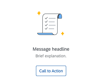
Generic illustrated message
Components
An illustrated message consists of the following parts:
- Illustration set (highly recommended)
- Message headline (mandatory)
- Message description (mandatory)
- Call to action (optional)
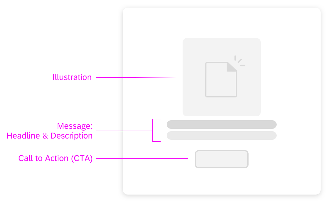
Anatomy of an illustrated message
Illustration Set
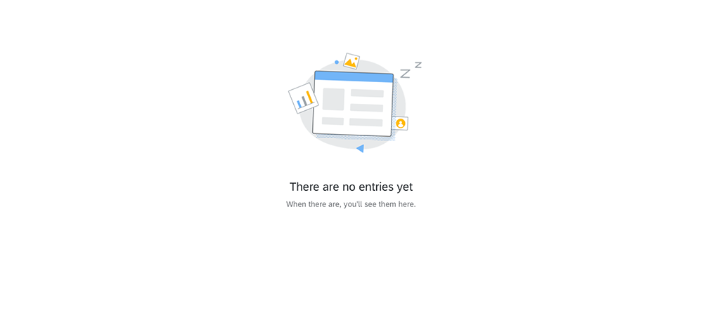
An illustrated message has a set of three UX illustrations per use case: spot, dialog, and scene. Each illustration has a different size and level of detail. The illustrations sizes are used at different breakpoints to ensure that the illustration is always appealing, regardless of the container size.
The illustrations help clarify the situation and add personality. It’s essential that the illustration is appropriate for the use case and the container you’re using (such as a dialog or card), and that similar use cases are handled consistently. The control automatically comes with illustrations for a set of dedicated use cases (see information box). You can use these illustrations if your use case is the same.
Each illustration is a themeable SVG file. Illustrations require an alternative text and are generally non-interactive. They do not require a tooltip.

Illustration set with all three illustration sizes
Headline
The headline explains the reason for the empty state, preferably in a single line. Use the headline to convey the essence of your message in simple, engaging language.
If you are using one of the standard use cases, you can refine the default text to tailor it to your specific app use case.
Description
The description adds details and tells the user what to do next, in three sentences or less. Write the description in sentence case with proper punctuation. You can also set links in the description (property: enableFormattedText).
If you are using one of the standard use cases, you can refine the default text to tailor it to your specific app use case.
Call to Action
If there is a clear next step, include a call to action, ideally in the form of a button.
Adaptiveness
Exemplified illustrated message
Default Behavior
By default, the illustrated message control adapts its appearance according to the size of the container in which it is placed (such as a dialog or card).
Fixed Sizes
Alternatively, you can set a fixed size for the illustrated message. This is only recommended in use cases where a page has multiple empty states in various controls and the illustrated message container is always rather big, resulting in several larger illustrated messages on one screen and hence a lot of unnecessary scrolling. For example, long object pages can contain several UI elements that are all initially empty. Be aware that the illustrated message remains fixed in such cases, also when the user resizes the window.
The illustrated message control offers the following predefined fixed sizes:
- Base – This is the smallest size. Be aware that this size does not display an illustration due to lack of space.
- Spot – This is the normal size for small containers, such as cards.
- Dialog – This is the size for medium-sized containers, such as dialogs.
- Scene – This is the size for large controls, such as tables and empty states for an entire screen.
Base size
Spot size
Dialog size
Scene size
Examples
Here are some examples of how illustrated messages can enhance the user experience for different empty states.
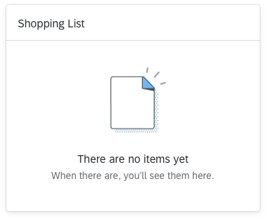
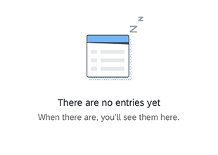
Empty state - No items
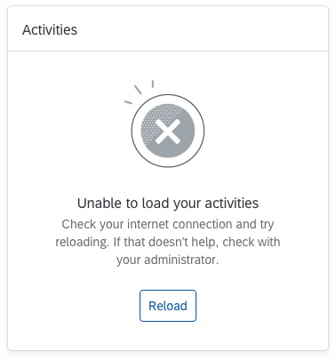
Empty state - No activities
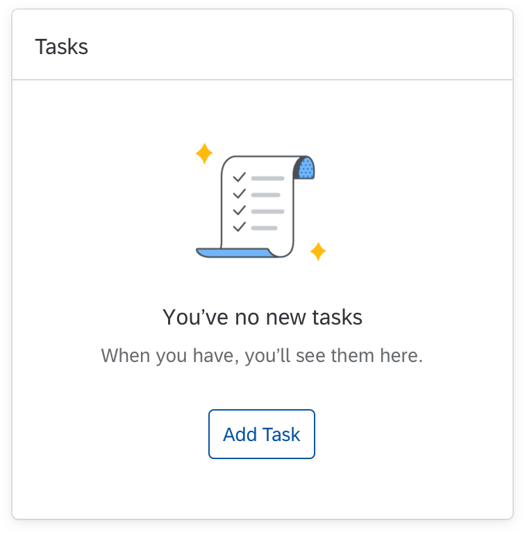
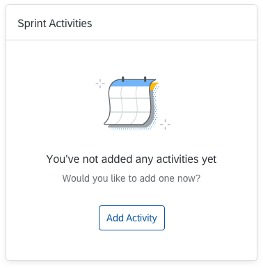
Empty state - No tasks
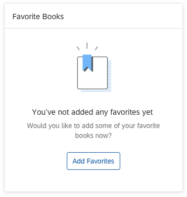
Empty state - No favorites
Empty state - No results, with search
Empty state - No results
Top Tips
Turn a negative event into a positive one
Take time to design and write a solution-oriented message. Be precise in your wording and be careful with the illustrations!
Reflect on old message habits. Have a look at the “Don’t” example. Why doesn’t this message work?
- The image ignores cultural considerations, doesn’t follow the illustration guidelines, and is unlikely to delight the user.
- The message text is problem-oriented and not helpful. It leaves the user alone with the problem and is likely to trigger negative emotions.
Ideally, a negative event in a software product doesn’t generate negative emotions. A well-designed illustrated message that leaves users feeling understood and valued can result in a neutral or even positive feeling. Remember that users will benefit from thoughtfully crafted illustrated messages every time they encounter them – perhaps even daily.
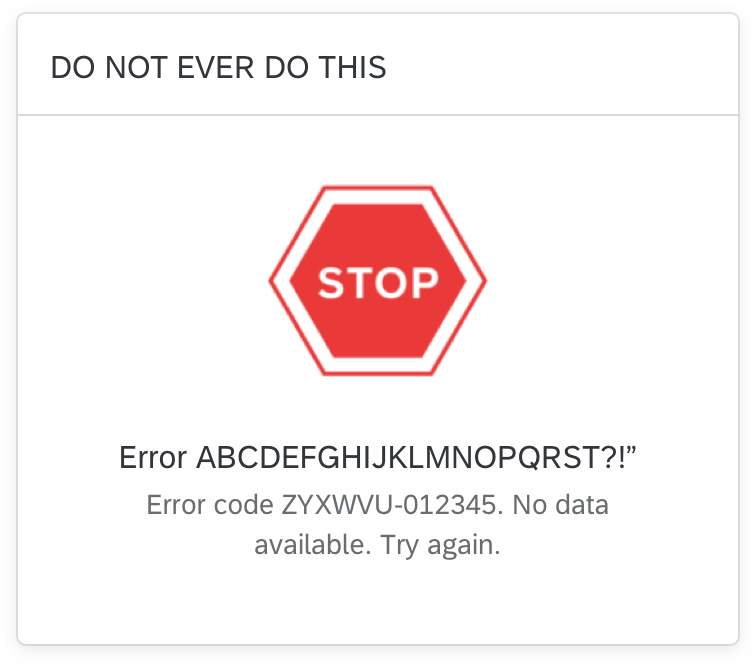
Unhelpful, problem-focused message with negative imagery
Helpful message with appropriate illustration and possible solutions
Always write a coherent, solution-oriented message
Make sure the illustration, message, and call to action work together as one to clarify the situation. Always provide a message. Never use an illustration without a message. A message combined with an illustration is more powerful than a message alone.
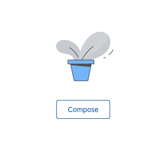
Illustration without a message and unrelated to the action
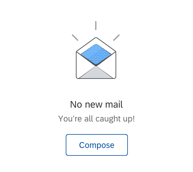
Matching message, illustration, and action
Tailor your message to your use case
- Always ensure that the default text fits in the context. If not, replace it or make it more precise.
Example:
Default text: No results found / Try changing your search criteria.
Adapted text (supplier table used with a filter bar): No suppliers found / Try adjusting your filter settings. - Recommended: Replace generic terms like “data” and “object” with your specific business object.
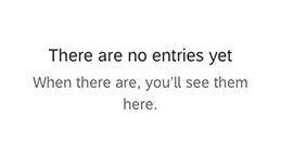
Example:
Default text: There’s no data yet / When there is you’ll see it here.
Adapted text: There are no orders yet / When there are, you’ll see them here.
Additional tips
- Never use other icons, images, or illustrations for an illustrated message. Always follow the guidelines on using UX illustrations.
- Don’t use the predefined illustrations for other use cases than the ones they were designed for. This would dilute the strength and recognizability of the illustration in the defined use case.
- Set alternative texts for the illustrations.
 Your feedback has been sent to the SAP Fiori design team.