
- Latest SAPUI Version 1.124
- SAPUI5 Version 1.122
- SAPUI5 Version 1.120
- SAPUI5 Version 1.118
- SAPUI5 Version 1.116
- SAPUI5 Version 1.114
- SAPUI5 Version 1.112
- SAPUI5 Version 1.110
- SAPUI5 Version 1.108
- SAPUI5 Version 1.106
- SAPUI5 Version 1.104
- SAPUI5 Version 1.102
- SAPUI5 Version 1.100
- SAPUI5 Version 1.98
- SAPUI5 Version 1.96
- SAPUI5 Version 1.94
- SAPUI5 Version 1.92
- SAPUI5 Version 1.88
- SAPUI5 Version 1.86
- SAPUI5 Version 1.84
- SAPUI5 Version 1.82
- SAPUI5 Version 1.80
- SAPUI5 Version 1.78
- SAPUI5 Version 1.76
- SAPUI5 Version 1.74
- SAPUI5 Version 1.72
- SAPUI5 Version 1.70
- SAPUI5 Version 1.68
- SAPUI5 Version 1.66
- SAPUI5 Version 1.64
- SAPUI5 Version 1.62
- SAPUI5 Version 1.60
- SAPUI5 Version 1.58
- SAPUI5 Version 1.56
- SAPUI5 Version 1.54
- SAPUI5 Version 1.52
- SAPUI5 Version 1.50
- SAPUI5 Version 1.48
- SAPUI5 Version 1.46
- SAPUI5 Version 1.44
- SAPUI5 Version 1.42
- SAPUI5 Version 1.40
- SAPUI5 Version 1.38
- SAPUI5 Version 1.36
- SAPUI5 Version 1.34
- SAPUI5 Version 1.32
- SAPUI5 Version 1.30
- SAPUI5 Version 1.28
- SAPUI5 Version 1.26
- Latest SAPUI Version 1.124
- SAPUI5 Version 1.122
- SAPUI5 Version 1.120
- SAPUI5 Version 1.118
- SAPUI5 Version 1.116
- SAPUI5 Version 1.114
- SAPUI5 Version 1.112
- SAPUI5 Version 1.110
- SAPUI5 Version 1.108
- SAPUI5 Version 1.106
- SAPUI5 Version 1.104
- SAPUI5 Version 1.102
- SAPUI5 Version 1.100
- SAPUI5 Version 1.98
- SAPUI5 Version 1.96
- SAPUI5 Version 1.94
- SAPUI5 Version 1.92
- SAPUI5 Version 1.90
- SAPUI5 Version 1.88
- SAPUI5 Version 1.86
- SAPUI5 Version 1.84
- SAPUI5 Version 1.82
- SAPUI5 Version 1.80
- SAPUI5 Version 1.78
- SAPUI5 Version 1.76
- SAPUI5 Version 1.74
- SAPUI5 Version 1.72
- SAPUI5 Version 1.70
- SAPUI5 Version 1.68
- SAPUI5 Version 1.66
- SAPUI5 Version 1.64
- SAPUI5 Version 1.62
- SAPUI5 Version 1.60
- SAPUI5 Version 1.58
- SAPUI5 Version 1.56
- SAPUI5 Version 1.54
- SAPUI5 Version 1.52
- SAPUI5 Version 1.50
- SAPUI5 Version 1.48
- SAPUI5 Version 1.46
- SAPUI5 Version 1.44
- SAPUI5 Version 1.42
- SAPUI5 Version 1.40
- SAPUI5 Version 1.38
- SAPUI5 Version 1.36
- SAPUI5 Version 1.34
- SAPUI5 Version 1.32
- SAPUI5 Version 1.30
- SAPUI5 Version 1.28
- SAPUI5 Version 1.26
Map
sap.ui.vbm.AnalyticMap | sap.ui.vbm.GeoMap
Intro
Maps are used to visualize data in an easy and intuitive way. A map is a symbolic visual illustration of areas, regions, and themes. SAP Visual Business supports analytic maps and geographic maps.
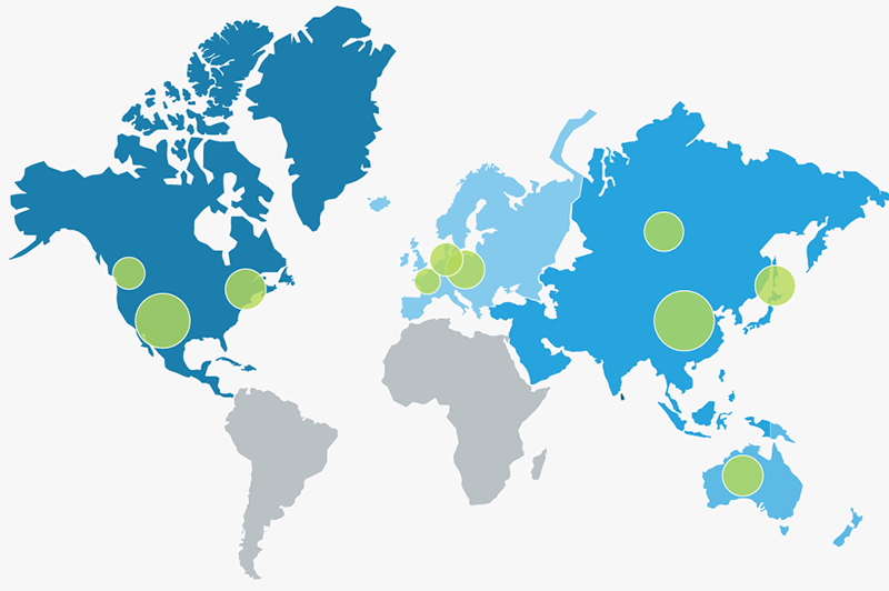
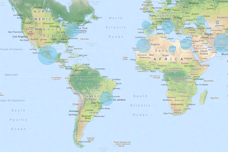
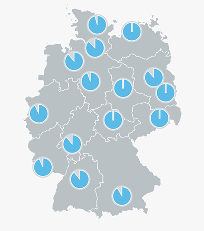
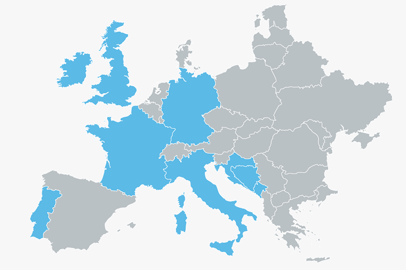
The analytic map shows regions such as continents or countries. Another term for this kind of map is a choropleth map.
In the context of a business application, the analytic map is useful for displaying quantitative or qualitative data by coloring various regions.
The analytic map is the best choice if you want to visualize region-specific values, such as for visualizing the sales revenue for different countries.
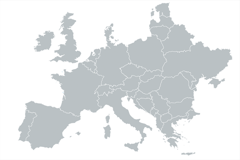
Analytic map
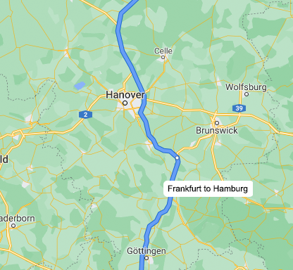
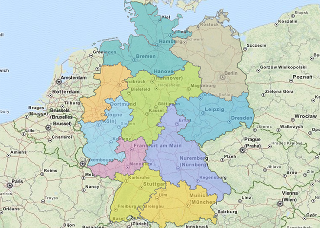
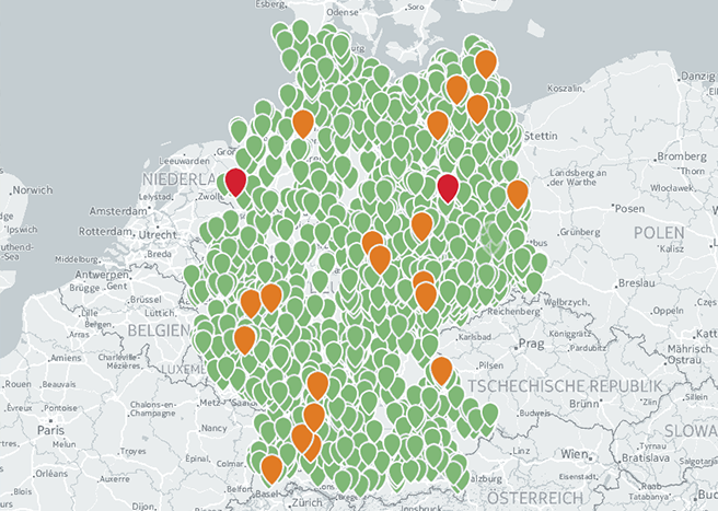
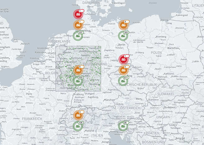
The geomap displays geographic elements like roads, cities, forests, and other details and is mostly used for navigation. In the context of a business application, a geomap is useful for displaying points of interest, area objects, or other charts over the map.
The geomap is the best choice if you have location-based data, and you want to show a road map, satellite map, or another specialist map in the background. For example, a geomap is good for visualizing the revenue of stores.
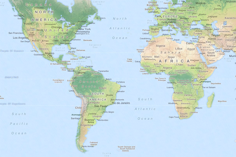
Geomap
In addition to the analytic map and geomap control, the SAP UI5 map container control provides you with a toolbar on top of the map. It also enables you to switch between maps and charts, includes personalization, provides a full screen mode, and enables you to include a list panel stack for displaying content on top of the map.
Components
A map can include any of the following elements:
- Toolbar (optional)
- Navigation tools:
- Legend (optional)
- Navigation control (optional) and scale (optional)
- Symbols for improved visualization of use cases:
- Spots (optional)
- Labels (optional)
- Circles/geocircles (optional)
- Areas (optional)
- Routes (optional)
- Container (optional) – here an arbitrary SAPUI5 control or chart can be shown on a map
Toolbar
If you need a toolbar, use the SAP UI5 map container control.
Navigation Tools
Legend
A panel containing a legend is displayed and expanded by default. You can collapse, expand, hide, or move the legend anywhere on the map if necessary.
The legend can be used interactively, in which case you have to enable the legend click event, which is provided by the control.
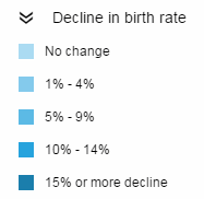
Legend
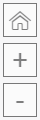
Navigation Control and Scale
Use the navigation control only if you do not use the chart container toolbar.
The navigation control is responsive and adapts to mobile and desktop devices. For mobile devices, the zoom function is visualized by using “+” and “–”, while an extended navigation tool is used for the desktop version.
The scale of a geomap is shown by default, although for analytic map it is not.

Desktop navigation
Navigation for mobile devices
Symbols for Improved Visualization of Use Cases
Spots
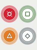
You can use spots to visualize specific locations on the map. There are five different types of spots: the default blue spot without any semantic value and the four semantic spots with icons. Adding numbers or text to a spot will replace an existing icon on the spot.
If you want to use a number with more than one digit, or text with up to five characters, you can use the relevant predefined spots that are provided. Spots are available for numbers containing up to one, three, and five digits. For text, spots are available for up to five characters (in all five colors). Use the label for numbers or text that exceed these limits. Ensure that numbers and texts on spots are not translated; if this is necessary, use labels.

Default spot
Spots with default icons
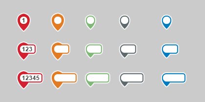
Spots with numbers or text
Labels
You can use a label to provide more information about a symbol. The label supports multiple lines and should be equally aligned for a group of symbols; for example, use the same alignment for all labels of spots.
For routes, the position of the label adapts to the map section. In other words, the label moves on the route so you can always see it at any zoom level. If a label is not sufficient, we recommend you use a container with the appropriate SAPUI5 control.
The label is available in five different colors: the default (neutral) white label and the semantic labels. The label adapts to the number of digits, and the content of the labels is translated if necessary.
In cases where a spot is insufficient, for example, if you want to include content that needs to be translated or that exceeds five characters, you can use a label instead of a spot. The label is available in four semantic colors, with or without anchors. It can be used as a standalone without any other symbols, like spots or routes.
Default label on a route
Standalone labels with semantic colors, with and without anchors
Circles/Geocircles
You can use circles to visualize specific, quantitative parameters, while geocircles can be used to visualize specific sizes or measures. The difference between circles and geocircles is as follows:
- Circles: Radius is given in pixels – constant screen size.
- Geocircles: Radius is given in meters – constant size in reality.
A use case for circles on a map might be to show the size of the biggest towns in a region or the revenue of a company per production location.
Analytic map displaying two parameters
Geomap with circles
Areas
You can visualize personalized areas. This can be used, for example, for visualizing regions such as countries or zip code zones.

Analytic map with areas (based on regions)
Geomap with areas
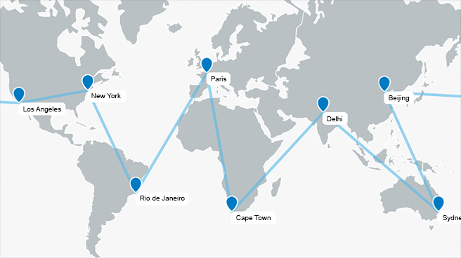
Routes
Routes can be displayed on maps with varying levels of detail, such as a map of the world or a local/national map depicting transport networks. For both levels of detail, app developers can adjust the following properties:
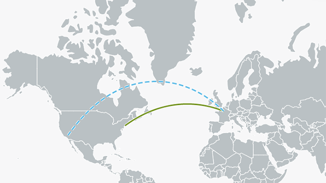
- Dot width: The default dot width for a route is zero, which results in a solid line. You can adjust the dot width to enable dotted or dashed lines, or a combination of dots and dashes.
- Route width: App developers can choose an appropriate route width. We recommend a route width of 3 px.
- Color: We recommend that you use the SAP Fiori chart colors.
- Arrow head: The route does not have an arrow head by default. You can enable an arrow head for the start and end points by changing the start or end property to 1.
- Direction indicator (only if arrow heads are enabled): The direction indicator is not set by default. If the direction of a route should always be visible, you can use the direction indicator, which displays additional arrows/triangles on the route as soon as the start or end point arrows are outside the visible area. In addition to the direction indicator, we recommend that you also use a white borderline.
- Borderline: No borderline is set by default. For accessibility reasons, we recommend that you only use a borderline to make a route more visible on the map.
- Curved route: Routes are displayed as straight by default. You can change them from straight to curved to display flight routes or bidirectional routes.
For accessibility reasons, we recommend that you use not only color, but also dot width for differentiation purposes. For example, use a solid line for planned routes and a dashed line for unplanned routes.
Analytic map with route
Analytic map with flight routes

Geomap with route
Container
You can use containers to display an arbitrary SAPUI5 control on the map. The map control only provides the container. The default container is transparent without a border. The app team can personalize the container (in terms of fill, border, and size) and add an arbitrary SAPUI5 control.
Analytic map with container containing another SAPUI5 control
Behavior and Interaction
Zoom
There are four ways of performing a zoom:
- Navigation tool: use the navigation controls to zoom in and out.
- Mouse wheel: use the mouse wheel to zoom in and out.
- Gesture: on a touchscreen, use the ‘pinch and spread’ gestures.
- Keyboard: use the ‘+’ and ‘-‘ keys to zoom in and out, or use the ‘Z’ key to use the rectangular zoom.
Thumbnail Mode (Minimized Map Control)
The map control can be minimized to a thumbnail, which can be used for tiles on the SAP Fiori launchpad or for the object page. Note that the thumbnail is a full-scale VBI control. If you use data binding, the thumbnail is updated automatically.
The app development team can specify the size of the thumbnail.
In the minimized state, only the thumbnail click event is available; all other mouse, keyboard, and touch events are disabled.
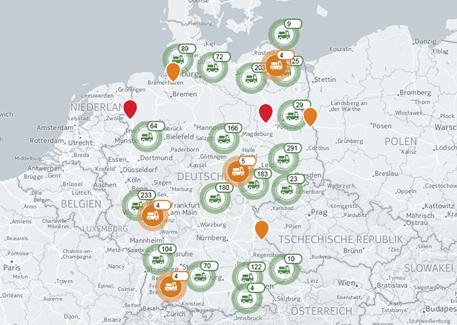
Clustering
To avoid cluttered screens with too many objects on the map, you can use one of three cluster algorithms:
- Grid clustering: Visual objects are clustered based on a grid. You can have multiple grid-based clusters. The visualization object is placed in the center of the grid cell with a specified offset.
- Tree clustering: Complex clustering based on Voronoi diagrams. The clustering itself is based on the areas in the Voronoi diagram, and cluster objects are aggregated to a hierarchy over several levels of detail.
- Distance clustering: Visual objects are clustered based on the visible distance between them. Objects are aggregated to a cluster object as long as they are within a specified range from the start object. The start object of a cluster is not specifically defined; only the nearest object that does not belong to a cluster is taken. The visualization objects are placed in the center of gravity of the covered objects. Thus the actual distance between them may vary. This type of clustering is fast, but the results may not be very convincing.
The control for visualizing clusters provides cluster icons in the four semantic colors (four types). If no type or text has been set, the default neutral, gray cluster is used. App developers can personalize the icons provided as follows:
- Change color
- Change icon
- Add text
- Replace the cluster icons provided with their own

Default cluster
Cluster icons provided (four types; without text)
Unclustered spots
Example: distance clustering with personalized semantic cluster icons
Example: grid clustering with personalized semantic cluster icons
Select
You can choose different selection modes: single selection to select a single item, and rectangular or lasso selection to select multiple items. You can also use the Shift key to add items to an existing selection, and the Ctrl key to select/deselect items.
Single Selection
This is the default selection mode. You can click your mouse button to select an object, while at the same time deselecting a previously selected object.
Rectangular Selection
You can switch to rectangular-selection mode by pressing the ‘R’ key. The cursor changes and you can use your left mouse button to draw a rectangle. Each object that lies within the rectangle is considered selected. Press the ‘R’ key again to leave this selection mode and return to single-selection mode.
Lasso Selection
You can switch to lasso-selection mode by pressing the ‘A’ key. The cursor changes and you can use your left mouse button to make a lasso selection. Each object that lies within the lasso is considered selected. Press the ‘A’ key again to leave this selection mode and return to single-selection mode.
View Tooltip
For desktops, a tooltip is enabled to provide additional information about the symbol.
Keyboard Shortcuts (desktop only)
| Action | Shortcut |
| Lasso selection | A |
| Rectangular selection | R |
| Zoom in | + |
| Zoom out | – |
| Rectangular zoom | Z |
| Move | ← ↑ → ↓ |
| Go to initial start position | H |
Styles
Analytical Map
Colors
For general rules about using colors in charts, see Chart – Color Palettes. You can define colors programmatically for each region.
Default Colors
Water and regions have default colors. The color of water cannot be changed. The color of each region can be changed individually. Keep the default color if the region has no data.

Default colors for analytic map
Regions Only
Colors from Qualitative Palette
Use colors from the qualitative palette to highlight particular regions. Use the first color of the qualitative palette. Also use colors from the qualitative palette to separate regions into distinct groups. Note that colors from the qualitative palette have no semantic value. For example, do not choose a color because it is blue or green as the hue associated to these colors may change in the future or may be customized by the customers. Start by using the first color and then the second color and so on, unless there is a good reason for not doing so. If there is no data for a region, keep the default color.
Map with one color

Map with multiple qualitative colors
Colors from Sequential Palette
Use colors from the sequential palette to encode quantitative differences, that is, to visually represent the idea of level, progression, or graduation. If there is no data for an item, keep the default color. See the section on How to Use the Sequential Palette in the Chart – Color Palettes article.
Map with colors from the sequential palette
Colors from Semantic Palette
Use colors from the semantic palette to show that data points are bad, neutral, or good. If there is no data for an item, keep the default color.

Map with colors from the semantic palette
Colors for Symbols
Symbols and Regions
Map with Circles/Geocircles
If you need to display circles over a map and use sequential colors for the regions, use the sequential palette with the following colors:
| Region | Circle | After |
| Multiple brightness of the first hue | sapUiChartPaletteSequentialHue2; Opacity: 60% | @sapUiLightestBorder |
See the section on How to Use the Sequential Palette in the Chart – Color Palettes article.
Visualizing two parameters of interest
Guidelines
General Guidelines
- If you want to include a toolbar and/or show additional content on a map, use the SAP UI5 map container control.
- Use the sequential color palette if there are no more than six different states. If you have more than three states, we recommend that you use the tooltip or legend in addition to the colors to provide detailed information. The reason for this is that the contrast of the colors for maps is too low to differentiate all colors at first glance. The sequential palette aims to highlight the most interesting states by using the darkest and the lightest color.
- Use the qualitative color palette if you want to visualize various states that are independent of each other, such as election areas.
- Use the semantic palette if you want to express good versus bad states, such as with revenue figures.
- If you want to display two regions with specific parameters, a combination of coloring the regions and using circles would be the best choice. Avoid overlaps by providing different aggregation levels at different zoom levels. Note that there could be problems with relating a parameter to the radius of a circle because a user will compare the area and not the radius. The area has a quadratic relation to the radius. Consequently, a smaller number looks very small and cannot be visually compared with other values.
Resources
Elements and Controls
- Chart (guidelines)
- Map Container (guidelines)
- Chart – Color Palettes (guidelines)
Implementation
- Analytic Map (SAPUI5 samples)
- Geo Map (SAPUI5 samples)
- Map Container (SAPUI5 samples)
- Best Practices (SAPUI5 API reference)
- Geo Map (SAPUI5 API reference)
 Your feedback has been sent to the SAP Fiori design team.