
- Latest SAPUI Version 1.124
- SAPUI5 Version 1.122
- SAPUI5 Version 1.120
- SAPUI5 Version 1.118
- SAPUI5 Version 1.116
- SAPUI5 Version 1.114
- SAPUI5 Version 1.112
- SAPUI5 Version 1.110
- SAPUI5 Version 1.108
- SAPUI5 Version 1.106
- SAPUI5 Version 1.104
- SAPUI5 Version 1.102
- SAPUI5 Version 1.100
- SAPUI5 Version 1.98
- SAPUI5 Version 1.96
- SAPUI5 Version 1.94
- SAPUI5 Version 1.92
- SAPUI5 Version 1.88
- SAPUI5 Version 1.86
- SAPUI5 Version 1.84
- SAPUI5 Version 1.82
- SAPUI5 Version 1.80
- SAPUI5 Version 1.78
- SAPUI5 Version 1.76
- SAPUI5 Version 1.74
- SAPUI5 Version 1.72
- SAPUI5 Version 1.70
- SAPUI5 Version 1.68
- SAPUI5 Version 1.66
- SAPUI5 Version 1.64
- SAPUI5 Version 1.62
- SAPUI5 Version 1.60
- SAPUI5 Version 1.58
- SAPUI5 Version 1.56
- SAPUI5 Version 1.54
- SAPUI5 Version 1.52
- SAPUI5 Version 1.50
- SAPUI5 Version 1.48
- SAPUI5 Version 1.46
- SAPUI5 Version 1.44
- SAPUI5 Version 1.42
- SAPUI5 Version 1.40
- SAPUI5 Version 1.38
- SAPUI5 Version 1.36
- SAPUI5 Version 1.34
- SAPUI5 Version 1.32
- SAPUI5 Version 1.30
- SAPUI5 Version 1.28
- SAPUI5 Version 1.26
- Latest SAPUI Version 1.124
- SAPUI5 Version 1.122
- SAPUI5 Version 1.120
- SAPUI5 Version 1.118
- SAPUI5 Version 1.116
- SAPUI5 Version 1.114
- SAPUI5 Version 1.112
- SAPUI5 Version 1.110
- SAPUI5 Version 1.108
- SAPUI5 Version 1.106
- SAPUI5 Version 1.104
- SAPUI5 Version 1.102
- SAPUI5 Version 1.100
- SAPUI5 Version 1.98
- SAPUI5 Version 1.96
- SAPUI5 Version 1.94
- SAPUI5 Version 1.92
- SAPUI5 Version 1.90
- SAPUI5 Version 1.88
- SAPUI5 Version 1.86
- SAPUI5 Version 1.84
- SAPUI5 Version 1.82
- SAPUI5 Version 1.80
- SAPUI5 Version 1.78
- SAPUI5 Version 1.76
- SAPUI5 Version 1.74
- SAPUI5 Version 1.72
- SAPUI5 Version 1.70
- SAPUI5 Version 1.68
- SAPUI5 Version 1.66
- SAPUI5 Version 1.64
- SAPUI5 Version 1.62
- SAPUI5 Version 1.60
- SAPUI5 Version 1.58
- SAPUI5 Version 1.56
- SAPUI5 Version 1.54
- SAPUI5 Version 1.52
- SAPUI5 Version 1.50
- SAPUI5 Version 1.48
- SAPUI5 Version 1.46
- SAPUI5 Version 1.44
- SAPUI5 Version 1.42
- SAPUI5 Version 1.40
- SAPUI5 Version 1.38
- SAPUI5 Version 1.36
- SAPUI5 Version 1.34
- SAPUI5 Version 1.32
- SAPUI5 Version 1.30
- SAPUI5 Version 1.28
- SAPUI5 Version 1.26
T Account
sap.suite.ui.commons.TAccount
Intro
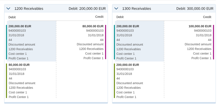
In double-entry bookkeeping, journal entries are transferred to the general ledger by posting their debit and credit amounts on specific ledger accounts, which are often referred to as T accounts. A ledger account (or T account) is usually displayed in a format that resembles the letter T: with the account name above the T, debit entries to the left of the T, and credit entries to the right of the T.
T accounts are usually clustered together, so the accountants can analyze how individual line items from different journal entries affect the ledger balances.
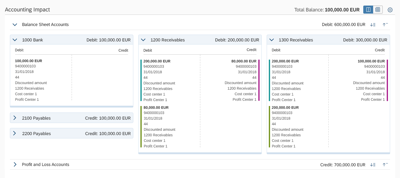
Example of a T account
Usage
Use the T account if:
- You need to analyze how individual line items affect one or several ledger accounts.
- You want to highlight the cross-account impact of one journal entry.
- You want to aggregate data of individual ledger accounts and provide total balances.
Do not use the T account if:
- You need to aggregate data through a different dimension than the account balance. Use a table instead.
- You need to display objects that are not journal entry line items.
Responsiveness
The T account control is fully responsive, and uses 100% of the available width of the container in which it is embedded. Depending on the available width, the number of T accounts on each line is updated dynamically to fit the available space.
On mobile devices, the T account control requires the full available width in order to display all its content.
The minimum width of each T account element is 20 rem (320 px). The width of the T account element grows until it reaches a breakpoint where enough width is available to render 2 or more T accounts on one line, leaving a space of 1 rem (16 px) between the T account items.
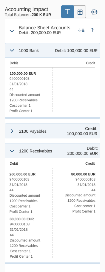
Size S
Size M
Size L
Layout
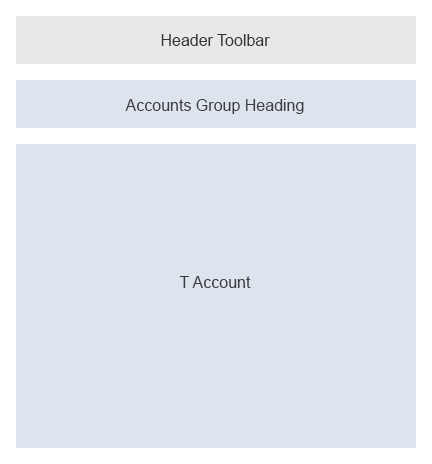
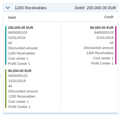
The T account control consists of a header toolbar, an account group heading, and individual T account elements. The header toolbar and account group heading can be hidden on the API level.
Schematic visualization of a T account
Components
By default, the T account control consists of a header toolbar, account group heading, and T accounts.
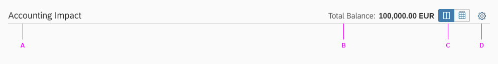
Header Toolbar
- A – Title: Provides a short and meaningful summary of the control’s content.
- B – Total Balance: Calculates the overall balance based on total credit and debit amounts of the ledger accounts included.
- C – View Switch: Switches the view between the T account view and table view.
- D – Settings: Displays a settings dialog, allowing users to show or hide additional information about accounts.
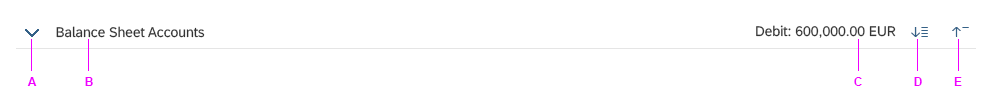
Account Group Heading
Each account group heading uses the expand/collapse behavior of the sap.m.Panel control, with an additional total balance indicator for the T accounts in the group as well as Expand All / Collapse All buttons. The Expand All / Collapse All buttons can be used to expand or collapse the content of all T accounts included in this account group.
- A – Expand/Collapse: Expands or collapses the group of accounts.
- B – Account Group Title: The name of the group of accounts.
- C – Group Balance: Calculates the balance based on total credit and debit entries of all T accounts included in the account group.
- D – Expand All: Expands all T accounts within the group of accounts.
- E – Collapse All: Collapses all T accounts within the group of accounts.
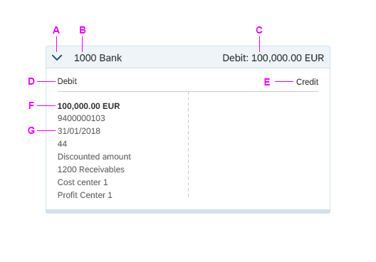
T Account
Every T account element consists of a heading, debit and credit content headings, and individual ledger entry blocks.
The number of individual entry blocks is unlimited and could potentially reach hundreds of blocks.
The entry blocks are nested under Credit and Debit headings. Each entry block takes 50% of the available width of the container. The credit and debit entry blocks are separated by a 1 rem (16 px) space.
- A – Expand/Collapse: Expands or collapses the T account.
- B – Account Title: The name of the T account.
- C – Account Balance: The sum of all credit and debit entries in the T account.
- D – Debit Content Heading
- E – Credit Content Heading
- F – Entry Block Amount: Provides the amount for a single ledger entry.
- G – Entry Block: Displays details of a specific ledger entry.
Header toolbar
Account group heading
T account
Behavior and Interaction
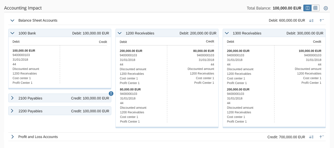
Matching Entries
Each journal entry usually impacts several ledger accounts. When the user clicks an entry in a T account, the control highlights this entry and all related entries in other T accounts, which helps identify matching entries in different accounts.
Highlighting for related entries
Color Indicators
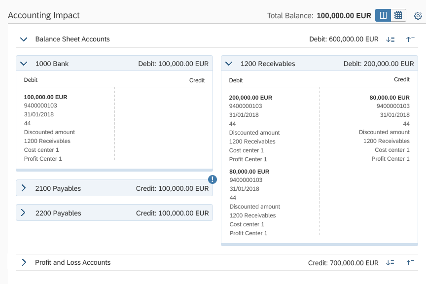
You can allow users to add color indicators to specific journal entries.
The T account control supports this on API level. However, the implementation should be done on the app level.
Tagging
Drag and Drop
By default, the control arranges T accounts dynamically to consume as little space as possible within the column grid. However, users can rearrange the T accounts freely by dragging them around.
If you would like to let users store their reordered layouts, use the variant management control.
View Settings
The view settings dialog enables the users to show or hide certain attributes of each entry block in a T account.
Additionally, you can show or hide labels that precede the values.

View settings
Resources
Want to dive deeper? Follow the links below to find out more about related controls, the SAPUI5 implementation, and the visual design.
 Your feedback has been sent to the SAP Fiori design team.