
- Latest SAPUI Version 1.124
- SAPUI5 Version 1.122
- SAPUI5 Version 1.120
- SAPUI5 Version 1.118
- SAPUI5 Version 1.116
- SAPUI5 Version 1.114
- SAPUI5 Version 1.112
- SAPUI5 Version 1.110
- SAPUI5 Version 1.108
- SAPUI5 Version 1.106
- SAPUI5 Version 1.104
- SAPUI5 Version 1.102
- SAPUI5 Version 1.100
- SAPUI5 Version 1.98
- SAPUI5 Version 1.96
- SAPUI5 Version 1.94
- SAPUI5 Version 1.92
- SAPUI5 Version 1.88
- SAPUI5 Version 1.86
- SAPUI5 Version 1.84
- SAPUI5 Version 1.82
- SAPUI5 Version 1.80
- SAPUI5 Version 1.78
- SAPUI5 Version 1.76
- SAPUI5 Version 1.74
- SAPUI5 Version 1.72
- SAPUI5 Version 1.70
- SAPUI5 Version 1.68
- SAPUI5 Version 1.66
- SAPUI5 Version 1.64
- SAPUI5 Version 1.62
- SAPUI5 Version 1.60
- SAPUI5 Version 1.58
- SAPUI5 Version 1.56
- SAPUI5 Version 1.54
- SAPUI5 Version 1.52
- SAPUI5 Version 1.50
- SAPUI5 Version 1.48
- SAPUI5 Version 1.46
- SAPUI5 Version 1.44
- SAPUI5 Version 1.42
- SAPUI5 Version 1.40
- SAPUI5 Version 1.38
- SAPUI5 Version 1.36
- SAPUI5 Version 1.34
- SAPUI5 Version 1.32
- SAPUI5 Version 1.30
- SAPUI5 Version 1.28
- SAPUI5 Version 1.26
- Latest SAPUI Version 1.124
- SAPUI5 Version 1.122
- SAPUI5 Version 1.120
- SAPUI5 Version 1.118
- SAPUI5 Version 1.116
- SAPUI5 Version 1.114
- SAPUI5 Version 1.112
- SAPUI5 Version 1.110
- SAPUI5 Version 1.108
- SAPUI5 Version 1.106
- SAPUI5 Version 1.104
- SAPUI5 Version 1.102
- SAPUI5 Version 1.100
- SAPUI5 Version 1.98
- SAPUI5 Version 1.96
- SAPUI5 Version 1.94
- SAPUI5 Version 1.92
- SAPUI5 Version 1.90
- SAPUI5 Version 1.88
- SAPUI5 Version 1.86
- SAPUI5 Version 1.84
- SAPUI5 Version 1.82
- SAPUI5 Version 1.80
- SAPUI5 Version 1.78
- SAPUI5 Version 1.76
- SAPUI5 Version 1.74
- SAPUI5 Version 1.72
- SAPUI5 Version 1.70
- SAPUI5 Version 1.68
- SAPUI5 Version 1.66
- SAPUI5 Version 1.64
- SAPUI5 Version 1.62
- SAPUI5 Version 1.60
- SAPUI5 Version 1.58
- SAPUI5 Version 1.56
- SAPUI5 Version 1.54
- SAPUI5 Version 1.52
- SAPUI5 Version 1.50
- SAPUI5 Version 1.48
- SAPUI5 Version 1.46
- SAPUI5 Version 1.44
- SAPUI5 Version 1.42
- SAPUI5 Version 1.40
- SAPUI5 Version 1.38
- SAPUI5 Version 1.36
- SAPUI5 Version 1.34
- SAPUI5 Version 1.32
- SAPUI5 Version 1.30
- SAPUI5 Version 1.28
- SAPUI5 Version 1.26
Time Picker
sap.m.TimePicker
Intro
The time picker allows the user to select a localized time. It can be used with touch, mouse, or keyboard input.
Usage
Use the time picker if:
- You want the user to select a time.
- You want the user to select a time range. In this case, one time picker can be used to set the starting time and a second one to set the end time.
- You want the user to select a detailed duration, such as 1 minute and 30 seconds.
Do not use the time picker if:
- You want the user to select a duration such as 15 minutes, 30 minutes, 1 hour, or 2 hours. In this case, use the select control instead.
Responsiveness
The time picker comes with a cozy mode and a compact mode. In the compact mode, the time input field and the button are smaller than in the cozy mode. In the compact mode, there are also arrows that the user can click to set hours, minutes, and so on. For more information, see the article on content density.
On desktop (size L/XL) and tablet (size M) devices, the user can enter a time in the input field of the time picker, or set a time via the time picker dropdown which opens when the user clicks the time picker button.
For mobile (size S) devices, the tap area is the same as for a tablet, and the user can type a time in the time input field. Unlike on a tablet or desktop, the time picker dropdown does not open below the time input field, but rather in a subview.
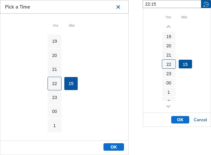
Cozy and compact mode of the time picker
Components
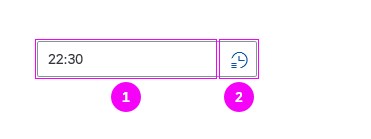
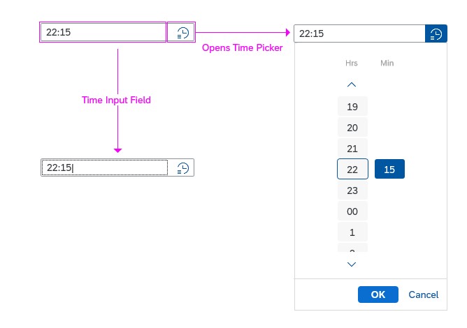
The time picker consists of a time input field (1) and a time picker button (2). On desktop, tablet, and mobile devices, both elements have their own click area. Clicking the time picker button opens the time picker dropdown.
You can set a predefined time, which shows as the initial value in the time input field and the time picker dropdown. Users can overwrite the initial value manually at any time.
Time picker input
Time Input Field
The time input field allows the user to enter a time directly in the field, or select it using the time picker dropdown. The input is validated and feedback is given to the user.
The time input field can also contain a placeholder (input prompt).
Time Picker Button
When the user clicks the time picker button, the time picker dropdown opens to allow the user to choose a time.
Time Picker Dropdown
In the time picker dropdown, the user can select a time by setting hours, minutes, seconds and AM/PM or a subset of these (with hours and minutes only).
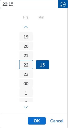
Dropdown with hours and minutes
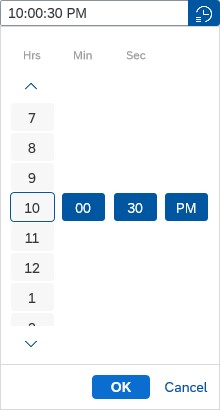
Dropdown with hours, minutes, seconds, and AM/PM
Behaviour and Interaction
Selecting a Time (Desktop Device)
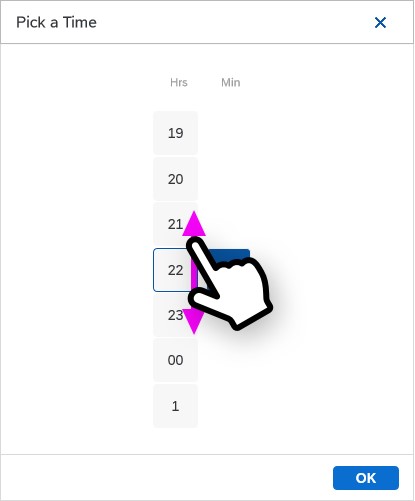
The user clicks the time picker button, which opens the time picker dropdown. In the time picker dropdown, the user can set the time either with the mouse or by using the keyboard arrows. The Page Up and Page Down keys can also be used to set the current selection to the lowest or highest value, and the Home and End keys can be used to go to the first or last element of the picker.
When the desired time has been selected, the user can confirm this selection by clicking the OK button. If the user wants to close the dropdown without changing the time to the selected time, this can be done by clicking the Cancel button or by clicking outside the dropdown.
Preventing Errors
The user can also select a time by clicking the time picker input field and typing the desired time in the field. You can prevent users from making incorrect entries by not allowing them to type in certain characters (see mask input). If the user enters a time that has the correct format but is invalid (such as 12:60:85), the time picker displays a validation error.
You can switch off the integrated mask input feature, but we strongly advice against doing so. Only deactivate the mask input if you need to make an exception for your use case (for example, if a variable length is required for a specific locale).
Time picker dropdown and input field
Selecting a Time (Tablet or Mobile Device)
On tablets and mobile devices, users can select the time by tapping the time picker button. The timer picker dropdown opens beneath the input field (a subview is opened on mobile devices). The user sets the hour by touching the hour element and then swiping up or down. To set the minutes, seconds, and AM/PM, the user also touches the corresponding element and swipes up or down to set the right value.
To confirm the selected time, the user taps the OK button. Tapping the Cancel button cancels the selection. On tablets, the selection can also be cancelled by tapping outside the time picker dropdown.
Set the time by swiping up and down (mobile)
Style
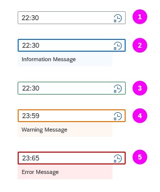
The Time Picker has five basic value states:
- Regular
- Information
- Success
- Warning
- Error
The information, warning, and error states can also have a message with additional information below.
Time picker value states
Guidelines
Time Formats
Seconds
Only let the user select time in seconds if this information is really necessary.
Time Zone
If the user has to set a time that is time zone-sensitive, offer a select control next to the time picker control to choose the appropriate time zone.
12-Hour System
In the 12-hour system, the date picker can contain selections for hours, minutes, seconds, and AM/PM.
24-Hour System
In the 24-hour system, the date picker can contain selections for hours, minutes, and seconds. AM/PM is not available in this mode.
For more information, see formatting time.
Properties
AM and PM are locale-dependent. Therefore, the locale can be set using the property “localeId”.
You can set the display format (property: displayFormat) to define the format in which the time input field and the time picker dropdown display the time. For more information about time formats, see the article on formatting dates.
Resources
Want to dive deeper? Follow the links below to find out more about related controls, the SAPUI5 implementation, and the visual design.
Elements and Controls
- Date Picker (guidelines)
- Date/Time Picker (guidelines)
- Input Field (guidelines)
- Select (guidelines)
- Formatting Time (guidelines)
- Formatting Dates (guidelines)
- How To Use Semantic Colors (guidelines)
 Your feedback has been sent to the SAP Fiori design team.