
- Latest SAPUI Version 1.124
- SAPUI5 Version 1.122
- SAPUI5 Version 1.120
- SAPUI5 Version 1.118
- SAPUI5 Version 1.116
- SAPUI5 Version 1.114
- SAPUI5 Version 1.112
- SAPUI5 Version 1.110
- SAPUI5 Version 1.108
- SAPUI5 Version 1.106
- SAPUI5 Version 1.104
- SAPUI5 Version 1.102
- SAPUI5 Version 1.100
- SAPUI5 Version 1.98
- SAPUI5 Version 1.96
- SAPUI5 Version 1.94
- SAPUI5 Version 1.92
- SAPUI5 Version 1.90
- SAPUI5 Version 1.88
- SAPUI5 Version 1.86
- SAPUI5 Version 1.84
- SAPUI5 Version 1.82
- SAPUI5 Version 1.80
- SAPUI5 Version 1.78
- SAPUI5 Version 1.76
- SAPUI5 Version 1.74
- SAPUI5 Version 1.72
- SAPUI5 Version 1.70
- SAPUI5 Version 1.68
- SAPUI5 Version 1.66
- SAPUI5 Version 1.64
- SAPUI5 Version 1.62
- SAPUI5 Version 1.60
- SAPUI5 Version 1.58
- SAPUI5 Version 1.56
- SAPUI5 Version 1.54
- SAPUI5 Version 1.52
- SAPUI5 Version 1.48
- SAPUI5 Version 1.46
- SAPUI5 Version 1.44
- SAPUI5 Version 1.42
- SAPUI5 Version 1.40
- SAPUI5 Version 1.38
- SAPUI5 Version 1.36
- SAPUI5 Version 1.34
- SAPUI5 Version 1.32
- SAPUI5 Version 1.30
- SAPUI5 Version 1.28
- SAPUI5 Version 1.26
- Latest SAPUI Version 1.124
- SAPUI5 Version 1.122
- SAPUI5 Version 1.120
- SAPUI5 Version 1.118
- SAPUI5 Version 1.116
- SAPUI5 Version 1.114
- SAPUI5 Version 1.112
- SAPUI5 Version 1.110
- SAPUI5 Version 1.108
- SAPUI5 Version 1.106
- SAPUI5 Version 1.104
- SAPUI5 Version 1.102
- SAPUI5 Version 1.100
- SAPUI5 Version 1.98
- SAPUI5 Version 1.96
- SAPUI5 Version 1.94
- SAPUI5 Version 1.92
- SAPUI5 Version 1.90
- SAPUI5 Version 1.88
- SAPUI5 Version 1.86
- SAPUI5 Version 1.84
- SAPUI5 Version 1.82
- SAPUI5 Version 1.80
- SAPUI5 Version 1.78
- SAPUI5 Version 1.76
- SAPUI5 Version 1.74
- SAPUI5 Version 1.72
- SAPUI5 Version 1.70
- SAPUI5 Version 1.68
- SAPUI5 Version 1.66
- SAPUI5 Version 1.64
- SAPUI5 Version 1.62
- SAPUI5 Version 1.60
- SAPUI5 Version 1.58
- SAPUI5 Version 1.56
- SAPUI5 Version 1.54
- SAPUI5 Version 1.52
- SAPUI5 Version 1.50
- SAPUI5 Version 1.48
- SAPUI5 Version 1.46
- SAPUI5 Version 1.44
- SAPUI5 Version 1.42
- SAPUI5 Version 1.40
- SAPUI5 Version 1.38
- SAPUI5 Version 1.36
- SAPUI5 Version 1.34
- SAPUI5 Version 1.32
- SAPUI5 Version 1.30
- SAPUI5 Version 1.28
- SAPUI5 Version 1.26
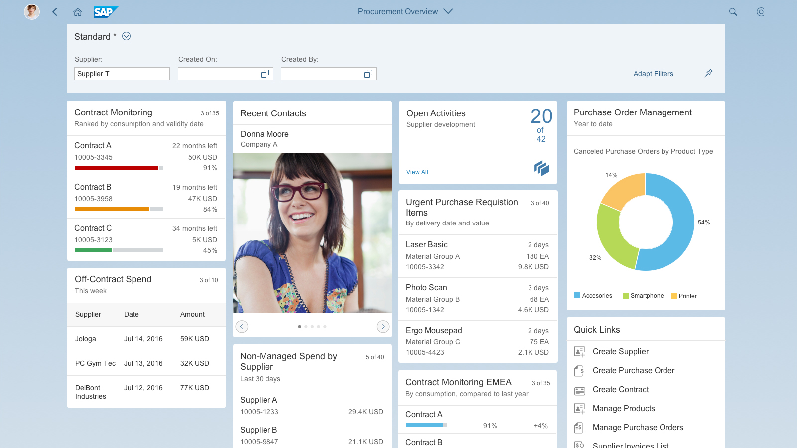
Dynamic Page (Layout + SAP Fiori Elements)
Intro
The dynamic page is a layout control designed to support various floorplans and use cases. The layout is fully responsive and is the successor of the full screen layout.
The design of the dynamic page header helps users to focus on the actual page content, but still ensures that important header information and actions are readily available.
The dynamic page layout is a generic control. The content of both the header and the page differs from floorplan to floorplan. The dynamic page header itself is a container that can be used for several controls. For detailed guidance, see the corresponding floorplan article:
- Analytical list page
- Initial page
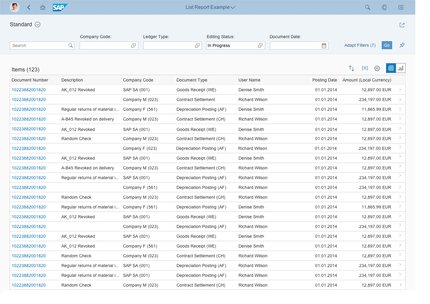
- List report
- Object page (The object page also offers a snapping header feature, but uses different underlying technology to the dynamic page.)
- Overview page
- Wizard
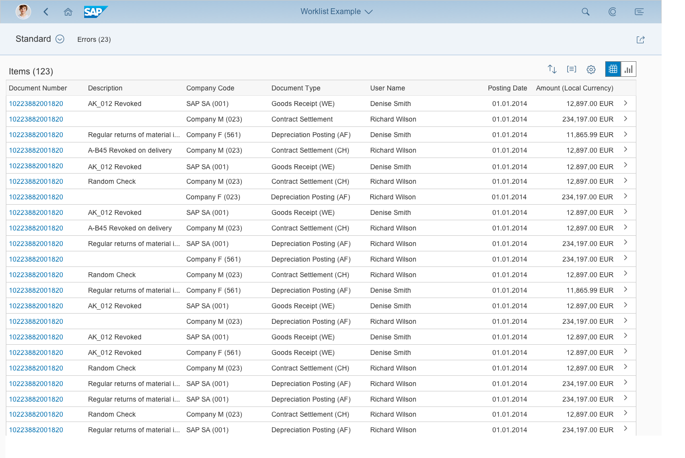
- Worklist
The dynamic page is already incorporated within all SAP Fiori element floorplans. You can also create a floorplan from scratch as a freestyle page using the semantic page. The semantic page provides an additional layer on top of the dynamic page layout, and helps to structure the content in the header and footer, such as the title and actions.
The footer toolbar is also part of the dynamic page layout and is used for closing or finalizing actions that impact the whole page.
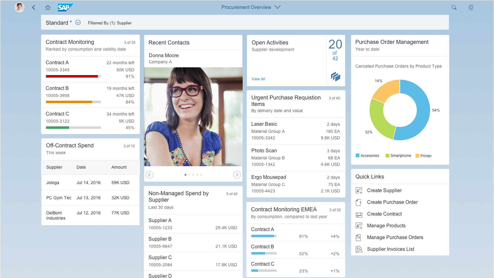
Dynamic Page Layout
Usage
Use the dynamic page layout if:
- You are building a freestyle application that uses the dynamic page header and footer toolbar features of SAP Fiori 2.0 (versions 1.40 and higher).
Do not use the dynamic page layout if:
- You are planning to use SAP Fiori elements, such as the list report, analytical list page, overview page, or object page, which already incorporate the dynamic page layout.
- You want to implement an initial page or object page floorplan. These floorplans already incorporate snapping header and footer toolbar features. The behavior is similar to the dynamic page, but the technical foundation is different.
- You only need to display a small amount of information. In this case, use a dialog instead. If you cannot avoid using the dynamic page layout, use letterboxing to mitigate the issue.
Structure
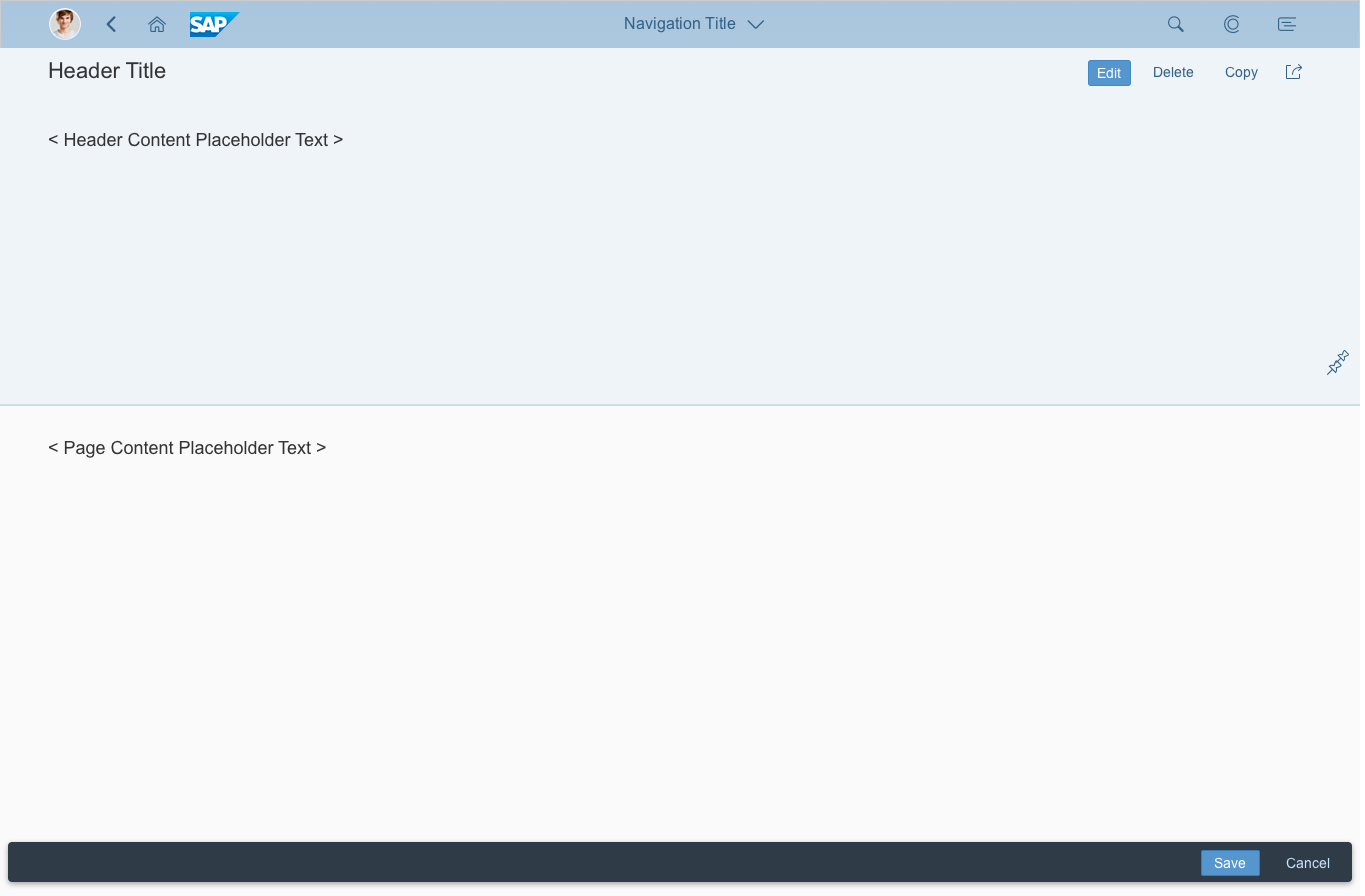
Like all layouts, the dynamic page layout is embedded in the shell bar of the SAP Fiori launchpad. From the shell bar, users have access to the launchpad services, including the home page, search, settings, and help. Apps are embedded in the shell and have little influence over its features. The shell bar also provides the back navigation and the app title, including the navigation menu.
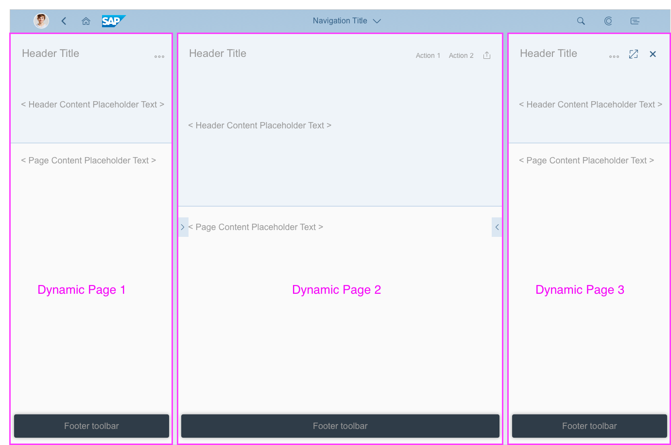
The dynamic page layout is responsive and optimized for use within a flexible column layout. Each column can contain its own dynamic page layout with a different floorplan, depending on the use case.
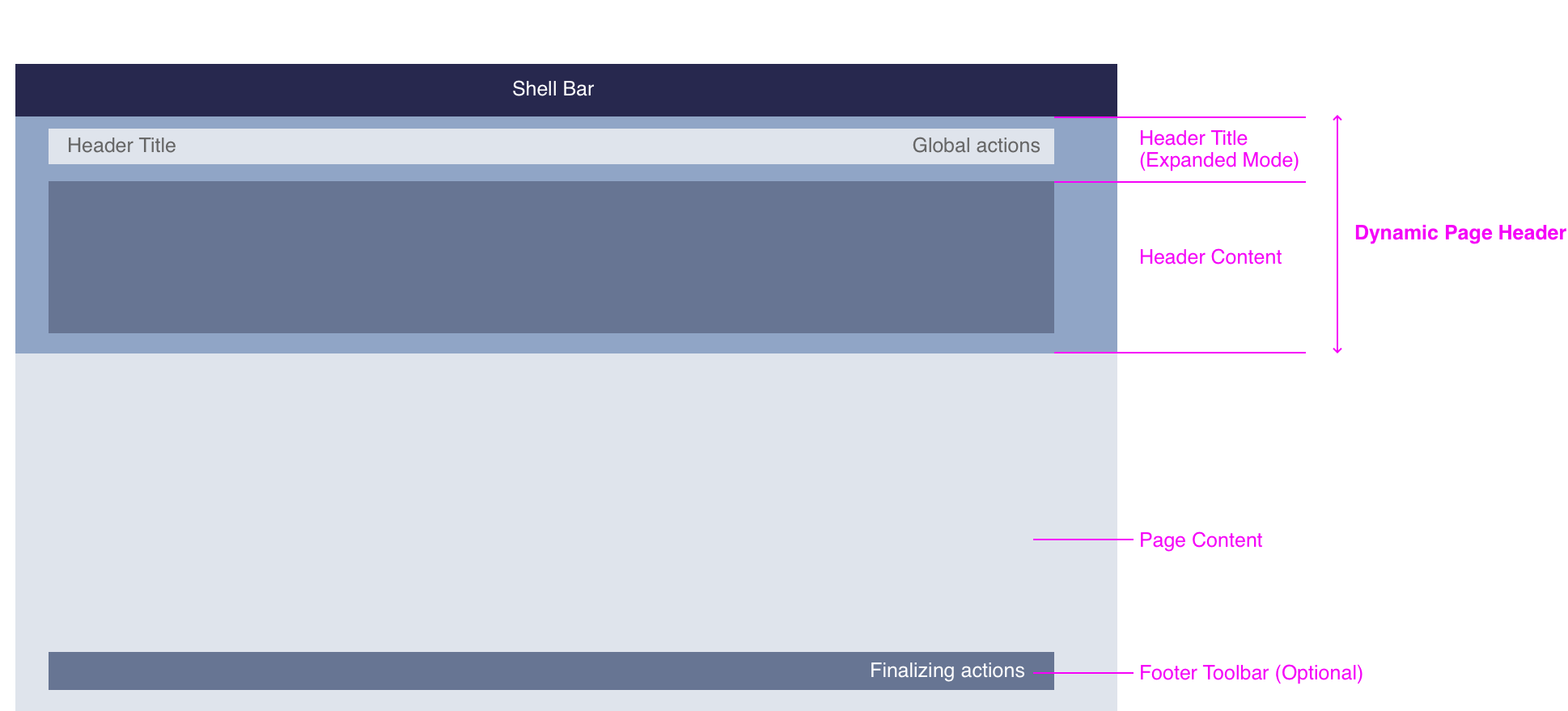
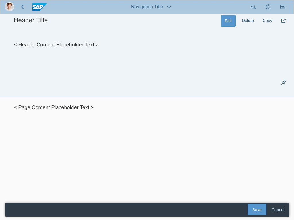
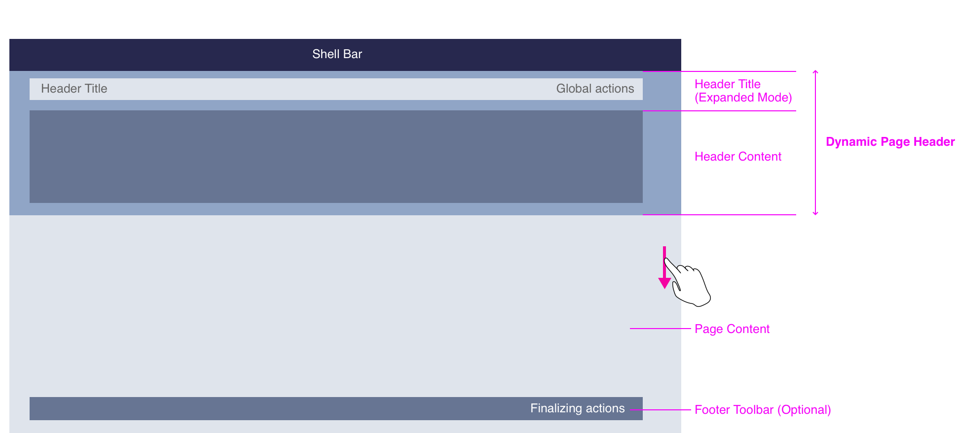
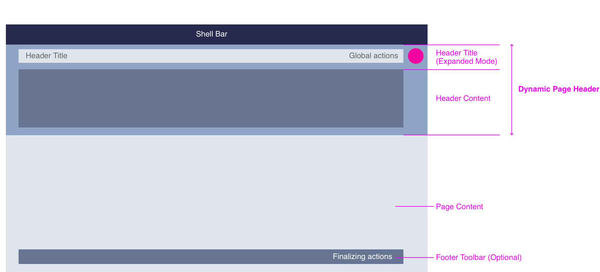
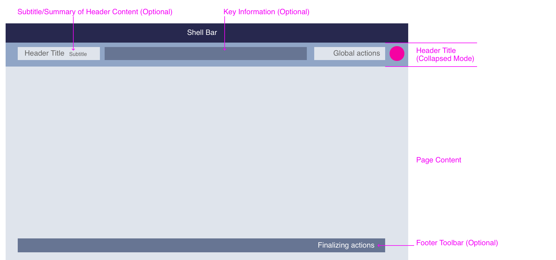
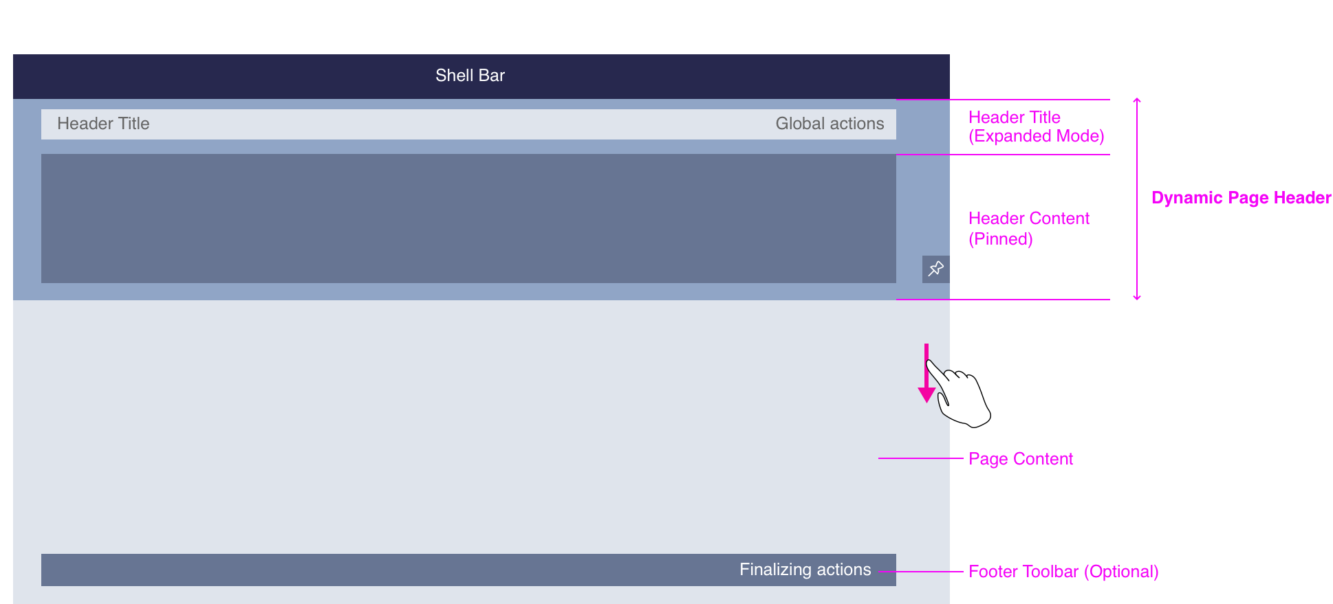
The dynamic page layout consists of three main areas:
- The header title combined with the subtitle/summary, key information (optional), and global actions (always visible)
- The header content (expandable/collapsible area)
- The content of the page, with a footer toolbar and finalizing actions (optional)
Depending on your use case, you can either use one of the predefined floorplans, or create your own layout.
Dynamic Page Layout - Structure
Components
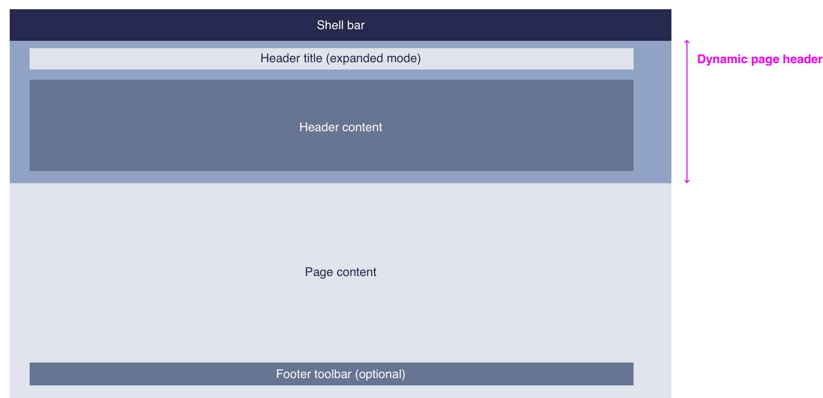
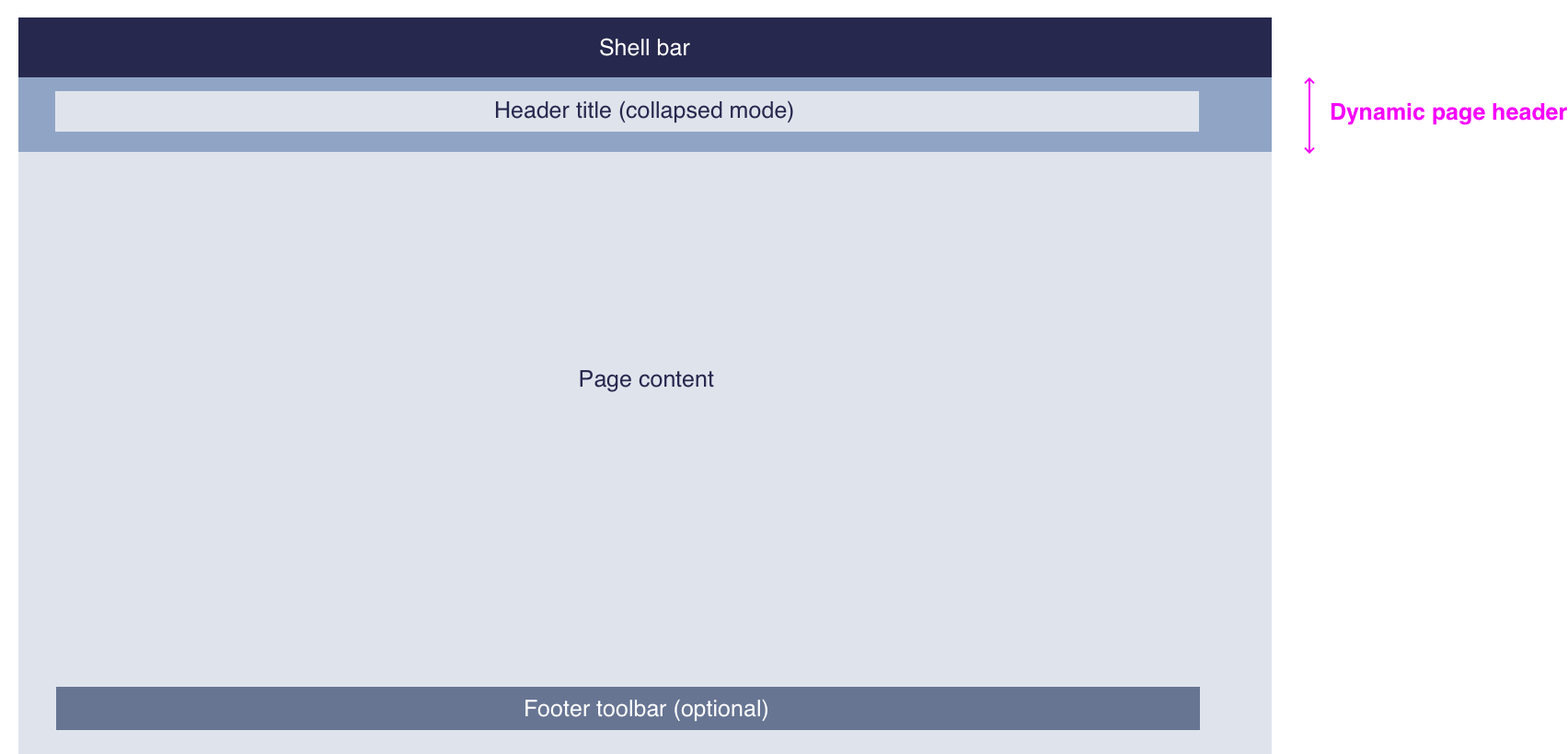
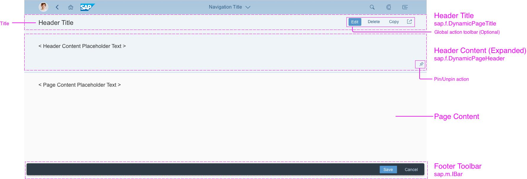
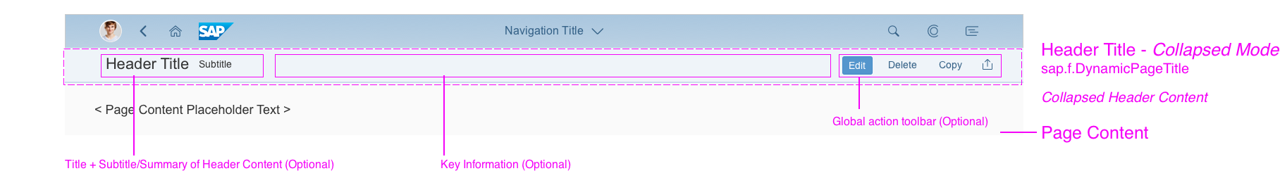
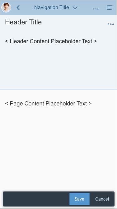
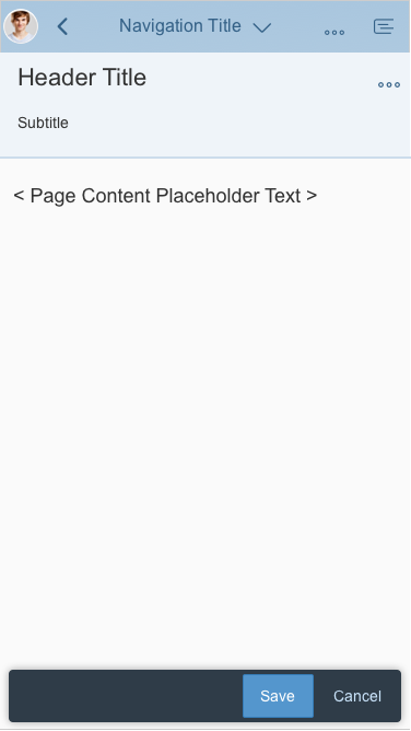
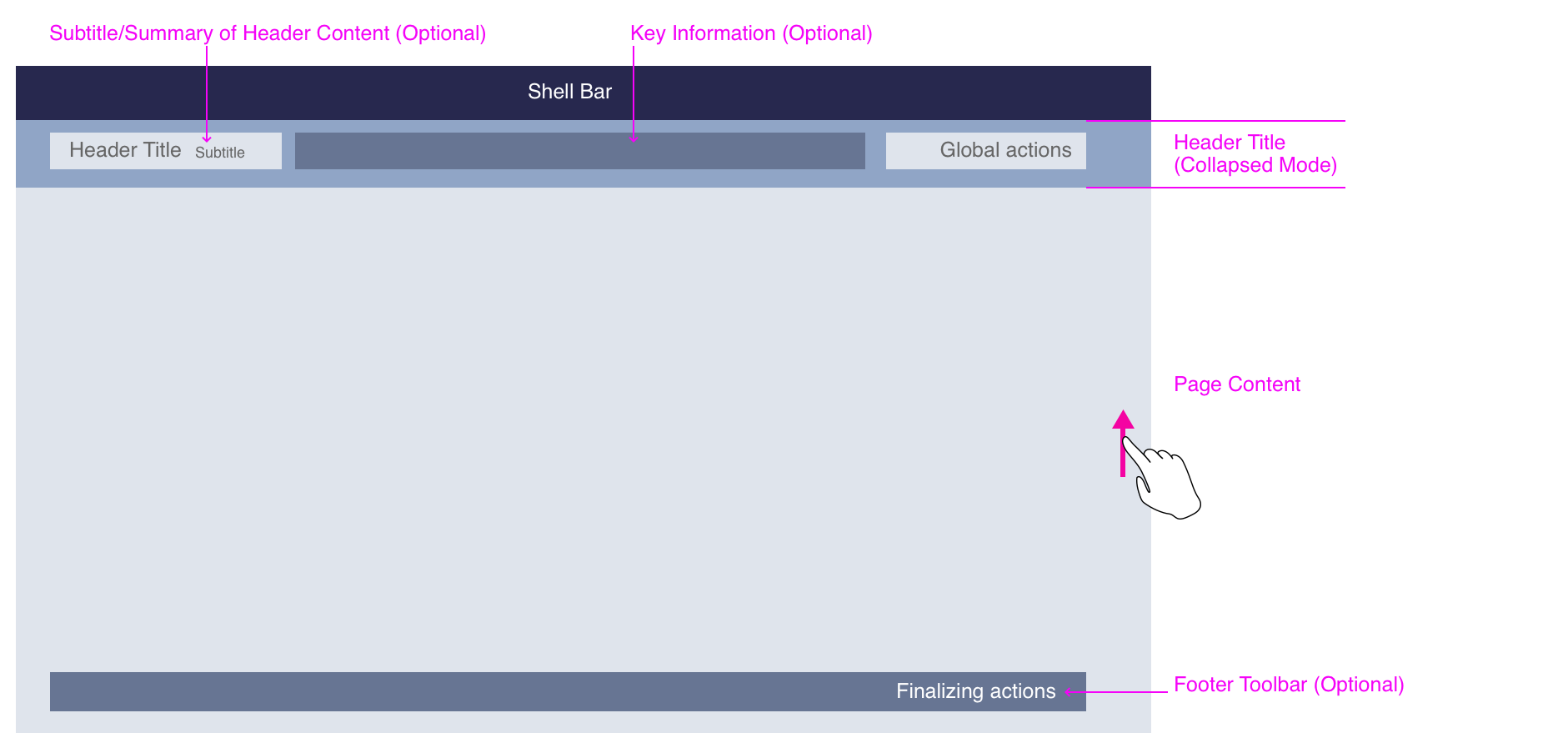
Together, the header title (mandatory) and the header content (optional) form the dynamic page header.
Dynamic page layout - Components (expanded mode)
Dynamic page layout - Components (collapsed mode)
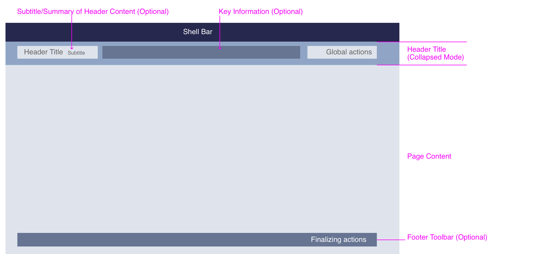
Header Title
The header title bar contains the following elements.
Mandatory Elements
- Title
The title is located on the left of the header title bar, and is always visible. The title can contain the following components:
-
- Text (mandatory)
- Link (optional)
- Variant management (optional)
Additional Elements (optional)
- Subtitle/summary
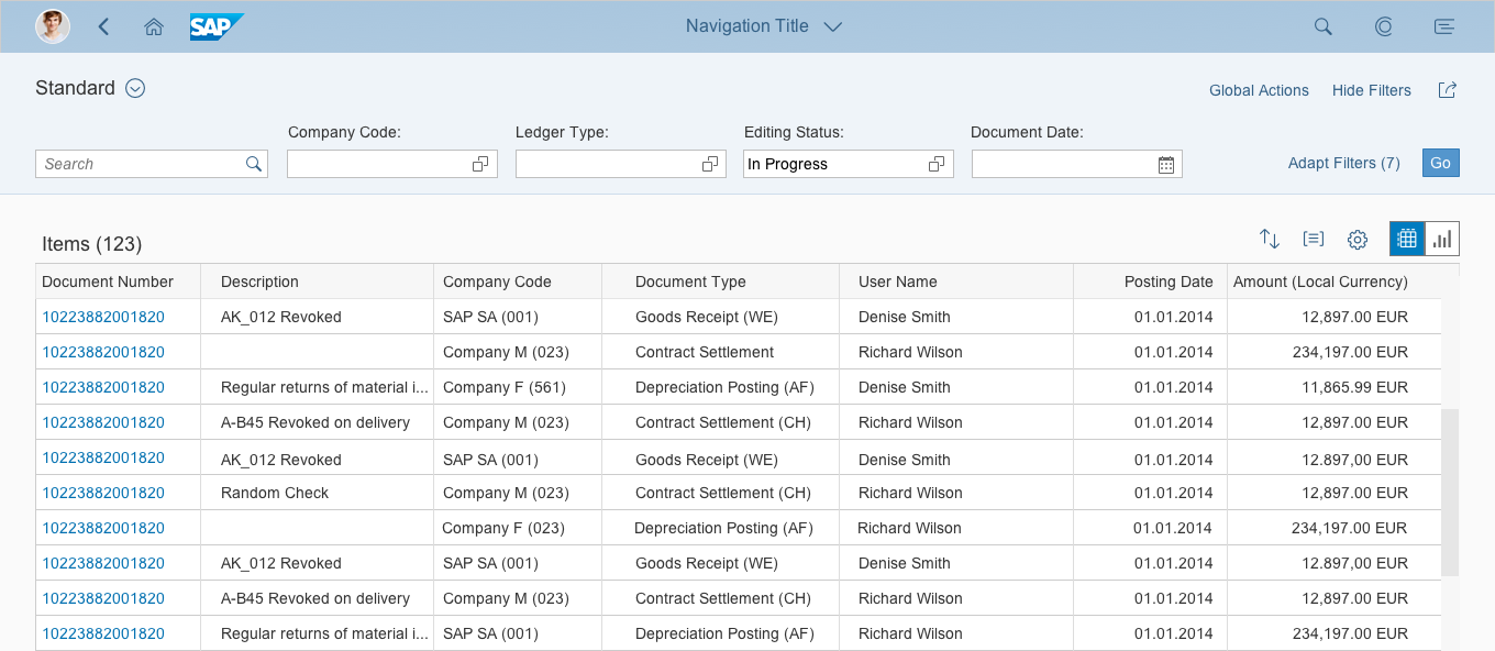
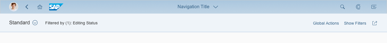
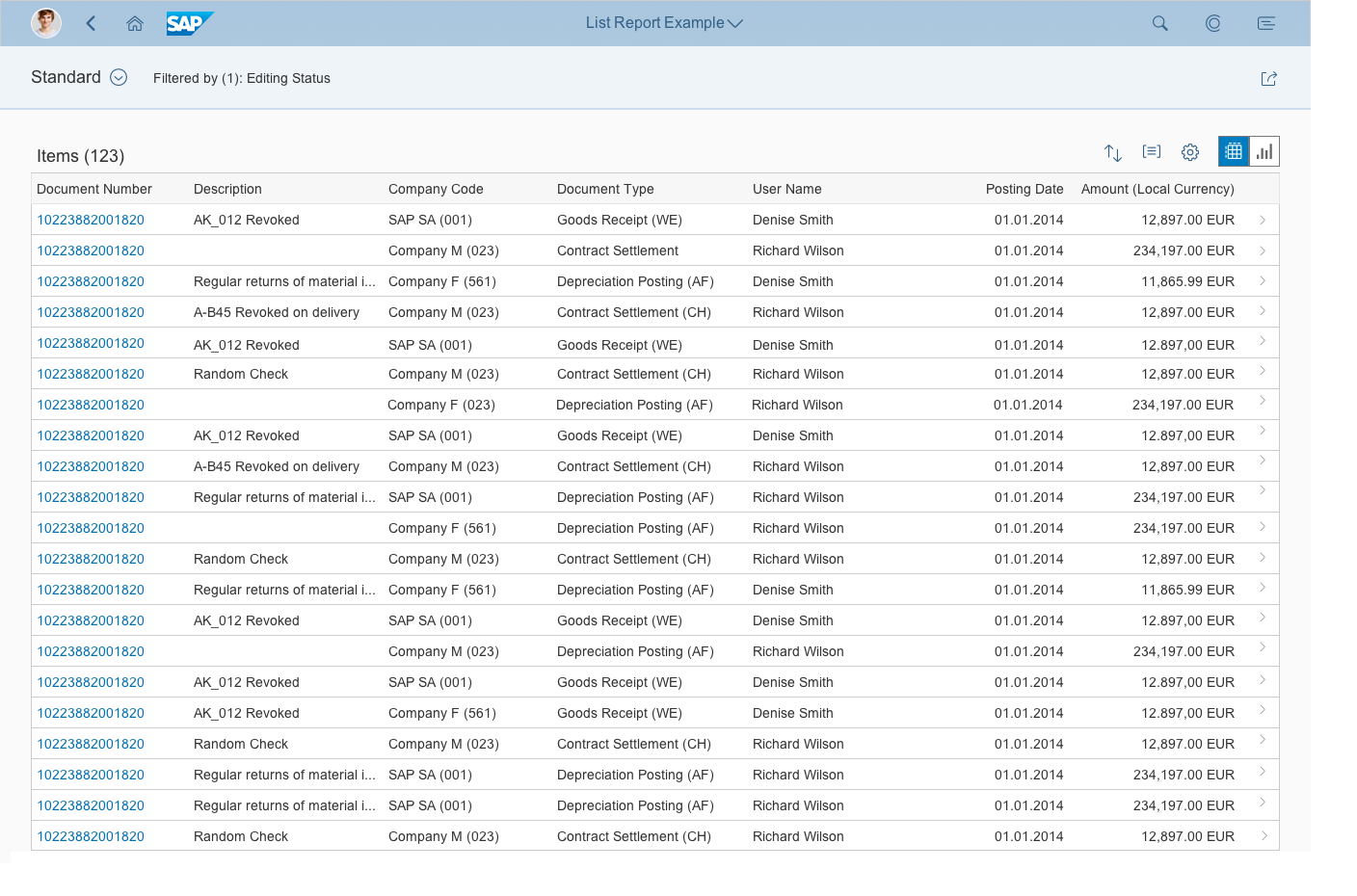
The subtitle is often used to summarize the most important information pertaining to the collapsed header content. For instance, it can be used to display the “Filtered by” information when the header content area contains a filter bar (for example, in a list report, analytical list page, or overview page). The subtitle can also be used to show information about the active tab within the worklist floorplan. Because the initial page contains an input field, no subtitle is needed. If the subtitle is used as a summary, make it clickable to allow the user to expand/collapse the header content. This needs to be provided as an additional feature, in parallel to the clickable area for the header title bar (see Behavior and Interaction). - Breadcrumb
Depending on the floorplan and use case, you can add breadcrumb navigation. The breadcrumb is located above the header title, and is primarily used to display the hierarchy of subpages within an object page. In the flexible column layout, the breadcrumb is only available in full screen mode and not in the multi-column layout. - Key information
Floorplans can also contain key information such as text, mini-facets, and KPI tags. Currently, KPI tags are only used within the analytical list page floorplan. - Global actions toolbar
Place global actions for the entire floorplan on the right-hand side of the header title bar. Always offer the actions as buttons, visualized either as text or icons. For more information, see Header Toolbar.
In the collapsed mode, the header title offers the same actions as in expanded mode and keeps them actionable. Do not remove or disable the actions within the global action toolbar when the header content is collapsed. - Layout actions
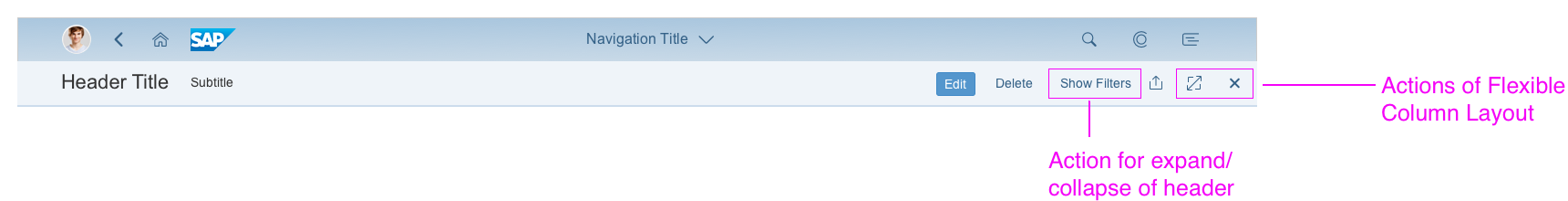
Layout actions, such as the Close or Full Screen / Exit Full Screen icons offered by the flexible column layout. Place these actions on the very right of the global actions toolbar and never move them into the overflow. Position the transparent Show/Hide <header content> button as the last text button before the icons. For more information, see the Exceptions section.
Placement of layout actions
Header Content
Located below the header title, the header content is optional.
You can place any components in the header content area, provided that they follow the guidelines for the respective floorplan.
When the dynamic page header collapses, the header content is hidden. If the header content is empty, it can also be hidden. If no header content is available, the header title is not interactive, and hence no dynamic page header functionality is provided.
In addition, the header content area includes an optional Pin/Unpin toggle action. This feature allows the user to keep the header title and all elements in the header content expanded, even when scrolling and clicking (see Behavior and Interaction).
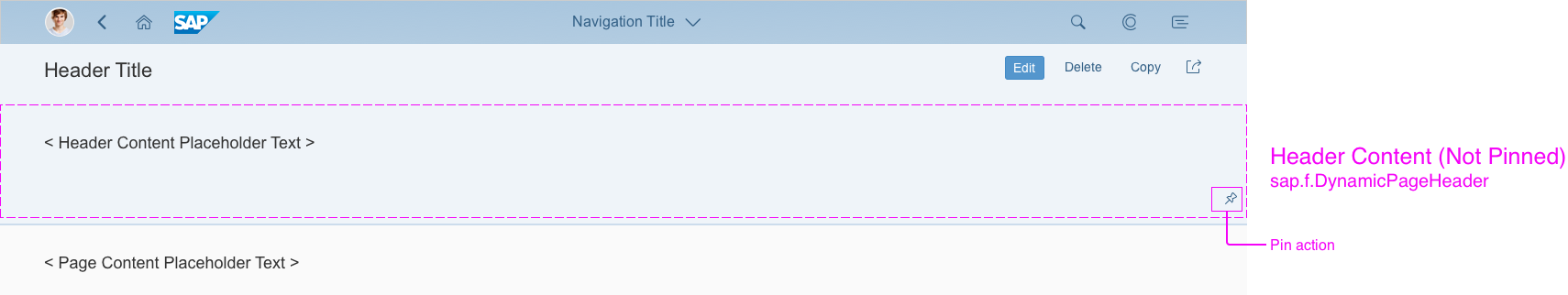
Dynamic page layout - Header content (unpinned)
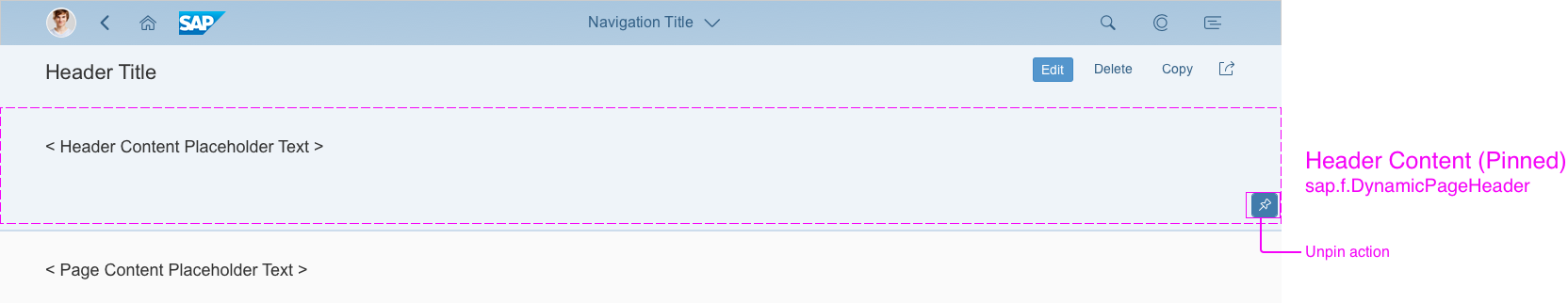
Dynamic page layout - Header content (pinned)
Footer Toolbar
The footer toolbar is also an optional part of the dynamic page layout. You can use it to offer closing or finalizing actions.

Dynamic page layout - footer toolbar
Responsiveness
The dynamic page layout offers considerable freedom and flexibility. In addition, the dynamic page header and the footer toolbar are designed to adapt automatically to small, medium, and large screen sizes.
Currently, global actions within the header toolbar are first to move into the overflow menu if there is a shortage of space. The toolbar follows the standard toolbar overflow guidelines by adding the available buttons to the overflow menu from right to left. If there still not enough space, the title and subtitle text wrap. The second line of the subtitle starts to wrap first.
Size S
Size M
Size L

Letterboxing means limiting the width of the content area to 1280 px. This prevents the app content from becoming too “stretched” on wide screens, and optimizes readability.
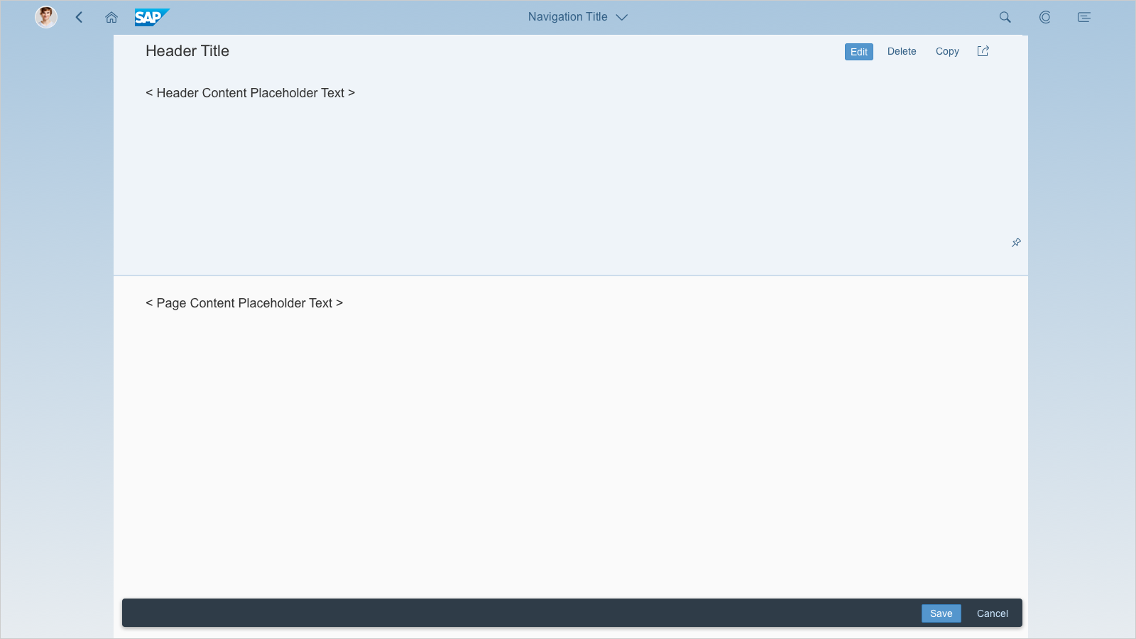
Dynamic page layout - With letterboxing on a desktop device
Dynamic Page Header
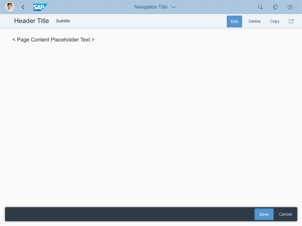
The header content collapses or expands on defined triggers (snap on scroll and snap on click) to show more of the actual page content.
In collapsed mode, the header title can display additional key information, such as a summary of the header content. The dynamic page header enables the user to focus on the actual work context by displaying the most important content. The footer toolbar isn’t affected by the snapping header.
Starting in expanded or collapsed mode
By default, the header content is initially expanded. For example, always expand the header content when starting the application if no query was fired (and the table is therefore empty).
In certain cases, depending on the way a floorplan is used, it can also make sense to deviate from the default and allow the header to appear in collapsed mode when initiating the app.

Dynamic page layout - Snap on scroll

Dynamic page layout - Snap on click
Dynamic page layout - Pin/unpin
Snap on Scroll
Scrolling is the typical trigger for collapsing the header content. When the user scrolls down the page, the header content scrolls away. The header title switches to snapped mode, and stays fixed. When the user scrolls up the page, the header content is revealed again.
Snap on Scroll
Snap on Click
In addition to the “snap on scroll” function, the user can also expand and collapse the header content by clicking anywhere on the header title bar where there are no active elements (such as links, active buttons, and so on). Titles and subtitles are part of the clickable area and also trigger the manual expand/collapse interaction.
On desktop devices, the cursor changes from an arrow to a hand to support the user’s interaction. If the header is expanded and user clicks on the title bar, the header content collapses, and vice versa.
Snap on Click
Exceptions
The following exception applies for pages containing desktop-centric tables, such as the analytical table, grid table, or tree table:
Because desktop-centric tables use up all of the available screen space, there is no scroll function, and hence no “snap on scroll” functionality. In this exceptional case, provide an additional transparent button for collapsing/expanding the header content area with the “snap on click” functionality in the global actions toolbar (for example, Hide Filters / Show Filters). Note that because a click interaction is required to expand or collapse the content area, the Pin/Unpin action is obsolete and is therefore not provided.
This exceptional case also applies to chart containers, which use up all the available screen space in a similar way to desktop-centric tables.
Wording: Show/Hide are mandatory terms for the “snap on click” action. Replace the second element of the action text after Show or Hide with a meaningful term, such as Filters. By default, this button goes into the overflow. However, depending on your use case, you can also keep it in the visible part of the global actions toolbar (Check: What is the main action on the screen?).
Dynamic page layout - Desktop-centric usage example (expanded mode)
Dynamic page layout - Desktop-centric usage example (collapsed mode)
Pinning the Header Content
The header content also includes a Pin/Unpin icon (toggle button) on the right-hand side ( ). Clicking the pin icon disables the snapping functionality of the header content. This lets the user keep the expanded mode of the header title and all elements in the header content even when scrolling and clicking. This mode remains fixed until the user clicks the pin icon again. This feature is optional and can be switched off if it is not useful for your application.
The pin functionality is not available for floorplans without scrollbars (see Exceptions above).
In the smartphone version, the pin action isn’t provided, as it would take up too much screen real estate.
Header Content - Pinning

Keyboard Interaction
The dynamic page header is a header that expands/collapses its content. We recommend exposing the expand functionality on click (on the header title bar) and on scroll events.
In addition, an optional expand button/link allows the user to manually expand the header via mouse interaction (see the exceptional case: desktop-centric table usage). This button is not embedded into the tab chain if the dynamic page header automatically expands while receiving keyboard focus.
For keyboard interaction, the dynamic page header expands automatically as soon as the content of the snapping header comes into focus via the keyboard, such as via tabbing or via group jumps (F6).
The dynamic page header collapses as soon as the keyboard focus leaves the dynamic page header content area.
| Key(s) | Behavior |
| [TAB] | Move focus to into dynamic page header – header title bar. Dynamic page header expands automatically.
If focus is inside the header content area, move focus to the next UI element within the header. If focus is on last UI element within the header content area, leave the header. Collapse header content. |
| [SHIFT] + [TAB] | See TAB, in reverse order. |
| [F6] | If focus is before the header title bar, set focus into the header title bar. Expand header content.
If focus is within the header content, move focus out of header and collapse header content. |
| [SHIFT] + [F6] | See F6, in reverse order. |
Floorplan Examples


Resources
Want to dive deeper? Follow the links below to find out more about related controls, the SAPUI5 implementation, and the visual design.
Elements and Controls
- Floorplan Overview (guidelines)
- SAP Fiori Elements (guidelines)
- Footer Toolbar (guidelines)
Implementation
- Dynamic Page – Freestyle Sample (SAPUI5 samples)
- Dynamic Page – List Report Sample (SAPUI5 samples)
- Dynamic Page – Desktop Centric Table Sample (SAPUI5 samples)
- Dynamic Page (SAPUI5 API reference)
- Overflow Toolbar (SAPUI5 API reference)
 Your feedback has been sent to the SAP Fiori design team.