
- Latest SAPUI Version 1.124
- SAPUI5 Version 1.122
- SAPUI5 Version 1.120
- SAPUI5 Version 1.118
- SAPUI5 Version 1.116
- SAPUI5 Version 1.114
- SAPUI5 Version 1.112
- SAPUI5 Version 1.110
- SAPUI5 Version 1.108
- SAPUI5 Version 1.106
- SAPUI5 Version 1.104
- SAPUI5 Version 1.102
- SAPUI5 Version 1.100
- SAPUI5 Version 1.98
- SAPUI5 Version 1.96
- SAPUI5 Version 1.92
- SAPUI5 Version 1.90
- SAPUI5 Version 1.88
- SAPUI5 Version 1.86
- SAPUI5 Version 1.84
- SAPUI5 Version 1.82
- SAPUI5 Version 1.80
- SAPUI5 Version 1.78
- SAPUI5 Version 1.76
- SAPUI5 Version 1.74
- SAPUI5 Version 1.72
- SAPUI5 Version 1.70
- SAPUI5 Version 1.68
- SAPUI5 Version 1.66
- SAPUI5 Version 1.64
- SAPUI5 Version 1.62
- SAPUI5 Version 1.60
- SAPUI5 Version 1.58
- SAPUI5 Version 1.56
- SAPUI5 Version 1.54
- SAPUI5 Version 1.52
- SAPUI5 Version 1.50
- SAPUI5 Version 1.48
- SAPUI5 Version 1.46
- SAPUI5 Version 1.44
- SAPUI5 Version 1.42
- SAPUI5 Version 1.40
- SAPUI5 Version 1.38
- SAPUI5 Version 1.36
- SAPUI5 Version 1.34
- SAPUI5 Version 1.32
- SAPUI5 Version 1.30
- SAPUI5 Version 1.28
- SAPUI5 Version 1.26
- Latest SAPUI Version 1.124
- SAPUI5 Version 1.122
- SAPUI5 Version 1.120
- SAPUI5 Version 1.118
- SAPUI5 Version 1.116
- SAPUI5 Version 1.114
- SAPUI5 Version 1.112
- SAPUI5 Version 1.110
- SAPUI5 Version 1.108
- SAPUI5 Version 1.106
- SAPUI5 Version 1.104
- SAPUI5 Version 1.102
- SAPUI5 Version 1.100
- SAPUI5 Version 1.98
- SAPUI5 Version 1.96
- SAPUI5 Version 1.94
- SAPUI5 Version 1.92
- SAPUI5 Version 1.90
- SAPUI5 Version 1.88
- SAPUI5 Version 1.86
- SAPUI5 Version 1.84
- SAPUI5 Version 1.82
- SAPUI5 Version 1.80
- SAPUI5 Version 1.78
- SAPUI5 Version 1.76
- SAPUI5 Version 1.74
- SAPUI5 Version 1.72
- SAPUI5 Version 1.70
- SAPUI5 Version 1.68
- SAPUI5 Version 1.66
- SAPUI5 Version 1.64
- SAPUI5 Version 1.62
- SAPUI5 Version 1.60
- SAPUI5 Version 1.58
- SAPUI5 Version 1.56
- SAPUI5 Version 1.54
- SAPUI5 Version 1.52
- SAPUI5 Version 1.50
- SAPUI5 Version 1.48
- SAPUI5 Version 1.46
- SAPUI5 Version 1.44
- SAPUI5 Version 1.42
- SAPUI5 Version 1.40
- SAPUI5 Version 1.38
- SAPUI5 Version 1.36
- SAPUI5 Version 1.34
- SAPUI5 Version 1.32
- SAPUI5 Version 1.30
- SAPUI5 Version 1.28
- SAPUI5 Version 1.26
Best Practices for Designing SAP Fiori Apps
Intro
After the “Discover” phase of the design-led development process, your product team knows which apps need to be designed for whom. In other words, you know the user’s business role and tasks.

Design phase
How do you translate this into an SAP Fiori design?
Start by deciding on the SAP Fiori design language:
- Is a native mobile app required because you need device capabilities such as a camera, or offline capabilities?
- Does it make sense to offer the app in a conversational bot for managing service calls, for example?
- Do you need to make the app available in different design languages to make use of their specific capabilities?
If your use case doesn’t require any device-specific capabilities or modifications, use SAP Fiori for web as your design language. Due to the responsive and adaptive design, web apps run on both desktop and mobile devices. The apps run in the device browser, so there’s no need to install any software.
The Basics
If you’re designing SAP Fiori web applications, familiarize yourself with the essentials:
- Keep the design principles in mind
- Understand the launchpad
- Get to know the information architecture: Layouts, floorplans, UI elements
- Get to know the most important general patterns
Keep the design principles in mind
Use the SAP Fiori design principles as the overarching guidance: Role-based, adaptive, simple, coherent, and delightful.
Understand the launchpad
Get to know the information architecture: Layouts, floorplans, UI elements
SAP Fiori is based on modular components that together build a consistent information architecture. In this section, we’ll explain what we mean by pages, layouts, floorplans, and UI elements. You’ll then see how pages are structured and populated with UI elements.
Pages, Layouts, Floorplans
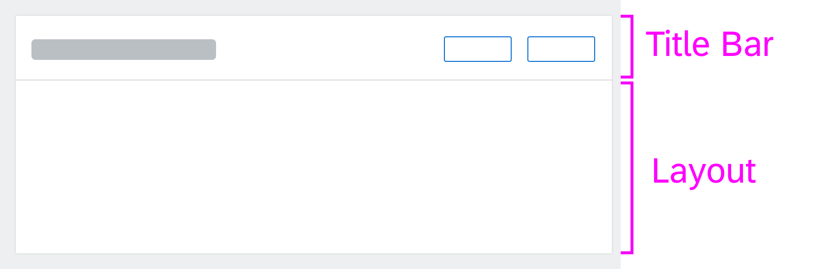
The basic entity in SAP Fiori is a page. A page uses the entire viewport of an app and consists of three main areas: A header, a content area, and an optional footer toolbar. We call this layout the dynamic page.
The following picture shows how a page is composed:

Page
Dynamic page
Floorplan – List report
For use cases relevant to many applications, we have defined standard page layouts, which we refer to as floorplans.
Examples:
- The list report, for finding, identifying, and selecting business objects.
- The object page, for displaying, creating, and editing a single business object.
You can find all floorplans in the Floorplans section of the navigation structure.
Most floorplans are based on the dynamic page and come with a specific combination of UI elements in the header and content areas. For use cases that cannot be designed using a floorplan, take the dynamic page as a basis.
Instead of showing one page at a time, you can also show up to three pages next to each other if they have a list-detail relationship. We call this the flexible column layout. For example, the first column contains a list report floorplan with all business objects, and the second the object page floorplan of the selected business object.
The following picture shows a flexible column layout with three pages:
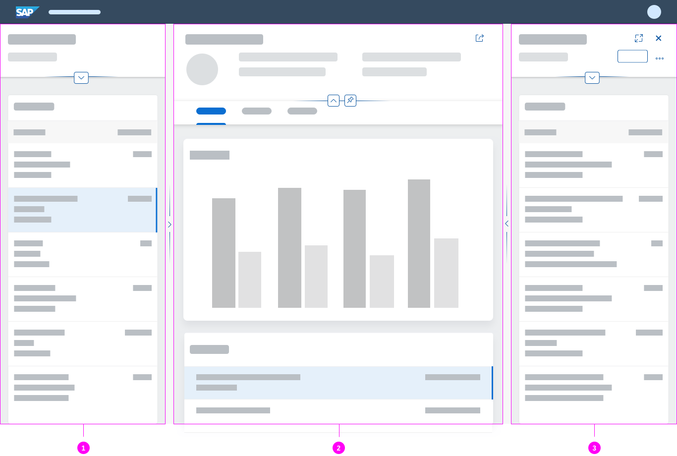
Flexible column layout with 3 pages
Dynamic Page: Structure of Header and Content Area
Most of the actual business content appears in the page header and content area.
- The header contains content that is relevant for the entire page and is visible at all times.
- The content area is the user’s main work area.
Header
The following picture shows the structure of the page header.
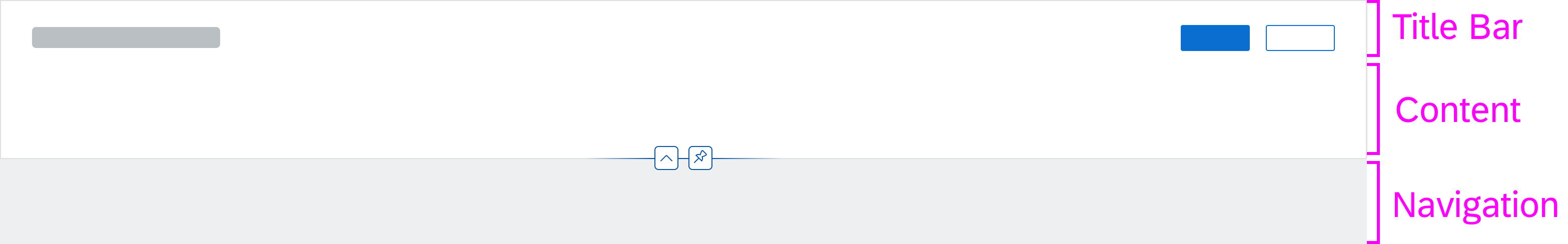
Header structure
The header consists of:
- A title bar with a title and an optional toolbar.
- Content (optional).
- Header navigation (optional).
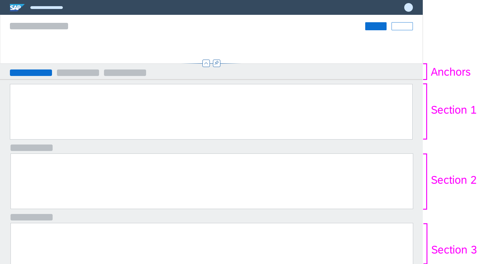
The header navigation is used to quickly access specific parts of the content area. You can either set anchors on the page or split the content in different tabs. Keep in mind that even if the content is split in different tabs, it is still one page.
Content Area
The structure of the content area varies depending on the header navigation. There are three options:
No header navigation
The content area is organized in one or more content blocks.
Anchor navigation
The content area is organized in sections. Each section contains one or more content blocks.
Tab navigation
The content area uses a tab container. The tab container contains one or more content blocks.
Content area - No header navigation
Content area - Anchor navigation

Content area - Tab navigation
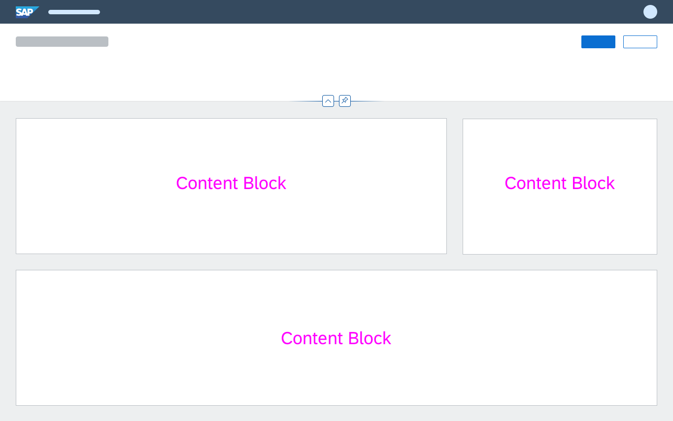
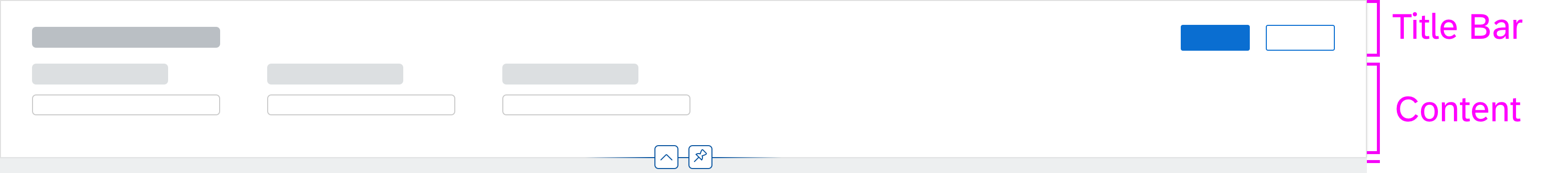
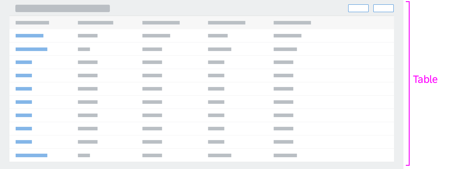
Content blocks represent different aspects of the overall page content, such as a business object or a workflow. The blocks help you design the content area in a well-balanced way. A content block itself is a container with a title and an optional toolbar on top, and a layout to arrange the controls:
Content block
Example
The example below shows a page without header navigation and with 3 content blocks in the content area:
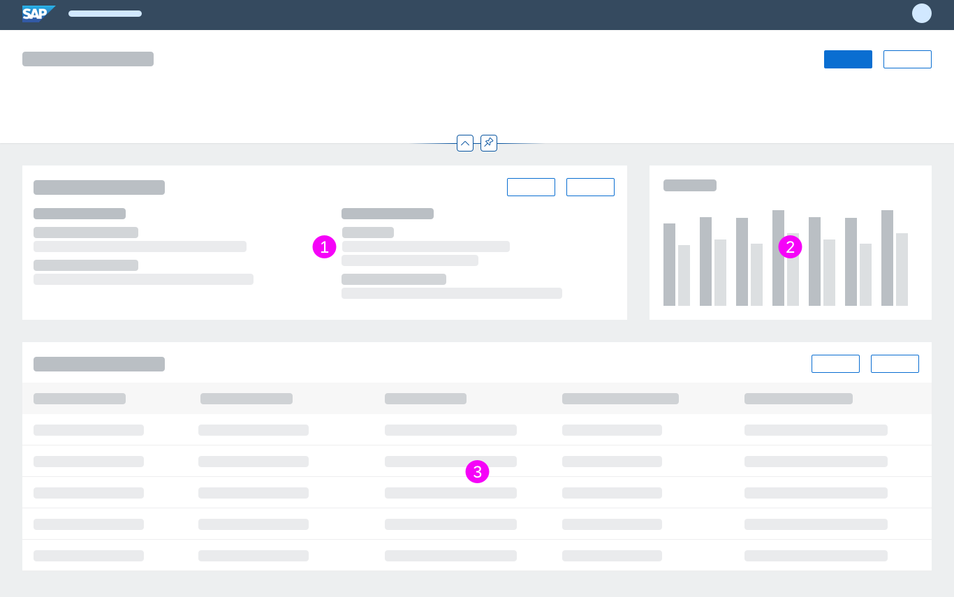
Content area with 3 content blocks
The three blocks above contain:
No.
Content Block
Description
1

Form container with:
- Title bar, showing the title (a) and toolbar (b)
- 2 form groups (c), each form group contains a form with a title and label-value pairs
2
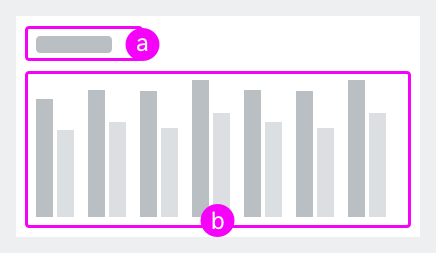
Chart container with:
- Title bar, showing a title (a)
- Column chart (b)
3
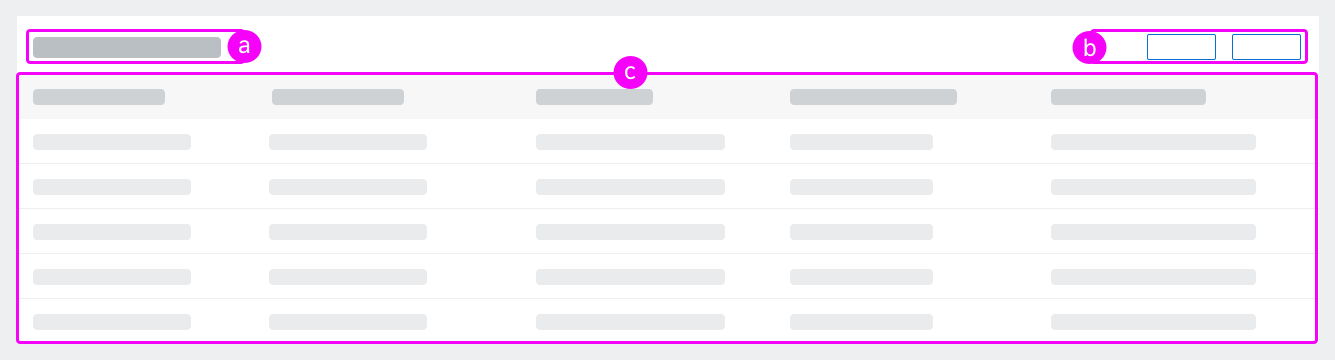
Table container with:
- Title bar, showing the title (a) and toolbar (b)
- Table with items (c)
Floorplan Structure
Floorplans come with a predefined structure in the header and content areas, some more restrictive, such as the list report, some less, such as the object page floorplan. See the respective floorplan articles for a detailed description.
The picture shows a simplified representation of a list report (for a complete description, see List Report):
- The header title bar contains a title and a toolbar, and the header content contains a filter bar with search fields. No other controls apart from the filter bar are allowed in the header content. You could use the header navigation to show different tables and/or charts in the content area.
- The content area holds a table and/or a chart. No other content blocks, such as forms, are allowed.
Explore all layouts, floorplans, and UI elements.
List report header
List report content
Get to know the most important general patterns
SAP Fiori includes interaction patterns that we use consistently in all SAP Fiori web apps. Make yourself familiar with these patterns. We recommend starting with:
| Pattern | Learn… |
| Object Handling | About all object actions (create, edit, delete) and the different edit flows, such as editing a complete object or only parts of an object. |
| Message Handling
|
About the different message types, such as information, error, warning, and how to present them to the user. See also how messages are shown when entries in forms are validated. |
| Action Placement | Where to place actions and their order in toolbars. |
| Navigation | How to navigate within an app and between apps, either using the shell bar options or using UI elements on the pages, such as smart links or quick views. |
| Draft Handling | About implicit saving in SAP Fiori. |
You can find all patterns in the General Patterns area in the navigation structure.
See SAP Fiori in Action
Reading guidelines is one thing, trying out how it works another.
SAPUI5 samples allow you to check the behavior of layouts and controls, such as the dynamic page, tables, and buttons.
3 Steps Toward a Consistent SAP Fiori Design
Step 1: Download the Latest UI Kit
The design assets in the UI kit are high-fidelity drafts of SAP Fiori layouts, floorplans, and UI elements. Because the design assets follow the guidelines, they can help you to create consistent and guideline-compliant SAP Fiori apps. You also need to download the SAP typeface 72 and the SAP icon font.
To download the UI kit, go to SAP S/4HANA Web UI Kit.
Step 2: Choose Your Floorplans and Layouts
- If possible, use one of the existing floorplans.
For more information, see When to Use Which Floorplan and Mapping Task Types to Floorplans. - If none of the predefined floorplans fit your use case and you need to create a freestyle design, use the dynamic page as the basis.
- Decide whether the app should run in a full screen layout (that is, 1 page at a time) or a flexible column layout (with up to 3 columns, each representing a page). With the flexible column layout, you can manage list-detail relationships.
For more information, see Full Screen vs Flexible Column Layout.
Step 3: Craft the Details
- Design the details of the different floorplan areas: header, content area, and footer. In the respective floorplan article (see navigation), you’ll find guidance on which controls can be used and how to arrange them.
- Balance your content area well and ensure that your design works for different screen sizes.
- Don’t forget the wording: Consistent and user-centric terms make your apps understandable. We’ve defined a comprehensive set of terms for you to use consistently. See the text guidelines.
- Use colors and icons consistently.
- If you want to emphasize or classify information using colors, stick to the semantic colors defined for SAP Fiori.
- Use icons only for their intended purpose and do not transfer them into another context.
- Consider accessibility, including support for screen readers and keyboard navigation/interaction. See Accessibility in SAP Fiori.
 Your feedback has been sent to the SAP Fiori design team.