
- Latest SAPUI Version 1.124
- SAPUI5 Version 1.122
- SAPUI5 Version 1.120
- SAPUI5 Version 1.118
- SAPUI5 Version 1.116
- SAPUI5 Version 1.114
- SAPUI5 Version 1.112
- SAPUI5 Version 1.110
- SAPUI5 Version 1.108
- SAPUI5 Version 1.106
- SAPUI5 Version 1.104
- SAPUI5 Version 1.102
- SAPUI5 Version 1.100
- SAPUI5 Version 1.98
- SAPUI5 Version 1.96
- SAPUI5 Version 1.92
- SAPUI5 Version 1.90
- SAPUI5 Version 1.88
- SAPUI5 Version 1.86
- SAPUI5 Version 1.84
- SAPUI5 Version 1.82
- SAPUI5 Version 1.80
- SAPUI5 Version 1.78
- SAPUI5 Version 1.76
- SAPUI5 Version 1.74
- SAPUI5 Version 1.72
- SAPUI5 Version 1.70
- SAPUI5 Version 1.68
- SAPUI5 Version 1.66
- SAPUI5 Version 1.64
- SAPUI5 Version 1.62
- SAPUI5 Version 1.60
- SAPUI5 Version 1.58
- SAPUI5 Version 1.56
- SAPUI5 Version 1.54
- SAPUI5 Version 1.52
- SAPUI5 Version 1.50
- SAPUI5 Version 1.48
- SAPUI5 Version 1.46
- SAPUI5 Version 1.44
- SAPUI5 Version 1.42
- SAPUI5 Version 1.40
- SAPUI5 Version 1.38
- SAPUI5 Version 1.36
- SAPUI5 Version 1.34
- SAPUI5 Version 1.32
- SAPUI5 Version 1.30
- SAPUI5 Version 1.28
- SAPUI5 Version 1.26
- Latest SAPUI Version 1.124
- SAPUI5 Version 1.122
- SAPUI5 Version 1.120
- SAPUI5 Version 1.118
- SAPUI5 Version 1.116
- SAPUI5 Version 1.114
- SAPUI5 Version 1.112
- SAPUI5 Version 1.110
- SAPUI5 Version 1.108
- SAPUI5 Version 1.106
- SAPUI5 Version 1.104
- SAPUI5 Version 1.102
- SAPUI5 Version 1.100
- SAPUI5 Version 1.98
- SAPUI5 Version 1.96
- SAPUI5 Version 1.94
- SAPUI5 Version 1.92
- SAPUI5 Version 1.90
- SAPUI5 Version 1.88
- SAPUI5 Version 1.86
- SAPUI5 Version 1.84
- SAPUI5 Version 1.82
- SAPUI5 Version 1.80
- SAPUI5 Version 1.78
- SAPUI5 Version 1.76
- SAPUI5 Version 1.74
- SAPUI5 Version 1.72
- SAPUI5 Version 1.70
- SAPUI5 Version 1.68
- SAPUI5 Version 1.66
- SAPUI5 Version 1.64
- SAPUI5 Version 1.62
- SAPUI5 Version 1.60
- SAPUI5 Version 1.58
- SAPUI5 Version 1.56
- SAPUI5 Version 1.54
- SAPUI5 Version 1.52
- SAPUI5 Version 1.50
- SAPUI5 Version 1.48
- SAPUI5 Version 1.46
- SAPUI5 Version 1.44
- SAPUI5 Version 1.42
- SAPUI5 Version 1.40
- SAPUI5 Version 1.38
- SAPUI5 Version 1.36
- SAPUI5 Version 1.34
- SAPUI5 Version 1.32
- SAPUI5 Version 1.30
- SAPUI5 Version 1.28
- SAPUI5 Version 1.26
Lightbox
sap.m.LightBox
Intro
The lightbox control allows the user to view an image in its original size. This control displays the image in a popup while dimming the rest of the screen.
Usage
Use the lightbox if:
- The thumbnail view is not detailed enough, and it would help the user to see the image in its original size.
- The original size of the image is bigger than the thumbnail.
Do not use the lightbox if:
- The image you are using is smaller than or as big as the thumbnail.
- There is another click event attached to the image control.
- You are using an image placeholder to display the object.
Responsiveness
The lightbox container is displayed in the middle of the screen.
The image is displayed in its original size unless the original image size is bigger than the size of the screen. In this case, the image is resized proportionally in order to be fully visible and fit on the screen.
On a mobile device, flipping the device to landscape mode will flip the lightbox. The image will then be adjusted to fit the new dimensions.

Lightbox - Size S
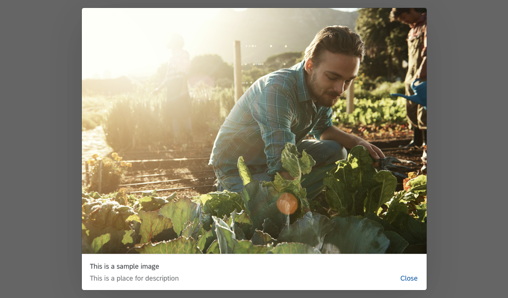
Lightbox - Size M
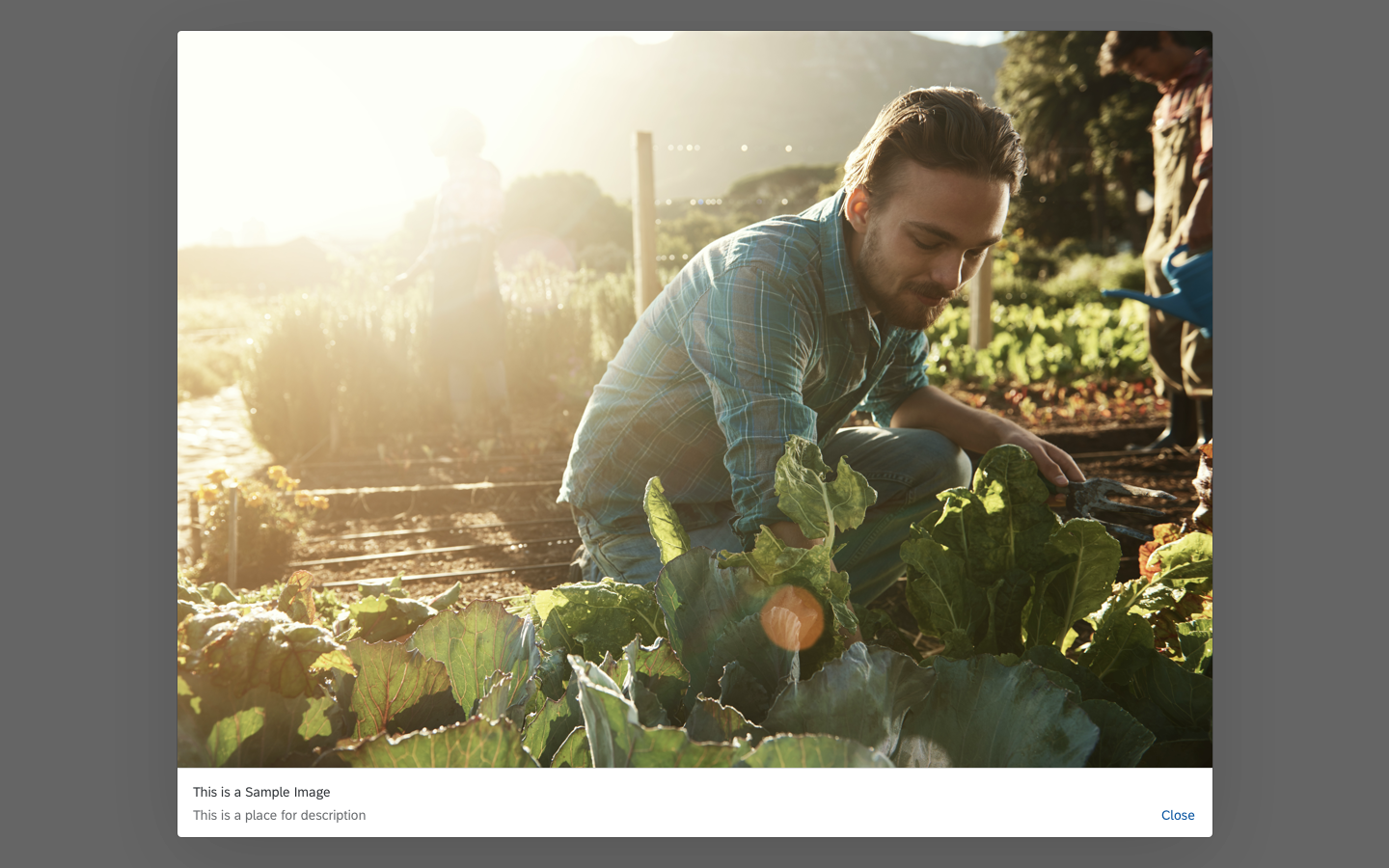
Lightbox - Size L
Components
The lightbox contains the following components:
- Lightbox container: This is the main container that holds all other components.
- Image: This component is an embedded image control that displays the image file with the maximum available size. The size of the image should not exceed the original size and it should fit within the screen.
- Image title: This component is mandatory and is used to describe the object to which the image is attached.
- Image subtitle: This component is optional and is used to give additional information about the object.
- Close button: This is a mandatory component and is used to close the lightbox container.

The components of the lightbox
Behavior and Interaction
Basic Interactions
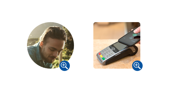
The lightbox control is attached to the press event of the image control. To trigger the lightbox, the user should click an image. Every image with an attached lightbox control is indicated with a zoom icon on the bottom right.
Lightbox - Zoom icon
When the lightbox control is triggered, the lightbox overlays the page content and the rest of the screen is dimmed out.
If it takes more than one second to load the original image, a busy indicator is shown inside the lightbox container.
The user can close the lightbox by clicking the Close button or by clicking outside of the lightbox container.
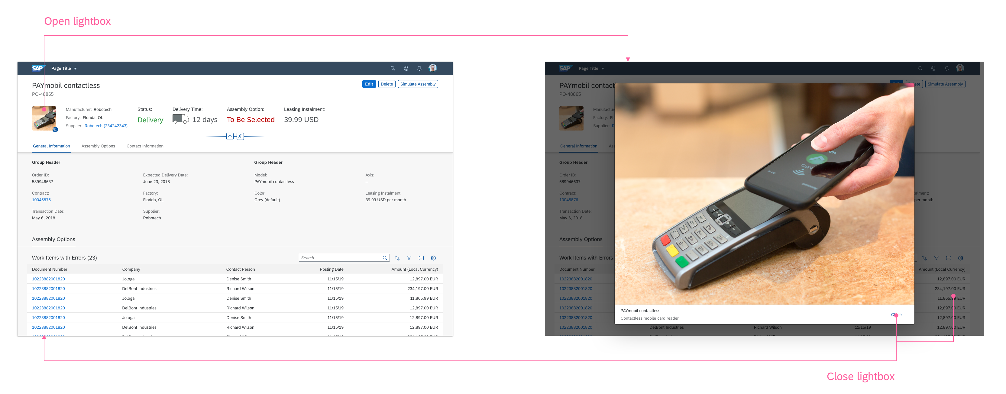
Lightbox - Basic interactions
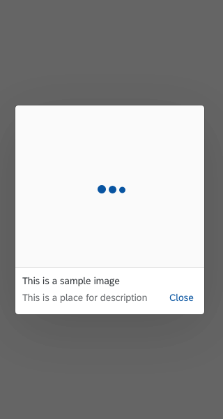
Lightbox - Image loading
Error Handling
An error message is displayed inside the lightbox when:
- The original file is missing or the connection to the server is lost.
- The image takes more than 10 seconds to load due to a server error or the size of the image.
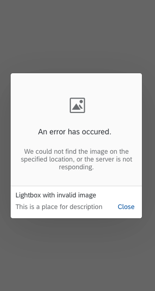
Lightbox - Error message
Resources
Want to dive deeper? Follow the links below to find out more about related controls, the SAPUI5 implementation, and the visual design.
 Your feedback has been sent to the SAP Fiori design team.