
- Latest SAPUI Version 1.124
- SAPUI5 Version 1.122
- SAPUI5 Version 1.120
- SAPUI5 Version 1.118
- SAPUI5 Version 1.116
- SAPUI5 Version 1.114
- SAPUI5 Version 1.112
- SAPUI5 Version 1.110
- SAPUI5 Version 1.108
- SAPUI5 Version 1.106
- SAPUI5 Version 1.104
- SAPUI5 Version 1.102
- SAPUI5 Version 1.100
- SAPUI5 Version 1.98
- SAPUI5 Version 1.96
- SAPUI5 Version 1.92
- SAPUI5 Version 1.90
- SAPUI5 Version 1.88
- SAPUI5 Version 1.86
- SAPUI5 Version 1.84
- SAPUI5 Version 1.82
- SAPUI5 Version 1.80
- SAPUI5 Version 1.78
- SAPUI5 Version 1.76
- SAPUI5 Version 1.74
- SAPUI5 Version 1.72
- SAPUI5 Version 1.70
- SAPUI5 Version 1.68
- SAPUI5 Version 1.66
- SAPUI5 Version 1.64
- SAPUI5 Version 1.62
- SAPUI5 Version 1.60
- SAPUI5 Version 1.58
- SAPUI5 Version 1.56
- SAPUI5 Version 1.54
- SAPUI5 Version 1.52
- SAPUI5 Version 1.50
- SAPUI5 Version 1.48
- SAPUI5 Version 1.46
- SAPUI5 Version 1.44
- SAPUI5 Version 1.42
- SAPUI5 Version 1.40
- SAPUI5 Version 1.38
- SAPUI5 Version 1.36
- SAPUI5 Version 1.34
- SAPUI5 Version 1.32
- SAPUI5 Version 1.30
- SAPUI5 Version 1.28
- SAPUI5 Version 1.26
- Latest SAPUI Version 1.124
- SAPUI5 Version 1.122
- SAPUI5 Version 1.120
- SAPUI5 Version 1.118
- SAPUI5 Version 1.116
- SAPUI5 Version 1.114
- SAPUI5 Version 1.112
- SAPUI5 Version 1.110
- SAPUI5 Version 1.108
- SAPUI5 Version 1.106
- SAPUI5 Version 1.104
- SAPUI5 Version 1.102
- SAPUI5 Version 1.100
- SAPUI5 Version 1.98
- SAPUI5 Version 1.96
- SAPUI5 Version 1.94
- SAPUI5 Version 1.92
- SAPUI5 Version 1.90
- SAPUI5 Version 1.88
- SAPUI5 Version 1.86
- SAPUI5 Version 1.84
- SAPUI5 Version 1.82
- SAPUI5 Version 1.80
- SAPUI5 Version 1.78
- SAPUI5 Version 1.76
- SAPUI5 Version 1.74
- SAPUI5 Version 1.72
- SAPUI5 Version 1.70
- SAPUI5 Version 1.68
- SAPUI5 Version 1.66
- SAPUI5 Version 1.64
- SAPUI5 Version 1.62
- SAPUI5 Version 1.60
- SAPUI5 Version 1.58
- SAPUI5 Version 1.56
- SAPUI5 Version 1.54
- SAPUI5 Version 1.52
- SAPUI5 Version 1.50
- SAPUI5 Version 1.48
- SAPUI5 Version 1.46
- SAPUI5 Version 1.44
- SAPUI5 Version 1.42
- SAPUI5 Version 1.40
- SAPUI5 Version 1.38
- SAPUI5 Version 1.36
- SAPUI5 Version 1.34
- SAPUI5 Version 1.32
- SAPUI5 Version 1.30
- SAPUI5 Version 1.28
- SAPUI5 Version 1.26
Grid List
sap.f.GridList
Intro
As with the list and the responsive table, the grid list displays a set of items. In contrast to both controls, the grid list displays the items not in rows, but in a grid.
The grid list is usually used as an alternative view for a list or table. It is ideal for displaying images, charts, object cards, and other content, which profit from more height (but less width).
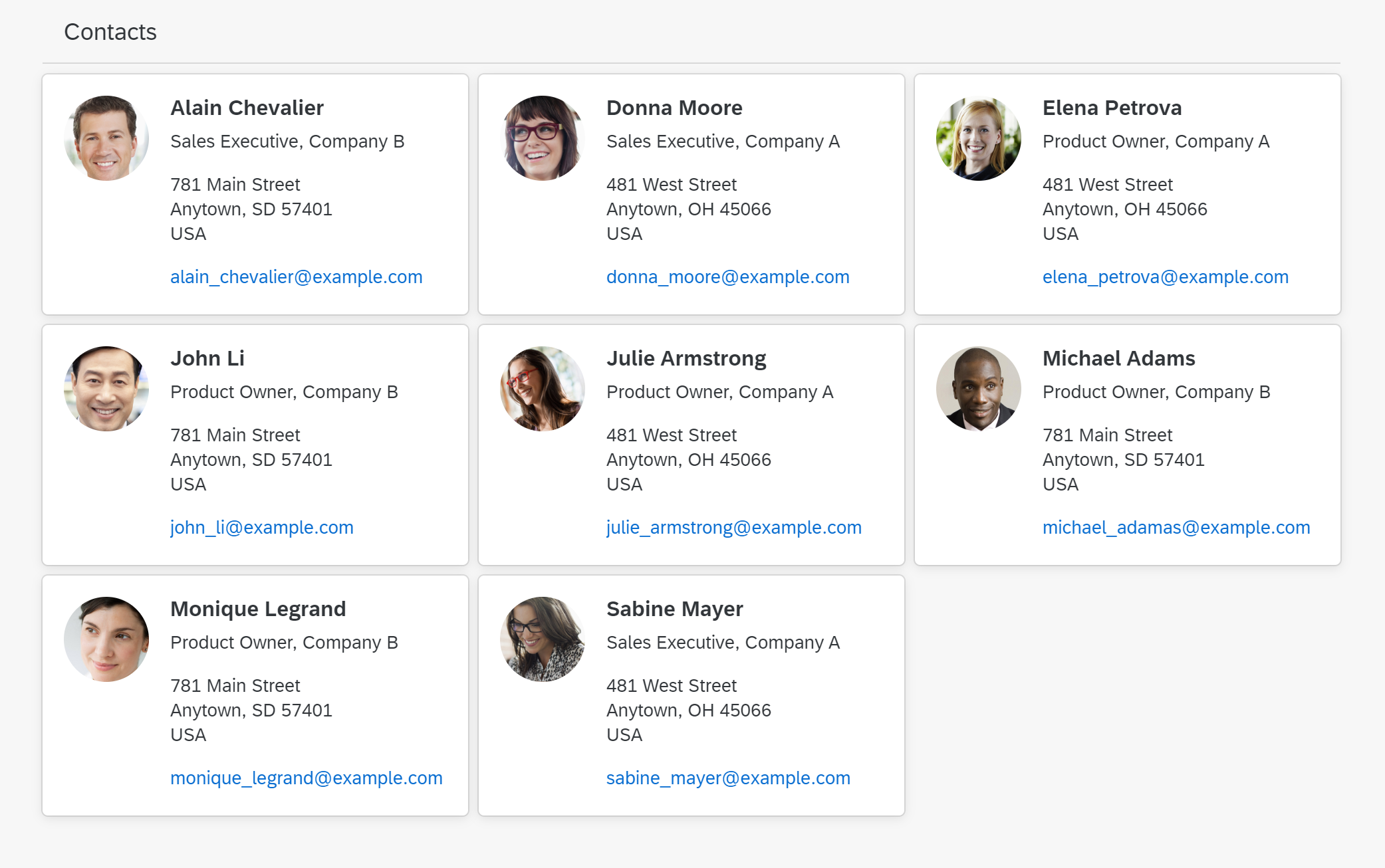
Grid List
Usage
Use the grid list if:
- Your content is “visual” and profits from the rectangular format of the items. This is true for e.g. images, charts, and object cards.
- The focus is on items, not on cells. The grid list shows complete items.
- You want to display a homogeneous set of basic data.
- You need to sort, group, or filter simple data sets.
- As an alternative view for tables or lists, if the content profits from the different format.
Do not use the grid list if:
- Your content is not appropriate for a card-like format. For example, do not use the grid list for displaying a wall of text. Use a table instead.
- The main use case is to select one item from a very small number of items, without viewing additional details. In this case, a select or combo box might be more appropriate.
- Data needs to be structured in a hierarchical manner. In this case, a tree might be more appropriate.
- You need an overview of a large amount of data. In this case, use a chart.
- You just need it for layout reasons. In this case, use a layout container such as the CSSGrid.
- You want to manage complex datasets that need to be extensively sorted, grouped, filtered, or edited. In this case, use a table.
Responsiveness
The responsiveness of the grid list results from the underlying grid. The underlying grid is defined by rows and columns. Columns can have a minimum and maximum or a fixed size. Whenever an additional column fits on the screen, it will be added. If a column does not fit on the screen anymore, it will be removed. Items are re-layouted accordingly.
Optionally, there can be different configurations for the underlying grid based on breakpoints, for example based on the device types.
To define the grid layout and behavior, you can use one of the pre-defined layouts:
- Grid box layout: Adds a variable number of columns depending on the available screen width. Columns have either a fixed width or can “breathe” slightly. All rows have the same height, and all items are the same size.
- Responsive column layout: The number of columns depends on breakpoints (4 columns for size S, 8 for size M, 12 for size ML and L, 16 for size XL, 20 for size XXL and XXXL). The width of the columns grows or shrinks with the available screen space until the next breakpoint is reached. The row height of the grid is determined by the height of the highest item in the row. The number of rows and columns taken up by an item can differ.
Alternatively, you can define your own grid. This gives you much greater flexibility to influence both the layout and the (responsive) behavior of the grid.
The underlying grid defines the available space per item. The width can differ pending on the screen width (“breathing”) or be fixed. The height can differ pending on the content of the item or be fixed. “Breathing” items make better use of the available screen space and is therefore recommended. Make sure, that the item adapts to the resulting width / height, for example by
- Re-layouting the item content
- Hiding less important information
- Re-sizing content, such as images or charts.
Items can use one ore more grid cells. Items can also be different sizes (for example, to allow for varying text lengths/wrapping in different items).
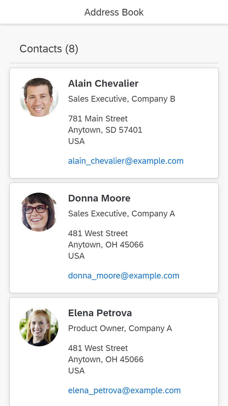
Size S
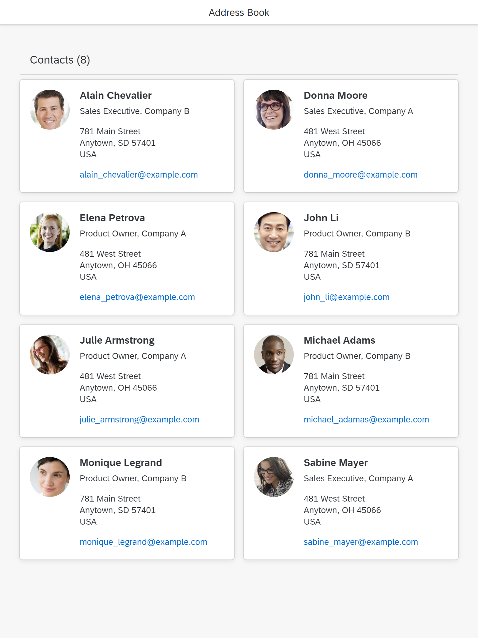
Size M
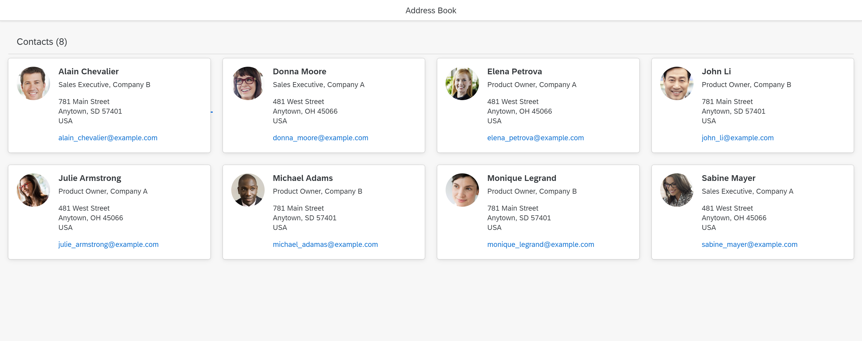
Size L
Components
- The title bar holds the title and, an item counter. Instead of a title bar you can use a toolbar, including title, counter, variant management and actions.
- Optionally, a filter infobar should appear when the grid list is filtered and shows information on the filter settings.
- The collection of grid list items, layouted on a grid, occupies the main part of the grid list.
- A More button can be shown if you do not want all items to be loaded at the start (known as “lazy loading”). Ideally, you should use scrolling to load more items instead of choosing the More button. Use More only, if content is shown below the grid list.
- The footer can contain additional static text information.
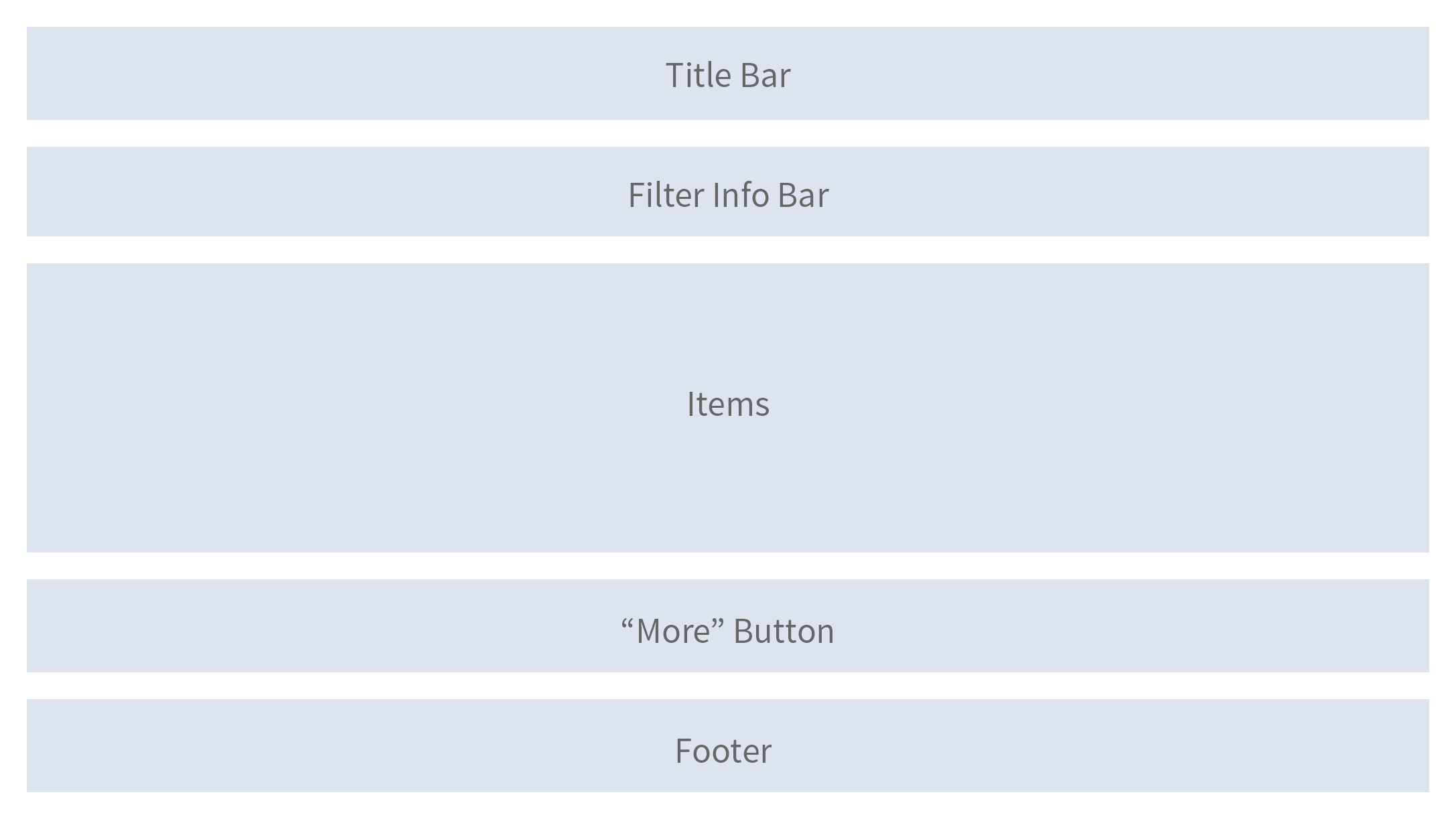
Schematic visualization of the grid list
Title Bar
The title bar contains the title of the grid list and an item counter

Title Bar
Instead of the title bar, a toolbar can be used instead. If done so, use a title control to display the title and item count. Variant management and actions can be added in this case. The toolbar can contain entry points for the view settings dialog, as well as view switches in the form of a segmented button, and buttons for actions like for example Add, or Edit.

Toolbar instead of title bar
For the title, keep the following in mind:
- Use a title if you need the item count, toolbar actions, or variant management. To avoid repeating text, feel free to use generic text as a title, such as Items.
- Do not show the title bar at all, if all elements (title, item count, variant management, toolbar) are available in the surrounding area.
Example: An object page (sub-)section contains only one grid list. In this case, add the item count and the toolbar to the (sub-)section header.
For displaying the item count, use the following format:
[title text] ([count])
for example:
Items (2,534)
For the item count, keep the following in mind:
- include all the items that a user can reach by scrolling except group headers.
- Remove the item count if there are zero items.
- Do not show a count on the title bar, if a More button is used. Show the count on the more button instead.
If possible, keep the title bar sticky (sap.m.GridList, property: sticky).
Filter Infobar
Beneath the toolbar, display a filter infobar (which itself is a special toolbar) if the grid list is filtered.

Filter infobar
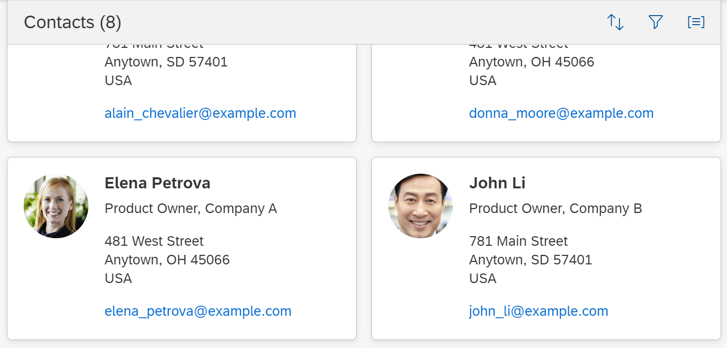
Items
The items (sap.f.GridListItem) are placed on a grid. To specify the design of items, it is recommend (but not mandatory) to follow the guidelines for object cards. Be aware that the item itself is responsible for its own responsiveness.
Use the grid list only, if your content profits from the format. This can apply to images, charts, but also to object cards or quick views. Another option is to mimick the format (but not the visual) of existing objects (e.g. business cards).
A grid list item can contain any content. This includes single controls, or a combination of controls (e.g. by using layout containers).
When designing an item,
- Use the grid list item as starting point and make sure that the content adapts responsively to a changing item width / height.
- Although the grid list can technically work with other list items (e.g. the standard list item), do not use them. They are not responsive enough for being used in a grid. In addition, selectors, navigation indicators and other elements are layouted differently (optimized for the list, not for the grid list).
- Take care that an item can be identified, e.g. by adding a title, and if needed a sub title.
- To show a string with an ID as identifier, use the title for the string, and the subtitle for the ID.
- For status information, use semantic colors on foreground elements.
- Avoid truncation. Use controls that wrap the text and configure them accordingly.
- If an edit mode is needed, change your text controls (labels, text, and links) to input fields or other appropriate editable controls, as soon as you switch to edit mode, but not before.
You can do this by changing the control or, in more complex cases, by exchanging the whole item.
Not all items have to follow the same structure. This could be the case if one item is locked, but another item is in edit mode. Another example is to show a set of objects of different types in the same grid list.
Items can be navigated in all directions using the Arrow keys. To skip several rows, Page Up and Page Down can be used. To move the focus to the first / last item use the Home and End keys.

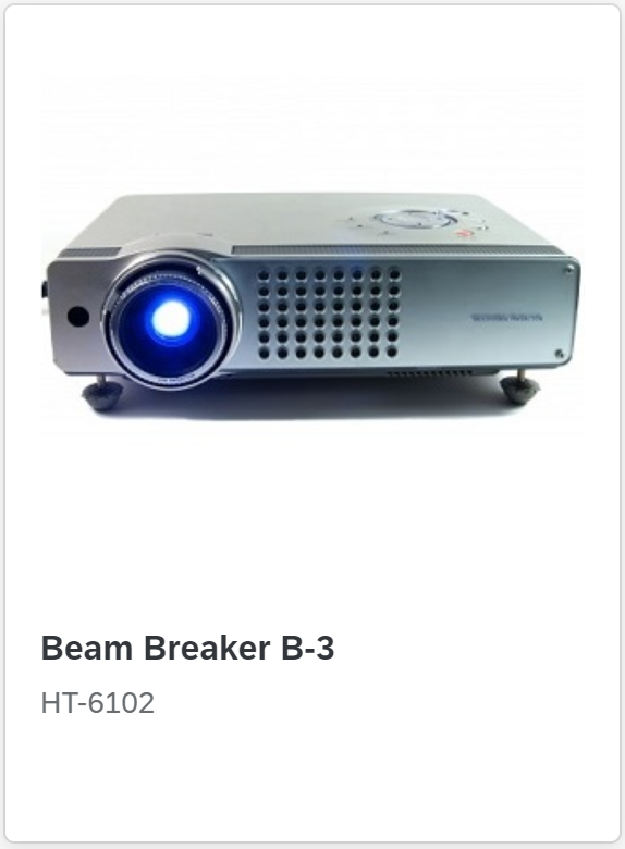
Example for a grid list item
Another example for a grid list item
Highlight
To show that an item needs attention, a highlight indicator can be shown in front of the item. The highlight indicator can be used to indicate:
- A semantic state, such as red or orange for an error or warning. In this case, use semantic colors.
- Additional information, such as blue to highlight newly added items. In this case, use semantic colors.
- Industry- / process-specific states, such as “out of stock” or “excess of inventory”. In this case, use indication colors.
Be aware that the highlight is just an indication. It does not tell users what exactly is wrong. Make sure that you provide this information within the item, ideally in the same color.
For details on the usage of highlight colors, see How To Use Semantic Colors / Industry-Specific Colors.
(sap.m.ListItemBase, property: highlight)
Highlighted item
States
To show that an item is unread, use the corresponding flag (sap.m.GridList, property: showUnread, sap.f.GridListItem, property: unread). This shows most of the content in bold font.

Unread item next to a read item
To show that an item has been modified, for example, within the global edit flow, add the string (Modified) near the item identifier.

A modified item
To show that a modified item contains an error (for example, within the global edit flow), add the string (Contains errors) near the item identifier. To do this, use an object status control with the error state (sap.m.ObjectStatus, property: state, value: sap.ui.core.ValueState.Error). In addition, highlight the item accordingly (sap.f.GridListItem, property: highlight).
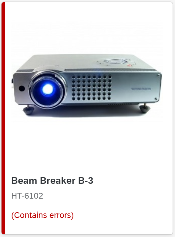
An item with an error
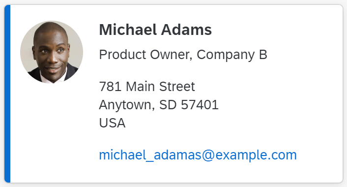
To show that an item is locked, use a transparent button with the corresponding icon and the text Locked by [Name] near the item identifier. The user can click the button to open a quick view of the person.

A locked item
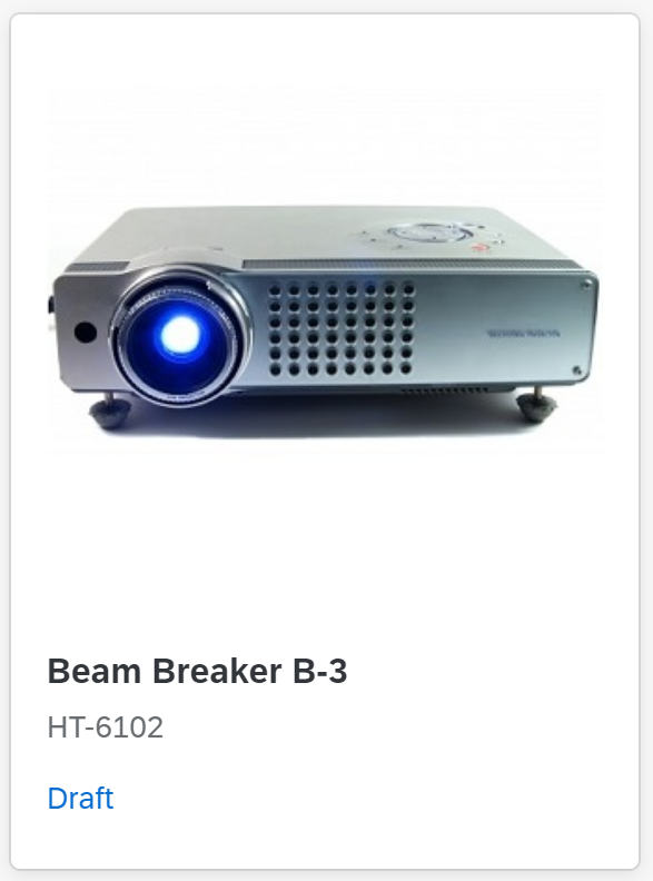
An item with draft state
Show only one state at any one time.
“More” Button
The More button loads more items to the front end if not all items have yet been loaded.
"More" button
Footer
The footer can be used to display additional static information relating to the content.

Grid list footer
Behavior and Interaction
Scroll
The height of the grid list is defined by the number of items it contains. It does not have a scroll container on its own but is scrolled together with the page. When the user scrolls the page, the title bar and filter infobar can stick to the top of the surrounding layout container (sap.m.GridList, property: sticky).
Sticky toolbar
Showing more items
If the grid list works in a “growing” mode, it only loads a few items at first. Additional items are only loaded (and rendered) on request. This request can either be triggered by scrolling (preferred), or by clicking the More button. Use the latter one only if content follows below the grid list. Use the “growing mode”, if more than 200 items are expected to be displayed.
If using the “More” button,
- show the number of items already loaded and (if possible) the total number items below the text More.
- do not show an item count on the title bar. Use the count on the More button instead.
In any case, if the “growing mode” is used, do not show more than 1,000 items overall.
Select
A grid list can have one of the following selection modes (sap.m.GridList/ sap.m.ListBase, property: mode):
- None: Items cannot be selected (sap.m.ListMode.None).
Beware: Items can still use the sap.m.ListType “navigation”, which allows click handling on specific items. Only use this option if the click triggers navigation to a corresponding item details page.
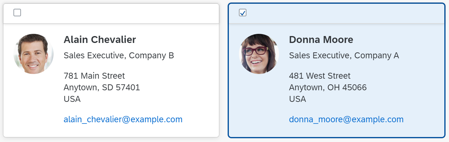
- Single selection master: One item in the grid list can be selected. Items are selected by clicking the whole row. The single select master mode has no obvious visual cues, such as checkboxes or radio buttons. It only provides a light blue background for the selected state. Because of this, it can barely be differentiated from grid lists without selection (mode: None). Single select master is the preferred mode for single selection. (sap.m.ListMode.SingleSelectMaster).

Selected item in "single selection master"
- Single selection left: One item in the grid list can be selected. For this, the grid list provides radio buttons on the left side of each item. Only use this mode if a click on the whole item is being used for something else, such as navigation. (sap.m.ListMode.SingleSelectLeft). Even in this case, prefer single select master and synchronize the selection with the navigation, so that the navigated item is also the selected item.
- Multi selection: Users can select one or more items. For this, the grid list provides checkboxes on the left side of each item. (sap.m.ListMode.MultiSelect). The Shift key can be used to select a range. Users can (de)select all items using Ctrl+A. Select All must (de)select all items that the user can reach by scrolling. Try to avoid combining multi selection with navigation.
An unselected and a selected item in "multi selection"
Click an Item
The whole item can be clickable. An event is fired by clicking the item (anywhere where there is no interactive control inside the item). Apps can react on the event, for example, by opening a dialog (sap.f.GridListItem, property: type, value: sap.m.ListType.Active or sap.m.ListType.DetailAndActive).
Active elements do not have a visual indication and can therefore not be differentiated from non-active elements.
Active is a list item type and can therefore not be used together with “navigation” or “edit”. In addition, “active” uses the whole item as a clickable area and therefore cannot be used together with a grid list in “single select master” mode.
Drag and Drop
One or several items can be repositioned within a grid list or moved to other UI elements using drag and drop operations (sap.m.ListBase, aggregation: dragDropConfig). While being dragged, the items are shown as ghost elements on the mouse cursor.
Drop targets can be on items, between items, or both (sap.ui.core.dnd.DropPosition). On a drop target, the mouse cursor changes to either a “copy”, “link”, “move”, or “none” cursor. “None” indicates that the dragged item cannot be dropped in the current position (sap.ui.core.dnd.DropEffect).
Drag and drop is only available on supporting browsers.
When using drag and drop, keep the following in mind:
- Drag and drop is “invisible” on the UI: users can’t see where dragging is available and where it isn’t. In addition there is no generic keyboard interaction. Drag and drop is also not available on all browsers. For these reasons, provide it only in addition to existing (and visible) UI elements that fulfill the same purpose and provide the corresponding keyboard support. For example, offer (toolbar) buttons for moving or for copying and pasting items. They are keyboard operable and available on all browsers.
- If you offer drag and drop for rearranging items within the grid list, use drop targets that are between items (sap.ui.core.dnd.DropPosition.Between). This provides better feedback on where the item will be inserted. Show the “move” mouse cursor (sap.ui.core.dnd.DropEffect.Move).
- Be aware that due to the re-arrangement of the items which happens after an item is dropped, it is not always clear where the item will finally be placed.
- When dropping items from outside the grid list, adapt the size of the drop indicator to match the target layout of the item (sap.f.dnd.GridDropInfo, property: dropIndicatorSize).
- Do not combine rearranging items and sorting. If you really need to do so, make sure that there is a dedicated sort criterion for the user-defined sort order, and only offer options for rearranging items if this sort order is set.
- When combining rearranging items with grouping, be aware that moving items to another group also means that a value of the dropped item changes: because grouping is based on a specific data point, the dropped item needs to take on the value of the target group for the corresponding data point. If this is not wanted, do not allow users to rearrange items in grouped grid lists. Example:
A grid list is grouped by availability. An item is moved from the group “Not Available” to the group “In Stock”. In this case, the moved item needs to change its availability to “In Stock” to match the target group. If changing the value doesn’t make sense, only allow users to rearrange the items within the same group, or don’t allow rearranging at all.
Loading Data
To indicate that the grid list is currently loading items, use the busy state. (sap.m.GridList, property: busy). Do not show any items or text. As soon as the data is loaded, remove the busy state and show all items.
Empty Grid Lists
Try not to display an empty grid list. If there is no way around this, provide instructions on how to fill the grid list with data (sap.m.ListBase, properties: showNoData, noDataText).
Examples:
- If a grid list is initially empty, provide at least a basic text:
No items available.
Overwrite this whenever a hint can be provided on how to fill the grid list with data. - If a grid list is used together with a filter bar (as in the list report), and is initially empty, use the following text:
To start, set the relevant filters. - If a grid list is used together with a filter bar and the filter does not return results, use the following text:
No data found. Try adjusting the filter settings.
Adapt the texts above if:
- The standard text is not precise enough for your use case (for example, a search is also offered, or only the search is offered).
- The standard text is misleading (for example, if the data is filled based on a master-detail pattern instead of filter settings).
Context Menu
You can attach a context menu to a grid list. The context menu gives users an alternative way to modify the whole grid list or an individual item by providing access to context-specific actions. A context menu is opened by right-clicking (mouse), long press (touch devices), or via keyboard using the Context Menu key or Shift+F10. If a control inside a grid list is the “click target”, and the control also provides a context menu, the control context menu “wins”.
Use the context menu only to give users a quick way of accessing functions that are already available elsewhere (for example, as buttons in the toolbar). Don’t just offer actions in the context menu itself, as users might not realize that these actions are available at all.
Be aware that using the context menu overrides the browsers context menu, which can no longer be opened.
Group
If grouped, a group header is displayed (sap.m.GroupHeaderListItem) above all items which belong to the corresponding group. The group header is not interactive.
A grouped grid list
Guidelines
Actions
To trigger actions on multiple items, use a multi-selection grid list (sap.m.GridList, property: mode, value: sap.m.ListMode.MultiSelect), and offer the corresponding actions on the toolbar of the grid list. Keep the toolbar sticky (sap.m.GridList, property: sticky).
In rare cases, you can also offer the corresponding actions in the footer toolbar. Do this only if the grid list is the only area on the screen to which actions can be applied and if the actions are finalizing.
Do not offer actions for multiple items if the grid list is expected to have fewer than 10 items in most cases.
To trigger actions on a single item only (sap.m.GridList, property: mode, value: sap.m.ListMode.SingleSelectMaster), the action can also be shown within the item. One example would be an Add to Cart button in a shopping application. Since these actions are repeated in every item and thus use a lot of screen real estate, only do this for one or two actions at most. In this case, show the action trigger near the content to which it belongs. Use a button, unless the action trigger belongs to a link. Hide the action in rows for which it is not applicable.
The following actions on single items must always be in-line:
- Delete: Use the “Delete” mode of the grid list (sap.m.ListBase, property: mode, value: sap.m.ListMode.Delete). This places a Delete button at the right side of an item. Clicking this button triggers the deletion of the corresponding item. Do not use this mode if deleting multiple items at once is the preferred use case.
Delete is a mode of the grid list and therefore cannot be used together with single selection or multi-selection.

Delete button
- Navigation: Use the “Navigation” item type (sap.m.ListItemBase, property: type, value: sap.m.ListType.Navigation). This places a Navigation indicator at the right side of an item and the entire item becomes clickable. Use this to navigate to a new page containing item details. In rare cases, you can also use this for the category navigation pattern without navigating to another page. By contrast, clicking an interactive control within an item does not trigger the navigation event. Instead, the corresponding control handles the click event.
“Navigation” is an item type and therefore cannot be used together with “edit”, or in combination with click events for the entire item (“active”).

Navigation Indicator
- Edit: Use the “Detail” list item type (sap.f.GridListItem, property: type, value: sap.m.ListType.Detail). This places an Edit icon at the right side of an item. Clicking the button triggers the edit event. Use this event to switch the corresponding item to edit mode.
Edit is a list item type and therefore cannot be used together with “navigation” or in combination with click events for the entire item (“active”).

Edit button
From these three actions (delete, navigation, and edit), you can combine delete and edit, or delete and navigation. Edit and navigation cannot be combined.
Design for Performance
To optimize performance, we recommend showing no more than 200 items at once in the responsive table. For larger datasets (up to 1,000 items), use the “growing” mechanism to limit the number of displayed items, and make sure that users can filter the data.
Add Items
- Place the Add or Create text button on the toolbar of the grid list.
- Use Create if the button adds a brand new item that doesn’t yet exist on the database.
- Use Add if the item already exists and is merely added or assigned to the current object.
- Place new items always as the first item of the grid list.
- Use highlight (information state) on the new item.
- Enable the shortcut Ctrl+Enter (and ideally Enter in addition) to trigger the Add or Create button.
There are three possibilities for adding an item, which should be considered in the following priority:
- Add the item inline. Create an empty, editable item as the first item of the grid list. Show the Save button on the toolbar of the grid list. This option is recommended for simple scenarios where just a few input fields have to be filled.
- Open a dialog for items where up to 8 input fields need to be filled. Save the new item at dialog level.
- Navigate to a new page. This behavior should only be used for very complex scenarios that cannot be handled by a dialog (for example, creating complex objects). When the user presses Save in the footer toolbar of the create page, navigate back to the grid list.
Depending on the flow, an item can be in one of three different states:
- New: The item was just created inline and is in edit mode (for example, after pressing the Create button). It is highlighted with a visual indicator (information state).
- Recent: The item was just created and is in read-only mode (for example, if Create leads to a dialog, and Save was triggered within the dialog). In this case, keep the item highlighted and display it as the first item of the grid list. Ignore current sort, filter, and grouping criteria to keep the item visible.
- Added: The item has been fully added. It follows the sort, filter, and grouping settings and also loses the visual highlight. This state is used after:
In the context of draft handling, new items are not saved on grid list level, but rather with the entire draft.
Export to Spreadsheet
- On the toolbar, provide a menu button for exporting items as tabular data to a spreadsheet.
- For the export, use the export to spreadsheet function.
Mass Editing
- Provide multiselection (sap.m.ListBase, property: mode, value: sap.m.ListMode.MultiSelect).
- Provide an Edit button.
- If several items are selected, choosing the Edit button opens a dialog in which the user edits the corresponding fields for all selected items.
For details, see mass editing.
Paste
To paste data from the clipboard to the grid list, the browser functionality for paste can be used (Ctrl+V or browser context menu).
If the focus is on item level, the app has to take the data from the clipboard and add it to the corresponding controls within the items.
If the focus is on an editable control within an item, the control gets the data automatically.
Pasting via context menu does not work if a custom context menu is used.
View Settings
- Provide individual buttons for each of the following settings on the toolbar of the grid list: sort, filter, group.
- Clicking one of these buttons opens the view settings dialog or P13nDialog dialog with just the relevant page inside.
- When closed, apply the settings to the grid list accordingly.
Keep the following in mind:
- Do not offer any of these features if the grid list is expected to have only a small number of entries (up to 20 in most cases).
- If filtering is a main use case, do not offer filtering on the toolbar of the grid list. Use the filter bar instead.
- Always use only the view settings which are really needed. For example, do not offer grouping if it does not support your use case well.
- Persist the view settings. When a user reopens the app, show the grid list with the same sort, filter, and group settings as last defined by this user.
Sort
- For the default sort settings, sort by the item title, which is usually the identifier of an item.
- If you offer sorting, offer it for each data point available in the item. Allow sorting in both directions, ascending and descending. The descending sort order must always be the exact reverse of the ascending sort order.
- For each data point, provide a meaningful sort order. For example:
- Sort text alphabetically
- Sort numbers by their value
- Sort status information by the severity of the status:
- Ascending: Sort status information from positive to negative, with neutral last.
- Descending: Sort status information from negative to positive, with neutral first.
- Ascending with different values per severity level: Sort status information from positive to negative, with neutral last. Sort different values within a severity level (semantic color) alphabetically.
- Descending with different values per severity level: Sort status information from negative to positive, with neutral first. Sort different values within a severity level (semantic color) alphabetically.
Filter
- To display the current filter state, use the infobar below the title. Clicking the infobar opens the filter page of the corresponding dialog.
- Show the infobar only if the filter settings are not shown somewhere else. For example, do not show the infobar for settings taken in the filter bar or in a select placed in the toolbar of the grid list.
- If the infobar is shown, provide an option to reset all corresponding filters on the infobar.
- Keep the infobar sticky (sap.m.GridList, property: sticky).
Group
- To display the current group state, group headers are shown.
- On the group header, show the following text (sap.m.GroupHeaderListItem, property: title):
[Label of the grouped data point]: [Grouping Value] - If there is no grouping value, show the following text:
[Label of the grouped data point]: (Not Available)
This is the case if you have a group of items that don’t have a value for the grouped data point.
Enabling/Disabling Actions
To indicate if an action can be applied to the current selection,
- Enable the action if it always works, regardless of whether or not items are selected.
- Enable the action, if it can be applied to all selected items.
- Enable the action, if it can be applied to a part of the selected items. If the action is triggered, show a message that informs the user about how many items will be affected. Provide the choice to apply the action anyway or to cancel the action.
- Only disable the action if it can be applied to none of the selected items.
For more details, see UI Element States.
If the action was applied, and if the items are still available, keep them selected.
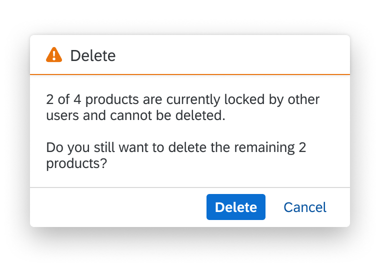
Message for an action which applies to a part of a selection
To trigger actions that are independent of the selection, show the actions on the toolbar of the grid list. Examples of such actions are add, edit (in the sense of changing the whole table to edit mode), sort, filter, and group.
To trigger a default action on the whole item, use the “Active” or “DetailAndActive” list item type (sap.f.GridListItem, property: type, value: sap.m.ListType.Active).
Active items trigger an event when clicked, which can be handled by apps (for example, to open a dialog). Clicks on interactive controls within the item do not trigger the event but are handled by the interactive control. Do not use Active for navigation, to switch the line item to an edit state, or to delete the item.
Active can be combined with edit and delete, but not with navigation. Do not combine active with single selection.
Errors and Warnings
To indicate that the grid list contains items with errors or warnings, show a corresponding message strip above the grid list. On the message strip, provide information about errors or warnings. When issues are solved or when new issues appear, update the message strip accordingly.
To indicate an error in a single item, see States above.
For details on displaying errors, warnings, and other messages, see Message Handling.
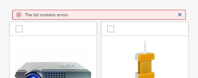
Grid list containing errors
Grid Lists in Object Pages
A grid list with up to 20 expected items can be displayed right away, without lazy loading.
If you expect the grid list to have more than 20 items, use one of the following 3 options:
- Lazy loading (More button): Use this option if you expect to have up to 100 items.
- Tab navigation: If you expect to have more than 50 to 100 items, but less than 400, use the object page with tab navigation instead of anchor navigation. Put the grid list on a dedicated tab.
- Navigation to a list report: If you expect the grid list to have more than 400 items, or if the tab approach is unsuitable, restrict the number of items in the grid list itself to a reasonable amount. To provide the user with a way to work with the entire grid list, offer navigation to a separate list report containing all items.
For all of the three options mentioned above, we recommend providing a search, and if feasible, sort and filter capabilities for the grid list in the object page. Grouping should be avoided.
For more information on the use of grid lists within the object page, see Object Page – Tables.
Properties
sap.f.GridList
The following additional properties are available for the grid list:
- The property: inset adds a margin on all sides of the grid list.
- The property: headerText is a simple way to set the title for the grid list. However, this excludes the following:
- A separate toolbar
- variantManagement
- The property: headerDesign affects the appearance of the header if the theme supports it. Leave the default value as it is.
- The property: footerText adds a small additional row below the table footer or last item. This row can contain text only. Do not use this property.
- The property: width defines the width of the whole grid list.
- The property: includeItemInSelection uses a click on the whole item to select the corresponding item if the grid list is in a selection mode. This competes with other settings like “Navigation” or “Active” and should therefore not be used in combination with these two settings.
- The property: enableBusyIndicator automatically shows a busy indicator while data is loaded. (In contrast to the property: busy, where the application can control when the grid list is set to busy state)
- The property: modeAnimationOn does not have any effect. Do not use it.
- The property: showSeparators does not have any effect. Do not use this property.
- The property: swipeDirection does not have any effect. Do not use this property.
- The property: rememberSelections leaves items selected even if they are currently not visible, for example, through filtering. If this behavior is not wanted, set the flag to “false”, but you should do so only in exceptional cases.
- The property: busy sets the grid list to a busy state. While in busy state, the whole grid list cannot be used and items cannot be read due to an overlay.
- The property: busyIndicatorDelay defines the time after which a busy state is shown after the grid list has been set to this state. Use the default value.
- The property: visible shows the grid list (“true”) or hides it (“false”).
- The property: tooltip provides a tooltip for the whole grid list. Do not use it.
sap.f.GridListItem
The following additional properties are available for sap.m.ColumnListItem:
- The property: selected allows an item to be selected programmatically.
- The property: counter shows a number on the right side of an item. This is used in cases like showing the number of subitems.
- Do not use the property: busy.
- Do not use the property: busyIndicatorDelay.
- The property: visible shows or hides the item.
- The property: tooltip adds a tooltip to a whole item. The tooltip is only shown on mouse interaction. It will not work on tablets or smartphones. Do not use it.
Resources
Want to dive deeper? Follow the links below to find out more about related controls, the SAPUI5 implementation, and the visual design.
Elements and Controls
- List (guidelines)
- Responsive Table (guidelines)
- Table Toolbar (guidelines)
- View Settings Dialog (guidelines)
- Variant Management (guidelines)
- Footer Toolbar (guidelines)
Implementation
- Grid List (SAPUI5 samples)
- Grid List (SAPUI5 API reference)
- Grid List Item (SAPUI5 API reference)
 Your feedback has been sent to the SAP Fiori design team.