
- Latest SAPUI Version 1.124
- SAPUI5 Version 1.122
- SAPUI5 Version 1.120
- SAPUI5 Version 1.118
- SAPUI5 Version 1.116
- SAPUI5 Version 1.114
- SAPUI5 Version 1.112
- SAPUI5 Version 1.110
- SAPUI5 Version 1.108
- SAPUI5 Version 1.106
- SAPUI5 Version 1.104
- SAPUI5 Version 1.102
- SAPUI5 Version 1.100
- SAPUI5 Version 1.98
- SAPUI5 Version 1.96
- SAPUI5 Version 1.92
- SAPUI5 Version 1.90
- SAPUI5 Version 1.88
- SAPUI5 Version 1.86
- SAPUI5 Version 1.84
- SAPUI5 Version 1.82
- SAPUI5 Version 1.80
- SAPUI5 Version 1.78
- SAPUI5 Version 1.76
- SAPUI5 Version 1.74
- SAPUI5 Version 1.72
- SAPUI5 Version 1.70
- SAPUI5 Version 1.68
- SAPUI5 Version 1.66
- SAPUI5 Version 1.64
- SAPUI5 Version 1.62
- SAPUI5 Version 1.60
- SAPUI5 Version 1.58
- SAPUI5 Version 1.56
- SAPUI5 Version 1.54
- SAPUI5 Version 1.52
- SAPUI5 Version 1.50
- SAPUI5 Version 1.48
- SAPUI5 Version 1.46
- SAPUI5 Version 1.44
- SAPUI5 Version 1.42
- SAPUI5 Version 1.40
- SAPUI5 Version 1.38
- SAPUI5 Version 1.36
- SAPUI5 Version 1.34
- SAPUI5 Version 1.32
- SAPUI5 Version 1.30
- SAPUI5 Version 1.28
- SAPUI5 Version 1.26
- Latest SAPUI Version 1.124
- SAPUI5 Version 1.122
- SAPUI5 Version 1.120
- SAPUI5 Version 1.118
- SAPUI5 Version 1.116
- SAPUI5 Version 1.114
- SAPUI5 Version 1.112
- SAPUI5 Version 1.110
- SAPUI5 Version 1.108
- SAPUI5 Version 1.106
- SAPUI5 Version 1.104
- SAPUI5 Version 1.102
- SAPUI5 Version 1.100
- SAPUI5 Version 1.98
- SAPUI5 Version 1.96
- SAPUI5 Version 1.94
- SAPUI5 Version 1.92
- SAPUI5 Version 1.90
- SAPUI5 Version 1.88
- SAPUI5 Version 1.86
- SAPUI5 Version 1.84
- SAPUI5 Version 1.82
- SAPUI5 Version 1.80
- SAPUI5 Version 1.78
- SAPUI5 Version 1.76
- SAPUI5 Version 1.74
- SAPUI5 Version 1.72
- SAPUI5 Version 1.70
- SAPUI5 Version 1.68
- SAPUI5 Version 1.66
- SAPUI5 Version 1.64
- SAPUI5 Version 1.62
- SAPUI5 Version 1.60
- SAPUI5 Version 1.58
- SAPUI5 Version 1.56
- SAPUI5 Version 1.54
- SAPUI5 Version 1.52
- SAPUI5 Version 1.50
- SAPUI5 Version 1.48
- SAPUI5 Version 1.46
- SAPUI5 Version 1.44
- SAPUI5 Version 1.42
- SAPUI5 Version 1.40
- SAPUI5 Version 1.38
- SAPUI5 Version 1.36
- SAPUI5 Version 1.34
- SAPUI5 Version 1.32
- SAPUI5 Version 1.30
- SAPUI5 Version 1.28
- SAPUI5 Version 1.26
Notifications
Intro
Notifications are the best way to make users aware of a situation that requires timely action or attention. This could be a situation that has just arisen or a task triggered by a workflow.
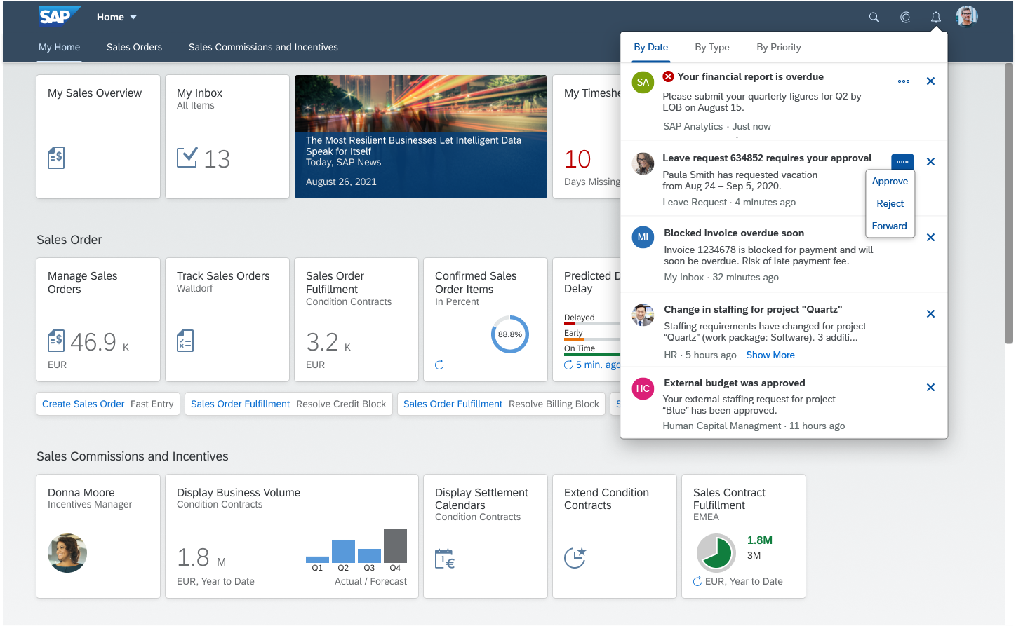
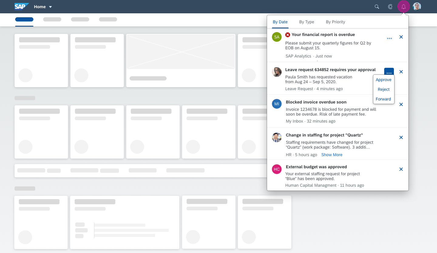
Users access notifications by clicking the bell icon in the shell bar at the top right of the screen.
In the notifications popover, the user can order notifications in various ways, take action, and navigate to the source of a specific notification.
Usage
- Use notifications to make users aware of situations that require attention.
- Reduce the amount of information and the number of actions to a minimum, but provide enough information to help users decide if the information is important.
- Use notification list items and notification list groups only in the SAP Fiori notifications popover.
Responsiveness
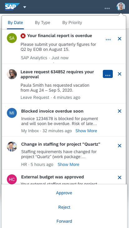
Notifications are fully responsive. For smaller screens, the actions move into the overflow and remain available on mobile devices.
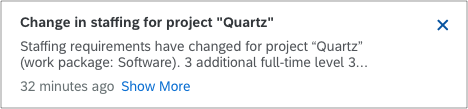
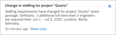
Users can access truncated text by pressing a Show More button that expands the item. Nevertheless, we recommend avoiding truncation when an item is displayed on a desktop device.
Size S
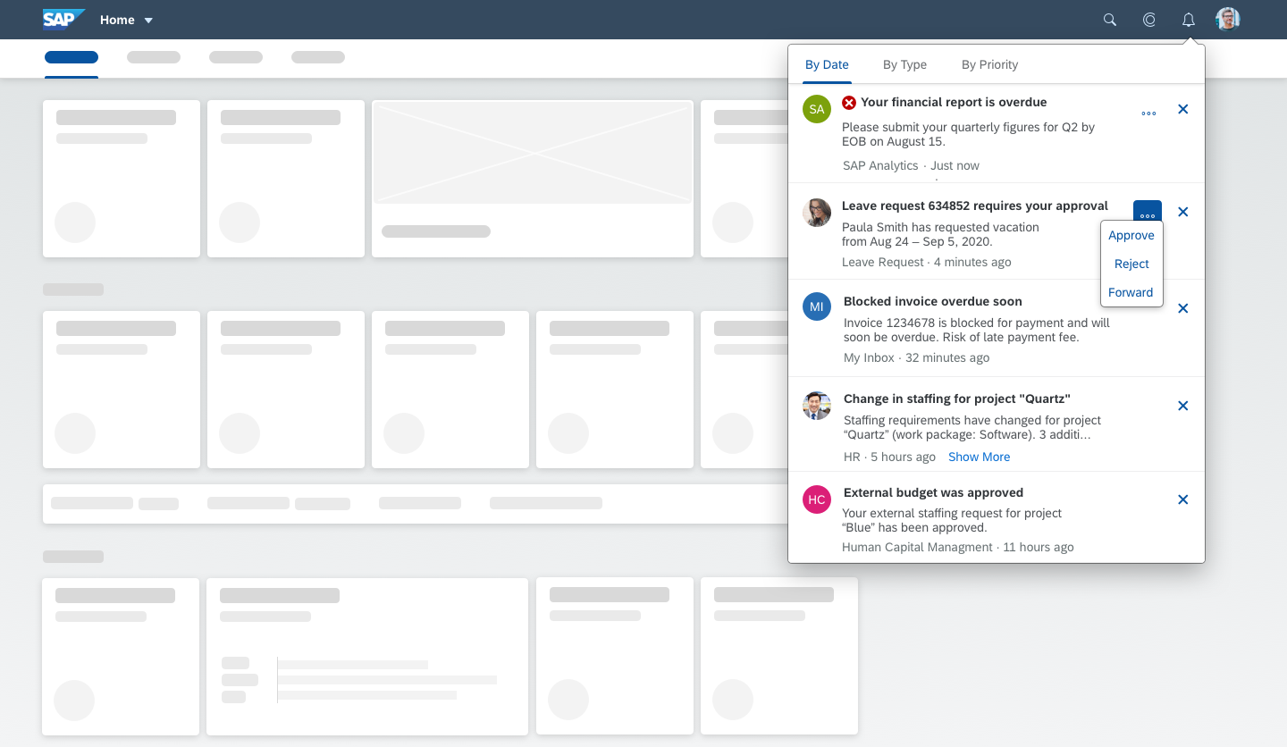
Size XL
Types
Individual notification list items are aggregated into notification list groups, based on sort criteria.
The groups are determined by date (newest to oldest), by type (A-Z), or by priority (high to low).
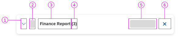
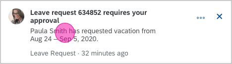
Properties for notification list items:
- Image
- Priority
- Title*
- Action
- Operation*
- Subtitle
- Author/Source
- Timestamp*
- Show/hide truncated text (Show More, Show Less)
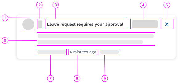
Schematic visualization of a notification item
Properties for notification list groups:
- Expand group*
- Group priority
- Title*
- Group item counter*
- Bulk actions
- Bulk operations*
Schematic visualization of a notification group
* Mandatory properties
Components
Notification List
Items are added to the list based on internal events within apps or systems. The list can display various types of notifications, which can differ in terms of appearance, content, and functionality. The list can be ordered as follows:
By Date
The list is ordered by the timestamp, meaning that the most recent notification appears first. The order resembles a common inbox.
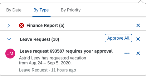
By Type
If the user chooses to order the items by type (= by app), they appear as grouped notifications ordered from A-Z. Ordering by the type makes it easier for the user to handle a high volume of notifications, and to act on all notifications for a group at once.
The highest-priority item defines the priority for the group.
Bulk actions are available when the group is open, but users can still execute single actions within the notification group. System administrators can hide bulk actions.
By Priority
The items are ordered from highest to lowest priority.
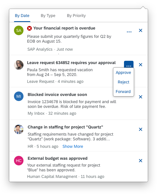
Notifications sorted by date
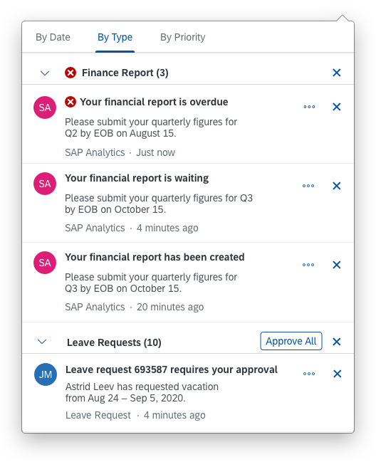
Notifications sorted by type
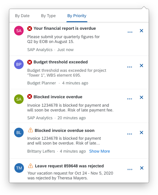
Notifications sorted by priority
Icon and Badge
The Notifications icon button is embedded in the shell bar and is the central access point for all notifications.
- A counter and red badge appears over the upper right-hand corner of the notification icon every time a new notification is added to the list. It displays the number of new notifications.
- Truncation:
Desktop: If the notification count is 1000 or more, the counter shows +999.
Mobile: If the notification count is 100 or more, the counter shows +99. - The badge is set to zero when the user opens the notification popover.
- When the notification popover is displayed, the badge continues to function as usual.
Notifications - Icon/badge
Banner
High-priority notifications are shown using the banner. The banner appears on the upper right-hand corner of the screen for a short period of time and then disappears. We recommend setting a notification to high priority if you need to get the user’s immediate attention. The banner is shown on all floorplans.
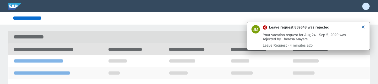
Notification banner
Groups
If the notification list is ordered by type/app, single notification items are aggregated in one group. Within a group, single items retain their interaction principles, but the user can also execute bulk actions on an entire group. The icon buttons (Expand Group) and (Collapse Group) display and hide the individual items.
- The highest priority for a single item within a group defines the priority for the entire group.
- The entire group can be dismissed at once. However, this does not affect processes behind the notifications. An item that was deleted from the notification list might still need to be processed.
- We strongly recommend including a count in the group headline.
Hint: Bulk actions are only available when a group is expanded and can be hidden by the system administrator. Single actions can still be executed within a group and can also be hidden.
Notification group
Items
The notification item contains several properties:
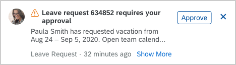
Actions
Actions are associated with notifications to allow users to act on notifications from within the notification popover. If more than one actions is exposed, all actions move into the overflow. We recommend displaying only self-explanatory actions that don’t require additional context. When notifications are sorted “By Type”, you can expose bulk actions at group level. Bulk actions are only displayed when the group is open.
Status
You can indicate the notification status using semantic icons within the notification item. There are four levels: red, orange, green, and grey. For more information about semantic colors, see How to Use Semantic Colors.
All high-priority notifications are also displayed as a banner to catch the user’s attention.
Operations
A notification operation can be dismissed. When dismissed, the notification item disappears from the list, but the task might still need to be processed. Bulk operations are exposed at group level.
Headline, Subtitle, Truncation
Provide a short, meaningful headline. If necessary, expose additional content using a subtitle. Longer texts are truncated after the second line. However, we recommend avoiding truncation altogether. If a text truncates, users can display the full text using the Show More button.
Image and Author
You can associate images, initials, or icons with a notification.
There is also a property for displaying the author, which is typically combined with an image.
Read/Unread
The “read” or “unread” status of a notification is visualized using medium and bold headlines. Unclicked/unopened notifications are shown as “unread” and in bold. When an item is clicked/opened, it is shown with a medium headline.
Navigation
Navigation is triggered by clicking the item.
Content
As of today, no other content is possible nor allowed.
Notification item with a single action
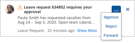
Notification item with multiple actions

Notification item with "read" status
All notification types are displayed in the settings dialog. Users can switch each type on or off without affecting the underlying processes.
Users can activate the banner function for each notification type. This sets the notification status to high priority and corresponding notifications have a red status indicator. Banners are also displayed for all other high priority notifications.
If the Show High-Priority Alerts setting is switched off, banners for high-priority notifications are deactivated, and the user can work without being interrupted.
Users can also receive notifications through other channels:
- Email: If this option is active, the user gets an email with a link to the underlying app.
- Mobile: If this option is active, notifications are sent to a mobile device.
Note: This feature is currently only available for Apple iOS devices and SAP S/4HANA apps. For more information, see Mobile Integration.
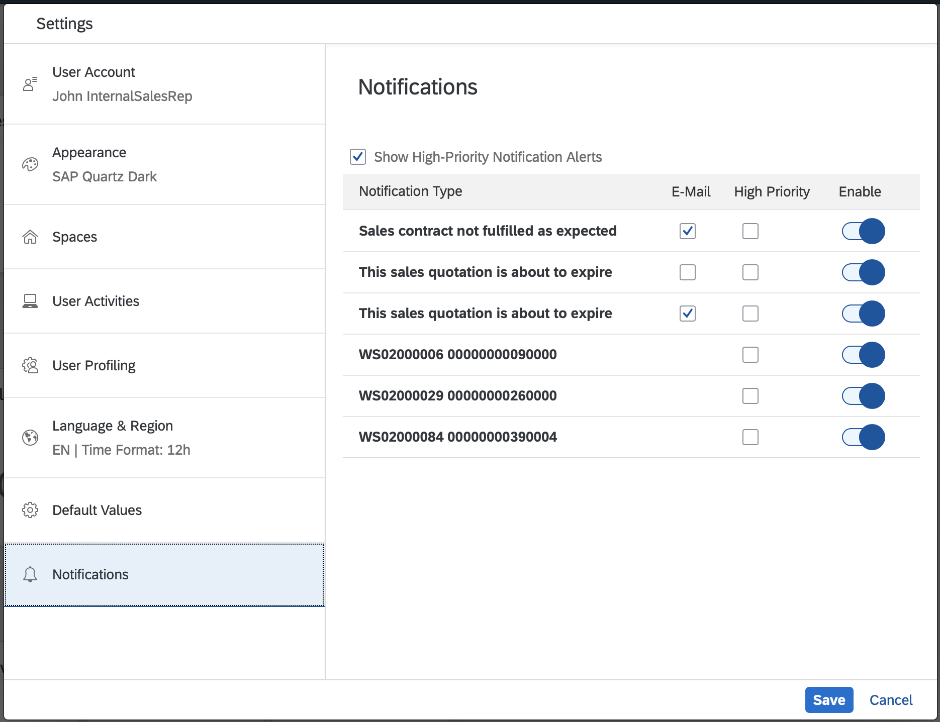
Notification settings
Behavior and Interaction
Accessing the Notifications
Users open and close the notification popover by clicking the notification icon in the shell bar.
Accessing notifications
Executing Actions
Actions are executed by clicking the action buttons, such as Approve or Reject.
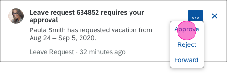
Action
Close
Clicking the Close icon in the upper right corner of the item removes the item from the list.
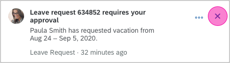
Dismiss notifications
Navigation
Clicking within the notification item triggers navigation to the source.
Banner
Show More
Clicking the Show More button displays the truncated text.
Mobile Integration (SAP S/4HANA only)
Apple iOS
The app icon badge on the mobile device might have a different count to the badge for notifications in the SAP Fiori shell bar. This can happen if some notifications have been disabled in the SAP Fiori settings dialog.
On a mobile device, only non-sensitive data is exposed. For legal reasons, no business data is shown on a locked screen or passed through third party networks. To see the sensitive data, users can always access the notifications on the SAP Fiori launchpad.
Similarly, business actions cannot be displayed or executed on native notifications.
Clicking a native notification triggers navigation to the corresponding app.
Resources
Want to dive deeper? Follow the links below to find out more about related controls, the SAPUI5 implementation, and the visual design.
 Your feedback has been sent to the SAP Fiori design team.