
- Latest SAPUI Version 1.124
- SAPUI5 Version 1.122
- SAPUI5 Version 1.120
- SAPUI5 Version 1.118
- SAPUI5 Version 1.116
- SAPUI5 Version 1.114
- SAPUI5 Version 1.112
- SAPUI5 Version 1.110
- SAPUI5 Version 1.108
- SAPUI5 Version 1.106
- SAPUI5 Version 1.104
- SAPUI5 Version 1.102
- SAPUI5 Version 1.100
- SAPUI5 Version 1.98
- SAPUI5 Version 1.96
- SAPUI5 Version 1.92
- SAPUI5 Version 1.90
- SAPUI5 Version 1.88
- SAPUI5 Version 1.86
- SAPUI5 Version 1.84
- SAPUI5 Version 1.82
- SAPUI5 Version 1.80
- SAPUI5 Version 1.78
- SAPUI5 Version 1.76
- SAPUI5 Version 1.74
- SAPUI5 Version 1.72
- SAPUI5 Version 1.70
- SAPUI5 Version 1.68
- SAPUI5 Version 1.66
- SAPUI5 Version 1.64
- SAPUI5 Version 1.62
- SAPUI5 Version 1.60
- SAPUI5 Version 1.58
- SAPUI5 Version 1.56
- SAPUI5 Version 1.54
- SAPUI5 Version 1.52
- SAPUI5 Version 1.50
- SAPUI5 Version 1.48
- SAPUI5 Version 1.46
- SAPUI5 Version 1.44
- SAPUI5 Version 1.42
- SAPUI5 Version 1.40
- SAPUI5 Version 1.38
- SAPUI5 Version 1.36
- SAPUI5 Version 1.34
- SAPUI5 Version 1.32
- SAPUI5 Version 1.30
- SAPUI5 Version 1.28
- SAPUI5 Version 1.26
- Latest SAPUI Version 1.124
- SAPUI5 Version 1.122
- SAPUI5 Version 1.120
- SAPUI5 Version 1.118
- SAPUI5 Version 1.116
- SAPUI5 Version 1.114
- SAPUI5 Version 1.112
- SAPUI5 Version 1.110
- SAPUI5 Version 1.108
- SAPUI5 Version 1.106
- SAPUI5 Version 1.104
- SAPUI5 Version 1.102
- SAPUI5 Version 1.100
- SAPUI5 Version 1.98
- SAPUI5 Version 1.96
- SAPUI5 Version 1.94
- SAPUI5 Version 1.92
- SAPUI5 Version 1.90
- SAPUI5 Version 1.88
- SAPUI5 Version 1.86
- SAPUI5 Version 1.84
- SAPUI5 Version 1.82
- SAPUI5 Version 1.80
- SAPUI5 Version 1.78
- SAPUI5 Version 1.76
- SAPUI5 Version 1.74
- SAPUI5 Version 1.72
- SAPUI5 Version 1.70
- SAPUI5 Version 1.68
- SAPUI5 Version 1.66
- SAPUI5 Version 1.64
- SAPUI5 Version 1.62
- SAPUI5 Version 1.60
- SAPUI5 Version 1.58
- SAPUI5 Version 1.56
- SAPUI5 Version 1.54
- SAPUI5 Version 1.52
- SAPUI5 Version 1.50
- SAPUI5 Version 1.48
- SAPUI5 Version 1.46
- SAPUI5 Version 1.44
- SAPUI5 Version 1.42
- SAPUI5 Version 1.40
- SAPUI5 Version 1.38
- SAPUI5 Version 1.36
- SAPUI5 Version 1.34
- SAPUI5 Version 1.32
- SAPUI5 Version 1.30
- SAPUI5 Version 1.28
- SAPUI5 Version 1.26
List Report Floorplan
Intro
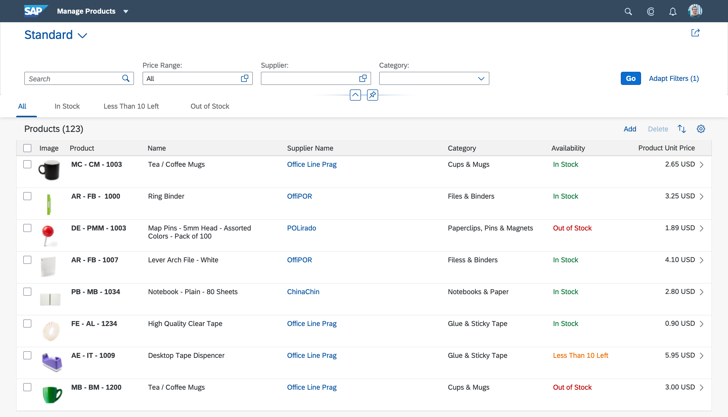
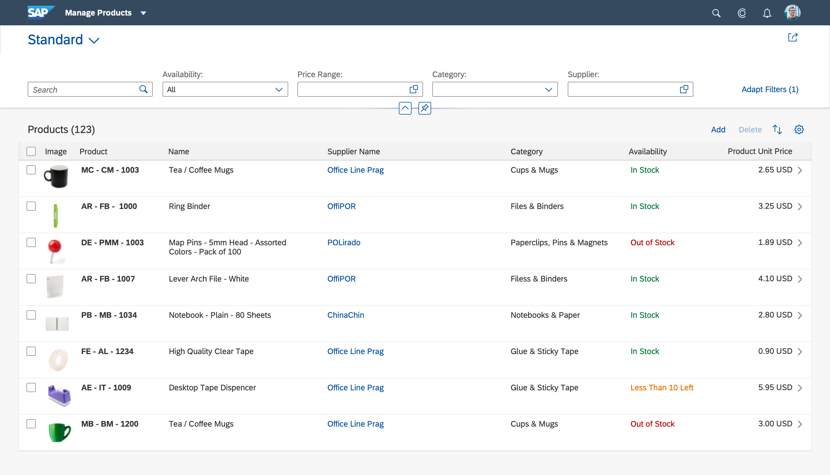
With a list report, users can view and work with a large set of items. This floorplan offers powerful features for finding and acting on relevant items. It is often used as an entry point for navigating to the item details, which are usually shown on an object page.
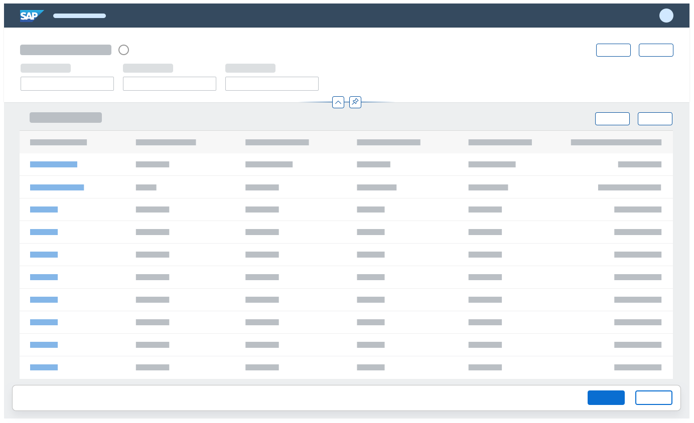
List report
When to Use
Use the list report floorplan if:
- Users need to find and act on relevant items within a large set of items by searching, filtering, sorting, and grouping.
- You want to let users display the whole dataset using different visualizations (for example, as a table or as a chart), but no interactions are required between these visualizations. An example use case might be reporting.
- Users need to work with multiple views of the same content, for example on items that are “Open”, “In Process”, or “Completed”. You want to let users switch views using tabs, segmented buttons, or a select control.
- Drilldown is rarely or never used, or is only available via navigation to another page, and not as free or flexible drilldown within the page itself.
- Users work on different kinds of items.
Do not use the list report floorplan if:
- Users need to see or edit one item with all its details. Use the object page floorplan instead.
- Users need to find one specific item, and the item or an identifying data point is known to the user (such as a code). Use the initial page floorplan instead.
- Users need to work through a comparably small set of items, one by one. Use the worklist floorplan instead.
- Users need to extract knowledge or insights from data, either to better understand the current situation, or to identify the root cause for a certain value. Use the analytical list page instead.
- Charts are not only used for visualization. Users need to switch between integrated chart and table views (hybrid view). Use the analytical list page instead.
- Users need to see the impact of their action on a KPI. Use the analytical list page instead.
- Users need to see not only the result, but also the impact of their filter settings directly in a chart representation. Use the analytical list page instead.
Components
The list report is a full screen floorplan. It can also be used in flexible column layout, where it is usually displayed in the first column.
The list report page is based on the dynamic page, and is divided into a header area and a content area, as defined by the dynamic page layout.
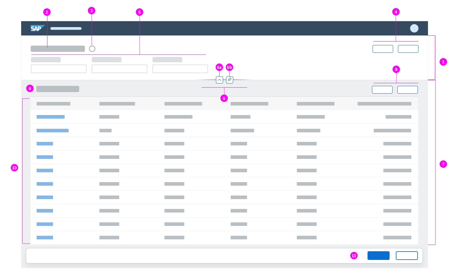
Schematic visualization of a list report
- The dynamic page header (1) contains the header title (2) and the expandable/collapsible header content (5).
- The header title (2) is part of the header area and should display a title or variant (3) for the whole page (mandatory), filter information (if the header is collapsed), and a header toolbar (4) with global actions, such as Share (optional).
- The header content (5) is used to display the filter bar or the smart filter bar (mandatory).
- The header features (6) allow users to expand/collapse the header (6a) (mandatory) and pin/unpin the header area (6b).
- The content area (7) is used to display:
- A table/chart title, textual icon tab bar, or select (8) (optional)
- One table/chart toolbar (9) per tab
- One or multiple tables and/or charts (10). You can use any kind of table. If you use a chart, you can display the chart on its own (without a table) or as an additional view for an existing table (switchable).
- The footer toolbar (11): If needed, use a footer toolbar to display the messaging button and finalizing actions.
Behavior and Interaction
Initial Focus
When the list report is loaded, set the initial focus as follows:
- If the header is expanded, set the focus on the first filter field (live update mode) or on the Go button (manual update mode).
- If the header contains empty mandatory fields, set the focus on the first empty mandatory field.
- If the header is collapsed, set the focus on the first table row.
Standard Naming Conventions
For all objects, follow the standard conventions for action buttons, the object name, and the title in the shell bar. For more information see:
Header Title
Variant Management
Variant management is optional. If you use variants, we recommend using one variant management control for the whole page. Use the variants to save and restore all settings for filters, selected tabs, all tables, and all charts.
In some specific cases, you might need to add a second variant at control level. This can be the case when the user needs to change the view settings of a list independently of the page filters. However, the default is to use a single variant management control for the entire page.
Users can choose a default variant, which is selected every time the app is started.
Allow users to choose whether a variant should be executed automatically as soon as it has been selected. Not executing a variant automatically allows the user to add or remove filters before the dataset is updated. Provide this option only if the filter bar is in manual update mode. For live updates, this option is not required.
If variant management is not needed, show a title that describes the current view instead.

Variant management
Filter Information
Display the filter information only if the header content is collapsed. Use the format Filtered By (x): followed by a comma-separated list of the filters currently applied. “x” stands for the number of applied filters.
Show up to 5 filters. If more filters have been applied, show an ellipsis (“…”) at the end of the string.
If no filters have been applied, show Not filtered.

Filter information
Header Toolbar
Use the header toolbar for non-finalizing global actions, such as Share. Share opens an action sheet, which features Save as Tile (if the SAP Fiori launchpad is available), Send Email, and Share in SAP Jam (if SAP Jam is available). Show the Share button only if it makes sense for your application.
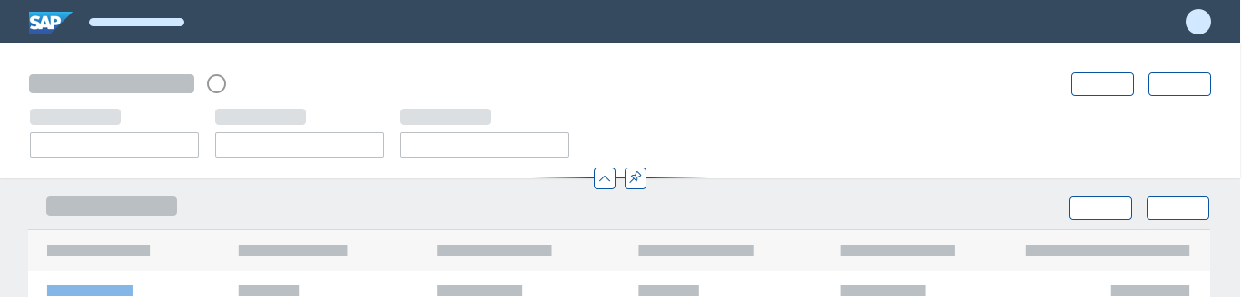
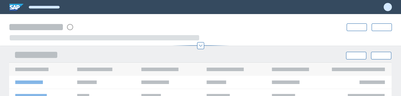
If the content area contains a grid table, an analytical table, a tree table, or any other content with its own scrollbar, display a Show Filters / Hide Filters button for expanding and collapsing the header content.
In addition, offer any other global, non-finalizing actions needed. Hide actions that cannot be used at all (for example, because of access rights). To save space on the header toolbar, group similar actions using a menu button.
For more information on global actions, see the guidelines for the header toolbar.

Header toolbar
Header Content
Search
The filter bar can contain a search field (optional). If you use the search field, the content shows only items that match both the search terms and the filter criteria.
The search generally searches across all available columns of the table, regardless of whether or not they are visible. In rare cases, some columns might not be included due to technical constraints. If the search does not apply to multiple columns, do not offer the search field.
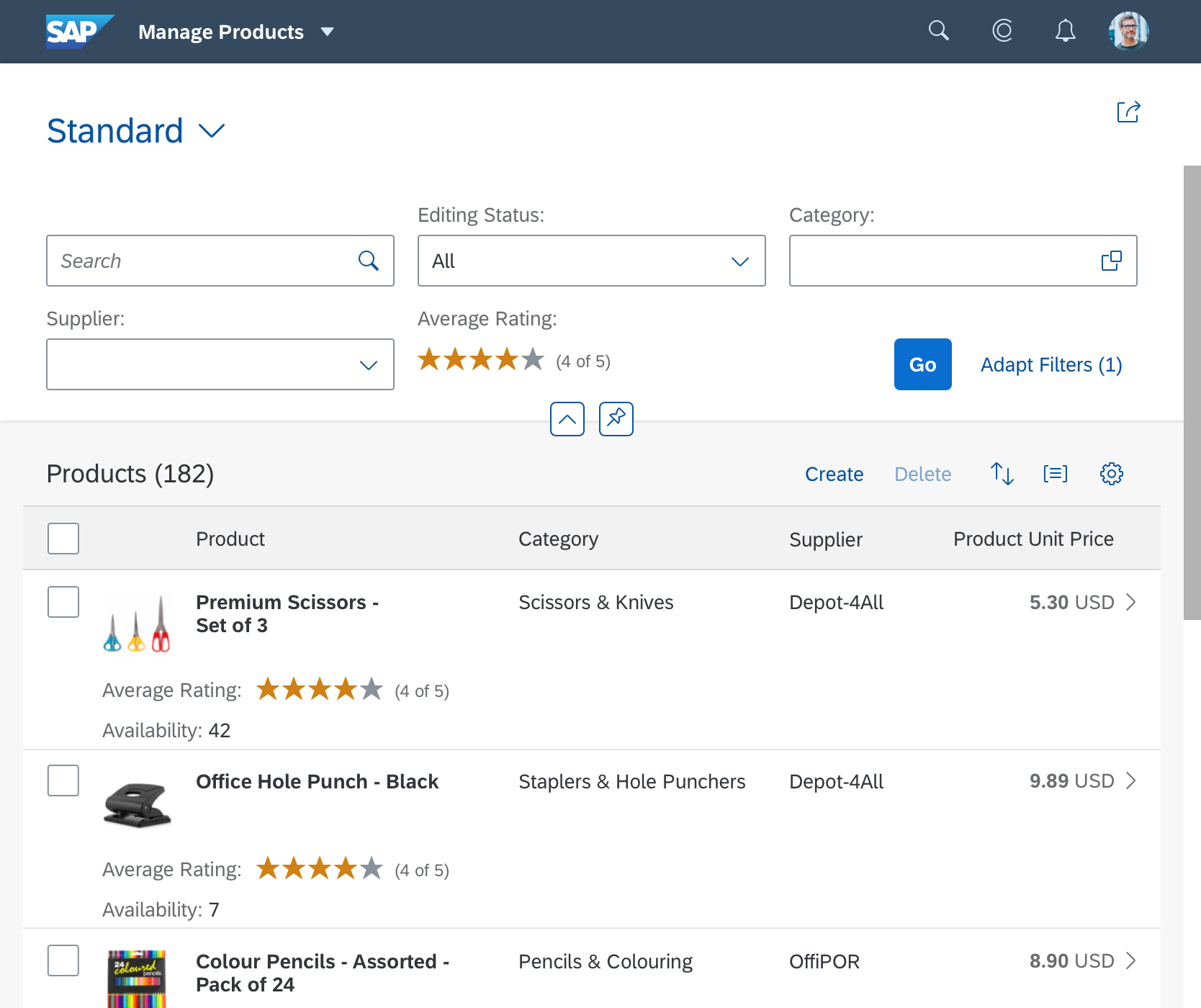
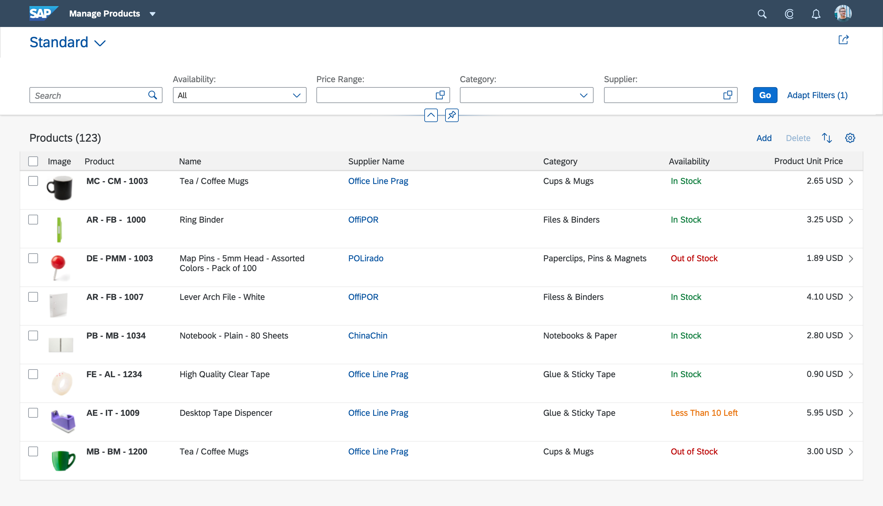
Filters
Filters are applied to all content, including all tables and charts. To improve performance, consider providing mandatory filter fields and/or default settings for filters.
If the list report loads automatically when the page loads, ensure that mandatory filter fields always have default values to avoid error messages.
The filter bar offers two different update modes:
- The live update mode (recommended) triggers filtering immediately whenever a filter setting is changed. If the search field is used, the search is triggered together with all filter settings with every letter typed.
- The manual update mode displays a Go button, which triggers the filtering. If the search field is used, the search is executed together with all filters as soon as the Go button is pressed.
Make sure that all tables and charts in the content area are in a busy state until the new data is available. Also ensure that the content is grayed out as soon as the filter settings do not correspond to the content shown (any table, property: showOverlay). This is usually the case if the content is not yet updated and the Go button needs to be triggered.
Use the manual update mode only if you run into performance problems while loading the table data.
Regardless of the update mode, make sure that the filter bar and the visible content match: The filter bar must always describe the items that are shown in the content area.

Filter bar
Header Content - Expand / Collapse Behavior
The header content collapses when the user scrolls down the page (except for desktop-centric tables), and expands again when the user scrolls back up (“snap on scroll”). Users can pin the header content to keep it visible. For more information, see Dynamic Page – Expand/Collapse Header.
Exception: The “Snap on scroll” and “pin header” features are not provided if the main content area contains desktop-centric tables (grid tables, analytical tables, tree tables) or any other content with its own scrollbar. In these cases, users need to expand and collapse the header content manually using the Show Filters / Hide Filters button.
When starting the application, expand the header content if no query was fired (and the table is therefore empty). Otherwise, collapse the header content.
Content Area
General Layout
There are three basic list report layouts: simple content, multiple views, and multiple content. These are described in more detail below.
Simple Content
In most cases, the content consists of just a table toolbar and a table. If needed, provide an option to switch between the table and a corresponding chart view.
Multiple Views
For more complex scenarios, provide multiple views of the same content. Multiple views involve one or more of the following:
- Showing the same table, but with different columns.
- Showing the same table in different pre-filtered states. These states are usually based on a status column, for example, items that are Open, In Process, or Closed. Make sure that the corresponding filter is not offered on the filter bar.
- Differentiating between the items displayed in the content in some other fundamental way.
There are two options for switching between different views:
The first option is to replace the table title with a content switch. Use this approach if all views share the same sort and group states, as well as the same actions.
The content switch can be:
- A segmented button for up to three views
- A select control for more than three views, or if the number of views changes dynamically
If you have both a table title and a content switch, display the table title first, then the content switch. Place both on the left side of the table toolbar. Since the content switch is placed on the table toolbar, the same actions are shown for all views.
If you are using the content switch together with charts, ensure that the chart also reacts to the content switch. This can be done by:
- Filtering the data that influences the display of the chart
- Changing the measures and/or dimensions (for example, View by Country/Region, View by Customer, …)
The second option for switching views is to show each view in a tab container of the icon tab bar. Use this approach if all views show different states of the same data (sort states, group states, as well as item selection). Using tabs also allows you to offer different actions on the table toolbar for each view.
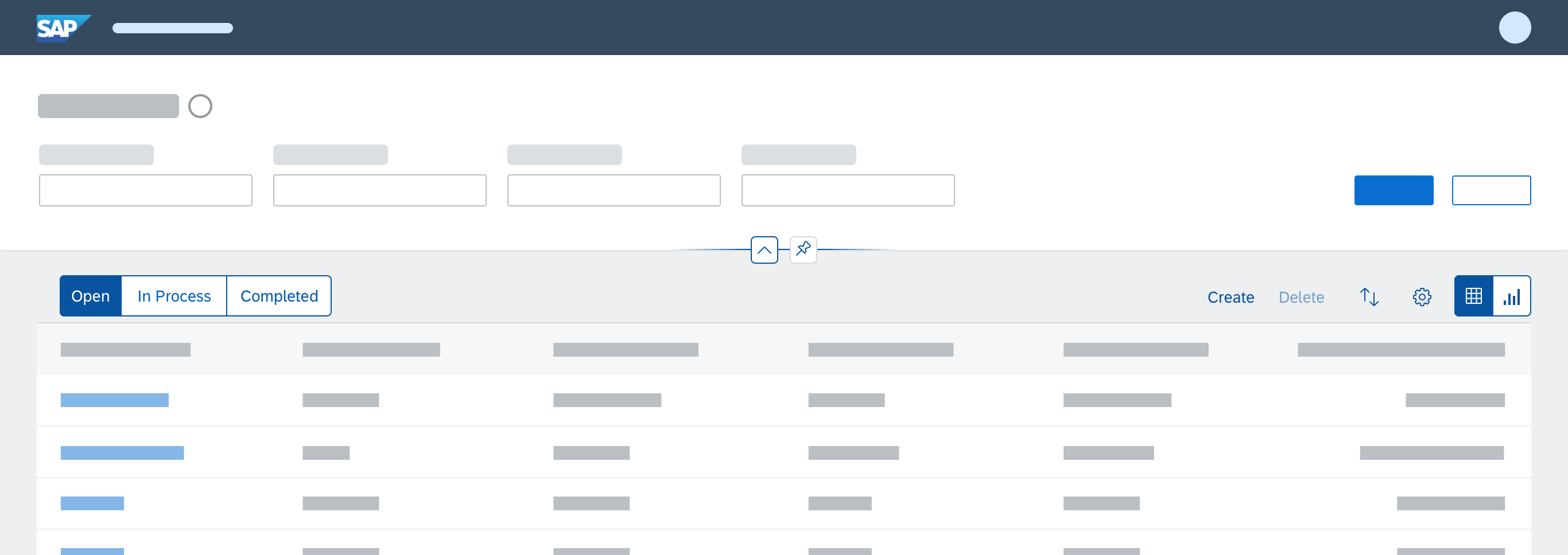
Table toolbar with a segmented button for up to three different views
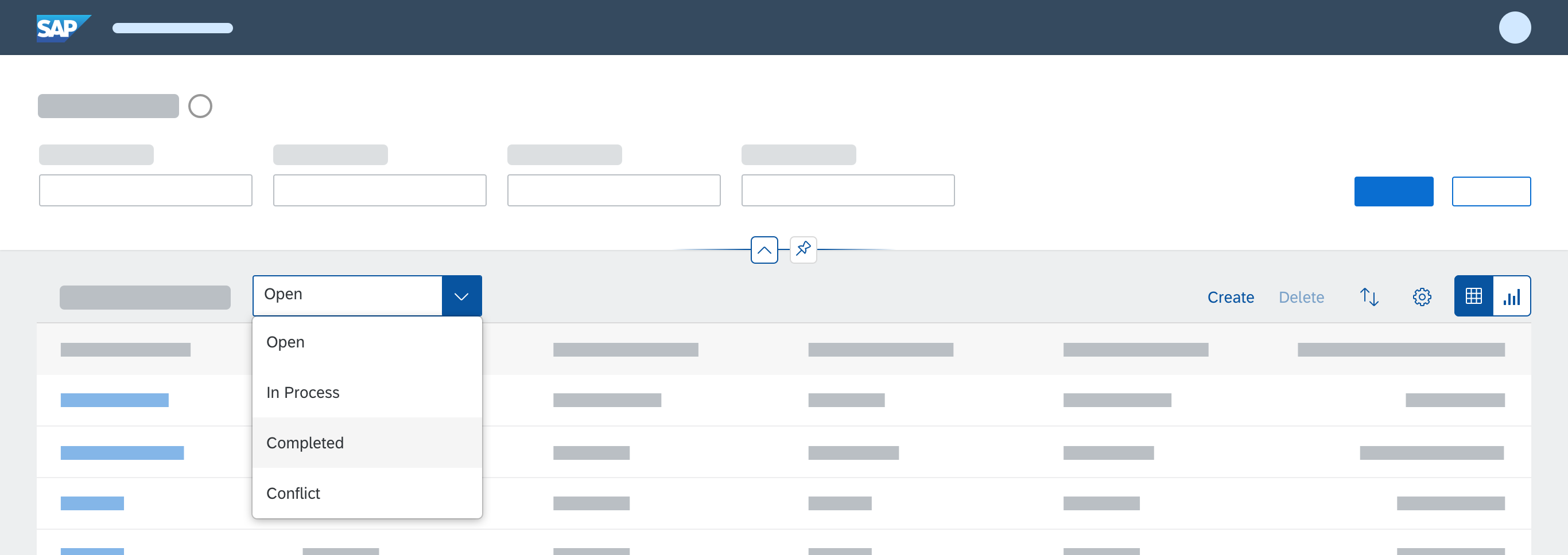
Table toolbar with a select control for more than three views
Multiple Content
To support even more complex use cases, a list report floorplan can also contain multiple tables that display different kinds of objects. The filter bar settings are applied to all of these tables in parallel. For example, a customer overview list report might display different tables for invoices, deliveries, and overdue payments. All of these tables can be filtered for a specific customer and a specific date.
Display each table inside a tab container of an icon tab bar. This also allows you to offer different actions on the table toolbar for each table.
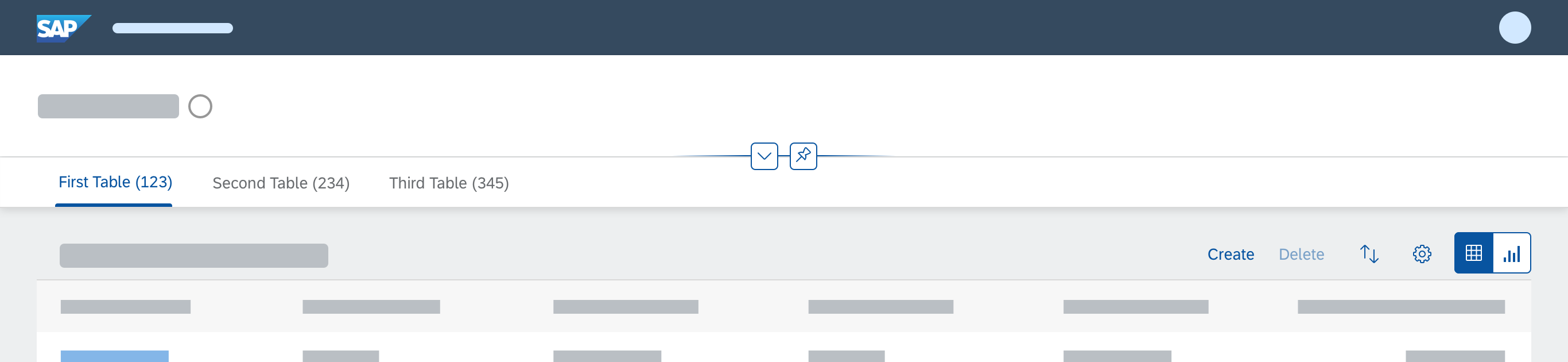
List report floorplan with multiple tables placed in multiple tabs
Icon Tab Bar
Use the text-only version of the icon tab bar. Display the number of items shown in the respective table on each tab (sap.m.IconTabFilter, property: count).

Icon tab bar
Table Toolbar
Display at least a table title (ideally with an item count) and icon-only buttons for sorting, grouping, and column settings. Do not offer additional filter settings on the table toolbar. For sort and group, show a view settings dialog with just the corresponding features enabled. For column settings, show the table personalization dialog. If you need more extensive functionality (for example, grouping or sorting on several levels, tables with more than 20 columns), use the P13n-Dialog with just the corresponding feature enabled.
If alternative visualizations are provided (such as charts), offer an additional view switch on the table toolbar. Triggering the switch replaces the current visualization with another one. If a table and chart need to be shown in parallel, offer a switch for the combined view.
In rare cases, you can offer an additional layout variant on the table toolbar. The layout variant stores view settings like the column order and the sort and group settings. If you use a layout variant, do not store the table settings in the filter variant. Offer this additional layout variant only if there is a strong use case for switching filter and layout variants independently. If there is no strong use case, or you are unsure, do not use a layout variant at all.

Typical toolbar in the list report floorplan containing the table title and item count, as well as buttons for sorting, grouping, and column settings

Toolbar with a switch between table and chart visualizations

Toolbar with a table title and layout variant

Toolbar with additional actions
In addition, offer any other actions needed. Disable selection-dependent actions (such as Delete) if no items are selected, or if the action cannot be applied to the selected items. Always enable selection-independent actions (such as Add). To save space on the table toolbar, group similar actions using a menu button. For example:
- Release and Release with Conditions
- Add Contact and Replace Contact
- Edit Account and Edit Title
For more information on table/chart actions, see the guidelines for the table toolbar, the chart toolbar, and for managing objects.
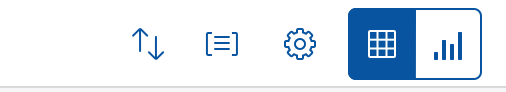
Table without the filter icon
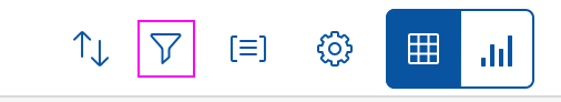
Table with a filter option
Table
If there are no items to display, use the “no data” text of the corresponding table. Explain why the table is empty, and what the user needs to do to display items.
Examples:
- After starting the app, no filters are applied:
To start, set the relevant filters. - The filter was executed, but no items were found. This can also happen if the list report was opened by a related app, and the filter criteria were transferred automatically:
No data found. Try adjusting the filter settings.
If you are using a responsive table, always enable “scroll to load” behavior.
Sticky Behavior
The icon tab bar, table/chart toolbar, and column headers of all table types must be “sticky”. This means that they stay fixed on top when the user scrolls down the page.
Navigation
There are three types of navigation at item level in the list report floorplan:
- Line item navigation: If applicable, allow navigation to a detail view (usually an object page) at line item level. Show a navigation indicator (chevron icon) for each line item that provides a detail view. In a list, tree, or responsive table, clicking the line item triggers the navigation.
In a grid table, analytical table, or tree table, clicking the navigation indicator triggers the navigation.
Another option is to use a link as the identifier for the line item. This link triggers the navigation. Use this only if the navigation indicator is being used for a different target.
Only show navigation indicators for target pages the user is authorized to access. - Drilldown navigation: If a line item contains aggregated data, allow navigation to a view that contains details for the aggregated amount. This is usually another list report. In this case, use a link to display the aggregated amount. If the table contains many columns with links, use the link options to provide different levels of highlighting.
In charts, offer the drilldown navigation link in the popover for the chart element. In this case, also navigate to the corresponding list report to show the details. - Cross navigation: If a line item contains cross-references to other entities, such as people or business objects, use a link to display the corresponding data point in the table. Triggering the link opens a quick view. Typically, the quick view displays basic details of the referenced object and a navigation link to another page (usually an object page) or another app that shows the object details.
Working Modes
When the user edits a list item in a filtered list, the changed item might no longer match the filter criteria. For this use case, there are two alternative working modes:
- Worklist mode
Users want to see a direct system reaction to their changes. Items that don’t match the current filtersvanish immediately. This mode applies to about 80% of all use cases. - Continuous working mode
The user still needs the edited item, even though it no longer matches the filter criteria. The item stays in the list until the next filtering process is triggered. The item is marked, and a system message informs the user about the filter mismatch. This mode applies to about 20% of all use cases.
The app developer can choose the appropriate working mode for the app use case.
Footer Toolbar
Use the footer toolbar to display the messaging button and finalizing actions. Only use the footer toolbar if finalizing actions for the whole page and/or the message popover are available.
Always show the footer toolbar in edit mode.
Hide actions that cannot be used at all (for example, if the user doesn’t have authorization). To save space on the footer toolbar, group similar actions using a menu button.
For more information on finalizing actions, see the guidelines for the footer toolbar.

Footer toolbar
Actions

Places for actions in the list report
(1) Global actions in the header toolbar
(2) Table actions in the table toolbar
(3) Line item actions
(4) Finalizing actions in the footer toolbar
1. Global Actions
Place actions that affect the entire page in the header toolbar in the header title (1). These include the following standard actions:
- Show Filters / Hide Filters: This button expands and collapses the header content. Show this button only if the list report contains a grid table, analytical table, or tree table.
- Share: This button opens an action sheet that contains actions like Save as Tile (if the SAP Fiori Launchpad is available), Send Email, and Share in SAP Jam (if SAP Jam is available). Show the Share button only if it makes sense for your application.
Hide actions that cannot be used at all (for example, because the user has no authorization). To save space on the header toolbar, group similar actions using a menu button.
Do not place actions that finalize the current process (“finalizing actions”) on the header toolbar of the header title, even if they affect the entire page.
For more information on global actions, see the guidelines for the header toolbar.
2. Table/Chart Actions
Place actions that affect the content of a table or chart in the table toolbar (2).
If you are using an icon tab bar, be aware that each tab contains its own table toolbar.
When to Enable, Disable, or Hide Actions
Indicate whether an action is available. Some actions are always available (such as Create for new objects). Other actions are only relevant if items have been selected (for example, Edit at item level, Remove, object-specific actions, or actions that change the status of an item).
Enable the following actions:
- All Add/Create actions, unless the user needs to specify where in the table the new item should be added.
- Edit actions that switch the entire table to edit mode (independent of the selected items).
If the user triggers the Edit button, replace it with Save and Cancel buttons (see Editing the Whole Table). - Item-dependent actions that can be applied to some or all of the selected items.
Disable the following actions:
- Item-dependent actions when no items have been selected.
- Add/Create actions where the user needs to specify the insert position in the table, but either no item has been selected, or more than one item has been selected.
Hide actions that cannot be used at all (for example, because the user has no authorization).
For more information, also see UI Element States – Control States.
Partial Processing
Enable the user to apply the changes to as many of the selected items as possible.
If an action can’t be applied to all selected items, show a warning message before executing the action:
- Indicate the number of selected items that can’t be processed (out of the total number of selected items).
- Give a reason why the action can’t be applied to these items.
- Let the user choose whether to apply the action to the remaining items anyway or cancel the action.
Note: In some scenarios, you might not be able to identify whether an action can be applied to all selected items before executing it. If the system is unable to apply the action to all items, show a message after executing the action.
Sort, Group, Personalization
Decide if you need to provide a sorting, grouping or personalization for your use case. If you offer more than one of these actions, offer them as single actions. We recommend keeping them in the following order: Sort, Group, Personalization.
Add/Create Items Using a Dialog
You can let users add or create new items at list report level using a dialog. This approach is recommended for cases where there are fewer than 8 required fields. Display the action in the table toolbar.
You can use this option for both draft and non-draft scenarios.
More Information
For more information on table and chart actions, see the guidelines for the table toolbar, chart toolbar, and for managing objects.
3. Line Item Actions
In rare cases, actions that affect a single item can be placed directly inside the line item. Use this only for specific, frequently used tasks (3). If the same action can also be applied to several items at once, feel free to also place it on the table toolbar. Nevertheless, if you do so, reconsider whether you really need to offer the action at line item level. Examples of line item actions include:
- Start/Stop (a batch job)
- Approve (an item)
- Assign (an item)
Do not disable line item actions. If an action cannot be used, hide it. This can be the case if the user has no authorization or the line item is in the wrong state.
4. Finalizing Actions
Place actions that trigger the end of a process and affect the entire page in the footer toolbar (4).
Examples:
- Save
- Cancel
- Submit
Please be aware: Even if you are using the icon tab bar, there is only one footer toolbar for all tabs.
Hide actions that cannot be used at all (for example, because the user has no authorization).
For more information on finalizing actions, see the guidelines for the footer toolbar.
Responsiveness
In general, the list report floorplan is responsive. However, there are exceptions if the following controls are used:
- Grid table, analytical table: Supported on desktop and tablet devices only. On smartphones, replace these tables with something else, such as a responsive table or a list. In rare cases, displaying only a chart on smartphones might also suffice.
- Tree table: Supported on desktop and tablet devices only. For smartphones, there is no equivalent alternative. In some cases, a tree, the category navigation pattern, or a chart might work.
- Smart table: The smart table is a wrapper around the different existing table controls. If a grid table, analytical table, or tree table is used inside the smart table, you will run into the issues mentioned above. On a smartphone, you can use a responsive table inside the smart table. For the tree table, you need to replace the smart table as described above.
For more details, see the respective guideline articles.

List report - Size L
List report - Size M

List report - Size S
Examples
The examples below show variants of the list report with the most commonly-used controls. You can also see the manual update mode (with a “Go” button) and the live update mode (no “Go” button).

Top Tips
- Avoid loading list report page without any data, even if there are no mandatory filters.
- Use only one key identifier in the table.
- If you are using the icon tab bar, place it beneath the filters.
- In the icon tab bar, use text labels only (without icons).
- Choose selection controls that best fit your use case.
- Make sure that columns in the table are aligned correctly.
- Ensure that mandatory filter fields always have default values.
- Avoid using variant management for tables. Use the page variant instead.
- Always enable actions like Add, Create or Edit. Once Edit is triggered, replace it with Save and Cancel.
- Never place finalizing actions in the header toolbar, even if they affect the whole page.
- When using the icon tab bar, be aware that each tab contains its own table toolbar.
Related Links
Elements and Controls
- Chart (guidelines)
- Filter Bar (guidelines)
- Floorplan Overview (guidelines)
- Icon Tab Bar (guidelines)
- Introduction to SAP Fiori Elements (guidelines)
- Table Overview (guidelines)
- Variant Management (guidelines)
Implementation
- Filter Bar (API)
- Icon Tab Bar (API)
- Responsive Table (API)
- List Report and Object Page (developer guide)
- SAP Fiori Elements Feature Map
 Your feedback has been sent to the SAP Fiori design team.