- Latest Version 1.128
- Version 1.126
- SAPUI Version 1.124
- SAPUI5 Version 1.122
- SAPUI5 Version 1.120
- SAPUI5 Version 1.118
- SAPUI5 Version 1.116
- SAPUI5 Version 1.114
- SAPUI5 Version 1.112
- SAPUI5 Version 1.110
- SAPUI5 Version 1.108
- SAPUI5 Version 1.106
- SAPUI5 Version 1.104
- SAPUI5 Version 1.102
- SAPUI5 Version 1.100
- SAPUI5 Version 1.98
- SAPUI5 Version 1.96
- SAPUI5 Version 1.94
- SAPUI5 Version 1.92
- SAPUI5 Version 1.90
- SAPUI5 Version 1.88
- SAPUI5 Version 1.86
- SAPUI5 Version 1.84
- SAPUI5 Version 1.82
- SAPUI5 Version 1.80
- SAPUI5 Version 1.78
- SAPUI5 Version 1.76
- SAPUI5 Version 1.74
- SAPUI5 Version 1.72
- SAPUI5 Version 1.70
- SAPUI5 Version 1.68
- SAPUI5 Version 1.66
- SAPUI5 Version 1.64
- SAPUI5 Version 1.62
- SAPUI5 Version 1.60
- SAPUI5 Version 1.58
- SAPUI5 Version 1.56
- SAPUI5 Version 1.54
- SAPUI5 Version 1.52
- SAPUI5 Version 1.50
- SAPUI5 Version 1.48
- SAPUI5 Version 1.46
- SAPUI5 Version 1.44
- SAPUI5 Version 1.42
- SAPUI5 Version 1.40
- SAPUI5 Version 1.38
- SAPUI5 Version 1.36
- SAPUI5 Version 1.34
- SAPUI5 Version 1.32
- SAPUI5 Version 1.30
- SAPUI5 Version 1.28
- SAPUI5 Version 1.26
Empty Page
Intro
Empty spaces are places in apps that have no content or data. There are different use cases where an empty page might be shown. The layout is still the same, but the text changes depending on the use case.
Responsiveness and Adaptiveness
The size of the empty page is adjusted to the amount of space available.
Types
The layout of the empty page always behaves the same. The only differences are the texts which change depending on the use case and the user’s location in the app. Have a look at the different types:
Filter
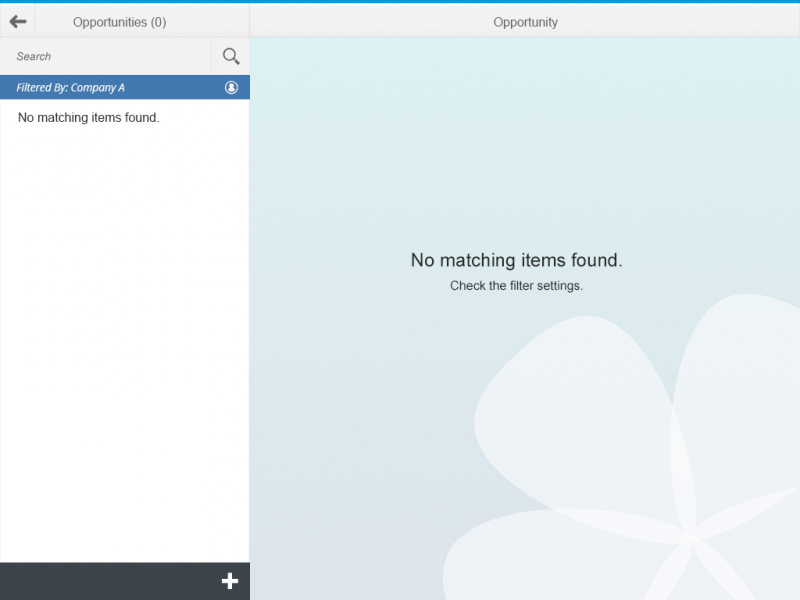
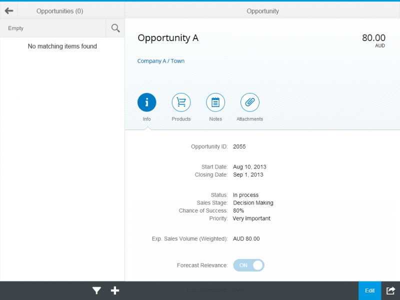
Contextual filter was set and there are no results.
Text
Please display the following text in the master list:
No matching <entity> found, e.g. No matching items found.
Please display the following text in the detail page:
No matching <entity> found. Check the filter settings. e.g. No matching items found. Check the filter settings.
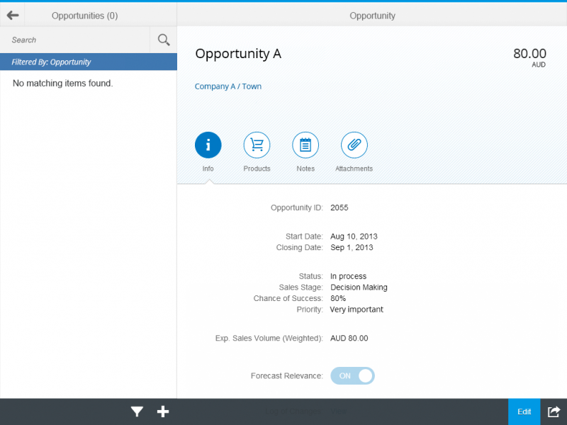
The user has set a filter and there are no results.
Text
Please display the following text in the master list:
No matching <entity> found e.g. No matching items found.
Please display the following text in the the detail page:
Show last selected <entity> e.g. Show last selected item.
Search
The user has searched something and there are no results (also for search and filter at the same time).
Text
Please display the following text in the master list:
No matching items found.
Please display the following text in the detail page:
Show last selected item.
There are no items, but the user searched anyway.
Text
Please display the following text in the master list:
No matching items found.
Please display the following text in the detail page:
Show last empty page use case.
No Item
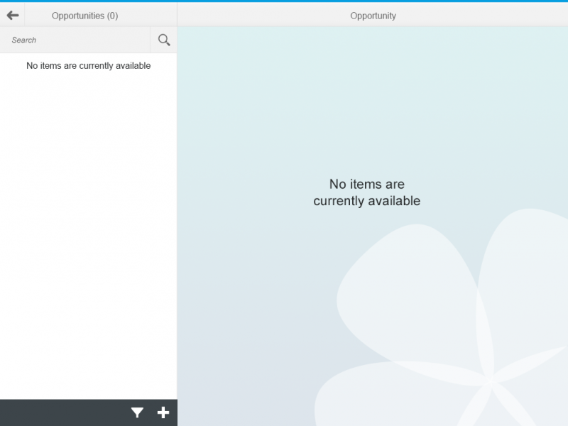
The app contains no items.
Text
Please display the following text in the master list and detail page:
No items are currently available.
Too Many Items
In this case, there are too many items in the master list. The user has to search to see results.
Text
Please display the following text in the master list:
Search for <business object (plural)> e.g. Search for opportunities.
Please display the following text in the detail page:
Search for <business object (plural)> e.g. Search for opportunities.
Loading
The app is loading (open, filter, sort…).
Text
Please display the following text in the master list:
Loading…
Please display the following text in the detail page:
Show last selected item.
Save as Tile
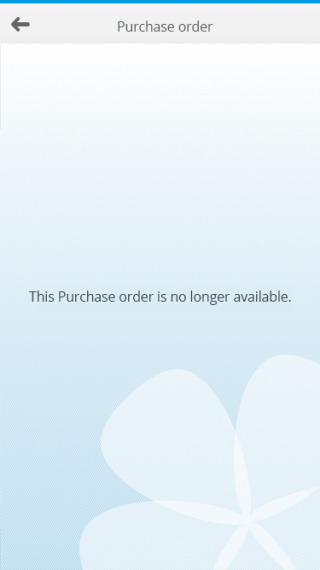
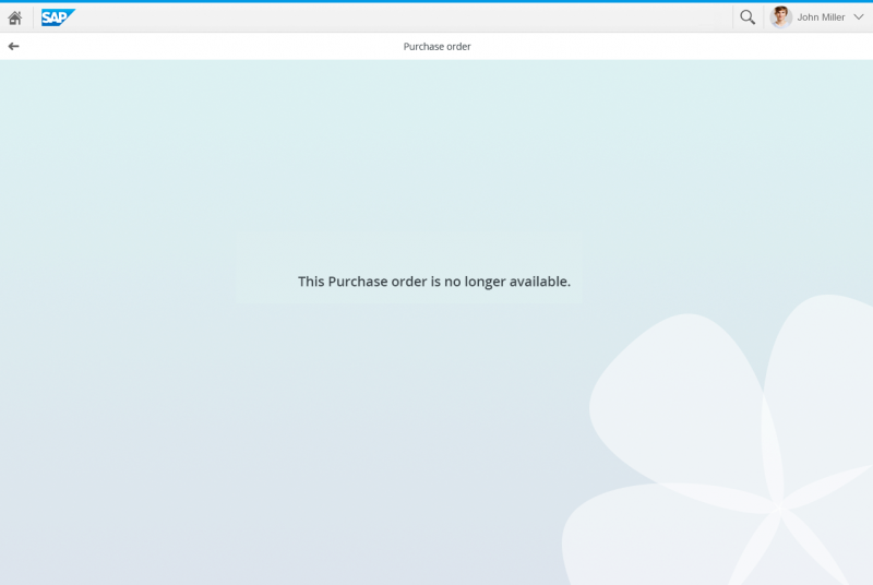
The item the user has saved is no longer available.
Text
Please display the following text in the master list:
No items selected.
On the detail page, indicate the specific entity. Where relevant, you can also include the ID:
This <entity> is no longer available.
<Entity> <ID> is no longer available.
Examples:
This product is no longer available.
Purchase order 123456 is no longer available.
Components
Following UI elements can be placed into the action sheet:
- Text
- Background image
Guidelines
Different texts are displayed in different use cases.
In General
- If there is only one sentence: no periods at the end of the phrases/sentences.
- <business object (plural)> should be replaced with the business object in plural and lower case.
Filter
In case a contextual filter is set in a split-screen view and there are no results, please display:
No matching items found. Check the filter settings.
However, if the user has set a filter and there are no results, the details area will continue to show the last selected item.
Search
If there are no items in the list to begin with and the user searches anyway the master list reads No matching items found and the details area shows the last empty state. The texts for this could be
No items are currently available or
No matching items found. Check the filter settings or Search for.
No Items
If your app simply does not contain any items, please display:
No items are currently available in both, the master list and in the details area.
Too Many Items
If there are too many items in the master list and the user has to conduct a search to see any results, please display:
Search for <>, where <> stands for the plural of the respective business object’s name in lower case.
Save as Tile
If the user saved a tile on his home screen, but the item is no longer available, you could use the text
This <entity> is no longer available, e.g. This product is no longer available.
Loading
Of course, sometimes your app will simply be loading. In that case, display: Loading…’. Please do not show the message No Data in this case, since that can be misleading.
Resources
Want to dive deeper? Follow the links below to find out more about related controls, the SAPUI5 implementation, and the visual design.



 Your feedback has been sent to the SAP Fiori design team.