
- Latest SAPUI Version 1.124
- SAPUI5 Version 1.122
- SAPUI5 Version 1.120
- SAPUI5 Version 1.118
- SAPUI5 Version 1.116
- SAPUI5 Version 1.114
- SAPUI5 Version 1.112
- SAPUI5 Version 1.110
- SAPUI5 Version 1.108
- SAPUI5 Version 1.106
- SAPUI5 Version 1.104
- SAPUI5 Version 1.102
- SAPUI5 Version 1.100
- SAPUI5 Version 1.98
- SAPUI5 Version 1.96
- SAPUI5 Version 1.94
- SAPUI5 Version 1.92
- SAPUI5 Version 1.90
- SAPUI5 Version 1.88
- SAPUI5 Version 1.86
- SAPUI5 Version 1.84
- SAPUI5 Version 1.82
- SAPUI5 Version 1.80
- SAPUI5 Version 1.78
- SAPUI5 Version 1.76
- SAPUI5 Version 1.74
- SAPUI5 Version 1.72
- SAPUI5 Version 1.70
- SAPUI5 Version 1.68
- SAPUI5 Version 1.66
- SAPUI5 Version 1.64
- SAPUI5 Version 1.62
- SAPUI5 Version 1.60
- SAPUI5 Version 1.58
- SAPUI5 Version 1.56
- SAPUI5 Version 1.54
- SAPUI5 Version 1.52
- SAPUI5 Version 1.50
- SAPUI5 Version 1.48
- SAPUI5 Version 1.46
- SAPUI5 Version 1.44
- SAPUI5 Version 1.42
- SAPUI5 Version 1.40
- SAPUI5 Version 1.38
- SAPUI5 Version 1.34
- SAPUI5 Version 1.32
- SAPUI5 Version 1.30
- SAPUI5 Version 1.28
- SAPUI5 Version 1.26
- Latest SAPUI Version 1.124
- SAPUI5 Version 1.122
- SAPUI5 Version 1.120
- SAPUI5 Version 1.118
- SAPUI5 Version 1.116
- SAPUI5 Version 1.114
- SAPUI5 Version 1.112
- SAPUI5 Version 1.110
- SAPUI5 Version 1.108
- SAPUI5 Version 1.106
- SAPUI5 Version 1.104
- SAPUI5 Version 1.102
- SAPUI5 Version 1.100
- SAPUI5 Version 1.98
- SAPUI5 Version 1.96
- SAPUI5 Version 1.94
- SAPUI5 Version 1.92
- SAPUI5 Version 1.90
- SAPUI5 Version 1.88
- SAPUI5 Version 1.86
- SAPUI5 Version 1.84
- SAPUI5 Version 1.82
- SAPUI5 Version 1.80
- SAPUI5 Version 1.78
- SAPUI5 Version 1.76
- SAPUI5 Version 1.74
- SAPUI5 Version 1.72
- SAPUI5 Version 1.70
- SAPUI5 Version 1.68
- SAPUI5 Version 1.66
- SAPUI5 Version 1.64
- SAPUI5 Version 1.62
- SAPUI5 Version 1.60
- SAPUI5 Version 1.58
- SAPUI5 Version 1.56
- SAPUI5 Version 1.54
- SAPUI5 Version 1.52
- SAPUI5 Version 1.50
- SAPUI5 Version 1.48
- SAPUI5 Version 1.46
- SAPUI5 Version 1.44
- SAPUI5 Version 1.42
- SAPUI5 Version 1.40
- SAPUI5 Version 1.38
- SAPUI5 Version 1.36
- SAPUI5 Version 1.34
- SAPUI5 Version 1.32
- SAPUI5 Version 1.30
- SAPUI5 Version 1.28
- SAPUI5 Version 1.26
Initial Page Floorplan
Intro
The initial page floorplan allows the user to navigate to a single object to view or edit it. The interaction point on the screen is a single input field that relies on assisted input to direct the user to the object in as few steps as possible (using features such as value help and live search). If you need to display more than one object, use the list report floorplan instead.
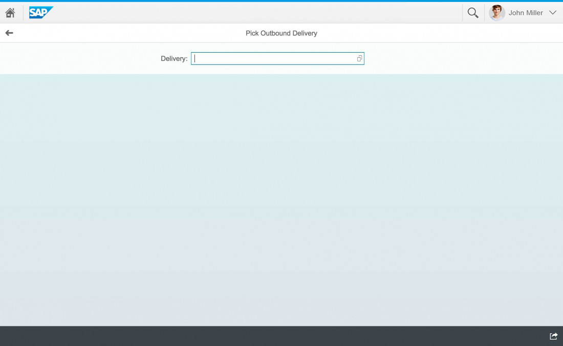
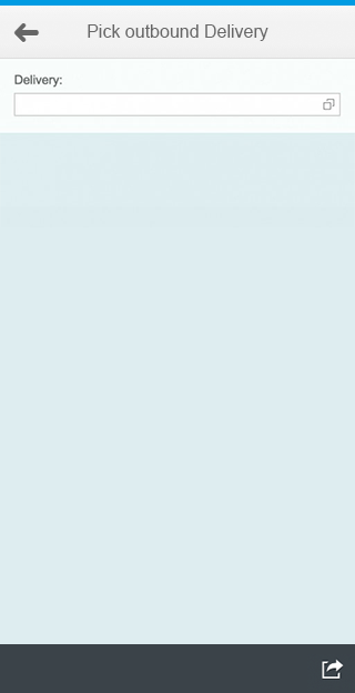
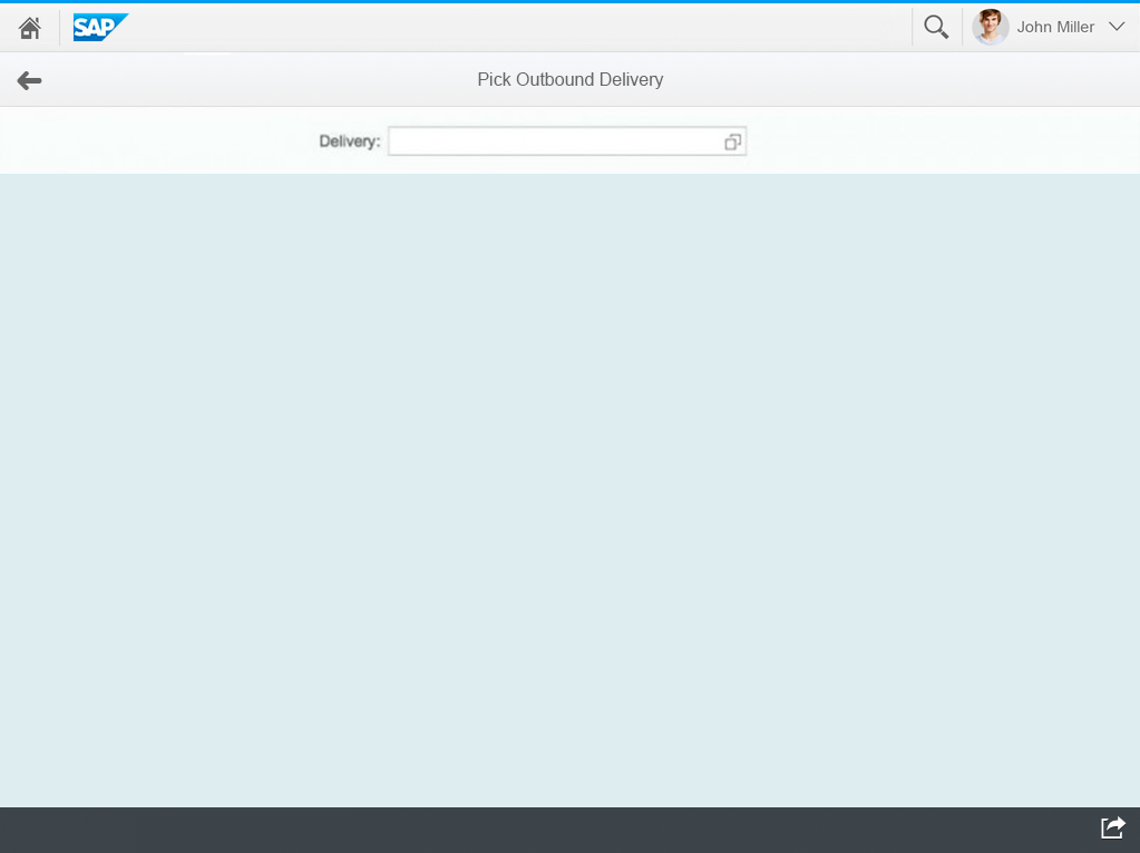
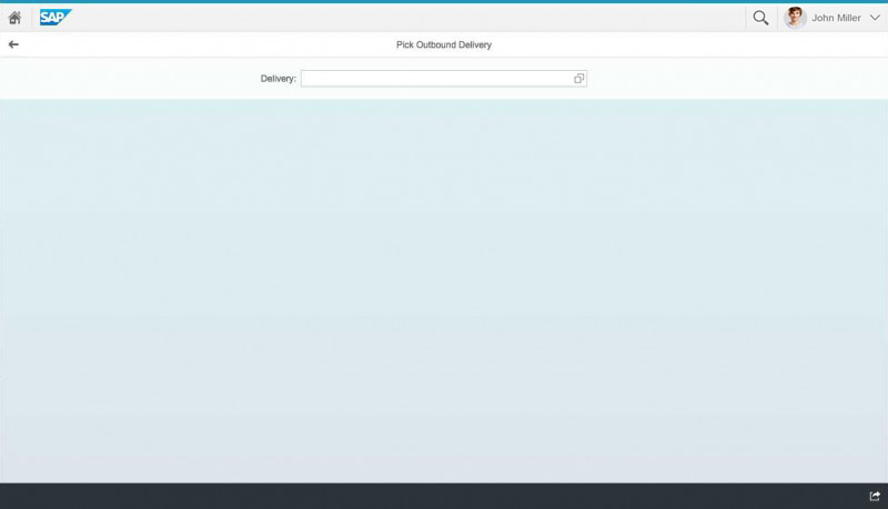
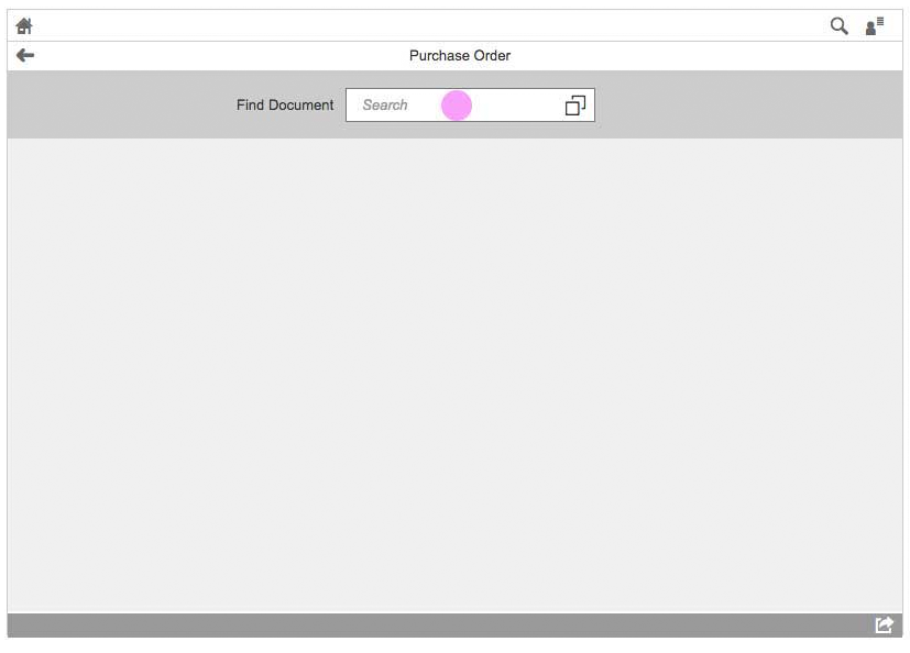
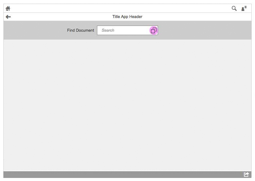
Initial screen - Empty state
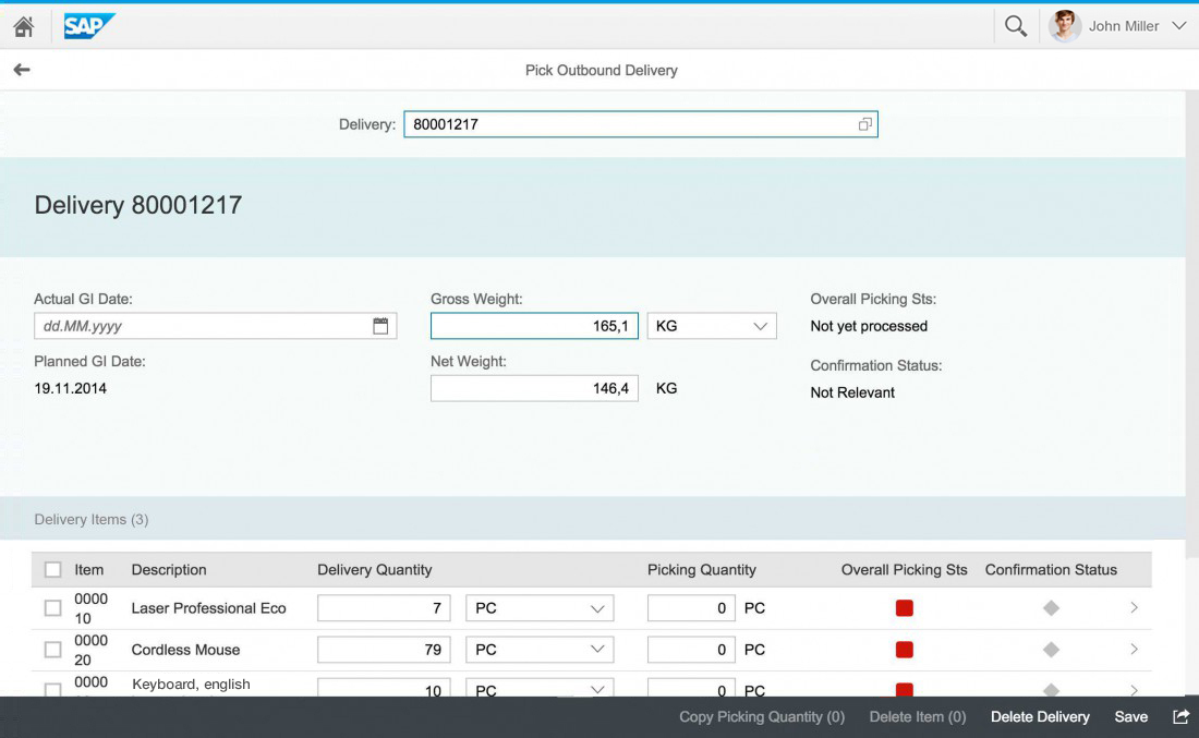
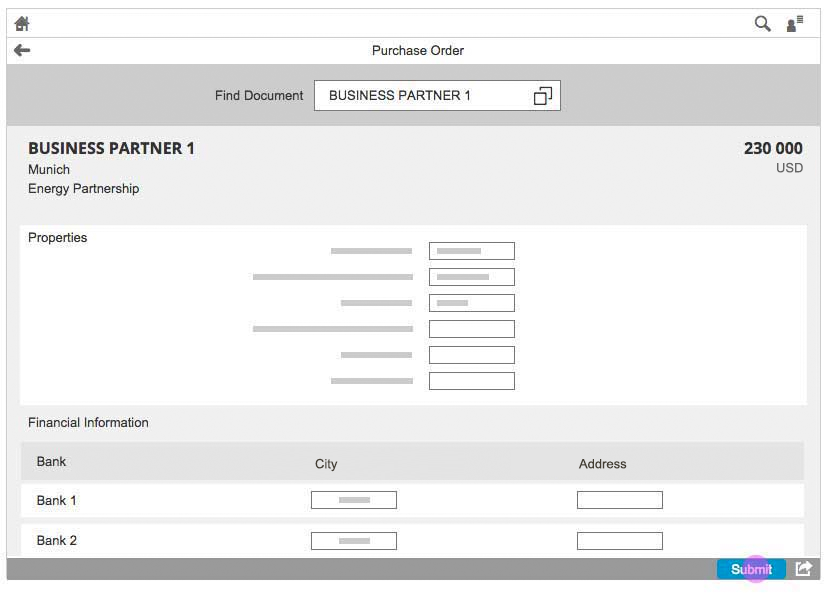
Initial screen - Showing object
Usage
Use the initial page floorplan if the user only needs to work on one object at a time. In this case, the list report floorplan would include a redundant step for viewing a list of items found by the search.
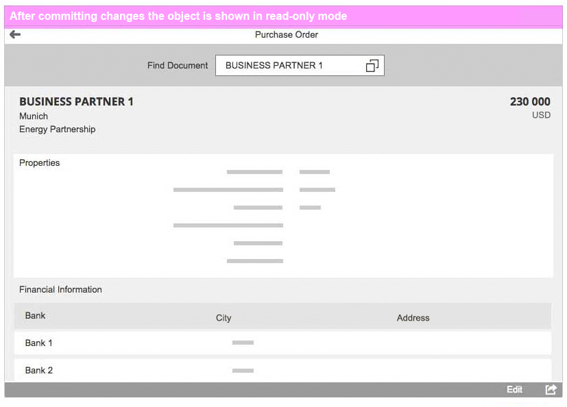
A typical use case for the initial page floorplan is a barcode scanning app, where each new scan leads to an object with input fields. Once the user has submitted the entries, the screen is shown in read-only mode. The cursor returns to the input field, ready for the user to scan the next object.
Do not use the initial screen floorplan if the search is supposed to return a list of objects. This is the scenario for the list report floorplan.
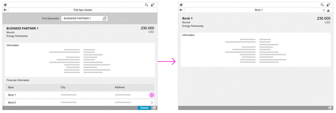
It is also advisable to use only one input field for finding the object. If you need to include detail views, or allow the user to switch between views, offer these features when displaying the object itself.
Structure
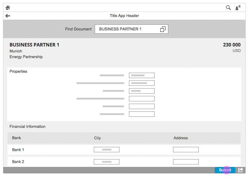
The initial page layout is based on the full screen layout, and uses this same structure. The launchpad shell bar is always available at the top of SAP Fiori apps. The app title (application header) reflects the title of the launch tile, such as “Manage Products”. However, instead of showing an object header or filter bar in the header section, the initial page displays only an input field. If value help is offered, it is shown in a dialog control. The content area is used to display the object. The object should be displayed following one of the floorplans outlined in the guidelines.
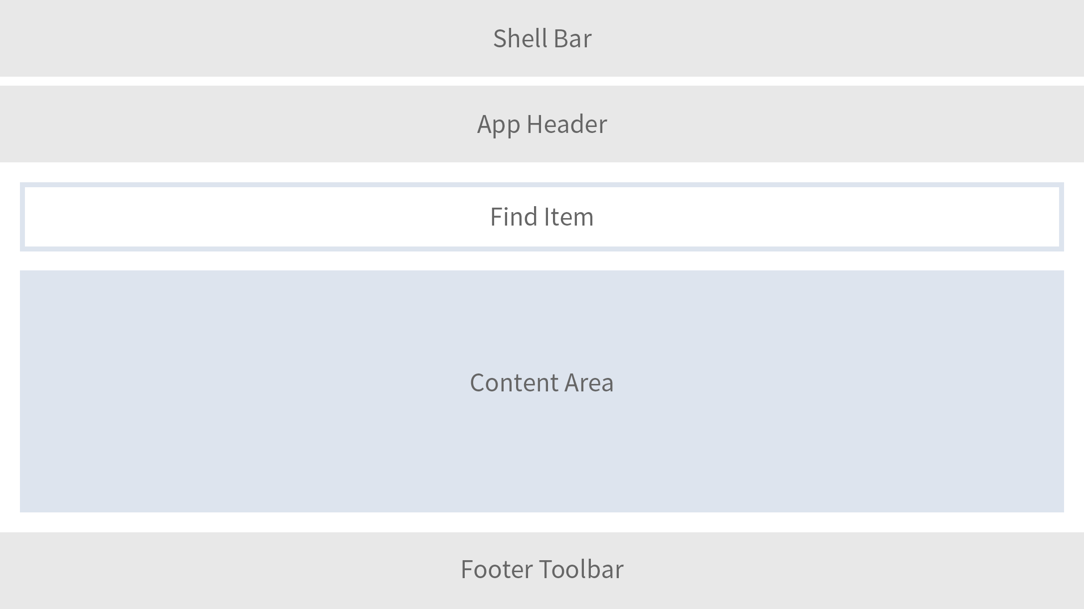
Structure of the initial screen
Responsiveness
The initial page features a single interaction point for the user: the input field near the top of the screen. Place the input field inside the header section. Configure the width to fit the width of the longest text (allowing some additional space for other languages), but do not make it significantly wider. When you set the maximum width of the input field, also consider the width available on mobile devices.
The field should never be as wide as the screen (except for on smartphone screens).
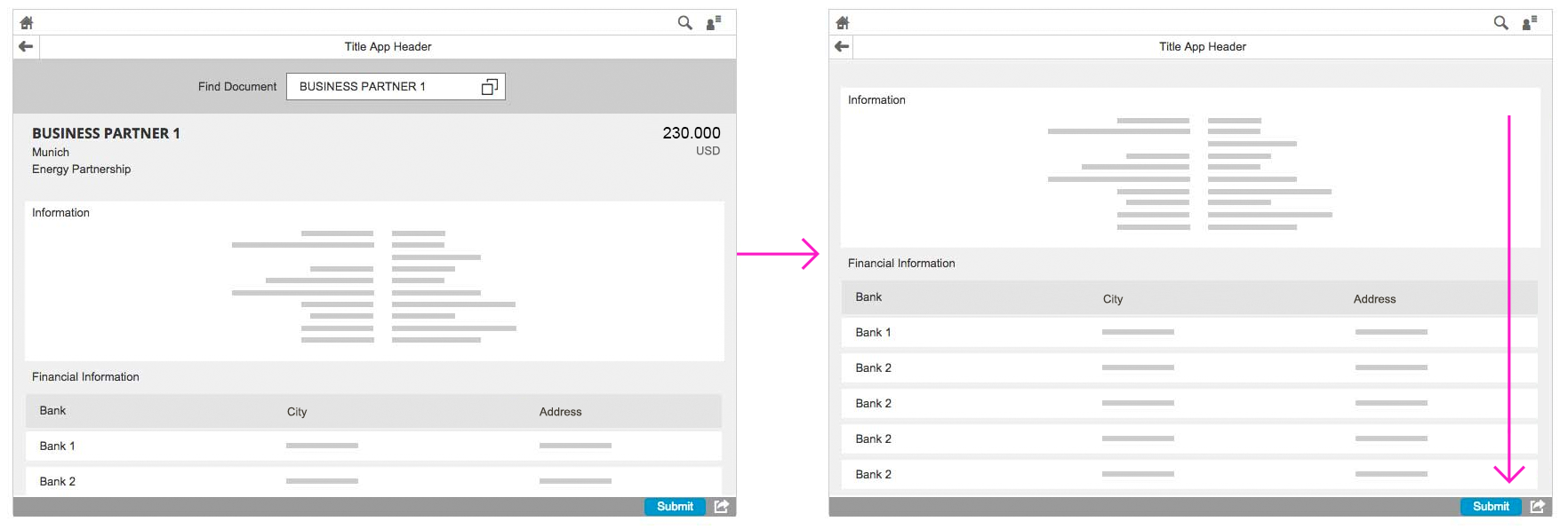
Initial page floorplan in size S
Initial page floorplan in size M
Initial page floorplan in size L
Flows and Interaction
Initial Screen with Live Search
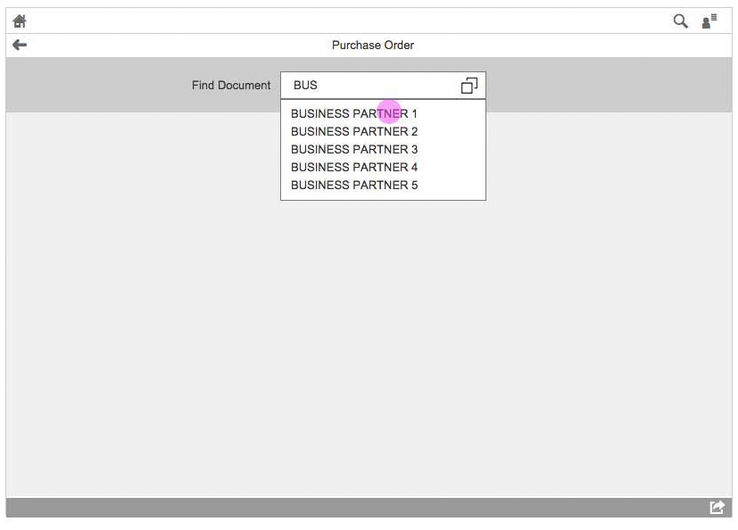
The input field serves as the single starting point for finding the object. The assisted input uses the live search or the value help dialog to speed up the search. The live search feature can show anything from one attribute to an entire table of values. It is possible to show a message such as “Enter ID manually or scan barcode” using the message page to guide the user.
Search As You Type
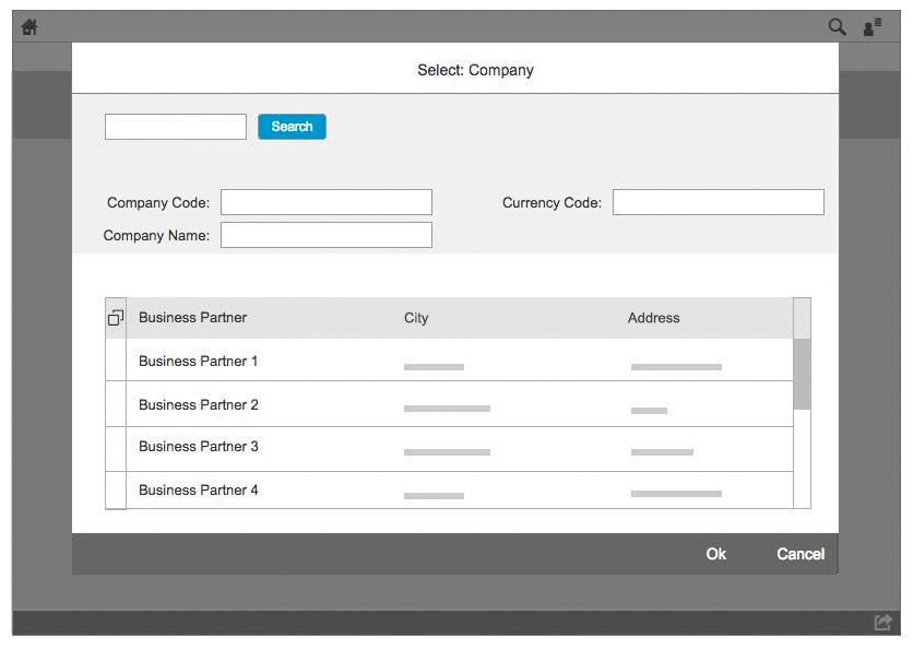
Initial Screen with Value Help Dialog
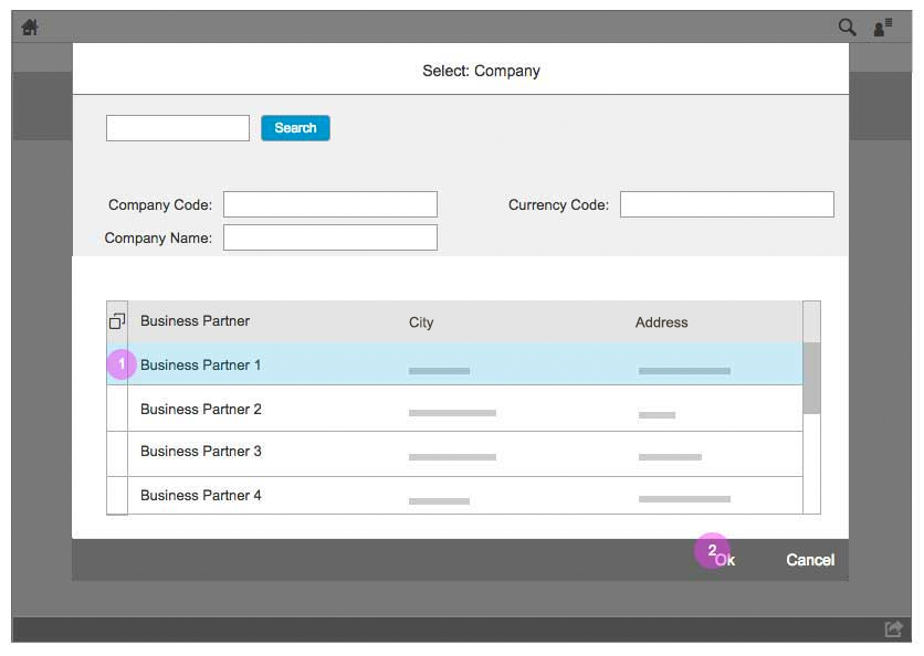
If multiple hits are possible for the same search terms, you may need to implement a value help dialog. This dialog lets the user narrow down the list of items based on more specific criteria. When the user selects an object from the list, the dialog closes and the object is displayed in the content area (no additional navigation is required).
Value Help Dialog
Behavior of the Search Field
The input field is in the header section of the page, but does not remain there when the page is scrolled downwards. The field does not appear when a subpage is opened.
Once the page has loaded, the search field should be on focus if no other additional action is provided. This allows the user to enter the search term directly without clicking into the field. You should only consider using this if there are no other elements that could be blocked by it, such as the on-screen keyboard on touch devices.
Behavior of the search field
Behavior of the search field
If the user enters new search terms in the input field, the focus moves away from the field and the app triggers a new search. If no results are found, the user sees a blank page with a corresponding message. If the input field is left blank, no message is shown.
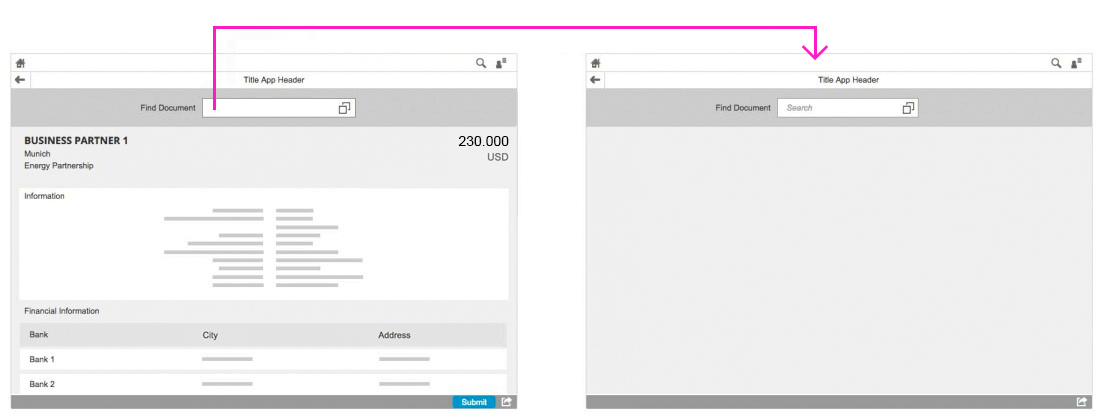
If the search term is deleted and focus moves away from the input field (or Enter is clicked), the screen becomes blank again
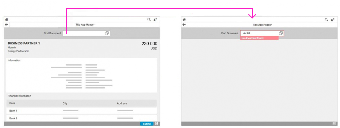
If a search is executed but no documents are found, the screen becomes blank again and an orange warning appears around the input field
Visual Design
Basic layout of the initial page floorplan on a smartphone
Basic layout of the initial page floorplan on a tablet
Basic layout of the initial page floorplan on a desktop
Resources
Want to dive deeper? Follow the links below to find out more about related controls, the SAPUI5 implementation, and the visual design.
Elements and Controls
- Floorplan Overview (guidelines)
- Input Field (with value help) (guidelines)
- Full Screen Layout (guidelines)
Implementation
- Input Field (SAPUI5 samples)
- Input Field (SAPUI5 test suite)
- Input Field (SAPUI5 API reference)
- Value Help Dialog (SAPUI5 samples)
 Your feedback has been sent to the SAP Fiori design team.