
- Latest SAPUI Version 1.124
- SAPUI5 Version 1.122
- SAPUI5 Version 1.120
- SAPUI5 Version 1.118
- SAPUI5 Version 1.116
- SAPUI5 Version 1.114
- SAPUI5 Version 1.112
- SAPUI5 Version 1.110
- SAPUI5 Version 1.108
- SAPUI5 Version 1.106
- SAPUI5 Version 1.104
- SAPUI5 Version 1.102
- SAPUI5 Version 1.100
- SAPUI5 Version 1.98
- SAPUI5 Version 1.96
- SAPUI5 Version 1.94
- SAPUI5 Version 1.92
- SAPUI5 Version 1.90
- SAPUI5 Version 1.88
- SAPUI5 Version 1.86
- SAPUI5 Version 1.84
- SAPUI5 Version 1.82
- SAPUI5 Version 1.80
- SAPUI5 Version 1.78
- SAPUI5 Version 1.76
- SAPUI5 Version 1.74
- SAPUI5 Version 1.72
- SAPUI5 Version 1.70
- SAPUI5 Version 1.68
- SAPUI5 Version 1.66
- SAPUI5 Version 1.64
- SAPUI5 Version 1.62
- SAPUI5 Version 1.60
- SAPUI5 Version 1.58
- SAPUI5 Version 1.56
- SAPUI5 Version 1.54
- SAPUI5 Version 1.52
- SAPUI5 Version 1.50
- SAPUI5 Version 1.48
- SAPUI5 Version 1.46
- SAPUI5 Version 1.44
- SAPUI5 Version 1.42
- SAPUI5 Version 1.40
- SAPUI5 Version 1.38
- SAPUI5 Version 1.34
- SAPUI5 Version 1.32
- SAPUI5 Version 1.30
- SAPUI5 Version 1.28
- SAPUI5 Version 1.26
- Latest SAPUI Version 1.124
- SAPUI5 Version 1.122
- SAPUI5 Version 1.120
- SAPUI5 Version 1.118
- SAPUI5 Version 1.116
- SAPUI5 Version 1.114
- SAPUI5 Version 1.112
- SAPUI5 Version 1.110
- SAPUI5 Version 1.108
- SAPUI5 Version 1.106
- SAPUI5 Version 1.104
- SAPUI5 Version 1.102
- SAPUI5 Version 1.100
- SAPUI5 Version 1.98
- SAPUI5 Version 1.96
- SAPUI5 Version 1.94
- SAPUI5 Version 1.92
- SAPUI5 Version 1.90
- SAPUI5 Version 1.88
- SAPUI5 Version 1.86
- SAPUI5 Version 1.84
- SAPUI5 Version 1.82
- SAPUI5 Version 1.80
- SAPUI5 Version 1.78
- SAPUI5 Version 1.76
- SAPUI5 Version 1.74
- SAPUI5 Version 1.72
- SAPUI5 Version 1.70
- SAPUI5 Version 1.68
- SAPUI5 Version 1.66
- SAPUI5 Version 1.64
- SAPUI5 Version 1.62
- SAPUI5 Version 1.60
- SAPUI5 Version 1.58
- SAPUI5 Version 1.56
- SAPUI5 Version 1.54
- SAPUI5 Version 1.52
- SAPUI5 Version 1.50
- SAPUI5 Version 1.48
- SAPUI5 Version 1.46
- SAPUI5 Version 1.44
- SAPUI5 Version 1.42
- SAPUI5 Version 1.40
- SAPUI5 Version 1.38
- SAPUI5 Version 1.36
- SAPUI5 Version 1.34
- SAPUI5 Version 1.32
- SAPUI5 Version 1.30
- SAPUI5 Version 1.28
- SAPUI5 Version 1.26
Table Overview
sap.m.Table
Intro
A table contains a set of line items and usually comprises rows (with each row showing one line item) and columns. Line items can contain data of any kind, but also interactive controls, for example, for editing the data, navigating, or triggering actions relating to the line item.
To display large amounts of data in tabular form, several table controls are provided. These are divided into two groups, each of which is defined by a consistent feature set:
- Fully responsive tables
- Desktop-centric tables
Usage
Use the responsive table if:
- A table is needed. The responsive table is the default table in SAP Fiori.
- The table content should be flexible and visually appealing. The responsive table offers the most flexibility in regards to its content because all SAPUI5 controls, and even multiple controls, can be used. In addition, different rows can be based on different item templates.
- The focus lies on working on line items, not on individual cells.
- A main use case involves selecting one or more items, for which details are needed in order to choose the correct item.
- Line items are independent of each other and no operation across columns is needed.
- You want to have only one implementation for all devices.
Use the list if:
- A simple data set is to be displayed.
- A table would be too complex.
- A list of actions is to be displayed.
- Simple two-level hierarchies are required (by using grouping or navigation).
- The main use case involves selecting one of several items with only a few details per item.
For these cases, use the list control instead.
Use the grid table if:
- You need to display more than 1,000 rows at the same time.
- The cell level and the spatial relationship between cells are more important than the line item, such as if users need to recognize patterns in the data, like in waterfall charts.
- Comparing items is a major use case. The grid table layout remains stable irrespective of the screen width. In addition, a cell only ever contains one control.
- You need an analytical table, but you cannot provide an analytical binding.
Note that the grid table is not fully responsive. It is available only for desktops and tablets, so you will need to take an adaptive approach by offering an additional UI for smartphones.
Use the tree table if:
- Data needs to be displayed in a hierarchical manner.
Note that the tree table is not fully responsive. It is available only for desktops and tablets, so you will need to take an adaptive approach by offering an additional UI for smartphones.
Use the analytical table if:
- You need multilevel grouping as well as grand totals and subtotals.
Note that the analytical table is not fully responsive. It is available only for desktops and tablets, so you will need to take an adaptive approach by offering an additional UI for smartphones.
Use the smart table if:
- Any of the above tables should render themselves from the OData service, and almost no additional UI code should be written.
Note that the smart table supports only basic content layouts, unless you invest further in UI code.
In addition, the smart table cannot be used within the chart container.
Do not use a table at all if:
- The main use case involves choosing one item from a very small number of items with no additional details. In this case, a select or combo box might be more suitable.
- You need an overview of large amounts of data. In this case, use a chart.
- You just need it for layout reasons. In this case, use a layout container, such as the grid layout.
- You need read-only or editable field-value pairs. In this case, use a form instead.
Types
Fully Responsive Tables
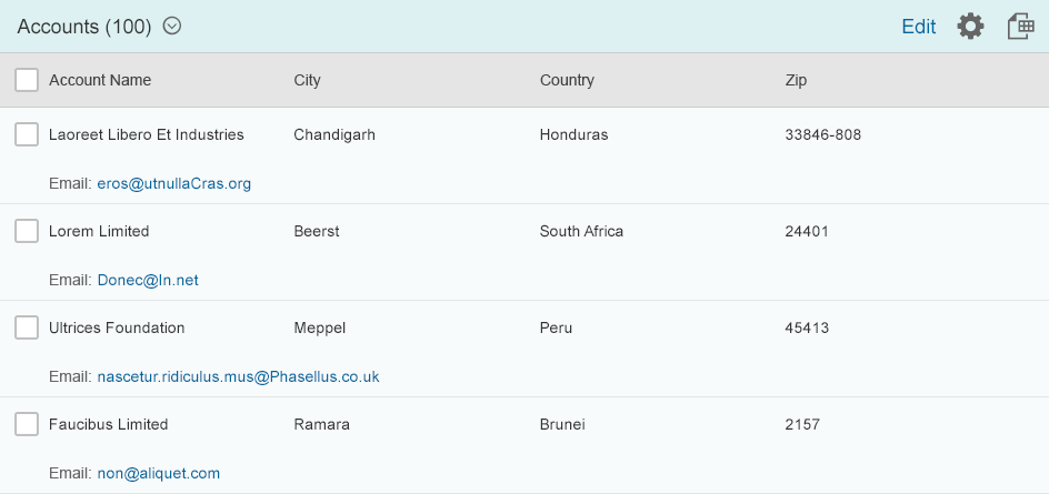
Responsive Table (sap.m.Table)
This is the default table in SAP Fiori. If a table is needed, the responsive table should be the first choice. It is based on the list.
The responsive table provides:
- An optimized way to show a line item at a glance without the need for horizontal scrolling, regardless of the screen width.
- Full flexibility in regards to content:
- Any SAPUI5 control can be used in a cell, including micro charts and forms.
- Using layout containers, such as a grid layout, allows more than one control to be used in a cell; consequently, the cell shows more than one data point.
- Templates with multiple rows are supported, so different items can have different layouts. For example, this can be used to show editable items and read-only items in the same table without switching modes. In this case, the editable items could have a completely different layout than the read-only items.
- Items with different heights are supported. This allows for more dynamic content in cells, for example, to show lists or use text controls that wrap instead of truncate.
- Smooth scrolling. This is done by rendering all items on the application background. Thus, the responsive table does not have its own scroll bar but uses the scroll bar of the entire page.
- A very lightweight design.
- Touch support.
The responsive table is limited in the following way:
- Since all items are rendered, the responsive table is limited to approximately 1,000 items on one screen (depending on the complexity of the items and the entire screen). Exceeding this number can lead to decreased rendering performance. On mobile devices, browsers can also run out of memory.
Responsive table
List (sap.m.List)
The list is the basis for the responsive table. It should be used whenever a table is too complex.
The list provides:
- Full flexibility in regards to its content:
- There are various specializations for specific list types.
- With a custom list item, all SAPUI5 controls can be used inside a list. Using layout containers allows more than one control to be used in a custom list item.
- Templates with multiple rows are supported, so different items can be shown in the same list.
- Items with different heights are supported.
- Smooth scrolling. This is done by rendering all items on the application background. Thus, the list does not have its own scroll bar but uses the scroll bar of the whole page.
- A very lean and lightweight design.
- Touch support.
The list is limited in the following way:
- Since all items are rendered, the list is limited to approximately 1,000 items on one screen (depending on the complexity of the items and the whole screen). Exceeding this number can lead to decreased rendering performance. On mobile devices, browsers can also run out of memory.
List
Desktop-Centric Tables
This group contains three different tables:
- Grid table: This is the most basic table in this group.
- Analytical table: This provides the following features on top of the grid table:
- Grouping by several levels.
- Automatic calculation of grand totals for a column and subtotals per group level.
- Tree table: This provides a hierarchical view of the items.
Grid Table (sap.ui.table.Table)
The grid table provides:
- An optimized way to show large amounts of data. It supports an unlimited number of rows. It also supports a very condensed display of line items on non-touch devices, thus allowing more rows to be displayed on the same screen real estate.
- Fixed control height, thus supporting horizontal and vertical scrolling (“viewport scrolling”). However, this also means that there are several vertical scrollbars on the screen for the page and table, which might be cumbersome on smaller screens.
- Touch devices are supported.
The grid table is limited in the following way:
- Content layout is less flexible:
- The grid table supports only certain controls, mainly for displaying text or getting single-line text input from users. For example, you cannot add micro charts.
- Only one control can be added per cell.
- It supports only single-row templates.
- All items need to have the same height.
- Vertical scrolling is not smooth. For performance reasons, the content is not really scrolled but exchanged.
- The design is more complex.
- Although touch is supported, the grid table works only on desktops and tablets. For smartphones, a fallback solution is needed.
Grid table
Analytical Table (sap.ui.table.AnalyticalTable)
The analytical table is based on the grid table and is therefore quite similar to it.
The analytical table provides:
- Multilevel grouping
- Display of grand totals per column and subtotals per group
The analytical table is limited in the same way as the grid table, with one addition:
- The analytical table needs analytical binding.

Analytical table
Tree Table (sap.ui.table.TreeTable)
The tree table is based on the grid table and is therefore quite similar to it.
In addition to the grid table, the tree table provides:
- One hierarchical column
The tree table is limited in the same way as the grid table.
Tree table
Smart Table
The smart table is not a table type, but rather a wrapper around existing table controls. It automatically adds a toolbar and the following additional common functionality:
- Item counter
- Variant management
- View switch between edit mode and read-only mode
- Table settings (sort, filter, group, column settings)
- Export to spreadsheet
The smart table is configured via the underlying OData service. Not much additional UI code needs to be added, which can save writing considerable amounts of source code.
However, the smart table is limited to standard layouts and use cases. If you need more, you will need to write additional UI code for the smart table, or use the underlying table controls directly.
Smart table using the responsive table
Resources
Want to dive deeper? Follow the links below to find out more about related controls, the SAPUI5 implementation, and the visual design.
Elements and Controls
- Responsive Table (guidelines)
- List (guidelines)
- Grid Table (guidelines)
- Analytical Table (guidelines)
- Tree Table (guidelines)
- Smart Table (guidelines)
Implementation
- No links
 Your feedback has been sent to the SAP Fiori design team.