
- Latest SAPUI Version 1.124
- SAPUI5 Version 1.122
- SAPUI5 Version 1.120
- SAPUI5 Version 1.118
- SAPUI5 Version 1.116
- SAPUI5 Version 1.114
- SAPUI5 Version 1.112
- SAPUI5 Version 1.110
- SAPUI5 Version 1.108
- SAPUI5 Version 1.106
- SAPUI5 Version 1.104
- SAPUI5 Version 1.102
- SAPUI5 Version 1.100
- SAPUI5 Version 1.98
- SAPUI5 Version 1.96
- SAPUI5 Version 1.94
- SAPUI5 Version 1.92
- SAPUI5 Version 1.90
- SAPUI5 Version 1.88
- SAPUI5 Version 1.86
- SAPUI5 Version 1.84
- SAPUI5 Version 1.82
- SAPUI5 Version 1.80
- SAPUI5 Version 1.78
- SAPUI5 Version 1.76
- SAPUI5 Version 1.74
- SAPUI5 Version 1.72
- SAPUI5 Version 1.70
- SAPUI5 Version 1.68
- SAPUI5 Version 1.66
- SAPUI5 Version 1.64
- SAPUI5 Version 1.62
- SAPUI5 Version 1.60
- SAPUI5 Version 1.58
- SAPUI5 Version 1.56
- SAPUI5 Version 1.54
- SAPUI5 Version 1.52
- SAPUI5 Version 1.50
- SAPUI5 Version 1.48
- SAPUI5 Version 1.46
- SAPUI5 Version 1.44
- SAPUI5 Version 1.42
- SAPUI5 Version 1.40
- SAPUI5 Version 1.38
- SAPUI5 Version 1.34
- SAPUI5 Version 1.32
- SAPUI5 Version 1.30
- SAPUI5 Version 1.28
- SAPUI5 Version 1.26
- Latest SAPUI Version 1.124
- SAPUI5 Version 1.122
- SAPUI5 Version 1.120
- SAPUI5 Version 1.118
- SAPUI5 Version 1.116
- SAPUI5 Version 1.114
- SAPUI5 Version 1.112
- SAPUI5 Version 1.110
- SAPUI5 Version 1.108
- SAPUI5 Version 1.106
- SAPUI5 Version 1.104
- SAPUI5 Version 1.102
- SAPUI5 Version 1.100
- SAPUI5 Version 1.98
- SAPUI5 Version 1.96
- SAPUI5 Version 1.94
- SAPUI5 Version 1.92
- SAPUI5 Version 1.90
- SAPUI5 Version 1.88
- SAPUI5 Version 1.86
- SAPUI5 Version 1.84
- SAPUI5 Version 1.82
- SAPUI5 Version 1.80
- SAPUI5 Version 1.78
- SAPUI5 Version 1.76
- SAPUI5 Version 1.74
- SAPUI5 Version 1.72
- SAPUI5 Version 1.70
- SAPUI5 Version 1.68
- SAPUI5 Version 1.66
- SAPUI5 Version 1.64
- SAPUI5 Version 1.62
- SAPUI5 Version 1.60
- SAPUI5 Version 1.58
- SAPUI5 Version 1.56
- SAPUI5 Version 1.54
- SAPUI5 Version 1.52
- SAPUI5 Version 1.50
- SAPUI5 Version 1.48
- SAPUI5 Version 1.46
- SAPUI5 Version 1.44
- SAPUI5 Version 1.42
- SAPUI5 Version 1.40
- SAPUI5 Version 1.38
- SAPUI5 Version 1.36
- SAPUI5 Version 1.34
- SAPUI5 Version 1.32
- SAPUI5 Version 1.30
- SAPUI5 Version 1.28
- SAPUI5 Version 1.26
List Report (Smart Templates/SAP Fiori Elements)
Intro
The smart template list report floorplan is an instance of the general list report floorplan implemented as a reusable template. The list report floorplan allows users to work with large lists of items and take action. The guidelines for the list report generally apply. Existing deviations and limitations are listed below.
Usage
If you are not sure whether to use this floorplan, please consult the list report floorplan guidelines. Use this template to efficiently implement standard applications that are based on large lists. The smart filter bar, smart table, and object page sections support breakout scenarios. This means that custom-coded deviations are technically possible, although this is not the case for the object header.
Responsiveness
The overall responsiveness depends mainly on the capability of the underlying controls; that is, the filter bar and the table being used. The table toolbar is responsive.
The template uses the smart table, which can render the responsive table, the grid table, and the analytical table. Depending on its use case, the app development team decides which table representation fits best. For more details, see the respective guideline articles.
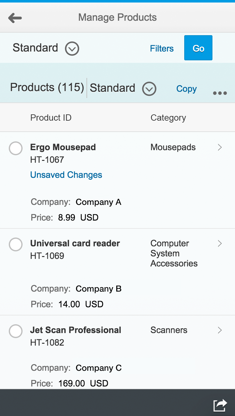
Size S
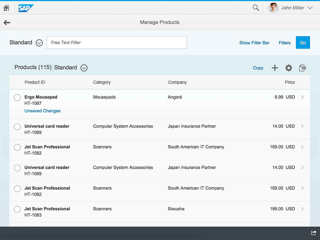
Size M
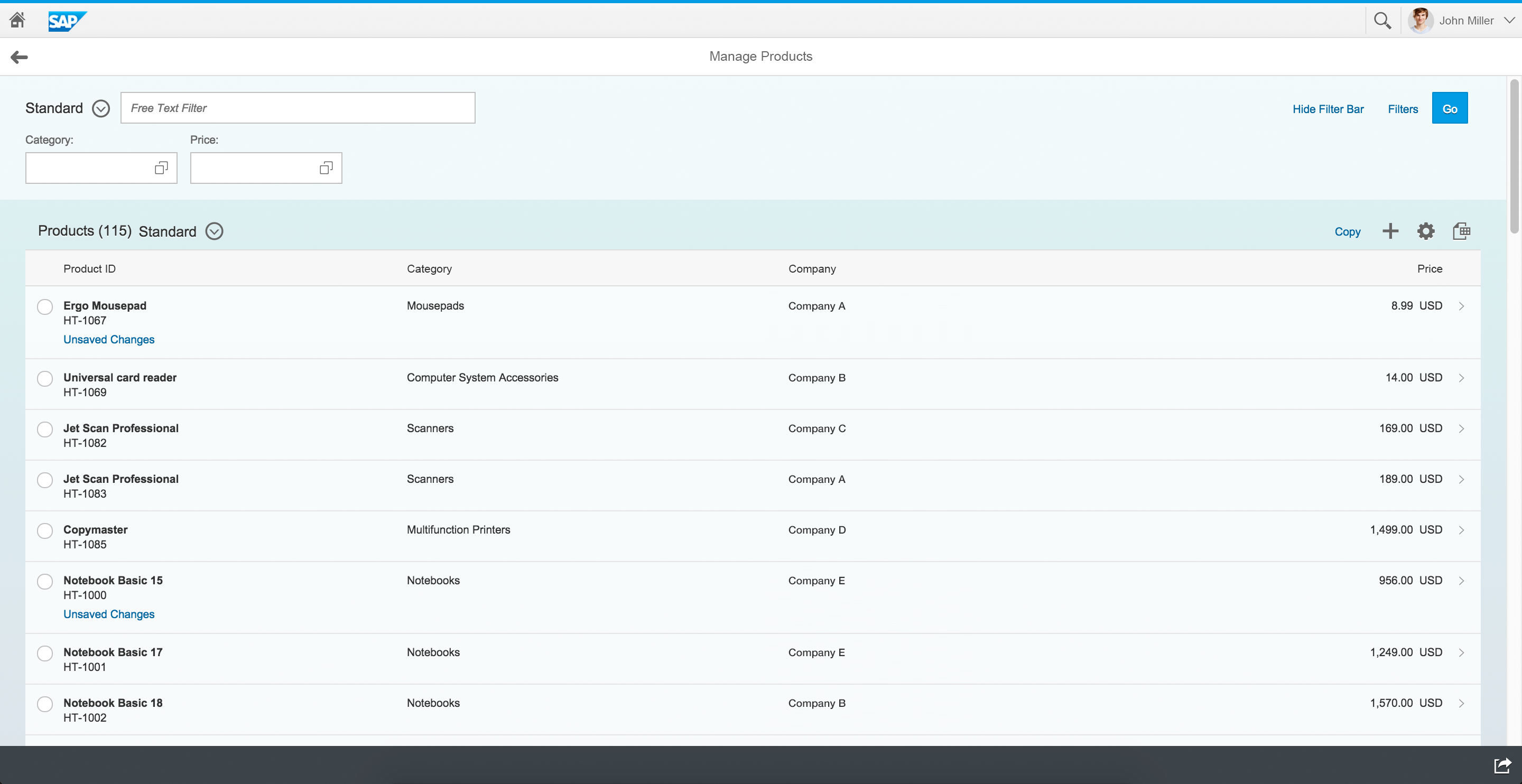
Size L
Layout
The template comprises the same areas as the list report:
- The app header showing the name of the app.
- The smart filter bar with variant management.
- The table toolbar for generic and app-specific actions.
- The smart table with layout management.
- The footer toolbar offering the share menu.
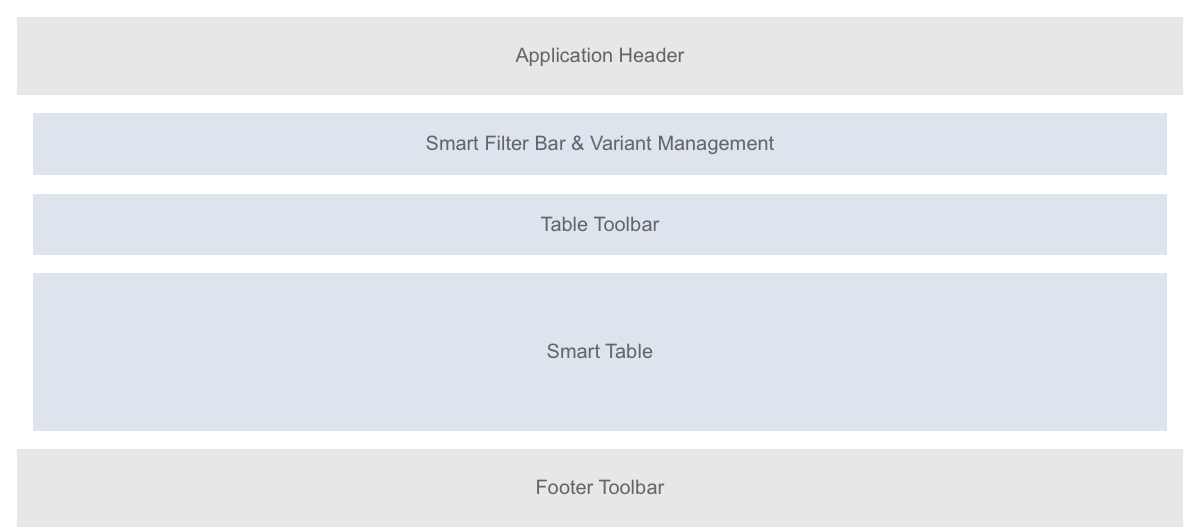
Schematic visualization of smart template – List report floorplan
Behavior and Interaction
Smart Filter Bar
Within the smart filter bar, app-specific filters are also possible. The following are possible as breakout scenarios: combo box, select, input field, search field, and value help, date picker, and rating indicator.
The default variant in the filter bar cannot be executed automatically when the page is loading. However, users can create their own variants and configure them to be loaded automatically.
Actions in the Smart Table Toolbar
Rendering
The toolbar supports layout management. It shows generic actions rendered as text icons (for example, “personalize”, including sort, filter, and group, “export to spreadsheet”, and “add/create item”). App development teams may define their own actions, which are rendered as text buttons (such as Copy, Approve, or Delete).
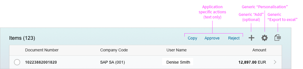
Actions in the smart table toolbar
Triggering
The user must select an item before triggering a use case specific action. Hiding actions is not possible. The app development team can define the type of dialog for the action:
- The system simply triggers the action.
- The action needs a user confirmation. This is used, for example, for critical actions that have severe consequences. The system opens a dialog in which the user needs to confirm the action. This message is generic and cannot be replaced.
- The action needs additional user input, such as an approval comment. The system opens a dialog with one or more entry elements in which the user enters the required data. The system can prefill data if applicable.
Smart Table
The smart table supports the following table types: responsive table, grid table, analytical table, and tree table. We do not recommend using the tree table at present.
The smart table supports the display of:
- Single and multi selection of rows.
- Draft/locked state indication within the rows.
- Line item navigation inside the app (to a related object page, for example).
- Link and smart link to navigate to different targets, also outside the application.
At present, the smart table does not support:
- The object number. Showing, for example, an amount as an object number would not appear specially formatted, but as standard text.
- Line item navigation to outside apps.
The grid table and the analytical table do not support:
- Line item navigation with a chevron icon to detail screens. As a short-term solution, the toolbar offers the “Show Details” action for navigating to details.
Only the responsive table supports the display of:
- A specific status like “out of stock” in connection with the standard semantic color status icon.
- The object identifier, showing the product name and ID.
Only the responsive table does not support:
- The enabling, disabling, showing, or hiding of action buttons. Action buttons are always displayed, even if they would not have an effect with a specific item chosen by the user. The app displays an error message in these cases.
- Smart multi selection which applies the items that are chosen and applicable in the given use case. For example, if a user chooses five items and only three are applicable to the chosen action, the app displays an error message. This generally enables multi selection.
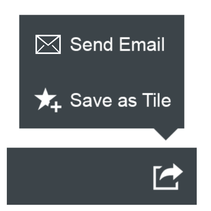
Footer Toolbar
App-specific actions cannot currently be offered in the footer toolbar besides the share.
The footer toolbar offers the share menu in an action sheet. It features Save as Tile if the launchpad is available, Send Email, and Share in Jam if Jam is available.
At present, the message popover for error messages is only supported by the object page, not within the list report.
The footer toolbar offers the share menu in an action sheet.
Resources
Want to dive deeper? Follow the links below to find out more about related controls, the SAPUI5 implementation, and the visual design.
Elements and Controls
- Introduction to Smart Templates (guidelines)
- Filter Bar (guidelines)
- Table – Overview (guidelines)
 Your feedback has been sent to the SAP Fiori design team.