- Latest SAPUI Version 1.124
- SAPUI5 Version 1.122
- SAPUI5 Version 1.120
- SAPUI5 Version 1.118
- SAPUI5 Version 1.116
- SAPUI5 Version 1.114
- SAPUI5 Version 1.112
- SAPUI5 Version 1.110
- SAPUI5 Version 1.108
- SAPUI5 Version 1.106
- SAPUI5 Version 1.104
- SAPUI5 Version 1.102
- SAPUI5 Version 1.100
- SAPUI5 Version 1.98
- SAPUI5 Version 1.96
- SAPUI5 Version 1.94
- SAPUI5 Version 1.92
- SAPUI5 Version 1.90
- SAPUI5 Version 1.88
- SAPUI5 Version 1.86
- SAPUI5 Version 1.84
- SAPUI5 Version 1.82
- SAPUI5 Version 1.80
- SAPUI5 Version 1.78
- SAPUI5 Version 1.76
- SAPUI5 Version 1.74
- SAPUI5 Version 1.72
- SAPUI5 Version 1.70
- SAPUI5 Version 1.68
- SAPUI5 Version 1.66
- SAPUI5 Version 1.64
- SAPUI5 Version 1.62
- SAPUI5 Version 1.60
- SAPUI5 Version 1.58
- SAPUI5 Version 1.56
- SAPUI5 Version 1.54
- SAPUI5 Version 1.52
- SAPUI5 Version 1.50
- SAPUI5 Version 1.48
- SAPUI5 Version 1.46
- SAPUI5 Version 1.44
- SAPUI5 Version 1.42
- SAPUI5 Version 1.40
- SAPUI5 Version 1.38
- SAPUI5 Version 1.34
- SAPUI5 Version 1.32
- SAPUI5 Version 1.30
- SAPUI5 Version 1.28
- SAPUI5 Version 1.26
- Latest SAPUI Version 1.124
- SAPUI5 Version 1.122
- SAPUI5 Version 1.120
- SAPUI5 Version 1.118
- SAPUI5 Version 1.116
- SAPUI5 Version 1.114
- SAPUI5 Version 1.112
- SAPUI5 Version 1.110
- SAPUI5 Version 1.108
- SAPUI5 Version 1.106
- SAPUI5 Version 1.104
- SAPUI5 Version 1.102
- SAPUI5 Version 1.100
- SAPUI5 Version 1.98
- SAPUI5 Version 1.96
- SAPUI5 Version 1.94
- SAPUI5 Version 1.92
- SAPUI5 Version 1.90
- SAPUI5 Version 1.88
- SAPUI5 Version 1.86
- SAPUI5 Version 1.84
- SAPUI5 Version 1.82
- SAPUI5 Version 1.80
- SAPUI5 Version 1.78
- SAPUI5 Version 1.76
- SAPUI5 Version 1.74
- SAPUI5 Version 1.72
- SAPUI5 Version 1.70
- SAPUI5 Version 1.68
- SAPUI5 Version 1.66
- SAPUI5 Version 1.64
- SAPUI5 Version 1.62
- SAPUI5 Version 1.60
- SAPUI5 Version 1.58
- SAPUI5 Version 1.56
- SAPUI5 Version 1.54
- SAPUI5 Version 1.52
- SAPUI5 Version 1.50
- SAPUI5 Version 1.48
- SAPUI5 Version 1.46
- SAPUI5 Version 1.44
- SAPUI5 Version 1.42
- SAPUI5 Version 1.40
- SAPUI5 Version 1.38
- SAPUI5 Version 1.36
- SAPUI5 Version 1.34
- SAPUI5 Version 1.32
- SAPUI5 Version 1.30
- SAPUI5 Version 1.28
- SAPUI5 Version 1.26
Text Area
sap.m.TextArea
Intro
The text area is an input control that allows the user to enter multiple lines of text.
Usage
Use the text area if you want to enter multiple lines of text. If you only want to enter a single line of text, use the text control instead.
Responsiveness
You can set the maximum number of lines to be shown. The amount of text depends on the size of the screen. On smaller screens, the user can scroll down the text area to see the entire text. To indicate that the text continues, the control shows only half of the last line. This also applies for mobile devices.
Components
The text area allows the user to enter multiple lines of text.
Behavior and Interaction
Entering and Removing Text
The user can enter text. As soon as the user starts typing, the placeholder disappears. It appears again when the user removes all the content from the text area.
You can also limit the number of characters a user can enter. In this case, the text area prevents the user from adding more characters than the maximum value defined (property: maxLength).
Making Text Non-Editable
You can set the text area to non-editable (property: editable). This mode still allows the user to scroll to the text that is currently hidden.
Disabling Text
Styles
As with any other input control, you can validate the fields and show the result as a value state (property: valueState) of the control (such as error, warning, success, or none).
For more information, see form field validation.
Guidelines
- As with other input fields in general, use a label. For exceptions regarding label usage, see the Exceptions section of the label article.
- The placeholder does not substitute a label. It can be used to give an additional hint, but should not repeat the label in long format.
- If you want to use the text area with a fixed text length (property: maxLength), for example, inside a form, use text beside the text area to indicate the number of remaining characters and a countdown while the user is typing.
Properties
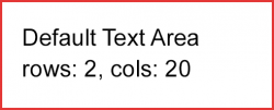
- You can provide a width by using the average character width (property: cols).
- You can define the height of the text area via the lines of text (property: rows). You can also set the height of the text area (property: height), which would override the rows property.
- Additionally, you can define the type of wrapping for the text area (property: wrapping) as Soft, Hard, or Off.
Resources
Want to dive deeper? Follow the links below to find out more about related controls, the SAPUI5 implementation, and the visual design.


 Your feedback has been sent to the SAP Fiori design team.