
- Latest SAPUI Version 1.124
- SAPUI5 Version 1.122
- SAPUI5 Version 1.120
- SAPUI5 Version 1.118
- SAPUI5 Version 1.116
- SAPUI5 Version 1.114
- SAPUI5 Version 1.112
- SAPUI5 Version 1.110
- SAPUI5 Version 1.108
- SAPUI5 Version 1.106
- SAPUI5 Version 1.104
- SAPUI5 Version 1.102
- SAPUI5 Version 1.100
- SAPUI5 Version 1.98
- SAPUI5 Version 1.96
- SAPUI5 Version 1.94
- SAPUI5 Version 1.92
- SAPUI5 Version 1.90
- SAPUI5 Version 1.88
- SAPUI5 Version 1.86
- SAPUI5 Version 1.84
- SAPUI5 Version 1.82
- SAPUI5 Version 1.80
- SAPUI5 Version 1.78
- SAPUI5 Version 1.76
- SAPUI5 Version 1.74
- SAPUI5 Version 1.72
- SAPUI5 Version 1.70
- SAPUI5 Version 1.68
- SAPUI5 Version 1.66
- SAPUI5 Version 1.64
- SAPUI5 Version 1.62
- SAPUI5 Version 1.60
- SAPUI5 Version 1.58
- SAPUI5 Version 1.56
- SAPUI5 Version 1.54
- SAPUI5 Version 1.52
- SAPUI5 Version 1.50
- SAPUI5 Version 1.48
- SAPUI5 Version 1.46
- SAPUI5 Version 1.44
- SAPUI5 Version 1.42
- SAPUI5 Version 1.40
- SAPUI5 Version 1.38
- SAPUI5 Version 1.34
- SAPUI5 Version 1.32
- SAPUI5 Version 1.30
- SAPUI5 Version 1.28
- SAPUI5 Version 1.26
- Latest SAPUI Version 1.124
- SAPUI5 Version 1.122
- SAPUI5 Version 1.120
- SAPUI5 Version 1.118
- SAPUI5 Version 1.116
- SAPUI5 Version 1.114
- SAPUI5 Version 1.112
- SAPUI5 Version 1.110
- SAPUI5 Version 1.108
- SAPUI5 Version 1.106
- SAPUI5 Version 1.104
- SAPUI5 Version 1.102
- SAPUI5 Version 1.100
- SAPUI5 Version 1.98
- SAPUI5 Version 1.96
- SAPUI5 Version 1.94
- SAPUI5 Version 1.92
- SAPUI5 Version 1.90
- SAPUI5 Version 1.88
- SAPUI5 Version 1.86
- SAPUI5 Version 1.84
- SAPUI5 Version 1.82
- SAPUI5 Version 1.80
- SAPUI5 Version 1.78
- SAPUI5 Version 1.76
- SAPUI5 Version 1.74
- SAPUI5 Version 1.72
- SAPUI5 Version 1.70
- SAPUI5 Version 1.68
- SAPUI5 Version 1.66
- SAPUI5 Version 1.64
- SAPUI5 Version 1.62
- SAPUI5 Version 1.60
- SAPUI5 Version 1.58
- SAPUI5 Version 1.56
- SAPUI5 Version 1.54
- SAPUI5 Version 1.52
- SAPUI5 Version 1.50
- SAPUI5 Version 1.48
- SAPUI5 Version 1.46
- SAPUI5 Version 1.44
- SAPUI5 Version 1.42
- SAPUI5 Version 1.40
- SAPUI5 Version 1.38
- SAPUI5 Version 1.36
- SAPUI5 Version 1.34
- SAPUI5 Version 1.32
- SAPUI5 Version 1.30
- SAPUI5 Version 1.28
- SAPUI5 Version 1.26
Using Tooltips
Intro
Tooltips appear next to the mouse pointer when it hovers over an element that offers a tooltip. Tooltips are shown only for elements that do not have a label or, in rare cases, to display additional information.
Since tooltips are handled by the browser, the form of tooltips depends on the platform, the browser, and the version.
Usage
Use a tooltip if:
Do not use a tooltip if:
- You want to show the full text for a truncated item. Instead, make more space for the item.
- You don’t want to use a label. You should always use a label.
- You want to offer an explanation or provide help. Instead, use help systems.
- The content of the tooltip would be redundant.
Responsiveness
Tooltips are usually invoked by a mouseover event, which is why they are limited to desktop devices. Most touch-only devices have no way of showing tooltips.
Because tooltips cannot be displayed on all devices, they should never contain critical information. They should also not contain redundant information.
Types
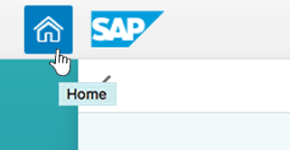
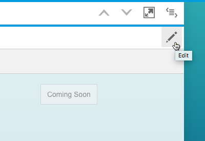
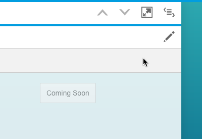
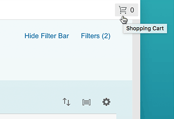
Icon-Only Buttons
Icon-only buttons must have a tooltip to indicate the action the button will trigger.
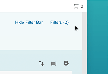
Icon-Only Buttons with Amounts
Icon-only buttons that contain numbers, but no text, must also have a tooltip.
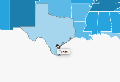
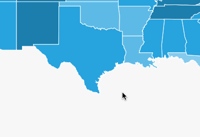
Maps
Within maps, different areas and hotspots can show different tooltips to elaborate the current position.
Guidelines
Overwriting standard icon tooltips
The icon within an icon-only button usually comes with a standard tooltip. However, this default tooltip contains the technical icon name, which may not be the right term for the icon in your context. Always check all icons, and overwrite the default tooltip texts with suitable texts for your specific use case.
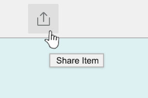
Icon with app-specific tooltip (default overwritten)
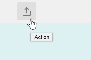
Icon with standard tooltip (default)
Resources
Want to dive deeper? Follow the links below to find out more about related controls, the SAPUI5 implementation, and the visual design.
Implementation
- Icon control (SAPUI5 samples)
- Geo Map (SAPUI5 samples)
- Analytical Map (SAPUI5 samples)
 Your feedback has been sent to the SAP Fiori design team.